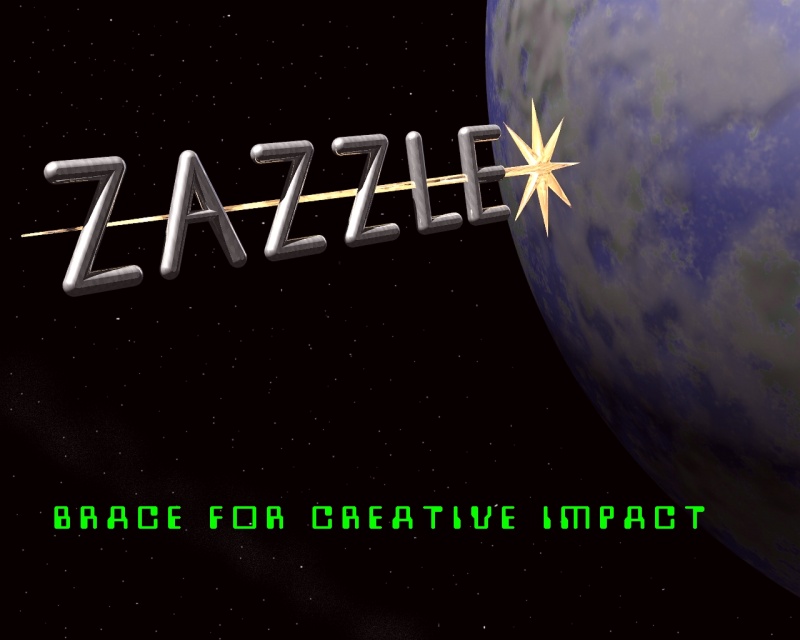
As the subject line implies, the folks at Zazzle are having a logo contest.
An idea popped into my head, so I gave it a go. Although I'm often
suspicious of "less is more" type claims, I went that route on this
occasion. Various attempted enhancements, such as adding "greebles" and
windows to make the letters more spaceship-like just made it look busier,
not better. (IMHO) The logo and planet are straight CSG in POV-Ray. Star
course. ;-)
viewed here:
http://www.zazzle.com/tricksteroflight
Regards All,
Mike C.
Post a reply to this message
Attachments:
Download 'zazlogocon.jpg' (86 KB)
Preview of image 'zazlogocon.jpg'
|