|
|
|
|
|
|
| |
| |
|
|
|
|
| |
| |
|
|
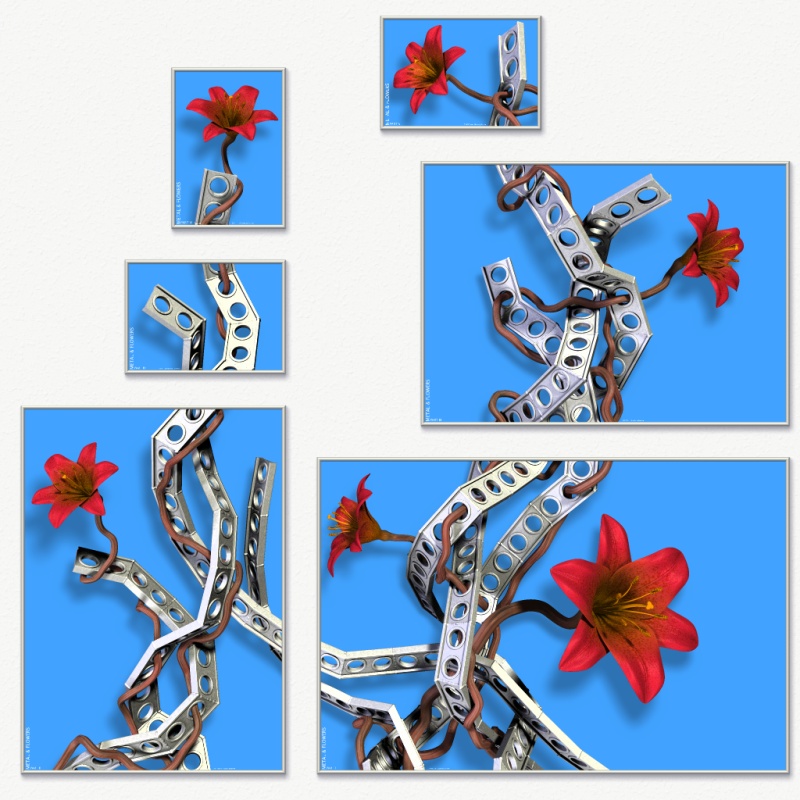
Rune nous apporta ses lumieres en ce 2007/08/18 21:46:
> Okay, so I've finally gotten all the details to a level where I'm satisfied
> with it. (You wouldn't believe how many tweaks I've made since the last
> version I posted, that probably no one else than me even notices...) Making
> test-prints with my printer have made me aware of issues with things than
> don't work as well on print as on the screen, because nuances in colors and
> luminance is lost once printed. To deal with that, contrast of certain
> textures have been enhanced, which looks better on the screen too as a
> bonus.
>
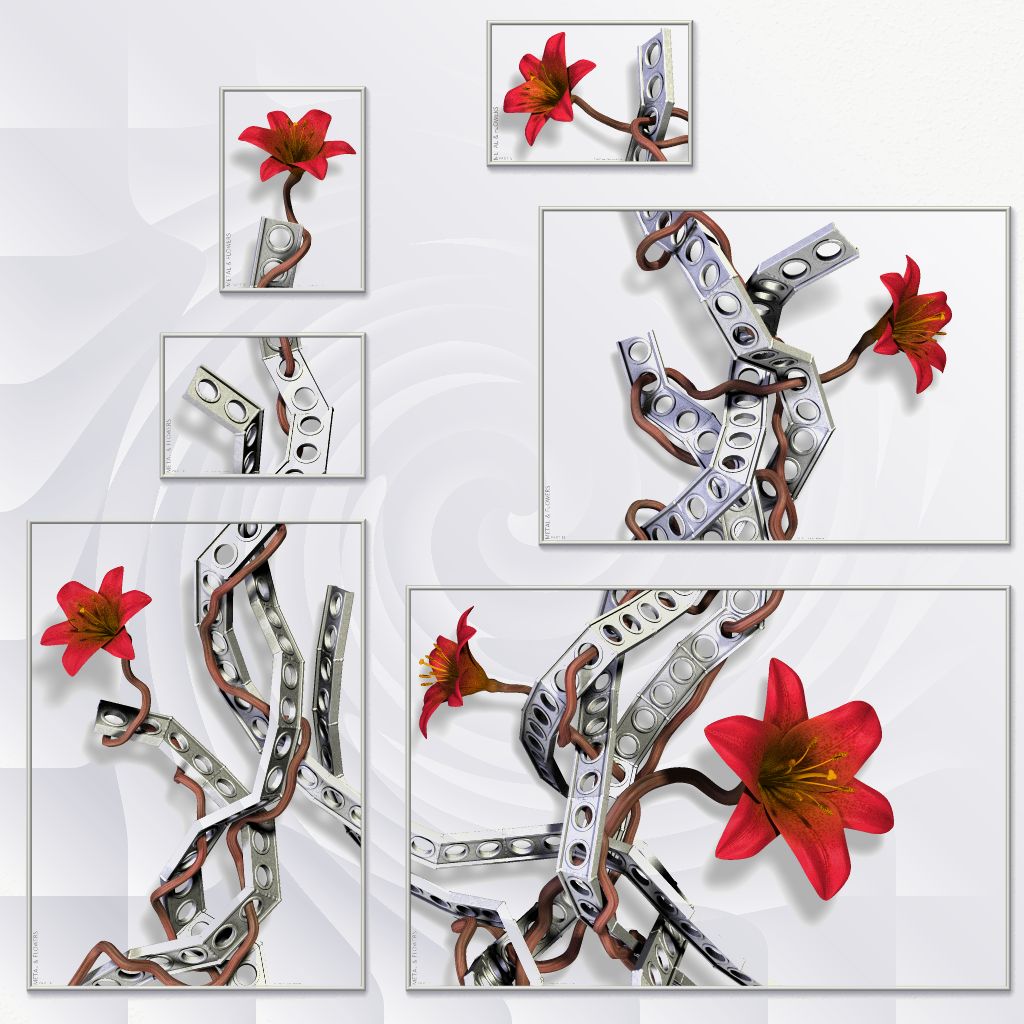
> Anyway, I've splitted the image into several layers, and once the background
> layer was separate, it suddenly got temptingly easy to play around with
> it... In my head the background was always just white, but after having seen
> some of the possible alternatives, I'm suddenly not sure I prefer white
> anymore. I don't know which version I want to have printed!
>
> What to do, what to do...
>
> What do you think?
>
> Teaser image is attached, the full versions can be seen here (in png format,
> so the page is slightly heavy):
> http://runevision.com/3d/metalandflowers/
>
> BTW, the blue, teal and green color is carefully selected. Colors with red
> in don't work well so shades of red, yellow, and violet are out. Also, light
> colors don't work well (except completely white), nor almost black or gray
> ones (except completely black). I also tried some linear gradient with color
> to white and color to black. At first it looks really sweet, but after
> looking at it for a little white it begins to just look cheap. Compromises
> don't work here. Just one strong color.
>
> Rune
>
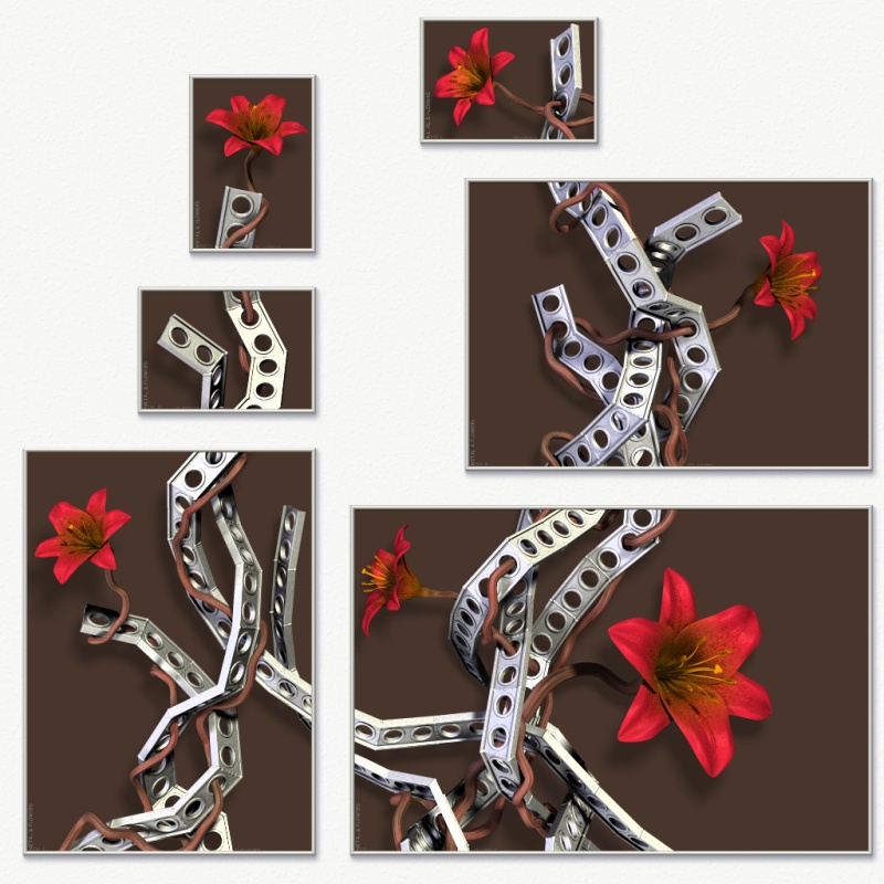
Very good! I realy like the white, teal and green versions. I don't like the
blue and black. Just a quetion of personal taste.

--
Alain
-------------------------------------------------
Confucianism: Confucius say, "Shit happens."
Post a reply to this message
|
|
| |
| |
|
|
|
|
| |
| |
|
|
Rune wrote:
> What do you think?

I'd go for either blue or teal if you don't want to use white (which I
also like, but some color is always better than black or white, IMHO).
I'm slightly biased towards the blue, maybe because I've seen so much
teal stuff lately that it just looks slightly less main-stream. :-)

Black looks gloomy and to me, kinda cheap as well, because what do you
do if you've got no clue for a background? Just keep it black. ;-)

And the green, though a good background to the red flowers, would only
fit into similiar colored rooms. Green is a very difficult color IMHO
for rooms and buildings.

But I like it, looks really great. :-)

Regards,
Tim

--
aka "Tim Nikias"
Homepage: <http://www.nolights.de>
Post a reply to this message
|
|
| |
| |
|
|
|
|
| |
| |
|
|
Rune wrote:

>
> What to do, what to do...
>
> What do you think?
>

WOW? :)

>
> BTW, the blue, teal and green color is carefully selected. Colors with red
> in don't work well so shades of red, yellow, and violet are out. Also,
> light colors don't work well (except completely white), nor almost black
> or gray ones (except completely black). I also tried some linear gradient
> with color to white and color to black. At first it looks really sweet,
> but after looking at it for a little white it begins to just look cheap.
> Compromises don't work here. Just one strong color.
>
> Rune

And to make the confusion complete :)

I would go for the white renders in silver frames but put them on a teal or
blue wall. But whatever way you go they look stunning and I wouldn't mind
seeing a picture of the finished product on a real wall.
--
Ger
Post a reply to this message
|
|
| |
| |
|
|
From: Thomas de Groot
Subject: Re: Metal & Flowers WIP? 5 - with new colors!
Date: 19 Aug 2007 03:00:56
Message: <46c7eaa8$1@news.povray.org>
|
|
|
| |
| |
|
|
"Rune" <new### [at] runevision com> schreef in bericht
news:46c7a10d@news.povray.org...
> Anyway, I've splitted the image into several layers, and once the
> background layer was separate, it suddenly got temptingly easy to play
> around with it... In my head the background was always just white, but
> after having seen some of the possible alternatives, I'm suddenly not sure
> I prefer white anymore. I don't know which version I want to have printed!
>
> What to do, what to do...
>
> What do you think?
>
Apart from white, I would suggest blue.
I think teal has already too much green in it, and like green, it offends
the eyes somewhat, especially if you have to look at the image over a longer
period. Black is ok, but only for a small image like the one presented with
one flower.
just my 2 cts :-)
Thomas com> schreef in bericht
news:46c7a10d@news.povray.org...
> Anyway, I've splitted the image into several layers, and once the
> background layer was separate, it suddenly got temptingly easy to play
> around with it... In my head the background was always just white, but
> after having seen some of the possible alternatives, I'm suddenly not sure
> I prefer white anymore. I don't know which version I want to have printed!
>
> What to do, what to do...
>
> What do you think?
>
Apart from white, I would suggest blue.
I think teal has already too much green in it, and like green, it offends
the eyes somewhat, especially if you have to look at the image over a longer
period. Black is ok, but only for a small image like the one presented with
one flower.
just my 2 cts :-)
Thomas
Post a reply to this message
|
|
| |
| |
|
|
From: Christian Froeschlin
Subject: Re: Metal & Flowers WIP? 5 - with new colors!
Date: 19 Aug 2007 05:15:45
Message: <46c80a41$1@news.povray.org>
|
|
|
| |
| |
|
|
Rune wrote:

> Anyway, I've splitted the image into several layers

Ah, so the shadow is rendered as a partially transparent alpha channel?

> What to do, what to do...

Black is cool but might need lighter colors for the flower and
probably doesn't work so well in print. I like the white version
best but despite everything you said would like to see a light
metallic blue to sky blue background ;)
Post a reply to this message
|
|
| |
| |
|
|
|
|
| |
| |
|
|
Christian Froeschlin wrote:
> Rune wrote:
>
>> Anyway, I've splitted the image into several layers
>
> Ah, so the shadow is rendered as a partially transparent alpha
> channel?

Not quite. The shadow is actually a pre-rendered image_map. In the final
image, it is just rendered as a gray on white texture on a plane, like it
looks in the white version (no alpha). Then, in Paint Shop Pro, I can put a
colored layer below the shadow layer, and make the shadow layer of type
"multiply".

>> What to do, what to do...
>
> I like the white version
> best but despite everything you said would like to see a light
> metallic blue to sky blue background ;)

Are you referring to the metal as being light metallic blue and requesting a
sky blue background, or are you requesting a gradient from light metallic
blue to sky blue? Also, I'm not quite sure if you were joking or not. :P
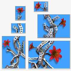
Well anyway, here's sky blue. (I don't like it.)

Rune
--
http://runevision.com
Post a reply to this message
Attachments:
Download 'metal12_composition_skyblue.jpg' (196 KB)
Preview of image 'metal12_composition_skyblue.jpg'
|
|
| |
| |
|
|
|
|
| |
| |
|
|
Alain wrote:
> Very good!

Thank you!

> I realy like the white, teal and green versions. I don't
> like the blue and black. Just a quetion of personal taste.

It seems from the answers here that it is indeed... White is the one option
everyone can agree on, while it might not be everyone's first choice.

I'm stuck between white, teal and blue. :/

Rune
--
http://runevision.com
Post a reply to this message
|
|
| |
| |
|
|
|
|
| |
| |
|
|
Tim Nikias wrote:
> Rune wrote:
>> What do you think?
>
> I'd go for either blue or teal if you don't want to use white (which I
> also like, but some color is always better than black or white, IMHO).
> I'm slightly biased towards the blue, maybe because I've seen so much
> teal stuff lately that it just looks slightly less main-stream. :-)

Hehe, maybe I haven't been exposed to that, because I think the teal one has
something special about it - maybe because it's the exact opposite color of
the red flowers?

I like white as well, but the main reason I'm tending towards blue or teal
is that they make the metal shapes much clearer to the eye. Some parts of
the metal are almost white and don't stand out that much from the white and
light gray background.

> And the green, though a good background to the red flowers, would only
> fit into similiar colored rooms. Green is a very difficult color IMHO
> for rooms and buildings.

Ah yes, you're right. While I like it, it is a very dominant color and
probably wouldn't go well with my room.

Rune
--
http://runevision.com
Post a reply to this message
|
|
| |
| |
|
|
|
|
| |
| |
|
|
Ger wrote:
> Rune wrote:
>> What to do, what to do...
>>
>> What do you think?
>
> WOW? :)

:D

> And to make the confusion complete :)
>
> I would go for the white renders in silver frames but put them on a
> teal or blue wall.

Interesting choice! I think I prefer to keep my walls white though.

> But whatever way you go they look stunning and I
> wouldn't mind seeing a picture of the finished product on a real wall.

I will post one once that's possible. :)

Rune
--
http://runevision.com
Post a reply to this message
|
|
| |
| |
|
|
|
|
| |
| |
|
|
Thomas de Groot wrote:
> Apart from white, I would suggest blue.
> I think teal has already too much green in it, and like green, it
> offends the eyes somewhat, especially if you have to look at the
> image over a longer period.

Hmm. It sounds sensible, but I'm not sure... (I really like the teal.)

> Black is ok, but only for a small image
> like the one presented with one flower.
> just my 2 cts :-)

I think I agree with that. :) Though there might be someone somewhere who
have an interior style in their house where the black set fits in perfectly.
;)

Rune
--
http://runevision.com
Post a reply to this message
|
|
| |
| |
|
|
From: Christian Froeschlin
Subject: Re: Metal & Flowers WIP? 5 - with new colors!
Date: 19 Aug 2007 06:39:43
Message: <46c81def$1@news.povray.org>
|
|
|
| |
| |
|
|
Rune wrote:

> Are you referring to the metal as being light metallic blue and requesting a
> sky blue background, or are you requesting a gradient from light metallic
> blue to sky blue?

No gradient, was just trying to suggest some shades of "lighter" blue.

> Well anyway, here's sky blue. (I don't like it.)

I like it better than the dark blue, but you need to like it ;)
Post a reply to this message
|
|
| |
| |
|
|
|
|
| |
| |
|
|
Rune wrote:
> Okay, so I've finally gotten all the details to a level where I'm satisfied
> with it. (You wouldn't believe how many tweaks I've made since the last
> version I posted, that probably no one else than me even notices...) Making
> test-prints with my printer have made me aware of issues with things than
> don't work as well on print as on the screen, because nuances in colors and
> luminance is lost once printed. To deal with that, contrast of certain
> textures have been enhanced, which looks better on the screen too as a
> bonus.
>
> Anyway, I've splitted the image into several layers, and once the background
> layer was separate, it suddenly got temptingly easy to play around with
> it... In my head the background was always just white, but after having seen
> some of the possible alternatives, I'm suddenly not sure I prefer white
> anymore. I don't know which version I want to have printed!
>
> What to do, what to do...
>
> What do you think?
>
That it, apart from aesthetics, would depend on things I don't know.
One is the printing process. If it is an inkjet like technique, the
black is probably not good. It costs a lot of ink and the paper might
become so soaking wet that it deforms.  OTOH black works well for book
covers and single pictures, it really makes color stand out, much more
than on screen. But, you are losing shadows and hence depth. My
experiences with blueish backgrounds using professional CMYK printers
are not good. None of my book covers that have shades of blue are any
near the color that I specified.

The other big question is the wall you will be hanging it on. If the
background color differs too much from the wall color, the first
impression would be the composition of the frames and not what is in it.
That is why I think e.g. the black version won't work, in close up
possibly, but not for your composition with 6 different frames from 5
meters away. I assumed that you were going for a white background
because you had a white wall. If the wall color is not white, using the
same color as a background immediately suggests that the picture was
designed specific for that wall. That would give the whole thing another
level. It might also lead to more people saying 'oh, can you do
something for me too?' If that is a good thing or not depends on how you
plan the rest of your career.

> Teaser image is attached, the full versions can be seen here (in png format,
> so the page is slightly heavy):
> http://runevision.com/3d/metalandflowers/
>
> BTW, the blue, teal and green color is carefully selected. Colors with red
> in don't work well so shades of red, yellow, and violet are out. Also, light
> colors don't work well (except completely white), nor almost black or gray
> ones (except completely black). I also tried some linear gradient with color
> to white and color to black. At first it looks really sweet, but after
> looking at it for a little white it begins to just look cheap. Compromises
> don't work here. Just one strong color.
>
> Rune
>
Post a reply to this message
|
|
| |
| |
|
|
|
|
| |
| |
|
|
Among other things, Rune saw fit to write:

> Anyway, I've splitted the image into several layers, and once the
> background layer was separate, it suddenly got temptingly easy to play
> around with it... In my head the background was always just white, but
> after having seen some of the possible alternatives, I'm suddenly not sure
> I prefer white anymore. I don't know which version I want to have printed!
>
> What to do, what to do...
>
> What do you think?

Hmm... print it in a transparent slide with no background so you can
physically change the background ;)

I'd go for white or blue. It would probably depend on the rest of your
furniture and decoration.

--
light_source{9+9*x,1}camera{orthographic look_at(1-y)/4angle 30location
9/4-z*4}light_source{-9*z,1}union{box{.9-z.1+x clipped_by{plane{2+y-4*x
0}}}box{z-y-.1.1+z}box{-.1.1+x}box{.1z-.1}pigment{rgb<.8.2,1>}}//Jellby
Post a reply to this message
|
|
| |
| |
|
|
|
|
| |
| |
|
|
I tried out a few more colors. I gave Christians suggested sky blue another
chance and made a lighter less saturated blue. It looked better. Quite ok.
Then I tried gold to see if really no colors with yellow in would work at
all. Gold looks ok too actually. Not something I'd have on my walls myself,
but it doesn't look wrong. Then, for some reason I tried an average of light
blue and gold - and got a really nice color I thought first was called
beige, but is actually called khaki (according to wikipedia). This is the
first light color I really like as background. So now, I'm even more
undecided... :/

Khaki is up at http://runevision.com/3d/metalandflowers/

Khaki, being light, has the advantage that it doesn't suffer from the
problem that Andrel mentioned:

"If the background color differs too much from the wall color, the first
impression would be the composition of the frames and not what is in it."

Khaki on a white wall differs just enough to be interesting, but not so much
that it distracts from the motive. That said, I don't really mind that much
if people first notice the composition of frames, since this composition is
indeed part of the "art". So as I said, I'm still undecided...

Rune
--
http://runevision.com
Post a reply to this message
|
|
| |
| |
|
|
|
|
| |
| |
|
|
andrel wrote:
> Rune wrote:
>> What do you think?
>>
> That it, apart from aesthetics, would depend on things I don't know.
> One is the printing process.

I have yet to investigate the printing process for the posters for myself. I
plan to have them made locally (by which I mean in this country), but after
that I plan to put the designs on Zazzle. I also don't know the printing
process on Zazzle...

> My experiences with blueish backgrounds using professional CMYK
> printers are not good. None of my book covers that have shades of
> blue are any near the color that I specified.

Worse than with private CMYK printers? Because in my own print tests all the
background colors I've tried have matched beautifully in the first try.

> The other big question is the wall you will be hanging it on.

White walls. (Or off-white or whatever it's called that means that it's not
completely sterile white, but it looks white none the less.)

> If the background color differs too much from the wall color, the first
> impression would be the composition of the frames and not what is in it.

Well, since this composition is part of the "art", that isn't completely
undesired, but of course it should preferably be balanced.

> I assumed that you were going for a white background
> because you had a white wall. If the wall color is not white, using
> the same color as a background immediately suggests that the picture
> was designed specific for that wall. That would give the whole thing
> another level. It might also lead to more people saying 'oh, can you
> do something for me too?' If that is a good thing or not depends on
> how you plan the rest of your career.

White wall or not, I'm not sure I agree that the posters should preferably
be the same color as the wall. Part of the reason to put up images on the
wall in the first place is to break the big plain surface IMO. If they
should deviate little, some or much from the color of the wall is a matter
of how strong an effect is desired. I agree though, that the more difference
there's between the wall and main poster color, the stronger and more
contrasted the motive must be to still shine through and make impact.

Rune
--
http://runevision.com
Post a reply to this message
|
|
| |
| |
|
|
|
|
| |
| |
|
|
Jellby wrote:
> Among other things, Rune saw fit to write:
>> What do you think?
>
> Hmm... print it in a transparent slide with no background so you can
> physically change the background ;)

Oooh, yes! I want that...! :P

> I'd go for white or blue. It would probably depend on the rest of your
> furniture and decoration.

I was undecided between white, blue and teal, but then I made a khaki
version and now I'm undecided between white, blue, teal and khaki... :/

Rune
--
http://runevision.com
Post a reply to this message
|
|
| |
| |
|
|
|
|
| |
| |
|
|
"Rune" <new### [at] runevisioncom> wrote in message
news:46c86c63@news.povray.org...

> Khaki is up at http://runevision.com/3d/metalandflowers/

   I like all variations Rune! Very small typo noticed - "motive" should be
'motif'.


     ~Steve~


> Rune
> --
> http://runevision.com
>
Post a reply to this message
|
|
| |
| |
|
|
|
|
| |
| |
|
|
I'm partial to the blue one myself, with the teal one being a close
second.

Nicely done. :-)

Jim
Post a reply to this message
|
|
| |
| |
|
|
|
|
| |
| |
|
|
Oooh, I really like the Kahaki.  For one thing it'd work very well on my
walls (which are a sort of forest green). :-)

Jim
Post a reply to this message
|
|
| |
| |
|
|
|
|
| |
| |
|
|
Rune wrote:

> I tried out a few more colors. I gave Christians suggested sky blue
> another chance and made a lighter less saturated blue. It looked better.
> Quite ok. Then I tried gold to see if really no colors with yellow in
> would work at all. Gold looks ok too actually. Not something I'd have on
> my walls myself, but it doesn't look wrong. Then, for some reason I tried
> an average of light blue and gold - and got a really nice color I thought
> first was called beige, but is actually called khaki (according to
> wikipedia). This is the first light color I really like as background. So
> now, I'm even more undecided... :/
>
> Khaki is up at http://runevision.com/3d/metalandflowers/
>
> Khaki, being light, has the advantage that it doesn't suffer from the
> problem that Andrel mentioned:
>
> "If the background color differs too much from the wall color, the first
> impression would be the composition of the frames and not what is in it."
>
> Khaki on a white wall differs just enough to be interesting, but not so
> much that it distracts from the motive. That said, I don't really mind
> that much if people first notice the composition of frames, since this
> composition is indeed part of the "art". So as I said, I'm still
> undecided...
>
> Rune

I guess I have to revise my opinion :)

I think the khaki works really well. By itself, but also on either a white
wall or a strong colored wall.
--
Ger
Post a reply to this message
|
|
| |
| |
|
|
|
|
| |
| |
|
|
Rune wrote:
> andrel wrote:
>> Rune wrote:
>>> What do you think?
>>>
>> That it, apart from aesthetics, would depend on things I don't know.
>> One is the printing process.
>
> I have yet to investigate the printing process for the posters for myself. I
> plan to have them made locally (by which I mean in this country), but after
> that I plan to put the designs on Zazzle. I also don't know the printing
> process on Zazzle...
>
>> My experiences with blueish backgrounds using professional CMYK
>> printers are not good. None of my book covers that have shades of
>> blue are any near the color that I specified.
>
> Worse than with private CMYK printers?
Yes much. BTW I meant the offset printers used for printing the covers
of books. Printers used in shops are probably closer to your private
printer. What we have in our department is essentially an big inkjet for A0.
> Because in my own print tests all the
> background colors I've tried have matched beautifully in the first try.
>
>> The other big question is the wall you will be hanging it on.
>
> White walls. (Or off-white or whatever it's called that means that it's not
> completely sterile white, but it looks white none the less.)
>
>> If the background color differs too much from the wall color, the first
>> impression would be the composition of the frames and not what is in it.
>
> Well, since this composition is part of the "art", that isn't completely
> undesired, but of course it should preferably be balanced.
>
>> I assumed that you were going for a white background
>> because you had a white wall. If the wall color is not white, using
>> the same color as a background immediately suggests that the picture
>> was designed specific for that wall. That would give the whole thing
>> another level. It might also lead to more people saying 'oh, can you
>> do something for me too?' If that is a good thing or not depends on
>> how you plan the rest of your career.
>
> White wall or not, I'm not sure I agree that the posters should preferably
> be the same color as the wall.
I didn't say that. I just wanted to point out that if they are too
different, in the real situation when you enter the room it might be
from such distance that the first impression is that of 6 rectangular
frames hanging on the wall. Also because you have a lot of background in
the images.

BTW how much time would it take to paint your background and the wall
e.g. mint green in the full room image (with different textures so there
is a small difference in color)?
> Part of the reason to put up images on the
> wall in the first place is to break the big plain surface IMO. If they
> should deviate little, some or much from the color of the wall is a matter
> of how strong an effect is desired. I agree though, that the more difference
> there's between the wall and main poster color, the stronger and more
> contrasted the motive must be to still shine through and make impact.
>
Post a reply to this message
|
|
| |
| |
|
|
|
|
| |
| |
|
|
"Rune" <new### [at] runevisioncom> wrote:
> I tried out a few more colors. I gave Christians suggested sky blue another
> chance and made a lighter less saturated blue. It looked better. Quite ok.
> Then I tried gold to see if really no colors with yellow in would work at
> all. Gold looks ok too actually. Not something I'd have on my walls myself,
> but it doesn't look wrong. Then, for some reason I tried an average of light
> blue and gold - and got a really nice color I thought first was called
> beige, but is actually called khaki (according to wikipedia). This is the
> first light color I really like as background. So now, I'm even more
> undecided... :/
>

I like the khaki or the blues best.
What would it look like if you tried to get almost the exact colour of the
wall it's being mounted on?

-tgq
Post a reply to this message
|
|
| |
| |
|
|
|
|
| |
| |
|
|
andrel wrote:
> Rune wrote:
>> White wall or not, I'm not sure I agree that the posters should
>> preferably be the same color as the wall.
>
> I didn't say that. I just wanted to point out that if they are too
> different, in the real situation when you enter the room it might be
> from such distance that the first impression is that of 6 rectangular
> frames hanging on the wall. Also because you have a lot of background
> in the images.

Yes, I agree.

> BTW how much time would it take to paint your background and the wall
> e.g. mint green in the full room image (with different textures so
> there is a small difference in color)?

I'm not sure what you mean. I can easily make a preview with any color for
the image backgrounds and any color for the wall if you give me some color
vectors (it's easier than me having to guess what color you mean). I'm not
sure what you mean about "different textures so there is a small difference
in color".

Rune
--
http://runevision.com
Post a reply to this message
|
|
| |
| |
|
|
|
|
| |
| |
|
|
St. wrote:
> "Rune" <new### [at] runevisioncom> wrote in message
> news:46c86c63@news.povray.org...
>
>> Khaki is up at http://runevision.com/3d/metalandflowers/
>
>   I like all variations Rune! Very small typo noticed - "motive"
> should be 'motif'.

Ah, thanks! The two words are pronounced and spelled the same in Danish, so
I often forget this difference.

Rune
--
http://runevision.com
Post a reply to this message
|
|
| |
| |
|
|
|
|
| |
| |
|
|
Trevor G Quayle wrote:
> "Rune" <new### [at] runevisioncom> wrote:
>> I tried out a few more colors. I gave Christians suggested sky blue
>> another chance and made a lighter less saturated blue. It looked
>> better. Quite ok. Then I tried gold to see if really no colors with
>> yellow in would work at all. Gold looks ok too actually. Not
>> something I'd have on my walls myself, but it doesn't look wrong.
>> Then, for some reason I tried an average of light blue and gold -
>> and got a really nice color I thought first was called beige, but is
>> actually called khaki (according to wikipedia). This is the first
>> light color I really like as background. So now, I'm even more
>> undecided... :/
>>
>
> I like the khaki or the blues best.
> What would it look like if you tried to get almost the exact colour
> of the wall it's being mounted on?

Well, the white version is already almost the same color as my white wall.
In the preview it's slighter lighter than the wall (I did this because paper
is lighter than my walls). However, later I've found out than the paper,
when put behind the glass of the framing, is actually slightly darker than
the walls, due to the tint and shadow of the glass. Note that the glass is
not colored; the tiny coloring of clear glass is enough to make this
difference.

If you meant for some other color than white, you can provide a color vector
for the background and for the wall, and I'll try to make a preview.

Rune
--
http://runevision.com
Post a reply to this message
|
|
| |
| |
|
|
|
|
| |
| |
|
|
These are all beautiful images and an interesting concept.  Thanks for
posting.

I've seen some very nice photograph frames that use clear glass as the
mat.  This allows the wall color to show through, and might be a good
choice here too.  Do you think the technology exists to print onto a
transparent background?
Post a reply to this message
|
|
| |
| |
|
|
|
|
| |
| |
|
|
Interesting problem.  I think one of the reasons you can end up chasing
your tail here is due to the number of factors involved.  Different
people, and you at different times, are going to focus on the emphasis
of one thing or another as the most important, and the different choices
emphasize different things.  What further complicates the problem is
that the different choices can strike more abstract, elusive, less
identifiable chords within the viewer.  Like when you say words like
"cheap" or "tacky".

And the image, for all its simple appeal, does have enough elements such
that something suffers and something benefits from each color variation.
  I don's see any choice that compliments each element perfectly.  So it
reduces, as you said, to a kind of comprimise, which doesn't sit well
either when you are seeking that final piece which completes the puzzle.

The white, because it is neutral, gives a good general comprimise.  And
has the huge benefit of not having to commit to a specific color.
Specific colors have specific associations and so will become more
quickly boring. But white is not without cost. For me, huge cost. One
cost, as you pointed out, is that it conflicts with the highlights on
the metal to create an overall harsh appearance. This is worsened by the
look of the shadows on the wall, they don't seem to 'stick' to the wall
to create space. Instead they meander and confuse the eye. But worst of
all for me about the white, it eats up the beautiful, delicate
highlights in the petals of the flowers, which give them such velvety
luminence.  These highlights are shown off best by the dark blue
version. (look at the largest flower in particular)

These effects of the dark blue surprised me.  In the postage stamp image
in your post, the blue did not seem to do well creating bleed problems
with the low vales of red, as one would expect.  But in the larger
resolution version it does not have this problem at all!  In fact it
sets off the edges of the petals crisply, while making the luminence of
the highlights visually pop. Likewise it shows off the metallic
highlights without confusion, and draws out the warm highlights of the
browns in the stem quite beautifully, but with a little more softness so
that they remain the secondary, harmonizing element to the flowers.  And
finally, the shadows work better in concert with the deeper tone of the
blue, staying in place, and more subtly creating relief.

And the shallow, but distinct relief seems important.  The dark, brown
version would have seemed the obvious choice.  No conflicts, each of the
elements framed in an encompassing murk which allows the lighted forms
to emerge equally.  It is neutral and so will always retain some mystery
without the specific associations of a saturated color. And to the
extent that it is a color it tends toward the warmth of the main
attraction of the picture, the flowers. Presumably this is one reason
the 'masters' preferred such a solution.  The shadows on the background
are no longer a bother, compositionally or otherwise, all that remains
is a gentle, dampening, satisfying, play of form.  And that is the main
problem, the lost of those other elements which gives the piece such
tension, visually and conceptually.  That second wall.

The main problem with the dark blue may be that it works too well and
the blue/brown harmony is just too known and overworked as a 'sure
thing'. Also the deep tone is emotionally more comlicated perhaps. The
teal is really a different version of the blue, with the green providing
more contrast to the red as opposites along one color axis. This makes
it less of a neutral background element that the blue and it starts to
eat up the saturation of the red slighly and is not so harmonious with
the stems.  But maybe this gives a bit of added tension.

The khaki is really a variation on the white but trying to make it less
harsh.  The hue gives it the ability to set off the metal where a grey
would not and it sets off the dark undershadows of the stems and metal
where the deeper toned variations soften them.  This is probably the
appeal for many viewers.  But again it comes at some expense to the
delicacy of the petals.

My preference would be the khaki or the deep blue.
Post a reply to this message
|
|
| |
| |
|
|
|
|
| |
| |
|
|
Ooh, I'm sold on the khaki. Teal would be my second choice. :-)

--
William Tracy
afi### [at] gmailcom wtr### [at] calpolyedu
You know you've been raytracing too long when you dream of real-time
raytraced games and game engines.
Neil Clark
Post a reply to this message
|
|
| |
| |
|
|
|
|
| |
| |
|
|
Jim Charter wrote:
> Interesting problem.  I think one of the reasons you can end up
> chasing your tail here is due to the number of factors involved.
> Different people, and you at different times, are going to focus on
> the emphasis of one thing or another as the most important, and the
> different choices emphasize different things.

Yeah... The different versions have different feels and qualities. I like
them all, it's just a matter of which I want to have hanging on my wall, not
because it's the best (I don't think there's any "best"), but because it
evokes the feel i want in my room.

> And the shallow, but distinct relief seems important.  The dark, brown
> version would have seemed the obvious choice.  No conflicts, each of
> the elements framed in an encompassing murk which allows the lighted
> forms to emerge equally.  It is neutral and so will always retain
> some mystery without the specific associations of a saturated color.
> And to the extent that it is a color it tends toward the warmth of
> the main attraction of the picture, the flowers.

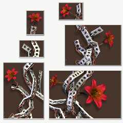
Brown, like in the attached version? I agree that this looks quite good and
rather balanced.

> My preference would be the khaki or the deep blue.

Those two seem to be the preferences of many, and I must say that they are
the most hamonious. However, I've decided that I prefer for myself the
slightly more "playful" and "fresh" feel that the teal version evokes in me.
My original intention was for the flowers to not only be in harmony with the
rest of the image, but also be rather bold and almost vulgar in intensity.
The white version has this. The khaki and blue versions make the whole image
a bit more calm in my opinion (and in the green version the background sort
of competes with the flowers for attention), while the teak somehow
preserves the boldness and "attitude", though in a way that enhances the
flowers rather than competing with them.

Rune
--
http://runevision.com
Post a reply to this message
Attachments:
Download 'metal12_composition_brown.jpg' (171 KB)
Preview of image 'metal12_composition_brown.jpg'
|
|
| |
| |
|
|
|
|
| |
| |
|
|
Spock wrote:
> These are all beautiful images and an interesting concept.  Thanks for
> posting.

Glad to. :)

> I've seen some very nice photograph frames that use clear glass as the
> mat.  This allows the wall color to show through, and might be a good
> choice here too.  Do you think the technology exists to print onto a
> transparent background?

Hmm, possibly? But I doubt it's a viable option for my wallet... :/

Also, I don't personally think that it's necessary good to aliminate the
difference between the background color and the color of the wall.

Rune
--
http://runevision.com
Post a reply to this message
|
|
| |
| |
|
|
|
|
| |
| |
|
|
Rune wrote:
> andrel wrote:

>> BTW how much time would it take to paint your background and the wall
>> e.g. mint green in the full room image (with different textures so
>> there is a small difference in color)?
>
> I'm not sure what you mean. I can easily make a preview with any color for
> the image backgrounds and any color for the wall if you give me some color
> vectors (it's easier than me having to guess what color you mean). I'm not
> sure what you mean about "different textures so there is a small difference
> in color".

Your wall may be plaster or something like that, the printed images will
be on much smoother paper even glossy and possibly with a layer of glass
in front. So even if you use exactly the same color the percepted color
will be slightly different. Well you know that of course, you use POV ;)

You already did a white background for a white wall and my question was
simply if you could easily change the color of the wall in your room
scene to match the image background just to see what that would look
like in a more real situation. Just out of curiosity.

BTW I didn't see your 'khaki' background before I posted, otherwise I
would have suggested a khaki wall in stead.
Post a reply to this message
|
|
| |
| |
|
|
From: Tim Attwood
Subject: Re: Metal & Flowers WIP? 5 - with new colors!
Date: 20 Aug 2007 18:45:11
Message: <46ca1977@news.povray.org>
|
|
|
| |
| |
|
|
> I have yet to investigate the printing process for the posters for myself.
> I plan to have them made locally (by which I mean in this country), but
> after that I plan to put the designs on Zazzle. I also don't know the
> printing process on Zazzle...

You might consider doing a poster of all the images in a single sheet,
which means you would have two background colors to pick.
Post a reply to this message
|
|
| |
| |
|
|
|
|
| |
| |
|
|
Tim Attwood wrote:
>> I have yet to investigate the printing process for the posters for
>> myself. I plan to have them made locally (by which I mean in this
>> country), but after that I plan to put the designs on Zazzle. I also
>> don't know the printing process on Zazzle...
>
> You might consider doing a poster of all the images in a single sheet,
> which means you would have two background colors to pick.

Nah, I don't like the idea of a poster depicting some posters on a wall...

Rune
--
http://runevision.com
Post a reply to this message
|
|
| |
| |
|
|
|
|
| |
| |
|
|
Rune wrote:

> Those two seem to be the preferences of many, and I must say that they are
> the most hamonious. However, I've decided that I prefer for myself the
> slightly more "playful" and "fresh" feel that the teal version evokes in me.
> My original intention was for the flowers to not only be in harmony with the
> rest of the image, but also be rather bold and almost vulgar in intensity.
> The white version has this. The khaki and blue versions make the whole image
> a bit more calm in my opinion (and in the green version the background sort
> of competes with the flowers for attention), while the teak somehow
> preserves the boldness and "attitude", though in a way that enhances the
> flowers rather than competing with them.
>
Yeah I think that's about right, the teal with the green cast moves
closer to the red/green axis.  So it adds tension and removes some of
the sweet even perfumy harmony with the blue.  But as it moves into
direct opposition with the red it also eats some of the red's saturation
but as youy say, it's a tradeoff that has your personal preference.
Post a reply to this message
|
|
| |
| |
|
|
|
|
| |
| |
|
|
Just to add my 2p - Blue for me with Teal a very close second. I like the
white also, but less so. Black is _ok_ buy you don't see the shadows - which
defeats the point a little?

Khaki works colour-sie but seems a little boring compared to the others. I
find the green overpowering.

Whatever you go with, I think they're all great.

the answer is probably "awful" but what do they look like with solid colours
but different in each "frame"?

"Rune" <new### [at] runevisioncom> wrote in message
news:46c7a10d@news.povray.org...
> Okay, so I've finally gotten all the details to a level where I'm
> satisfied with it. (You wouldn't believe how many tweaks I've made since
> the last version I posted, that probably no one else than me even
> notices...) Making test-prints with my printer have made me aware of
> issues with things than don't work as well on print as on the screen,
> because nuances in colors and luminance is lost once printed. To deal with
> that, contrast of certain textures have been enhanced, which looks better
> on the screen too as a bonus.
>
> Anyway, I've splitted the image into several layers, and once the
> background layer was separate, it suddenly got temptingly easy to play
> around with it... In my head the background was always just white, but
> after having seen some of the possible alternatives, I'm suddenly not sure
> I prefer white anymore. I don't know which version I want to have printed!
>
> What to do, what to do...
>
> What do you think?
>
> Teaser image is attached, the full versions can be seen here (in png
> format, so the page is slightly heavy):
> http://runevision.com/3d/metalandflowers/
>
> BTW, the blue, teal and green color is carefully selected. Colors with red
> in don't work well so shades of red, yellow, and violet are out. Also,
> light colors don't work well (except completely white), nor almost black
> or gray ones (except completely black). I also tried some linear gradient
> with color to white and color to black. At first it looks really sweet,
> but after looking at it for a little white it begins to just look cheap.
> Compromises don't work here. Just one strong color.
>
> Rune
> --
> http://runevision.com
>
>
Post a reply to this message
|
|
| |
| |
|
|
|
|
| |
| |
|
|
Simon nous apporta ses lumieres en ce 2007/08/21 17:21:
> Just to add my 2p - Blue for me with Teal a very close second. I like the
> white also, but less so. Black is _ok_ buy you don't see the shadows - which
> defeats the point a little?
>
> Khaki works colour-sie but seems a little boring compared to the others. I
> find the green overpowering.
>
> Whatever you go with, I think they're all great.
>
> the answer is probably "awful" but what do they look like with solid colours
> but different in each "frame"?
Could be nice, but you'll loose a sense of unity. May be OK in some setings, or
as a way to show every available colours in one go, if you don't have enough
place to have a sample of each colour.
>
> "Rune" <new### [at] runevisioncom> wrote in message
> news:46c7a10d@news.povray.org...
>> Okay, so I've finally gotten all the details to a level where I'm
>> satisfied with it. (You wouldn't believe how many tweaks I've made since
>> the last version I posted, that probably no one else than me even
>> notices...) Making test-prints with my printer have made me aware of
>> issues with things than don't work as well on print as on the screen,
>> because nuances in colors and luminance is lost once printed. To deal with
>> that, contrast of certain textures have been enhanced, which looks better
>> on the screen too as a bonus.
>>
>> Anyway, I've splitted the image into several layers, and once the
>> background layer was separate, it suddenly got temptingly easy to play
>> around with it... In my head the background was always just white, but
>> after having seen some of the possible alternatives, I'm suddenly not sure
>> I prefer white anymore. I don't know which version I want to have printed!
>>
>> What to do, what to do...
>>
>> What do you think?
>>
>> Teaser image is attached, the full versions can be seen here (in png
>> format, so the page is slightly heavy):
>> http://runevision.com/3d/metalandflowers/
>>
>> BTW, the blue, teal and green color is carefully selected. Colors with red
>> in don't work well so shades of red, yellow, and violet are out. Also,
>> light colors don't work well (except completely white), nor almost black
>> or gray ones (except completely black). I also tried some linear gradient
>> with color to white and color to black. At first it looks really sweet,
>> but after looking at it for a little white it begins to just look cheap.
>> Compromises don't work here. Just one strong color.
>>
>> Rune
>> --
>> http://runevision.com
>>
>>
>
>


--
Alain
-------------------------------------------------
Politics is such a torment that I advise everyone I love not to mix with it.
Thomas Jefferson
Post a reply to this message
|
|
| |
| |
|
|
|
|
| |
| |
|
|
On Tue, 21 Aug 2007 22:21:33 +0100, Simon wrote:

> Black is _ok_ buy you don't see the shadows - which defeats the point a
> little?

That was my thought as well - losing the shadows changes things a bit.

Jim
Post a reply to this message
|
|
| |
| |
|
|
|
|
| |
| |
|
|
Simon wrote:
> Just to add my 2p - Blue for me with Teal a very close second. I like
> the white also, but less so. Black is _ok_ buy you don't see the
> shadows - which defeats the point a little?

Yes, somewhat. The drop shadow was not specifically part of my initial
vision, but I must say I like it very much. The black version is indeed my
least favorite, but I think it has its justification nonetheless -
particularly when looking at the image in the upper left corner isolated.

> Khaki works colour-sie but seems a little boring compared to the
> others. I find the green overpowering.

Agreed. I have tried a new lime green, which to my surprise I like. I still
want teal for my own room though.

> Whatever you go with, I think they're all great.

Thank you! :)

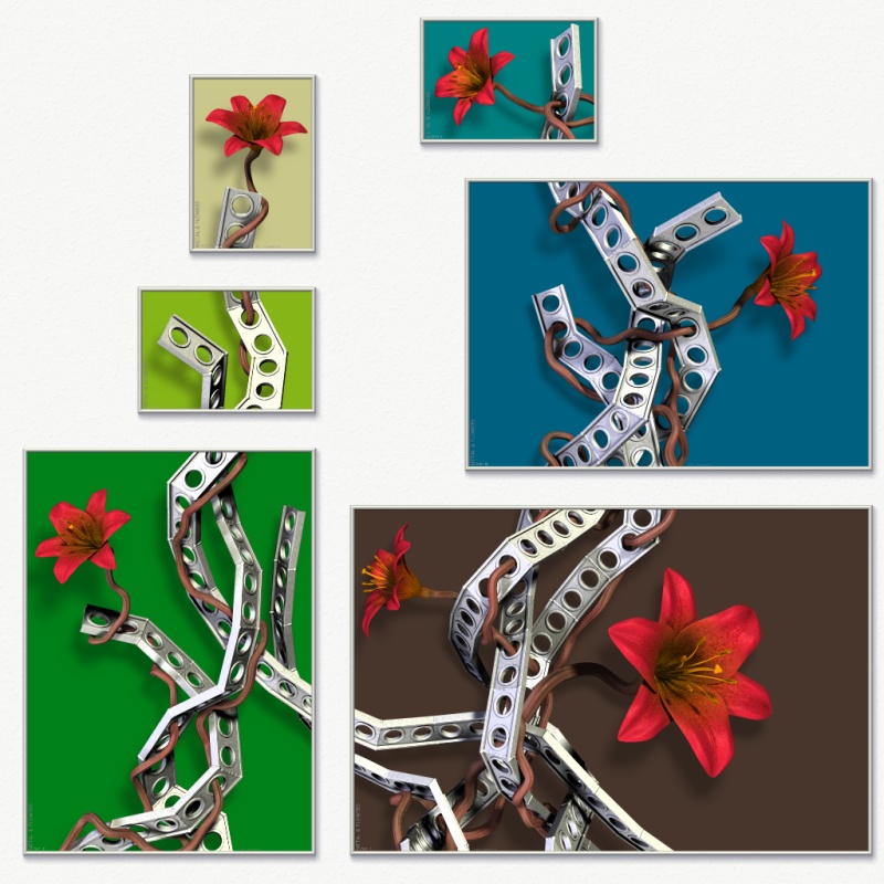
> the answer is probably "awful" but what do they look like with solid
> colours but different in each "frame"?

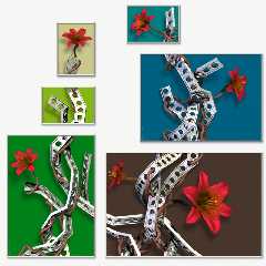
I've considered myself how this would look, though mostly as a curiosum.
I've only just tried it now (see attached), and it actually looks worse than
I thought. And that's even when I've tried to create a little balance rather
than choosing completely randomly. Ugh, it's so confusing to my eye...

Rune
--
http://runevision.com
Post a reply to this message
Attachments:
Download 'metal12_composition_1024_multicolored.jpg' (180 KB)
Preview of image 'metal12_composition_1024_multicolored.jpg'
|
|
| |
| |
|
|
|
|
| |
| |
|
|
I have to admit that I like the brown one....

Jim
Post a reply to this message
|
|
| |
| |
|
|
|
|
| |
| |
|
|
Rune wrote:

> I've considered myself how this would look, though mostly as a curiosum.
> I've only just tried it now (see attached), and it actually looks worse
> than I thought. And that's even when I've tried to create a little balance
> rather than choosing completely randomly. Ugh, it's so confusing to my
> eye...
>
> Rune

To me multi colored backgrounds don't work. Not with this. In my view it's
both the metal and the flowers that make the picture and the background is
there to reinforce that, not to make a picture on its own.
--
Ger
Post a reply to this message
|
|
| |
| |
|
|
|
|
| |
| |
|
|
I made a little flash file where you can change the color of the wall and
see the posters on that color. You can also choose between the various
preset poster colors or even pick a color of your own choice.

http://runevision.com/3d/metalandflowers/

You can also share your findings, so if you want to show off how the posters
would look on your wall, or want to suggest a color for the posters that you
think look awsome, simply copy the url generated at the bottom and post
here.

Sorry for the very buggy color picker. I found it on the net and it was even
worse before I fixed a few (other) major issues it had. If anyone have been
able to find a free one that's better, please let me know. All the well
tested ones seem to cost money.

Rune
--
http://runevision.com
Post a reply to this message
|
|
| |
| |
|
|
|
|
| |
| |
|
|
Rune wrote:

> I made a little flash file where you can change the color of the wall and
> see the posters on that color. You can also choose between the various
> preset poster colors or even pick a color of your own choice.
>
> http://runevision.com/3d/metalandflowers/
>
Been playing with it for a bit and I must say that the only color that works
well on almost any wall color, in my view that is, is khaki. Even if you
had an of-khaki wall it works. White also works well because it's a neutral
color but it's not as forgiving. Other colors are far more picky. The dark
colors, black and brown, are just out of the question.

All this is obviously just my opinion.

And as an aside, I'm very pleasantly surprised by the lengths you go to get
a good end result. One doesn't see that nearly enough. :)
--
Ger
Post a reply to this message
|
|
| |
| |
|
|
From: Christian Froeschlin
Subject: Re: Metal & Flowers WIP? 5 - with new colors!
Date: 22 Aug 2007 16:03:37
Message: <46cc9699$1@news.povray.org>
|
|
|
| |
| |
|
|
Rune wrote:

> I've considered myself how this would look, though mostly as a curiosum.
> I've only just tried it now (see attached), and it actually looks worse than
> I thought.

Eew. Mental & Flowers ;)
Post a reply to this message
|
|
| |
| |
|
|
|
|
| |
| |
|
|
"Rune" <new### [at] runevisioncom> wrote:
> I made a little flash file where you can change the color of the wall and
> see the posters on that color. You can also choose between the various
> preset poster colors or even pick a color of your own choice.
>
> http://runevision.com/3d/metalandflowers/
>
> You can also share your findings, so if you want to show off how the posters
> would look on your wall, or want to suggest a color for the posters that you
> think look awsome, simply copy the url generated at the bottom and post
> here.
>
> Sorry for the very buggy color picker. I found it on the net and it was even
> worse before I fixed a few (other) major issues it had. If anyone have been
> able to find a free one that's better, please let me know. All the well
> tested ones seem to cost money.
>
> Rune
> --
> http://runevision.com

Well, the metal reflects both yellow and blue reflections, which
incidentally might explain the overwhelming support for both kakhi and blue
backgrounds, so I thought a light green could work. Something like
http://runevision.com/3d/metalandflowers/?wall=FFFFFF&poster=CBD4CB&frames=true
IMO, it sets off the red in the stems, which in turn make the red of the
flowers really stand out.

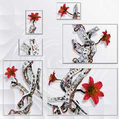
I also tried a non-uniform background, based on white and the blue
reflection #c8c8d3. Maybe a tad obvious. :-p
Post a reply to this message
Attachments:
Download 'metal12_composition_1024_white_wirly.jpg' (143 KB)
Preview of image 'metal12_composition_1024_white_wirly.jpg'
|
|
| |
| |
|
|
|
|
| |
| |
|
|
Grassblade wrote:
> Well, the metal reflects both yellow and blue reflections, which
> incidentally might explain the overwhelming support for both kakhi
> and blue backgrounds, so I thought a light green could work.
> Something like
> http://runevision.com/3d/metalandflowers/?wall=FFFFFF&poster=CBD4CB&frames=true
> IMO, it sets off the red in the stems, which in turn make the red of
> the flowers really stand out.

I'm really surprised how a color so close to light gray actually sets off
the metal so nicely rather than blending in with it. It works very well, I
agree.

> I also tried a non-uniform background, based on white and the blue
> reflection #c8c8d3. Maybe a tad obvious. :-p

Hehe...

Rune
--
http://runevision.com
Post a reply to this message
|
|
| |
| |
|
|
|
|
| |
| |
|
|
Rune wrote:
>
> Colors with red
> in don't work well

??? I think orange is a good choice. Try <255, 150, 65>
Your khaki is greenish for my tastes. I prefer warmer, lighter <215,
205, 160>
Adjustment to your desaturated blue and teal backgrounds would "eat"
your flowers less <71, 112, 178> <71, 178, 155>

 -Shay
Post a reply to this message
|
|
| |
| |
|
|
|
|
| |
| |
|
|
> You can also share your findings, so if you want to show off how the
> posters would look on your wall, or want to suggest a color for the
> posters that you think look awsome, simply copy the url generated at the
> bottom and post here.

Light blue doesn't look to bad.
http://runevision.com/3d/metalandflowers/?wall=FFFFFF&poster=DCEDED&frames=true
Post a reply to this message
|
|
| |
| |
|
|
|
|
| |
| |
|
|
Shay wrote:
> Rune wrote:
>> Colors with red
>> in don't work well
>
> ??? I think orange is a good choice. Try <255, 150, 65>

Ok:
http://runevision.com/3d/metalandflowers/?wall=FFFFFF&poster=FF9641&frames=true

I have to say that I think the flowers look flat and uninspired on the
orange background.

> Your khaki is greenish for my tastes. I prefer warmer, lighter <215, 205,
> 160>

http://runevision.com/3d/metalandflowers/?wall=FFFFFF&poster=D7CDA0&frames=true

Hmm, personally I like the green tint in the khaki, as it creates slightly
more contrast with the flowers.

> Adjustment to your desaturated blue and teal backgrounds would "eat"
> your flowers less <71, 112, 178> <71, 178, 155>

http://runevision.com/3d/metalandflowers/?wall=FFFFFF&poster=4770B2&frames=true
http://runevision.com/3d/metalandflowers/?wall=FFFFFF&poster=47B29B&frames=true

Hmm, I think we generally have different tastes in color. :)
(Or your screen is much darker than mine!)

Rune
--
http://runevision.com
Post a reply to this message
|
|
| |
| |
|
|
|
|
| |
| |
|
|
Tim Attwood wrote:
>> You can also share your findings, so if you want to show off how the
>> posters would look on your wall, or want to suggest a color for the
>> posters that you think look awsome, simply copy the url generated at
>> the bottom and post here.
>
> Light blue doesn't look to bad.
> http://runevision.com/3d/metalandflowers/?wall=FFFFFF&poster=DCEDED&frames=true

Being so close to the color of the metal, and more saturated too, it
flickers rather much in my eyes. :/

Rune
--
http://runevision.com
Post a reply to this message
|
|
| |
| |
|
|
|
|
| |
| |
|
|
Rune wrote:
>
> Hmm, I think we generally have different tastes in color. :)
> (Or your screen is much darker than mine!)
>

And goals. I don't care for any of the cools with your neutral red and
warm stamens. IMO, anything even leaning towards Vermillion looks best
with at least as warm as a slightly cool yellow. Red recedes against
cool, deep colors, which is why I desaturated and/or lightened your blue
and teal.

Orange pulls the stamens out of the flowers, IMO.

Nice image whichever you choose. Looking forward to seeing photos of the
finished project.

 -Shay
Post a reply to this message
|
|
| |
| |
|
|
|
|
| |
|
|