|
|
|
|
|
|
| |
| |
|
|
|
|
| |
| |
|
|
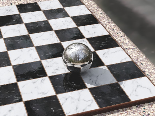
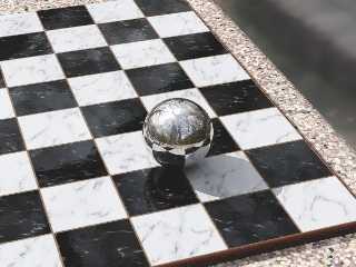
Yes folks, it's time for Yet Another Reflective Sphere On Checkered Plane!

This is a WIP for the Before+After round of the
I-can't-believe-it's-not-the-IRTC contest. The concept here is rather
obviously before + after I got my mad povray skillz. I'm gonna have a
double-image with one side being the standard rsocp like I could do when I
first used pov, and the other side being the most realistic rsocp I can do.
This is, obviously, the latter.

There's some tone-mapping in there already though I think it looks a little
like a painting not a photo at the moment. So I'm gonna mess with that and
add some lens effects (blur, dispersion). BTW, if it isn't obvious, the
background's another HDR probe from http://unparent.com/

Any suggestions on how I can make this more real?
--
Tek
http://evilsuperbrain.com
Post a reply to this message
Attachments:
Download 'before+after.jpg' (115 KB)
Preview of image 'before+after.jpg'
|
|
| |
| |
|
|
|
|
| |
| |
|
|
Looks great!  Very impressive.

If you're using HDRI, I'm surprised that the shadow is so sharp.  Are you
using a light source as well?  If you are, you might consider making it an
area light.

For my own taste, I would either move the camera a little closer or make the
sphere bigger.  But that's just my own opinion.

I'm curious what you mean by "tone-mapping"--I've not heard of that before.

-- Kirk
Post a reply to this message
|
|
| |
| |
|
|
|
|
| |
| |
|
|
tres cool texture on the table edge
Post a reply to this message
|
|
| |
| |
|
|
|
|
| |
| |
|
|
Impressive...
Post a reply to this message
|
|
| |
| |
|
|
|
|
| |
| |
|
|
Uh, pretty nice! Pretty damn nice to be specific :)

As you ask for possible improvements: Personally I don't like seeing the
background where the table ends, I'd prefer some sort of ground. As a
minor thing I'd suggest adding a frame around the chessboard, I've never
seen one where the tiles start right at the edges.


Regards,
Florian
Post a reply to this message
|
|
| |
| |
|
|
|
|
| |
| |
|
|
> If you're using HDRI, I'm surprised that the shadow is so sharp. Are you
> using a light source as well? If you are, you might consider making it an
> area light.
Yeah it's a light source, with radiosity for the HDR. I was suffering nasty
artefacts with just radiosity and HDRI (hence my earlier HDR post using a
light dome) but evidently having 1 dominant light is enough to make the
radiosity look good.
You're right, it needs to be an area_light, I'll go fix that. I'll also
stick in a shadow from the trees.
Tone mapping is like a gamma curve but fancier, see the megapov
documentation on it's tone_mapping feature:
http://megapov.inetart.net/manual-1.2.1/global_settings.html#tone_mapping
--
Tek
http://evilsuperbrain.com
"Kirk Andrews" <kir### [at] hotmail com> wrote in message
news:web.461fbb1c1c29fca243f28d40@news.povray.org...
> Looks great! Very impressive.
>
> If you're using HDRI, I'm surprised that the shadow is so sharp. Are you
> using a light source as well? If you are, you might consider making it an
> area light.
>
> For my own taste, I would either move the camera a little closer or make
> the
> sphere bigger. But that's just my own opinion.
>
> I'm curious what you mean by "tone-mapping"--I've not heard of that
> before.
>
> -- Kirk
>
> com> wrote in message
news:web.461fbb1c1c29fca243f28d40@news.povray.org...
> Looks great! Very impressive.
>
> If you're using HDRI, I'm surprised that the shadow is so sharp. Are you
> using a light source as well? If you are, you might consider making it an
> area light.
>
> For my own taste, I would either move the camera a little closer or make
> the
> sphere bigger. But that's just my own opinion.
>
> I'm curious what you mean by "tone-mapping"--I've not heard of that
> before.
>
> -- Kirk
>
>
Post a reply to this message
|
|
| |
| |
|
|
|
|
| |
| |
|
|
"Jim Charter" <jrc### [at] msncom> wrote in message
news:461fc4ef$1@news.povray.org...
> tres cool texture on the table edge

Thanks! Came up with that moments before posting

pigment {
   crackle
   form <1,-.5,0>
   pigment_map {
    [.2
     crackle
     solid
     colour_map {
      [.25 rgb 1]
      [.25 rgb <.8,.7,.5>]
      [.75 rgb <.15,.1,.15>]
      [.75 rgb <0,.05,.05>]
     }
    ]
    [.4 rgb <.2,.1,.07>]
   }
   scale .1
  }

--
Tek
http://evilsuperbrain.com
Post a reply to this message
|
|
| |
| |
|
|
|
|
| |
| |
|
|
I totally agree, though focal blur should help tie the blurry HDRI
background to the sharp foreground a bit better. But in any case I'm going
to experiment with some kind of ground.

Good suggestion regarding the board, I hadn't thought of that (and I don't
play it myself). I'll add one now.

--
Tek
http://evilsuperbrain.com

"Florian Brucker" <tor### [at] torfboldcom> wrote in message
news:461fc967$1@news.povray.org...
> Uh, pretty nice! Pretty damn nice to be specific :)
>
> As you ask for possible improvements: Personally I don't like seeing the
> background where the table ends, I'd prefer some sort of ground. As a
> minor thing I'd suggest adding a frame around the chessboard, I've never
> seen one where the tiles start right at the edges.
>
>
> Regards,
> Florian
Post a reply to this message
|
|
| |
| |
|
|
|
|
| |
| |
|
|
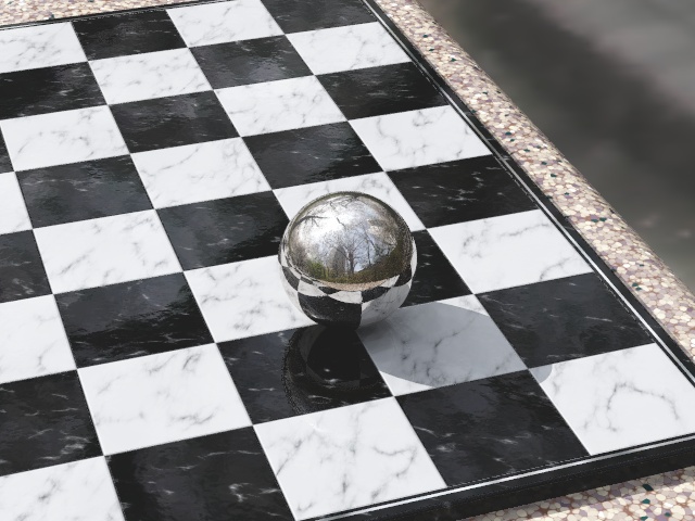
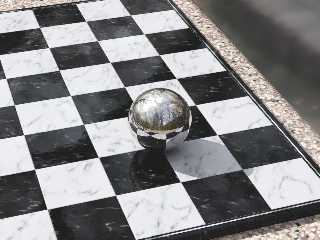
Here's a redesigned board, based loosely on a few boards google found. It
seems wood+marble don't usually appear on the same board so I went fully
marble, with a chrome line to outline the board. Not sure I like the chrome
line, I think I'll try an inverted version with white marble border and a
black line...

--
Tek
http://evilsuperbrain.com

"Tek" <tek### [at] evilsuperbraincom> wrote in message
news:461fd775$1@news.povray.org...
>I totally agree, though focal blur should help tie the blurry HDRI
> background to the sharp foreground a bit better. But in any case I'm going
> to experiment with some kind of ground.
>
> Good suggestion regarding the board, I hadn't thought of that (and I don't
> play it myself). I'll add one now.
>
> --
> Tek
> http://evilsuperbrain.com
>
> "Florian Brucker" <tor### [at] torfboldcom> wrote in message
> news:461fc967$1@news.povray.org...
>> Uh, pretty nice! Pretty damn nice to be specific :)
>>
>> As you ask for possible improvements: Personally I don't like seeing the
>> background where the table ends, I'd prefer some sort of ground. As a
>> minor thing I'd suggest adding a frame around the chessboard, I've never
>> seen one where the tiles start right at the edges.
>>
>>
>> Regards,
>> Florian
>
>
Post a reply to this message
Attachments:
Download 'before+after.1.jpg' (109 KB)
Preview of image 'before+after.1.jpg'
|
|
| |
| |
|
|
|
|
| |
| |
|
|
Tek wrote:
> Yes folks, it's time for Yet Another Reflective Sphere On Checkered Plane!
>
> This is a WIP for the Before+After round of the
> I-can't-believe-it's-not-the-IRTC contest. The concept here is rather
> obviously before + after I got my mad povray skillz. I'm gonna have a
> double-image with one side being the standard rsocp like I could do when I
> first used pov, and the other side being the most realistic rsocp I can do.
> This is, obviously, the latter.
>
> There's some tone-mapping in there already though I think it looks a little
> like a painting not a photo at the moment. So I'm gonna mess with that and
> add some lens effects (blur, dispersion). BTW, if it isn't obvious, the
> background's another HDR probe from http://unparent.com/
>
> Any suggestions on how I can make this more real?
Wow!

Now, I'm going to pick on every little thing though, since you want
suggestion to make it more real. Anything I wouldn't expect in a photograph.

What my eyes first noticed was the 'noise' just below and to the left of
the sphere. I don't know what AA settings you used, but changing that
could either soften and spread out the highlight and make it look more
real, or get rid of them completely which probably wouldn't look as nice.

The background is very blurry. My camera seems to think that to get the
background that faded would require a very narrow depth of field, if the
table is normal height off the ground for an outdoor chess table. A
little blur at the far side of the table would take care of that and
might even convince the photographers that this is a real picture.

Lastly, the table edge itself. I love the pigment, it looks just like
the composite stone I would expect to find in a park. My eyes say that
each chip in the stone seems too flat. I would suggest normals, but it's
the shadow that gives it away. The shadow of the board on the lower
right looks too crisp as it passes over each little chip. Similerly, the
green on the far top right looks just as bright as the near green
specks, something I wouldn't expect looking at that table. The little
bit of lens effects you mentioned might take care of all of that without
resorting to anything more complecated.

I linked the picture to a friend, fellow computer geek but not into
graphics. His response was, 'wow, wait, that's not real?' Personally,
I'd want this as a desktop, or a poster as is. I can't wait to see it
when you are finished.
Post a reply to this message
|
|
| |
| |
|
|
|
|
| |
| |
|
|
My reflective sphere over checkered plane didn't look this cool :(

--
Dan
GoofyGraffix.com
Post a reply to this message
|
|
| |
| |
|
|
|
|
| |
| |
|
|
"Sabrina Kilian" <ykg### [at] vtedu> wrote in message
news:461fea7c$1@news.povray.org...
> What my eyes first noticed was the 'noise' just below and to the left of
> the sphere.

Good point I hadn't noticed, I've upped my AA settings now.

> The background is very blurry. My camera seems to think that to get the
> background that faded would require a very narrow depth of field, if the
> table is normal height off the ground for an outdoor chess table. A
> little blur at the far side of the table would take care of that and
> might even convince the photographers that this is a real picture.

The picture actually has quite a zoomed lens so a real camera would need an
apeture of several centimetres to get that much blur, and that's just not
realistic! So I plan to build a detailed non-blurry floor to go there.

> Lastly, the table edge itself. I love the pigment, it looks just like
> the composite stone I would expect to find in a park. My eyes say that
> each chip in the stone seems too flat. I would suggest normals, but it's
> the shadow that gives it away. The shadow of the board on the lower
> right looks too crisp as it passes over each little chip. Similerly, the
> green on the far top right looks just as bright as the near green
> specks, something I wouldn't expect looking at that table. The little
> bit of lens effects you mentioned might take care of all of that without
> resorting to anything more complecated.

The table actually has a reflective sheen, though it's not obvious at this
angle, so it's supposed to be composite stone polished to a very smooth
finish. In any case I've added an area light which has now slightly softened
the edge of the shade so that should fix the problem. Do you think the green
specks are too bright or too dark? I put them in at the last minute and I'm
not sure I like them!

> I linked the picture to a friend, fellow computer geek but not into
> graphics. His response was, 'wow, wait, that's not real?' Personally,
> I'd want this as a desktop, or a poster as is. I can't wait to see it
> when you are finished.

Thanks for your comments!
--
Tek
http://evilsuperbrain.com
Post a reply to this message
|
|
| |
| |
|
|
|
|
| |
| |
|
|
Tek wrote:
> "Sabrina Kilian" <ykg### [at] vtedu> wrote in message
> news:461fea7c$1@news.povray.org...
>> Lastly, the table edge itself. I love the pigment, it looks just like
>> the composite stone I would expect to find in a park. My eyes say that
>> each chip in the stone seems too flat. I would suggest normals, but it's
>> the shadow that gives it away. The shadow of the board on the lower
>> right looks too crisp as it passes over each little chip. Similerly, the
>> green on the far top right looks just as bright as the near green
>> specks, something I wouldn't expect looking at that table. The little
>> bit of lens effects you mentioned might take care of all of that without
>> resorting to anything more complecated.
>
> The table actually has a reflective sheen, though it's not obvious at this
> angle, so it's supposed to be composite stone polished to a very smooth
> finish. In any case I've added an area light which has now slightly softened
> the edge of the shade so that should fix the problem. Do you think the green
> specks are too bright or too dark? I put them in at the last minute and I'm
> not sure I like them!
>

You are right, the table looked matte almost and the sheen did not show
up like it did for the chess board. I'm not used to seeing composite
stone brand new, so I was expecting the small pieces to be slightly
varied in height or angle which would break up the near side's shadow.
With the sheen being more obvious, or the shadow being softer, I think
it will look great.

I don't think the green specks are too bright or dark, I just can't
reconcile that the chips on the top right look to be almost the same
color as the ones on the nearest edge. It looks great on the near edge,
but it seems too colorful on the far edge.

All of this could be because I am picturing how this would look from a
camera up close with a wide angle lens, not a far off zoom. I'll put a
marble on my desk again, and find a telephoto lens, and see what I think
then.

>> I linked the picture to a friend, fellow computer geek but not into
>> graphics. His response was, 'wow, wait, that's not real?' Personally,
>> I'd want this as a desktop, or a poster as is. I can't wait to see it
>> when you are finished.
>
> Thanks for your comments!

And thank you for another wonderful picture.
Post a reply to this message
|
|
| |
| |
|
|
|
|
| |
| |
|
|
I like it!


Florian
Post a reply to this message
|
|
| |
| |
|
|
|
|
| |
| |
|
|
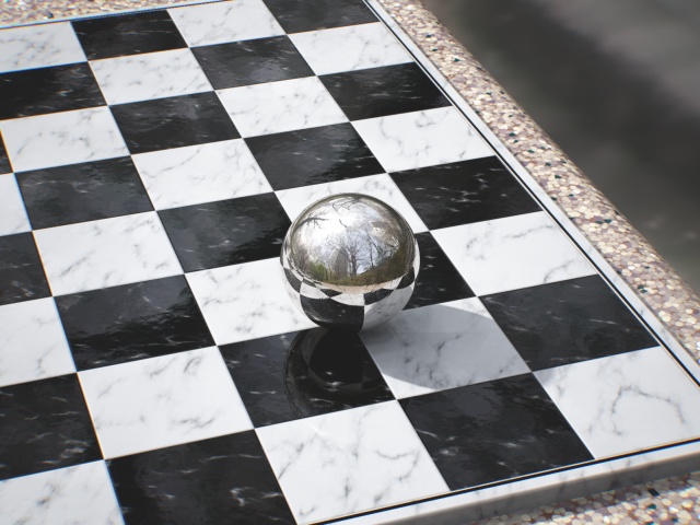
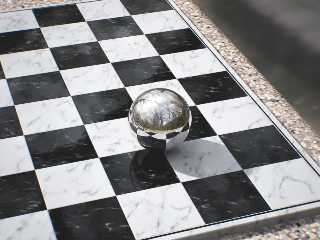
Here's a version with some camera effects (subtle vignetting and
dispersion), improved anti-aliasing (actually rendered at 1600x1200 and
resized), an area_light, and a redesigned chess board.

The vignetting should help vary the colours across the image, so hopefully
those green specks will look better now.

--
Tek
http://evilsuperbrain.com

"Sabrina Kilian" <"ykgp <at> wrote in message
news:462052bc$1@news.povray.org...
> Tek wrote:
>> "Sabrina Kilian" <ykg### [at] vtedu> wrote in message
>> news:461fea7c$1@news.povray.org...
>>> Lastly, the table edge itself. I love the pigment, it looks just like
>>> the composite stone I would expect to find in a park. My eyes say that
>>> each chip in the stone seems too flat. I would suggest normals, but it's
>>> the shadow that gives it away. The shadow of the board on the lower
>>> right looks too crisp as it passes over each little chip. Similerly, the
>>> green on the far top right looks just as bright as the near green
>>> specks, something I wouldn't expect looking at that table. The little
>>> bit of lens effects you mentioned might take care of all of that without
>>> resorting to anything more complecated.
>>
>> The table actually has a reflective sheen, though it's not obvious at
>> this
>> angle, so it's supposed to be composite stone polished to a very smooth
>> finish. In any case I've added an area light which has now slightly
>> softened
>> the edge of the shade so that should fix the problem. Do you think the
>> green
>> specks are too bright or too dark? I put them in at the last minute and
>> I'm
>> not sure I like them!
>>
>
> You are right, the table looked matte almost and the sheen did not show
> up like it did for the chess board. I'm not used to seeing composite
> stone brand new, so I was expecting the small pieces to be slightly
> varied in height or angle which would break up the near side's shadow.
> With the sheen being more obvious, or the shadow being softer, I think
> it will look great.
>
> I don't think the green specks are too bright or dark, I just can't
> reconcile that the chips on the top right look to be almost the same
> color as the ones on the nearest edge. It looks great on the near edge,
> but it seems too colorful on the far edge.
>
> All of this could be because I am picturing how this would look from a
> camera up close with a wide angle lens, not a far off zoom. I'll put a
> marble on my desk again, and find a telephoto lens, and see what I think
> then.
>
>>> I linked the picture to a friend, fellow computer geek but not into
>>> graphics. His response was, 'wow, wait, that's not real?' Personally,
>>> I'd want this as a desktop, or a poster as is. I can't wait to see it
>>> when you are finished.
>>
>> Thanks for your comments!
>
> And thank you for another wonderful picture.
Post a reply to this message
Attachments:
Download 'before+after.1-pp.jpg' (103 KB)
Preview of image 'before+after.1-pp.jpg'
|
|
| |
| |
|
|
|
|
| |
| |
|
|
You should be forbidden to post such excellent wip images!!!  :-)

Thomas
Post a reply to this message
|
|
| |
| |
|
|
|
|
| |
| |
|
|
-----BEGIN PGP SIGNED MESSAGE-----
Hash: SHA1

	There's a problem with your photograph: it was taken by the
Invisible Man! Otherwise, he should be visible in the reflection on
the sphere ;)

		Jerome
- --
+------------------------- Jerome M. BERGER ---------------------+
|    mailto:jeb### [at] freefr      | ICQ:    238062172            |
|    http://jeberger.free.fr/     | Jabber: jeb### [at] jabberfr   |
+---------------------------------+------------------------------+
-----BEGIN PGP SIGNATURE-----
Version: GnuPG v1.4.7 (GNU/Linux)

iD8DBQFGINY4d0kWM4JG3k8RApcGAJ9ekXG8sTpGNi7eWgKGDMSHulY0CQCfVwTB
eI2yZBYZPlxFw6AnwBOvzhA=
=pPWH
-----END PGP SIGNATURE-----
Post a reply to this message
|
|
| |
| |
|
|
|
|
| |
| |
|
|
Nice. However, I think the black border around the board looks
a bit artificial. Maybe there should be just a groove centered
in the white border. Also, the board seems to be too perfectly
aligned with the table.
Post a reply to this message
|
|
| |
| |
|
|
|
|
| |
| |
|
|
I am thinking of cheekily building a cameraman to be in the reflection!

--
Tek
http://evilsuperbrain.com

""Jérôme M. Berger"" <jeb### [at] freefr> wrote in message
news:4620d638$1@news.povray.org...
> -----BEGIN PGP SIGNED MESSAGE-----
> Hash: SHA1
>
> There's a problem with your photograph: it was taken by the
> Invisible Man! Otherwise, he should be visible in the reflection on
> the sphere ;)
>
> Jerome
> - --
> +------------------------- Jerome M. BERGER ---------------------+
> |    mailto:jeb### [at] freefr      | ICQ:    238062172            |
> |    http://jeberger.free.fr/     | Jabber: jeb### [at] jabberfr   |
> +---------------------------------+------------------------------+
> -----BEGIN PGP SIGNATURE-----
> Version: GnuPG v1.4.7 (GNU/Linux)
>
> iD8DBQFGINY4d0kWM4JG3k8RApcGAJ9ekXG8sTpGNi7eWgKGDMSHulY0CQCfVwTB
> eI2yZBYZPlxFw6AnwBOvzhA=
> =pPWH
> -----END PGP SIGNATURE-----
Post a reply to this message
|
|
| |
| |
|
|
|
|
| |
| |
|
|
"Christian Froeschlin" <chr### [at] chrfrde> wrote in message
news:4620e2ee$1@news.povray.org...
> Nice. However, I think the black border around the board looks
> a bit artificial. Maybe there should be just a groove centered
> in the white border. Also, the board seems to be too perfectly
> aligned with the table.

2 good points. I can't make my mind up about the border so I'll try some
variations. The alignment to the table is perfect because I havent decided
if the board is built into the table or not. Though I think it's not (since
it looks like an expensive marble board on a cheap stone table) so I'll
shift the positions a little.

Very useful comments, thanks!

--
Tek
http://evilsuperbrain.com
Post a reply to this message
|
|
| |
| |
|
|
|
|
| |
| |
|
|
"Sabrina Kilian" <"ykgp <at> wrote in message
news:462052bc$1@news.povray.org...
> All of this could be because I am picturing how this would look from a
> camera up close with a wide angle lens, not a far off zoom. I'll put a
> marble on my desk again, and find a telephoto lens, and see what I think
> then.

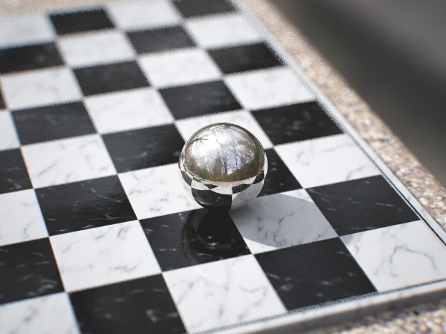
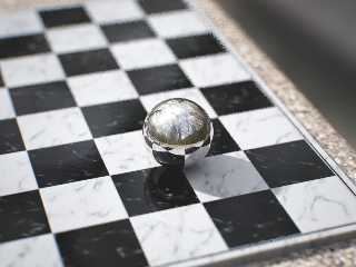
Hmm... my camera might not be as zoomed as I thought, here's a render with
blur from a 35mm aperture. It's easily enough to tie the background to the
foreground.

But I think it's too blurry, so I'm gonna build some background objects.

--
Tek
http://evilsuperbrain.com
Post a reply to this message
Attachments:
Download 'before+after.1-pp.jpg' (85 KB)
Preview of image 'before+after.1-pp.jpg'
|
|
| |
| |
|
|
|
|
| |
| |
|
|
Fantastic image Tek! However, I think the border should be wider? If you
think of 1/2"...

     ~Steve~
Post a reply to this message
|
|
| |
| |
|
|
|
|
| |
| |
|
|
Tek wrote:

> But I think it's too blurry, so I'm gonna build some background objects.

Maybe you are taking photorealism too far. If it's to blurry,
why don't you just reduce the blur? Just think of the number
of blur_samples you'll need to make this look good anyway ;)

I suppose camera manufacturers would happily build cameras which show
less blur if they could (well, in fact you can take multiple images
with different focus and combine them in software).
Post a reply to this message
|
|
| |
| |
|
|
|
|
| |
| |
|
|
> Maybe you are taking photorealism too far. If it's to blurry,
> why don't you just reduce the blur? Just think of the number
> of blur_samples you'll need to make this look good anyway ;)

On a similar note, when I first looked at the image, I thought "That
shadow needs an area light!" Then I realized that I've spent so much
time indoors with fluorescent light that shadows from sunlight look
wrong to me. >_<

--
William Tracy
afi### [at] gmailcom -- wtr### [at] calpolyedu
Post a reply to this message
|
|
| |
| |
|
|
|
|
| |
| |
|
|
William Tracy wrote:

> On a similar note, when I first looked at the image, I thought "That
> shadow needs an area light!" Then I realized that I've spent so much
> time indoors with fluorescent light that shadows from sunlight look
> wrong to me.

Actually, the sun appears as a disk, not as a point light, so
a circular area light would be quite appropriate. But who knows,
maybe the final version will use a sky dome, the HDRI is there ;)
Post a reply to this message
|
|
| |
| |
|
|
|
|
| |
| |
|
|
> Actually, the sun appears as a disk, not as a point light, so
> a circular area light would be quite appropriate. But who knows,
> maybe the final version will use a sky dome, the HDRI is there ;)

But the sun is so far away that it still generates pretty sharp shadows
(compared to indoor lighting).

--
William Tracy
afi### [at] gmailcom -- wtr### [at] calpolyedu

You know you've been raytracing too long when you are certain that if
you see one more post on c.g.r.r. from a newbie asking what the best
raytracing software available is you're going to go out and throttle the
hell out of someone just to get it out of your system.
Ken Tyler
Post a reply to this message
|
|
| |
| |
|
|
|
|
| |
| |
|
|
Well real cameras have adjustable apertures, a photo taken outdoors in
fairly bright sunlight would not usually have the aperture open far enough
for this much blur, though it is possible with a filter. I just wanted to
get an upper limit for maximum possible blur within the bounds of reality.
Since it's more blur than I need I'm safely inside the bounds of reality
with whatever setting I choose!

--
Tek
http://evilsuperbrain.com

"Christian Froeschlin" <chr### [at] chrfrde> wrote in message
news:46215631$1@news.povray.org...
> Tek wrote:
>
>> But I think it's too blurry, so I'm gonna build some background objects.
>
> Maybe you are taking photorealism too far. If it's to blurry,
> why don't you just reduce the blur? Just think of the number
> of blur_samples you'll need to make this look good anyway ;)
>
> I suppose camera manufacturers would happily build cameras which show
> less blur if they could (well, in fact you can take multiple images
> with different focus and combine them in software).
Post a reply to this message
|
|
| |
| |
|
|
|
|
| |
| |
|
|
Apparently, according to wikipedia, the sun's disk has a diameter of around
0.5 degrees from our point of view. That's equivalent to an area light at a
distance of 1 unit having a width of 0.0087 units, which is really not very
much blur. I'm using about 3 times more area_light blur than is realistic.

--
Tek
http://evilsuperbrain.com

"William Tracy" <wtr### [at] calpolyedu> wrote in message
news:46217c76@news.povray.org...
>> Actually, the sun appears as a disk, not as a point light, so
>> a circular area light would be quite appropriate. But who knows,
>> maybe the final version will use a sky dome, the HDRI is there ;)
>
> But the sun is so far away that it still generates pretty sharp shadows
> (compared to indoor lighting).
>
> --
> William Tracy
> afi### [at] gmailcom -- wtr### [at] calpolyedu
>
> You know you've been raytracing too long when you are certain that if you
> see one more post on c.g.r.r. from a newbie asking what the best
> raytracing software available is you're going to go out and throttle the
> hell out of someone just to get it out of your system.
> Ken Tyler
Post a reply to this message
|
|
| |
| |
|
|
|
|
| |
| |
|
|
Tek wrote:
> Apparently, according to wikipedia, the sun's disk has a diameter of around
> 0.5 degrees from our point of view.

Except that back-scattering off the atmosphere provides a much larger
area of light. Contrast the sky with the moon vs the sun, both of which
are about the same size. It's difficult to even look close to the sun on
a clear day.

--
   Darren New / San Diego, CA, USA (PST)
     His kernel fu is strong.
     He studied at the Shao Linux Temple.
Post a reply to this message
|
|
| |
| |
|
|
|
|
| |
| |
|
|
The reason it's hard to look at the sun is it's brighter than the moon.
Nonetheless with the right filter you can clearly see the sun's disk, which
means the disk itself is significantly brighter than light scattered by the
atmosphere. So I'll use an area light for the disc, and the radiosity from
my HDR dome will handle the light from the sky.

--
Tek
http://evilsuperbrain.com

"Darren New" <dne### [at] sanrrcom> wrote in message
news:4621a037$1@news.povray.org...
> Tek wrote:
>> Apparently, according to wikipedia, the sun's disk has a diameter of
>> around 0.5 degrees from our point of view.
>
> Except that back-scattering off the atmosphere provides a much larger area
> of light. Contrast the sky with the moon vs the sun, both of which are
> about the same size. It's difficult to even look close to the sun on a
> clear day.
>
> --
>   Darren New / San Diego, CA, USA (PST)
>     His kernel fu is strong.
>     He studied at the Shao Linux Temple.
Post a reply to this message
|
|
| |
| |
|
|
|
|
| |
| |
|
|
Among other things, Darren New saw fit to write:

> Except that back-scattering off the atmosphere provides a much larger
> area of light. Contrast the sky with the moon vs the sun, both of which
> are about the same size. It's difficult to even look close to the sun on
> a clear day.

So similar are their sizes, indeed, that we can experience both total and
anular eclipses... I find that amazing.

--
light_source{9+9*x,1}camera{orthographic look_at(1-y)/4angle 30location
9/4-z*4}light_source{-9*z,1}union{box{.9-z.1+x clipped_by{plane{2+y-4*x
0}}}box{z-y-.1.1+z}box{-.1.1+x}box{.1z-.1}pigment{rgb<.8.2,1>}}//Jellby
Post a reply to this message
|
|
| |
| |
|
|
|
|
| |
| |
|
|
Tek wrote:
> The reason it's hard to look at the sun is it's brighter than the moon.

Right. I meant, it's difficult to even look within about 5 degrees of
the sun. I think the disk that's projecting light is a lot larger than
0.5%. Of course, in POV you have to do things somewhat differently to
get the same effect.

--
   Darren New / San Diego, CA, USA (PST)
     His kernel fu is strong.
     He studied at the Shao Linux Temple.
Post a reply to this message
|
|
| |
| |
|
|
|
|
| |
| |
|
|
"Darren New" <dne### [at] sanrrcom> wrote in message
news:46225066$1@news.povray.org...
> Tek wrote:
>> The reason it's hard to look at the sun is it's brighter than the moon.
>
> Right. I meant, it's difficult to even look within about 5 degrees of the
> sun. I think the disk that's projecting light is a lot larger than 0.5%.
> Of course, in POV you have to do things somewhat differently to get the
> same effect.

I'm not sure I follow. The sun's disk is 5 degrees in radius from earth, the
brightness of it doesn't make it any larger (like I say you can use a filter
to see that all the suns direct light comes from that disk). Povray can
simulate a circular area light of the same angle and brightness. The only
reason I'm using a larger one is because I'm taking some artistic license,
in truth a small ball on a table would have an almost perfectly sharp
shadow.

--
Tek
http://evilsuperbrain.com
Post a reply to this message
|
|
| |
| |
|
|
|
|
| |
| |
|
|
Tek wrote:

> I'm not sure I follow. The sun's disk is 5 degrees in radius from earth, the
> brightness of it doesn't make it any larger

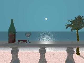
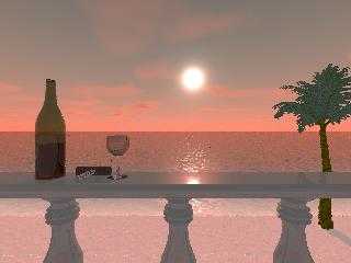
The sun might appear as a larger apparent "disk" of brightness
due to directional scattering in the atmosphere. In fact, compare
the two attached WIP images. The sun really appears quite small
in the version without scattering (and that was already 4 times
larger than physically correct).
Post a reply to this message
Attachments:
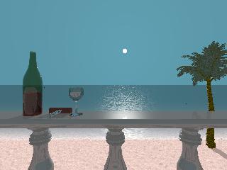
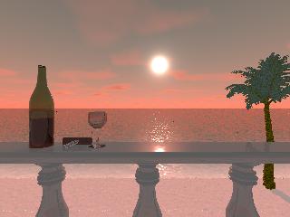
Download 'beach-320.jpg' (10 KB)
Download 'beach-scatter-320.jpg' (10 KB)
Preview of image 'beach-320.jpg'
Preview of image 'beach-scatter-320.jpg'
|
|
| |
| |
|
|
|
|
| |
| |
|
|
Tek wrote:
> Any suggestions on how I can make this more real?

I think my biggest problem is the reflection in the sphere is perfectly
focused, but then so is the sphere itself. With a short focal length,
only one should be in focus as you're either focused the (very short)
distance to the sphere, or the (very long) distance to the trees behind you.

Cheers!
Rick Measham
Post a reply to this message
|
|
| |
| |
|
|
|
|
| |
| |
|
|
Actually because it's a curved reflective surface the reflection will tend
to appear very sharp. What you said is certainly true of flat mirrors but
the distortion in a convex mirror makes the image appear sharp (because the
image appears much smaller than in a flat mirror, so the blur is relatively
unnoticeable).

Here's a great example google image search found:
http://colourblind.ca/images/20050807233841_shiny_sphere.jpg
You'll notice the background is blurry but both the ball & reflection appear
sharp.

In any case, I'm using focal blur when rendering now, and pov's simulation
is good enough to accurately apply focal blur to reflections.

--
Tek
http://evilsuperbrain.com

"Rick Measham" <ric### [at] diespammerdieisitenetau> wrote in message
news:462### [at] diespammerdieisitenetau...
> Tek wrote:
>> Any suggestions on how I can make this more real?
>
> I think my biggest problem is the reflection in the sphere is perfectly
> focused, but then so is the sphere itself. With a short focal length, only
> one should be in focus as you're either focused the (very short) distance
> to the sphere, or the (very long) distance to the trees behind you.
>
> Cheers!
> Rick Measham
Post a reply to this message
|
|
| |
| |
|
|
|
|
| |
| |
|
|
"Jellby" <me### [at] privacynet> schreef in bericht
news:nkc### [at] badulaqueunexes...
> Among other things, Darren New saw fit to write:
>
>> Except that back-scattering off the atmosphere provides a much larger
>> area of light. Contrast the sky with the moon vs the sun, both of which
>> are about the same size. It's difficult to even look close to the sun on
>> a clear day.
>
> So similar are their sizes, indeed, that we can experience both total and
> anular eclipses... I find that amazing.
>

It is one of those random chances that nature offers us  :-)
If I am correct, we are also at the right time too, while the Moon is slowly
receding. So there might come a moment when only anular eclipses will happen
I believe. The astronomers among us can tell.

Thomas
Post a reply to this message
|
|
| |
| |
|
|
|
|
| |
| |
|
|
Tek wrote:
> Actually because it's a curved reflective surface the reflection will tend
> to appear very sharp. What you said is certainly true of flat mirrors but
> the distortion in a convex mirror makes the image appear sharp (because the
> image appears much smaller than in a flat mirror, so the blur is relatively
> unnoticeable).


Bah! I sat here thinking about it before I posted that. Decided I was
right and hit the "Send" button. Now I regret it. Of course you're right.

Cheers!
Rick Measham
Post a reply to this message
|
|
| |
| |
|
|
|
|
| |
| |
|
|
Tek nous apporta ses lumieres en ce 15-04-2007 13:09:
> "Darren New" <dne### [at] sanrrcom> wrote in message
> news:46225066$1@news.povray.org...
>> Tek wrote:
>>> The reason it's hard to look at the sun is it's brighter than the moon.
>> Right. I meant, it's difficult to even look within about 5 degrees of the
>> sun. I think the disk that's projecting light is a lot larger than 0.5%.
>> Of course, in POV you have to do things somewhat differently to get the
>> same effect.

> I'm not sure I follow. The sun's disk is 5 degrees in radius from earth, the
> brightness of it doesn't make it any larger (like I say you can use a filter
> to see that all the suns direct light comes from that disk). Povray can
> simulate a circular area light of the same angle and brightness. The only
> reason I'm using a larger one is because I'm taking some artistic license,
> in truth a small ball on a table would have an almost perfectly sharp
> shadow.

The Sun's real apparent radius is 0.5 degrees. It's extreem brightness does make
it look much larger, as even with a very small amount of scettering, that
scattered light is still blinding.

--
Alain
-------------------------------------------------
I can read your mind, and you should be ashamed of yourself.
Post a reply to this message
|
|
| |
| |
|
|
|
|
| |
| |
|
|
Nonetheless we're not discussing how it looks, rather how to simulate it
with an area_light. The majority of the light comes from the sun itself, not
the scattering (since if you look at the sun through a filter you can see
it's disk clearly), hence I'm using a lightsource to simulate the sun and
radiosity from the HDR dome to simulate scattered light from the sky.

--
Tek
http://evilsuperbrain.com

"Alain" <ele### [at] netscapenet> wrote in message
news:4623e6d1$1@news.povray.org...
> Tek nous apporta ses lumieres en ce 15-04-2007 13:09:
>> "Darren New" <dne### [at] sanrrcom> wrote in message
>> news:46225066$1@news.povray.org...
>>> Tek wrote:
>>>> The reason it's hard to look at the sun is it's brighter than the moon.
>>> Right. I meant, it's difficult to even look within about 5 degrees of
>>> the sun. I think the disk that's projecting light is a lot larger than
>>> 0.5%. Of course, in POV you have to do things somewhat differently to
>>> get the same effect.
>
>> I'm not sure I follow. The sun's disk is 5 degrees in radius from earth,
>> the brightness of it doesn't make it any larger (like I say you can use a
>> filter to see that all the suns direct light comes from that disk).
>> Povray can simulate a circular area light of the same angle and
>> brightness. The only reason I'm using a larger one is because I'm taking
>> some artistic license, in truth a small ball on a table would have an
>> almost perfectly sharp shadow.
>
> The Sun's real apparent radius is 0.5 degrees. It's extreem brightness
> does make it look much larger, as even with a very small amount of
> scettering, that scattered light is still blinding.
>
> --
> Alain
> -------------------------------------------------
> I can read your mind, and you should be ashamed of yourself.
Post a reply to this message
|
|
| |
| |
|
|
|
|
| |
| |
|
|
"Tek" <tek### [at] evilsuperbraincom> wrote in message
news:461fa7bb@news.povray.org...
> Yes folks, it's time for Yet Another Reflective Sphere On Checkered Plane!
>
> This is a WIP for the Before+After round of the
> I-can't-believe-it's-not-the-IRTC contest. The concept here is rather
> obviously before + after I got my mad povray skillz. I'm gonna have a
> double-image with one side being the standard rsocp like I could do when I
> first used pov, and the other side being the most realistic rsocp I can
do.
> This is, obviously, the latter.

That looks fantastic.

Is the texture used on the blocks of the chess board an image map, or is it
procedural?
Post a reply to this message
|
|
| |
| |
|
|
|
|
| |
| |
|
|
The texture's just pov's granite. I almost never use image maps (apart from
the HDR probe!).

Here's the code for the white tiles (the black ones are very similar)

pigment {
 pigment_pattern { granite colour_map { [0 rgb 1][1 rgb 0] } }
 poly_wave 8
 scale <1,2,2> rotate -60*y
 colour_map { [0 rgb .5][1 rgb 0] }
}

It's helped a lot by having a reflective sheen with a slightly bumpy normal.

--
Tek
http://evilsuperbrain.com


"Gail Shaw" <initialsurname@sentech sa dot com> wrote in message
news:46244d2a@news.povray.org...
>
> "Tek" <tek### [at] evilsuperbraincom> wrote in message
> news:461fa7bb@news.povray.org...
>> Yes folks, it's time for Yet Another Reflective Sphere On Checkered
>> Plane!
>>
>> This is a WIP for the Before+After round of the
>> I-can't-believe-it's-not-the-IRTC contest. The concept here is rather
>> obviously before + after I got my mad povray skillz. I'm gonna have a
>> double-image with one side being the standard rsocp like I could do when
>> I
>> first used pov, and the other side being the most realistic rsocp I can
> do.
>> This is, obviously, the latter.
>
> That looks fantastic.
>
> Is the texture used on the blocks of the chess board an image map, or is
> it
> procedural?
>
>
Post a reply to this message
|
|
| |
| |
|
|
|
|
| |
| |
|
|
"Tek" <tek### [at] evilsuperbraincom> wrote in message
news:4624b281$1@news.povray.org...
> The texture's just pov's granite. I almost never use image maps (apart
from
> the HDR probe!).
>
> Here's the code for the white tiles (the black ones are very similar)

Thank you, thank you, thank you. I've been trying to get a descent marble
texture for a couple weeks with no luck
Post a reply to this message
|
|
| |
| |
|
|
|
|
| |