|
|
|
|
|
|
| |
| |
|
|
|
|
| |
| |
|
|
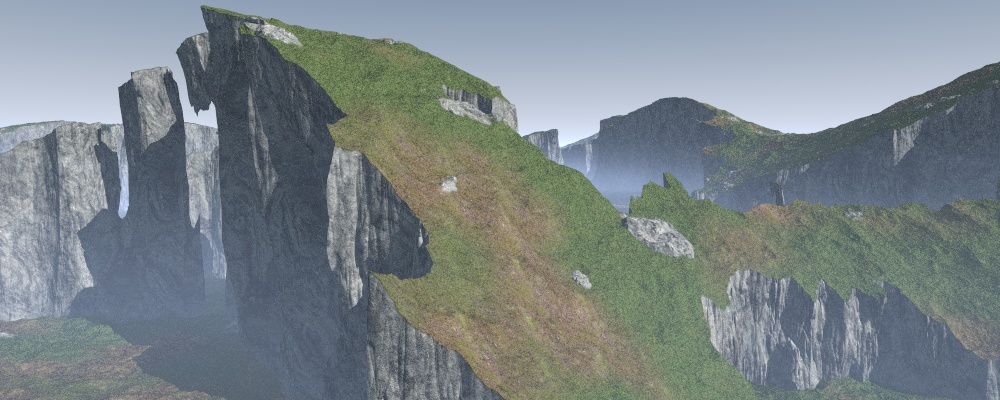
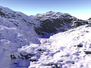
I've been making a few isosurface landscapes this week, so I thought I'd
share the best ones.
My favourite one is the grassy cliffs, though I can't get the colours to
look right, it looks too fake, so I hid the ugliness with fog and gloomy
lighting.
Comments would be helpful, none of these images has had more than a few
hours work so far and I'll probably develop one or two of them into serious
pictures.
Next I'm gonna try something with trees and water...
--
Tek
http://evilsuperbrain.com
Post a reply to this message
Attachments:
Download 'landscape5.1.jpg' (161 KB)
Download 'landscape1.jpg' (145 KB)
Download 'landscape2.jpg' (88 KB)
Preview of image 'landscape5.1.jpg'
Preview of image 'landscape1.jpg'

Preview of image 'landscape2.jpg'
|
|
| |
| |
|
|
|
|
| |
| |
|
|
Am I the only one who saw "landscapes", saw "tek", and thought "Great,
another image I can't live up to"? :)
Anyway, I really like the second and third ones, they are stunning. The
second one could really use some flowing water running through the
bottom of it, though.
The first one is nice, but you're right about the colors not looking right.
...Chambers
Post a reply to this message
|
|
| |
| |
|
|
|
|
| |
| |
|
|
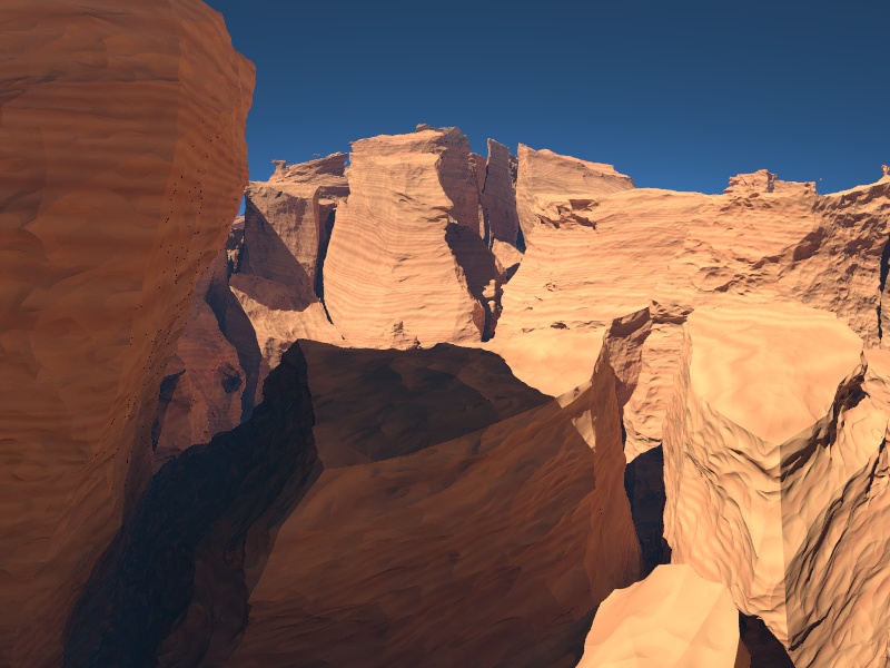
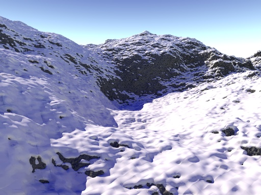
I really like number 2 and 3. The rockformations look very interesting and
well textured. If it doesn't make the scene too slow I would try to add a
small amount of granite pattern in no. 2 to make the rock look more
detailed in closeup. Just a sugestion though, they look great as they are.
Best regards, Christoph
Post a reply to this message
|
|
| |
| |
|
|
|
|
| |
| |
|
|
45d49b22@news.povray.org...
> I've been making a few isosurface landscapes this week, so I thought I'd
> share the best ones.
>
> My favourite one is the grassy cliffs, though I can't get the colours to
> look right, it looks too fake, so I hid the ugliness with fog and gloomy
> lighting.
>
The #1 makes me think of Roger Dean's drawings but #2 is my favourite
Marc
Post a reply to this message
|
|
| |
| |
|
|
|
|
| |
| |
|
|
#2 is my favourite, even with some levitating gravel in the background :-)
#1 is strange but could well be used for a more surreal scene, Roger
Dean-style, like Marc mentionned. So, although it is less perfect, it would
be the first one I would try to use!
Thomas
Post a reply to this message
|
|
| |
| |
|
|
|
|
| |
| |
|
|
"Tek" <tek### [at] evilsuperbrain com> wrote:
> I've been making a few isosurface landscapes this week, so I thought I'd
> share the best ones.
Great pictures, #2 looks 'finished' to me. The way you're using snow in
the third image is very interesting ... would you care to show the source
for how it's done?
--
jussi com> wrote:
> I've been making a few isosurface landscapes this week, so I thought I'd
> share the best ones.
Great pictures, #2 looks 'finished' to me. The way you're using snow in
the third image is very interesting ... would you care to show the source
for how it's done?
--
jussi
Post a reply to this message
|
|
| |
| |
|
|
|
|
| |
| |
|
|
"Tek" <tek### [at] evilsuperbraincom> wrote:
> I've been making a few isosurface landscapes this week, so I thought I'd
> share the best ones.
>
> My favourite one is the grassy cliffs, though I can't get the colours to
> look right, it looks too fake, so I hid the ugliness with fog and gloomy
> lighting.
>
> Comments would be helpful, none of these images has had more than a few
> hours work so far and I'll probably develop one or two of them into serious
> pictures.
>
> Next I'm gonna try something with trees and water...
> --
> Tek
> http://evilsuperbrain.com
The colours of #2 are excellent, I think the snow needs some work in #3, not
the layout which looks good but it looks like you can see the polygons, also
the texture isn't quite right. I think if the snow can be improved #3 could
be my favourite..
Sean
Post a reply to this message
|
|
| |
| |
|
|
|
|
| |
| |
|
|
Tek wrote:
> I've been making a few isosurface landscapes this week, so I thought I'd
> share the best ones.
>
> My favourite one is the grassy cliffs, though I can't get the colours to
> look right, it looks too fake, so I hid the ugliness with fog and gloomy
> lighting.
>
> Comments would be helpful, none of these images has had more than a few
> hours work so far and I'll probably develop one or two of them into serious
> pictures.
>
> Next I'm gonna try something with trees and water...
no fair submitting photographs, Tek!
landscape1 looks a lot like the rocks of Death Valley, which truthfully
don't look like they belong on this planet either.
Post a reply to this message
|
|
| |
| |
|
|
|
|
| |
| |
|
|
Actually those aren't polygons, the snow's an isosurface using the gradient
of the rock isosurface underneath, but I calculate that gradient using just
2 samples so you get a nasty artefact. I could probably fix it with a bit of
work. Personally I think the composition in #3 is way too boring to bother
developing further.
--
Tek
http://evilsuperbrain.com
"s.day" <s.d### [at] uelacuk> wrote in message
news:web.45d6477d1312d0ce956134060@news.povray.org...
> "Tek" <tek### [at] evilsuperbraincom> wrote:
>> I've been making a few isosurface landscapes this week, so I thought I'd
>> share the best ones.
>>
>> My favourite one is the grassy cliffs, though I can't get the colours to
>> look right, it looks too fake, so I hid the ugliness with fog and gloomy
>> lighting.
>>
>> Comments would be helpful, none of these images has had more than a few
>> hours work so far and I'll probably develop one or two of them into
>> serious
>> pictures.
>>
>> Next I'm gonna try something with trees and water...
>> --
>> Tek
>> http://evilsuperbrain.com
>
> The colours of #2 are excellent, I think the snow needs some work in #3,
> not
> the layout which looks good but it looks like you can see the polygons,
> also
> the texture isn't quite right. I think if the snow can be improved #3
> could
> be my favourite..
>
> Sean
>
>
Post a reply to this message
|
|
| |
| |
|
|
|
|
| |