|
|
|
|
|
|
| |
| |
|
|
|
|
| |
| |
|
|
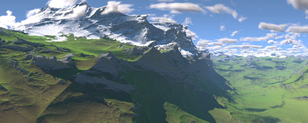
Well, I got bored. So last night I decided to see what my waves looked like
if I stuck a nice landscape texture on them!

The waves are about 50% taller than in my ocean scene, and the camera's much
closer to them. The cool looking grass texture uses megapovs aoi pattern to
do a kind of fur/velvet shader thing. The grass/rock pattern is controlled
by the same pattern as the foam in the original scene (with rock where the
foam was), plus a slope factor to prevent grass on the steepest hills.
Snow's controlled by a turbulent gradient with a slope factor. Clouds are
just simple media with density based on granite with turbulence, the sky
colour comes from fog.

Not bad for only a couple of hours work :)
--
Tek
http://evilsuperbrain.com
Post a reply to this message
Attachments:
Download 'waves_of_stone.jpg' (239 KB)
Preview of image 'waves_of_stone.jpg'
|
|
| |
| |
|
|
|
|
| |
| |
|
|
> Not bad for only a couple of hours work :)

Must be really nice to be obscenely talented. :-}
Post a reply to this message
|
|
| |
| |
|
|
|
|
| |
| |
|
|
I wasn't happy with the contrast so I messed around in photoshop before
sticking it on my deviantart page:
http://www.deviantart.com/deviation/43626574/
--
Tek
http://evilsuperbrain.com
"Tek" <tek### [at] evilsuperbrain com> wrote in message
news:456828fa@news.povray.org...
> Well, I got bored. So last night I decided to see what my waves looked
> like if I stuck a nice landscape texture on them!
>
> The waves are about 50% taller than in my ocean scene, and the camera's
> much closer to them. The cool looking grass texture uses megapovs aoi
> pattern to do a kind of fur/velvet shader thing. The grass/rock pattern is
> controlled by the same pattern as the foam in the original scene (with
> rock where the foam was), plus a slope factor to prevent grass on the
> steepest hills. Snow's controlled by a turbulent gradient with a slope
> factor. Clouds are just simple media with density based on granite with
> turbulence, the sky colour comes from fog.
>
> Not bad for only a couple of hours work :)
> --
> Tek
> http://evilsuperbrain.com
>
>
> com> wrote in message
news:456828fa@news.povray.org...
> Well, I got bored. So last night I decided to see what my waves looked
> like if I stuck a nice landscape texture on them!
>
> The waves are about 50% taller than in my ocean scene, and the camera's
> much closer to them. The cool looking grass texture uses megapovs aoi
> pattern to do a kind of fur/velvet shader thing. The grass/rock pattern is
> controlled by the same pattern as the foam in the original scene (with
> rock where the foam was), plus a slope factor to prevent grass on the
> steepest hills. Snow's controlled by a turbulent gradient with a slope
> factor. Clouds are just simple media with density based on granite with
> turbulence, the sky colour comes from fog.
>
> Not bad for only a couple of hours work :)
> --
> Tek
> http://evilsuperbrain.com
>
>
>
Post a reply to this message
|
|
| |
| |
|
|
|
|
| |
| |
|
|
"Tek" <tek### [at] evilsuperbraincom> schreef in bericht
news:456828fa@news.povray.org...
> Well, I got bored. So last night I decided to see what my waves looked
> like if I stuck a nice landscape texture on them!
>
Very nice! Yet another way to use your code. I had thought about this indeed
too, and filed the idea away for future use :-)
Interesting and dramatic, somewhat alien landscape.

Thomas
Post a reply to this message
|
|
| |
| |
|
|
|
|
| |
| |
|
|
Tek wrote:
> I wasn't happy with the contrast so I messed around in photoshop before
> sticking it on my deviantart page:
> http://www.deviantart.com/deviation/43626574/

  The image may be cool after the post-processing, but such heavy
post-processing kind of spoils it, IMO. It sort of diminishes the
role of POV-Ray in the whole process.

  And to be honest, I actually like the original more.
Post a reply to this message
|
|
| |
| |
|
|
|
|
| |
| |
|
|
"Tek" <tek### [at] evilsuperbraincom> wrote:
> Well, I got bored. So last night I decided to see what my waves looked like
> if I stuck a nice landscape texture on them!

Very nice.  Scottish highlands, or New Zealand, maybe.

Rohan?  :)

--
Dan
GoofyGraffix.com
Post a reply to this message
|
|
| |
| |
|
|
|
|
| |
| |
|
|
Tek wrote:
> I wasn't happy with the contrast so I messed around in photoshop before
> sticking it on my deviantart page:
> http://www.deviantart.com/deviation/43626574/
>

Wow, this one is really beautifull ! I like the high contrast with the
"grainy" look, it gives to the picture a kind of "dreamish" mood, makes
me feel I am looking at some supernatural place.

Thibaut
Post a reply to this message
|
|
| |
| |
|
|
|
|
| |
| |
|
|
On Sat, 25 Nov 2006 17:18:08 +0200, Warp wrote:

>  And to be honest, I actually like the original more.

I have to admit I do as well.

That's not to say I don't like the modified one, but it does seem to lose
something...

Jim
Post a reply to this message
|
|
| |
| |
|
|
|
|
| |
| |
|
|
WOW!!!

Sven
Post a reply to this message
|
|
| |
| |
|
|
|
|
| |
| |
|
|
What a surprise, finding povray purists on a povray noticeboard! :)
Okay you're probably right but I'm trying to develop my photoshop skills,
just thought I'd share it as a curiosity.

I feel kinda dirty fixing contrast in photoshop rather than by tweaking
lighting!

--
Tek
http://evilsuperbrain.com

"Jim Henderson" <nos### [at] nospamcom> wrote in message
news:pan### [at] nospamcom...
> On Sat, 25 Nov 2006 17:18:08 +0200, Warp wrote:
>
>>  And to be honest, I actually like the original more.
>
> I have to admit I do as well.
>
> That's not to say I don't like the modified one, but it does seem to lose
> something...
>
> Jim
Post a reply to this message
|
|
| |
| |
|
|
|
|
| |
| |
|
|
What a great scene! What tremendous possibilities of enhancements it bears!

Tek, why not you add a texture for the meadow lands with tiny ways and small
primitive settlements?

Also, add some real flowers and leaves to the foreground, maybe a bit
unsharp (due focus). And add some tiny distant lifeforms, such as distant
birds (small swarms or individuals), a few insects, and maybe some tiny
humans (tiny due the distance).

Replace the unrealisg sky with some real late afternoon sky (and modify the
light color), or with some other real sky.

Maybe a broad or thin river going through tzhe lowest points of the meadlow
lands?

Honestly, that scene can become something BIG!

Best greetings,

Sven
Post a reply to this message
|
|
| |
| |
|
|
|
|
| |
| |
|
|
Maybe a late afternoon or early evening scene with a still visible landscape
but already here and there a few camp fires with their shine around...

Sven
Post a reply to this message
|
|
| |
| |
|
|
|
|
| |
| |
|
|
On Sat, 25 Nov 2006 23:48:04 +0000, Tek wrote:

> What a surprise, finding povray purists on a povray noticeboard! :) Okay
> you're probably right but I'm trying to develop my photoshop skills, just
> thought I'd share it as a curiosity.

Oh, I do like it - some of the adjustments give it a more film-like
quality.

> I feel kinda dirty fixing contrast in photoshop rather than by tweaking
> lighting!

<shudder>  ;-)

Jim
Post a reply to this message
|
|
| |
| |
|
|
|
|
| |
| |
|
|
"Tek" <tek### [at] evilsuperbraincom> wrote:
> What a surprise, finding povray purists on a povray noticeboard! :)
> Okay you're probably right but I'm trying to develop my photoshop skills,
> just thought I'd share it as a curiosity.
>
> I feel kinda dirty fixing contrast in photoshop rather than by tweaking
> lighting!

Tek, you're just absolutely awesome with your photography.... but just not
sure it's proper to post your photos here.. this is a rendering forum.. not
a photography forum... right?   hehe...

ok.. for testing your photoshop.. try this........

1:  Make a copy of this and convert it to grayscale.

2:  Then with your gray copy, darken it, so that the maximum highlight value
is say... 96.

3:  Add the darkened gray copy to the original.  Well.. use A(1-B)+B
formula.

I'm curious to see the results.
Post a reply to this message
|
|
| |
| |
|
|
|
|
| |
| |
|
|
"EagleSun" <nomail@nomail> wrote in message
news:web.45691190ec7b76a47d94a1ae0@news.povray.org...
> ok.. for testing your photoshop.. try this........
>
> 1:  Make a copy of this and convert it to grayscale.
>
> 2:  Then with your gray copy, darken it, so that the maximum highlight
> value
> is say... 96.

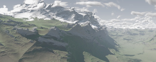
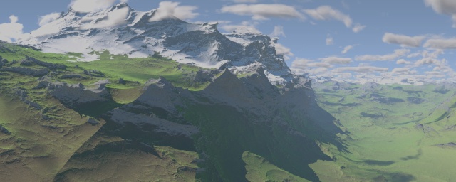
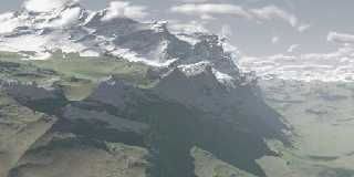
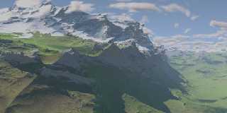
You mean 96% or 96/255? I've made one of each.

> 3:  Add the darkened gray copy to the original.  Well.. use A(1-B)+B
> formula.

Unfortunately photoshop doesn't use blends like "Add", let alone A(1-B)+B.
So I've had to use a multiply layer using the inverse of the greyscale (PS
doesn't seem to have an invert option so I did a difference with white),
with a "screen" layer that roughly looks additive.

> I'm curious to see the results.

What were you hoping it would look like? All you've done is effectively
desaturate the brighter bits, which looks pretty dull.

--
Tek
http://evilsuperbrain.com
Post a reply to this message
Attachments:
Download 'waves_of_stone_96percent.jpg' (61 KB)
Download 'waves_of_stone_96of255.jpg' (62 KB)
Preview of image 'waves_of_stone_96percent.jpg'
Preview of image 'waves_of_stone_96of255.jpg'
|
|
| |
| |
|
|
|
|
| |
| |
|
|
"Tek" <tek### [at] evilsuperbraincom> wrote:

> I feel kinda dirty fixing contrast in photoshop rather than by tweaking
> lighting!
>

LOL!  A "pure" POV-Ray cleansing or two will make you feel much better.  :-p

Ken
Post a reply to this message
|
|
| |
| |
|
|
|
|
| |
| |
|
|
Tek wrote:
> Well, I got bored. So last night I decided to see what my waves looked like
> if I stuck a nice landscape texture on them!
>
Well, besides the evocative title it made me think of this:

I was visiting my mother over the holiday and as can happen on such
visits I passed some time actually looking at the various large coffee
table books collected over the years.  I was looking at one called,
"National Geographic, The Pictures" (or similar)  There was a series of
pictures from the Canadian Arctic of, I think, wolves.  The animals were
great but what fascinated me even more was the very stange rock
forms/textures in the background.  Your render reminds me to consider
just how strange rocks can be.
Post a reply to this message
|
|
| |
| |
|
|
|
|
| |
| |
|
|
Wow!
Ready for your snowboard?
;-)
Paolo

> "Tek" <tek### [at] evilsuperbraincom> wrote:
> Well, I got bored. So last night I decided to see what my waves looked
like
> if I stuck a nice landscape texture on them!
>
> The waves are about 50% taller than in my ocean scene, and the camera's
much
> closer to them. The cool looking grass texture uses megapovs aoi pattern
to
> do a kind of fur/velvet shader thing. The grass/rock pattern is controlled
> by the same pattern as the foam in the original scene (with rock where the
> foam was), plus a slope factor to prevent grass on the steepest hills.
> Snow's controlled by a turbulent gradient with a slope factor. Clouds are
> just simple media with density based on granite with turbulence, the sky
> colour comes from fog.
>
> Not bad for only a couple of hours work :)
> --
> Tek
> http://evilsuperbrain.com
>
>
>
Post a reply to this message
|
|
| |
| |
|
|
|
|
| |
| |
|
|
"Tek" <tek### [at] evilsuperbraincom> wrote in message
news:4569a5e1@news.povray.org...
> "EagleSun" <nomail@nomail> wrote in message
> news:web.45691190ec7b76a47d94a1ae0@news.povray.org...
>> ok.. for testing your photoshop.. try this........
>>
>> 1:  Make a copy of this and convert it to grayscale.
>>
>> 2:  Then with your gray copy, darken it, so that the maximum highlight
>> value
>> is say... 96.
>
> You mean 96% or 96/255? I've made one of each.

Yeah, I mean 96/255...

>
>> 3:  Add the darkened gray copy to the original.  Well.. use A(1-B)+B
>> formula.
>
> Unfortunately photoshop doesn't use blends like "Add", let alone A(1-B)+B.
> So I've had to use a multiply layer using the inverse of the greyscale (PS
> doesn't seem to have an invert option so I did a difference with white),
> with a "screen" layer that roughly looks additive.

Nice trick...

>
>> I'm curious to see the results.
>
> What were you hoping it would look like? All you've done is effectively
> desaturate the brighter bits, which looks pretty dull.
>

Oh well... sometimes it works, sometimes not...  I did the same with an
over-colored old image of Saturn, results looked quite recent, which kinda
looked more realistic.  But sometimes it takes away from artistic effects.
Post a reply to this message
|
|
| |
| |
|
|
|
|
| |