|
|
|
|
|
|
| |
| |
|
|
|
|
| |
| |
|
|
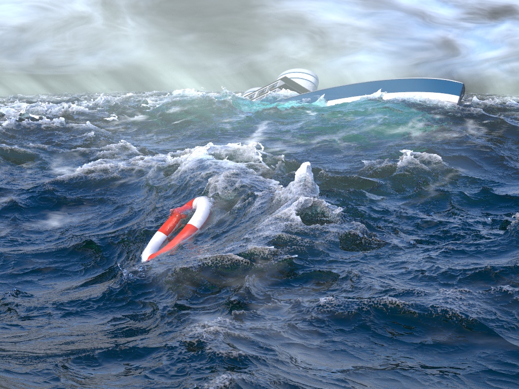
Well in light of the recently announced IRTC topic "Complexity" I figure a
multi-fractal based water effect is fairly on topic (perhaps?). So I've
adapted this to be a more dramatic image.

Changes: I've moved the ship further away and smashed it's windows, there's
some nice media to fogging and mist from the waves, and some general
tweaking of the overall colours in the scene.

Also, since it's been requested, I've posted the source in p.b.s-f. Enjoy!

I think it's basically finished!

What do you think?
--
Tek
http://evilsuperbrain.com
Post a reply to this message
Attachments:
Download 'ridgedmf.jpg' (371 KB)
Preview of image 'ridgedmf.jpg'
|
|
| |
| |
|
|
|
|
| |
| |
|
|
you're water is truly amazing, but the ship, imho, needs a little bit of work.
Or at least make each window cracked in a different way :) right now it looks
like some kind of logo :)

cu!
--
#macro G(b,e)b+(e-b)*C/50#end#macro _(b,e,k,l)#local C=0;#while(C<50)
sphere{G(b,e)+3*z.1pigment{rgb G(k,l)}finish{ambient 1}}#local C=C+1;
#end#end _(y-x,y,x,x+y)_(y,-x-y,x+y,y)_(-x-y,-y,y,y+z)_(-y,y,y+z,x+y)
_(0x+y.5+y/2x)_(0x-y.5+y/2x)            // ZK http://www.povplace.com
Post a reply to this message
|
|
| |
| |
|
|
|
|
| |
| |
|
|
It's dramatic to be sure!

It mostly looks really good. Only... the water doesn't quite loose
"right" Can't put my finger on why... Too opaque? Not reflective enough?
I don't know.

Other than that, it's a pretty good image!
Post a reply to this message
|
|
| |
| |
|
|
|
|
| |
| |
|
|
Doh! Thanks for pointing that out, there's a typo in my code so I was
resetting a random seed for each window!
--
Tek
http://evilsuperbrain.com
"Zeger Knaepen" <zeg### [at] povplace com> wrote in message
news:45576a5f$1@news.povray.org...
> you're water is truly amazing, but the ship, imho, needs a little bit of
> work. Or at least make each window cracked in a different way :) right now
> it looks like some kind of logo :)
>
> cu!
> --
> #macro G(b,e)b+(e-b)*C/50#end#macro _(b,e,k,l)#local C=0;#while(C<50)
> sphere{G(b,e)+3*z.1pigment{rgb G(k,l)}finish{ambient 1}}#local C=C+1;
> #end#end _(y-x,y,x,x+y)_(y,-x-y,x+y,y)_(-x-y,-y,y,y+z)_(-y,y,y+z,x+y)
> _(0x+y.5+y/2x)_(0x-y.5+y/2x) // ZK http://www.povplace.com
>
> com> wrote in message
news:45576a5f$1@news.povray.org...
> you're water is truly amazing, but the ship, imho, needs a little bit of
> work. Or at least make each window cracked in a different way :) right now
> it looks like some kind of logo :)
>
> cu!
> --
> #macro G(b,e)b+(e-b)*C/50#end#macro _(b,e,k,l)#local C=0;#while(C<50)
> sphere{G(b,e)+3*z.1pigment{rgb G(k,l)}finish{ambient 1}}#local C=C+1;
> #end#end _(y-x,y,x,x+y)_(y,-x-y,x+y,y)_(-x-y,-y,y,y+z)_(-y,y,y+z,x+y)
> _(0x+y.5+y/2x)_(0x-y.5+y/2x) // ZK http://www.povplace.com
>
>
Post a reply to this message
|
|
| |
| |
|
|
|
|
| |
| |
|
|
It might be that the water's too blue, I've faked the sky to be blue
overhead with only clouds at the horizon, to make the water reflect more
blue than it would on a cloudy day. That was just an attempt to make the
water look more like you'd expect, rather than realistic...

I'll do a test render without this trickery (though it looks far too grey in
the low-res preview).

--
Tek
http://evilsuperbrain.com

"Orchid XP v3" <voi### [at] devnull> wrote in message
news:45576b1b$1@news.povray.org...
> It's dramatic to be sure!
>
> It mostly looks really good. Only... the water doesn't quite loose "right"
> Can't put my finger on why... Too opaque? Not reflective enough? I don't
> know.
>
> Other than that, it's a pretty good image!
Post a reply to this message
|
|
| |
| |
|
|
|
|
| |
| |
|
|
Overall Tek, that is a nice image. :o)  But, the one thing that stands out
to me is that straight line on the high crest in (almost) the centre of the
image. Could you not move the life bouy over to the crest to hide it, and
kind of have it being swept upwards?

    If you've cracked the sea, then you'll have plenty of time to sort that
ship out.  ;)

    ~Steve~
Post a reply to this message
|
|
| |
| |
|
|
|
|
| |
| |
|
|
Tek wrote:
> It might be that the water's too blue, I've faked the sky to be blue
> overhead with only clouds at the horizon, to make the water reflect more
> blue than it would on a cloudy day. That was just an attempt to make the
> water look more like you'd expect, rather than realistic...
>
> I'll do a test render without this trickery (though it looks far too grey in
> the low-res preview).
>
I think it is not just about what is expected.  There is an emotive
juxtaposition.  The water is beautiful with clear, aqua, tints
attractive to the eye, but still, it is utterly indifferent to the
sinking boat it envelops,...envelops with barely a shrug.  A hueless,
pasty countenance for the water would produce a different result.
Repellent, awful, opaque.  You would need a greater sense of mayhem and
drama surrounding the boat as it goes under.  Right now the waves are
like the claws of a beautiful cat when it suddenly betrays its feral nature.

You picture is an astounding technical advance, in direct line from that
original piece by Alberto, that showed us the astonishing potential of
isosurfaces.  But there is something to your title too.  You signal
"artistic", probably in the sense of "stylized".  And I think it is
true.  Stylizations, are always to some degree, a meditation on the
effect of stylization.  Van Gogh paintings for instance.

I have always loved marine paintings, and I never cared a hoot about the
boat.  The boat is rarely more than an excuse to do water.  And how a
particular painter stylized his water is always the fascinating thing.
For a stylization it must be, because water is never still for even a
moment.  Even the airborne, gobbing, foam caught in a stop-action photo
of a crashing wave is not water as the human eye sees it.  So an artist
must sneak up on the reality of water.  It is often a matter of focusing
on one of the aspects of water, perhaps its solidity is emphasized, or
its transparency, its power, its motion, or its turbulence.  Often there
is an attempt to understand its turbulent mayhem according to more
regular patterns. The focus on one representative aspect of the subject
allows for coherency and homogeneity within the limits of the technique
used. If this one aspect is observed and translated correctly the
portrayal is believed.  Necessarily these attempts push the limits of
the available tool.  Painters employ the effects of paint application:
measured strokes of brush, impastoed workings of the knife, delicately
laid in tints, splatters, or wiped back effects of the rag.  With water,
tromp l'oeil is really not possible, (except perhaps with animation,)
for a still picture of water is automatically artificial.  With the
painting of water we have always accepted the role of stylization, in
the sense of a knowing exploitation of paint application, together with
the judicious focusing of observation, in the artist's attempt to sneak
up on realism.

Raytracing, has been dominated by the technical hunt. It is a hunt based
in the paradigm of the subject-first-modeled-then-viewed, and it has
mostly allowed stylization only where the separation from realism is
clear and safe. It is acceptable, for instance, with animated cartoons,
which emphasize gesture, or perhaps with alien landscapes or beast-like
figures, where what is "real" is a hybrid fantasy anyway.  Your picture
approaches a queasier area where tromp l'oeil results are sometimes
possible.  A liquid surface rippled by concentric, even interfering,
sine waves can be modeled directly, while the turbulated patterns of
tree bark can only be simulated.  Simulated closely, albeit, close
enough for tromp l'oeil even, but within the result there lurks the
conceptual tripwire that it is not exact, that what we relegate to
randomness may yet be a form we do not recognize.

Your portrayal of water, here, flirts with a difficult progression.  The
transparency has a tromp l'oeil result. Same with the fractal peaking of
wavelets and dissolving foam textures especially in select areas. The
longer roll of crests and troughs is believable.  But the steepening
crests topped with foam are a harder sell. And yet they are the main
attraction.  They are also the most difficult to observe and remember
from real experience.  They have a conceptual presence in our minds
which can be quite tangible but which may differ markedly from their
appearance in reality.  The reality is motion, not stopped motion.
Steep waves "heave", "build", "boil", "churn", "break", "pitch", "roll",
"burst", "topple", etc. The look of this as stopped action is a
construct.  Your picture asks us to suspend our personal concepts, and
accept your synthesis of how this might look.  We must abandon the hope
of complete illusion while integrating its partial successes with the
more speculative parts of you synthesis. Is this the new "stylized"?
Can we accept the "artistic" outcome even as we relish the technical
underpinnings.  Can we make the small step which substitutes fractal for
wave, and enjoy the real illusion of transparent liquid, even as we are
aware that we are doing both?  I think I can.
Post a reply to this message
|
|
| |
| |
|
|
From: Tor Olav Kristensen
Subject: Re: artistic water final - IRTC WIP
Date: 12 Nov 2006 18:44:47
Message: <4557b1ef@news.povray.org>
|
|
|
| |
| |
|
|
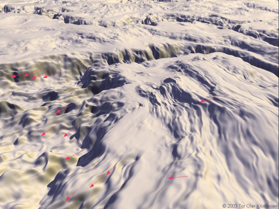
St. wrote:
>   Overall Tek, that is a nice image. :o)  But, the one thing that stands out
> to me is that straight line on the high crest in (almost) the centre of the
> image.
...

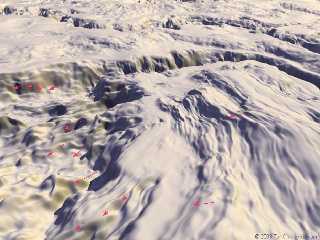
As many has said before me: The sea is great !

But I was about to comment on the same as Steve mentions above.

Similar annoying lines have appeared in several of my isosurface
images too.

In the attached image, some of these lines are marked with arrows.

I have a suspicion that this may be caused by a defect in one of
POV-Ray's noise generators.

--
Tor Olav
http://subcube.com
Post a reply to this message
Attachments:
Download 'isosurface_terrain_lines.jpg' (152 KB)
Preview of image 'isosurface_terrain_lines.jpg'
|
|
| |
| |
|
|
|
|
| |
| |
|
|
"Tor Olav Kristensen" <tor### [at] TOBEREMOVEDgmailcom> wrote in message
news:4557b1ef@news.povray.org...
> I have a suspicion that this may be caused by a defect in one of
> POV-Ray's noise generators.

Your ones might be, but mine are just the "ridges" in the "ridged" mf. They
look fine when they occur on the smoother parts of the ocean, in fact they
look great, but foam shouldn't be able to have sharp edges.

I can't really think of a way to smooth off ridges in a ridged fractal, so
I'll just try to cover it up with some mist/spray effects!

--
Tek
http://evilsuperbrain.com
Post a reply to this message
|
|
| |
| |
|
|
|
|
| |
| |
|
|
That's a thoughtful analysis, Jim. Thank you.

I suppose that all this is the reason why, when I saw this last image by
Tek, I was immediately reminded of Hokusai's Big Wave, or some marines from
the 17th/18th century.

Thomas
Post a reply to this message
|
|
| |
| |
|
|
|
|
| |
| |
|
|
There was a request earlier to put the Niagara into Tek's wonderful water.
The Niagara, unfortunatley is in the dry dock, undergoing some major
refitting and overhauling to the hull. However, one of the ship's boats was
available. Unfortunately, it does not look like it was up to the crossing
and is foundering in the storm.

Tek - I love your "artistic" water. It gives a sense of drama and emotion
that I have not seen in any other POV water. You can bet tht I will be
tinkering with the code to see how I could possibly use it in my own work.

Tim
Post a reply to this message
Attachments:
Download 'tek_test.jpg' (152 KB)
Preview of image 'tek_test.jpg'

|
|
| |
| |
|
|
|
|
| |
| |
|
|
"Tek" <tek### [at] evilsuperbraincom> wrote:
> Well in light of the recently announced IRTC topic "Complexity" I figure a
> multi-fractal based water effect is fairly on topic (perhaps?). So I've
> adapted this to be a more dramatic image.
>
> Changes: I've moved the ship further away and smashed it's windows, there's
> some nice media to fogging and mist from the waves, and some general
> tweaking of the overall colours in the scene.
>
> Also, since it's been requested, I've posted the source in p.b.s-f. Enjoy!
>
> I think it's basically finished!
>
> What do you think?
> --
> Tek
> http://evilsuperbrain.com

Really NICE!

I think you should add a person struggling to reach the life ring, to add
with the sinking ship... then it will take the cake on emotion.
Post a reply to this message
|
|
| |
| |
|
|
|
|
| |
| |
|
|
Awesome. I think your materials need to be tweaked to suit my lighting, but
that still looks pretty cool! :)

--
Tek
http://evilsuperbrain.com

"Tim McMurdo" <jod### [at] wohrrcom> wrote in message
news:web.4558759a7adb74e7acb32c570@news.povray.org...
> There was a request earlier to put the Niagara into Tek's wonderful water.
> The Niagara, unfortunatley is in the dry dock, undergoing some major
> refitting and overhauling to the hull. However, one of the ship's boats
> was
> available. Unfortunately, it does not look like it was up to the crossing
> and is foundering in the storm.
>
> Tek - I love your "artistic" water. It gives a sense of drama and emotion
> that I have not seen in any other POV water. You can bet tht I will be
> tinkering with the code to see how I could possibly use it in my own work.
>
> Tim
>
>
Post a reply to this message
|
|
| |
| |
|
|
|
|
| |
| |
|
|
Yeah but at the moment it's all one self-enclosed pov scene, and people are
bloody hard to do in pure pov! I don't want to go bloating it with huge
meshes, because I want to be able to distribute full source.

--
Tek
http://evilsuperbrain.com

"EagleSun" <nomail@nomail> wrote in message
news:web.45587f9a7adb74e7841337530@news.povray.org...
> "Tek" <tek### [at] evilsuperbraincom> wrote:
>> Well in light of the recently announced IRTC topic "Complexity" I figure
>> a
>> multi-fractal based water effect is fairly on topic (perhaps?). So I've
>> adapted this to be a more dramatic image.
>>
>> Changes: I've moved the ship further away and smashed it's windows,
>> there's
>> some nice media to fogging and mist from the waves, and some general
>> tweaking of the overall colours in the scene.
>>
>> Also, since it's been requested, I've posted the source in p.b.s-f.
>> Enjoy!
>>
>> I think it's basically finished!
>>
>> What do you think?
>> --
>> Tek
>> http://evilsuperbrain.com
>
> Really NICE!
>
> I think you should add a person struggling to reach the life ring, to add
> with the sinking ship... then it will take the cake on emotion.
>
>
Post a reply to this message
|
|
| |
| |
|
|
From: Tek
Subject: Re: artistic water final - IRTC WIP - Bigger boat test
Date: 13 Nov 2006 09:42:33
Message: <45588459@news.povray.org>
|
|
|
| |
| |
|
|
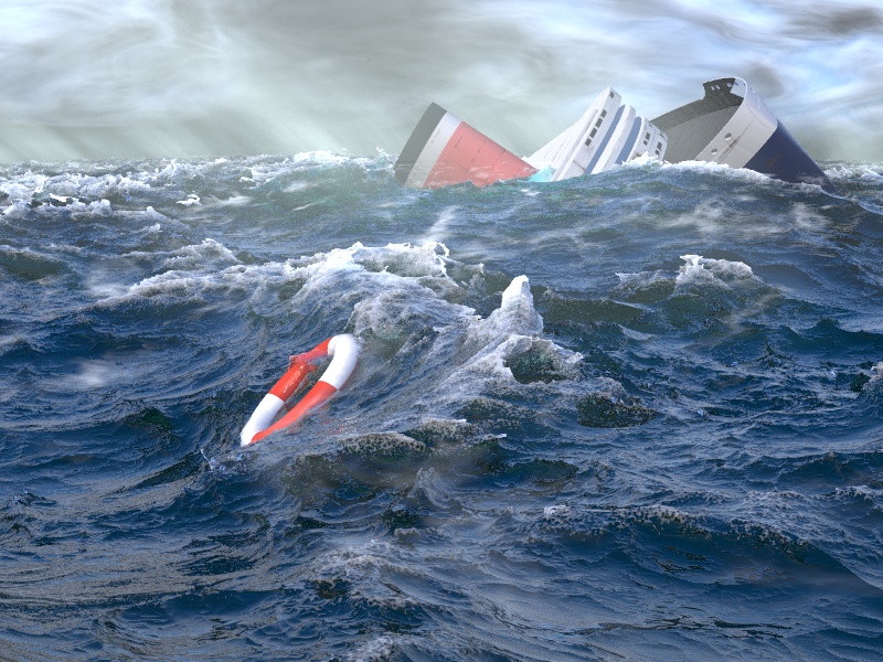
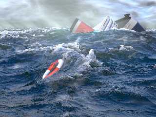
Alright I've been messing around with a different boat that I built (this
time I actually looked at photos of real boats!). I figured out the problem
with the old one was very inconsistent styling, it had the smoke stacks of a
huge ocean liner, but the scale of the windows was more that of a luxury
yacht, giving the overall effect of a cute kids toy.

Now, the scale of this big one is a bit off, because from this angle a boat
that's to scale would be beyond the crest of the furthest visible waves, or
would be so close it completely filled the screen, so I've used a bit of
"forced perspective" so we still get to see it interacting with some waves.

I couldn't really tell from my preview renders last night, but now this high
quality one's finished I can see that the scale is too obviously wrong, and
also a large scale disaster should have more debris than just one life
ring... annoying!

So, I'm gonna have another bash at it, with some kind of luxury yacht or
something. After all this huge ship only took an hour to model :)
--
Tek
http://evilsuperbrain.com

"Tek" <tek### [at] evilsuperbraincom> wrote in message
news:45574a89@news.povray.org...
> Well in light of the recently announced IRTC topic "Complexity" I figure a
> multi-fractal based water effect is fairly on topic (perhaps?). So I've
> adapted this to be a more dramatic image.
>
> Changes: I've moved the ship further away and smashed it's windows,
> there's
> some nice media to fogging and mist from the waves, and some general
> tweaking of the overall colours in the scene.
>
> Also, since it's been requested, I've posted the source in p.b.s-f. Enjoy!
>
> I think it's basically finished!
>
> What do you think?
> --
> Tek
> http://evilsuperbrain.com
>
>
>
Post a reply to this message
Attachments:
Download 'ridgedmf.jpg' (236 KB)
Preview of image 'ridgedmf.jpg'
|
|
| |
| |
|
|
|
|
| |
| |
|
|
Tek,

I won't bother making any changes, I don't want to be a distraction to what
you are trying to do. I like the direction you are going and am very
excited to see your final image.

One thought though...do you need a boat/ship at all? You might have a very
powerful image on your hands with just the life ring.

Either way, this is fantastic work on your part. You certainly are inspiring
me.

Tim

"Tek" <tek### [at] evilsuperbraincom> wrote:
> Awesome. I think your materials need to be tweaked to suit my lighting, but
> that still looks pretty cool! :)
>
> --
> Tek
> http://evilsuperbrain.com
>
Post a reply to this message
|
|
| |
| |
|
|
|
|
| |
| |
|
|
"Tim McMurdo" <jod### [at] wohrrcom> wrote in message
news:web.45589a247adb74e7acb32c570@news.povray.org...
> One thought though...do you need a boat/ship at all? You might have a very
> powerful image on your hands with just the life ring.

Interesting thought, though I started without a boat and it looked a bit
empty. Plus I want something to show off the underwater shading so I need
something there...

--
Tek
http://evilsuperbrain.com
Post a reply to this message
|
|
| |
| |
|
|
|
|
| |
| |
|
|
Tek wrote:
>
> Interesting thought, though I started without a boat and it looked a bit
> empty. Plus I want something to show off the underwater shading so I need
> something there...
>

A shark and a red underwater "cloud"? :)

--
Eero "Aero" Ahonen
   http://www.zbxt.net
      aer### [at] removethiszbxtnetinvalid
Post a reply to this message
|
|
| |
| |
|
|
|
|
| |
| |
|
|
"Tek" <tek### [at] evilsuperbraincom> wrote:
> Well in light of the recently announced IRTC topic "Complexity" I figure a
> multi-fractal based water effect is fairly on topic (perhaps?). So I've
> adapted this to be a more dramatic image.
>
> Changes: I've moved the ship further away and smashed it's windows, there's
> some nice media to fogging and mist from the waves, and some general
> tweaking of the overall colours in the scene.
>
> Also, since it's been requested, I've posted the source in p.b.s-f. Enjoy!
>
> I think it's basically finished!
>
> What do you think?
> --
> Tek
> http://evilsuperbrain.com

This is extremely fine-looking water; as Jim Charter mentioned, it makes one
(well, me, at least) question my own recollections of the ocean and waves,
and it provides an artistic rather than photographic interpretation
(although the realism is very good too). It made me think of Hokusai's 'Big
Wave' as well. Incredible. Also generous of you to provide the code--
thanks!

If I could offer any suggestion, it would be that the clouds should have the
same sort of complexity at several scales that the water does. I know this
is pretty difficult, though. I also think the boat detracts, because it's
so much simpler than the water. Maybe another organic object as well, like
a jellyfish, feather, bit of wood, etc...

-Stefan
Post a reply to this message
|
|
| |
| |
|
|
|
|
| |
| |
|
|
I agree with you on both points. The clouds & boat do look too simple by
comparison. The problem is that the scene's a bit dull without them...
although I suppose I could shift the camera angle... ooh now you've given me
an interesting idea! An overhead view (so you don't see the clouds) with the
boat fully submerged below the life ring (so the refraction through the
waves hides the crappiness of it's appearance).

Though right now I'm rendering the same image as before but with a fairly
detailed trawler-style boat. Anyway if that still looks a bit wrong I'll try
that new idea you just inspired!

Thanks :)
--
Tek
http://evilsuperbrain.com

"Smws" <smw### [at] poboxcom> wrote in message
news:web.45593c137adb74e745b35da20@news.povray.org...
> "Tek" <tek### [at] evilsuperbraincom> wrote:
>> Well in light of the recently announced IRTC topic "Complexity" I figure
>> a
>> multi-fractal based water effect is fairly on topic (perhaps?). So I've
>> adapted this to be a more dramatic image.
>>
>> Changes: I've moved the ship further away and smashed it's windows,
>> there's
>> some nice media to fogging and mist from the waves, and some general
>> tweaking of the overall colours in the scene.
>>
>> Also, since it's been requested, I've posted the source in p.b.s-f.
>> Enjoy!
>>
>> I think it's basically finished!
>>
>> What do you think?
>> --
>> Tek
>> http://evilsuperbrain.com
>
> This is extremely fine-looking water; as Jim Charter mentioned, it makes
> one
> (well, me, at least) question my own recollections of the ocean and waves,
> and it provides an artistic rather than photographic interpretation
> (although the realism is very good too). It made me think of Hokusai's
> 'Big
> Wave' as well. Incredible. Also generous of you to provide the code--
> thanks!
>
> If I could offer any suggestion, it would be that the clouds should have
> the
> same sort of complexity at several scales that the water does. I know this
> is pretty difficult, though. I also think the boat detracts, because it's
> so much simpler than the water. Maybe another organic object as well, like
> a jellyfish, feather, bit of wood, etc...
>
> -Stefan
>
>
Post a reply to this message
|
|
| |
| |
|
|
|
|
| |
| |
|
|
Thomas de Groot wrote:
> That's a thoughtful analysis, Jim. Thank you.
>
> I suppose that all this is the reason why, when I saw this last image by
> Tek, I was immediately reminded of Hokusai's Big Wave, or some marines from
> the 17th/18th century.
>

In fact, as soon as I read the title, and before I opened the image, I
remembered this one:
http://www.irtc.org/ftp/pub/stills/2000-08-31/dmwave.jpg


But yes, the portrayal of water might be a fascinating subplot to the
history of art, but I have never come across such a treatment.  I wonder
what Gombrich might have said about it.

Also there are pictures like this that I grew up with and loved:
http://www.ago.net/www/picture.three/harris.jpg
http://tinyurl.com/ylzcm6
Post a reply to this message
|
|
| |
| |
|
|
|
|
| |
| |
|
|
"Tek" <tek### [at] evilsuperbraincom> wrote:
>
>
> ...but foam shouldn't be able to have sharp edges.
>
> I can't really think of a way to smooth off ridges in a ridged fractal, so
> I'll just try to cover it up with some mist/spray effects!
>

I'm just enthralled with your water.  It is *so* inspiring, and presents (to
me) a *new level* of the power of POV-Ray.

I've been doing a great deal of isosurface experimentation lately, learning
lots of new things, and there might be a way to alter those crests. The idea
involves "fading" one isosurface function into another, over a certain
distance.

What I'm thinking is this:
Fading in an f_noise3d function in the +y-direction, somewhere near the top
of the crests--to actually break them up with "bits" of tiny noise blobs, to
simulate spray. I *think* (but am not sure) that your water-wave function(s)
could be used IN the noise function, to actually vary the height at which
the noise comes into play (so that the noise doesn't just show up at a set
y-height.) I've gotten this trick to work on some isosurfaces of my
own...though not of the complexity of your waves.

My ideas are a bit tricky mathematically...and difficult to explain...but I
now have a methodology of sorts that seems to work, and that "makes sense"
to me.

I'll definitely take a look at your code--which I'm absolutely overjoyed
that you've posted--and see if I can do what I've mentioned. If successful,
I'll post an image.

Meanwhile, I'll work up a simple --VERY simple!--demonstration code example
(or two) and post it here.

Ken W.
Post a reply to this message
|
|
| |
| |
|
|
|
|
| |
| |
|
|
I had a similar idea, but the trouble is to fade in a different isosurface
on the foamy sections you need to know where those foamy sections are, i.e.
you need to modulate it by the wave function, and a smooth function
modulated by a function with hard edges is going to have hard edges. As far
as I can see this paradox is inescapable.

--
Tek
http://evilsuperbrain.com

"Kenneth" <kdw### [at] earthlinknet> wrote in message
news:web.455d57fe7adb74e76135df7c0@news.povray.org...
> "Tek" <tek### [at] evilsuperbraincom> wrote:
>>
>>
>> ...but foam shouldn't be able to have sharp edges.
>>
>> I can't really think of a way to smooth off ridges in a ridged fractal,
>> so
>> I'll just try to cover it up with some mist/spray effects!
>>
>
> I'm just enthralled with your water.  It is *so* inspiring, and presents
> (to
> me) a *new level* of the power of POV-Ray.
>
> I've been doing a great deal of isosurface experimentation lately,
> learning
> lots of new things, and there might be a way to alter those crests. The
> idea
> involves "fading" one isosurface function into another, over a certain
> distance.
>
> What I'm thinking is this:
> Fading in an f_noise3d function in the +y-direction, somewhere near the
> top
> of the crests--to actually break them up with "bits" of tiny noise blobs,
> to
> simulate spray. I *think* (but am not sure) that your water-wave
> function(s)
> could be used IN the noise function, to actually vary the height at which
> the noise comes into play (so that the noise doesn't just show up at a set
> y-height.) I've gotten this trick to work on some isosurfaces of my
> own...though not of the complexity of your waves.
>
> My ideas are a bit tricky mathematically...and difficult to explain...but
> I
> now have a methodology of sorts that seems to work, and that "makes sense"
> to me.
>
> I'll definitely take a look at your code--which I'm absolutely overjoyed
> that you've posted--and see if I can do what I've mentioned. If
> successful,
> I'll post an image.
>
> Meanwhile, I'll work up a simple --VERY simple!--demonstration code
> example
> (or two) and post it here.
>
> Ken W.
>
>
>
>
>
Post a reply to this message
|
|
| |
| |
|
|
|
|
| |
| |
|
|
Jim Charter <jrc### [at] msncom> wrote:

> But yes, the portrayal of water might be a fascinating subplot to the
> history of art, but I have never come across such a treatment.  I wonder
> what Gombrich might have said about it.
>


I saw a video by Neil MacGregor, then the director of the National Gallery,
where he discussed this briefly. IIRC water was a difficult subject before
the use of oils. When tempera was used artists could not get the
transparency needed. Maybe water is too dificult to paint to have much of a
history.
Some of the best seascapes I’ve seen were by L S Lowry (pictures of
matchstick men)


Stephen
Post a reply to this message
|
|
| |
| |
|
|
|
|
| |
| |
|
|
Wasn't it Tek who wrote:
>I had a similar idea, but the trouble is to fade in a different isosurface
>on the foamy sections you need to know where those foamy sections are, i.e.
>you need to modulate it by the wave function

It's not quite as complicated as that because your wave function
modulates the height, so you just need your blending function to be a
function of height. It doesn't need to know where the height comes from.

I quickly threw together this proof-of-concept. The actual functions I
use here are pretty naff, they just demonstrate a mechanism.

#version 3.6;
global_settings {assumed_gamma 1.0}
camera {location  <0,5,-10> look_at <0,0,0> angle 40}
background {rgb 1}
light_source {<-30, 100, -30> color rgb 1}
#include "functions.inc"


#declare WAVE = function {f_bozo(x,0,z)*2 +y -0.5}
#declare FOAM = function {f_bozo(x*10,y*10,z*10)-0.5}

#declare BLEND = function {
  WAVE(x,y,z) -
  FOAM(x,y,z) * (atan(y*20)+pi/2) *0.35
}

isosurface {
  function { BLEND(x,y,z) }
        max_gradient 12
        contained_by{box{-3,3}}
        pigment { rgb <.1,.3,.6> }
}


(atan(y*20)+pi/2) goes smoothly from 0.05 to pi as y goes from -1 to +1,
so it adds more FOAM at the top of the WAVE. There are almost certainly
better functions to use.

--
Mike Williams
Gentleman of Leisure
Post a reply to this message
|
|
| |
| |
|
|
|
|
| |
| |
|
|
That's still going to suffer the same problem. I'll try to break it down for
you:

The wave function has a hard edge
so the height has a hard edge
so anything modulated by either height or the wave function will have that
hard edge

And, as an aside, my wave function isn't actually a height function, it has
some overlaps.

--
Tek
http://evilsuperbrain.com

"Mike Williams" <nos### [at] econymdemoncouk> wrote in message
news:Iv3RkEA$IYXFFwU$@econym.demon.co.uk...
> Wasn't it Tek who wrote:
>>I had a similar idea, but the trouble is to fade in a different isosurface
>>on the foamy sections you need to know where those foamy sections are,
>>i.e.
>>you need to modulate it by the wave function
>
> It's not quite as complicated as that because your wave function
> modulates the height, so you just need your blending function to be a
> function of height. It doesn't need to know where the height comes from.
>
> I quickly threw together this proof-of-concept. The actual functions I
> use here are pretty naff, they just demonstrate a mechanism.
>
> #version 3.6;
> global_settings {assumed_gamma 1.0}
> camera {location  <0,5,-10> look_at <0,0,0> angle 40}
> background {rgb 1}
> light_source {<-30, 100, -30> color rgb 1}
> #include "functions.inc"
>
>
> #declare WAVE = function {f_bozo(x,0,z)*2 +y -0.5}
> #declare FOAM = function {f_bozo(x*10,y*10,z*10)-0.5}
>
> #declare BLEND = function {
>  WAVE(x,y,z) -
>  FOAM(x,y,z) * (atan(y*20)+pi/2) *0.35
> }
>
> isosurface {
>  function { BLEND(x,y,z) }
>        max_gradient 12
>        contained_by{box{-3,3}}
>        pigment { rgb <.1,.3,.6> }
> }
>
>
> (atan(y*20)+pi/2) goes smoothly from 0.05 to pi as y goes from -1 to +1,
> so it adds more FOAM at the top of the WAVE. There are almost certainly
> better functions to use.
>
> --
> Mike Williams
> Gentleman of Leisure
Post a reply to this message
|
|
| |
| |
|
|
|
|
| |
| |
|
|
"Jim Charter" <jrc### [at] msncom> schreef in bericht
news:4559e4c6$1@news.povray.org...
>
> In fact, as soon as I read the title, and before I opened the image, I
> remembered this one:
> http://www.irtc.org/ftp/pub/stills/2000-08-31/dmwave.jpg
>
I totally forgot that one!!!

>
> But yes, the portrayal of water might be a fascinating subplot to the
> history of art, but I have never come across such a treatment.  I wonder
> what Gombrich might have said about it.
>
> Also there are pictures like this that I grew up with and loved:
> http://www.ago.net/www/picture.three/harris.jpg
> http://tinyurl.com/ylzcm6

Aah! Those two are beautiful! Very much my type of painting!

This: http://www.artrenewal.org/asp/database/image.asp?id=30208 is one of
the paintings I was thinking about.

Thomas
Post a reply to this message
|
|
| |
| |
|
|
|
|
| |
| |
|
|
Thomas de Groot wrote:

> Aah! Those two are beautiful! Very much my type of painting!

I always loved that the striated waves might be:
-the artifacts of his painting style of simplified solids
-waves caught in some mystic frozn moment
-waves actually frozen as ice


>
> This: http://www.artrenewal.org/asp/database/image.asp?id=30208 is one of
> the paintings I was thinking about.
>
Wow, I was dimly aware of these paintings if at all.  And so very close
to Tek's image!  Seems my blather was even closer to the target than I
realized :0
Post a reply to this message
|
|
| |
| |
|
|
|
|
| |
| |
|
|
"Jim Charter" <jrc### [at] msncom> schreef in bericht
news:455e2013$1@news.povray.org...
>>
>> This: http://www.artrenewal.org/asp/database/image.asp?id=30208 is one of
>> the paintings I was thinking about.
>>
> Wow, I was dimly aware of these paintings if at all.  And so very close to
> Tek's image!  Seems my blather was even closer to the target than I
> realized :0

Absolutely! I had this painting in the back of my mind, and when I saw it
again, I immediately thought: "Tek".
And yes, your analysis was very close to the point indeed. A great talent
you have for this (no kidding).

Thomas
Post a reply to this message
|
|
| |
| |
|
|
|
|
| |
| |
|
|
Tek wrote:
> What do you think?

  I was waiting to see if you would work more on the ship and the sky
to make them look more realistic. The water is completely superb, but
the ship and the sky are a bummer.
  I would have nominated this image for the HoF if the ship and the
sky were better.
  (Of course it's in no way up to me to decide what goes and doesn't
go there, but I would have mentioned this to the team for them to
judge.)
Post a reply to this message
|
|
| |
| |
|
|
|
|
| |
| |
|
|
"Warp" <war### [at] tagpovrayorg> schreef in bericht
news:455f228d@news.povray.org...
>
>  I was waiting to see if you would work more on the ship and the sky
> to make them look more realistic. The water is completely superb, but
> the ship and the sky are a bummer.
>  I would have nominated this image for the HoF if the ship and the
> sky were better.
>  (Of course it's in no way up to me to decide what goes and doesn't
> go there, but I would have mentioned this to the team for them to
> judge.)

I would not be surprised if Tek was coming up with something! :-)
It would certainly be eligible then.

Thomas
Post a reply to this message
|
|
| |
| |
|
|
|
|
| |
| |
|
|
"Thomas de Groot" <t.d### [at] internlnet> wrote in message
news:455f29ad$1@news.povray.org...
>
> "Warp" <war### [at] tagpovrayorg> schreef in bericht
> news:455f228d@news.povray.org...
>>
>>  I would have nominated this image for the HoF if the ship and the
>> sky were better.
>
> I would not be surprised if Tek was coming up with something! :-)
> It would certainly be eligible then.

Uh... have you guys seen my new post? (from some 3 days before your comments
here)
news:455b17c1@news.povray.org (hopefully that link might work)

It's an improved ship model, with a view which doesn't show the sky.

--
Tek
http://evilsuperbrain.com
Post a reply to this message
|
|
| |
| |
|
|
|
|
| |
| |
|
|
Tek wrote:
> Uh... have you guys seen my new post? (from some 3 days before your comments
> here)
> news:455b17c1@news.povray.org (hopefully that link might work)
>
> It's an improved ship model, with a view which doesn't show the sky.

  Doesn't show the ship either... ;)

  What little is shown from the ship looks like just 3 cylinders.
Not very impressive IMO. :P

  I like the point of view where the sky is shown. You get to see
more of the water, and an impressive-looking sky would complete the
image perfectly.
Post a reply to this message
|
|
| |
| |
|
|
|
|
| |
| |
|
|
"Kenneth" <kdw### [at] earthlinknet> wrote:
>... there might be a way to alter those crests. The idea
> involves "fading" one isosurface function into another, over a certain
> distance.
>
>... I'll work up a simple --VERY simple!--demonstration code example
> (or two) and post it here.
>


Sorry for the delay. My demo code ended up being a bit more complex than I
thought, and somewhat off-topic; so I posted it as a new thread, here...

http://news.povray.org/povray.binaries.images/thread/%3Cweb.45632ef1a91bd327dc4a63960%40news.povray.org%3E/

Ken W.
Post a reply to this message
|
|
| |
| |
|
|
|
|
| |
|
|