|
|
|
|
|
|
| |
| |
|
|
|
|
| |
| |
|
|
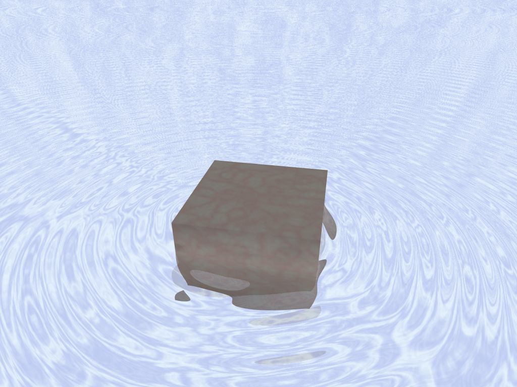
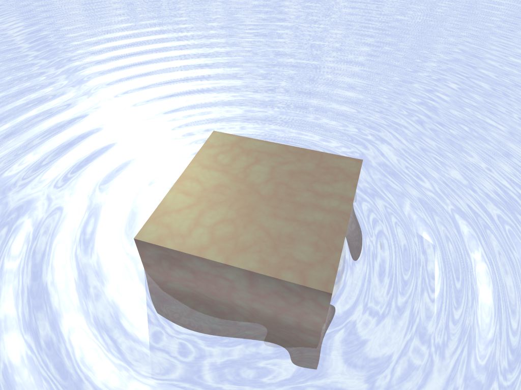
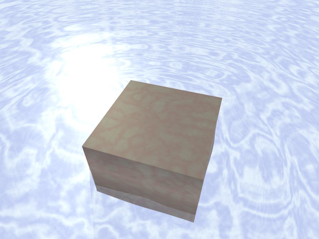
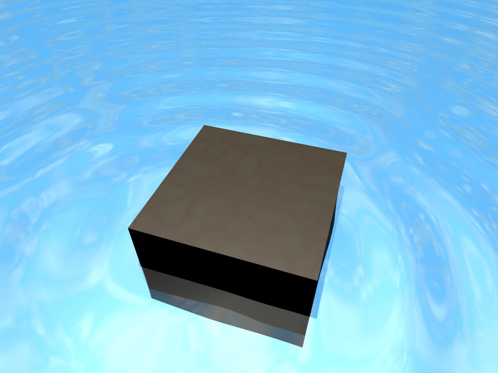
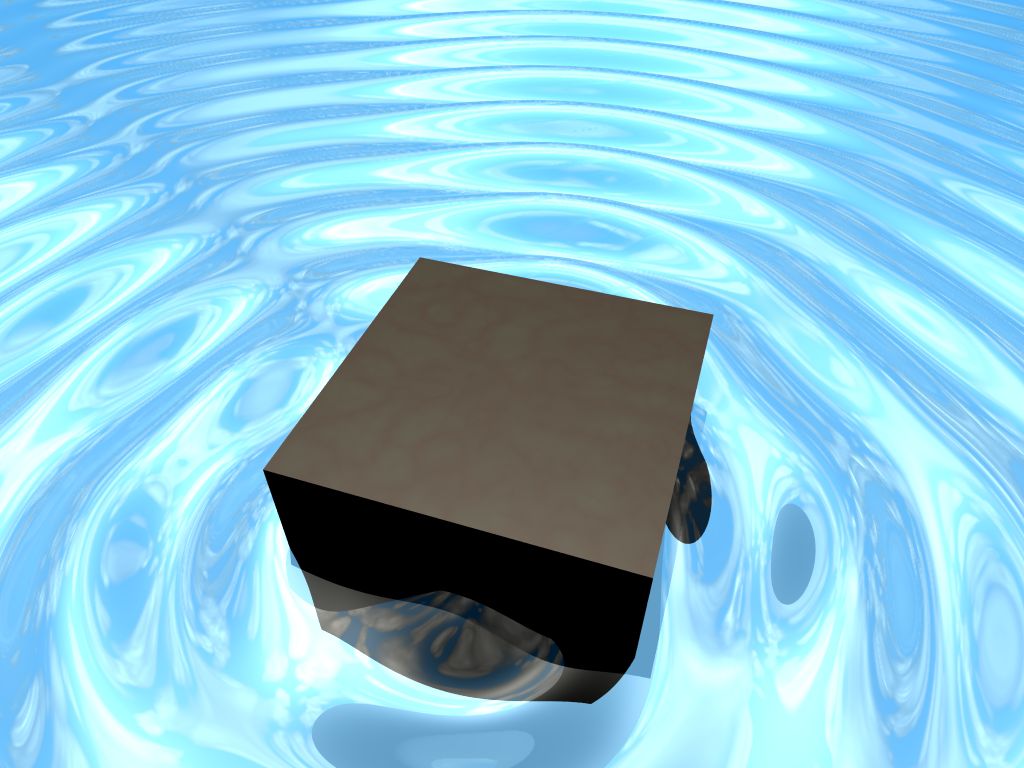
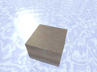
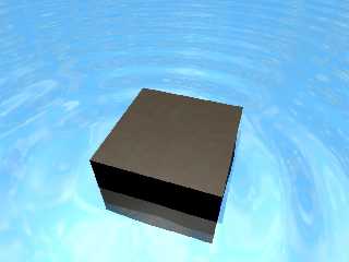
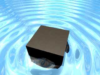
The concept was simple: a stone block sitting in a pool of rippling
water, with some assorted glassare on top.

Well, I made the pool and the stone block. But, as you can see, the
results were pittiful to say the least. (The last two even use an
extremely slow volumetric cloud algorithm - not that you can tell!)

I despare sometimes. I can't made even the simplest thing look *good*!
 >_< This just looks pathetic...

Can *anybody* tell me how to make this look cool like everybody else's
renders do??
Post a reply to this message
Attachments:
Download 'glassware01.jpg' (91 KB)
Download 'glassware02.jpg' (82 KB)
Download 'glassware03.jpg' (63 KB)
Download 'glassware05.jpg' (51 KB)
Download 'glassware06.jpg' (93 KB)
Preview of image 'glassware01.jpg'
Preview of image 'glassware02.jpg'
Preview of image 'glassware03.jpg'
Preview of image 'glassware05.jpg'
Preview of image 'glassware06.jpg'
|
|
| |
| |
|
|
|
|
| |
| |
|
|
"Orchid XP v3" <voi### [at] dev null> a écrit dans le message de news:
452791f9@news.povray.org...
>
> Can *anybody* tell me how to make this look cool like everybody else's
> renders do??
did you visit Christoph's water tutorial ?
http://www.imagico.de/pov/water/index.html
Marc null> a écrit dans le message de news:
452791f9@news.povray.org...
>
> Can *anybody* tell me how to make this look cool like everybody else's
> renders do??
did you visit Christoph's water tutorial ?
http://www.imagico.de/pov/water/index.html
Marc
Post a reply to this message
|
|
| |
| |
|
|
|
|
| |
| |
|
|
>> Can *anybody* tell me how to make this look cool like everybody else's
>> renders do??
> did you visit Christoph's water tutorial ?
> http://www.imagico.de/pov/water/index.html

No - but thanks for the link...
Post a reply to this message
|
|
| |
| |
|
|
|
|
| |
| |
|
|
Well I have a few suggestions:

1/ a perfect cube always looks very fake, use a slightly irregular shape
like a superellipsoid or isosurface

2/ it's easy to say this after the fact, but the human eye is extremely
forgiving of reflections in bumpy surfaces, so you really shouldn't worry
about making a complex sky, just something flat that has the right colours.
But it sounds like you learnt this the hard way.

3/ think about the size of the ripples regarding the scale of your scene,
these ones are huge but smooth (particularly in the last image). Smooth
usually means very small ripples, which would make the stone block about 1cm
big! I'd suggest use much much smaller ripples, so the surface is nearly
flat. if you want a dramatically wavey surface for this scale you need
something less smooth, the wrinkles pattern is sometimes pretty good for
this, or granite (inverted to make spikey waves).

4/ water material - a physically correct water is simply: pigment{rgbt
1}finish{reflection{0,1 fresnel}}interior{ior 1.33 fade_colour ...
fade_power 2 fade_distance ...}, there's a lot of tweaks you can do but that
should get you something good. Basically it's transparent, refractive, the
reflections obey fresnel so there's no need to tweak them, and if you want
to colour it you should use fade_colour not pigment because the colour
should be throughout the material not just at the surface.

5/ stone material - always reference a real material, in your present scene
I can't tell if it's meant to be a polished stone like marble, or a more
natural rough finish. A realistic rough finish is easier: just give it a
noisy normal, like normal { granite -.2 }, and no specular or phong. A
realistic smooth finish is difficult because smooth things look fake in CG,
I'd suggest choosing a stone with a very distinctive pattern, like marble or
something. And on that topic note that pov's granite pattern looks more like
marble than the marble pattern...

6/ use global_settings { assumed_gamma 1 }, it screws up all the colours in
the scene so you'll need to adjust them, but it make reflections and
lighting look more realistic.

Hope that's helpful and not patronising :)

I'd be happy to knock together an example scene of how I'd do it if you
think it would help?
--
Tek
http://evilsuperbrain.com

"Orchid XP v3" <voi### [at] devnull> wrote in message
news:452791f9@news.povray.org...
> The concept was simple: a stone block sitting in a pool of rippling
> water, with some assorted glassare on top.
>
> Well, I made the pool and the stone block. But, as you can see, the
> results were pittiful to say the least. (The last two even use an
> extremely slow volumetric cloud algorithm - not that you can tell!)
>
> I despare sometimes. I can't made even the simplest thing look *good*!
> >_< This just looks pathetic...
>
> Can *anybody* tell me how to make this look cool like everybody else's
> renders do??
>
Post a reply to this message
|
|
| |
| |
|
|
|
|
| |
| |
|
|
"Tek" <tek### [at] evilsuperbraincom> wrote in message
news:4527ad2a@news.povray.org...
> 4/ water material - a physically correct water is simply: pigment{rgbt
> 1}finish{reflection{0,1 fresnel}}interior{ior 1.33 fade_colour ...
> fade_power 2 fade_distance ...}, there's a lot of tweaks you can do but
> that should get you something good. Basically it's transparent,
> refractive, the reflections obey fresnel so there's no need to tweak them,
> and if you want to colour it you should use fade_colour not pigment
> because the colour should be throughout the material not just at the
> surface.

Doh! and of course use conserve_energy in reflections, that's vital!

--
Tek
http://evilsuperbrain.com
Post a reply to this message
|
|
| |
| |
|
|
|
|
| |
| |
|
|
> 1/ a perfect cube always looks very fake, use a slightly irregular shape
> like a superellipsoid or isosurface

Cube is a placeholder, yes. I was attempting to get the stone texture
and the water to look right first. (I intend to replace it with a
rounded cube later.)

> 2/ it's easy to say this after the fact, but the human eye is extremely
> forgiving of reflections in bumpy surfaces, so you really shouldn't worry
> about making a complex sky, just something flat that has the right colours.
> But it sounds like you learnt this the hard way.

I only used the complex volumetric sky because I already had one from
another scene that had the right colours, and I couldn't come up with a
static pigment with anything approaching the right colours.

For my trouble, I ended up with an entire scene that's bright blue. (Why
does the real world not do this BTW? The real sky is blue...)

> 3/ think about the size of the ripples regarding the scale of your scene,
> these ones are huge but smooth (particularly in the last image). Smooth
> usually means very small ripples, which would make the stone block about 1cm
> big! I'd suggest use much much smaller ripples, so the surface is nearly
> flat. if you want a dramatically wavey surface for this scale you need
> something less smooth, the wrinkles pattern is sometimes pretty good for
> this, or granite (inverted to make spikey waves).

OK. I'm currently investigating Christoph's waver macro. Seems to
produce big fractal-like waves. (I'd actually like the ripples to
radiate from the stone block and follow its shape eventually...)

> 4/ water material - a physically correct water is simply: pigment{rgbt
> 1}finish{reflection{0,1 fresnel}}interior{ior 1.33 fade_colour ...
> fade_power 2 fade_distance ...}, there's a lot of tweaks you can do but that
> should get you something good. Basically it's transparent, refractive, the
> reflections obey fresnel so there's no need to tweak them, and if you want
> to colour it you should use fade_colour not pigment because the colour
> should be throughout the material not just at the surface.

The water *itself* is a fairly simple thing, as you say. It's
transparent, refractive and reflective. So basically it doesn't look
like anything by itself... gotta have something nice to reflect.

My main problem seems to be getting a decent sky. :-S

> 5/ stone material - always reference a real material, in your present scene
> I can't tell if it's meant to be a polished stone like marble, or a more
> natural rough finish. A realistic rough finish is easier: just give it a
> noisy normal, like normal { granite -.2 }, and no specular or phong. A
> realistic smooth finish is difficult because smooth things look fake in CG,
> I'd suggest choosing a stone with a very distinctive pattern, like marble or
> something. And on that topic note that pov's granite pattern looks more like
> marble than the marble pattern...

The look I'm eventually going for is water-polished rock. Maybe
limestone or something. So I probably just need to make it look slightly
lumpy... and get better colours...

> 6/ use global_settings { assumed_gamma 1 }, it screws up all the colours in
> the scene so you'll need to adjust them, but it make reflections and
> lighting look more realistic.

I wouldn't have thought assumed_gamma 1 would have *any* effect...
surely that just means that each colour component is raised to the power
of 1 before being output?
Post a reply to this message
|
|
| |
| |
|
|
|
|
| |
| |
|
|
"Orchid XP v3" <voi### [at] devnull> wrote in message
news:4527b397$1@news.povray.org...
>
> Cube is a placeholder, yes.

Spheres usually make better placeholders when tweaking materials IMO, the
hard edges of the cube mean you don't see how it interacts with the light at
all angles, making it very hard to tune effects like specular.

> OK. I'm currently investigating Christoph's waver macro. Seems to
> produce big fractal-like waves. (I'd actually like the ripples to
> radiate from the stone block and follow its shape eventually...)

Well if you want ripples radiating from the block why are you looking at a
macro for fractal like waves?

Radiating from a block is a bit awkward, I suggest basing it on a function,
like:
normal { function { sin(8*pi*sqrt(pow(max(x-1,0),2)+pow(max(z-1,0),2))) } }
that should give nice "distance from a square" based ripples, though if you
plan on changing the shape of your stone it might not look so good.

> The water *itself* is a fairly simple thing, as you say. It's
> transparent, refractive and reflective. So basically it doesn't look
> like anything by itself... gotta have something nice to reflect.
>
> My main problem seems to be getting a decent sky. :-S

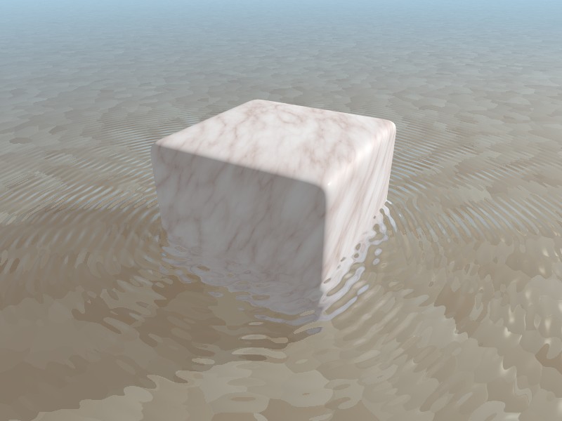
Nope I disagree, if you have a realistic water material from this angle it
would be almost completely transparent, the reflection would only show up on
the top edge of the ripples (see attached picture). What's important is the
fall-off of the reflection, which should be either reflection{.01,1 falloff
5} to fake it or reflection{0,1 fresnel} if you have a realistic ior.

> I wouldn't have thought assumed_gamma 1 would have *any* effect...
> surely that just means that each colour component is raised to the power
> of 1 before being output?

Yeah that confused the hell out of me when I first encountered it. The
simple answer is that pov knows what your display gamma is, or rather it has
a default of 2.2. If you don't say "assumed_gamma" it doesn't gamma correct
from the linear colour space of the pov scene to the non-linear gamma of the
monitor. assumed_gamma essentially tells pov what the gamma space of your
scene is, which is a very bizarre thing to do since pov does linear
calculations on light so by definition it has a gamma of 1, it's very
counter intuitive but it works!

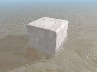
Anyway I couldn't resist the urge to have a go at a similar scene myself, so
here's a picture and the source is in p.b.s-f. Most importantly note that
the reflection on the water is very subtle, without the ripples you'd hardly
see the water surface at all.

--
Tek
http://evilsuperbrain.com
Post a reply to this message
Attachments:
Download 'rock mat test.jpg' (62 KB)
Preview of image 'rock mat test.jpg'
|
|
| |
| |
|
|
|
|
| |
| |
|
|
>> Cube is a placeholder, yes.
>
> Spheres usually make better placeholders when tweaking materials IMO, the
> hard edges of the cube mean you don't see how it interacts with the light at
> all angles, making it very hard to tune effects like specular.

I guess so...

>> OK. I'm currently investigating Christoph's waver macro. Seems to
>> produce big fractal-like waves. (I'd actually like the ripples to
>> radiate from the stone block and follow its shape eventually...)
>
> Well if you want ripples radiating from the block why are you looking at a
> macro for fractal like waves?

Because it works by placing multiple concentric rings of ripples
semi-randomly. Now if I place the centers of those ripples to coincide
with the edges of the block, the ripples will follow its outline. (This,
apparently, is how the Real World(tm) works...)

>> My main problem seems to be getting a decent sky. :-S
>
> Nope I disagree, if you have a realistic water material from this angle it
> would be almost completely transparent, the reflection would only show up on
> the top edge of the ripples (see attached picture).

Mmm, OK. In that case, my water is going to be completely black...

> What's important is the
> fall-off of the reflection, which should be either reflection{.01,1 falloff
> 5} to fake it or reflection{0,1 fresnel} if you have a realistic ior.

Is IOR=1.3 "realistic"?

>> I wouldn't have thought assumed_gamma 1 would have *any* effect...
>> surely that just means that each colour component is raised to the power
>> of 1 before being output?
>
> Yeah that confused the hell out of me when I first encountered it.

Here's a random question: does LCD require gamma correction?

> Anyway I couldn't resist the urge to have a go at a similar scene myself, so
> here's a picture and the source is in p.b.s-f. Most importantly note that
> the reflection on the water is very subtle, without the ripples you'd hardly
> see the water surface at all.

0__0

OMG... you created something 17,826% better than what I had in about 20
seconds!
Post a reply to this message
|
|
| |
| |
|
|
|
|
| |
| |
|
|
Orchid XP v3 nous apporta ses lumieres en ce 07/10/2006 11:16:
>>> Cube is a placeholder, yes.
>>
>> Spheres usually make better placeholders when tweaking materials IMO,
>> the hard edges of the cube mean you don't see how it interacts with
>> the light at all angles, making it very hard to tune effects like
>> specular.
>
> I guess so...
>
>>> OK. I'm currently investigating Christoph's waver macro. Seems to
>>> produce big fractal-like waves. (I'd actually like the ripples to
>>> radiate from the stone block and follow its shape eventually...)
>>
>> Well if you want ripples radiating from the block why are you looking
>> at a macro for fractal like waves?
>
> Because it works by placing multiple concentric rings of ripples
> semi-randomly. Now if I place the centers of those ripples to coincide
> with the edges of the block, the ripples will follow its outline. (This,
> apparently, is how the Real World(tm) works...)
>
>>> My main problem seems to be getting a decent sky. :-S
>>
>> Nope I disagree, if you have a realistic water material from this
>> angle it would be almost completely transparent, the reflection would
>> only show up on the top edge of the ripples (see attached picture).
>
> Mmm, OK. In that case, my water is going to be completely black...
>
>> What's important is the fall-off of the reflection, which should be
>> either reflection{.01,1 falloff 5} to fake it or reflection{0,1
>> fresnel} if you have a realistic ior.
>
> Is IOR=1.3 "realistic"?
It is, it's close to the real ior of water. Pure water ior is 4/3. Salt or sea
water's ior is close to 1.4.
>
>>> I wouldn't have thought assumed_gamma 1 would have *any* effect...
>>> surely that just means that each colour component is raised to the power
>>> of 1 before being output?
>>
>> Yeah that confused the hell out of me when I first encountered it.
>
> Here's a random question: does LCD require gamma correction?
>
>> Anyway I couldn't resist the urge to have a go at a similar scene
>> myself, so here's a picture and the source is in p.b.s-f. Most
>> importantly note that the reflection on the water is very subtle,
>> without the ripples you'd hardly see the water surface at all.
>
> 0__0
>
> OMG... you created something 17,826% better than what I had in about 20
> seconds!
Fade_power should be 1 to be physicaly correct. A value of 2 is perfect for a
light source, double the distance and get 1/4 the lighting, not for fading
trough some substance. Light absorbtion trough a substance is linearly
proportional to the thicknessm, double the thickness and the effect double, it
don't quadruple.
Any way, for water, fade_distance is relatively large.

--
Alain
-------------------------------------------------
No matter how good she looks, some other guy is sick and tired of putting up
with her shit.
	Men's Room, Linda's Bar and Grill, Chapel Hill , NC
Post a reply to this message
|
|
| |
| |
|
|
|
|
| |
| |
|
|
"Alain" <ele### [at] netscapenet> a écrit dans le message de news:
4527c96f$1@news.povray.org...
> Fade_power should be 1 to be physicaly correct. A value of 2 is perfect
for a
> light source, double the distance and get 1/4 the lighting, not for fading
> trough some substance. Light absorbtion trough a substance is linearly
> proportional to the thicknessm, double the thickness and the effect
double, it
> don't quadruple.
> Any way, for water, fade_distance is relatively large.
>
I don't agree about fade power in water :
daylight rays have to get twice (down and back up) through water before
reaching your eye so double the depth quadruple the thickness

Marc
Post a reply to this message
|
|
| |
| |
|
|
|
|
| |
| |
|
|
>> Fade_power should be 1 to be physicaly correct. A value of 2 is perfect
> for a
>> light source, double the distance and get 1/4 the lighting, not for fading
>> trough some substance. Light absorbtion trough a substance is linearly
>> proportional to the thicknessm, double the thickness and the effect
> double, it
>> don't quadruple.
>> Any way, for water, fade_distance is relatively large.
>>
> I don't agree about fade power in water :
> daylight rays have to get twice (down and back up) through water before
> reaching your eye so double the depth quadruple the thickness

That's still linear.

If it was quadratic, 3x the depth would be 9x the darkening. By your
reasoning, it would be 6x.

Note also that POV-Ray will see that the light passes through the water
twice and darken it twice anyway, so you only need fade_power=1...
Post a reply to this message
|
|
| |
| |
|
|
|
|
| |
| |
|
|
"Marc" <jac### [at] wanadoofr> wrote in message
news:4527d21c@news.povray.org...
> I don't agree about fade power in water :
> daylight rays have to get twice (down and back up) through water before
> reaching your eye so double the depth quadruple the thickness

I think pov will simulate that implicitly anyway, because the shadow cast by
the water onto stuff underneath tints the daylight falling on the underwater
objects, then when we look at them through the water we get more tinting.
But if we're looking at a flat coloured ambient object the amount of tinting
just depends on it's distance from us.

Also I believe the power can be between 1 & 2 for realistic effects, since
the particles of fog can occlude each other... or something. I remember
figuring all this out once but the pov docs say between 1 & 2 so I'll defer
to their judgement :)

Anyway if you want it to look totally right I suggest scattering media...

--
Tek
http://evilsuperbrain.com
Post a reply to this message
|
|
| |
| |
|
|
|
|
| |
| |
|
|
> > > I wouldn't have thought assumed_gamma 1 would have *any* effect...
> > > surely that just means that each colour component is raised to
> > > the power of 1 before being output?
> >
> > Yeah that confused the hell out of me when I first encountered it.
>
> Here's a random question: does LCD require gamma correction?

Yes, PC LCDs are designed specifically to match the response of CRTs.
Post a reply to this message
|
|
| |
| |
|
|
|
|
| |
| |
|
|
> > OMG... you created something 17,826% better than what I had in
> > about 20 seconds!
> Fade_power should be 1 to be physicaly correct. A value of 2 is
> perfect for a light source, double the distance and get 1/4 the
> lighting, not for fading trough some substance. Light absorbtion
> trough a substance is linearly proportional to the thicknessm, double
> the thickness and the effect double, it don't quadruple.

Physically correct is exponential isn't it?  ie a certain % of the light
gets attenuated each unit distance.  If a certain distance only lets 10% of
the light through, then you'd expect 1% after double the distance, 0.01%
after 4x etc.
Post a reply to this message
|
|
| |
| |
|
|
|
|
| |
| |
|
|
You are correct, but this power is applied within an exponential curve. I
think it's like exp(-x) vs exp(-pow(x,2)), IIRC. we were debating the power
part without mentioning the exp part... or at least that's what I think was
being discussed!

--
Tek
http://evilsuperbrain.com

"scott" <ask### [at] mecom> wrote in message news:4528e243@news.povray.org...
>> > OMG... you created something 17,826% better than what I had in
>> > about 20 seconds!
>> Fade_power should be 1 to be physicaly correct. A value of 2 is
>> perfect for a light source, double the distance and get 1/4 the
>> lighting, not for fading trough some substance. Light absorbtion
>> trough a substance is linearly proportional to the thicknessm, double
>> the thickness and the effect double, it don't quadruple.
>
> Physically correct is exponential isn't it?  ie a certain % of the light
> gets attenuated each unit distance.  If a certain distance only lets 10%
> of the light through, then you'd expect 1% after double the distance,
> 0.01% after 4x etc.
>
>
Post a reply to this message
|
|
| |
| |
|
|
|
|
| |
| |
|
|
> You are correct, but this power is applied within an exponential
> curve.

I don't think it is, read section 3.6.1.6 of the documentation.
Post a reply to this message
|
|
| |
| |
|
|
|
|
| |
| |
|
|
"scott" <ask### [at] mecom> wrote in message news:452909e1@news.povray.org...
>> You are correct, but this power is applied within an exponential
>> curve.
>
> I don't think it is, read section 3.6.1.6 of the documentation.
>

Ah okay, well a 1/x curve...
Anyway, I dunno what's physically correct, but it looks good enough :-)
Post a reply to this message
|
|
| |
| |
|
|
|
|
| |
| |
|
|
Only because no-one has mentioned it yet:

Water will tend to look more realistic with some land underneath it.

Also, try using an image_map on a sky_sphere for your clouds.
Post a reply to this message
|
|
| |
| |
|
|
|
|
| |
| |
|
|
Orchid XP v3 <voi### [at] devnull> wrote:
>
> I only used the complex volumetric sky because I already had one from
> another scene that had the right colours, and I couldn't come up with a
> static pigment with anything approaching the right colours.
>
> For my trouble, I ended up with an entire scene that's bright blue. (Why
> does the real world not do this BTW? The real sky is blue...)

Tek wrote:
> > 4/ water material - a physically correct water is simply: pigment{rgbt
> > 1}finish{reflection{0,1 fresnel}}interior{ior 1.33 fade_colour ...
> > fade_power 2 fade_distance ...}, there's a lot of tweaks you can do but that
> > should get you something good. Basically it's transparent, refractive, the
> > reflections obey fresnel so there's no need to tweak them, and if you want
> > to colour it you should use fade_colour not pigment because the colour
> > should be throughout the material not just at the surface.
>
> The water *itself* is a fairly simple thing, as you say. It's
> transparent, refractive and reflective. So basically it doesn't look
> like anything by itself... gotta have something nice to reflect.

Actually, water really *is* blue.  Sky reflection contributes little to the
color of the sea.  As someone else mentioned, water reflects the sky color
significantly only at shallow angles, due to the Fresnel effect.  It's only
a coincidence that the sky and water are similar colors.

The sky looks blue due to Reyleigh scattering; whatever light is *not*
scattered into the is still present in the direct sunlight.  By contrast,
water absorbs (removes) light preferentially from the red end of the
spectrum, leaving blue and green to illuminate the scene.  That's why
underwater scenes (without camera lights) look blue, whereas objects on
land do not.  Also, shallow water looks greener than deep water because
water absorbs green faster than blue.

The reason a glass or a bathtub full of water looks completely clear is that
water absorbs very little light.  If your bathtub were as big as a pond, the
water would be bluish.

In Real Life, bodies of water contain particulates, which often dominate the
color of the water.  The slow-moving water at the lower ends of rivers looks
brown because of the silt mixed in.  The water of cold ocean currents
contains a lot of plankton, giving it somewhat of a dark greenish cast.
Some rivers contain tannin, which literally dyes the water a reddish-brown
color.

BTW, from what little i know of these things, fade_power 1 seems to make
sense for absorption.  (Point light sources, of course, are subject to the
inverse square law, i.e., fade_power 2.  The formula POV uses isn't quite
inverse square, but i have a feeling that the Team did it that way to
compensate for the limited dynamic range of the output.)
Post a reply to this message
|
|
| |
| |
|
|
|
|
| |
| |
|
|
"Cousin Ricky" <ric### [at] yahoocom> wrote:
> BTW, from what little i know of these things, fade_power 1 seems to make
> sense for absorption.  (Point light sources, of course, are subject to the
> inverse square law, i.e., fade_power 2.  The formula POV uses isn't quite
> inverse square, but i have a feeling that the Team did it that way to
> compensate for the limited dynamic range of the output.)

It doesn't make a great deal of difference in rendering terms, but the
physically correct version is usually

fade_power 1000

which triggers the use of exp(-x/D). You tend to see more of the fade_colour
with it than with fade_power 1 or 2.

The exponential comes from Beer's law, which holds for simple homogeneous
materials that don't absorb incredibly strongly (like water).

Tom
Post a reply to this message
|
|
| |
| |
|
|
|
|
| |
| |
|
|
> The exponential comes from Beer's law, which holds for simple homogeneous
> materials that don't absorb incredibly strongly (like water).

OMG... water is blue due to *beer's law*? LMAO!
Post a reply to this message
|
|
| |
| |
|
|
|
|
| |
| |
|
|
>>>> I wouldn't have thought assumed_gamma 1 would have *any* effect...
>>>> surely that just means that each colour component is raised to
>>>> the power of 1 before being output?
>>> Yeah that confused the hell out of me when I first encountered it.
>> Here's a random question: does LCD require gamma correction?
>
> Yes, PC LCDs are designed specifically to match the response of CRTs.

Gah! >_<

Why don't they just make everything linear like it should be?
Post a reply to this message
|
|
| |
| |
|
|
|
|
| |
| |
|
|
>>> My main problem seems to be getting a decent sky. :-S
>>
>> Nope I disagree, if you have a realistic water material from this
>> angle it would be almost completely transparent, the reflection would
>> only show up on the top edge of the ripples (see attached picture).
>
> Mmm, OK. In that case, my water is going to be completely black...

OMG! It actually works... I put some stuff *under* the water and made
the water completely transparent to completely reflective with fresnel
reflection, and suddenly it looks cool! o__O

That's amazing! Heh.

The sky is just plain blue, and it still looks good...
Post a reply to this message
|
|
| |
| |
|
|
|
|
| |
| |
|
|
"Orchid XP v3" <voi### [at] devnull> wrote in message
news:452be6a1$1@news.povray.org...
>
> Why don't they just make everything linear like it should be?

Well the human eye isn't linear, so if you make a linear display device you
end up with horrible colour banding even in 24-bit colour.

And I could make that answer a lot longer if I wanted to... don't tempt
me... ;-)
--
Tek
http://evilsuperbrain.com
Post a reply to this message
|
|
| |
| |
|
|
|
|
| |
|
|