|
|
|
|
|
|
| |
| |
|
|
|
|
| |
| |
|
|
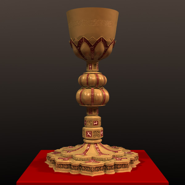
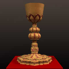
All I see are problems here, but this thing has absorbed so much time so
far that I thought I would stop and get a reaction.

The light is actually three lights placed randomly and colored randomly
in the red-yellow range of hues.  The total light color of the three
lights approaches something like rgb <1,.99,.97>

Radiosity data was collected at 600 samples.  The actual render used
"Outdoor Low Quality" settings from the include file of presets.

The actual cup is a iso dirived from a SOR with bump and bitmap textures
subtracted.  The rest is all mesh modelledin Wings with some bump
normals to suggest pounded metal and a "micro" normal for blurred
reflection applied.

The enamel inlay is a bitmap applied with uv's and was hand "painted"
Post a reply to this message
Attachments:
Download 'img.0075.jpg' (78 KB)
Preview of image 'img.0075.jpg'
|
|
| |
| |
|
|
|
|
| |
| |
|
|
That's an elaborate cup! Must've been a lot of work.

You said metal... well, sorry to say that I see it as ceramic-like. Possibly
carved wood that has been painted. Except maybe the upper parts. And even
then I'm seeing the top as being nearly opaque frosted glass, maybe because
of the darkened edge on the right side which looks like a cross section of
the thickness.

I wouldn't really want to change anything about it if I were doing anything
with it, except maybe the tabletop. That's so smooth it makes the chalice
seem to float over it. At least that's my guess as to why I'm thinking that.

Fantastic creation, Jim.
Post a reply to this message
|
|
| |
| |
|
|
|
|
| |
| |
|
|
Jim Charter spake:

> All I see are problems here, but this thing has absorbed so much time so
> far that I thought I would stop and get a reaction.
>
> The light is actually three lights placed randomly and colored randomly
> in the red-yellow range of hues.  The total light color of the three
> lights approaches something like rgb <1,.99,.97>
>
> Radiosity data was collected at 600 samples.  The actual render used
> "Outdoor Low Quality" settings from the include file of presets.
>
> The actual cup is a iso dirived from a SOR with bump and bitmap textures
> subtracted.  The rest is all mesh modelledin Wings with some bump
> normals to suggest pounded metal and a "micro" normal for blurred
> reflection applied.
>
> The enamel inlay is a bitmap applied with uv's and was hand "painted"

Love the detail, especially on the stand / bottom of the chalice...

--
Stefan Viljoen
Software Support Technician / Programmer
Polar Design Solutions
Post a reply to this message
|
|
| |
| |
|
|
|
|
| |
| |
|
|
Bob H wrote:
> That's an elaborate cup! Must've been a lot of work.
>
> You said metal... well, sorry to say that I see it as ceramic-like. Possibly
> carved wood that has been painted. Except maybe the upper parts. And even
> then I'm seeing the top as being nearly opaque frosted glass, maybe because
> of the darkened edge on the right side which looks like a cross section of
> the thickness.
>
> I wouldn't really want to change anything about it if I were doing anything
> with it, except maybe the tabletop. That's so smooth it makes the chalice
> seem to float over it. At least that's my guess as to why I'm thinking that.
>
> Fantastic creation, Jim.
>
>
Thanks for the feedback! Yes I have had a miserable time trying to get a
metallic look to it,  The dark band you noticed is, I believe, the edge
of the darkened hemisphere that forms the background.  The hemisphere
extending from "behind" the camera is colored to provide something to
reflect.  The "soft" or "rough" look of the slighly downtapered sides of
the actual cup is so recalcatrant that I actually did some test renders
to assure myself that it wasn't somehow a property of how textures act
on SORs or Iso's vs on mesh!  It seems to be a matter of the downturned
nature or the surface.    Meanwhile the upturned surfaces of the base
seem to have an overdiffuse look of shiney plastic instead of the
specular sheen of worried metal.  Sigh!  The rounded box surface the
thing is standing on is just a pigment texture with no normal and
default finish, really just a placeholder for now.
Post a reply to this message
|
|
| |
| |
|
|
|
|
| |
| |
|
|
"Jim Charter" <jrc### [at] msn com> schreef in bericht
news:4426fcfd@news.povray.org...
> All I see are problems here, but this thing has absorbed so much time so
> far that I thought I would stop and get a reaction.
>
> The light is actually three lights placed randomly and colored randomly
> in the red-yellow range of hues. The total light color of the three
> lights approaches something like rgb <1,.99,.97>
>
> Radiosity data was collected at 600 samples. The actual render used
> "Outdoor Low Quality" settings from the include file of presets.
>
> The actual cup is a iso dirived from a SOR with bump and bitmap textures
> subtracted. The rest is all mesh modelledin Wings with some bump
> normals to suggest pounded metal and a "micro" normal for blurred
> reflection applied.
>
> The enamel inlay is a bitmap applied with uv's and was hand "painted"
>
This is an impressive piece of work, Jim. The only thing "wrong" ith it is
the metal texture which looks too much like plastic, imho. It seems to be
the finish. Did you use specular or phong here? Looks like specular to me.
That is often what I prefer, but maybe phong would work better here (if I am
correct in my analysis! which is probably not the case). However, metal is
sooo difficult to get right!
Still, a mighty achievement!
Thomas com> schreef in bericht
news:4426fcfd@news.povray.org...
> All I see are problems here, but this thing has absorbed so much time so
> far that I thought I would stop and get a reaction.
>
> The light is actually three lights placed randomly and colored randomly
> in the red-yellow range of hues. The total light color of the three
> lights approaches something like rgb <1,.99,.97>
>
> Radiosity data was collected at 600 samples. The actual render used
> "Outdoor Low Quality" settings from the include file of presets.
>
> The actual cup is a iso dirived from a SOR with bump and bitmap textures
> subtracted. The rest is all mesh modelledin Wings with some bump
> normals to suggest pounded metal and a "micro" normal for blurred
> reflection applied.
>
> The enamel inlay is a bitmap applied with uv's and was hand "painted"
>
This is an impressive piece of work, Jim. The only thing "wrong" ith it is
the metal texture which looks too much like plastic, imho. It seems to be
the finish. Did you use specular or phong here? Looks like specular to me.
That is often what I prefer, but maybe phong would work better here (if I am
correct in my analysis! which is probably not the case). However, metal is
sooo difficult to get right!
Still, a mighty achievement!
Thomas
Post a reply to this message
|
|
| |
| |
|
|
|
|
| |
| |
|
|
Jim, not entirely same material, but you saw that sax a couple of threads
above. I would expect something in that direction for the chalice.

Thomas
Post a reply to this message
|
|
| |
| |
|
|
|
|
| |
| |
|
|
Thomas de Groot wrote:
> Jim, not entirely same material, but you saw that sax a couple of threads
> above. I would expect something in that direction for the chalice.
>

Thanks for the feedback.

Yeah about Steves Sax, but it doesn't seem to work here, assuming that
there he blew out

the reflection and smooth settings to get essentially a mirror-like
surface.

When I do that on this object it tends to
look like colored glass.  I definitely need a blurred reflection effect
together with a high specular I think.  Maybe just a matter of finer
tweeking.  If I boost the specular too much the upward facing surface of
the base just blows out.  I think I also need a way to distress the
whole surface more.  I think the "painted on" look Bob referred to has a
lot to do with the homogeneity along the joins of some of the metal
work. Like where the little containing ridges for the enamel inlays meet
the surface they are resting on.  Actually, in the reference those are
serrated into a beads almost. Might have to go to a bit-map for the
metal texture too in order to get some tarnish into the seems etc.
though that would be a lot of work.  Will prob add more irregularity and
detail to the metalwork first.
Post a reply to this message
|
|
| |
| |
|
|
|
|
| |
| |
|
|
Stefan Viljoen <spamnot@ wrote:

>
> Love the detail, especially on the stand / bottom of the chalice...
>

Thanks Stefan.  The filligree along the bottom edge was the first major
challenge.  (Modelled the whole chalice literally from the bottom up)
Basically I isolated a 1/8th section of the repeating motif that could
be mirrored, modelled that section manually, then mirrored the 1/8th to
make a 1/4, the 1/4 to make a 1/2, the 1/2 to the whole, using Wings'
"mirror" tool. There are actually two layers of filligree to reproduce
the dense pattern in the reference, but only the outer one seems to show.
Post a reply to this message
|
|
| |
| |
|
|
|
|
| |
| |
|
|
Jim Charter spake:

> Stefan Viljoen <spamnot@ wrote:
>
>>
>> Love the detail, especially on the stand / bottom of the chalice...
>>
>
> Thanks Stefan.  The filligree along the bottom edge was the first major
> challenge.  (Modelled the whole chalice literally from the bottom up)
> Basically I isolated a 1/8th section of the repeating motif that could
> be mirrored, modelled that section manually, then mirrored the 1/8th to
> make a 1/4, the 1/4 to make a 1/2, the 1/2 to the whole, using Wings'
> "mirror" tool. There are actually two layers of filligree to reproduce
> the dense pattern in the reference, but only the outer one seems to show.

Don't you just hate it when that happens? I'm still learning a lot, and this
has happened to me too - spending hours putting in extra detail, only to
find that in the final image it is invisible...

You wouldn't consider documenting exactly how you did that and putting it up
somewhere on the web? I read your description of its creation and the bit
you say here just makes it sound even more involved. The final effect IS
impressive, though!

I'm always amazed with Pov (and with Blender) and Wings at the stuff
talented people can produce. I've often sat, bored, wondering what I can do
next that would look cool, and then somebody comes along and I can bang my
head on the table and ask the old "now why did't I think of that?!" :)

Kind regards,
--
Stefan Viljoen
Software Support Technician / Programmer
Polar Design Solutions
Post a reply to this message
|
|
| |
| |
|
|
|
|
| |
| |
|
|
Stefan Viljoen <spamnot@ wrote:

>
> Don't you just hate it when that happens? I'm still learning a lot, and this
> has happened to me too - spending hours putting in extra detail, only to
> find that in the final image it is invisible...

At least I had the good luck ( not really through foresight but more
through the cautious methodologies of age, and because it made the
modelling a little easier, ) to break out the added detail into a
separate piece which I can include, or not, as I wish.


>
> You wouldn't consider documenting exactly how you did that and putting it up
> somewhere on the web? I read your description of its creation and the bit
> you say here just makes it sound even more involved.

That is a nice invitation.  I will give it some thought.  When I work I
save off my models at different nodes or points where the modelling is
about to branch either into a new level of detail that can't be
retreated from, or into an alternate approach to the problem.  So I have
something of a record, not really complete, but something anyway that I
can consult.  Still, there was so much trial and error and backtracking
of steps that it is difficult to reconstruct and remember what I
actually did... and further, to sense what might be of interest and what
wouldn't.

As a ancilliary thought, I am quite convinced that this object would
have required about the same amount of work if I'd modelled it with
SDL/CSG.  There would probably have been less trial and error on
technique and approach, but at lot of fussing with transforms.


> talented people can produce. I've often sat, bored, wondering what I can do
> next that would look cool,

People make images for all sorts of different reasons and motivations.
It has always been my contention that there are as many different
reasons for making "art" as there are "artists."  And also, that the
tribe, if you will, of people who self-identify as "artists" is far more
various than "non-artists" think it is.

I remember seeing a show of photographs, years ago now, by a
photographer who never did "make it"  But she had gained some sort of
access to a group of people who were producing S&M materials and at the
same time, of course, indulging in these practices for their own
enjoyment.  It seems to me that this was in the early eighties just when
such things were becoming popular or "mainstream" but had not yet
reached their present state of commodity.  It was like these people were
the early commoditizers and she felt she had discovered a secret,
furtive world.  (That is just how it seems to me, I really know very
little of that world or its actual history.  I am probably revealing
myself as impossible naive! )  Anyway, this is a lengthy preamble to a
short point.  I remember that in her documentary, it was quoted that the
  S&M participants "couldn't believe" that anyone would be interested in
these materials.  That for them the interest was purely in doing it, not
watching.  And I have known many artists who viewed their art
similarily, as merely the by-product of their activities, interests,...
obsessions even.

For instance, the guy who taught sculpting at my undergraduate school, a
macho ex-marine, often ruddy from liquor, quick tempered and surly,
considered his own work to be so much "dirty linen."  (He cast heroic,
oversized, contorted male torsos, headless and limbless, in bronze, in a
Rodinesque, factured style.)

So I can't tell you what use, or art, there is to going to a museum,
picking out some artifact as a subject, then modelling and rendering it.
  All I can say is that I can't really stop myself and spend a good
amount of time trying to rationalize it after the fact.

When I finally began to emerge from depression after loosing my job and
9/11 and all that, I began to work doing aisle sales selling printers.
At that job I met yet another ex-marine.  He had a regular job with a
lot of responsibility in a large brokerage firm, was due to be made VP,
but still he worked the weekend aisle-sales job.  He also did peoples'
taxes on the side, and various speaking gigs on identity theft, ( I
dunno, but he was formerly Special Forces, ) and I don't know what else.
  Anyway he once said to me that one very wealthy man he knew
(money-wise) had stated a simple credo, that one should never put energy
into anything that didn't make money.  Well I have put most of my
energies in life into things that don't make money.  And presto, I don't
have much money! It's a serious joke, my friend.

There is one person here who mentions something in conversation that is
very close to my own experience.  The person is Jaime Vives Piqueres,
and what he talks about is the role of "surprise" in his motivation for
making pictures.  I think it is significant that he, like me, is mostly
a mimetic artist.  This role of surprise was crucial to me during all
the years I spent painting.  It may seem counter-intuitive to others but
realists or mimeticists can be genuinely surprised at the outcome of a
painting or image.  It is really at the heart of it, even when the sole
purpose is to reproduce some object.  It has something to do with the
idea of garnering and displaying empirical information.  Though he
doesn't talk about it, I sense that this same factor is also strongly
present in Christoph Hormann's "Earth View" pictures.

I also wanted to mention Rene Buui's work as a further turn of this
screw but it will have to wait.  Time to go on shift!  In fact I'm late.
Post a reply to this message
|
|
| |
| |
|
|
|
|
| |
| |
|
|
Jim Charter <jrc### [at] msncom> wrote:

> There is one person here who mentions something in conversation that is
> very close to my own experience.  The person is Jaime Vives Piqueres,
> and what he talks about is the role of "surprise" in his motivation for
> making pictures.  I think it is significant that he, like me, is mostly
> a mimetic artist.  This role of surprise was crucial to me during all
> the years I spent painting.  It may seem counter-intuitive to others but
> realists or mimeticists can be genuinely surprised at the outcome of a
> painting or image.  It is really at the heart of it, even when the sole
> purpose is to reproduce some object.  It has something to do with the
> idea of garnering and displaying empirical information.

Don’t you think that using PovRay encourages mimetic art? IMO CG is too new
for original styles to have developed yet. Also PovRay strives to be photo
realistic and we try to create images that look real. Even the mathematical
images are (just) beautiful visions of already described functions.
 Not that I think this is a bad thing.

Oh! Great goblet BTW, love the filigree on the base. I wish I could help
with the metal. How are your lights?

Stephen
Post a reply to this message
|
|
| |
| |
|
|
|
|
| |
| |
|
|
"Jim Charter" <jrc### [at] msncom> wrote in message
news:44278004$1@news.povray.org...
>>
> Thanks for the feedback! Yes I have had a miserable time trying to get a
> metallic look to it...

It may be that there's nothing to reflect off of the metal.  Try putting a
large box with a multi-colored image map behind the camera.

Eric
Post a reply to this message
|
|
| |
| |
|
|
|
|
| |
| |
|
|
Stephen wrote:

 > Don’t you think that using PovRay encourages mimetic art?

Sure, I'll agree with "encourages."
Taking a virtual picture of a virtual
lighted space is fundamental to the
paradigm after all. So that even when people try to go
abstract it is usually abstraction circa Kandinsky
  where they are creating the abstract effect by
  "picturing" some sort of geometric objects and
  there is a general sense of abstracting from nature.
But geometry, math, and a computer language for
deploying it are also parts of the POV paradigm, and those
features lend "encouragement" to those who wish
to explore more abstract compositions.
  More commonly however, people are making images by
  making models then picturing them and the
  results are intended to be depictional.  And as you say the
common goal is a sense of realism with photo effects being
the de facto standard for what is "real"
   Furthermore there is a distinct preference for
  "complete" scenes that suggest you are always seeing
  a fragment of the greater world jsut out of camera view.

But, an aside, when I used
the term "mimetic" I was reserving it for
  the narrow situation of faithful, even slavish recording of
the world, where said record becomes pretty much the point of
the endeavour.  Not really an argument but mentioned
  only as a clarification of my original intended
  meaning.  I usually use "depictional" to refer to broader, usually
narrative uses of recognizable imagery, however stylized.
It was the situation where the artist is more or less focused
on achieving a record, and not necessarily anything further, that I was
attempting to comment on.


IMO CG is too new
 > for original styles to have developed yet.

I think it is really that it is too new yet to mount much of a critique
of its processes
with success.  Though there are some possible beginnings there.  The
  work of Rene Bui comes to mind.  Also the two banished attempted it
in crude ways.  But I've forgotten their names.
Post a reply to this message
|
|
| |
| |
|
|
|
|
| |
| |
|
|
Eric Freeman wrote:
> "Jim Charter" <jrc### [at] msncom> wrote in message
> news:44278004$1@news.povray.org...
>
>>Thanks for the feedback! Yes I have had a miserable time trying to get a
>>metallic look to it...
>
>
> It may be that there's nothing to reflect off of the metal.  Try putting a
> large box with a multi-colored image map behind the camera.
>
You know, that is the *oldest* suggestion in the book and I certainly
did have some

  colors behind the camera to be reflected.

But it just occurred to me that I may not have had *enough* back there
or at
a high enough ambient. Off to do more testing.

Thanks for the kick in the backside.  Apparently I needed it!
Post a reply to this message
|
|
| |
| |
|
|
|
|
| |
| |
|
|
Jim Charter <jrc### [at] msncom> wrote:
> Stephen wrote:
>
>  > Don’t you think that using PovRay encourages mimetic art?
>
> Sure, I'll agree with "encourages."

[Snip]

>    Furthermore there is a distinct preference for
>   "complete" scenes that suggest you are always seeing
>   a fragment of the greater world jsut out of camera view.

I wish that I had said that. (Don’t worry I will :-)

>
> But, an aside, when I used
> the term "mimetic" I was reserving it for
>   the narrow situation of faithful, even slavish recording of
> the world, where said record becomes pretty much the point of
> the endeavour.  Not really an argument but mentioned
>   only as a clarification of my original intended
>   meaning.  I usually use "depictional" to refer to broader, usually
> narrative uses of recognizable imagery, however stylized.
> It was the situation where the artist is more or less focused
> on achieving a record, and not necessarily anything further, that I was
> attempting to comment on.

I don’t know if I am following you. Are you comparing some Pov work to, say,
the way genteel folk in the 17th, 18th and 19th centuries would record their
world in water colours? But this does not fit in with Rene Bui’s work.


>
> IMO CG is too new
>  > for original styles to have developed yet.
>
> I think it is really that it is too new yet to mount much of a critique
> of its processes with success.

Yes, styles are just evolving, as is Pov-Ray. It is interesting (to me) how
styles like impressionism can be rendered.

>  But I've forgotten their names.

Starved of the oxygen of publicity, how cruel.

Stephen
Post a reply to this message
|
|
| |
| |
|
|
|
|
| |
| |
|
|
Stephen wrote:

>
> I don’t know if I am following you. Are you comparing some Pov work to, say,
> the way genteel folk in the 17th, 18th and 19th centuries would record their
> world in water colours?

A fairly pure example of how I am using "mimetic" would be the painter
Lucien Freud.

"Depictional" would mean everything that depends on recognizable
imagery:  gothic mosaics, Renaissance scenes, Disney cartoons,... and
Lucien Freud.

But what about Analytic Cubism? Well maybe, but in that case the
discussion would push precisely the limit of what I commonly mean when I
use either word.


But this does not fit in with Rene Bui’s work.
>
>
"record their world"  That starts to get at it, doesn't it?  Precisely
what "world" is Rene depicting?
Post a reply to this message
|
|
| |
| |
|
|
|
|
| |
| |
|
|
"Jim Charter" <jrc### [at] msncom> schreef in bericht
news:442c0d60$1@news.povray.org...
>
> A fairly pure example of how I am using "mimetic" would be the painter
> Lucien Freud.
>
> "Depictional" would mean everything that depends on recognizable
> imagery:  gothic mosaics, Renaissance scenes, Disney cartoons,... and
> Lucien Freud.
>
> But what about Analytic Cubism? Well maybe, but in that case the
> discussion would push precisely the limit of what I commonly mean when I
> use either word.
>

With Lucian Freud, I would add Frank Auerbach too. Less known perhaps, but a
mighty artist.
While one might think about Egon Schiele too...

>
> But this does not fit in with Rene Bui’s work.
> >
> >
> "record their world"  That starts to get at it, doesn't it?  Precisely
> what "world" is Rene depicting?
Post a reply to this message
|
|
| |
| |
|
|
|
|
| |
| |
|
|
Jim Charter <jrc### [at] msncom> wrote:
> Stephen wrote:
>
> >
> > I don’t know if I am following you. Are you comparing some Pov work to, say,
> > the way genteel folk in the 17th, 18th and 19th centuries would record their
> > world in water colours?
>
> A fairly pure example of how I am using "mimetic" would be the painter
> Lucien Freud.

At this point, I make my excuses and leave. I find Lucien Freud too
unpleasing to my eye. Although there are similarities to Stanley Spencer,
an artist I like. Especially his war work.
Anyway I’ve never been one for, the theory of art on modern painters. I
know, I know it’s snobby.  But I’m not educated enough to be able to
evaluate the seemingly pretentious claptrap that assaults my ears. Not that
I mean you or anyone here. In fact I thank you for enlightening me. {Oh!
Master let me sit at your feet. On second thoughts I don’t want to see what
you’ve got on them :-}


> But this does not fit in with Rene Bui’s work.
> >
> >
> "record their world"  That starts to get at it, doesn't it?  Precisely
> what "world" is Rene depicting?

Great isn’t it? It does seem to be a world that he can share.

Stephen
Post a reply to this message
|
|
| |
| |
|
|
|
|
| |
| |
|
|
Stephen wrote:
> Jim Charter <jrc### [at] msncom> wrote:
>
>>Stephen wrote:
>>

>>A fairly pure example of how I am using "mimetic" would be the painter
>>Lucien Freud.
>
>
> At this point, I make my excuses and leave. I find Lucien Freud too
> unpleasing to my eye.


Okay, but you don't have to like his work to understand what I mean.
Post a reply to this message
|
|
| |
| |
|
|
|
|
| |
| |
|
|
Jim Charter <jrc### [at] msncom> wrote:
> Stephen wrote:
> > Jim Charter <jrc### [at] msncom> wrote:
> >
> >>Stephen wrote:
> >>
>
> >>A fairly pure example of how I am using "mimetic" would be the painter
> >>Lucien Freud.
> >
> >
> > At this point, I make my excuses and leave. I find Lucien Freud too
> > unpleasing to my eye.
>
>
> Okay, but you don't have to like his work to understand what I mean.

True, I thought I made that clear. I know a little bit more now.
I originally meant that PovRay is good at rendering objects but it is not
easy to represent suggestions of an object. I can think of a few exceptions
like an object with no image but with a shadow. It is things like painting a
horse with the minimum of brush strokes that I’ve not seen.

Stephen
Post a reply to this message
|
|
| |
| |
|
|
|
|
| |
| |
|
|
> I originally meant that PovRay is good at rendering objects but it is not
> easy to represent suggestions of an object. I can think of a few exceptions
> like an object with no image but with a shadow. It is things like painting a
> horse with the minimum of brush strokes that I’ve not seen.
>
Ah! yes. Economy of means.  That is true.  Firstly because the manual
element is removed and then also because the paradigm is of replication
through model building. If you leave detail out of the model it doesn't
seem like a "suggestion" to the viewer, it just seems like a crude
model.  The exceptions make for an interesting side discussion though*.
    I think one place these concepts come into play is in texturing and
expecially with texturing * resolution.  The pixel plays a role in
whether the texture can suggested, or handled more explicitly.  Also I
suppose, in how much detail is necessary in a model.


*Just to get it said, in mesh modelling there is a strong tendency to
economy of means, further bolstered by the psuedo-pragmatic ideal of
models animating well.  And notice that in mesh modelling the manual
role is restored to a degree.
Post a reply to this message
|
|
| |
| |
|
|
|
|
| |
| |
|
|
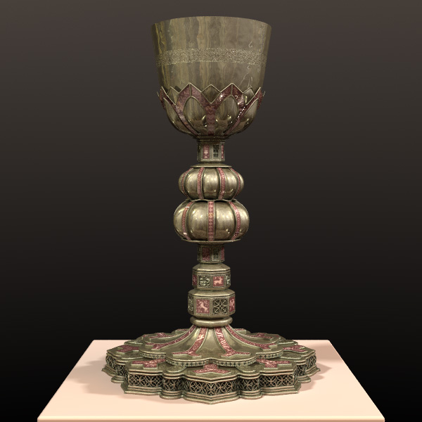
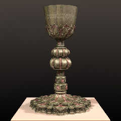
Tweeks:

on the metal
	reflection raised significantly esp the lower or coincident
	value ( .1 .6  ->  .6 .9 )
	specular roughness tweeked up by ~ 50x ( now .12 )
	color changed to try and match the brass in the reference
	(rather than gold) ( rgb CHSL2RGB( <70,.12,.29> ) )

on the enamel
	desaturated the colors by 50% and tinted the white marks
	lowered specular 3x ( -> .2 ) but increased specular roughness
400x 	( -> .4)
	increased reflection slightly ( .1 .3 -> .2 .4 )

changed the photo behind the camera and increased its ambient

desaturated the lights so they still vary, but across a smaller color
range and are all much closer to white

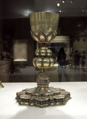
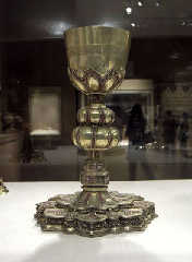
included a shot of the reference
Post a reply to this message
Attachments:
Download 'img.0132.jpg' (79 KB)
Download 'ref2.jpg' (41 KB)
Preview of image 'img.0132.jpg'
Preview of image 'ref2.jpg'
|
|
| |
| |
|
|
|
|
| |
| |
|
|
Superb Jim! Great work there.


      ~Steve~
Post a reply to this message
|
|
| |
| |
|
|
From: Thomas de Groot
Subject: Re: chalice WIP Update [79 kb & 41 kb]
Date: 3 Apr 2006 02:55:59
Message: <4430c6ff@news.povray.org>
|
|
|
| |
| |
|
|
My goodness! This is the very thing now!
Very much a Grail object (just been reading Robert Holdstock lately :-) )

Thomas
Post a reply to this message
|
|
| |
| |
|
|
|
|
| |
| |
|
|
Almost perfect! ...and I say "almost" only because the upper border of
the coup makes it look like it is too flat. In the reference photo I can
see a little the edge highlight, suggesting some thickness. Anyhow, that
was a great improvement on the metal texture: just don't touch it! Well,
you can tweak the color pigment, but the finish and normals seem perfect
like they are now.

--
Jaime
Post a reply to this message
|
|
| |
| |
|
|
|
|
| |
| |
|
|
Jim Charter <jrc### [at] msncom> wrote:

> Ah! yes. Economy of means.

So that’s what it’s called. I was struggling to describe what I meant.

> That is true.  Firstly because the manual
> element is removed and then also because the paradigm is of replication
> through model building. If you leave detail out of the model it doesn't
> seem like a "suggestion" to the viewer, it just seems like a crude
> model.  The exceptions make for an interesting side discussion though*.
>     I think one place these concepts come into play is in texturing and
> expecially with texturing * resolution.  The pixel plays a role in
> whether the texture can suggested, or handled more explicitly.  Also I
> suppose, in how much detail is necessary in a model.


Yes and lighting. For a series of images I made a while ago. I used a high
ambient, no shadows and flat lighting to give an unrealistic or cartoon
effect.

>
> *Just to get it said, in mesh modelling there is a strong tendency to
> economy of means, further bolstered by the psuedo-pragmatic ideal of
> models animating well.  And notice that in mesh modelling the manual
> role is restored to a degree.

Yes as much as in CSG I would think. What is wrong with using as little as
you can get away with?
Why is it a “psuedo-pragmatic ideal” I’m not sure that I’m following you
again. Excuse my ignorance. I’m interested in animation and use mostly
Poser figure meshes. But I think that I’m straying from your point.
Those changes to your chalice are spot on, BTW. All you need now is some
wine and wafers :-)
Post a reply to this message
|
|
| |
| |
|
|
|
|
| |
| |
|
|
Stephen wrote:
> Jim Charter <jrc### [at] msncom> wrote:

> Why is it a “psuedo-pragmatic ideal”

It is a pragmatic ideal because "light" meshes can be rendered faster in
games and in full movie animations also consume less resources.  Also
less complexity allows for easier morphing at joints and in the faces.

It is psuedo-pragmatic when the ideal is extended beyond its usefulness.

It is not a problem really, but growing up I always felt stifled by the
level of pragmatism which I experienced as "provincial."  So I am wary
of runaway Calvinism. It's a personal thing.

Btw, in the late stages of my painting "career" when I had reached a
fair level of facility with my shoe paintings, I typically used cheap,
crude, loose-haired 1/2" -> 1-1/2" cutters.*  I only used a small
artist's brush to put in a few details on the shoe such as the line of
the sole, and maybe the laces and their eyelets.

*Actually, here they are!
http://tinyurl.com/ntlvc

I LOVED those brushes.  As a general rule I love humble things.  But not
when it's used as a moral stricture.
Post a reply to this message
|
|
| |
| |
|
|
|
|
| |
| |
|
|
St. wrote:
>
>    Superb Jim! Great work there.
>
>
Thanks Buddy.
Post a reply to this message
|
|
| |
| |
|
|
|
|
| |
| |
|
|
"Jaime Vives Piqueres" <jai### [at] ignoranciaorg> wrote in message
news:44310b0f$1@news.povray.org...
> upper border of the cup makes it look like it is too flat. see a little
> the edge highlight, suggesting some thickness.

I noticed that, too, wondering if it could be the lesser clarity of the
photo but it definitely looks like the lines there are thicker on the real
one.

It's really fantastic now, anyhow, Jim! Could only get more perfect from
here on, if at all possible. Before reading I had thought the second picture
was this thing placed into a more realistic setting.

Something I couldn't stop thinking about is reflection 'exponent' and
whether or not that might be plausible to use for the metal if you hadn't
already done so. Maybe it would help dull the metal some by reflecting less
of the darkness around it. Not sure if you would want to go on tweaking on
that texture, though, since it looks pretty amazing already. Which makes me
ask, are your render times for this reasonable (hours not days)?

--
Bob H  www.3digitaleyes.com
http://3digitaleyes.com/imagery/
Post a reply to this message
|
|
| |
| |
|
|
|
|
| |
| |
|
|
Thomas de Groot wrote:
> My goodness! This is the very thing now!
> Very much a Grail object (just been reading Robert Holdstock lately :-) )
>
Thanks Thomas, I'll give Holdstock a look, I am not currently familiar.
  Actually someone in my household took "Stonehenge" (Bernard Cornwell)
out of the library and I read a bit yesterday, while letting others use
the computer.  Historical fiction, but fun, and I guess it suits my mood
somehow given I am picturing religious artifacts lately, lol.  Actually
the whole humble-cup/ornate-relinquary concept is kinda weird when you
think about it.

My attraction to the subject has something to do with verticality,
ritual, vertical sequencing, decorative icon, bodily ritual, bodily
gratification, spheres of perception.

I big influence on me, since forever, was a piece by Bruce Nauman titled
"From Hand to Mouth"  It was, as I recall, a wall sculpture which was a
cast from a fragment of a human body showing only the hand, arm, portion
of the neck and jaw up to the mouth, and the mouth.  Formally it
serviced the conceptual task of the day of illustrating a verbal
expression.  But I believe I remember that he talked about it in terms
of hand to mouth gratifications such as smoking and drinking coffee.
Post a reply to this message
|
|
| |
| |
|
|
|
|
| |
| |
|
|
Jaime Vives Piqueres wrote:
> Almost perfect! ...and I say "almost" only because the upper border of
> the coup makes it look like it is too flat. In the reference photo I can
> see a little the edge highlight, suggesting some thickness. Anyhow, that
> was a great improvement on the metal texture: just don't touch it! Well,
> you can tweak the color pigment, but the finish and normals seem perfect
> like they are now.
>
> --
> Jaime
Thanks Jaime. Yes, that top edge highlight is on the to do list.  As I
am sure to realize, the present look is because the upper edge is really
created by the isosurface's bounding box, so I'll need to bend the SOR
in, then clip it just above with the bounding box.

I also want to get more out of the embossed lettering on the cup if
possible.
Post a reply to this message
|
|
| |
| |
|
|
|
|
| |
| |
|
|
Bob H wrote:

> Something I couldn't stop thinking about is reflection 'exponent' and
> whether or not that might be plausible to use for the metal if you hadn't
> already done so.

Wow, that looks like just the thing I was looking for!  Must try it!
I'd completely forgot about it though I now remember reading about it in
the manual, in the past.  Thing is, with this model it is too much work
to edit the mesh so a material with ior can be used.  At least too much
at the moment.  I *had* been trying to remember if "fresnel" took an
exponent value, (while sitting in a cafe,... not at my computer :P ).
Now I look at the docs I see that I might try the conserve_energy
keyword too.
Post a reply to this message
|
|
| |
| |
|
|
|
|
| |
| |
|
|
Bob H wrote:

> that texture, though, since it looks pretty amazing already. Which makes me
> ask, are your render times for this reasonable (hours not days)?

Usually just under 2 hrs, for 600x600 and most of that is on the iso
surface cup especially where the lettering is displaced.  At higher
resolutions though, I expect more time will be needed around the
filligree at the base.
Post a reply to this message
|
|
| |
| |
|
|
|
|
| |
| |
|
|
Jim Charter <jrc### [at] msncom> wrote:
> Stephen wrote:
> > Jim Charter <jrc### [at] msncom> wrote:
>
> > Why is it a “psuedo-pragmatic ideal”
>
> It is a pragmatic ideal because "light" meshes can be rendered faster in
> games and in full movie animations also consume less resources.  Also
> less complexity allows for easier morphing at joints and in the faces.

Oh! Games, I forgot about those. There is no time for frivolity in my brand
of Calvinism :-) That’s because I was brought up in the “Free Presbyterian
Church of Scotland” amongst other sects. But if Holy Willie says that you
only need a couple of hundred triangles to enter the gates of realism. Then
who am I to argue.
I think that it is “horses for courses” it all depends on what you want the
output to look like.


>
> I LOVED those brushes.  As a general rule I love humble things.  But not
> when it's used as a moral stricture.

Oh! Nice brushes BTW

What’s your opinion of Uriah Heep from David Copperfield? I ask in my very
humble way:-)

Stephen
Post a reply to this message
|
|
| |
| |
|
|
|
|
| |
| |
|
|
Stephen wrote:
> Jim Charter <jrc### [at] msncom> wrote:
>
>>Stephen wrote:
>>
>That’s because I was brought up in the “Free Presbyterian
> Church of Scotland” amongst other sects.
My father's mother was born in Scotland and he and his two brothers and
six sisters made a big deal of it.  And of course they kept their
hardwood polished. Polished.


> Oh! Nice brushes BTW

I can't tell you enough.  They were thin you see, so they didn't suck up
a lot of expensive paint.  And those long, irregular, limp bristles.
Perfect.  Especially for oil paint of the certain viscosity that I
liked.  I used a lot of varnish and stand oil in my medium.  Funny they
are sold as gesso brushes.  The hog's hair swells with water which makes
them useless.


>
> What’s your opinion of Uriah Heep from David Copperfield? I ask in my very
> humble way:-)
>

No opinion due to my ignorance of that tale.  Maybe I can get back to
you on it tho'.
Post a reply to this message
|
|
| |
| |
|
|
|
|
| |
| |
|
|
Jim Charter <jrc### [at] msncom> wrote:

> Thing is, with this model it is too much work
> to edit the mesh so a material with ior can be used.  At least too much
> at the moment.

Probably I am making wrong assumptions, but if you are keeping this mesh in
a separate file and #including it in your main scene file, and it is too
big to comfortably edit, can't that be as simple as using something like
this in the main scene?

object {
  #include "Chalice.mesh" // or whatever;

  interior {
    ior 10
  }
}

No editing of the mesh file required, just an appropriate fresnel reflection
statement for the mesh. Possibly the exponent keyword will be more useful to
you, though.
Post a reply to this message
|
|
| |
| |
|
|
|
|
| |
| |
|
|
Tom York wrote:
> Jim Charter <jrc### [at] msncom> wrote:
>
>
>>Thing is, with this model it is too much work
>>to edit the mesh so a material with ior can be used.  At least too much
>>at the moment.
>
>
> Probably I am making wrong assumptions, but if you are keeping this mesh in
> a separate file and #including it in your main scene file, and it is too
> big to comfortably edit, can't that be as simple as using something like
> this in the main scene?
>
> object {
>   #include "Chalice.mesh" // or whatever;
>
>   interior {
>     ior 10
>   }
> }
>
> No editing of the mesh file required, just an appropriate fresnel reflection
> statement for the mesh. Possibly the exponent keyword will be more useful to
> you, though.
>
>
Yes I believe you are right.  Anyway to be sure I thought it time for a
quick test.

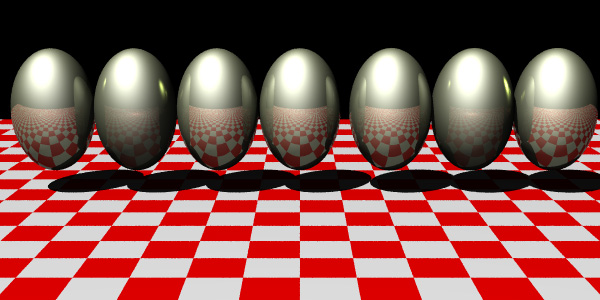
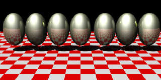
Eggs from left to right
1. Mesh2 with original texture applied in the texture list
2. Mesh2 with exponent .125 added to original texture and applied in
texture list
3. Mesh2 with interior { ior 1.18 } applied in object wrapper as you suggest
4. Mesh2 with texture list removed and material{texture{...} interior
{ior 1.18}} applied in object wrapper
5. Scaled sphere primitive with original texture
6. Scaled sphere with exponent added to texture
7. Scaled sphere with material applied
Post a reply to this message
Attachments:
Download 'img.0134.jpg' (101 KB)
Preview of image 'img.0134.jpg'
|
|
| |
| |
|
|
|
|
| |
| |
|
|
Jim Charter nous apporta ses lumieres en ce 02/04/2006 14:17:
> Tweeks:
>
> on the metal
>     reflection raised significantly esp the lower or coincident
>     value ( .1 .6  ->  .6 .9 )
>     specular roughness tweeked up by ~ 50x ( now .12 )
>     color changed to try and match the brass in the reference
>     (rather than gold) ( rgb CHSL2RGB( <70,.12,.29> ) )
>
> on the enamel
>     desaturated the colors by 50% and tinted the white marks
>     lowered specular 3x ( -> .2 ) but increased specular roughness
> 400x     ( -> .4)
>     increased reflection slightly ( .1 .3 -> .2 .4 )
>
> changed the photo behind the camera and increased its ambient
>
> desaturated the lights so they still vary, but across a smaller color
> range and are all much closer to white
>
> included a shot of the reference
>
>
> ------------------------------------------------------------------------
>
>
> ------------------------------------------------------------------------
>
Very impressive! Looks like the original may have looked like when almost new. Save
your file and
try aging it some. Darkening the enamels and adding some grime over the metal parts.

--
Alain
-------------------------------------------------
You can go anywhere you want if you look serious and carry a clipboard.
Post a reply to this message
|
|
| |
| |
|
|
|
|
| |
| |
|
|
I hadn't thought a texture on a mesh would look different from same used
sphere but your test seems to show the 2 and 6 are maybe a little different.
Interesting how those two have such enhanced highlights from neighboring
eggs and a bit of a brightnened area on the checkers below the light(?).

You said fresnel before so I wanted to clarify I wasn't suggesting it; only
that the old keyword reflection_exponent was exchanged with the shortened
keyword exponent and isn't related to fresnel, directly anyhow AFAIK. At
least, it (the old keyword) existed before fresnel did, IIRC. Keyword
falloff in the reflection block might be something similar yet still not the
same thing.

Didn't want people reading here to get confused about this, hopefully not
anyhow.
Post a reply to this message
|
|
| |
| |
|
|
|
|
| |
| |
|
|
Jim Charter <jrc### [at] msncom> wrote:
> Stephen wrote:
> > Jim Charter <jrc### [at] msncom> wrote:
> >
> >>Stephen wrote:
> >>
> >That’s because I was brought up in the “Free Presbyterian
> > Church of Scotland” amongst other sects.
> My father's mother was born in Scotland and he and his two brothers and
> six sisters made a big deal of it.  And of course they kept their
> hardwood polished. Polished.
>

Only one word for it, “heidbangers” :-)

> > Oh! Nice brushes BTW
>
> I can't tell you enough.  They were thin you see, so they didn't suck up
> a lot of expensive paint.  And those long, irregular, limp bristles.
> Perfect.  Especially for oil paint of the certain viscosity that I
> liked.  I used a lot of varnish and stand oil in my medium.  Funny they
> are sold as gesso brushes.  The hog's hair swells with water which makes
> them useless.
>

When you are working with your hands. The importance of good tools cannot be
over emphasised.

> >
> > What’s your opinion of Uriah Heep from David Copperfield? I ask in my very
> > humble way:-)
> >
>
> No opinion due to my ignorance of that tale.  Maybe I can get back to
> you on it tho'.

No need, if you don’t like Victorian novels. I read it a couple of years ago
on an audio book (talking book). Great for long car journeys. Hmm! There’s a
thought. JC the New York cabbie who plays classics to his clients.

“Driver, drive around the block a couple of times ‘till Henry James finishes
this sentence”

Not so fanciful as my wife has said it to me after a 400 mile journey.

Stephen
Post a reply to this message
|
|
| |
| |
|
|
|
|
| |
| |
|
|
Bob H wrote:

>
> You said fresnel before so I wanted to clarify I wasn't suggesting it; only
> that the old keyword reflection_exponent was exchanged with the shortened
> keyword exponent and isn't related to fresnel, directly anyhow AFAIK. At
> least, it (the old keyword) existed before fresnel did, IIRC. Keyword
> falloff in the reflection block might be something similar yet still not the
> same thing.
>
> Didn't want people reading here to get confused about this, hopefully not
> anyhow.
>
Well I am the one who created the confusion.  I was blathering as usual.
Post a reply to this message
|
|
| |
| |
|
|
From: Thomas de Groot
Subject: Re: chalice WIP Update [79 kb & 41 kb]
Date: 4 Apr 2006 09:01:36
Message: <44326e30@news.povray.org>
|
|
|
| |
| |
|
|
"Jim Charter" <jrc### [at] msncom> schreef in bericht
news:443130d0$1@news.povray.org...
> Thomas de Groot wrote:
> > My goodness! This is the very thing now!
> > Very much a Grail object (just been reading Robert Holdstock lately
:-) )
> >
> Thanks Thomas, I'll give Holdstock a look, I am not currently familiar.
>   Actually someone in my household took "Stonehenge" (Bernard Cornwell)
> out of the library and I read a bit yesterday, while letting others use
> the computer.  Historical fiction, but fun, and I guess it suits my mood
> somehow given I am picturing religious artifacts lately, lol.  Actually
> the whole humble-cup/ornate-relinquary concept is kinda weird when you
> think about it.
>

Ah! Cornwell, yes indeed. Did you read "the Winter King"? Arthurian legend
in an archeologically sound environment.
Holdstock is another matter. My mental associations often make big jumps!
Holdstock explores the myth-generation process of the mind and builds some
extremely fascinating stories around that concept, usually drawing
inspiration from the Mabinogion and the Arthur legend embedded there.

Thomas
Post a reply to this message
|
|
| |
| |
|
|
|
|
| |
| |
|
|
Jim Charter <jrc### [at] msncom> wrote:
> Well I have put most of my energies in life into things
> that don't make money.  And presto, I don't
> have much money! It's a serious joke, my friend.

thankfully, the purpose of life has nothing to do with making money.  Money
is great for buying you food, nothing more...

> It may seem counter-intuitive to others but
> realists or mimeticists can be genuinely surprised at the outcome of a
> painting or image.

I believe this is true for most artists:  to begin from scratch, with a few
sketches and look how far you can get by just throwing mud... :)
Post a reply to this message
|
|
| |
| |
|
|
|
|
| |
| |
|
|
Jim Charter wrote:

Impressive. Do you ever spend the money to print these object studies?

  -Shay
Post a reply to this message
|
|
| |
| |
|
|
|
|
| |
| |
|
|
none wrote:
> Jim Charter wrote:
>
> Impressive.

Thanks Shay


Do you ever spend the money to print these object studies?
>


Nah.  Actaully I did a lot of printing of all sorts of things when I was
demoing printers in stores and printed out my works as well as that of
some others here.  The results were interesting but really never
rivalled a photograph for intrinsic interest.  The one I like best was a
print of the Boli figure.

But there are better machines to print with than the little consumer
printers I was demoing obviously.
Post a reply to this message
|
|
| |
| |
|
|
|
|
| |