|
|
|
|
|
|
| |
| |
|
|
|
|
| |
| |
|
|
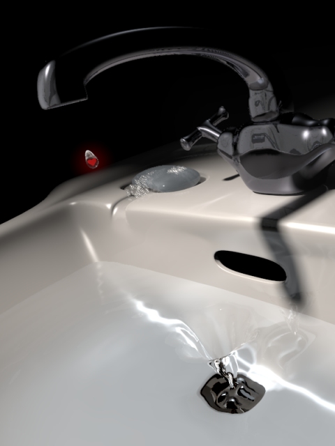
So, here's the next step.

Tilted the camera, worked on the lighting, the water, the textures, the
models... Added that thing which'll go down the drain as well. Quite unsure
what to add now, if I want to tinker with the colors and lighting some
more... I guess I'll have to give it a rest for a day or two to get a new
look at it.

Comments and suggestions appreciated! :-)

Regards,
Tim

--
aka "Tim Nikias v2.0"
Homepage: <http://www.nolights.de>
Post a reply to this message
Attachments:
Download 'DtD_wip4.jpg' (73 KB)
Preview of image 'DtD_wip4.jpg'
|
|
| |
| |
|
|
|
|
| |
| |
|
|
Looks good. A few suggestions:
The water should form a spiralling whirlpool as it goes down the drain.
It needs a lighter background, black is a very unnatural colour for this
subject.
The sink looks too clean, particularly around the soap where I'd expect some
soap scum showing where soapy water has run down the side from the soap
dish.

Also, is the refractive index right? Water should be around ior 1.33, I
think. I have to say the water looked more real in the first one, I think
it's just because there's more highlights reflecting and refracting in the
water.

--
Tek
http://evilsuperbrain.com

"Tim Nikias" <JUSTTHELOWERCASE:timISNOTnikias(at)gmx.netWARE> wrote in
message news:44022a22@news.povray.org...
> So, here's the next step.
>
> Tilted the camera, worked on the lighting, the water, the textures, the
> models... Added that thing which'll go down the drain as well. Quite
> unsure
> what to add now, if I want to tinker with the colors and lighting some
> more... I guess I'll have to give it a rest for a day or two to get a new
> look at it.
>
> Comments and suggestions appreciated! :-)
>
> Regards,
> Tim
>
> --
> aka "Tim Nikias v2.0"
> Homepage: <http://www.nolights.de>
>
>
>
Post a reply to this message
|
|
| |
| |
|
|
|
|
| |
| |
|
|
"Tim Nikias" <JUSTTHELOWERCASE:timISNOTnikias(at)gmx.netWARE> spake:

> So, here's the next step.
>
> Tilted the camera, worked on the lighting, the water, the textures, the
> models... Added that thing which'll go down the drain as well. Quite
> unsure what to add now, if I want to tinker with the colors and lighting
> some more... I guess I'll have to give it a rest for a day or two to get a
> new look at it.
>
> Comments and suggestions appreciated! :-)
>
> Regards,
> Tim

Ouch! Each time I think I made something nice, Tim comes along...

First look at this scene - VERY impressive.

--
Stefan Viljoen
Software Support Technician / Programmer
Polar Design Solutions
Post a reply to this message
|
|
| |
| |
|
|
|
|
| |
| |
|
|
> Ouch! Each time I think I made something nice, Tim comes along...

Hey, that doesn't diminish your nice images in any way! Different style,
different level of experience...

> First look at this scene - VERY impressive.

Thank you! :-)

Regards,
Tim

--
aka "Tim Nikias v2.0"
Homepage: <http://www.nolights.de>
Post a reply to this message
|
|
| |
| |
|
|
|
|
| |
| |
|
|
> Looks good.

Thank you!

> A few suggestions:
> The water should form a spiralling whirlpool as it goes down the drain.

It does, though it's less pronounced now. Might have to work a little on
that.

> It needs a lighter background, black is a very unnatural colour for this
> subject.

My brother commented as much, I'm thinking about it, though I do like that
its slightly off the usual rules.

> The sink looks too clean, particularly around the soap where I'd expect
some
> soap scum showing where soapy water has run down the side from the soap
> dish.

Texture-detail is something I haven't really begun with yet, though I was
wondering about leaving everything looking shiny and new. I like the
contrast of the story I'm trying to hide in the image and the look of the
image (sad vs cheerful/bright).

> Also, is the refractive index right? Water should be around ior 1.33, I
> think. I have to say the water looked more real in the first one, I think
> it's just because there's more highlights reflecting and refracting in the
> water.

Refractive index is right, it's at 1.34 at the moment. I'm thinking about
adding a lightsource just for the water to catch some highlights.

Thanks for the comments, I'll ponder them and look what I can do. :-)

Regards,
Tim

--
aka "Tim Nikias v2.0"
Homepage: <http://www.nolights.de>
Post a reply to this message
|
|
| |
| |
|
|
|
|
| |
| |
|
|
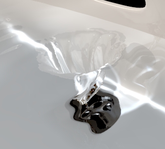
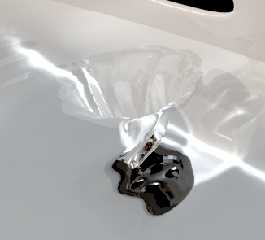
> The water should form a spiralling whirlpool as it goes down the drain.

Here's an attempt at that. Quite honestly, the refraction and viewing angle
obscure the view on the mesh so much that I don't think the extra workload
is needed. I've written a small script to generate an array of points which
aren't spread evenly like in a heightfield, but are closer together at the
center where the vortex is, and further apart at the edges, where there's
less detail. I then twisted the vortex's axis a little with it being
displaced, so the vortex doesn't go straight down, but swirl towards the
drain.

Might be that I've got to add another lightsource for highlights to show the
displacement on the vortex, but if that doesn't do much, I think I'll go
stick with the simpler heightfield. Some of the caustics (non-photon-mapped)
are more pleasing to me visually in the old version.

Regards,
Tim

--
aka "Tim Nikias v2.0"
Homepage: <http://www.nolights.de>
Post a reply to this message
Attachments:
Download 'DtD_vortex.jpg' (34 KB)
Preview of image 'DtD_vortex.jpg'
|
|
| |
| |
|
|
|
|
| |
| |
|
|
Tim Nikias wrote:
>> Ouch! Each time I think I made something nice, Tim comes along...
>
> Hey, that doesn't diminish your nice images in any way! Different style,
> different level of experience...

How should I feel then, having been immersed in POV for 10 years now? :)

...Chambers
Post a reply to this message
|
|
| |
| |
|
|
|
|
| |
| |
|
|
Very nice Tim, but why the first drop is red?

Oleguer


"Tim Nikias" <JUSTTHELOWERCASE:timISNOTnikias(at)gmx.netWARE> escribió en el
mensaje news:44022a22@news.povray.org...
> So, here's the next step.
>
> Tilted the camera, worked on the lighting, the water, the textures, the
> models... Added that thing which'll go down the drain as well. Quite
> unsure
> what to add now, if I want to tinker with the colors and lighting some
> more... I guess I'll have to give it a rest for a day or two to get a new
> look at it.
>
> Comments and suggestions appreciated! :-)
>
> Regards,
> Tim
>
> --
> aka "Tim Nikias v2.0"
> Homepage: <http://www.nolights.de>
>
>
>
Post a reply to this message
|
|
| |
| |
|
|
|
|
| |
| |
|
|
> >> Ouch! Each time I think I made something nice, Tim comes along...
> >
> > Hey, that doesn't diminish your nice images in any way! Different style,
> > different level of experience...
>
> How should I feel then, having been immersed in POV for 10 years now? :)

I thought I had that covered with "different style". :-P

I'm not sure, but the way I say it, people are different, have different
talents, and different ways how to do things. Putting the marker "better" or
"worse" on things often isn't really what's asked for.

Regards,
Tim

--
aka "Tim Nikias v2.0"
Homepage: <http://www.nolights.de>
Post a reply to this message
|
|
| |
| |
|
|
|
|
| |
| |
|
|
> Very nice Tim, but why the first drop is red?

The one thing my brother asked as well. If you'd take a closer look, you'd
see that there's a heart in the drop. Add the title "Down the Drain" and
you've got yourself something to interpret. :-)

Regards,
Tim

--
aka "Tim Nikias v2.0"
Homepage: <http://www.nolights.de>
Post a reply to this message
|
|
| |
| |
|
|
|
|
| |
| |
|
|
Oleguer Vilella wrote:
> Very nice Tim, but why the first drop is red?
>
> Oleguer

There's a heart inside of it, going along with his "Down the Drain"
theme.  I didn't see it right away, either; maybe you should make it larger?

...Chambers
Post a reply to this message
|
|
| |
| |
|
|
|
|
| |
| |
|
|
> There's a heart inside of it, going along with his "Down the Drain"
> theme.  I didn't see it right away, either; maybe you should make it
larger?

I am pondering about that as well. Trouble is, when I make it larger, the
relationship drop to faucet doesn't work really well anymore. It's not final
anyway, as I'm also thinking about making the drop still attached to the
faucet and just about to drop off.

I originally thought the red would attract the eyes, but I can see that the
resolution at which I posted does throw it off a little. Maybe I should also
find a way to attenuate the border a bit, that might help as well.

Regards,
Tim

--
aka "Tim Nikias v2.0"
Homepage: <http://www.nolights.de>
Post a reply to this message
|
|
| |
| |
|
|
|
|
| |
| |
|
|
"Tim Nikias" <JUSTTHELOWERCASE:timISNOTnikias(at)gmx.netWARE> wrote in
message news:44035750$1@news.povray.org...
>> Very nice Tim, but why the first drop is red?
>
> The one thing my brother asked as well. If you'd take a closer look, you'd
> see that there's a heart in the drop. Add the title "Down the Drain" and
> you've got yourself something to interpret. :-)


    Your drop is much better than my drops in my last image. Mine are just
boring old water drops...  :/

      Nice idea Tim, following this enthusiastically.  :o)

       ~Steve~


>
> Regards,
> Tim
>
> --
> aka "Tim Nikias v2.0"
> Homepage: <http://www.nolights.de>
>
>
Post a reply to this message
|
|
| |
| |
|
|
|
|
| |
| |
|
|
On second thought, I like the current size.  It will be much better, of
course, at a higher resolution.

Anyway, if you do decide to increase the size of something, I'd go with
making the glow around the drop stronger / larger, rather than changing
the size of the drop itself.

Of course, it's not my image to begin with, so take this with a grain of
salt :)

...Chambers
Post a reply to this message
|
|
| |
| |
|
|
|
|
| |
| |
|
|
>     Your drop is much better than my drops in my last image. Mine are just
> boring old water drops...  :/

You can have mine! The size is probably off, so you should scale it at the
end.

  blob{threshold .5
    sphere{0,2,1 scale .02*<1,1.25,1>}
    sphere{0,2,1 scale .01*<1,2,1> translate <0,.03,0>}
    sphere{0,2,1 scale .01*<1,1.5,1> translate <0,.01,0>}
    hollow
    pigment{rgbt <1,1,1,.99>}
    interior{ior 1.14}
    finish{
      specular 2 roughness .001
      reflection{0,1 fresnel}
    }
    //Scale and move to proper position here!
    scale 1
  }

>       Nice idea Tim, following this enthusiastically.  :o)

Hm... Now I'll become paranoid. ;-)

Regards,
Tim

--
aka "Tim Nikias v2.0"
Homepage: <http://www.nolights.de>
Post a reply to this message
|
|
| |
| |
|
|
|
|
| |
| |
|
|
> Anyway, if you do decide to increase the size of something, I'd go with
> making the glow around the drop stronger / larger, rather than changing
> the size of the drop itself.

That's something that is easily overdone, and all of a sudden you get a huge
red blob in your image. If I increase the size, I also have to make the
gradient smoother, so as not to make the red dot a red GIANT. But I'll see
how it'll turn out. I've been told to try for a background with tiles, and I
have to see how that works out.

> Of course, it's not my image to begin with, so take this with a grain of
> salt :)

I always do. I like to hear opinions and ideas, as they often lead to new
ideas or help improve the image. But as much as feedback is always
appreciated, the final choice is always mine. And I guess everyone knows
that and does it that way himself. :-P

Regards,
Tim

--
aka "Tim Nikias v2.0"
Homepage: <http://www.nolights.de>
Post a reply to this message
|
|
| |
| |
|
|
|
|
| |
| |
|
|
"Tim Nikias" <JUSTTHELOWERCASE:timISNOTnikias(at)gmx.netWARE> wrote in
message news:4403297a@news.povray.org...
>> The water should form a spiralling whirlpool as it goes down the drain.
>
> Here's an attempt at that. Quite honestly, the refraction and viewing
> angle
> obscure the view on the mesh so much that I don't think the extra workload
> is needed. I've written a small script to generate an array of points
> which
> aren't spread evenly like in a heightfield, but are closer together at the
> center where the vortex is, and further apart at the edges, where there's
> less detail. I then twisted the vortex's axis a little with it being
> displaced, so the vortex doesn't go straight down, but swirl towards the
> drain.
>
> Might be that I've got to add another lightsource for highlights to show
> the
> displacement on the vortex, but if that doesn't do much, I think I'll go
> stick with the simpler heightfield. Some of the caustics
> (non-photon-mapped)
> are more pleasing to me visually in the old version.

Without reality-checking here it looks much like I'd expect it to. I don't
think there's ever much visibilty for something like this. Might be larger
than usual for the depth, if anything. Seems to me that the vortex is
typically very thin, hardly breaking the surface, until the surface gets
near the drain. So maybe this sink would be a little scary for people with a
phobia about such things (sister's daughter did).  :)

Trying to remember about twisting directions... I know it is commonly
thought that the northern and southern hemispheres of the planet have their
own direction but it's apparently just a random thing instead. I forget.
Something about no relation to weather that is influenced by earth rotation
instead.

Bob H
Post a reply to this message
|
|
| |
| |
|
|
|
|
| |
| |
|
|
Bob Hughes wrote:
> Trying to remember about twisting directions... I know it is commonly
> thought that the northern and southern hemispheres of the planet have their
> own direction but it's apparently just a random thing instead. I forget.
> Something about no relation to weather that is influenced by earth rotation
> instead.

   I wondered how long it would take for someone to bring this up.

   The rotation of the water has nothing to do with the rotation of
the Earth or anything like that. It's purely a question of geometry
of the sink, the pipes, initial water movement, etc.
Post a reply to this message
|
|
| |
| |
|
|
|
|
| |
| |
|
|
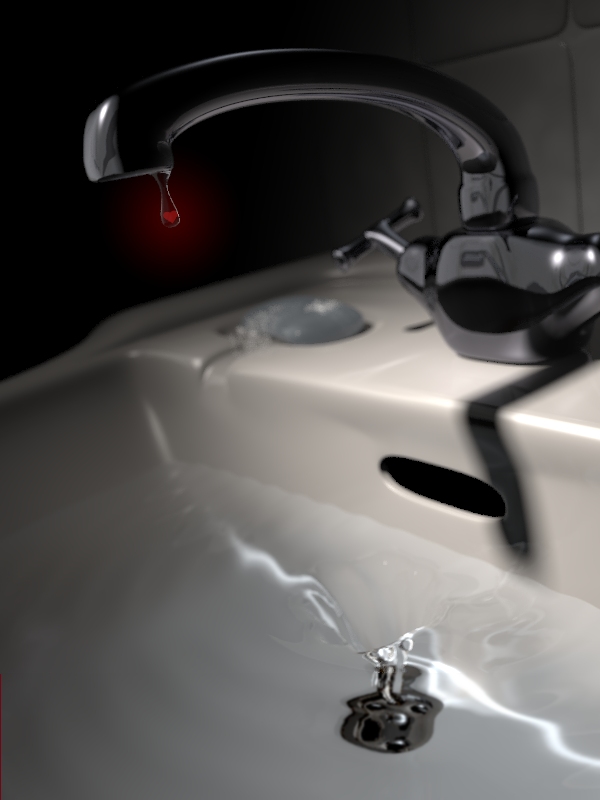
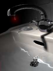
So, here's a quick (heh, 7hours and not done yet ain't quick!) test with
focal blur.

The render wasn't complete yet, so the lower 120 lines or so are basically
just a blurred version of the standard antia-aliased render.

Anyways, I think the focal blur adds a lot and I'll keep it for the final
render. Now I'm getting to the spot where I'm unsure if I want to add
anything and I *really* should give it a rest for a day or two, and take
some more comments and suggestions. A good friend of mine wants to say
something as well, but as she's not here at the moment, I have to wait for
her as well.

The tiles behind the sink required a little change in the spotlight's
point_at, which in effect caused a little more lighting variance in the
lower left corner. I'm thinking about pushing it a little further (either
via texture or via lighting changes), but we'll see. As it is now I think
I'll be experimenting with some "less shiny-new-clean" textures to check if
it enhances the mood I'd like to create. I also want to try and add some
waterdrops onto the surface of the faucet near its base and on the sink.

And for those wondering, the waterdrop is now modelled with Silo like
everything else in the image besides the heart, the water in the sink, and
the foam on the soap.

Regards,
Tim

--
aka "Tim Nikias v2.0"
Homepage: <http://www.nolights.de>
Post a reply to this message
Attachments:
Download 'DtD_wip6.jpg' (115 KB)
Preview of image 'DtD_wip6.jpg'
|
|
| |
| |
|
|
|
|
| |
| |
|
|
I can only congratulate for a STUNNING image... I do have a couple of
suggestions though:

1) Raise the ambient lighting a little. I think the image is a little dark.
2) The taps only have two knobs... I've never seen taps like this... Taps of
this style seem to always have four knobs.  I think this would also round
out this area of the image.
3) Where is the plug? In sinks like this, the plug is usually chained to a
attachment just above the overflow... This would give you the opportunity
for some real nice chain.
4) I think there is a little too much focal blur in this... the soap is a
bit too blurred.

I agree with you about using some dirty textures rather than the too shiny
ones...

Even as a WIP this image is bloody impressive... you have more patience than
I do!

Rarius
Post a reply to this message
|
|
| |
| |
|
|
|
|
| |
| |
|
|
Tim,it will be nice...

Regards.

------
Hasan
Post a reply to this message
|
|
| |
| |
|
|
|
|
| |
| |
|
|
> 1) Raise the ambient lighting a little. I think the image is a little
dark.

That's often a problem with what monitor you're watching it on. Personally,
I like it like it is, but I might try to make it a tad brighter. I'm not
sure if that creates a wash-out on the already bright parts, but I'll
certainly look into it.

> 2) The taps only have two knobs... I've never seen taps like this... Taps
of
> this style seem to always have four knobs.  I think this would also round
> out this area of the image.

Yeah, should give that a try. I always like doing things slightly off what
you're expecting, but you're right, maybe it would balance that section of
the image.

> 3) Where is the plug? In sinks like this, the plug is usually chained to a
> attachment just above the overflow... This would give you the opportunity
> for some real nice chain.

Actually, I do have a plug fitting the drain. But then I decided to leave it
away, as if to say that there's no way to keep that drop going down the
drain. Might have to create the chain in any case, to make the absence of
the plug more obvious.

> 4) I think there is a little too much focal blur in this... the soap is a
> bit too blurred.

It's a difficult choice. I kinda like how the tab gets blurred, but then the
soap gets blurred to much. I surely will toy around with those settings,
they were the latest addition and haven't been tweaked as much as other
stuff.

Thanks for the feedback!

Regards,
Tim
--
aka "Tim Nikias v2.0"
Homepage: <http://www.nolights.de>
Post a reply to this message
|
|
| |
| |
|
|
|
|
| |
| |
|
|
> Tim,it will be nice...

Thank you!

Regards,
Tim

--
aka "Tim Nikias v2.0"
Homepage: <http://www.nolights.de>
Post a reply to this message
|
|
| |
| |
|
|
|
|
| |
| |
|
|
> Bob Hughes wrote:
> > Trying to remember about twisting directions... I know it is commonly
> > thought that the northern and southern hemispheres of the planet have their
> > own direction but it's apparently just a random thing instead. I forget.
> > Something about no relation to weather that is influenced by earth rotation
> > instead.
>
Warp <war### [at] tag povrayorg> wrote:
> I wondered how long it would take for someone to bring this up.
>
> The rotation of the water has nothing to do with the rotation of
> the Earth or anything like that. It's purely a question of geometry
> of the sink, the pipes, initial water movement, etc.
Everything you ever knew about spinning water that ain't so:
http://www.ems.psu.edu/~fraser/Bad/BadCoriolis.html
A similar fallacy leads some New-Agers to believe that the tides affect our
body fluid. It's sometimes scary all the things we take for granted that
are totally bogus. Here's a bunch:
http://tag.povray.org/povQandT/misconceptions.html povrayorg> wrote:
> I wondered how long it would take for someone to bring this up.
>
> The rotation of the water has nothing to do with the rotation of
> the Earth or anything like that. It's purely a question of geometry
> of the sink, the pipes, initial water movement, etc.
Everything you ever knew about spinning water that ain't so:
http://www.ems.psu.edu/~fraser/Bad/BadCoriolis.html
A similar fallacy leads some New-Agers to believe that the tides affect our
body fluid. It's sometimes scary all the things we take for granted that
are totally bogus. Here's a bunch:
http://tag.povray.org/povQandT/misconceptions.html
Post a reply to this message
|
|
| |
| |
|
|
|
|
| |
| |
|
|
Hi Tim,

It's looking excellent.

In terms of dramatic effect, have you considered placing the heart deep in
the vortex, just on the brink of going down the plug-hole? The drop forming
on the tap looks like it leaves a glimmer of hope that one could salvage the
situation by plugging the hole. You could even have a faint red spiral
coming back off the heart and maybe a dagger inside the water drop ready to
fall and slice the heart into pieces before it finally drops out of sight.

Hope these ideas raise your spirits ;o)

All the best,
Chris B.
Post a reply to this message
|
|
| |
| |
|
|
|
|
| |
| |
|
|
> It's looking excellent.

Thank you very much!

> In terms of dramatic effect, have you considered placing the heart deep in
> the vortex, just on the brink of going down the plug-hole? The drop
forming
> on the tap looks like it leaves a glimmer of hope that one could salvage
the
> situation by plugging the hole. You could even have a faint red spiral
> coming back off the heart and maybe a dagger inside the water drop ready
to
> fall and slice the heart into pieces before it finally drops out of sight.

Initially, I wanted to place something near or even in the vortex. As for
the plug, Rarius mentioned that it seems missing. I'm currently thinking
about adding part of a chain to the faucet, which should show more clearly
that the plug is in fact missing, there is no hope for rescue by plugging
the vortex.
As for the dagger - I like and want an image which, overall, gives the
impression of a nice, clean and bright environment, and a friend of mine
today told me as much. The heart is the tiny drop that'll tell the story
behind the title "Down the drain".

> Hope these ideas raise your spirits ;o)

Well, the image and the work on it is more of a distraction. I'm too much of
a thinker.

Regards,
Tim

--
aka "Tim Nikias v2.0"
Homepage: <http://www.nolights.de>
Post a reply to this message
|
|
| |
| |
|
|
|
|
| |