|
|
|
|
|
|
| |
| |
|
|
|
|
| |
| |
|
|
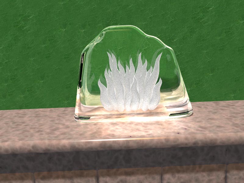
Any suggestions appreciated.

   ~Steve~
Post a reply to this message
Attachments:
Download 'fireice.jpg' (104 KB)
Preview of image 'fireice.jpg'
|
|
| |
| |
|
|
|
|
| |
| |
|
|
I like it.
Post a reply to this message
|
|
| |
| |
|
|
|
|
| |
| |
|
|
St. wrote:
> Any suggestions appreciated.
>
>   ~Steve~
>
>
> ------------------------------------------------------------------------
>
I think it is technically very challenging and well realized.  By that I
mean how you accomplished the cut interior look and combined it with
excellent texturing and photons(?) and achieve a remarkable level of
realism.  It is also a great interpretation of the topic, but with
regards to that, the color scheme doesn't make much sense to me.  I
would think that some play of reds and cyans might push the irony a
little more, but perhaps you are trying to be less obvious.  I do wonder
if you might experiment more with the lighting to make the image a
little more evocative and perhaps gain further allusion to the topic.
Post a reply to this message
|
|
| |
| |
|
|
|
|
| |
| |
|
|
St. spake:

> Any suggestions appreciated.
>
>    ~Steve~

Nice, a unique variation. Love the textures, especially the lower part near
the table.
--
Stefan Viljoen
Software Support Technician / Programmer
Polar Design Solutions
Post a reply to this message
|
|
| |
| |
|
|
|
|
| |
| |
|
|
Original interpretation!!
I would put a little puddle of water at the base too......
I am not too fond of the background texture, though... Why green?

Thomas
Post a reply to this message
|
|
| |
| |
|
|
|
|
| |
| |
|
|
"Thomas de Groot" <t.d### [at] inter nlnet> wrote in message
news:43f971f8@news.povray.org...
> Original interpretation!!
Thanks!
> I would put a little puddle of water at the base too......
Ha! I beat you to it! Rendering now... Should be about 2 hours.
> I am not too fond of the background texture, though... Why green?
Heh... :) It was just the first image I picked as an image map - it's an
actual photo of... green leather! No, I didn't like it either, so I've gone
for a plainer look.
~Steve~
>
> Thomas
>
> nlnet> wrote in message
news:43f971f8@news.povray.org...
> Original interpretation!!
Thanks!
> I would put a little puddle of water at the base too......
Ha! I beat you to it! Rendering now... Should be about 2 hours.
> I am not too fond of the background texture, though... Why green?
Heh... :) It was just the first image I picked as an image map - it's an
actual photo of... green leather! No, I didn't like it either, so I've gone
for a plainer look.
~Steve~
>
> Thomas
>
>
Post a reply to this message
|
|
| |
| |
|
|
|
|
| |
| |
|
|
"Jim Charter" <jrc### [at] msncom> wrote in message
news:43f937e9$1@news.povray.org...
> St. wrote:
>> Any suggestions appreciated.
>>
>>   ~Steve~
>>
>>
>> ------------------------------------------------------------------------
>>
> I think it is technically very challenging and well realized.  By that I
> mean how you accomplished the cut interior look and combined it with
> excellent texturing and photons(?) and achieve a remarkable level of
> realism.

   Blimey Jim, thanks!

 It is also a great interpretation of the topic, but with
> regards to that, the color scheme doesn't make much sense to me.  I would
> think that some play of reds and cyans might push the irony a little more,
> but perhaps you are trying to be less obvious.  I do wonder if you might
> experiment more with the lighting to make the image a little more
> evocative and perhaps gain further allusion to the topic.

    Check the next one out soon.

    ~Steve~
Post a reply to this message
|
|
| |
| |
|
|
|
|
| |
| |
|
|
"St." <dot### [at] dotcom> wrote in message news:43f8cf69@news.povray.org...
> Any suggestions appreciated.

Mmm, there's something about the combination of photons and the refraction that
makes it look really pretty.  I'll look forward to the next version you
mentioned :)

I notice there are some black areas (on the left, and at the bottom on each
corner) - is this a max_trace_level hit or is it reflecting or refracting
something out to the sides that's black?  If the latter, you could use this to
your advantage - put something coloured out there with a high ambient (maybe a
burnt orange/yellow?) and use it to accentuate the edges.

As others have mentioned the background might need changing - how about a deep
rich blue?

Nice work :)

Lance.

thezone - thezone.firewave.com.au
Post a reply to this message
|
|
| |
| |
|
|
|
|
| |
| |
|
|
"St." <dot### [at] dotcom> wrote in message news:43f8cf69@news.povray.org...

> Any suggestions appreciated.

Nice, but like others, I think the background texture is, well, not the
greatest. Also, I'm not crazy about the marble texture either (POV materials
are so overused and also are not the best). The slant is also distracting
for me, it would not be so bad if at least one edge of the shelf/mantle were
visible. Finally, the transition from wall to mantle needs work. The piece
is pretty good, but I don't like the setting too much overall. Now, if you
placed it on a coffee table in front of the mantle and have the fire
reflecting faintly off of it, and make it glossier and melting...
Post a reply to this message
|
|
| |
| |
|
|
From: St
Subject: Re: What do you think now...? (still wip 245kb's)
Date: 20 Feb 2006 11:57:55
Message: <43f9f513@news.povray.org>
|
|
|
| |
| |
|
|
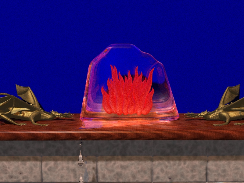
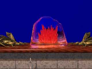
Phew! That was a long 2 hours!  ;)

Ok, I've implemented Lance' deep rich blue as the background - not too sure
about it, but would appreciate other's thoughts.

 Thomas' suggestion of having the 'ice' block melting is there now too, and
I've added a couple of brass beasties with fiery flames, as a kind of
surreal effect to go with the melting ice...

  Oh, and I've moved the camera back a little as per nobody's suggestion,
but if this image isn't going to work out, I'll probably follow his other
advise and do the whole fireplace thing instead... Or both. Hmm...

  Oh again, and what do you think of the red flames this time?

   ~Steve~
Post a reply to this message
Attachments:
Download 'fireice2.jpg' (246 KB)
Preview of image 'fireice2.jpg'
|
|
| |
| |
|
|
From: Lance Birch
Subject: Re: What do you think now...? (still wip 245kb's)
Date: 20 Feb 2006 12:04:11
Message: <43f9f68b$1@news.povray.org>
|
|
|
| |
| |
|
|
"St." <dot### [at] dotcom> wrote in message news:43f9f513@news.povray.org...
> Phew! That was a long 2 hours!  ;)
>
> Ok, I've implemented Lance' deep rich blue as the background - not too sure
> about it <snip>

Now that I see it, neither am I... heh :S

I actually quite like the neutral colours of the surface material from the last
one, and the neutral colours of the flames - maybe the red is a little
overpowering?

Hmm... *ponders*

Lance.

thezone - thezone.firewave.com.au
Post a reply to this message
|
|
| |
| |
|
|
|
|
| |
| |
|
|
"Orchid XP v2" <voi### [at] devnull> wrote in message
news:43f8e8d4@news.povray.org...
>I like it.

  Thanks. And yours is coming along nicely too.

   ~Steve~
Post a reply to this message
|
|
| |
| |
|
|
|
|
| |
| |
|
|
"Stefan Viljoen polard.com>" <spamnot@<removethis> wrote in message
news:43f957b2@news.povray.org...
> St. spake:
>
>> Any suggestions appreciated.
>>
>>    ~Steve~
>
> Nice, a unique variation. Love the textures, especially the lower part
> near
> the table.

   Thanks Stefan! Not sure what you mean by 'table' though, as it's really a
mantle over a fireplace.

    ~Steve~


> --
> Stefan Viljoen
> Software Support Technician / Programmer
> Polar Design Solutions
>
>
Post a reply to this message
|
|
| |
| |
|
|
|
|
| |
| |
|
|
"somebody" <x### [at] ycom> wrote in message news:43f9a6a1$1@news.povray.org...
> "St." <dot### [at] dotcom> wrote in message news:43f8cf69@news.povray.org...
>
>> Any suggestions appreciated.
>
> Nice, but like others, I think the background texture is, well, not the
> greatest.

   :op   ;)  Thanks for the 'nice'.

Also, I'm not crazy about the marble texture either (POV materials
> are so overused and also are not the best).

  Yes, I picked the one closest to our actual fireplace tiles here. I've
kept them as the fireplace surround, but as you'll see I've changed the
mantle to wood. I think it gives a nice contrast.


The slant is also distracting
> for me,

  Sorted. I didn't like it too.

it would not be so bad if at least one edge of the shelf/mantle were
> visible. Finally, the transition from wall to mantle needs work. The piece
> is pretty good, but I don't like the setting too much overall. Now, if you
> placed it on a coffee table in front of the mantle and have the fire
> reflecting faintly off of it, and make it glossier and melting...

  It's funny that you said that. This image started off with a vision of an
old guy sat in an armchair in front of his open coal fire with his feet up
on a cracket and one arm and hand showing holding a freezing cold glass of
water, (so in effect, all you would see is his legs and slippers, and to the
right, his arm and hand holding the glass - kind of like this  \ //  ).
Well, I started with the mantle-piece, and then I was wondering what to put
on the mantle, so I hit the 'net and stumbled on those glass frosted
ornaments - and that was it for now, I haven't bothered with the other idea,
but may well do if time permits.

   Thanks for the suggestions.

     ~Steve~


>
>
Post a reply to this message
|
|
| |
| |
|
|
From: St
Subject: Re: What do you think now...? (still wip 245kb's)
Date: 20 Feb 2006 12:36:04
Message: <43f9fe04@news.povray.org>
|
|
|
| |
| |
|
|
"St." <dot### [at] dotcom> wrote in message news:43f9f513@news.povray.org...

 > as per nobody's suggestion,

  OOPS!! Not 'nobody's' suggestion!! *SOMEBODY*  :)

   Sorry somebody.

    ~Steve~
Post a reply to this message
|
|
| |
| |
|
|
From: Jim Charter
Subject: Re: What do you think now...? (still wip 245kb's)
Date: 20 Feb 2006 12:37:59
Message: <43f9fe77$1@news.povray.org>
|
|
|
| |
| |
|
|
Lance Birch wrote:
> "St." <dot### [at] dotcom> wrote in message news:43f9f513@news.povray.org...
>
>>Phew! That was a long 2 hours!  ;)
>>
>>Ok, I've implemented Lance' deep rich blue as the background - not too sure
>>about it <snip>
>
>
> Now that I see it, neither am I... heh :S
>
> I actually quite like the neutral colours of the surface material from the last
> one, and the neutral colours of the flames - maybe the red is a little
> overpowering?
>
> Hmm... *ponders*
>


Well I'm sure and I'm sure it's a great image.

Maybe room for some fine tuning but basucally I think it is on track.

I particularily like the lighter, refracted blue in the ice/glass above
the "flames"

I also think that the rich wood color makes and important contribution.
  The color scheme is basically the three "primaries" red/blue/yellow.
The difficult place is perhaps the grey area under the mantel but the
way the picture crops right along the line of the tiles saves it.
Post a reply to this message
|
|
| |
| |
|
|
From: Darren New
Subject: Re: What do you think now...? (still wip 245kb's)
Date: 20 Feb 2006 12:42:07
Message: <43f9ff6f$1@news.povray.org>
|
|
|
| |
| |
|
|
I'd buy one of those to put on *my* fireplace! :-)
Post a reply to this message
|
|
| |
| |
|
|
|
|
| |
| |
|
|
I like it so far, but I'll be a little critical for you:

1) A shinier, more reflectier, brassier texture on the dragons (if you
like...)

2) The water drops should not be pointed at the top, but rather be
elliptical (pointy drops is something we all draw as kids, but doesn't
exist in reality).  Also, have the water pool extend around the edge of the
mantle and the drops forming below.  As it is right now, the drops look like
they are dropping off the top or side of the mantle which doesn't look
right.


-tgq
Post a reply to this message
|
|
| |
| |
|
|
From: Stefan Viljoen
Subject: Re: What do you think now...? (still wip 245kb's)
Date: 21 Feb 2006 00:45:52
Message: <43faa90f@news.povray.org>
|
|
|
| |
| |
|
|
St. spake:

> Phew! That was a long 2 hours!  ;)

2 hours is long for a rendering? I thought a 1000 is long... :)

> Ok, I've implemented Lance' deep rich blue as the background - not too
> sure about it, but would appreciate other's thoughts.

The first image was a great image, now this is a fab image! It looks very
alien to me, both warm and inviting and glowing and ominous - very well
done.

--
Stefan Viljoen
Software Support Technician / Programmer
Polar Design Solutions
Post a reply to this message
|
|
| |
| |
|
|
|
|
| |
| |
|
|
Among other things, St. saw fit to write:

>   It's funny that you said that. This image started off with a vision of
>   an
> old guy sat in an armchair in front of his open coal fire with his feet up
> on a cracket and one arm and hand showing holding a freezing cold glass of
> water, (so in effect, all you would see is his legs and slippers, and to
> the
> right, his arm and hand holding the glass - kind of like this  \ //  ).

... then dropping the glass and muttering "Rosebud"?

--
light_source{9+9*x,1}camera{orthographic look_at(1-y)/4angle 30location
9/4-z*4}light_source{-9*z,1}union{box{.9-z.1+x clipped_by{plane{2+y-4*x
0}}}box{z-y-.1.1+z}box{-.1.1+x}box{.1z-.1}pigment{rgb<.8.2,1>}}//Jellby
Post a reply to this message
|
|
| |
| |
|
|
|
|
| |
| |
|
|
"Jellby" <me### [at] privacynet> wrote in message
news:egm### [at] badulaqueunexes...
> Among other things, St. saw fit to write:
>
>>   It's funny that you said that. This image started off with a vision of
>>   an
>> old guy sat in an armchair in front of his open coal fire with his feet
>> up
>> on a cracket and one arm and hand showing holding a freezing cold glass
>> of
>> water, (so in effect, all you would see is his legs and slippers, and to
>> the
>> right, his arm and hand holding the glass - kind of like this  \ //  ).
>
> ... then dropping the glass and muttering "Rosebud"?

     Heh... :)   I'd like to try that myself, but the other half would slap
me!  :oO

     ;)

    ~Steve~


>
> --
> light_source{9+9*x,1}camera{orthographic look_at(1-y)/4angle 30location
> 9/4-z*4}light_source{-9*z,1}union{box{.9-z.1+x clipped_by{plane{2+y-4*x
> 0}}}box{z-y-.1.1+z}box{-.1.1+x}box{.1z-.1}pigment{rgb<.8.2,1>}}//Jellby
Post a reply to this message
|
|
| |
| |
|
|
|
|
| |
| |
|
|
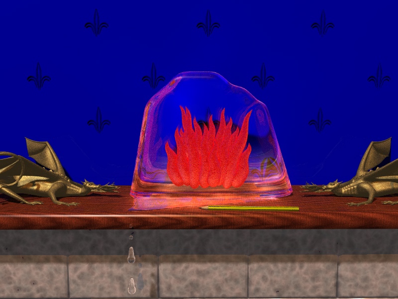
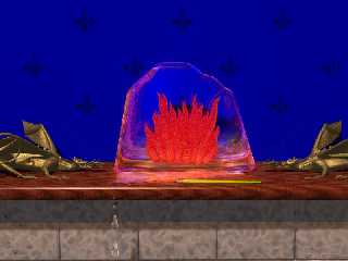
I could keep this image to a fairly low compression this time because of the
change in that back wall...

  I've added some <hopefully!> velvet-looking fleur-de-lis patterns as the
background wallpaper... And a pencil.

  I plan to add an openly ripped letter, and some coins too, and maybe a
mirror behind the ice block... (not sure).

   The rounded drips (re-modeled now) are there as per Somebody's
suggestion, but I would like further comments on these...?

    What other things have you got on your mantle at this moment?

   ~Steve~
Post a reply to this message
Attachments:
Download 'fire_ice3.jpg' (133 KB)
Preview of image 'fire_ice3.jpg'
|
|
| |
| |
|
|
|
|
| |
| |
|
|
>> I like it.
>
>
>  Thanks. And yours is coming along nicely too.

Ah.

Yes...

I must admit it didn't immediately convey to me "fire and ice". More
like "hey, there's a lump of glass with a cool pattern inside it!"
Post a reply to this message
|
|
| |
| |
|
|
|
|
| |
| |
|
|
To borrow the catchphrase of a certain infamous American institution...
"I'm lovin' it."


Definitely conveys "fire" much more strongly now. (Not sure about the
"ice" part yet... maybe some of the extreme edges could be slightly cloudy?)
Post a reply to this message
|
|
| |
| |
|
|
|
|
| |
| |
|
|
Much better than the second one, except for one thing: that pencil lying
there, all nice and straight, is really bugging me.  Just add a little
random rotation, and it will be great :)

...Chambers
Post a reply to this message
|
|
| |
| |
|
|
|
|
| |
| |
|
|
"Chambers" <bdc### [at] yahoocom> wrote in message
news:43fb7ce4$1@news.povray.org...
> Much better than the second one, except for one thing: that pencil lying
> there, all nice and straight, is really bugging me.  Just add a little
> random rotation, and it will be great :)

   Hey, hiya Ben. Nice to see you around here again. :)

   Ok, well, truth is, that pencil looked absolutely terrible rotated. The
straight lines were looking like they were rendered with no AA when +a0.0
was turned on. In fact, this image is with +a0.0 turned on now, but with the
pencil at 90 degrees - and it still looks kind of cruddy... :/

   To counteract this, I think I have the answer in actually scaling it a
little bigger - and, if it doesn't work, I'll take it out. It was fun making
the pencil though, as this is the first time I've made one... ;)

   Coins and envelope/letter next, but I thought of something else earlier
that will hopefully be the icing on the cake.  :)

   Thanks for your comments, appreciated.

     ~Steve~


>
> ...Chambers
Post a reply to this message
|
|
| |
| |
|
|
From: St
Subject: Re: What do you think now...? (still wip 245kb's)
Date: 21 Feb 2006 19:12:05
Message: <43fbac55@news.povray.org>
|
|
|
| |
| |
|
|
"Stefan Viljoen polard.com>" <spamnot@<removethis> wrote in message
news:43faa90f@news.povray.org...
> St. spake:
>
>> Phew! That was a long 2 hours!  ;)
>
> 2 hours is long for a rendering? I thought a 1000 is long... :)


    Lol! You ol' renderdog, you! :)


>
>> Ok, I've implemented Lance' deep rich blue as the background - not too
>> sure about it, but would appreciate other's thoughts.
>
> The first image was a great image, now this is a fab image! It looks very
> alien to me, both warm and inviting and glowing and ominous - very well
> done.

  Sheesh. I actually don't know what to say now... I'm speechless for a
change. Apart from 'thank you' Stefan, much appreciated.

   *And* keep a lookout for updates...  ;)

     ~Steve~


>
> --
> Stefan Viljoen
> Software Support Technician / Programmer
> Polar Design Solutions
>
>
Post a reply to this message
|
|
| |
| |
|
|
|
|
| |
| |
|
|
"Orchid XP v2" <voi### [at] devnull> wrote in message
news:43fb6f84$1@news.povray.org...
> To borrow the catchphrase of a certain infamous American institution...
> "I'm lovin' it."

   Thanks Mr Inv... !

>
>
> Definitely conveys "fire" much more strongly now. (Not sure about the
> "ice" part yet... maybe some of the extreme edges could be slightly
> cloudy?)

  Yep, you're right. I know what you're saying and I think I may have a
little time left to try this for the comp.

    I'll follow this up anyway even if I don't have time...  :o)

     ~Steve~
Post a reply to this message
|
|
| |
| |
|
|
|
|
| |
| |
|
|
>> Definitely conveys "fire" much more strongly now. (Not sure about the
>> "ice" part yet... maybe some of the extreme edges could be slightly
>> cloudy?)
>
>
>  Yep, you're right. I know what you're saying and I think I may have a
> little time left to try this for the comp.
>
>    I'll follow this up anyway even if I don't have time...  :o)

Some more thoughts, in no particular order...

You should either make the edges cloudy, or maybe put tiny water
droplets / rivulets on the sides. (Keep it to the sides of avoid
obscuring the flames.)

The flames should perhaps emit a *tiny* amount of red light to produce a
slight hilight on nearby objects.

Perhaps add more orange / yellow to the base of the flames?
Post a reply to this message
|
|
| |
| |
|
|
|
|
| |
| |
|
|
"St." <dot### [at] dotcom> wrote in message news:43fb65c6@news.povray.org...


>   The rounded drips (re-modeled now) are there as per Somebody's
> suggestion, but I would like further comments on these...?

     *Trevors'* suggestion(!) Humph...

     Sorry Trevor.  (Man, I'm too busy...)  :o/

     ~Steve~
Post a reply to this message
|
|
| |
| |
|
|
From: St
Subject: Re: What do you think now...? (still wip 245kb's)
Date: 26 Feb 2006 14:17:28
Message: <4401fec8@news.povray.org>
|
|
|
| |
| |
|
|
"Darren New" <dne### [at] sanrrcom> wrote in message
news:43f9ff6f$1@news.povray.org...
> I'd buy one of those to put on *my* fireplace! :-)

   Twenty dollars, fifty cents...  :o)

    Is that cheap??

    ~Steve~
Post a reply to this message
|
|
| |
| |
|
|
From: Eero Ahonen
Subject: Re: What do you think now...? (still wip 245kb's)
Date: 27 Feb 2006 14:34:59
Message: <44035463$1@news.povray.org>
|
|
|
| |
| |
|
|
Darren New wrote:
> I'd buy one of those to put on *my* fireplace! :-)

I wouldn't. It looks too live fire to be *outside* of the fireplace :O.

--
Eero "Aero" Ahonen
   http://www.zbxt.net
      aer### [at] removethiszbxtnetinvalid
Post a reply to this message
|
|
| |
| |
|
|
From: Eero Ahonen
Subject: Re: What do you think now...? (still wip 245kb's)
Date: 27 Feb 2006 14:36:33
Message: <440354c1$1@news.povray.org>
|
|
|
| |
| |
|
|
Stefan Viljoen <spamnot@ wrote:
>
> 2 hours is long for a rendering? I thought a 1000 is long... :)
>

Well yes for a draft oslt, but for a biiig image going at the background
it's not even near too much (well yeah, it's still long one). But kernel
panic after 1800 hours makes you mad for a while :/.

--
Eero "Aero" Ahonen
   http://www.zbxt.net
      aer### [at] removethiszbxtnetinvalid
Post a reply to this message
|
|
| |
| |
|
|
From: Arttu Voutilainen
Subject: Re: What do you think now...? (still wip 245kb's)
Date: 27 Feb 2006 14:48:38
Message: <44035796$1@news.povray.org>
|
|
|
| |
| |
|
|
Eero Ahonen wrote:
> Stefan Viljoen <spamnot@ wrote:
>
>>2 hours is long for a rendering? I thought a 1000 is long... :)
>>
>
>
> Well yes for a draft oslt, but for a biiig image going at the background
> it's not even near too much (well yeah, it's still long one). But kernel
> panic after 1800 hours makes you mad for a while :/.
>
The plasm-tube on brandher? I started to think about it, when brandher
said that my screen was dead..

-- Arttu "Blizzara" Voutilainen
Post a reply to this message
|
|
| |
| |
|
|
From: Eero Ahonen
Subject: Re: What do you think now...? (still wip 245kb's)
Date: 27 Feb 2006 15:10:49
Message: <44035cc9$1@news.povray.org>
|
|
|
| |
| |
|
|
Arttu Voutilainen wrote:
>
> The plasm-tube on brandher? I started to think about it, when brandher
> said that my screen was dead..
>

Yep. Some memory error, I hope it's not physical - that would require
either removing some memory or buying some new (and one more reboot).

--
Eero "Aero" Ahonen
   http://www.zbxt.net
      aer### [at] removethiszbxtnetinvalid
Post a reply to this message
|
|
| |
| |
|
|
|
|
| |