|
|
|
|
|
|
| |
| |
|
|
|
|
| |
| |
|
|
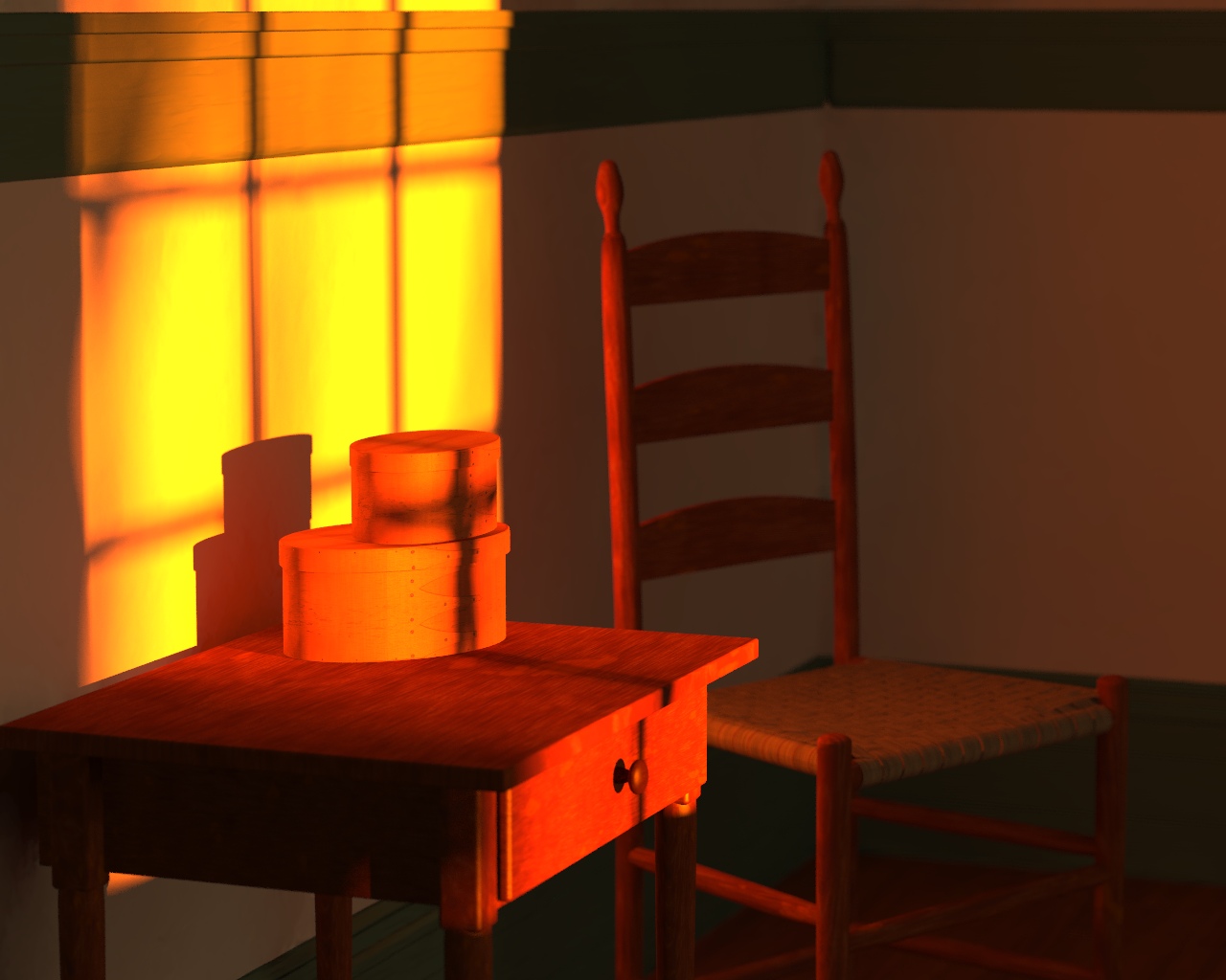
I don't like the above title, so that will probably change, but overall, I'm
pretty happy with the way this has turned out.  Since my last post in April
(I think), I have fixed the chair dimensions (It was too wide), changed the
style (and completed) the side-table, and made a few other technical
improvements.

However, I wouldn't mind some advice, especially in certain areas, like
framing.  I was thinking of making this taller, so that it included more of
the table and chair legs.  Additionally, I have considered changing the
camera position, among other things.  Or maybe adjusting the lighting.

Certain parts of the image are "tweaked" and intentional, however.  The
shadow of the cross falling onto the boxes was very deliberate.  If you
think you can make out a shadowy figure on the cross shape, you are also
correct.  I generally don't like pointing out those details, because if
anyone gets enjoyment from my pictures, it's supposed to be from finding the
minor details.  I guess that's my approach to Art.  Yes, the cross shadow is
created by the window mullions (I think that's the right word for the
divider thingies), so it serves a dual purpose.

Ovearall, this was one image that I definitely tried to keep simple.  KISS
(keep it simple, stupid) had to be adhered to because, while I doubt the
Shakers invented the term, it seems to quite readily sum up a large part of
their belief-system.  So, I believe that I have quite accurately captured
both the Christianity and the Simplicity evident in their beliefs.  I
rock!!!  But seriously, that was my intent, and I think I did pretty well,
hopefully without being too cliched.  But you be the judge of that.

Again, feel free to criticize, offer advice, tell me I'm an idiot, etc.
Basically, this is one scene on which I would really appreciate feedback,
positive or negative.  I'm feeling unusually thick-skinned.  ;-)

--
Jeremy M. Praay
Post a reply to this message
Attachments:
Download 'Shaker10.jpg' (193 KB)
Preview of image 'Shaker10.jpg'
|
|
| |
| |
|
|
|
|
| |
| |
|
|
Great! I've just dropped in here to find a nice wallpaper for my desktop
(just installed new system) and first thing to find was your beautiful
picture. Even its size is what I need. I guess it will stay in my computer
for a long time. Hope it isn't copyrighted and can be used as desktop
wallpaper ;-)
Przemek
Post a reply to this message
|
|
| |
| |
|
|
|
|
| |
| |
|
|
"Jeremy M. Praay" <jer### [at] questsoftware cmo> wrote in message
news:438df271@news.povray.org...
>snip<
> Again, feel free to criticize, offer advice, tell me I'm an idiot, etc.
> Basically, this is one scene on which I would really appreciate feedback,
> positive or negative. I'm feeling unusually thick-skinned. ;-)
>
> --
> Jeremy M. Praay
>
>
The composition is quite pleasing to my eye.
My only issues of concern were:
the way-too-yellowness of the early morning light
the absence of a skirting board
the height of the dado rail on the wall (higher than ladder-back top makes
it useless/unutilitarian)
To quote the Shakers - form follows function
DLM cmo> wrote in message
news:438df271@news.povray.org...
>snip<
> Again, feel free to criticize, offer advice, tell me I'm an idiot, etc.
> Basically, this is one scene on which I would really appreciate feedback,
> positive or negative. I'm feeling unusually thick-skinned. ;-)
>
> --
> Jeremy M. Praay
>
>
The composition is quite pleasing to my eye.
My only issues of concern were:
the way-too-yellowness of the early morning light
the absence of a skirting board
the height of the dado rail on the wall (higher than ladder-back top makes
it useless/unutilitarian)
To quote the Shakers - form follows function
DLM
Post a reply to this message
|
|
| |
| |
|
|
|
|
| |
| |
|
|
Jeremy M. Praay spake:

> I don't like the above title, so that will probably change, but overall,
> I'm
> pretty happy with the way this has turned out.  Since my last post in

Hi Jeremy

I like it quite a lot - especially the light effect - it looks almost
exactly like a scene I remember from my childhood in my grandparents house
early one morning. The composition is OK too, I would like a bit more
"stuff" in the scene (it looks a bit empty to my eye) but since it is still
almost-WIP (!) it looks quite good I think.

Regards,
--
Stefan Viljoen
Software Support Technician / Programmer
Polar Design Solutions
Post a reply to this message
|
|
| |
| |
|
|
From: Thomas de Groot
Subject: Re: Shaker Simple (near final) [200K]
Date: 1 Dec 2005 04:05:23
Message: <438ebcd3@news.povray.org>
|
|
|
| |
| |
|
|
"Jeremy M. Praay" <jer### [at] questsoftwarecmo> schreef in bericht
news:438df271@news.povray.org...
> However, I wouldn't mind some advice, especially in certain areas, like
> framing.  I was thinking of making this taller, so that it included more
of
> the table and chair legs.  Additionally, I have considered changing the
> camera position, among other things.  Or maybe adjusting the lighting.
>

Very neat and careful image, Jeremy. I think it would win in dramatic
feeling if the format were portrait instead of landscape. Also, in the
religious meaning, it would simbolize the vertical trend of communication
with God. The elements in the scene are already more vertically-oriented
than horizontal.

Thomas
Post a reply to this message
|
|
| |
| |
|
|
|
|
| |
| |
|
|
"Przemek Loesch" <nomail@nomail> wrote in message
news:web.438df78e60bfd0a5b0aac12c0@news.povray.org...
> Great! I've just dropped in here to find a nice wallpaper for my desktop
> (just installed new system) and first thing to find was your beautiful
> picture. Even its size is what I need. I guess it will stay in my computer
> for a long time. Hope it isn't copyrighted and can be used as desktop
> wallpaper ;-)
> Przemek
>
Thank you!  And you're certainly free to use it as Wallpaper.  :-)  I often
use my own pictures as my desktop wallpaper while they are in-progress. Then
I can stare at them and consider what the scene might need, plus I sometimes
get remarks from coworkers, which can be helpful.
Post a reply to this message
|
|
| |
| |
|
|
|
|
| |
| |
|
|
"dlm" <me### [at] addressinvalid> wrote in message
news:438e6faf$1@news.povray.org...
>
> The composition is quite pleasing to my eye.
> My only issues of concern were:
>  the way-too-yellowness of the early morning light
>  the absence of a skirting board
>  the height of the dado rail on the wall (higher than ladder-back top
> makes it useless/unutilitarian)
> To quote the Shakers - form follows function
>

Thank you for your response!

The light may be too yellow.  I experimented with my digital camera and took
several photos that I used for comparison.  But in this case, I was looking
for a very yellow (almost orange) light.

The peg-board (if I had created one) would be much higher up, yes.  Dado
rails at this height were very common in the 1800's.  I'll have to check
some of my Shaker reference photo's, since I don't recall exacly why I did
it that way.  Maybe I had no particular reason.  I think the image needs
"something" in that space, however.
Post a reply to this message
|
|
| |
| |
|
|
|
|
| |
| |
|
|
"Stefan Viljoen polard.com>" <spamnot@<removethis> wrote in message
news:438e906d@news.povray.org...
>
> I like it quite a lot - especially the light effect - it looks almost
> exactly like a scene I remember from my childhood in my grandparents house
> early one morning. The composition is OK too, I would like a bit more
> "stuff" in the scene (it looks a bit empty to my eye) but since it is
> still
> almost-WIP (!) it looks quite good I think.
>

Thank you!  I added a couple of things to the back wall, but I felt like
they were too distracting.  I thought about having a small broom hanging in
the back, though.  I'm still considering it, though modelling a decent whisk
broom sounds fairly challenging.
Post a reply to this message
|
|
| |
| |
|
|
|
|
| |
| |
|
|
"Thomas de Groot" <t.d### [at] internlnet> wrote in message
news:438ebcd3@news.povray.org...
>
> Very neat and careful image, Jeremy. I think it would win in dramatic
> feeling if the format were portrait instead of landscape. Also, in the
> religious meaning, it would simbolize the vertical trend of communication
> with God. The elements in the scene are already more vertically-oriented
> than horizontal.
>

I often "feel" that something isn't right (or could be better), but I don't
have an objective view of "why".  I think you've given that to me.  Very
good input.  Thank you.

I'll experiment with a few different sizes and repost.  Hopefully soon.
Post a reply to this message
|
|
| |
| |
|
|
|
|
| |
| |
|
|
"Jeremy M. Praay" <jer### [at] questsoftwarecmo> wrote in message
news:438f187d$1@news.povray.org...
> "dlm" <me### [at] addressinvalid> wrote in message
> news:438e6faf$1@news.povray.org...
> >
> > The composition is quite pleasing to my eye.
> > My only issues of concern were:
> >  the way-too-yellowness of the early morning light
> >  the absence of a skirting board
> >  the height of the dado rail on the wall (higher than ladder-back top
> > makes it useless/unutilitarian)
> > To quote the Shakers - form follows function
> >
>
> Thank you for your response!
>
> The light may be too yellow.  I experimented with my digital camera and
took

I agree with the yellowness. A little too much for my taste. It looks like a
fun scene to tweak lighting on for hours and hours :)

have you thought about a night-time variation? i know it wouldn't get the
points across that you wanted to make, but it might look neat anyway.
Post a reply to this message
|
|
| |
| |
|
|
|
|
| |
| |
|
|
"Ross" <rli### [at] everestkcnet> wrote in message
news:438f2026$1@news.povray.org...
>>
>> The light may be too yellow.  I experimented with my digital camera and
> took
>
> I agree with the yellowness. A little too much for my taste. It looks like
> a
> fun scene to tweak lighting on for hours and hours :)
>
> have you thought about a night-time variation? i know it wouldn't get the
> points across that you wanted to make, but it might look neat anyway.
>


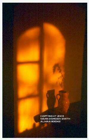
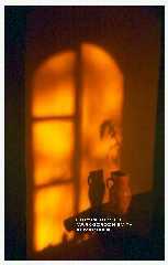
Attached is a photograph I came across last year when researching a proper
lighting for "The Three Blind Mice Return" (my POVComp entry).  It was
largely the inspiration for this type of a scene.  (Also note the vertical
framing.)

--
Jeremy M. Praay
www.beantoad.com
Post a reply to this message
Attachments:
Download 'MALMANTILE.JPG' (62 KB)
Preview of image 'MALMANTILE.JPG'
|
|
| |
| |
|
|
|
|
| |
| |
|
|
"Jeremy M. Praay" <jer### [at] questsoftwarecom> wrote in message
news:438f3873@news.povray.org...
> "Ross" <rli### [at] everestkcnet> wrote in message
> news:438f2026$1@news.povray.org...
> >>
> >> The light may be too yellow.  I experimented with my digital camera and
> > took
> >
> > I agree with the yellowness. A little too much for my taste. It looks
like
> > a
> > fun scene to tweak lighting on for hours and hours :)
> >
> > have you thought about a night-time variation? i know it wouldn't get
the
> > points across that you wanted to make, but it might look neat anyway.
> >
>
>
> Attached is a photograph I came across last year when researching a proper
> lighting for "The Three Blind Mice Return" (my POVComp entry).  It was
> largely the inspiration for this type of a scene.  (Also note the vertical
> framing.)
>

In the photo the wall itself looks yellow, with not as much yellow light.
Your wall looks white-ish with lots of yellow light. Or maybe the photo just
has a better radiosity setting that allows the wall to spread the color
better ;)
Post a reply to this message
|
|
| |
| |
|
|
|
|
| |
| |
|
|
"Ross" <rli### [at] everestkcnet> wrote in message
news:438f43cf$1@news.povray.org...
>
> In the photo the wall itself looks yellow, with not as much yellow light.
> Your wall looks white-ish with lots of yellow light.

Hmmm... I fear that you are correct.  I kind of enjoy the yellowish, though.
Maybe simply because I've gotten so used to it.  I used Jaime's light
macros, so blame him.  ;-)  But seriously, it's pretty easy to adjust the
temperature of "the sun" (Honestly, I don't fully understand what I'm doing
with those macros).  In this case, I made it pretty low.

> Or maybe the photo just
> has a better radiosity setting that allows the wall to spread the color
> better ;)

He probably used God's "Let there be light" macro's, which I'm told, render
very quickly.  ;-)
Post a reply to this message
|
|
| |
| |
|
|
|
|
| |
| |
|
|
"Jeremy M. Praay" <jer### [at] questsoftwarecmo> wrote in message
news:438f187d$1@news.povray.org...
> "dlm" <me### [at] addressinvalid> wrote in message
> news:438e6faf$1@news.povray.org...
>>
>> The composition is quite pleasing to my eye.
>> My only issues of concern were:
>>  the way-too-yellowness of the early morning light
>>  the absence of a skirting board
>>  the height of the dado rail on the wall (higher than ladder-back top
>> makes it useless/unutilitarian)
>> To quote the Shakers - form follows function
>>
>
> Thank you for your response!
>
> The light may be too yellow.  I experimented with my digital camera and
> took several photos that I used for comparison.  But in this case, I was
> looking for a very yellow (almost orange) light.
Perhaps hellfire's aburning outside?


> The peg-board (if I had created one) would be much higher up, yes.  Dado
> rails at this height were very common in the 1800's.  I'll have to check
> some of my Shaker reference photo's, since I don't recall exacly why I did
> it that way.  Maybe I had no particular reason.  I think the image needs
> "something" in that space, however.

It certainly balances the composition.
And granted there are dado rails set at almost any old height in even in the
same 19th century NY country home.
e.g. http://www.maplegroveny.org/resources/03History.pdf


But would Shakers have built a rail with such a large cross-section? And
placed it at mantel height fit for an Irish pub - imagine a line of empty
beer glasses perched on that... Perhaps I was thinking of the utility of a
chair rail - to protect both wall and furniture, and 3 or 4 inches high.
There are some rather more spartan interiors to view at e.g.
http://shakermuseumandlibrary.org/ourhistory.htm

If you do stretch your format vertically perhaps the more shaker-typical peg
board would make sense.

DLM
Post a reply to this message
|
|
| |
| |
|
|
|
|
| |
| |
|
|
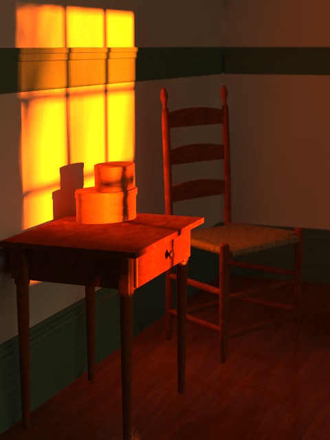
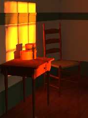
Quick portrait-style render.  I think I like this better.  But perhaps I
shouldn't have cut-off the bottom of the table leg.

Also, I think I need to spend some time working on the floor now.  Their
floors were not nearly so shiny and polished, and generally had larger,
lighter colored boards.

Comments?

--
Jeremy M. Praay
www.beantoad.com
Post a reply to this message
Attachments:
Download 'Shaker11.jpg' (46 KB)
Preview of image 'Shaker11.jpg'
|
|
| |
| |
|
|
From: Thomas de Groot
Subject: Re: Shaker Simple (near final) [200K]
Date: 2 Dec 2005 07:51:53
Message: <43904369@news.povray.org>
|
|
|
| |
| |
|
|
"Jeremy M. Praay" <jer### [at] questsoftwarecom> schreef in bericht
news:438fcc47@news.povray.org...
> Quick portrait-style render.  I think I like this better.  But perhaps I
> shouldn't have cut-off the bottom of the table leg.
>
> Also, I think I need to spend some time working on the floor now.  Their
> floors were not nearly so shiny and polished, and generally had larger,
> lighter colored boards.
>
> Comments?
>
Yes, I like this better too. Now you might experiment with the crucifixion
shadow on a higher level, against the wall... But maybe that would become to
explicite.
There is an interesting  *conflict*  as it were, between the horizontal
shelf(?) and the projection of the window. As if spirituality was breaking
through down to earth materialism...
The shelf thing, is that where Shakers hung their furniture in order to
clean the floor? I have seen photographs were that was higher up the wall...

Thomas
Post a reply to this message
|
|
| |
| |
|
|
|
|
| |
| |
|
|
"Thomas de Groot" <t.d### [at] internlnet> wrote in message
news:43904369@news.povray.org...
>
> Yes, I like this better too. Now you might experiment with the crucifixion
> shadow on a higher level, against the wall... But maybe that would become
> to
> explicite.

Hmmmm... Interesting thought, but I'll probably keep it where it is in this
image.  What I really didn't want to do was "beat you over the head" with
the cross/crucifix.  In fact, if the majority of viewers never noticed it,
that would be fine.  I often like putting things in my scenes so that if
someone stares at it for 5 minutes, they may eventually exclaim, "Hey!  Did
you see this?"

I _may_ create other versions, or other Shaker scenes.  I suppose it largely
depends on how long my interest holds, among other things.  I've also
thought it would be neat to produce (I don't know what it's called) a series
of 3 pictures: the large central image, with the two smaller (tall) pictures
on the side.  But I do not see this scene working well that way.  It would
likely be a new scene.

> There is an interesting  *conflict*  as it were, between the horizontal
> shelf(?) and the projection of the window. As if spirituality was breaking
> through down to earth materialism...
> The shelf thing, is that where Shakers hung their furniture in order to
> clean the floor? I have seen photographs were that was higher up the
> wall...
>

Last night, I looked over my Shaker books again.  Most rooms had the
peg-board at about 6 feet up the wall, and some rooms also had the lower
"dado rail" (it's a new term for me), which apparently is there to prevent
the back of the chairs (or other furniture) from banging against the wall.
As such, mine appears to be a little too high to be realistic.

I experimented with changing the height of the rail last night.  Also, the
highest point of the wall that is visible is only around 5 feet high, so the
pegboard could not be seen (if it existed).

Thank you for all of your input.  I really appreciate it.  I'm learning.
:-)
Post a reply to this message
|
|
| |
| |
|
|
|
|
| |
| |
|
|
Ya know ...

I keep coming back and looking at this image.  I really like it allot.
I think it has a very warm, soothing feeling about it.  I'd like to
sit there and soak up the warm sunlight.  Very nice.


Kyle
Post a reply to this message
|
|
| |
| |
|
|
|
|
| |
| |
|
|
"Kyle" <hob### [at] gatenet> wrote in message
news:2um1p1tlbmke5ghon9548ni775e27pkaqb@4ax.com...
> Ya know ...
>
> I keep coming back and looking at this image.  I really like it allot.
> I think it has a very warm, soothing feeling about it.  I'd like to
> sit there and soak up the warm sunlight.  Very nice.
>

Thank you.  :-)

I should have an updated version out later this week.  I'm tweaking again...
Post a reply to this message
|
|
| |
| |
|
|
|
|
| |