 |
|
|
|
|
|
| |
| |
|
|
|
|
| |
| |
|
|
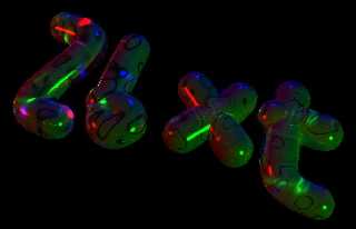
Humh
Was just thinking about doing something, and got idea for a new-styled
text for my websites frontpage. Opinions, anyone?
--
Eero "Aero" Ahonen
http://www.zbxt.net
aer### [at] removethis zbxtnetinvalid zbxtnetinvalid
Post a reply to this message
Attachments:
Download 'zbxt.jpg' (24 KB)
Preview of image 'zbxt.jpg'
|
|
| |
| |
|
|
|
|
| |
| |
|
|
Very unique and eye catching design. One thing I can suggest though is
that the text should stand out more from the black background. Perhaps
you could increase the light intensity to make the text brighter.
I have no idea how you are desiging the webpage or what layout you are
using, but at this current resolution/size it may be a bit big for most
webpages. I found that smoothly integrating 3D text into websites can
be rather difficult, which is why I usually stick with 2D text for most
of my projects. Looks good so far though.
Skip
Post a reply to this message
|
|
| |
| |
|
|
|
|
| |
| |
|
|
Skip Talbot wrote:
> Very unique and eye catching design. One thing I can suggest though is
> that the text should stand out more from the black background. Perhaps
> you could increase the light intensity to make the text brighter.
This actually is my usual problem. I'm using very dark monitor
(brightness set to 0), but with extreme contrast (set to full) - so
alltough everything is dark, the different shades of black (and colors,
especially) are visible. And when I create graphics which look nice
here, they are usually way too dark everywhere else.
> I have no idea how you are desiging the webpage or what layout you are
> using, but at this current resolution/size it may be a bit big for most
> webpages. I found that smoothly integrating 3D text into websites can
> be rather difficult, which is why I usually stick with 2D text for most
> of my projects. Looks good so far though.
If you'll check the site (http://www.zbxt.net), you'll see that there's
a "zbxt" -image on frontpage that changes (actually, it's randomized
when you load the page). The goal is to have the image same-sized as the
old ones (right now the image is rendered 800x600 and I cropped it) and
small (bytes, I mean here, to get it quick-loading). Site itself is
using basic text for all actual information.
> Skip
--
Eero "Aero" Ahonen
http://www.zbxt.net
aer### [at] removethiszbxtnetinvalid
Post a reply to this message
|
|
| |
| |
|
|
|
|
| |
| |
|
|
can't read the text.
Post a reply to this message
|
|
| |
| |
|
|
|
|
| |
| |
|
|
> can't read the text.
Screen's too dark.
Post a reply to this message
|
|
| |
| |
|
|
|
|
| |
| |
|
|
Eero Ahonen nous apporta ses lumieres en ce 2005-09-16 16:25:
> Skip Talbot wrote:
>
>> Very unique and eye catching design. One thing I can suggest though
>> is that the text should stand out more from the black background.
>> Perhaps you could increase the light intensity to make the text brighter.
>
>
> This actually is my usual problem. I'm using very dark monitor
> (brightness set to 0), but with extreme contrast (set to full) - so
> alltough everything is dark, the different shades of black (and colors,
> especially) are visible. And when I create graphics which look nice
> here, they are usually way too dark everywhere else.
>
>> I have no idea how you are desiging the webpage or what layout you are
>> using, but at this current resolution/size it may be a bit big for
>> most webpages. I found that smoothly integrating 3D text into
>> websites can be rather difficult, which is why I usually stick with 2D
>> text for most of my projects. Looks good so far though.
>
>
> If you'll check the site (http://www.zbxt.net), you'll see that there's
> a "zbxt" -image on frontpage that changes (actually, it's randomized
> when you load the page). The goal is to have the image same-sized as the
> old ones (right now the image is rendered 800x600 and I cropped it) and
> small (bytes, I mean here, to get it quick-loading). Site itself is
> using basic text for all actual information.
>
>> Skip
>
>
>
My monitor is set at brightness 48% and contrast 100%, and I can barely see that there
is something
looking like it may be some text!
Alain
Post a reply to this message
|
|
| |
| |
|
|
|
|
| |
| |
|
|
Eero Ahonen wrote:
> Skip Talbot wrote:
...
> This actually is my usual problem. I'm using very dark monitor
> (brightness set to 0), but with extreme contrast (set to full) - so
> alltough everything is dark, the different shades of black (and colors,
> especially) are visible. And when I create graphics which look nice
> here, they are usually way too dark everywhere else.
>
...
>
> If you'll check the site (http://www.zbxt.net), you'll see that there's
> a "zbxt" -image on frontpage that changes (actually, it's randomized
...
I suggest you re-think how you're making your images. Your website is
totally illegible as well. All I can see is a totally black screen with
a few meaningless dark smudges on it. (Except for the straight-text
links -- people/hardware/etc...)
-=- Larry -=-
Post a reply to this message
|
|
| |
| |
|
|
|
|
| |
| |
|
|
Larry Hudson wrote:
> Eero Ahonen wrote:
>
>> This actually is my usual problem. I'm using very dark monitor
>> (brightness set to 0), but with extreme contrast (set to full) - so
>> alltough everything is dark, the different shades of black (and
>> colors, especially) are visible. And when I create graphics which look
>> nice here, they are usually way too dark everywhere else.
>>
> ...
>
> I suggest you re-think how you're making your images. Your website is
> totally illegible as well. All I can see is a totally black screen with
> a few meaningless dark smudges on it. (Except for the straight-text
> links -- people/hardware/etc...)
>
> -=- Larry -=-
Umh, image really THAT dark? There has to be something mystical either
with my monitor or with my eyes... It has to be with my eyes actually,
'cause I keep all monitors usually as dark as possible (and I like it -
and I see it clearly).
But hmh, you can't see the texts behind those links? Normal text is a
bit darker than a link, but IMO it should be fully readable by anyone
(color is #bbbbbb). The Raytracing -department "might be" "a bit" dark;
maybe part of the Photography, too?
--
Eero "Aero" Ahonen
http://www.zbxt.net
aer### [at] removethiszbxtnetinvalid
Post a reply to this message
|
|
| |
| |
|
|
|
|
| |
| |
|
|
Eero Ahonen nous apporta ses lumieres en ce 2005-09-17 03:02:
> Larry Hudson wrote:
>
>> Eero Ahonen wrote:
>>
>>> This actually is my usual problem. I'm using very dark monitor
>>> (brightness set to 0), but with extreme contrast (set to full) - so
>>> alltough everything is dark, the different shades of black (and
>>> colors, especially) are visible. And when I create graphics which
>>> look nice here, they are usually way too dark everywhere else.
>>>
>> ...
>>
>> I suggest you re-think how you're making your images. Your website is
>> totally illegible as well. All I can see is a totally black screen
>> with a few meaningless dark smudges on it. (Except for the
>> straight-text links -- people/hardware/etc...)
>>
>> -=- Larry -=-
>
>
> Umh, image really THAT dark? There has to be something mystical either
> with my monitor or with my eyes... It has to be with my eyes actually,
> 'cause I keep all monitors usually as dark as possible (and I like it -
> and I see it clearly).
>
> But hmh, you can't see the texts behind those links? Normal text is a
> bit darker than a link, but IMO it should be fully readable by anyone
> (color is #bbbbbb). The Raytracing -department "might be" "a bit" dark;
> maybe part of the Photography, too?
>
The raytracing section IS VERY dark! I have to crank up the brightness of monitor
almost to the max.
Some tumbnails are so dark, I have to hit ctrl-A to realise that there IS something
there...
I've done a render of "life" and realised that there is a textured ground and
non-black background
by going trough the code.
Alain
Post a reply to this message
|
|
| |
| |
|
|
|
|
| |
| |
|
|
Greg M. Johnson wrote:
> can't read the text.
Can you make out the difference between all of these on your monitor?
http://www.dpreview.com/images/grayscale.gif
Post a reply to this message
|
|
| |
| |
|
|
|
|
| |


