|
|
|
|
|
|
| |
| |
|
|
|
|
| |
| |
|
|
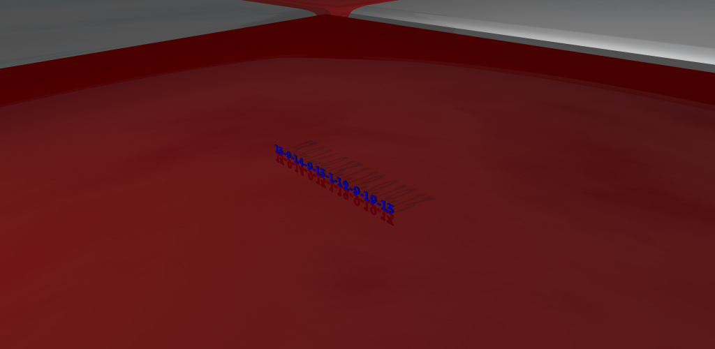
I tried this with no_image on the numbers and reflection 0 on the tile which
just left the shadow, but the whole image looked a bit flat

     Should I stick with this one?

     ~Steve~
Post a reply to this message
Attachments:
Download 'mina.jpg' (95 KB)
Preview of image 'mina.jpg'
|
|
| |
| |
|
|
|
|
| |
| |
|
|
I'm kinda hesitant about making such a sweeping criticism, but I've seen
this in a lot of images posted here: Personally I don't think the use of
text in an image can be considered minimalist, particularly not if we're
talking about anything as complex as an entire 5 syllable word (or a
digital encoding thereof).

My reasoning is pretty simple: minimalism is all about reduction to the
simplest possible form, and the letters of the alphabet are elaborate
and complex from a visual point of view compared to the base forms we
find in ray-tracing: spheres, boxes, etc.

If you want to use text perhaps present it in a context where text is
the most minimal form, e.g. on an old-school green on black computer screen.

Obviously you can disagree, but at the very least use a sans-serif font :)

Tek


St. wrote:
> I tried this with no_image on the numbers and reflection 0 on the tile
> which just left the shadow, but the whole image looked a bit flat
>
>     Should I stick with this one?
>
>     ~Steve~
>
>
> ------------------------------------------------------------------------
>
Post a reply to this message
|
|
| |
| |
|
|
|
|
| |
| |
|
|
"Tek" <tek### [at] evilsuperbrain com> wrote in message
news:42e374b4@news.povray.org...
> I'm kinda hesitant about making such a sweeping criticism, but I've seen
> this in a lot of images posted here: Personally I don't think the use of
> text in an image can be considered minimalist, particularly not if we're
> talking about anything as complex as an entire 5 syllable word (or a
> digital encoding thereof).
>
> My reasoning is pretty simple: minimalism is all about reduction to the
> simplest possible form, and the letters of the alphabet are elaborate and
> complex from a visual point of view compared to the base forms we find in
> ray-tracing: spheres, boxes, etc.
>
> If you want to use text perhaps present it in a context where text is the
> most minimal form, e.g. on an old-school green on black computer screen.
>
> Obviously you can disagree, but at the very least use a sans-serif font :)
No, I won't disagree Tek. I think you're dead right and all of what you
say has sunken in. To be honest, I think it's a nice image but wasn't happy
with it. I'll try something else.
Thanks for the input.
(Love your 'over, down, in' image btw!) :)
~Steve~
>
> Tek com> wrote in message
news:42e374b4@news.povray.org...
> I'm kinda hesitant about making such a sweeping criticism, but I've seen
> this in a lot of images posted here: Personally I don't think the use of
> text in an image can be considered minimalist, particularly not if we're
> talking about anything as complex as an entire 5 syllable word (or a
> digital encoding thereof).
>
> My reasoning is pretty simple: minimalism is all about reduction to the
> simplest possible form, and the letters of the alphabet are elaborate and
> complex from a visual point of view compared to the base forms we find in
> ray-tracing: spheres, boxes, etc.
>
> If you want to use text perhaps present it in a context where text is the
> most minimal form, e.g. on an old-school green on black computer screen.
>
> Obviously you can disagree, but at the very least use a sans-serif font :)
No, I won't disagree Tek. I think you're dead right and all of what you
say has sunken in. To be honest, I think it's a nice image but wasn't happy
with it. I'll try something else.
Thanks for the input.
(Love your 'over, down, in' image btw!) :)
~Steve~
>
> Tek
Post a reply to this message
|
|
| |
| |
|
|
|
|
| |
| |
|
|
Tek wrote:

> I'm kinda hesitant about making such a sweeping criticism, but I've
> seen this in a lot of images posted here: Personally I don't think the
> use of text in an image can be considered minimalist, particularly not
> if we're talking about anything as complex as an entire 5 syllable
> word (or a digital encoding thereof).
>
> My reasoning is pretty simple: minimalism is all about reduction to
> the simplest possible form, and the letters of the alphabet are
> elaborate and complex from a visual point of view compared to the base
> forms we find in ray-tracing: spheres, boxes, etc.
>
> If you want to use text perhaps present it in a context where text is
> the most minimal form, e.g. on an old-school green on black computer
> screen.

I don't know anything about the definition of minimalism but while
reading your statements, the following comes to my mind:
One could use minimalist objects such as spheres, boxes or pixels to
create something complex like text.
Post a reply to this message
|
|
| |
| |
|
|
|
|
| |
| |
|
|
Urs Holzer wrote:
> I don't know anything about the definition of minimalism but while
> reading your statements, the following comes to my mind:
> One could use minimalist objects such as spheres, boxes or pixels to
> create something complex like text.

This is true, but that would be almost the opposite of minimalism. One
could say minimalism is the art of expressing something using the bare
minimum of elements in the image. For example whilst you could make a
tree using thousands of boxes, can you see a way to create a
recognisable tree with just 3 boxes?

Though, of course, that example lacks the abstract aspect of minimalism,
but that's well beyond my abilities to explain. e.g. Does the red circle
make you feel happy? ;)

Tek
Post a reply to this message
|
|
| |
| |
|
|
|
|
| |
| |
|
|
Tek wrote:
> I'm kinda hesitant about making such a sweeping criticism, but I've seen
> this in a lot of images posted here: Personally I don't think the use of
> text in an image can be considered minimalist,

Yes it can


particularly not if we're
> talking about anything as complex as an entire 5 syllable word (or a
> digital encoding thereof).

Yes it can, I think Kawara's "Today Series" is "minimalist"


>
> My reasoning is pretty simple: minimalism is all about reduction to the
> simplest possible form, and the letters of the alphabet are elaborate
> and complex from a visual point of view compared to the base forms we
> find in ray-tracing: spheres, boxes, etc.

It is about reduction but there is not need to be limited to "form" as
the focus.  That is the usual understand though.

>
> If you want to use text perhaps present it in a context where text is
> the most minimal form, e.g. on an old-school green on black computer
> screen.

Probably a good ploy.  Text can be as banal as any other everyday
artifact.  Empahsizing this would fall under the enterprise of
"minimalist" I think


>
> Obviously you can disagree, but at the very least use a sans-serif font :)
>

LOL, but then maybe you might also chose a 'default' font.
Post a reply to this message
|
|
| |
| |
|
|
|
|
| |
| |
|
|
Jim Charter <jrc### [at] msncom> wrote:
> Tek wrote:
> > I'm kinda hesitant about making such a sweeping criticism, but I've seen
> > this in a lot of images posted here: Personally I don't think the use of
> > text in an image can be considered minimalist,
>
> Yes it can
>
>
> particularly not if we're
> > talking about anything as complex as an entire 5 syllable word (or a
> > digital encoding thereof).
>
> Yes it can, I think Kawara's "Today Series" is "minimalist"
>
>
> >


I would agree that text can be used, but the Today/Date paintings were using
words and symbols that have become meaningless to us through sheer
commonplace-ity.  Kawara, I think, is trying to draw attention BACK to the
meaning, te glory of the words (This is largely my own interpretation. I
don't know myuch about the artist, other than his postcards: "I am still
alive. I woke up at...") So while the first impression is indeed
minimalist, there is a depth to his work, something beyond "What you see is
what you see." Certainly, though, encoding letters into numbers and
printing the numbers at an angle in a color is stretching the definition of
minimalism, and while cool looking, I don't think it is very similar to
Kawara's works.

Complexity is not disallowed, but there is a great amount of concern with
meaning going on around here than the more "Ceci n'est pas une pipe" of
minimalism. (Yes, I know Magritte was surreal. I'll live)

Whew! I'm in ranting mode this morning. You're getting there, St. Keep it up
;)


-s
5TF!
Post a reply to this message
|
|
| |
| |
|
|
|
|
| |
| |
|
|
St. wrote:
> I tried this with no_image on the numbers and reflection 0 on the tile
> which just left the shadow, but the whole image looked a bit flat
>
>     Should I stick with this one?

The shadows-only approach has possibilities, the problem being that the
viewer may not know or care how the shadows got to be there or even if
they were shadows.  Very long shadows is kind of cliche but they might
make their presence spookier.  Also if the shadows fell on an uneven
surface, and in such a way that we know they must be shadows, but what
is casting them?

What I like about the scene is your use of scale and camera to produce a
"monumental" effect together with a general starkness and harsh color.
The presence of the mysterious number sequence presents further
possibilities along these scifi lines but I think its presence must be
revealed to the viewer in a more compelling way.  Letters standing
inexplicably on a plain, like Stonehenge, is one way to go, but are
there other possibilities?

I don't know if you followed one link that I posted here to a Robert
Smithson essay.  The essay demonstrates the very poetic way that he both
viewed and participated in the art of the "minimalist" sculptors. He was
something of a latecomer and like everyone is projecting his interests
into the thing. But in general I think you can say that he was sensitive
to the type of thinking that these artists were involving themselves
with.  Your piece reminds me of the scene from the quote he uses at the
top of the essay.  I considered reproducing this scene myself for my
current irtc entry.  In all of the candidate ideas that you have shared
so far, you show your usual cinematic sense for a scene.  I think that
if you combine that with a subset of qualities that characterized
minimalist art such as muted earth colors or grays and a preference for
hard edge geometries, and then apply that to themes such as entropy,
time, alienation, and the like, you entry would be perfectly valid.

About the text.  Historically, about the same time "minimalism"
predominated, "conceptual" art also became hugely popular, and the two
fed each other. Further, both marched under a larger flag labelled
"deconstructionist".  This flag encompassed many arts and was
particularily well liked among theorists and other verbal types of
people. It was also considered intellectually ambitious. One of their
great themes was the interplay of "sign" and "symbol" and how "meaning"
was communicated.   These theorists went to excrutiating lengths to
analyze such things, and naturally, "text" was a big focus.  So you see,
among such purists, if you introduce text into your picture you are
opening a big can of worms.  But if you are someone making a picture to
tell a story or evoke a mood like movie-makers do, what the hell?  What
some may find objectionable about your present scene, is a feeling that
you may be using the presence of text to infuse an otherwise
straightforward landscape with unwarranted significance, ambition, and
intellectual irony.  I say tell your story.
Post a reply to this message
|
|
| |
| |
|
|
|
|
| |
| |
|
|
stm31415 wrote:


> alive. I woke up at...") So while the first impression is indeed
> minimalist, there is a depth to his work, something beyond "What you see is
> what you see."

It may be a critique of minimalism, but not how I take it.  I think they
play very much on a taste for the banal, the minimal, the immediate,
then discover variety within serialization.  It is very much "cross
over" work spanning painting, performance, concept, installation even.
I would certainly categorize it as "conceptual" art before I categorized
it as "minimalist" painting.  But I think it is painting that is very
close to Robert Ryman, say.  I think it derives very much from
minimalism and its time.


Certainly, though, encoding letters into numbers and
> printing the numbers at an angle in a color is stretching the definition of
> minimalism, and while cool looking, I don't think it is very similar to
> Kawara's works.

No, but I was responding in the general case.  The assertion was
encompassing so I need just one example to disprove it don't I?


>
> Complexity is not disallowed,

I would hope not, because it also becomes difficult to define. Sol
Lewitt's work comes to mind. ie. simple building block, complex result.


but there is a great amount of concern with
> meaning going on around here than the more "Ceci n'est pas une pipe" of
> minimalism. (Yes, I know Magritte was surreal. I'll live)

The problem is that to satisfy the irtc topic you need only address the
word "minimalism" in some way.  Including putting it in your picture.
Post a reply to this message
|
|
| |
| |
|
|
|
|
| |
| |
|
|
Very fine analysis, Jim.

Thomas
Post a reply to this message
|
|
| |
| |
|
|
|
|
| |
| |
|
|
>
> I would hope not, because it also becomes difficult to define. Sol
> Lewitt's work comes to mind. ie. simple building block, complex result.
>
You've introduced me to a new artist, there.
>
> but there is a great amount of concern with
> > meaning going on around here than the more "Ceci n'est pas une pipe" of
> > minimalism. (Yes, I know Magritte was surreal. I'll live)
>
> The problem is that to satisfy the irtc topic you need only address the
> word "minimalism" in some way.  Including putting it in your picture.

I think the concentration on the word itself is being overdone, here,
though. When the theme was contrast, did anyone make an image based around
the physical aspect of the english word 'contrast'? And if they had, what
would you have thought of it? The image is supposed to address the THEME
'minimalism', something which this image does, but it does even without the
inclusion of text. I am happy, even overjoyed (at this point) to see
anything that does not apply the artistic meaning of the word, but I do
want to see the meaning of the word in some sense, not just the word itself
('DK' for 'decay' comes to mind. It made me laugh out loud when I saw it,
but it was not meant as a serious entry, and many criticized it harshly for
not really interpreting the theme.) I sat up in my seat the other day when
someone mentioned 'minimalist comedy' (in context of Bob Newhart) and wish
I could find a way to use that. But to write minimalism in the image
somehow is not enough fro me to say it DOES address the topic. It mentions
the topic. If I didn't speak english, if I was, say, a native esperantist,
an image that simply said 'minimalism' would not apply to the topic at all.
 It's an international competition, and making your entry specifically
english in nature is fine, but risky, if you ask me. THe guy who submitted
a picture of 'minimalism' in written in sumerian (who would get kudos from
me for THAT translation ;)) might not be happy.

Shoot! I did it again. It might be best for me to take a break for a few
days ;) How bout this: minimalim in posting technique. 1 Haiku posts for
the rest of the week from me.

-s
5TF!
Post a reply to this message
|
|
| |
| |
|
|
|
|
| |
| |
|
|
stm31415 wrote:

>
> Shoot! I did it again. It might be best for me to take a break for a few
> days ;) How bout this: minimalim in posting technique. 1 Haiku posts for
> the rest of the week from me.
>
No, you are right.  My comment was glib.  But we agree on the larger
point, that producing an actual, arguably minimalist, work is not
strictly necessary.
Post a reply to this message
|
|
| |
| |
|
|
|
|
| |
| |
|
|
stm31415 wrote:
> but I do
> want to see the meaning of the word in some sense, not just the word itself
> ('DK' for 'decay' comes to mind. It made me laugh out loud when I saw it,

Being a pun, it made me groan out loud...

And speaking of puns, I thought the "Out of Place" entry (in the Jan-Feb
'05 IRTC competition) by Tom Melly was a much more clever pun than the
"DK".  I was rather surprised that in the comments, so few seemed to get
this pun.  Although I have to confess that it took me a bit of thought
to 'get it' myself.

However, this is rather OT, so I'll shut up now.

      -=- Larry -=-
Post a reply to this message
|
|
| |
| |
|
|
|
|
| |
| |
|
|
On Mon, 25 Jul 2005 19:11:46 -0700, Larry Hudson <org### [at] yahoocom>
wrote:

>
>And speaking of puns, I thought the "Out of Place" entry (in the Jan-Feb
>'05 IRTC competition) by Tom Melly was a much more clever pun than the
>"DK".  I was rather surprised that in the comments, so few seemed to get
>this pun.  Although I have to confess that it took me a bit of thought
>to 'get it' myself.

I thought so too.

Regards
        Stephen
Post a reply to this message
|
|
| |
| |
|
|
|
|
| |
| |
|
|
Thank you for making me go back and stare at this image until I finally
got it (took me at least a couple minutes).  Honestly, when I first saw
this image I thought those were boxes of kitty litter, one with clumped
cat excrement that someone was trying to pawn off as oysters.  Yes, you
can safely assume that I was more than baffled.

Skip
Post a reply to this message
|
|
| |
| |
|
|
|
|
| |
| |
|
|
Skip Talbot wrote:
> Thank you for making me go back and stare at this image until I finally
> got it (took me at least a couple minutes).

Me, too.

>   Honestly, when I first saw
> this image I thought those were boxes of kitty litter, one with clumped
> cat excrement that someone was trying to pawn off as oysters.  Yes, you
> can safely assume that I was more than baffled.

I agree that as an image, it could have used more work.  (Even Tom Melly
himself said so in his image description.)  But as a pun, when you
finally see it, it's great.

If anyone still hasn't seen the point, I don't want to explain it --
there's no fun in that.  :-)    I'll just say:  look at the label, look
at the box, think about the topic.  'Nuff said (I hope).  ;-)

Just in case someone hasn't seen it:  IRTC Jan-Feb '05, topic:  Out of
Place.  http://www.irtc.org/ftp/pub/stills/2005-02-28/tm_oop.jpg

      -=- Larry -=-
Post a reply to this message
|
|
| |
| |
|
|
|
|
| |
| |
|
|
Larry Hudson wrote:
> stm31415 wrote:
>
>> but I do
>> want to see the meaning of the word in some sense, not just the word
>> itself
>> ('DK' for 'decay' comes to mind. It made me laugh out loud when I saw it,
>
>
> Being a pun, it made me groan out loud...
>
> And speaking of puns, I thought the "Out of Place" entry (in the Jan-Feb
> '05 IRTC competition) by Tom Melly was a much more clever pun than the
> "DK".  I was rather surprised that in the comments, so few seemed to get
> this pun.  Although I have to confess that it took me a bit of thought
> to 'get it' myself.
>
> However, this is rather OT, so I'll shut up now.
>
>      -=- Larry -=-

Aggh.. for the past few days I've been agonising over "what pun?" This
image has no pun. What are they talking about, its just a sequence of
numbers. So I looked, nothing in the numbers. So I stared: Nothing in
the shadows. I don't get it. I just don't get it.

Then I reread the whole thing about pun images. and... wham, I looked at
the numbers again. Clever.


--
~Mike

Things! Billions of them!
Post a reply to this message
|
|
| |
| |
|
|
|
|
| |
| |
|
|
Mike Raiford wrote:
> Aggh.. for the past few days I've been agonising over "what pun?" This
> image has no pun. What are they talking about, its just a sequence of
> numbers. ...

When I posted my initial message, I was just responding to a side
comment that had nothing to do with this thread or this image, I even
said it was off-topic.  Sorry 'bout that.

Let's either change the subject and start a new thread, or let's drop
it.  (I didn't expect this side issue to continue this long anyway.)   :-)

      -=- Larry -=-
Post a reply to this message
|
|
| |
| |
|
|
|
|
| |
|
|