|
|
|
|
|
|
| |
| |
|
|
|
|
| |
| |
|
|
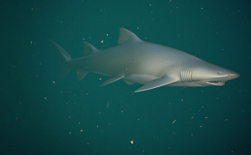
I have taken the approach of incrementally refining different aspects of
  the scene rather than trying to perfect one thing, say the model,
before proceeding to the next.  I am still tempted to use just a black
bg for the scene though.
Post a reply to this message
Attachments:
Download 'img.00089.jpg' (39 KB)
Preview of image 'img.00089.jpg'
|
|
| |
| |
|
|
|
|
| |
| |
|
|
Jim Charter <jrc### [at] msn com> wrote:
I am still tempted to use just a black
> bg for the scene though.
Oh, please don't! I really like this setting. The hunks of stuff are maybe a
little big, but the water makes it look so much more natural. The shark is
still a little stiff, but a solid background will only make that worse, I
think.
-s
5TF! com> wrote:
I am still tempted to use just a black
> bg for the scene though.
Oh, please don't! I really like this setting. The hunks of stuff are maybe a
little big, but the water makes it look so much more natural. The shark is
still a little stiff, but a solid background will only make that worse, I
think.
-s
5TF!
Post a reply to this message
|
|
| |
| |
|
|
|
|
| |
| |
|
|
Looking very good to me Jim.

 ~Steve~
Post a reply to this message
|
|
| |
| |
|
|
|
|
| |
| |
|
|
The shark certainly looks a lot better, looks like you have added some
damage to the body. Sharks always seem to look fairly battered but I think
the fins could be a bit more damage, they look a bit too smooth to me.

I like the background but think it needs to look a bit more like it is
underwater, I have never done an underwater scene so I can't really give
any advice (I wouldn't know where to start except I expect very long trace
times..)

A scene with underwater caustics would be good, maybe have the shark nearer
the surface being lit from above with some caustics on the body. Excellent
modelling though, can't remember what you said you used in the last post,
was it wings or blender?
Post a reply to this message
|
|
| |
| |
|
|
|
|
| |
| |
|
|
s.day wrote:
> The shark certainly looks a lot better, looks like you have added some
> damage to the body. Sharks always seem to look fairly battered but I think
> the fins could be a bit more damage, they look a bit too smooth to me.
>
> I like the background but think it needs to look a bit more like it is
> underwater, I have never done an underwater scene so I can't really give
> any advice (I wouldn't know where to start except I expect very long trace
> times..)
>
> A scene with underwater caustics would be good, maybe have the shark nearer
> the surface being lit from above with some caustics on the body. Excellent
> modelling though, can't remember what you said you used in the last post,
> was it wings or blender?
>
>
Wings.

Yes the whole shark thing may lead to some different underwater type
scenes to examine the associated lighting/media/refraction issues.  This
really started out as a modelling/texturing study, lol.  I thought the
shark shape would be relatively easy.  But like any simple looking
smooth form, the subtlties become more important.  The setting is still
not all that convincing but it is better than the last 35 or so tests
that I have run. As I meantioned the clearer, darker, totally camera-lit
renders ( and reference photos ) tend to look prettier, more colorful,
more contrasty. But the more turgid looking, filtered light seems much
more of a challenge.
Post a reply to this message
|
|
| |
| |
|
|
|
|
| |
| |
|
|
St. wrote:
>
> Looking very good to me Jim.
>
Thanks Steve.
Post a reply to this message
|
|
| |
| |
|
|
|
|
| |
| |
|
|
stm31415 wrote:
> Jim Charter <jrc### [at] msncom> wrote:
>   I am still tempted to use just a black
>
>>bg for the scene though.
>
>
> Oh, please don't! I really like this setting. The hunks of stuff are maybe a
> little big, but the water makes it look so much more natural. The shark is
> still a little stiff, but a solid background will only make that worse, I
> think.
>
Thanks. It will be relatively easy to put some movement into the shark
but only after the model is set.  Redoing changes across a number of
posed models would be a pain.  So I have resisted doing that so far.
Post a reply to this message
|
|
| |
| |
|
|
|
|
| |
| |
|
|
s.day wrote:
> I like the background but think it needs to look a bit more like it is
> underwater, I have never done an underwater scene so I can't really give
> any advice (I wouldn't know where to start except I expect very long trace
> times..)

As a certified scuba diver, I can say that the background *and* the
flotsam are both quite convincing. It's simply a deep evening dive.

--
   Darren New / San Diego, CA, USA (PST)
     The samba was clearly inspired
     by the margarita.
Post a reply to this message
|
|
| |
| |
|
|
|
|
| |
| |
|
|
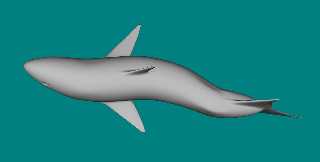
Jim, this is almost like an underwater flash pic if this is possible. It
seems to have been captured by a camera flash light to me. I think this is
why I like it, apart from the modeling, which is close to excellent.

    It does need some movement at some stage though, which I know you're
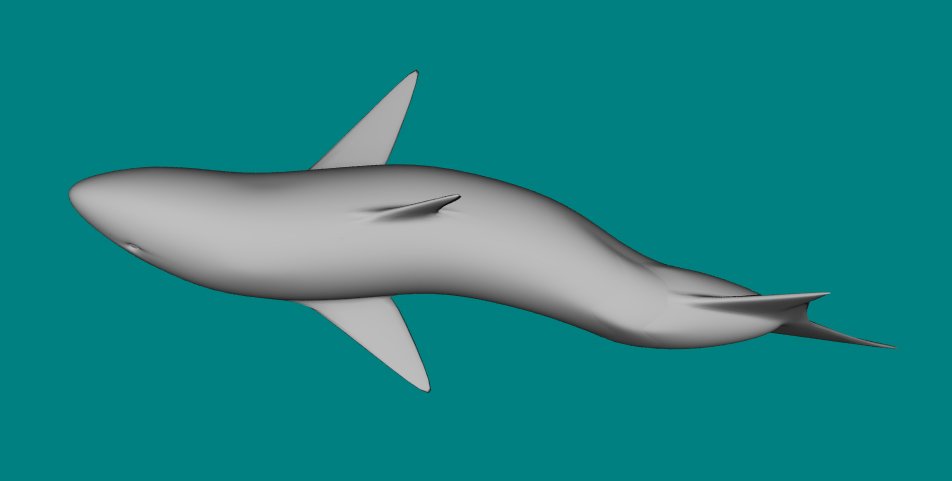
considering. Attached is an overhead shot of my crap shark, but I think I
captured the movement ok. I did this some time ago now. Hope it helps in
some way.

   Hmm... you do drive me onwards with your modeling and ideas.

     ~Steve~
Post a reply to this message
Attachments:
Download 'shark2.jpg' (16 KB)
Preview of image 'shark2.jpg'
|
|
| |
| |
|
|
|
|
| |
| |
|
|
Jim Charter wrote:
>
> I have taken the approach of incrementally refining different aspects of
>   the scene rather than trying to perfect one thing, say the model,
> before proceeding to the next.  I am still tempted to use just a black
> bg for the scene though.
>
>   ------------------------------------------------------------------------
>  [Image]

Nice modeling, I like it.
Post a reply to this message
|
|
| |
| |
|
|
|
|
| |
| |
|
|
Darren New wrote:
> s.day wrote:
>
>> I like the background but think it needs to look a bit more like it is
>> underwater, I have never done an underwater scene so I can't really give
>> any advice (I wouldn't know where to start except I expect very long
>> trace
>> times..)
>
>
> As a certified scuba diver, I can say that the background *and* the
> flotsam are both quite convincing. It's simply a deep evening dive.
>
Cool, I'll take it!
Post a reply to this message
|
|
| |
| |
|
|
|
|
| |
| |
|
|
Jim Charter <jrc### [at] msncom> wrote:

This is starting to look quite realistic.  As Steve said, it looks like a
flash photo with backscatter from suspended particles in the water column.

One thing; water tends to shorten flash ranges to about 2-8 ft, decreasing
with the amount of particulate matter, so for this picture to be realistic
the shark would have to be fairly small and about 4-5 ft from the camera.

I'd make the water a shade greener, then make the 'flash' brighter but with
a short fade-distance so there's greater contrast between the near and far
areas.

Also, with particles that large, I'd expect a LOT more smaller particles. I
think a wider range of particle size would be more realistic.

Here's a shot with roughly the same water color as yours, note the sediment
backscatter and how the colors wash out rapidly further from the flash.
This was a wide angle shot, so the shadows in the background are rocks no
more than 10-12 ft away, yet they're almost completely black.

RG
Post a reply to this message
Attachments:
Download 'sd034.jpg' (49 KB)
Preview of image 'sd034.jpg'

|
|
| |
| |
|
|
|
|
| |
| |
|
|
gonzo wrote:
> Jim Charter <jrc### [at] msncom> wrote:
>
> This is starting to look quite realistic.  As Steve said, it looks like a
> flash photo with backscatter from suspended particles in the water column.
>
> One thing; water tends to shorten flash ranges to about 2-8 ft, decreasing
> with the amount of particulate matter, so for this picture to be realistic
> the shark would have to be fairly small and about 4-5 ft from the camera.
>
> I'd make the water a shade greener, then make the 'flash' brighter but with
> a short fade-distance so there's greater contrast between the near and far
> areas.
>
> Also, with particles that large, I'd expect a LOT more smaller particles. I
> think a wider range of particle size would be more realistic.
>
> Here's a shot with roughly the same water color as yours, note the sediment
> backscatter and how the colors wash out rapidly further from the flash.
> This was a wide angle shot, so the shadows in the background are rocks no
> more than 10-12 ft away, yet they're almost completely black.
>

Thanks Ron.  It is very helpful to have that information confirmed
especially about the water color.  I did in fact have a media layer of
fine yellow "pea" included but took it out because I was worried that it
was looking too turgid.  I'll put it back and go for a render in closer
with wider camera angle and lighting as you suggest.  The thing is the
modeling/texturing on the shark isn't detailed enough yet to sustain a
real close view.  And my command of media effects isn't quite up to a
long view with sunlight coming down from a surface plane.  But getting
there. ;)
Post a reply to this message
|
|
| |
| |
|
|
|
|
| |
| |
|
|
St. wrote:
> Jim, this is almost like an underwater flash pic if this is possible. It
> seems to have been captured by a camera flash light to me. I think this
> is why I like it, apart from the modeling, which is close to excellent.

The light is placed near the camera like a flash and it has a pretty
steep fade power.  But it is a spot light with a fall off angle of
around 20 degrees.  So I was really thinking directional strobe but I
guess a flash could be directed too.  Anyway I'll try some wider angles
and other things.  Thanks for the support.

>
>    It does need some movement at some stage though, which I know you're
> considering. Attached is an overhead shot of my crap shark, but I think
> I captured the movement ok. I did this some time ago now. Hope it helps
> in some way.
>


Nice shot.  I see you went for the aqua sea color too.

   And you see I was right.  At some point you just gotta try doing a shark.

   But okay okay, I'll make the shark wiggle,,,soon.
Post a reply to this message
|
|
| |
| |
|
|
|
|
| |
| |
|
|
Alberto Mendoza wrote:
>
> Jim Charter wrote:
>
>>I have taken the approach of incrementally refining different aspects of
>>  the scene rather than trying to perfect one thing, say the model,
>>before proceeding to the next.  I am still tempted to use just a black
>>bg for the scene though.
>>
>>  ------------------------------------------------------------------------
>> [Image]
>
>
> Nice modeling, I like it.
Thanks Alberto and back at ya.  Great first cut on a very tough subject
... the female face you posted.
Post a reply to this message
|
|
| |
| |
|
|
|
|
| |
| |
|
|
"Jim Charter" <jrc### [at] msncom> schreef in bericht
news:42dd4561@news.povray.org...
> I have taken the approach of incrementally refining different aspects of
>   the scene rather than trying to perfect one thing, say the model,
> before proceeding to the next.  I am still tempted to use just a black
> bg for the scene though.
>
Wow! Not only convincing, but terrifying! Very good job.

Thomas
Post a reply to this message
|
|
| |
| |
|
|
|
|
| |
| |
|
|
Jim Charter a écrit :
> I have taken the approach of incrementally refining different aspects of
>  the scene rather than trying to perfect one thing, say the model,
> before proceeding to the next.  I am still tempted to use just a black
> bg for the scene though.

Looks very nice to me !
Please don't put a black bg !!!!!

--
Dark Skull Software
http://www.darkskull.net

A+
Post a reply to this message
|
|
| |
| |
|
|
|
|
| |
| |
|
|
"gonzo" <rgo### [at] lansetcom> wrote:
> Jim Charter <jrc### [at] msncom> wrote:
>
> This is starting to look quite realistic.  As Steve said, it looks like a
> flash photo with backscatter from suspended particles in the water column.

I see you've stolen Gilles Tran's program which converts photographs to
scene files. :)

This would have to be the most realistic POV underwater image I've ever
seen.
Post a reply to this message
|
|
| |
| |
|
|
|
|
| |
| |
|
|
Jim Charter <jrc### [at] msncom> wrote:
> I have taken the approach of incrementally refining different aspects of
>   the scene rather than trying to perfect one thing, say the model,
> before proceeding to the next.  I am still tempted to use just a black
> bg for the scene though.

Bravo Jim, excellent image ! can't wait for the next step.
Maybe a grainy look should be interesting.
Why not try a black bg with a stronger and harsh light.

Rene
http://rene.bui.free.fr - online portfolio
Post a reply to this message
|
|
| |
| |
|
|
|
|
| |
| |
|
|
Jim Charter wrote:
> I have taken the approach of incrementally refining different aspects of
>  the scene rather than trying to perfect one thing, say the model,
> before proceeding to the next.  I am still tempted to use just a black
> bg for the scene though.

well, i'm not much into "lifelike" critters in tracing, but this is
nice. i like the chunks.

bob
Post a reply to this message
|
|
| |
| |
|
|
|
|
| |
| |
|
|
PM 2Ring wrote:
> "gonzo" <rgo### [at] lansetcom> wrote:
>
>>Jim Charter <jrc### [at] msncom> wrote:
>>
>>This is starting to look quite realistic.  As Steve said, it looks like a
>>flash photo with backscatter from suspended particles in the water column.
>
>
> I see you've stolen Gilles Tran's program which converts photographs to
> scene files. :)
>
> This would have to be the most realistic POV underwater image I've ever
> seen.
>
That's quite a compliment!  Thankyou.
Post a reply to this message
|
|
| |
| |
|
|
|
|
| |
| |
|
|
Thomas de Groot wrote:
> "Jim Charter" <jrc### [at] msncom> schreef in bericht
> news:42dd4561@news.povray.org...
>
>>I have taken the approach of incrementally refining different aspects of
>>  the scene rather than trying to perfect one thing, say the model,
>>before proceeding to the next.  I am still tempted to use just a black
>>bg for the scene though.
>>
>
> Wow! Not only convincing, but terrifying! Very good job.
>
Thankyou. As usual, what started out to be an easy exercise has quickly
catapulted to the "edge" of my "envelop" of skills.
Post a reply to this message
|
|
| |
| |
|
|
|
|
| |
| |
|
|
Marneus Calgar wrote:
> Jim Charter a écrit :
>
>> I have taken the approach of incrementally refining different aspects
>> of  the scene rather than trying to perfect one thing, say the model,
>> before proceeding to the next.  I am still tempted to use just a black
>> bg for the scene though.
>
>
> Looks very nice to me !
> Please don't put a black bg !!!!!
>
Okay, but I gotta say, the tests done with a black bg are colourful and
pretty in a way the media bg's are not.  So maybe I'll comprimise and
promise not to post a black bg version without also doing a media version.
Post a reply to this message
|
|
| |
| |
|
|
|
|
| |
| |
|
|
Rene Bui wrote:
> Jim Charter <jrc### [at] msncom> wrote:
>

> Why not try a black bg with a stronger and harsh light.

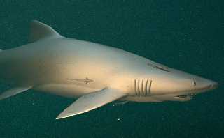
Many test runs are like that and it must be said they look very pretty.
  The spot light with falloff alone gives a very nice sense of the fish
emerging from the gloom and the color looks clear and crisp.

In this latest test I reduced the degree of large flopsum, added a fine
grained pea and reduced the general scattering to almost black.  I also
added real absorption to produce the color from the overhead light
(formerly it was just a colored light overhead.)

Also, in response to gonzo I adjusted the whole scene so that the camera
is now about 8 units from an 11 unit shark with a fade distance about 6
units, fade power 7 or so and a lens and spotlight angle of around 60
degrees.  The overhead light is about 100 units up with fade at 50
units, power 4.  I also used the Rune/Shay contrast trick

There is also enough modelling changes in this one, mostly to the eye
and vicinity and lower jaw, that I had to do a lot of work to fix the uv
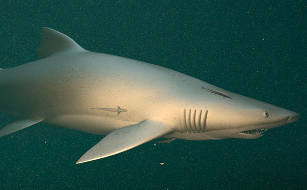
map.  But I am not entirely happy with the results so I attach a
downscaled shot of the test here.
Post a reply to this message
Attachments:
Download 'img.00111.jpg' (52 KB)
Preview of image 'img.00111.jpg'
|
|
| |
| |
|
|
|
|
| |
| |
|
|
bob wrote:
> Jim Charter wrote:
>
>> I have taken the approach of incrementally refining different aspects
>> of  the scene rather than trying to perfect one thing, say the model,
>> before proceeding to the next.  I am still tempted to use just a black
>> bg for the scene though.
>
>
> well, i'm not much into "lifelike" critters in tracing, but this is
> nice. i like the chunks.
>
> bob
Thanks.  As I am sure you realize the chunks are just an added media
layer with a granite density pattern that's mostly black.  Looks okay as
long as a "chunk" doesn't overlap the figure.  Then the chunk looks
faded for reasons I am clueless about.
Post a reply to this message
|
|
| |
| |
|
|
|
|
| |
| |
|
|
Jim Charter <jrc### [at] msncom> wrote:
> map.  But I am not entirely happy with the results so I attach a
> downscaled shot of the test here.

Jim, it's better and better. The environment, the lighting and modelling are
great and remoras add a life-like touch. The head is very convincing too.
But I think there is something wrong with the skin texture. It seems like a
sort of metallized plastic. Honnestly, I don't know how to fix it, maybe
with the normal-map (?). I think Grey-nurse (or Sand-tiger) skin have many
more spottings than you did. And also, the fins could be a bit darker with
color variations...etc.
http://www.dinosoria.com/diapo_requins/images/requin_taureau_jpg.jpg
http://www.dinosoria.com/diapo_requins/images/requin_taureau_002_jpg.jpg

Rene
http://rene.bui.free.fr - online portfolio
Post a reply to this message
|
|
| |
| |
|
|
|
|
| |
| |
|
|
Rene Bui wrote:
> Jim Charter <jrc### [at] msncom> wrote:
>
>>map.  But I am not entirely happy with the results so I attach a
>>downscaled shot of the test here.
>
>
> Jim, it's better and better. The environment, the lighting and modelling are
> great and remoras add a life-like touch. The head is very convincing too.
> But I think there is something wrong with the skin texture. It seems like a
> sort of metallized plastic. Honnestly, I don't know how to fix it, maybe
> with the normal-map (?). I think Grey-nurse (or Sand-tiger) skin have many
> more spottings than you did. And also, the fins could be a bit darker with
> color variations...etc.
> http://www.dinosoria.com/diapo_requins/images/requin_taureau_jpg.jpg
> http://www.dinosoria.com/diapo_requins/images/requin_taureau_002_jpg.jpg
>
Hi Rene, I truly appreciate the support.  It's at this late stage in a
work where the final 10% of quality seems to cost 90% of the effort that
my determination usually breaks down.

One thing I may need to do is look up a post someone recently made about
using jpeg's and their gamma adjustment, because in fact you wouldn't
believe how dark and contrasted this color image_map actually is.  It's
to the extent that while editing it I can just barely see the markings I
am adding.  Also, I am having some better success if I also average the
markings from the bump_map layer into the image_map layer so that some
darkness corresponds to the depressions.  But it comes at a cost.  That
merging process tends to soften the markings that were intended to show
the color changes alone. But you photos seem to show that I am getting
fairly close to the overall color.

Right now the bump_map is also being averaged with a procedural granite
normal. This is meant to show the overall skin texture under the random
gouges. I have spent several evenings experimenting with different brush
definitions when drawing the bump_map.  It has resulted in improvements
but it is not yet "right"  Though actually it shows up better at higher
resolutions.

As far as the finish goes, part of the problem is that the metallic
look, which is mostly do to the high specular I think, is close to how
it actually looks to me in different photo references and on some TV
documentaries I've been seeing.  I tried to use a texture_map with a
slope pattern pointed at the camera to get the specular to fall off more
dramatically but unfortunately that increases the render time
exponentially.  I also tried a layered texture to get more control over
the color markings you mentioned but that also makes the render time
untenable.  Right now the little-sphere-over-the-camera trick is what I
am resorting to to increase the apparent contrast.  Also, in the render
I showed you, I may not have adjusted the fade-power enough to
compensate for the lessening of scattering and extinction.

Anyway I am taking a break from the skin texture issues and writing a
macro to generate some little fishes in various random postures.

Thanks again for taking the time.

-Jim
Post a reply to this message
|
|
| |
| |
|
|
|
|
| |