|
|
|
|
|
|
| |
| |
|
|
|
|
| |
| |
|
|
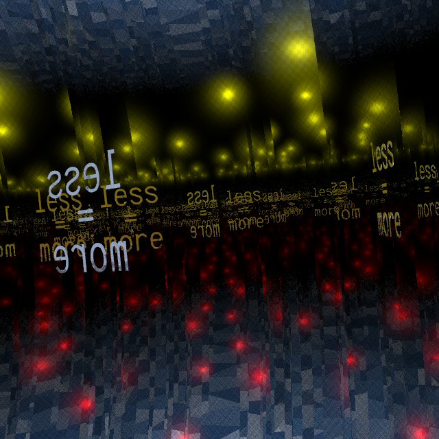
Following a different track in the quest of minimalism, I came up with this.
Thomas
Post a reply to this message
Attachments:
Download 'Infinity Monument_03.jpg' (89 KB)
Preview of image 'Infinity Monument_03.jpg'
|
|
| |
| |
|
|
|
|
| |
| |
|
|
Thomas de Groot wrote:
> Following a different track in the quest of minimalism, I came up with this.
>
> Thomas
>
>
>
It's a beautiful image and I think it hints at how the text and its
message have become iconic. I find the color slightly problematic in a
couple of ways. First, classic minimalists inlucing Mies ( I think )
would have eschewed color. Unless it appeared either sufficiently
"lurid" or else sufficiently "industrial" in the case of some. But it
is not clear that you are trying to mimic a classicly minimal art piece.
But then there is my second objection. I just don't like the bluish
grays at top and bottom all that much. It's okay, I just wonder if some
other choice might work better. I do understand that you are probably
quoting the idea of the three primaries. But I think a harmony along a
single axis ie green/red or blue/yellow might work better.
But all in all, I like the "take". It seems to echo a lot of the themes
from the minimalism era.
Post a reply to this message
|
|
| |
| |
|
|
|
|
| |
| |
|
|
"Jim Charter" <jrc### [at] msn com> schreef in bericht
news:42dd1676$1@news.povray.org...
> >
> It's a beautiful image and I think it hints at how the text and its
> message have become iconic. I find the color slightly problematic in a
> couple of ways. First, classic minimalists inlucing Mies ( I think )
> would have eschewed color. Unless it appeared either sufficiently
> "lurid" or else sufficiently "industrial" in the case of some. But it
> is not clear that you are trying to mimic a classicly minimal art piece.
> But then there is my second objection. I just don't like the bluish
> grays at top and bottom all that much. It's okay, I just wonder if some
> other choice might work better. I do understand that you are probably
> quoting the idea of the three primaries. But I think a harmony along a
> single axis ie green/red or blue/yellow might work better.
>
> But all in all, I like the "take". It seems to echo a lot of the themes
> from the minimalism era.
Thank you indeed, Jim! I always much appreciate your comments. I may agree
with your first objection, but - as you surmise- I am not trying to mimic.
Instead, I try to explore new ways in which to express minimalism, in this
case with a reference to a source. The truth is that color may distract from
the concept, however. Hmmm... Have to experiment further I guess.
Your second objection is perfectly true. An earlier version where the
background was dark blue, was better imo. I shall go further in a more
harmonic direction and see what that results in.
Thomas com> schreef in bericht
news:42dd1676$1@news.povray.org...
> >
> It's a beautiful image and I think it hints at how the text and its
> message have become iconic. I find the color slightly problematic in a
> couple of ways. First, classic minimalists inlucing Mies ( I think )
> would have eschewed color. Unless it appeared either sufficiently
> "lurid" or else sufficiently "industrial" in the case of some. But it
> is not clear that you are trying to mimic a classicly minimal art piece.
> But then there is my second objection. I just don't like the bluish
> grays at top and bottom all that much. It's okay, I just wonder if some
> other choice might work better. I do understand that you are probably
> quoting the idea of the three primaries. But I think a harmony along a
> single axis ie green/red or blue/yellow might work better.
>
> But all in all, I like the "take". It seems to echo a lot of the themes
> from the minimalism era.
Thank you indeed, Jim! I always much appreciate your comments. I may agree
with your first objection, but - as you surmise- I am not trying to mimic.
Instead, I try to explore new ways in which to express minimalism, in this
case with a reference to a source. The truth is that color may distract from
the concept, however. Hmmm... Have to experiment further I guess.
Your second objection is perfectly true. An earlier version where the
background was dark blue, was better imo. I shall go further in a more
harmonic direction and see what that results in.
Thomas
Post a reply to this message
|
|
| |
| |
|
|
|
|
| |
| |
|
|
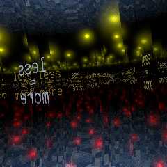
This is a new version, following comments by Jim Charter.
I tried out a different text too, with - and + signs refering to the
preceding one.
Thomas
Post a reply to this message
Attachments:
Download 'Infinity Monument_04.jpg' (69 KB)
Preview of image 'Infinity Monument_04.jpg'
|
|
| |
| |
|
|
|
|
| |
| |
|
|
Thomas de Groot wrote:
> This is a new version, following comments by Jim Charter.
>
> I tried out a different text too, with - and + signs refering to the
> preceding one.
>
Nice. Compositionally very strong I think. The color works much better and
even sets up an interesting permutation on the spectrum wheel. The text
now gives a playful illusion of having recomposed itself in each reflection.
Post a reply to this message
|
|
| |
| |
|
|
|
|
| |
| |
|
|
"Jim Charter" <jrc### [at] msncom> schreef in bericht
news:42dfacbc$1@news.povray.org...
>
> Nice. Compositionally very strong I think. The color works much better
and
>
> even sets up an interesting permutation on the spectrum wheel. The text
> now gives a playful illusion of having recomposed itself in each
reflection.
Thank you Jim. I feel this is one end product, indeed. I shall leave this
track as is. Still a few others to explore. Stay tuned!
Thomas
Post a reply to this message
|
|
| |
| |
|
|
|
|
| |