|
|
|
|
|
|
| |
| |
|
|
|
|
| |
| |
|
|
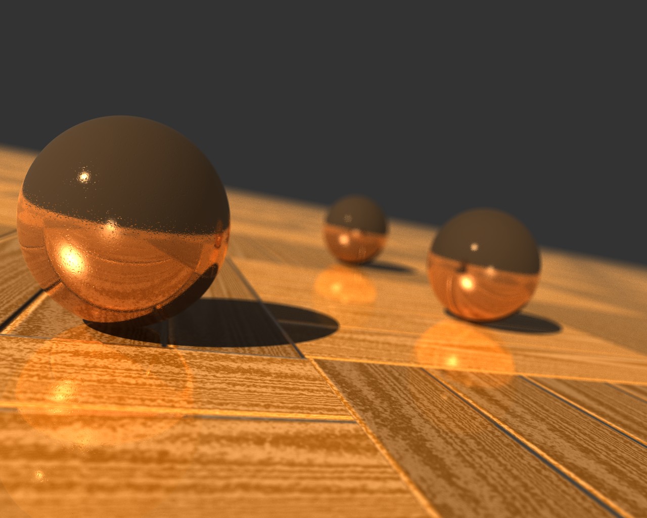
New wallpaper.

Yeah, I'm in a rut. Was a material test to begin with, evolved into this.
--
~Mike
Post a reply to this message
Attachments:
Download 'copper.jpg' (168 KB)
Preview of image 'copper.jpg'
|
|
| |
| |
|
|
|
|
| |
| |
|
|
Mike Raiford wrote:
> New wallpaper.
>
> Yeah, I'm in a rut. Was a material test to begin with, evolved into this.
>
> ------------------------------------------------------------------------
>
Nice! Bright, hard, cold, well polished copper spheres with some condensation on them.
Like those RSOC.

Alain
Post a reply to this message
|
|
| |
| |
|
|
|
|
| |
| |
|
|
Really nice ... but I didn't see condensation ... I see tiny chips and
dings...
Neil
"Alain" <ele### [at] netscape net> wrote in message
news:41defbc7$1@news.povray.org...
> Mike Raiford wrote:
> > New wallpaper.
> >
> > Yeah, I'm in a rut. Was a material test to begin with, evolved into
this.
> >
> > ------------------------------------------------------------------------
> >
> Nice! Bright, hard, cold, well polished copper spheres with some
condensation on them.
> Like those RSOC.
>
> Alain net> wrote in message
news:41defbc7$1@news.povray.org...
> Mike Raiford wrote:
> > New wallpaper.
> >
> > Yeah, I'm in a rut. Was a material test to begin with, evolved into
this.
> >
> > ------------------------------------------------------------------------
> >
> Nice! Bright, hard, cold, well polished copper spheres with some
condensation on them.
> Like those RSOC.
>
> Alain
Post a reply to this message
|
|
| |
| |
|
|
|
|
| |
| |
|
|
"Neil Kolban" <kol### [at] kolbancom> wrote in message
news:41df0800$1@news.povray.org...
> Really nice ... but I didn't see condensation ... I see tiny chips and
> dings...

  I see that too. The thing with copper is that it's 'very' soft and what I
would call 'draggy', (that metal 'moves'!) For me, the main copper sphere
had rolled down a tarmacced road for a little while, but having said this,
the weight of that sphere would also produce surprisingly larger dents too.

   ~Steve~


> Neil
Post a reply to this message
|
|
| |
| |
|
|
|
|
| |
| |
|
|
St. wrote:
>
> I see that too. The thing with copper is that it's 'very' soft and
> what I would call 'draggy', (that metal 'moves'!)

I was thinking the same thing. Too hard. I've stripped enough copper
wire to know that you couldn't make a ball bearing out of it. Makes
great connecting rod bearings, however, but I'm getting off the point.
Color and finish look convincing.

  -Shay
Post a reply to this message
|
|
| |
| |
|
|
|
|
| |
| |
|
|
St. wrote:
>
> "Neil Kolban" <kol### [at] kolbancom> wrote in message
> news:41df0800$1@news.povray.org...
>
>> Really nice ... but I didn't see condensation ... I see tiny chips and
>> dings...
>
>
>  I see that too. The thing with copper is that it's 'very' soft and what
> I would call 'draggy', (that metal 'moves'!) For me, the main copper
> sphere had rolled down a tarmacced road for a little while, but having
> said this, the weight of that sphere would also produce surprisingly
> larger dents too.

Hmm, I need to work on scale, I think.... Anyone ever have a BB gun when
they were kids? This is sort of the inspiration... A close-up look at a
copper BB. As I remember they tended to get a bit knurled at times. So
yes -- not condensation, but dings (I think the normal was actually
called "chinks" in the source file.)

A BB is rather small, and doesn't have very good mass, I need to add a
bit of oxidation to the finish as well, I think.
Post a reply to this message
|
|
| |
| |
|
|
|
|
| |
| |
|
|
Does copper really have such sharp reflections? Pennies sure don't.

 - Slime
 [ http://www.slimeland.com/ ]
Post a reply to this message
|
|
| |
| |
|
|
|
|
| |
| |
|
|
Slime wrote:
> Does copper really have such sharp reflections? Pennies sure don't.
>
I think most of the time, no, but then we have those examples of early
Roman copper mirrors and so on.  It can be polished up. Just like brass.
  We used to do this to the copper plates we used for etching.  We used
brass cleaner.  It really creates a mirror-like and deeply luminous
surface.  Slightest oil smudges from your fingers would stand out.  But
surface dings would look less like pocks and more like gouges where you
could see the metal displaced.  True pocks would fill in with grunge.
Post a reply to this message
|
|
| |
| |
|
|
|
|
| |
| |
|
|
"Michael Raiford" <mra### [at] hotmailcom> wrote in message
news:41df41fd@news.povray.org...

> A BB is rather small, and doesn't have very good mass, I need to add a bit
> of oxidation to the finish as well, I think.

     The oxidisation might be a tough one. If it's that kind of surface
you're looking for, then try a little green and grey in there too. Having
said that, it doesn't ring true for this image:

    http://crystalchild2.home.att.net/images/Copper.jpg

     I suspect though, that this sphere is an old beaten sphere that's been
lovingly handled through the years, and has kept a nice sheen. Still, it
gives a better idea of what your surface should look like.

    ~Steve~
Post a reply to this message
|
|
| |
| |
|
|
|
|
| |
| |
|
|
Neil Kolban wrote:
> Really nice ... but I didn't see condensation ... I see tiny chips and
> dings...
>
> Neil
>
> "Alain" <ele### [at] netscapenet> wrote in message
> news:41defbc7$1@news.povray.org...
>
>>Mike Raiford wrote:
>>
>>>New wallpaper.
>>>
>>>Yeah, I'm in a rut. Was a material test to begin with, evolved into
>
> this.
>
>>>------------------------------------------------------------------------
>>>
>>
>>Nice! Bright, hard, cold, well polished copper spheres with some
>
> condensation on them.
>
>>Like those RSOC.
>>
>>Alain
>
>
>
Maybe, but at first look, those specks made me think of tiny water droplets on the
balls surface.

Alain
Post a reply to this message
|
|
| |
| |
|
|
|
|
| |
| |
|
|
The little dings look similar to what happens to sterling silver rings -
they get covered with "texture" after awhile from being banged against other
items.  That part of the texture looks very convincing.


Stephen
Post a reply to this message
|
|
| |
| |
|
|
|
|
| |
| |
|
|
Mike:

Put a white plane up above the scene for the metal to reflect off of and
see what happens.  For a material to really look reflective, it has to
have something to ... uh ... reflect.  The bottom half of the spheres
look quite interesting, though.

Aaron
Post a reply to this message
|
|
| |
| |
|
|
|
|
| |
| |
|
|
Aaron Gillies wrote:
> Mike:
>
> Put a white plane up above the scene for the metal to reflect off of and
> see what happens.  For a material to really look reflective, it has to
> have something to ... uh ... reflect.  The bottom half of the spheres
> look quite interesting, though.
>
> Aaron

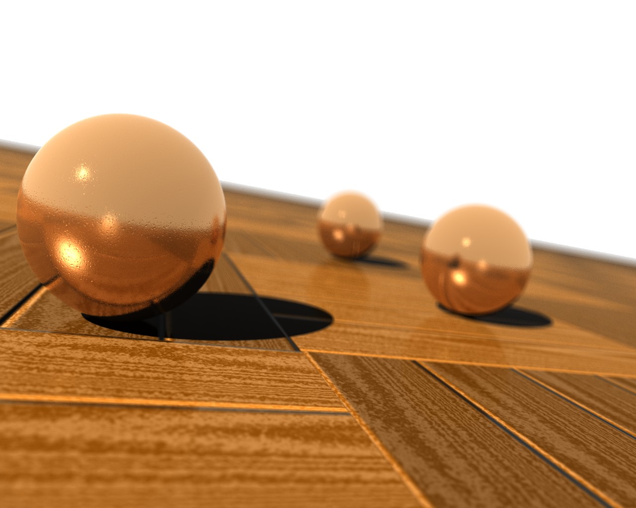
This is the same image, with white "sky", I did modify the texture a
bit. I've adjusted the scale and depth of the micro texture to blur the
relection a bit, all other things are the same. Blur samples were
increased slightly to give a bit cleaner looking image.

--
~Mike
Post a reply to this message
Attachments:
Download 'copper2.jpg' (153 KB)
Preview of image 'copper2.jpg'
|
|
| |
| |
|
|
|
|
| |
| |
|
|
Mike Raiford <mra### [at] hotmailcom> wrote:
> Aaron Gillies wrote:
> > Mike:
> >
> > Put a white plane up above the scene for the metal to reflect off of and
> > see what happens.  For a material to really look reflective, it has to
> > have something to ... uh ... reflect.  The bottom half of the spheres
> > look quite interesting, though.
> >
> > Aaron
>
> This is the same image, with white "sky", I did modify the texture a
> bit. I've adjusted the scale and depth of the micro texture to blur the
> relection a bit, all other things are the same. Blur samples were
> increased slightly to give a bit cleaner looking image.
>
> --
> ~Mike

The blurred reflection improves the appearance a lot. I thought the first
image looked a bit off, but I couldn't exactly put my finger on why I felt
that way. This new image looks very convincing.

 - dan B hentschel
Post a reply to this message
|
|
| |
| |
|
|
|
|
| |
| |
|
|
Mike Raiford wrote:

> New wallpaper.
>
> Yeah, I'm in a rut. Was a material test to begin with, evolved into this.

Gahh....

Had to pick by jaw off the floor after seeing this one. Very well done!

--
Stefan Viljoen
Software Support Technician
Polar Design Solutions
Post a reply to this message
|
|
| |
| |
|
|
|
|
| |
| |
|
|
Well, maybe it's just me, but I like the first one  better - you mentioned
wallpaper so I am testing your image as my wallpaper.
The dark "sky" is what I prefer for my background - it shows icons well.

The white version looks great on the lower half of the image but way too
empty on the top half. Perhaps you can find something more interesting than
white (a checkered "sky" perhaps??).

Copper looks great.

Stephen
Post a reply to this message
|
|
| |
| |
|
|
|
|
| |
| |
|
|
Stephen wrote:
> Well, maybe it's just me, but I like the first one  better - you mentioned
> wallpaper so I am testing your image as my wallpaper.
> The dark "sky" is what I prefer for my background - it shows icons well.
>
> The white version looks great on the lower half of the image but way too
> empty on the top half. Perhaps you can find something more interesting than
> white (a checkered "sky" perhaps??).
>
> Copper looks great.
>
> Stephen

I use the one with the black background. I think the checkered "sky"
would make it too busy for it to be practical as a wallpaper

--
~Mike
Post a reply to this message
|
|
| |
| |
|
|
|
|
| |
| |
|
|
"checkered sky" was a joke -- sorry for the confusion - I just meant that
the plain white sky - if it's meant to be sky - was too plain and
non-interesting to me. I was making a pun on the reflective sphere on a
checkered floor - i.e. a checkered sky.


The copper BB and wood textures are warm, rich and full of depth.

YES - I like the dark "sky" for my desktop. For a desktop, I like the black
or dark backgrounds with limited image or distracting colours - but then
again each to his and or her own.

Thanks for the image.

Would you be able to send me the copper texture, please?

signup42 at shaw dot ca
Stephen


Raiford" <mra### [at] hotmailcom> wrote in message
news:41e3d141$1@news.povray.org...
> Stephen wrote:
> > Well, maybe it's just me, but I like the first one  better - you
mentioned
> > wallpaper so I am testing your image as my wallpaper.
> > The dark "sky" is what I prefer for my background - it shows icons well.
> >
> > The white version looks great on the lower half of the image but way too
> > empty on the top half. Perhaps you can find something more interesting
than
> > white (a checkered "sky" perhaps??).
> >
> > Copper looks great.
> >
> > Stephen
>
> I use the one with the black background. I think the checkered "sky"
> would make it too busy for it to be practical as a wallpaper
>
> --
> ~Mike
Post a reply to this message
|
|
| |
| |
|
|
|
|
| |
| |
|
|
Stephen wrote:
> "checkered sky" was a joke -- sorry for the confusion - I just meant that
> the plain white sky - if it's meant to be sky - was too plain and
> non-interesting to me. I was making a pun on the reflective sphere on a
> checkered floor - i.e. a checkered sky.
>
>
> The copper BB and wood textures are warm, rich and full of depth.
>
> YES - I like the dark "sky" for my desktop. For a desktop, I like the black
> or dark backgrounds with limited image or distracting colours - but then
> again each to his and or her own.
>
> Thanks for the image.
>
> Would you be able to send me the copper texture, please?
>
> signup42 at shaw dot ca
> Stephen
>
>
>
>
> Raiford" <mra### [at] hotmailcom> wrote in message
> news:41e3d141$1@news.povray.org...
>
>>Stephen wrote:
>>
>>>Well, maybe it's just me, but I like the first one  better - you
>
> mentioned
>
>>>wallpaper so I am testing your image as my wallpaper.
>>>The dark "sky" is what I prefer for my background - it shows icons well.
>>>
>>>The white version looks great on the lower half of the image but way too
>>>empty on the top half. Perhaps you can find something more interesting
>
> than
>
>>>white (a checkered "sky" perhaps??).
>>>
>>>Copper looks great.
>>>
>>>Stephen
>>
>>I use the one with the black background. I think the checkered "sky"
>>would make it too busy for it to be practical as a wallpaper
>>
>>--
>>~Mike
>
>
>

Look at p.t.sf

--
~Mike
Post a reply to this message
|
|
| |
| |
|
|
|
|
| |