|
|
|
|
|
|
| |
| |
|
|
|
|
| |
| |
|
|
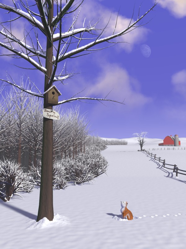
So, after christmas matters were resolved, I had some time again to work on
the image. It is now in its "near final" state. I plan on adding some
half-covered grass-blades in the closer vicinity of the forest and maybe the
main tree, and want to experiment if I can get a little more variation onto
the heightfield which goes way back into the distance, aside of that, no
large changes or additions are planned, maybe a tweaking of details.

This render took 1h20m for 768x1280, an increase of 1h on my 2.6GHz, 768 MB
RAM, Win2000 System, all due to the media used for the sky-sphere with
clouds. They're subtle and not too volumetric, just another touch to add
some more life and color to the image.

Technical note: peak memory used was 97 MB, so I think I'll add some more
trees into places where you can't see them... ;-)

If POV-Ray were a polygon-based renderer, I'd say the barn in the background
is low-poly, but the way it is, its just very simple CSG with only a dozen
or so objects, built in roughly half an hour. Suffices for the background.

As always, suggestions and comments welcome, even though this is "near
final".

Regards,
Tim

--
"Tim Nikias v2.0"
Homepage: <http://www.nolights.de>
Post a reply to this message
Attachments:
Download 'missyou_wip.jpg' (117 KB)
Preview of image 'missyou_wip.jpg'
|
|
| |
| |
|
|
|
|
| |
| |
|
|
Awesome ...

Just two remarks.

I find my eye wandering to the barn in the background and to the moon.
Since I know that these are not the primary focus of the image, I am
wondering if this is right ...  For some reason they "stick out."

Otherwise, I really like it.  The technical work is very, very good.
The "narrative" is interesting.  The "artistic merit" is definitely there.

A success!

Aaron
Post a reply to this message
|
|
| |
| |
|
|
|
|
| |
| |
|
|
> I find my eye wandering to the barn in the background and to the moon.
> Since I know that these are not the primary focus of the image, I am
> wondering if this is right ...  For some reason they "stick out."

Hm. The moon can be subdued, its in its own lightgroup and less light would
make it less prominent. As for the barn, that's difficult. I could try to
get it more hazy than flaming red... I'll see what I can do. Thanks for that
remark though! Maybe I need to put something in the foreground to put more
attention to the cat and the bird's house...

> Otherwise, I really like it.  The technical work is very, very good.
> The "narrative" is interesting.  The "artistic merit" is definitely there.
> A success!

Thanks for the positive feedback. :-)

Regards,
Tim

--
"Tim Nikias v2.0"
Homepage: <http://www.nolights.de>
Post a reply to this message
|
|
| |
| |
|
|
|
|
| |
| |
|
|
Tim Nikias nous apporta ses lumieres ainsi en ce 2004-12-28 20:19... :

>So, after christmas matters were resolved, I had some time again to work on
>the image. It is now in its "near final" state. I plan on adding some
>half-covered grass-blades in the closer vicinity of the forest and maybe the
>main tree, and want to experiment if I can get a little more variation onto
>the heightfield which goes way back into the distance, aside of that, no
>large changes or additions are planned, maybe a tweaking of details.
>
>This render took 1h20m for 768x1280, an increase of 1h on my 2.6GHz, 768 MB
>RAM, Win2000 System, all due to the media used for the sky-sphere with
>clouds. They're subtle and not too volumetric, just another touch to add
>some more life and color to the image.
>
>Technical note: peak memory used was 97 MB, so I think I'll add some more
>trees into places where you can't see them... ;-)
>
>If POV-Ray were a polygon-based renderer, I'd say the barn in the background
>is low-poly, but the way it is, its just very simple CSG with only a dozen
>or so objects, built in roughly half an hour. Suffices for the background.
>
>As always, suggestions and comments welcome, even though this is "near
>final".
>
>Regards,
>Tim
>
>
>
The barn in the background may be to colourfull, it draws the eye to it
to much. Old unpainted barns thend to be gray weathered wood. You may
try averaging the pigment used with 2/3 to 4/5 gray, or go totaly gray.
The clouds make the sky look more blue, unless you intensified it. Nice
winter sky!

Alain
Post a reply to this message
|
|
| |
| |
|
|
|
|
| |
| |
|
|
> This render took 1h20m for 768x1280, an increase of 1h on my 2.6GHz, 768
MB
> RAM, Win2000 System, all due to the media used for the sky-sphere with
> clouds. They're subtle and not too volumetric, just another touch to add
> some more life and color to the image.

I notice that your primary light source(s) are behind the camera. If the
render time increase from the clouds bothers you, try cutting a hole in the
media container using a difference with a huge cone, whose point is at the
light source position and whose base is large and below the interesting part
of the image. I tried this in an image I've been working on, and since it
prevents unnoticable cloud shadows from falling on the majority of the
image, it speeds up the render time (the clouds are only sampled in the
sky). Of course, if your light source is below the clouds in the first
place, this won't make any difference.

Anyway, if you liked the blue-white contrast that someone mentioned the
image had last time, then I'd encourage you to make the clouds even more
subtle (less dense).

> If POV-Ray were a polygon-based renderer, I'd say the barn in the
background
> is low-poly, but the way it is, its just very simple CSG with only a dozen
> or so objects, built in roughly half an hour. Suffices for the background.

I agree that you should add a window or something onto the big empty wall
facing us; it seems strangely blank.

By the way, I see now that the fence is zig-zagging; I didn't notice this
before because I didn't look at its shadow. That's why I mentioned it
looking strange: it looks like every pair of horizontal poles starts below
the previous pair, slants up, and ends above the next pair, because you
can't see every other pair from our camera position. Maybe you should reduce
the zig-zaggyness so that we can see those sections of the fence which are
hiding behind the poles.

Is there snow on the nearby part of the fence?

 - Slime
 [ http://www.slimeland.com/ ]
Post a reply to this message
|
|
| |
| |
|
|
|
|
| |
| |
|
|
Tim,
Please don't overdo it.
I thought it was better without the barn. Its a really good barn, but for
another picture. The focus has to stay on the cat's eyeline to make sense.
And if you must keep the barn, cover it with snow! The clouds are good and
make the moon superfluous.
DLM
Post a reply to this message
|
|
| |
| |
|
|
|
|
| |
| |
|
|
Wow!
That's great!
But... Didn't you forgot to add snow on the barn?
And I agree with the others: I think the barn is too much red.
(I personally know a cat that would be sad, too... ;-))

Regards,

--
Laurent ARTAUD
Post a reply to this message
|
|
| |
| |
|
|
|
|
| |
| |
|
|
> Please don't overdo it.

Trying not to. :-)

> I thought it was better without the barn. Its a really good barn, but for
> another picture. The focus has to stay on the cat's eyeline to make sense.
> And if you must keep the barn, cover it with snow! The clouds are good and
> make the moon superfluous.

I know, many have said that the barn's color sticks out. I'll make it
somewhat older and covered with some snow, that should take care of it. I
really want to keep it as it breaks up the horizon on the right side of the
image and fills the blank space there with something other than forest. So
I'll go the "less color" way.


--
"Tim Nikias v2.0"
Homepage: <http://www.nolights.de>
Post a reply to this message
|
|
| |
| |
|
|
|
|
| |
| |
|
|
> The barn in the background may be to colourfull, it draws the eye to it
> to much. Old unpainted barns thend to be gray weathered wood. You may
> try averaging the pigment used with 2/3 to 4/5 gray, or go totaly gray.

I'll try that, in addition to some snow on the roof.

> The clouds make the sky look more blue, unless you intensified it. Nice
> winter sky!

Nope, no intensification going on.

--
"Tim Nikias v2.0"
Homepage: <http://www.nolights.de>
Post a reply to this message
|
|
| |
| |
|
|
|
|
| |
| |
|
|
> In addition to comments on the barn color, you might want to drop a
> window and/or door on there.

I modelled it after a reference pic, and that one had the main door on the
wall obscured by the silo. I'll see what I can do though.

--
"Tim Nikias v2.0"
Homepage: <http://www.nolights.de>
Post a reply to this message
|
|
| |
| |
|
|
|
|
| |
| |
|
|
> I notice that your primary light source(s) are behind the camera
SNIP [technical jargon for media and lightsources]

The clouds are in their own lightgroup and are limited roughly to the
visible area, so that's not a problem.

> Anyway, if you liked the blue-white contrast that someone mentioned the
> image had last time, then I'd encourage you to make the clouds even more
> subtle (less dense).

I'm still experimenting on that, but I kinda like the added color.

> By the way, I see now that the fence is zig-zagging; I didn't notice this
> before because I didn't look at its shadow.

It's not really zig-zag, but more random placement of the poles. Perhaps
less would be better. In addition, the shadow might be a little off, the
fence's beams are slightly drooping as well as being placed first in front
and then behind the poles.

> Is there snow on the nearby part of the fence?

No, just some texture. Another detail I need to work on, but shouldn't be
too difficult.

Regards,
Tim

--
"Tim Nikias v2.0"
Homepage: <http://www.nolights.de>
Post a reply to this message
|
|
| |
| |
|
|
|
|
| |
| |
|
|
> Wow!
> That's great!

Thanks!

> But... Didn't you forgot to add snow on the barn?

Will do.

> And I agree with the others: I think the barn is too much red.

Yup, on the to-do list.

Regards,
Tim

--
"Tim Nikias v2.0"
Homepage: <http://www.nolights.de>
Post a reply to this message
|
|
| |
| |
|
|
|
|
| |
| |
|
|
-----BEGIN PGP SIGNED MESSAGE-----
Hash: SHA1
It's very good, but the border of the forest looks strange. Maybe
simply moving the bushes so that they are more under the first row of
trees would help? Otherwise, you can take a look at this link:
http://mairie.arches.free.fr/foret.htm
The text is in french, but there are several drawings of different
kinds of forest borders. (For those who wonder, the page describes
how the forest edge should be to resist being damaged in case of
tempest).
Jerome
- --
******************************
* Jerome M. Berger *
* mailto:jbe### [at] ifrance com *
* http://jeberger.free.fr/ *
******************************
-----BEGIN PGP SIGNATURE-----
Version: GnuPG v1.2.4 (GNU/Linux)
iD8DBQFB0pb2qIYJdJhyixIRAkvvAJ9yo/lRMBIRaT59fJflV6O7+lXg4wCdF7uT
gQlcs4vyx2wqxgdmyHJlZ+s=
=l+U1
-----END PGP SIGNATURE----- com *
* http://jeberger.free.fr/ *
******************************
-----BEGIN PGP SIGNATURE-----
Version: GnuPG v1.2.4 (GNU/Linux)
iD8DBQFB0pb2qIYJdJhyixIRAkvvAJ9yo/lRMBIRaT59fJflV6O7+lXg4wCdF7uT
gQlcs4vyx2wqxgdmyHJlZ+s=
=l+U1
-----END PGP SIGNATURE-----
Post a reply to this message
|
|
| |
| |
|
|
|
|
| |
| |
|
|
I love the addition of the barn.  I think it adds much to the picture
both compositionally and narratively.  The shadow seems a bit
disconcerting, not because of its sharpness, but because it is not
laying flat.  It seems to be falling on an incline.  I don't know if
your placement of the barn is physically sensible or not.  It may be one
of those moments when the brain won't accept the illustion no matter how
correctly it is mapped from reality.  This happens all the time when
painting or drawing.  The artist has to change the actual record of the
  tones or edge angles or whatever to get a result the mind accepts as
more convincing.
Post a reply to this message
|
|
| |
| |
|
|
|
|
| |
| |
|
|
> It's very good, but the border of the forest looks strange. Maybe
> simply moving the bushes so that they are more under the first row of
> trees would help?

The bushes actually *are* very close and inside the forest, but the front
bushes may be obscuring that. As it is, I think I won't change much on that
anymore. You can get only so close on your first try, and then need other
images, different settings etc to gather some experience. For this image, I
call the forest edge (aside of the missing grass-blades I plan to add) a
wrap. Thanks for the link though, interesting stuff (though I'd need to get
more into french again, only had it a few years in school and wasn't my best
course...).

Regards,
Tim

--
"Tim Nikias v2.0"
Homepage: <http://www.nolights.de>
Post a reply to this message
|
|
| |
| |
|
|
|
|
| |
| |
|
|
> I love the addition of the barn.  I think it adds much to the picture
> both compositionally and narratively.  The shadow seems a bit
> disconcerting, not because of its sharpness, but because it is not
> laying flat.

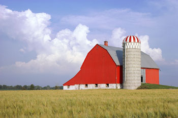
What you're actually seeing is not the shadow of the barn, but a
side-addition. Attached to this post a small photo gathered somewhere from
the web as reference.

That aside, the shadow probably does fall on some hills or such, the image
makes heavy usage of forced perspective, but *looks* okay.

--
"Tim Nikias v2.0"
Homepage: <http://www.nolights.de>
Post a reply to this message
Attachments:
Download '2216033.jpeg.jpg' (18 KB)
Preview of image '2216033.jpeg.jpg'
|
|
| |
| |
|
|
|
|
| |
| |
|
|
Tim Nikias wrote:
>>I love the addition of the barn.  I think it adds much to the picture
>>both compositionally and narratively.  The shadow seems a bit
>>disconcerting, not because of its sharpness, but because it is not
>>laying flat.
>
>
> What you're actually seeing is not the shadow of the barn, but a
> side-addition. Attached to this post a small photo gathered somewhere from
> the web as reference.
>
> That aside, the shadow probably does fall on some hills or such, the image
> makes heavy usage of forced perspective, but *looks* okay.
>
>
Oh.  That's called the "bridge" of the barn
Post a reply to this message
|
|
| |
| |
|
|
|
|
| |
| |
|
|
Jim Charter <jrc### [at] msncom> wrote:
> Tim Nikias wrote:
> >>I love the addition of the barn.  I think it adds much to the picture
> >>both compositionally and narratively.  The shadow seems a bit
> >>disconcerting, not because of its sharpness, but because it is not
> >>laying flat.
> >
> >
> > What you're actually seeing is not the shadow of the barn, but a
> > side-addition. Attached to this post a small photo gathered somewhere from
> > the web as reference.
> >
> > That aside, the shadow probably does fall on some hills or such, the image
> > makes heavy usage of forced perspective, but *looks* okay.
> >
> >
> Oh.  That's called the "bridge" of the barn


We always called it the "lean-to" :)

Tim, it's amazing how much that picture reminds me of the farm where I grew
up. The barn looks almost identical. Nice work.
Post a reply to this message
|
|
| |
| |
|
|
|
|
| |
| |
|
|
> Tim, it's amazing how much that picture reminds me of the farm where I
grew
> up. The barn looks almost identical. Nice work.

Thanks. It's good to know that I'm getting the details right. :-)

--
"Tim Nikias v2.0"
Homepage: <http://www.nolights.de>
Post a reply to this message
|
|
| |
| |
|
|
|
|
| |
| |
|
|
Tim Nikias wrote:
> So, after christmas matters were resolved, I had some time again to work on
> the image.

Very nice, not extremely realistic in texturing but message and
composition well compensate for that.

>
> As always, suggestions and comments welcome, even though this is "near
> final".

Maybe it's just not visible at this size but the fence seems to lack
snow coverage.  Same for the building.

Christoph

--
POV-Ray tutorials, include files, Sim-POV,
HCR-Edit and more: http://www.tu-bs.de/~y0013390/
Last updated 23 Sep. 2004 _____./\/^>_*_<^\/\.______
Post a reply to this message
|
|
| |
| |
|
|
|
|
| |
| |
|
|
> Very nice, not extremely realistic in texturing but message and
> composition well compensate for that.

Thanks. I always aim more towards the composition and message, but I'm
always refining my texturing skills.

> Maybe it's just not visible at this size but the fence seems to lack
> snow coverage.  Same for the building.

Implemented now, latest post has roof textured to fit with the snow, and the
fence is covered with a snow-blob.

Regards,
Tim

--
"Tim Nikias v2.0"
Homepage: <http://www.nolights.de>
Post a reply to this message
|
|
| |
| |
|
|
|
|
| |
| |
|
|
Statler wrote:
> Jim Charter <jrc### [at] msncom> wrote:
>
>>Tim Nikias wrote:
>>
>>>>I love the addition of the barn.  I think it adds much to the picture
>>>>both compositionally and narratively.  The shadow seems a bit
>>>>disconcerting, not because of its sharpness, but because it is not
>>>>laying flat.
>>>
>>>
>>>What you're actually seeing is not the shadow of the barn, but a
>>>side-addition. Attached to this post a small photo gathered somewhere from
>>>the web as reference.
>>>
>>>That aside, the shadow probably does fall on some hills or such, the image
>>>makes heavy usage of forced perspective, but *looks* okay.
>>>
>>>
>>
>>Oh.  That's called the "bridge" of the barn
>
>
>
> We always called it the "lean-to" :)
>
Okay, anyway the idea being that the hay and equipment is stored up
above where the livestock actually is.
Post a reply to this message
|
|
| |
| |
|
|
|
|
| |