|
|
|
|
|
|
| |
| |
|
|
|
|
| |
| |
|
|
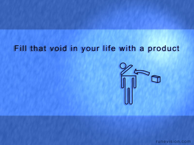
Rafal and Alf, are the shadows better now?
I've also changed "the void" to "that void". I'm not sure which is better...
Rune
--
3D images and anims, include files, tutorials and more:
rune|vision: http://runevision.com
POV-Ray Ring: http://webring.povray.co.uk
Post a reply to this message
Attachments:
Download 'universal_ad_b.jpg' (49 KB)
Preview of image 'universal_ad_b.jpg'
|
|
| |
| |
|
|
|
|
| |
| |
|
|
Hugo Asm wrote:
> The man looks like a trashcan, and the product
> is supposedly junk?
I realize it looks a little like that, but it's not entirely intentional. I
just didn't know how else to illustrate it with simple symbols. To "fill the
void" is not easy to represent visually...
> I think you may be overstating the matter a little,
> but there IS a point in this, as the commercial
> world has got too much power over peoples lifes
> (in my opinion). Good job!
Thanks :)
Well lots of ads do signal that you'll be cooler and gain respect and be
happier and find love if you buy their product. Also, some people actually
go shopping - even alone - to feel better if they've had a bad day. I don't
think it's a huge problem, but still worth commenting on, and humor is a
nice approach at that IMO.
Rune
--
3D images and anims, include files, tutorials and more:
rune|vision: http://runevision.com
POV-Ray Ring: http://webring.povray.co.uk
Post a reply to this message
|
|
| |
| |
|
|
|
|
| |
| |
|
|
Nice I really like this!
Post a reply to this message
|
|
| |
| |
|
|
|
|
| |
| |
|
|
run### [at] runevision com news:411aa2d2@news.povray.org
> Rafal and Alf, are the shadows better now?
Yeap, much better.
Perhaps but some small but "sharp" details on the background because to be
ohnes it looks still a bit blurry? Like small drops of water or some other
detail to focus eye on?
--
http://www.raf256.com/3d/
Rafal Maj 'Raf256', home page - http://www.raf256.com/me/
Computer Graphics com news:411aa2d2@news.povray.org
> Rafal and Alf, are the shadows better now?
Yeap, much better.
Perhaps but some small but "sharp" details on the background because to be
ohnes it looks still a bit blurry? Like small drops of water or some other
detail to focus eye on?
--
http://www.raf256.com/3d/
Rafal Maj 'Raf256', home page - http://www.raf256.com/me/
Computer Graphics
Post a reply to this message
|
|
| |
| |
|
|
|
|
| |
| |
|
|
Rune wrote:
> Rafal and Alf, are the shadows better now?
>
> I've also changed "the void" to "that void". I'm not sure which is better...
>
> Rune
>
Great concept! I love this :)
--
-------------------------
George Pantazopoulos
http://www.gammaburst.net
Post a reply to this message
|
|
| |
| |
|
|
|
|
| |
| |
|
|
did is better, too - the "closer" shadow works well.
Lance.
thezone - thezone.firewave.com.au
thehandle - www.thehandle.com
Post a reply to this message
|
|
| |
| |
|
|
|
|
| |
| |
|
|
Lance Birch wrote:
Thanks!
map of UK you're referring to - where we follow a womans day, all shown in
diagrams? :)
> I think the newer version you did is better, too
> - the "closer" shadow works well.
Great.
Rune
--
3D images and anims, include files, tutorials and more:
rune|vision: http://runevision.com
POV-Ray Ring: http://webring.povray.co.uk
Post a reply to this message
|
|
| |
| |
|
|
|
|
| |
| |
|
|
> Rafal and Alf, are the shadows better now?
My eyes are happy now :)
It is quite a complex concept for such a simple image but I think you
have
done it.
Alf
Post a reply to this message
|
|
| |
| |
|
|
|
|
| |
| |
|
|
Great Image!
Post a reply to this message
|
|
| |
| |
|
|
|
|
| |
| |
|
|
Rune wrote:
> Rafal and Alf, are the shadows better now?
>
> I've also changed "the void" to "that void". I'm not sure which is better...
>
> Rune
>
I prefer the change.
Your message is only too true.
Post a reply to this message
|
|
| |
| |
|
|
|
|
| |