|
|
|
|
|
|
| |
| |
|
|
|
|
| |
| |
|
|
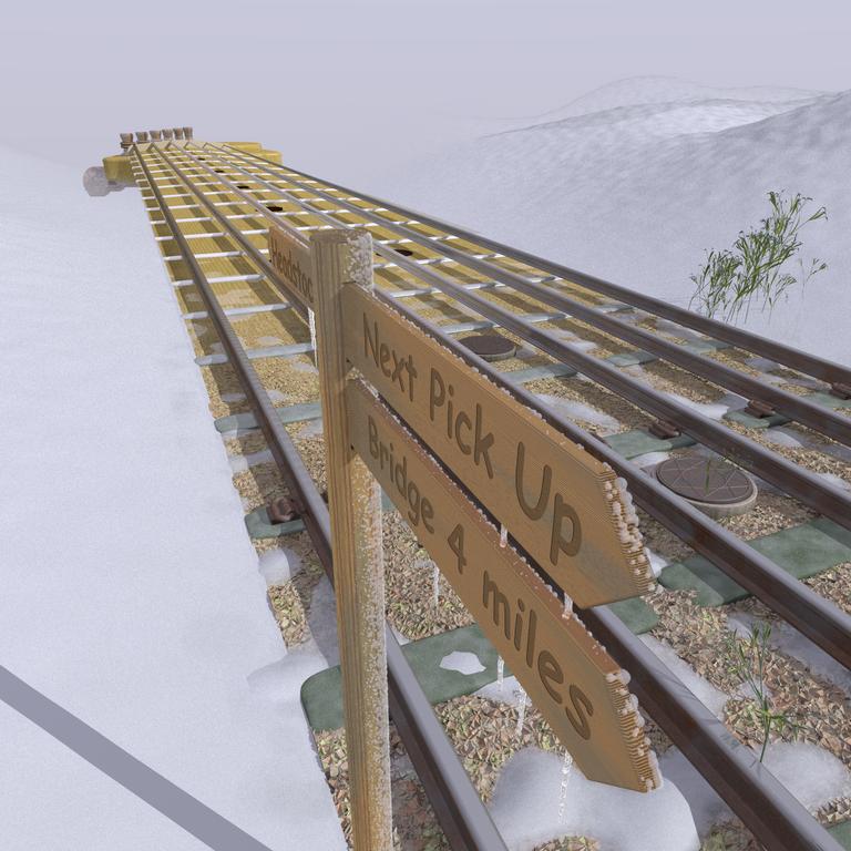
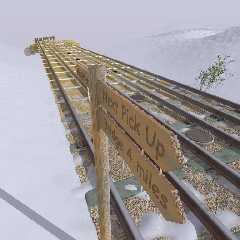
Here's that CD cover I've been working on.
They want it at 300 dpi so the actual render was
twice this size (1536x1536) making it 13cm square
(CD covers are 12cm square but the publishers wanted
1cm extra for trimming.)
A spline function controls the "guitarness"/"trackness"
for each point along the neck/track.
--
Bill Hails
Post a reply to this message
Attachments:
Download 'tracks.jpg' (79 KB)
Preview of image 'tracks.jpg'
|
|
| |
| |
|
|
|
|
| |
| |
|
|
"Bill Hails" <bil### [at] europe yahoo-inccom> wrote in message
news:404abf82@news.povray.org...
> Here's that CD cover I've been working on.
>
> They want it at 300 dpi so the actual render was
> twice this size (1536x1536) making it 13cm square
> (CD covers are 12cm square but the publishers wanted
> 1cm extra for trimming.)
>
> A spline function controls the "guitarness"/"trackness"
> for each point along the neck/track.
VERY, VERY cool. yahoo-inccom> wrote in message
news:404abf82@news.povray.org...
> Here's that CD cover I've been working on.
>
> They want it at 300 dpi so the actual render was
> twice this size (1536x1536) making it 13cm square
> (CD covers are 12cm square but the publishers wanted
> 1cm extra for trimming.)
>
> A spline function controls the "guitarness"/"trackness"
> for each point along the neck/track.
VERY, VERY cool.
Post a reply to this message
|
|
| |
| |
|
|
|
|
| |
| |
|
|
"Bill Hails" <bil### [at] europeyahoo-inccom> wrote in message
news:404abf82@news.povray.org...
> Here's that CD cover I've been working on.
Woah that is really nice. Superb concept brilliantly executed, I particularly
like the signs :)
--
Tek
www.evilsuperbrain.com
Post a reply to this message
|
|
| |
| |
|
|
|
|
| |
| |
|
|
Thanks!
--
Bill Hails
Post a reply to this message
|
|
| |
| |
|
|
|
|
| |
| |
|
|
Tek wrote:
>
> Woah that is really nice. Superb concept brilliantly executed, I
> particularly like the signs :)
>
I'm very flattered.
I'm still just a newbie but I *love* doing this stuff :-)
--
Bill Hails
Post a reply to this message
|
|
| |
| |
|
|
|
|
| |
| |
|
|
Bill Hails wrote:
> Here's that CD cover I've been working on.
>
> They want it at 300 dpi so the actual render was
> twice this size (1536x1536) making it 13cm square
> (CD covers are 12cm square but the publishers wanted
> 1cm extra for trimming.)
>
> A spline function controls the "guitarness"/"trackness"
> for each point along the neck/track.
>
>
> ------------------------------------------------------------------------
>
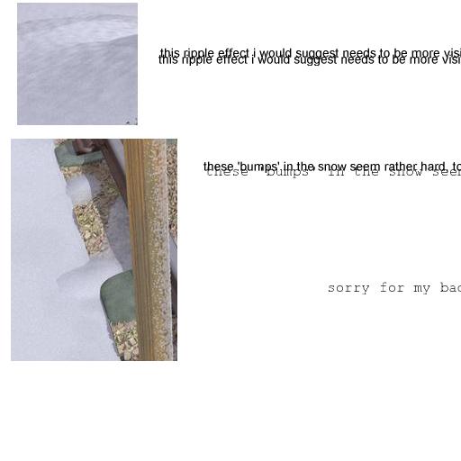
its lovely, i like the grass !!
nice idea as well, but you hear the but coming
:-)
not very good with gimp, but thought i'd try as it's rather differcult
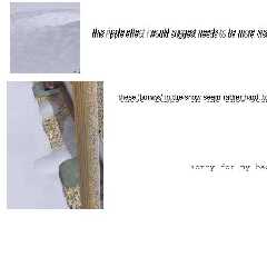
to describe where in the image i'm mithering about
attached jpg has two sections, top bit refers to the ripple effect top
right of main image possible being more visible left of tracks, left of
tracks appears very very flat
second highlights bottom half of post and and tracks towards
'headstock', there some rather hard looking bumps, near the 'wriggle
holding the rail' particularly.
i just noticed that the rails seems to float, guitar ok rails no;
question - loose the wriggly clamps and make the rails, similarly size
wire cables, with weave visible - suspension bridge type cable
noticing that suggests said wriggles are a bit sparse in reality, yeah
ok artistic license .... but
thirdly looking at image as i type, maybe the drain covers need to
darken a bit less rapidly with distance, go black too soon ?
hth
stephen
Post a reply to this message
|
|
| |
| |
|
|
|
|
| |
| |
|
|
stephen parkinson wrote:
> Bill Hails wrote:
>
>> Here's that CD cover I've been working on.
>>
>> They want it at 300 dpi so the actual render was
>> twice this size (1536x1536) making it 13cm square
>> (CD covers are 12cm square but the publishers wanted
>> 1cm extra for trimming.)
>>
>> A spline function controls the "guitarness"/"trackness"
>> for each point along the neck/track.
>>
>>
>> ------------------------------------------------------------------------
>>
>
> its lovely, i like the grass !!
> nice idea as well, but you hear the but coming
> :-)
> not very good with gimp, but thought i'd try as it's rather differcult
> to describe where in the image i'm mithering about
>
> attached jpg has two sections, top bit refers to the ripple effect top
> right of main image possible being more visible left of tracks, left of
> tracks appears very very flat
>
> second highlights bottom half of post and and tracks towards
> 'headstock', there some rather hard looking bumps, near the 'wriggle
> holding the rail' particularly.
>
> i just noticed that the rails seems to float, guitar ok rails no;
> question - loose the wriggly clamps and make the rails, similarly size
> wire cables, with weave visible - suspension bridge type cable
>
> noticing that suggests said wriggles are a bit sparse in reality, yeah
> ok artistic license .... but
>
> thirdly looking at image as i type, maybe the drain covers need to
> darken a bit less rapidly with distance, go black too soon ?
>
> hth
>
> stephen
forgot the gimp bit
stephen
Post a reply to this message
Attachments:
Download 'samples.jpg' (21 KB)
Preview of image 'samples.jpg'
|
|
| |
| |
|
|
|
|
| |
| |
|
|
stephen parkinson wrote:
>
> its lovely, i like the grass !!
> nice idea as well, but you hear the but coming
> :-)
> not very good with gimp, but thought i'd try as it's rather differcult
> to describe where in the image i'm mithering about
I'm replying to this post to avoid unwanted indents, I see your other
with the thumbnails.
> attached jpg has two sections, top bit refers to the ripple effect top
> right of main image possible being more visible left of tracks, left of
> tracks appears very very flat
Agreed, but the top right and bottom left are reserved for the
artist and title, so I'm not too worried.
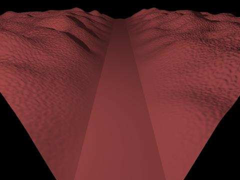
> second highlights bottom half of post and and tracks towards
> 'headstock', there some rather hard looking bumps, near the 'wriggle
> holding the rail' particularly.
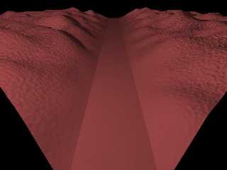
yes, it's difficult to get that right, because of the way the landscape
is done using a pigment function to generate a height field (see attachment)
the fine grain noise in the landscape falls to zero along with the rest of
the function as it approaches the valley floor.
I guess I could add the noise rather than multiplying it in
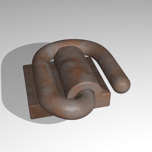
> i just noticed that the rails seems to float, guitar ok rails no;
> question - loose the wriggly clamps and make the rails, similarly size
> wire cables, with weave visible - suspension bridge type cable
The rails are blobs of cylinders that run from one end of the rail
to the other, pinned around a circle at the far end and around the
rail cross section at the near, this is the only feature of the
track/neck that doesn't make use of the spline function, and being
that way they definately touch the sleepers at the start and definately
hang well above the frets at the end. I guess they probably are starting
to take off as you indicated, but I think that's just part of the
picture.
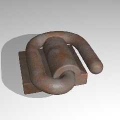
I like the clamps, (see attachment :-)
close up they are very physical objects. The rust texture isn't mine.
I'd be sad to loose them.
> noticing that suggests said wriggles are a bit sparse in reality, yeah
> ok artistic license .... but
yeah, I didn't want to put them on the nearest sleepers because then
they'd seem to just stop, and by the 4th sleepers out it's too far
towards being a guitar - compromise rather than artistic license.
> thirdly looking at image as i type, maybe the drain covers need to
> darken a bit less rapidly with distance, go black too soon ?
Yes you are right. In fact the problem is probably that they go black
at all. A rich dark brown wood would be better.
> hth
>
> stephen
Thanks for your comments.
--
Bill Hails
Post a reply to this message
Attachments:
Download 'staple.jpg' (18 KB)
Download 'test.jpg' (13 KB)
Preview of image 'staple.jpg'
Preview of image 'test.jpg'
|
|
| |
| |
|
|
|
|
| |
| |
|
|
Very ingenious, congratulations.
Fernando
Post a reply to this message
|
|
| |
| |
|
|
|
|
| |
| |
|
|
"Bill Hails" <bil### [at] europeyahoo-inccom> wrote in message
news:404aeda3@news.povray.org...
> Tek wrote:
>
> >
> > Woah that is really nice. Superb concept brilliantly executed, I
> > particularly like the signs :)
> >
>
> I'm very flattered.
> I'm still just a newbie but I *love* doing this stuff :-)
Oh man, if you're a newbie I gotta go buy a lot of popcorn and beer because
what you're gonna do next is gonna be ground-breaking!!!
Post a reply to this message
|
|
| |
| |
|
|
|
|
| |