|
|
|
|
|
|
| |
| |
|
|
|
|
| |
| |
|
|
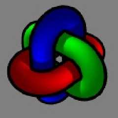
I've been overhauling my website lately, and I've decided to review the logo.
I'm still happy with the choice of pov object, based on this old image of mine:
http://www.evilsuperbrain.com/gallery/index.php?gallery=finished&image=lockw

But I'm starting to dislike the excessively bright and flat looking version of
it I've used for my website logo. So I've been playing with a couple of other
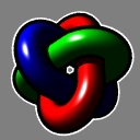
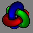
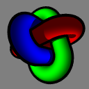
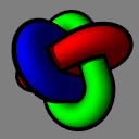
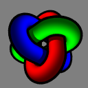
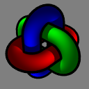
ideas. original.gif is the logo as it is now, the other images are some new
variations.

So what do you think? Stick or twist?
Any suggestions for other variations?

--
Tek
www.evilsuperbrain.com
Post a reply to this message
Attachments:
Download 'persp.jpg' (7 KB)
Download 'angle.jpg' (7 KB)
Download 'sidelit.jpg' (7 KB)
Download 'lighttrick.jpg' (6 KB)
Download 'original.gif' (3 KB)
Download 'shiny.jpg' (8 KB)
Preview of image 'persp.jpg'

Preview of image 'angle.jpg'

Preview of image 'sidelit.jpg'
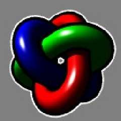
Preview of image 'lighttrick.jpg'
Preview of image 'original.gif'

Preview of image 'shiny.jpg'

|
|
| |
| |
|
|
|
|
| |
| |
|
|
I prefer the 4th but whis a little more bright lightning... The second is
good too.
Post a reply to this message
|
|
| |
| |
|
|
|
|
| |
| |
|
|
"LightBeam" <s.f### [at] tiscali fr> wrote in message
news:404a5c88$1@news.povray.org...
> I prefer the 4th but whis a little more bright lightning... The second is
> good too.
I'm with LightBeam on this one -- 4 is definitely to most professional
looking. And, a logo shouldn't detract from the rest of the page, so the one
right above it with the specular highlights might be too dominant. Just a
shmidgeon more contrast to 4 and it would be supa-sweet. fr> wrote in message
news:404a5c88$1@news.povray.org...
> I prefer the 4th but whis a little more bright lightning... The second is
> good too.
I'm with LightBeam on this one -- 4 is definitely to most professional
looking. And, a logo shouldn't detract from the rest of the page, so the one
right above it with the specular highlights might be too dominant. Just a
shmidgeon more contrast to 4 and it would be supa-sweet.
Post a reply to this message
|
|
| |
| |
|
|
|
|
| |
| |
|
|
Tek wrote:

> I've been overhauling my website lately, and I've decided to review the
> logo. I'm still happy with the choice of pov object, based on this old
> image of mine:
>
http://www.evilsuperbrain.com/gallery/index.php?gallery=finished&image=lockw
>
> But I'm starting to dislike the excessively bright and flat looking
> version of it I've used for my website logo. So I've been playing with a
> couple of other ideas. original.gif is the logo as it is now, the other
> images are some new variations.
>
> So what do you think? Stick or twist?
> Any suggestions for other variations?
>

I like no. 3 "sidelit.jpg" personally, the others all look too
"cartoony"

--
Bill Hails
Post a reply to this message
|
|
| |
| |
|
|
|
|
| |
| |
|
|
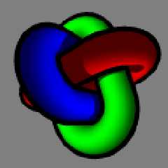
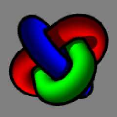
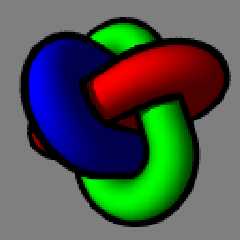
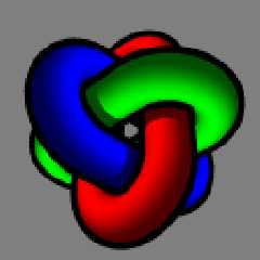
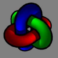
Okay, in light of a very obvious trend in opinion, here's a few other versions
that have a lot more in common.

Which ones do you prefer now?
(and thanks from the feedback so far!)

--
Tek
www.evilsuperbrain.com
Post a reply to this message
Attachments:
Download 'all.png' (15 KB)
Download 'angle.png' (8 KB)
Download 'off.png' (8 KB)
Download 'light.png' (8 KB)
Download 'ud.png' (8 KB)
Download 'cont.png' (8 KB)
Preview of image 'all.png'

Preview of image 'angle.png'
Preview of image 'off.png'
Preview of image 'light.png'
Preview of image 'ud.png'
Preview of image 'cont.png'
|
|
| |
| |
|
|
|
|
| |
| |
|
|
I second your opinion. 4th is the best, IMO.

Fernando

"LightBeam" <s.f### [at] tiscalifr> escribió en el mensaje
news:404a5c88$1@news.povray.org...
> I prefer the 4th but whis a little more bright lightning... The second is
> good too.
>
>
Post a reply to this message
|
|
| |
| |
|
|
|
|
| |
| |
|
|
On Sat, 06 Mar 2004 17:39:11 -0800, Tek wrote:

> Okay, in light of a very obvious trend in opinion, here's a few other versions
> that have a lot more in common.
>
> Which ones do you prefer now?
> (and thanks from the feedback so far!)

The first, if you remove that white border artifact.
Post a reply to this message
|
|
| |
| |
|
|
|
|
| |
| |
|
|
Tyler Eaves wrote:

> On Sat, 06 Mar 2004 17:39:11 -0800, Tek wrote:
>
>> Okay, in light of a very obvious trend in opinion, here's a few other
>> versions that have a lot more in common.
>>
>> Which ones do you prefer now?
>> (and thanks from the feedback so far!)
>
> The first, if you remove that white border artifact.

I agree, it's no. 1, but I like the white border.

--
Bill Hails
Post a reply to this message
|
|
| |
| |
|
|
|
|
| |
| |
|
|
"Bill Hails" <bil### [at] europeyahoo-inccom> wrote in message
news:404abd2f@news.povray.org...
> Tyler Eaves wrote:
> > The first, if you remove that white border artifact.

Artefact?! I went to some trouble to put that *feature* in there!

> I agree, it's no. 1, but I like the white border.

Me too, although after conversion to a gif with a transparent background the
lack of anti-aliasing on the white looked particularly bad.

Incidentally, I've already put number 1 on my site, but without the white
border. This is not my final decision but since I was sure it looked better than
the old logo I figured I should change it now. Though from the sound of it
number 1 is the best so it's probably gonna stay!

Still, I'll carry on listening to the feedback here, there might be some more
improvements that can be made...

--
Tek
www.evilsuperbrain.com
Post a reply to this message
|
|
| |
| |
|
|
|
|
| |
| |
|
|
Tek wrote:

> "Bill Hails" <bil### [at] europeyahoo-inccom> wrote in message
> news:404abd2f@news.povray.org...
>> Tyler Eaves wrote:
>> > The first, if you remove that white border artifact.
>
> Artefact?! I went to some trouble to put that *feature* in there!
>
>> I agree, it's no. 1, but I like the white border.
>
> Me too, although after conversion to a gif with a transparent background
> the lack of anti-aliasing on the white looked particularly bad.
>

One tiny thing, the white spot at the center is a little
distracting maybe?

--
Bill Hails
Post a reply to this message
|
|
| |
| |
|
|
|
|
| |
| |
|
|
"Bill Hails" <bil### [at] europeyahoo-inccom> wrote in message
news:404ae75a@news.povray.org...
> One tiny thing, the white spot at the center is a little
> distracting maybe?

Which white spot? Do you mean the white outlined hole in the centre?
I've removed the white outline from the version on my web page, so there's
nothing white in the centre, but there's still a hole there.

Does this version look okay to you?: www.evilsuperbrain.com
Or should I get rid of the hole altogether?

--
Tek
www.evilsuperbrain.com
Post a reply to this message
|
|
| |
| |
|
|
|
|
| |
| |
|
|
"Tek" <tek### [at] evilsuperbraincom> schrieb im Newsbeitrag
news:404afa80$1@news.povray.org...
> Which white spot? Do you mean the white outlined hole in the centre?
> I've removed the white outline from the version on my web page, so there's
> nothing white in the centre, but there's still a hole there.
>
> Does this version look okay to you?: www.evilsuperbrain.com
> Or should I get rid of the hole altogether?

Nah, it looks good. Without the white outline it looks much better imho.

jsj
Post a reply to this message
|
|
| |
| |
|
|
|
|
| |
| |
|
|
> > > The first, if you remove that white border artifact.
>
> Artefact?! I went to some trouble to put that *feature* in
> there!

My I ask how you are adding the black or white borders?
Are you doing it in POV-Ray or is that put in with some
post processing?  I've tried to outline objects before and
never found a good way to do it.

Carl
Post a reply to this message
|
|
| |
| |
|
|
|
|
| |
| |
|
|
Tek wrote:

> "Bill Hails" <bil### [at] europeyahoo-inccom> wrote in message
> news:404ae75a@news.povray.org...
>> One tiny thing, the white spot at the center is a little
>> distracting maybe?
>
> Which white spot? Do you mean the white outlined hole in the centre?
> I've removed the white outline from the version on my web page, so there's
> nothing white in the centre, but there's still a hole there.

yes that hole, I thought it looked a bit like my mouse cursor,
maybe I was still half asleep.

> Does this version look okay to you?: www.evilsuperbrain.com
> Or should I get rid of the hole altogether?
>

The hole looks better with a black border, imho.

--
Bill Hails
Post a reply to this message
|
|
| |
| |
|
|
|
|
| |
| |
|
|
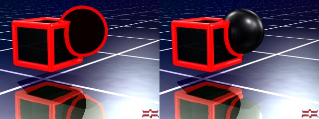
Well the white outline is easy, it's just a slightly thicker version of the
object drawn bigger and further away (I have a macro for building my object that
takes thickness as a parameter).

The black outline is a cunning trick: I use a thicker object (so it completely
encloses the coloured object, and every point on the surface of the thick object
is a fixed distance from the inner object), then I colour it with texture {
pigment { rgbt 1 } } interior_texture { pigment { rgb 0 } }. This gives a good
outline.

--
Tek
www.evilsuperbrain.com

"Carl Hoff" <hof### [at] wtnet> wrote in message news:404b2e9b@news.povray.org...
> > > > The first, if you remove that white border artifact.
> >
> > Artefact?! I went to some trouble to put that *feature* in
> > there!
>
> My I ask how you are adding the black or white borders?
> Are you doing it in POV-Ray or is that put in with some
> post processing?  I've tried to outline objects before and
> never found a good way to do it.
>
> Carl
>
>
Post a reply to this message
|
|
| |
| |
|
|
|
|
| |
| |
|
|
"Tek" <tek### [at] evilsuperbraincom> wrote in message
news:404b936e$1@news.povray.org...
> Well the white outline is easy, it's just a slightly thicker version of
the
> object drawn bigger and further away (I have a macro for building my
object that
> takes thickness as a parameter).
>
> The black outline is a cunning trick: I use a thicker object (so it
completely
> encloses the coloured object, and every point on the surface of the thick
object
> is a fixed distance from the inner object), then I colour it with texture
{
> pigment { rgbt 1 } } interior_texture { pigment { rgb 0 } }. This gives a
good
> outline.
>
> --
> Tek
> www.evilsuperbrain.com

Looks great! I vote blacken the hole personally, but it's a matter of style.
You'll never get a heard of cats to meow the same way when looking for their
opinion :-)
Post a reply to this message
|
|
| |
| |
|
|
|
|
| |
| |
|
|
Tek wrote:
>
> I've been overhauling my website lately, and I've decided to review the logo.
> I'm still happy with the choice of pov object, based on this old image of mine:

Logos should be both simple and distinctive.  That makes the next-to-
last image and the third-from last image the best ones.

Regards,
John
Post a reply to this message
|
|
| |
| |
|
|
|
|
| |
| |
|
|
Have you seen the other images I posted in a reply to my original post?

> Logos should be both simple and distinctive.  That makes the next-to-
> last image and the third-from last image the best ones.

I agree, which is why I've been having so much trouble choosing. On the one hand
there's the issue of what looks better, and on the other the question of which
is simpler.

I'd really appreciate your opinion on the new one on the main page of my website
(I've attached that version). Do you think it is getting too far away from the
simple designs?

Thanks
--
Tek
www.evilsuperbrain.com
Post a reply to this message
Attachments:
Download 'locklogo.gif' (7 KB)
Preview of image 'locklogo.gif'

|
|
| |
| |
|
|
|
|
| |
| |
|
|
I like the current one, but I think it should be brighter. As it is now,
the darker shades of the colors almost can't be distinguished from the
black outlines. Consider the attached version. (There however the
reflections are too strong, which is an effect of the simple gamma
correction I used.)

Rune
--
3D images and anims, include files, tutorials and more:
rune|vision:  http://runevision.com **updated Mar 7**
POV-Ray Ring: http://webring.povray.co.uk
Post a reply to this message
Attachments:
Download 'locklogo_brighter.gif' (7 KB)
Preview of image 'locklogo_brighter.gif'

|
|
| |
| |
|
|
|
|
| |
| |
|
|
> Well the white outline is easy, it's just a slightly thicker version
> of the object drawn bigger and further away (I have a macro
> for building my object that takes thickness as a parameter).

Ok... that won't work though if there is something in the scene
to reflect your object.

> The black outline is a cunning trick: I use a thicker object
> (so it completely encloses the coloured object, and every
> point on the surface of the thick object is a fixed distance
> from the inner object), then I colour it with texture
> { pigment { rgbt 1 } } interior_texture { pigment { rgb 0 } }.
> This gives a good
> outline.

Wow!  That is cunning and I think it will work for what I
want to do too.

Thank you so much,
Carl
Post a reply to this message
|
|
| |
| |
|
|
|
|
| |
| |
|
|
> > The black outline is a cunning trick: I use a thicker object
> > (so it completely encloses the coloured object, and every
> > point on the surface of the thick object is a fixed distance
> > from the inner object), then I colour it with texture
> > { pigment { rgbt 1 } } interior_texture { pigment { rgb 0 } }.
> > This gives a good
> > outline.
>
> Wow!  That is cunning and I think it will work for what I
> want to do too.

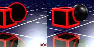
Ok... I hit a snag.  When I try your trick the object is outlined
alright but I lose all the highlights and reflections on the inner
object.  Is there a way I can get them back and keep the
outline.  Yours still have reflections on them.

See here is what I get when I add an outlike to the sphere in
this scene.

Carl
Post a reply to this message
Attachments:
Download 'Testa1.JPG' (59 KB)
Preview of image 'Testa1.JPG'
|
|
| |
| |
|
|
|
|
| |
| |
|
|
You mean more like this (brighter.png)?

I dunno, I think that looks too flat. I guess it depends on the brightness of
your monitor but on mine (both here and at work) all the colours are clearly
seperate from the black, apart from the blue which doesn't really look any
better in this version.

There is another option, which is to not use totally pure colours (colour.png).
This has as much contrast as the current one on my site, but more visible dark
areas because I've used slightly different colours. I'm not sure about it, what
do you think?

--
Tek
www.evilsuperbrain.com


"Rune" <run### [at] runevisioncom> wrote in message
news:404c5782@news.povray.org...
> I like the current one, but I think it should be brighter. As it is now,
> the darker shades of the colors almost can't be distinguished from the
> black outlines. Consider the attached version. (There however the
> reflections are too strong, which is an effect of the simple gamma
> correction I used.)
>
> Rune
> --
> 3D images and anims, include files, tutorials and more:
> rune|vision:  http://runevision.com **updated Mar 7**
> POV-Ray Ring: http://webring.povray.co.uk
>
>
>
Post a reply to this message
Attachments:
Download 'brighter.png' (15 KB)
Download 'colour.png' (16 KB)
Preview of image 'brighter.png'

Preview of image 'colour.png'

|
|
| |
| |
|
|
|
|
| |