|
|
|
|
|
|
| |
| |
|
|
|
|
| |
| |
|
|
Hi!

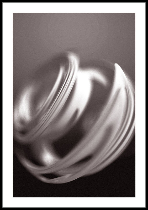
Here's my try at a photorealistic picture with a julia fractal. I made some
slight color modifications in photoshop.
Rendering time : around 2 hours.

Comments? Critics?

Louis Gagnon-Séguin
Post a reply to this message
Attachments:
Download 'juliaphotomod.jpg' (77 KB)
Preview of image 'juliaphotomod.jpg'
|
|
| |
| |
|
|
|
|
| |
| |
|
|
> Comments? Critics?
I like the mood it creates, and I have always been fascinated by Julias.
But your Image seems to be a bit grainy. Perhaps higher focal blur
settings could help?

Florian
Post a reply to this message
|
|
| |
| |
|
|
|
|
| |
| |
|
|
in news:3fd84584@news.povray.org Florian Brucker wrote:

> But your Image seems to be a bit grainy.

Tri-X in HC-100 gives such a result.

But where do the rings above Julia come from?

Ingo
Post a reply to this message
|
|
| |
| |
|
|
|
|
| |
| |
|
|
"Hubert Séguin" <lou### [at] sympatico ca> wrote in message
news:3fd7b835@news.povray.org...
> Here's my try at a photorealistic picture with a julia fractal. I made
some
> slight color modifications in photoshop.
> Rendering time : around 2 hours.
>
> Comments? Critics?
Beautiful -- I love the image, and I love the grain as well! Have you
thought about putting it on a site like ArtSIG?
Mark ca> wrote in message
news:3fd7b835@news.povray.org...
> Here's my try at a photorealistic picture with a julia fractal. I made
some
> slight color modifications in photoshop.
> Rendering time : around 2 hours.
>
> Comments? Critics?
Beautiful -- I love the image, and I love the grain as well! Have you
thought about putting it on a site like ArtSIG?
Mark
Post a reply to this message
|
|
| |
| |
|
|
|
|
| |
| |
|
|
> Tri-X in HC-100 gives such a result.
Ok, so what exactly are you talking about? Some photography internals, I
guess?

Florian
Post a reply to this message
|
|
| |
| |
|
|
|
|
| |
| |
|
|
Very fast kodak B/W film developed in a rather harsh developer.  Looks like
printing on gravel instead of paper.  Can be interesting when the effect
works.

"Florian Brucker" <tor### [at] torfboldcom> wrote in message
news:3fd8ca44$1@news.povray.org...
> > Tri-X in HC-100 gives such a result.
> Ok, so what exactly are you talking about? Some photography internals, I
> guess?
>
> Florian
>
Post a reply to this message
|
|
| |
| |
|
|
|
|
| |
| |
|
|
> I like the mood it creates, and I have always been fascinated by Julias.
> But your Image seems to be a bit grainy. Perhaps higher focal blur
> settings could help?
>
> Florian

Oh no ! :-))
Keep it grainy. It makes it less "synthetic"...
Post a reply to this message
|
|
| |
| |
|
|
|
|
| |
| |
|
|
They appeared after I boosted the contrasts and added a bit of grain in
photoshop.
On my screen, they are not too pronounced, maybe they are more on your's.
But I don't like them, any idea how to avoid them?

Louis

"ingo" <ing### [at] tagpovrayorg> a écrit dans le message de news:
Xns### [at] netplexaussieorg...
> in news:3fd84584@news.povray.org Florian Brucker wrote:
>
> > But your Image seems to be a bit grainy.
>
> Tri-X in HC-100 gives such a result.
>
> But where do the rings above Julia come from?
>
> Ingo
Post a reply to this message
|
|
| |
| |
|
|
|
|
| |
| |
|
|
Thanks a lot! I have always loved grain too. I think it adds a lot of
realism.
What's ArtSIG?

Louis

> Beautiful -- I love the image, and I love the grain as well! Have you
> thought about putting it on a site like ArtSIG?
>
> Mark
>
>
Post a reply to this message
|
|
| |
| |
|
|
|
|
| |
| |
|
|
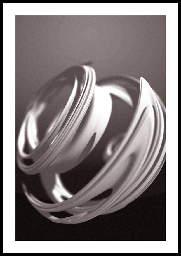
Anyway, I did another render with less grainy focal blur, maybe not enough
though.
Maybe in between would be better?
What do you think?

Louis
Post a reply to this message
Attachments:
Download 'juliaphotomod02.jpg' (82 KB)
Preview of image 'juliaphotomod02.jpg'
|
|
| |
| |
|
|
|
|
| |
| |
|
|
Hubert Séguin wrote:
> Anyway, I did another render with less grainy
> focal blur, maybe not enough though.

It looks as though there is not only less grain, there is also less
focal blur.

> Maybe in between would be better?
> What do you think?

I far prefer the first one. Not even in between, just plain the first
one...

Rune
--
3D images and anims, include files, tutorials and more:
rune|vision:  http://runevision.com **updated Sep 28**
POV-Ray Ring: http://webring.povray.co.uk
Post a reply to this message
|
|
| |
| |
|
|
|
|
| |
| |
|
|
On 11 Dec 2003 11:08:42 -0500, ingo <ing### [at] tagpovrayorg> wrote:
> But where do the rings above Julia come from?

Isn't it lightning form light source on some object ? See:

  camera{location 0 direction z}
  plane{ z 4 pigment{rgb 1}}
  light_source{z rgb 1}

ABX
Post a reply to this message
|
|
| |
| |
|
|
|
|
| |
| |
|
|
"Hubert Séguin" <lou### [at] sympaticoca> wrote in message
news:3fd933f2@news.povray.org...
> Anyway, I did another render with less grainy focal blur, maybe not
enough
> though.
> Maybe in between would be better?
> What do you think?

I much prefer this one. I think the blur was overdone in your
previous one.

Those rings in the background look like what you sometimes get when
colour reducing, or converting to grayscale.

Alf
Post a reply to this message
|
|
| |
| |
|
|
|
|
| |
| |
|
|
"Hubert Séguin" <lou### [at] sympaticoca> wrote in message
news:3fd9328a@news.povray.org...
> Thanks a lot! I have always loved grain too. I think it adds a lot of
> realism.
> What's ArtSIG?

http://www.artsig.com
Post a reply to this message
|
|
| |
| |
|
|
|
|
| |
| |
|
|
I dunno... the first had a much more artistic and photo-like feel.  The
second might be more photo-realistic, but it's lacking some of the
impression or mystique of the first.

Frank
Post a reply to this message
|
|
| |
| |
|
|
|
|
| |
| |
|
|
Would you mind posting the code for the julia?  I'm trying to experiment
with them, and I really like the sort of warped, "ringy" look you've got
going on there.

Thanks!
Frank
Post a reply to this message
|
|
| |
| |
|
|
|
|
| |
| |
|
|
Here it is :
 julia_fractal {
    <-0.9,-0.4,-0.12,0>
    quaternion
    cube
    max_iteration 6
    precision 200
    texture { pigment {color rgb <1,1,1>*1.95 }
    finish {phong 0.1 ambient 0.2}}
    rotate <0,0,0> scale 1
      }

"Frank" <fd8### [at] virginiaedu> a écrit dans le message de news:
web.3fde0caf9be596df606ff9980@news.povray.org...
> Would you mind posting the code for the julia?  I'm trying to experiment
> with them, and I really like the sort of warped, "ringy" look you've got
> going on there.
>
> Thanks!
> Frank
>
Post a reply to this message
|
|
| |
| |
|
|
|
|
| |
| |
|
|
Ya, the first one seems more dynamic, like if it was moving and the blur was
motion blur.
Neverthless, when I posted a similar image on another art forum, people said
that there was way too much blur, they thought I missed the "shot" (or
render...) : they said "it's really bad dof (depth of field) ".
So, I really don't know what to choose and what are the criterias for a good
macro photo/render.

Louis

"Frank" <fd8### [at] virginiaedu> a écrit dans le message de news:
web.3fddfc079be596df606ff9980@news.povray.org...
> I dunno... the first had a much more artistic and photo-like feel.  The
> second might be more photo-realistic, but it's lacking some of the
> impression or mystique of the first.
>
> Frank
>
Post a reply to this message
|
|
| |
| |
|
|
|
|
| |