|
|
|
|
|
|
| |
| |
|
|
|
|
| |
| |
|
|
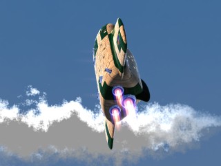
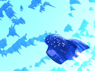
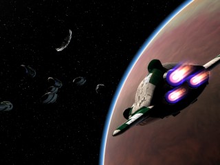
I need a picture to be the "movie poster" for my animation, but I can't decide
which to use!

I've narrowed it down to these three. Please take a look and see which you think
is going to be the best looking and most eye catching. I have just "11 hours, 56
minutes, and 58 seconds" to decide! :)

--
Tek
http://www.evilsuperbrain.com
Post a reply to this message
Attachments:
Download 'starjump143.jpg' (14 KB)
Download 'islands040.jpg' (21 KB)
Download 'spacefleet.jpg' (16 KB)
Preview of image 'starjump143.jpg'
Preview of image 'islands040.jpg'
Preview of image 'spacefleet.jpg'
|
|
| |
| |
|
|
|
|
| |
| |
|
|
Tek wrote:
>I need a picture to be the "movie poster" for my animation, but I can't decide
>which to use!
>
>I've narrowed it down to these three. Please take a look and see which you think
>is going to be the best looking and most eye catching. I have just "11 hours, 56
>minutes, and 58 seconds" to decide! :)
>
>--
>Tek
>http://www.evilsuperbrain.com
>


image #2

-----------------------------
dan
Goofy Graffix - http://hometown.aol.com/goofygrafx
DanByersArt - http://www.huntel.net/goofygraffix
Post a reply to this message
|
|
| |
| |
|
|
|
|
| |
| |
|
|
Well, IMHO, both #1 and #3 are nice pictures but I don't think they
are material for a poster. They don't focus on anything that attracts
your attention. They look abit like illustrations from a scifi-book.
I'd like to see the spaceship trying to fly out of the image or something
like that. If I have to choose, I'd pick #3.
But they are nice.. :)
/Stefan
"Tek" <tek### [at] evilsuperbrain com> skrev i meddelandet
news:3e9c2d94@news.povray.org...
> I need a picture to be the "movie poster" for my animation, but I can't
decide
> which to use!
>
> I've narrowed it down to these three. Please take a look and see which you
think
> is going to be the best looking and most eye catching. I have just "11
hours, 56
> minutes, and 58 seconds" to decide! :)
>
> --
> Tek
> http://www.evilsuperbrain.com
>
>
> com> skrev i meddelandet
news:3e9c2d94@news.povray.org...
> I need a picture to be the "movie poster" for my animation, but I can't
decide
> which to use!
>
> I've narrowed it down to these three. Please take a look and see which you
think
> is going to be the best looking and most eye catching. I have just "11
hours, 56
> minutes, and 58 seconds" to decide! :)
>
> --
> Tek
> http://www.evilsuperbrain.com
>
>
>
Post a reply to this message
|
|
| |
| |
|
|
|
|
| |
| |
|
|
#3
Post a reply to this message
|
|
| |
| |
|
|
|
|
| |
| |
|
|
"Tek" <tek### [at] evilsuperbraincom> wrote in news:3e9c2d94@news.povray.org:

> I need a picture to be the "movie poster" for my animation, but I
> can't decide which to use!
>
> I've narrowed it down to these three. Please take a look and see which
> you think is going to be the best looking and most eye catching. I
> have just "11 hours, 56 minutes, and 58 seconds" to decide! :)


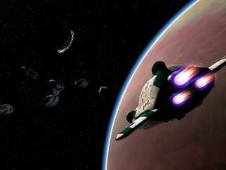
I like the "spacefleet" image best.


Tor Olav
Post a reply to this message
|
|
| |
| |
|
|
|
|
| |
| |
|
|
#1
Post a reply to this message
|
|
| |
| |
|
|
|
|
| |
| |
|
|
I'd choose #3
Marc
"Tek" <tek### [at] evilsuperbraincom> a écrit dans le message de news:
3e9c2d94@news.povray.org...
> I need a picture to be the "movie poster" for my animation, but I can't
decide
> which to use!
>
> I've narrowed it down to these three. Please take a look and see which you
think
> is going to be the best looking and most eye catching. I have just "11
hours, 56
> minutes, and 58 seconds" to decide! :)
>
> --
> Tek
> http://www.evilsuperbrain.com
>
>
>
Post a reply to this message
|
|
| |
| |
|
|
|
|
| |
| |
|
|
#3 looks best I think..

DIRKO
Post a reply to this message
|
|
| |
| |
|
|
|
|
| |
| |
|
|
I vote for #1
Post a reply to this message
|
|
| |
| |
|
|
|
|
| |
| |
|
|
Tek wrote:
>I need a picture to be the "movie poster" for my animation, but I can't decide
>which to use!
>
>I've narrowed it down to these three. Please take a look and see which you think
>is going to be the best looking and most eye catching. I have just "11 hours, 56
>minutes, and 58 seconds" to decide! :)
>
>--
>Tek
>http://www.evilsuperbrain.com
>

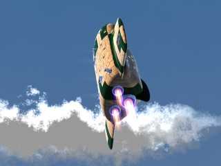
Actually number one is my favorite.  It is dynamic, and it gives a good view
of the ship...  But the clouds behind the ship are horrible.  If you could
mend the clouds I would deffinitly use #1.  If that is too much of a hastle
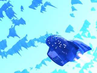
though I also like #2, it is very dramatic though also a bit monochromatic.

I am looking forward to seeing this animation. All the images and demos I
have seen so far are brillient!  Good luck
Post a reply to this message
|
|
| |
| |
|
|
|
|
| |
| |
|
|
"Spacefleet"

jim
Post a reply to this message
|
|
| |
| |
|
|
|
|
| |
| |
|
|
#2 for overall composition: color and the ship's oriented in a way that
makes sense.

BUT the real question is what is your anim *about*?
Post a reply to this message
|
|
| |
| |
|
|
|
|
| |
| |
|
|
i should go for #3
1 is not a very good possition for a poster imo and the clouds don't look
very good.
the second one is good but too bright/blue, it's hard to look at.
i prefer the last one, it's a good composition


"Tek" <tek### [at] evilsuperbraincom> schreef in bericht
news:3e9c2d94@news.povray.org...
> I need a picture to be the "movie poster" for my animation, but I can't
decide
> which to use!
>
> I've narrowed it down to these three. Please take a look and see which you
think
> is going to be the best looking and most eye catching. I have just "11
hours, 56
> minutes, and 58 seconds" to decide! :)
>
> --
> Tek
> http://www.evilsuperbrain.com
>
>
>
Post a reply to this message
|
|
| |
| |
|
|
|
|
| |
| |
|
|
I choose one.... #1

#2 is too... erm blue... :)

#3 is too dark and unclear.
Post a reply to this message
|
|
| |
| |
|
|
|
|
| |
| |
|
|
#2 looks the most intriguing to me.

Tek wrote:
>
> I need a picture to be the "movie poster" for my animation, but I can't decide
> which to use!
>
> I've narrowed it down to these three. Please take a look and see which you think
> is going to be the best looking and most eye catching. I have just "11 hours, 56
> minutes, and 58 seconds" to decide! :)
>
> --
> Tek
> http://www.evilsuperbrain.com
>
>  [Image]
>
>  [Image]
>
>  [Image]
Post a reply to this message
|
|
| |
| |
|
|
|
|
| |
| |
|
|
1 or 3

    1 if you can get better clouds and maybe move the ship off to the lower
right a hint.

    3 if the planet gets some definition, and the other ships become more
distinct.

    The landscape in 2 looks too much like nothing or a cartoon, and the
ship has too little contrast.


---
Outgoing mail is certified Virus Free.
Checked by AVG anti-virus system (http://www.grisoft.com).
Version: 6.0.471 / Virus Database: 269 - Release Date: 4/10/03
Post a reply to this message
|
|
| |
| |
|
|
|
|
| |
| |
|
|
#3
Post a reply to this message
|
|
| |
| |
|
|
|
|
| |
| |
|
|
Thanks for the comments, it looks like I should go for number 3 (spacefleet).

To answer some of the other comments:

I kinda like the clouds in #1, they're meant to look kind of hand painted.

#2 doesn't look too good out of context (way too blue!) but I was considering it
because it's a fairly strong image from the animation.

And as for the subject of the animation, it's about a ship that travels through
space teleporting from location to location. So that's kind of hard to represent
in one picture.

I wasn't planning to modify the elements in these posters, because they're just
frames from the animation. Though I've finished the animation now and have a few
hours spare so I may try to create a new picture for the poster. :)

--
Tek
http://www.evilsuperbrain.com
Post a reply to this message
|
|
| |
| |
|
|
|
|
| |
| |
|
|
Tek wrote:
>
> Thanks for the comments, it looks like I should go for number 3 (spacefleet).
>
> To answer some of the other comments:
>
> I kinda like the clouds in #1, they're meant to look kind of hand painted.
>
> #2 doesn't look too good out of context (way too blue!) but I was considering it
> because it's a fairly strong image from the animation.
>

That's exactly the reason why it should make a good poster. It catches
the eye, much more then the other ones, and stands out more. But that's
just my layman's opinion 8)

> And as for the subject of the animation, it's about a ship that travels through
> space teleporting from location to location. So that's kind of hard to represent
> in one picture.
>
> I wasn't planning to modify the elements in these posters, because they're just
> frames from the animation. Though I've finished the animation now and have a few
> hours spare so I may try to create a new picture for the poster. :)
>
> --
> Tek
> http://www.evilsuperbrain.com
Post a reply to this message
|
|
| |
| |
|
|
|
|
| |
| |
|
|
> > #2 doesn't look too good out of context (way too blue!) but I was
considering it
> > because it's a fairly strong image from the animation.
>
> That's exactly the reason why it should make a good poster. It catches
> the eye, much more then the other ones, and stands out more. But that's
> just my layman's opinion 8)

Well I agree with you, but I could see equally good reasons for using the other
two pictures, that's why I was having trouble deciding between them!

I'm currently working on modifying #3 to produce a good image. Still 3 hours to
the deadline, no hurry... :)

--
Tek
http://www.evilsuperbrain.com
Post a reply to this message
|
|
| |
| |
|
|
|
|
| |
| |
|
|
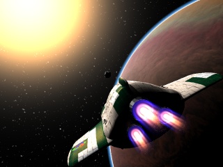
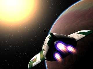
Well, I spent 10 minutes playing with #3, and came up with this. It's a little
unoriginal, but it shows off the visual style of the animation quite well.

And now I'm going to submit! Hope you like the finished animation.

--
Tek
http://www.evilsuperbrain.com
Post a reply to this message
Attachments:
Download 'starjump.jpg' (26 KB)
Preview of image 'starjump.jpg'
|
|
| |
| |
|
|
|
|
| |
| |
|
|
Tek wrote:
> Thanks for the comments, it looks like I should go for number 3 (spacefleet).
>
> To answer some of the other comments:
>
> I kinda like the clouds in #1, they're meant to look kind of hand painted.
>
> #2 doesn't look too good out of context (way too blue!) but I was considering it
> because it's a fairly strong image from the animation.

If it's not too late I'd like to vote for: Anything but #3.
I do like the effect of the clouds in #1 and the cartoony appearance of
#2 precisely because they are not like image #3. I think that while #3
probably looks very cool as part of the animation it is just too cliched
for the promo poster. Go with something stylised like #1 or #1, that
people won't expect and which will get them wondering what the animation
looks like.
Post a reply to this message
|
|
| |
| |
|
|
|
|
| |
| |
|
|
"Edward Coffey" <eco### [at] alphalinkcomau> wrote in message
news:3E9### [at] alphalinkcomau...
> If it's not too late I'd like to vote for: Anything but #3.
> I do like the effect of the clouds in #1 and the cartoony appearance of
> #2 precisely because they are not like image #3. I think that while #3
> probably looks very cool as part of the animation it is just too cliched
> for the promo poster. Go with something stylised like #1 or #1, that
> people won't expect and which will get them wondering what the animation
> looks like.

Well you have a good point, but the weight of opinion is against you. i.e. if
everyone here who voted for #3 decides to look at the animation then I'll be
happy :)

I completely agree with your reasoning. The way I looked at it was like this, I
had the conventional shot #3, the unexpected and somewhat spontaneous shot #1,
and the just plain overpowering #2.

Though the main reason I've gone for #3 is because it best represents the
quality of the animation. The other two suggest that maybe the animation is
slightly more abstract or lacking in detail. It is a cliche, but it's a cliche
for a reason: it shows the kind of things you want on a poster, so everyone uses
that style. Still, I wouldn't have been able to choose between them without
putting it to a vote.

But anyway, it's all academic now. I'm afraid you were too late, I've already
submitted it.

--
Tek
http://www.evilsuperbrain.com
Post a reply to this message
|
|
| |
| |
|
|
|
|
| |
| |
|
|
Tek wrote:
> Well you have a good point, but the weight of opinion is against you. i.e. if
> everyone here who voted for #3 decides to look at the animation then I'll be
> happy :)
>
> I completely agree with your reasoning. The way I looked at it was like this, I
> had the conventional shot #3, the unexpected and somewhat spontaneous shot #1,
> and the just plain overpowering #2.
>
> Though the main reason I've gone for #3 is because it best represents the
> quality of the animation. The other two suggest that maybe the animation is
> slightly more abstract or lacking in detail. It is a cliche, but it's a cliche
> for a reason: it shows the kind of things you want on a poster, so everyone uses
> that style. Still, I wouldn't have been able to choose between them without
> putting it to a vote.
>
> But anyway, it's all academic now. I'm afraid you were too late, I've already
> submitted it.

Yeah, I kinda guessed I was too late when I refreshed and saw your other
post ahead of mine. Obviously the image likely to get you the most
viewers is the right one, and it sounds like that's #3. Good luck.
Post a reply to this message
|
|
| |
| |
|
|
|
|
| |
| |
|
|
I like #2 for its anime look and feel. But then again, that only
makes sense if the movie is an anime.


--
merge{#local i=-11;#while(i<11)#local
i=i+.1;sphere{<i*(i*i*(.05-i*i*(4e-7*i*i+3e-4))-3)10*sin(i)30>.5}#end
pigment{rgbt 1}interior{media{emission x}}hollow}//  Mark Weyer
Post a reply to this message
|
|
| |
| |
|
|
|
|
| |
| |
|
|
IMHO the top one is the best looking.

Gary


"Tek" <tek### [at] evilsuperbraincom> wrote in message
news:3e9c2d94@news.povray.org...
> I need a picture to be the "movie poster" for my animation, but I can't
decide
> which to use!
>
> I've narrowed it down to these three. Please take a look and see which you
think
> is going to be the best looking and most eye catching. I have just "11
hours, 56
> minutes, and 58 seconds" to decide! :)
>
> --
> Tek
> http://www.evilsuperbrain.com
>
>
>
Post a reply to this message
|
|
| |
| |
|
|
|
|
| |
| |
|
|
Tek wrote:
>Well, I spent 10 minutes playing with #3, and came up with this. It's a little
>unoriginal, but it shows off the visual style of the animation quite well.
>
>And now I'm going to submit! Hope you like the finished animation.

Wonderful! I liked #3 but felt the composition wasn't quite right for a
poster. I actually played around with it in Photoshop to see if I could do
any better, but your final image is perfect.

Looking forward the the premier!
Post a reply to this message
|
|
| |
| |
|
|
|
|
| |
| |
|
|
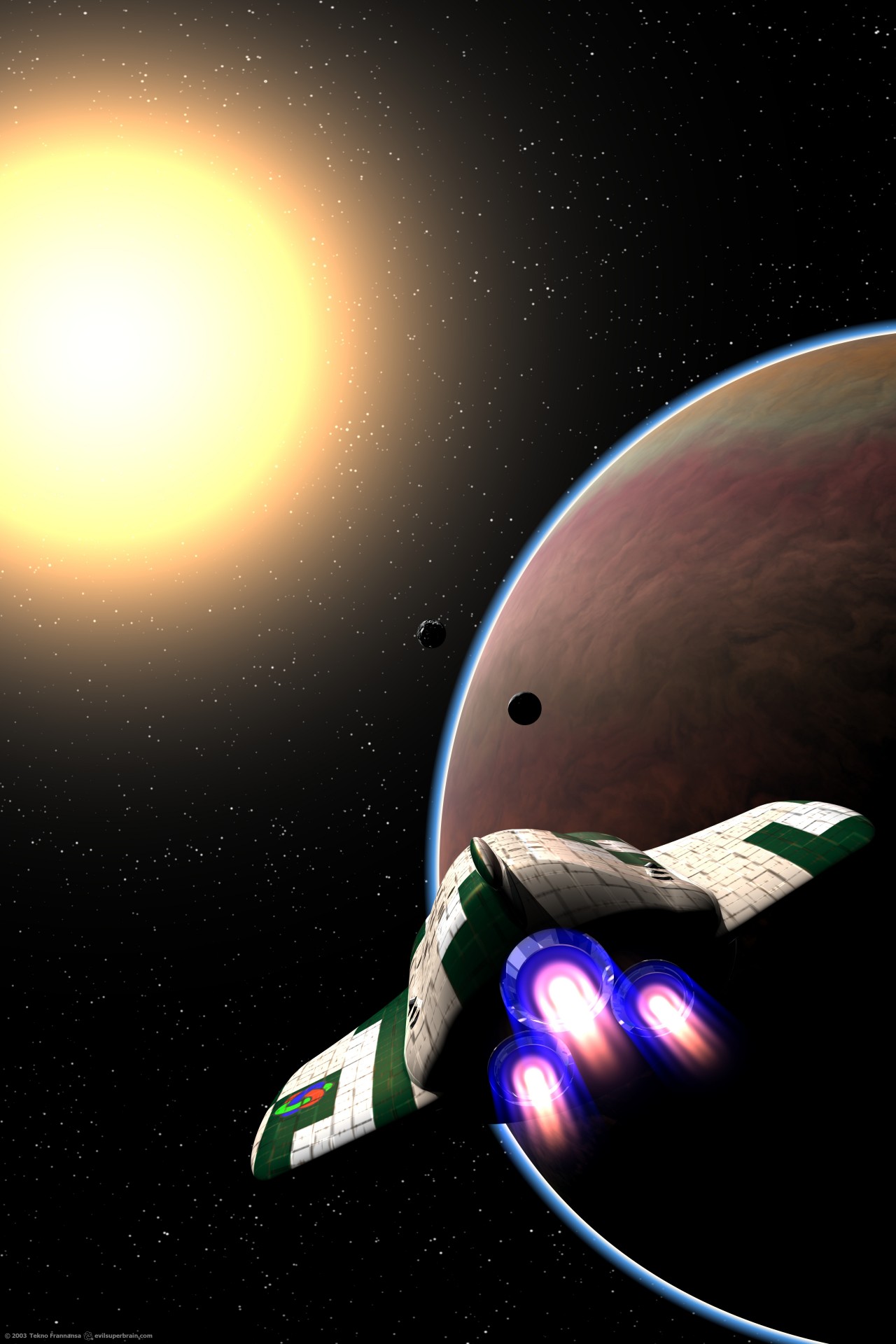
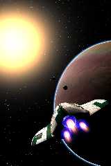
And just one last thing, I liked this view so much I've rendered a massive
(5200x7800) version for zazzle. So I thought I'd post a slightly reduced (but
still really big) version here.

The poster will be available in a few days, along with a bunch of other ones.
Shameless plug :)

--
Tek
http://www.evilsuperbrain.com
Post a reply to this message
Attachments:
Download 'starjump-movieposter.jpg' (229 KB)
Preview of image 'starjump-movieposter.jpg'
|
|
| |
| |
|
|
|
|
| |
| |
|
|
fantastic!!!!!!
if it wasn't a portrait my desktop was now covered with this image. how did
you make the sun? looks very cool


"Tek" <tek### [at] evilsuperbraincom> schreef in bericht
news:3e9f7578@news.povray.org...
> And just one last thing, I liked this view so much I've rendered a massive
> (5200x7800) version for zazzle. So I thought I'd post a slightly reduced
(but
> still really big) version here.
>
> The poster will be available in a few days, along with a bunch of other
ones.
> Shameless plug :)
>
> --
> Tek
> http://www.evilsuperbrain.com
>
>
>
Post a reply to this message
|
|
| |
| |
|
|
|
|
| |
| |
|
|
From: "Lenx" <len### [at] pandorabe>
> fantastic!!!!!!

Thank you :)

> if it wasn't a portrait my desktop was now covered with this image. how
did
> you make the sun? looks very cool

It's much simpler than it looks:

sky_sphere{
 //put the rest of the sky pigments here (before the sun)
 pigment {
  //sun
  gradient y
  scale 2
  translate -1
  Reorient_Trans( y, vnormalize(vSunPos)+z )
  poly_wave 50
  colour_map {
   [0 rgbt 1]
   [1 rgb <3,2,1>*1]
  }
 }
}

Tek
http://www.evilsuperbrain.com
Post a reply to this message
|
|
| |
| |
|
|
|
|
| |