|
|
|
|
|
|
| |
| |
|
|
|
|
| |
| |
|
|
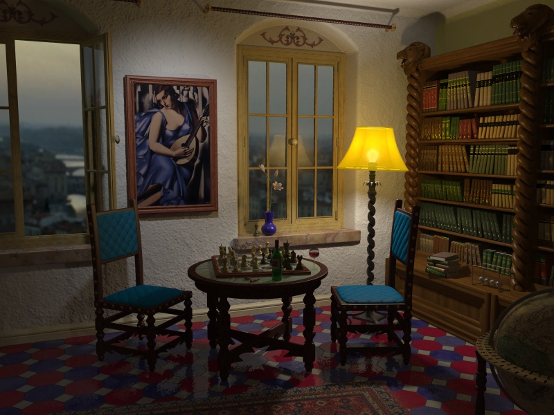
...some more experiments with lighting, radiosity and things like
this. But it does not (yet) look like expected and desired.

Radiosity data saved with high ambient for the lamp shade and
also for the "world" outside. Then rendered with double_illuminate
for the lamp shade and ambient 0.4 for the world. There is also
some light reflected by the mirror above the chimney (faked with
projected_through). Yes, there is chimney just behind the viewers
back, indeed there is the complete room defined.
The main idea is that every lamp in the room ( there are four, but
only two of them are turned on for this scene) can be switched
on/off and it should always produce a more or less realistic lighting
situation, no matter where the camera does look at.

Most of the furniture you can see in this view is stolen from Gilles,
the painting is by Tamara de Lempicka and the town is Florence
where I've been recently.

-Ive
Post a reply to this message
Attachments:
Download 'Italian Room.jpg' (157 KB)
Preview of image 'Italian Room.jpg'
|
|
| |
| |
|
|
|
|
| |
| |
|
|
Impressive picture! I'd like to see it with the
camera a bit lower. Maybe try to avoid some
of the color-mergers happening right now, for
example the wine glass merges into the
shadow of the window sill. Great lighting...
=Bob=
Post a reply to this message
|
|
| |
| |
|
|
|
|
| |
| |
|
|
> the painting is by Tamara de Lempicka and the town is Florence
> where I've been recently.

I think we took the picture (Florence panorama) from the same point :)

http://propro.ru/go/Album/it/images/evening.jpg

Gena.
Post a reply to this message
|
|
| |
| |
|
|
|
|
| |
| |
|
|
Very well done.

Maybe you should consider to change the camera angle to avoid perspective
contortions. The book shelf "escapes" a little bit near the ceiling. In
Englisch, vertical reference lines are nonparallel.

Rene
--
Rene Schwietzke
r.schwietzke<at>reneschwietzke.de
http://www.rene-schwietzke.de/
Post a reply to this message
|
|
| |
| |
|
|
|
|
| |
| |
|
|
hey all

good job!

perhaps you could change the colors of the floor pattern to something more
classic (black/white, gray or stone). just my 2 cents...

greetings,
florian
Post a reply to this message
|
|
| |
| |
|
|
|
|
| |
| |
|
|
On Tue, 26 Nov 2002 03:36:37 +0100
"Ive" <ive### [at] lilysoft com> wrote:
> ...some more experiments with lighting, radiosity and things like
> this. But it does not (yet) look like expected and desired.
Well, at the moment it looks very good. The composition is fine and
the light setup looks amazing. But now that you mention the chimney, I
think it would be a nice touch to have the chimney (and fire) reflecting
onto the glass of the left window (turning the open part to just reflect
it).
--
Jaime Vives Piqueres
La Persistencia de la Ignorancia
http://www.ignorancia.org com> wrote:
> ...some more experiments with lighting, radiosity and things like
> this. But it does not (yet) look like expected and desired.
Well, at the moment it looks very good. The composition is fine and
the light setup looks amazing. But now that you mention the chimney, I
think it would be a nice touch to have the chimney (and fire) reflecting
onto the glass of the left window (turning the open part to just reflect
it).
--
Jaime Vives Piqueres
La Persistencia de la Ignorancia
http://www.ignorancia.org
Post a reply to this message
|
|
| |
| |
|
|
|
|
| |
| |
|
|
Stunning image!
I wonder about the light though. It looks alright except for the
colour: with a yellow lampshade wouldn't the light be much more
yellow? Even without the lampshade the average lightbulb doesn't
produce such white light (that's why I prefer neon ;))
Oh, and perhaps you should get a new interior decorator because
the colour on the chairs don't really match with the colours of
the floor tiles. On the other hand, I've never been to Italy, so
what do I know? :)
But that's just to pick some nits, I think the combination of
the interior and exterior is working out great.

Remco
Post a reply to this message
|
|
| |
| |
|
|
|
|
| |
| |
|
|
> Impressive picture! I'd like to see it with the
> camera a bit lower. Maybe try to avoid some
> of the color-mergers happening right now, for
> example the wine glass merges into the
> shadow of the window sill.

You are right. Well, there are so many small details
to pay attention to. I also do not like the fact that the
lower part of the lamp shade builds a line with one
of the book shelves and the window cross.
Anyway, I will change the camera and maybe also
the position of some of the objects...

thanks
-Ive
Post a reply to this message
|
|
| |
| |
|
|
|
|
| |
| |
|
|
> I think we took the picture (Florence panorama) from the same point :)
>
In fact, the picture was taken by my girl friend about 1999 if I remember
right. But the sunset and the sky does look much more impressive in your
photo. If one would have done this sky with POV, I'm pretty sure someone
would nit-picking that the sky does not look very real :-)

-Ive
Post a reply to this message
|
|
| |
| |
|
|
|
|
| |
| |
|
|
> Maybe you should consider to change the camera angle to avoid perspective
> contortions. The book shelf "escapes" a little bit near the ceiling. In
> Englisch, vertical reference lines are nonparallel.
>
But they are not parallel when the camera does not focus the horizont line.
Or is there some rule for photographers I'm not aware of. (Well, I know
not very much about photographic technique.) But anyway, the camera
will change a little for a future render of this image, let's see...

-Ive
Post a reply to this message
|
|
| |
| |
|
|
|
|
| |
| |
|
|
Excelent. I like it a lot.

I just think the floor colors are a bit too strong and look a little out of
place, but thats just my amateur oppinion :)

Nice work.


Best regards.
Post a reply to this message
|
|
| |
| |
|
|
|
|
| |
| |
|
|
"Ive" <ive### [at] lilysoftcom> wrote in message news:3de39c07$1@news.povray.org...
: > Impressive picture! I'd like to see it with the
: > camera a bit lower. Maybe try to avoid some
: > of the color-mergers happening right now, for
: > example the wine glass merges into the
: > shadow of the window sill.
:
: You are right. Well, there are so many small details
: to pay attention to. I also do not like the fact that the
: lower part of the lamp shade builds a line with one
: of the book shelves and the window cross.

I agree, and in the current camera position, the curtain
rod crosses at the top of the arched window and sort-of
spoils that great window. Still a really wonderful picture
though.
=Bob=

: Anyway, I will change the camera and maybe also
: the position of some of the objects...
:
: thanks
: -Ive
:
:
Post a reply to this message
|
|
| |
| |
|
|
|
|
| |
| |
|
|
> perhaps you could change the colors of the floor pattern to something more
> classic (black/white, gray or stone). just my 2 cents...
>

Hmm, I did start working on this one at the same time as I did with the
Vermeer-style-images (you can see some of them in this ng), and there
are the floor tiles "more classic". So I liked the idea to do a more colorful
floor here. In fact this room is a mixture of two real ones (well, with some
drops of fantasy added) - and one of this rooms is made with this kind of
floor tiles. Maybe not so saturated as within this rendered image. But I
tried to add some strong blue that does work well together with the painting
and I wanted to add exactly this painting because I've just read a biography
about Tamara...

-Ive
Post a reply to this message
|
|
| |
| |
|
|
|
|
| |
| |
|
|
>   Well, at the moment it looks very good. The composition is fine and
> the light setup looks amazing. But now that you mention the chimney, I
> think it would be a nice touch to have the chimney (and fire) reflecting
> onto the glass of the left window (turning the open part to just reflect
> it).

Lol.
When I started with this one, it was early autumn, so there was no need
to put a fire into the chimney but meanwhile it's getting cold outside so it
would be really nice.
And when I think about it, I've never used POV to do some fire yet, not
even a match stick flame, so I guess it's definitely time (also the right time
of the year) to start working on this. And the fire could also contribute
nicely to the lighting... oh, oh, I see a lot of work upcoming.
Anyway, next time I do a render of that chimney and the renaissance mirror
 above.
-Ive
Post a reply to this message
|
|
| |
| |
|
|
|
|
| |
| |
|
|
> I wonder about the light though. It looks alright except for the
> colour: with a yellow lampshade wouldn't the light be much more
> yellow? Even without the lampshade the average lightbulb doesn't
> produce such white light (that's why I prefer neon ;))

Hey, I'm a child of the new wave generation, so I do love neon :-)
But indeed, I also have expected a quite different lighting. I was after the
(as I imagined interesting) blend between the warm yellow/orange and
the cold lighting from the spot lamp that points at the painting. For some
reason it does not look this way (but I did like the unexpected result,
so I have posted it). Maybe this has to do with the color-range clipping
within POV, so I think it would be very interesting to render this scene
with Kari Kivisalos film exposure patch. One more thing I will play around
the next time...

> Oh, and perhaps you should get a new interior decorator because
> the colour on the chairs don't really match with the colours of
> the floor tiles. On the other hand, I've never been to Italy, so
> what do I know? :)

Nobody seems to like the colorful floor tiles, but I swear they are taken
from the real world :-)

-Ive
Post a reply to this message
|
|
| |
| |
|
|
|
|
| |
| |
|
|
> Excelent. I like it a lot.

Thanks.

> I just think the floor colors are a bit too strong and look a little out of
> place, but thats just my amateur oppinion :)
>

Oops, one more who does not like the floor tiles. I guess this is enough,
the interior decorator is fired and I will rework the floor :-)

-Ive
Post a reply to this message
|
|
| |
| |
|
|
|
|
| |
| |
|
|
>
> Oops, one more who does not like the floor tiles. I guess this is enough,
> the interior decorator is fired and I will rework the floor :-)
>
> -Ive
>

LooooooooooooL :D

It's not the color, but its intensity. I just thnk the colors are too strong
and don't belong in the overall "warm" feeling of the overall picture.


Best regards
Post a reply to this message
|
|
| |
| |
|
|
|
|
| |
| |
|
|
"JPGargoyle" <jot### [at] netcabopt> ha scritto nel messaggio
news:3de3c711@news.povray.org...

> > Oops, one more who does not like the floor tiles. I guess this is
enough,
> > the interior decorator is fired and I will rework the floor :-)


> It's not the color, but its intensity. I just thnk the colors are too
strong
> and don't belong in the overall "warm" feeling of the overall picture.

I completely agree. Maybe this is not of much importance, but I am italian
and I was born in Florence. If you want my opinion, you'll never find a
floor like that in the whole city! However, I found all the rest very good.

                                    Red Golpe

_____________________________________________

"What doesn't kill you... makes you stronger"
  Jean-Baptiste Emmanuel Zorg

http://redgolpe.com
(La capovolta ambiguità di Orione)
____________________________________________
Post a reply to this message
|
|
| |
| |
|
|
|
|
| |
| |
|
|
Ive wrote:
>....some more experiments with lighting, radiosity and things like
>this. But it does not (yet) look like expected and desired.

Sweet! I love its warm feeling. Oh, and I love the floor, both the tiles and
the colors, I see no reason why you shouldn't find a similar floor here in
Florence...
One thing: the room looks like it's midnight, I would expect more light to
come in through the window.

BTW, I spent two years of my life rowing on that river... (sweet but wet
memories).

--
Jonathan
Post a reply to this message
|
|
| |
| |
|
|
|
|
| |
| |
|
|
> Sweet! I love its warm feeling. Oh, and I love the floor, both the tiles and
> the colors, I see no reason why you shouldn't find a similar floor here in
> Florence...
>
Thanks and it's nice to hear another oppinion about the floor. So next, I
will work on a different project and when I go back to the italian room
I have to look at the floo again and maybe will try to make it a little bit less
saturated.

> One thing: the room looks like it's midnight, I would expect more light to
> come in through the window.
>
Hmm. I'm not sure. If you would make a similar picture by using a camera
and do face a light bulb (even if it's only 60W) I would expect something similar.
The ambient value (for radiosity) of the surrounding dome (where the image is
mapped to) is also controlled by the EXPOSURE variable from Jaime's lighting
macros. This way, I can simply turn all the lights off and make a daylight picture
of the room similar to the vermeer images (but I'm currently not in the mood for
a 10 day render). Anyway, I know this does not have to do very much with
real world physics and does need some more fine tuning but should give fairly
realistic results - and well, if not at least some pleasing images, I hope :-)

> BTW, I spent two years of my life rowing on that river... (sweet but wet
> memories).
>
I guess you do not mean that you did fell into the river... :-)

-Ive
Post a reply to this message
|
|
| |
| |
|
|
|
|
| |
| |
|
|
Ive wrote:
>I guess you do not mean that you did fell into the river... :-)

Not me. But I saw many others do that...

--
Jonathan
Post a reply to this message
|
|
| |
| |
|
|
|
|
| |
| |
|
|
Hi,

most of the time you try to avoid the mentioned effect when taking photos
 (except if the topic includes this effect, e.g. large buildings, to stress
their size).
Using the effect and having it by accident distinguishes the amateur from
the
semi-profi/profi.

Rene
--
Rene Schwietzke
r.schwietzke<at>reneschwietzke.de
http://www.rene-schwietzke.de/

"Ive" <ive### [at] lilysoftcom> wrote in message news:3de39c0c$1@news.povray.org...
> > Maybe you should consider to change the camera angle to avoid
perspective
> > contortions. The book shelf "escapes" a little bit near the ceiling. In
> > Englisch, vertical reference lines are nonparallel.
> >
> But they are not parallel when the camera does not focus the horizont
line.
> Or is there some rule for photographers I'm not aware of. (Well, I know
> not very much about photographic technique.) But anyway, the camera
> will change a little for a future render of this image, let's see...
>
> -Ive
>
>
Post a reply to this message
|
|
| |
| |
|
|
|
|
| |