|
|
|
|
|
|
| |
| |
|
|
|
|
| |
| |
|
|
Since we're closing in on the deadline and most of my
friends observed the changes all the way through, I thought
I'd try and get some new oppinions from here.
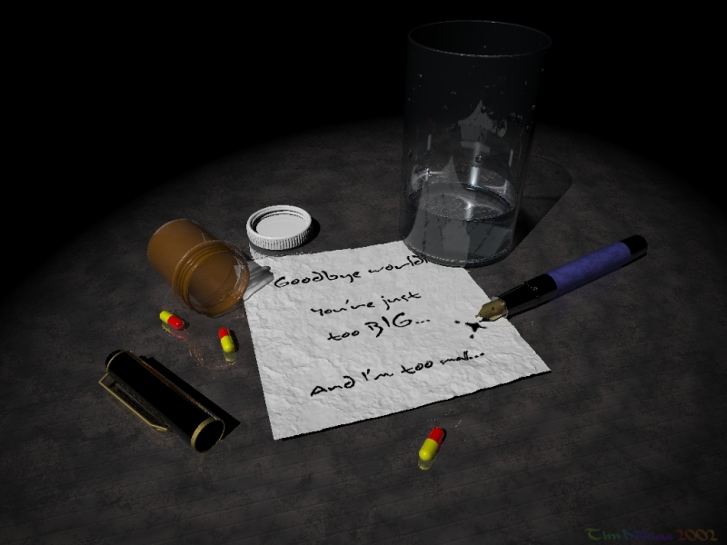
IMO the image is pretty self-explanatory, so...
No radiosity (will be used for final version), photons are
in (as you can see in the glass), everything CSG except for
the note, made with heightfield and some pigment-patterns
as function...
Final version will also use area-lights, no focal-blur, cause
it doesn't work that well with this image (I've tried).
So, comments?
--
Tim Nikias
Homepage: http://www.digitaltwilight.de/no_lights/index.html
Email: Tim### [at] gmx de de
Post a reply to this message
Attachments:
Download 'too_lonely7.jpg' (173 KB)
Preview of image 'too_lonely7.jpg'
|
|
| |
| |
|
|
|
|
| |
| |
|
|
The image looks very good and I'm not very good in
technicalities so I won't comment there.
The message might also have read:
"Goodbye world. I'll make it short. This paper is far too
wrinkled to write a decent farewell message on."
That's the only thing I wanted to comment on.
Oh, and are you suggesting that my red-and-yellow pills are
lethal?
Post a reply to this message
|
|
| |
| |
|
|
|
|
| |
| |
|
|
The wrinkled paper was meant to convey that
the person who wrote the farewell had been
thinking about it sometime. Like taking the
note out of the trash-bin again after thinking
otherwise.

And with the pills I'm not suggesting anything except
that he took pills to leave...

--
Tim Nikias
Homepage: http://www.digitaltwilight.de/no_lights/index.html
Email: Tim### [at] gmxde

"Remco de Korte" <rem### [at] onwijscom> schrieb im Newsbeitrag
news:3D5FB182.58C88C32@onwijs.com...
> The image looks very good and I'm not very good in
> technicalities so I won't comment there.
> The message might also have read:
> "Goodbye world. I'll make it short. This paper is far too
> wrinkled to write a decent farewell message on."
> That's the only thing I wanted to comment on.
> Oh, and are you suggesting that my red-and-yellow pills are
> lethal?
Post a reply to this message
|
|
| |
| |
|
|
|
|
| |
| |
|
|
I don't have much to offer on this except to say, I think you would be doing
yourself a great injustice if you didn't also enter IcedLand. It's better (at
least in theme ) IMHO.

--
light_source{0,1}#macro c(J,a)sphere{0,1pigment{rgb z}scale a translate J+O}
#end#macro B(R,V,O)c(0,4)intersection{c(V,R)difference{c(-z*4x+10)c(-z*4.1x+
10)c(0<7.5,45,5>)}}#end B(12,0z*25)B(8y*4<0,12,50>)          // Batronyx ^"^
Post a reply to this message
|
|
| |
| |
|
|
|
|
| |
| |
|
|
Tim,
I think the trouble is that the open pen, it's position and the ink
spill lead us to think the note was written as the pills did their work.
If so, why is the paper wrinkled?  The obvious explanation which remains
is that the pill taker had been repeatedly wadding up and then unfolding
a blank piece of paper.  I suppose somebody might do this, but I think
it more likely the individual would be mentally thrashing over an
already  written  note.
Bill P.

> The wrinkled paper was meant to convey that
> the person who wrote the farewell had been
> thinking about it sometime. Like taking the
> note out of the trash-bin again after thinking
> otherwise.
>
> And with the pills I'm not suggesting anything except
> that he took pills to leave...
>
>
Post a reply to this message
|
|
| |
| |
|
|
|
|
| |
| |
|
|
I agree!

> I don't have much to offer on this except to say, I think you would be doing
> yourself a great injustice if you didn't also enter IcedLand. It's better (at
> least in theme ) IMHO.
Post a reply to this message
|
|
| |
| |
|
|
|
|
| |
| |
|
|
Okay, you two just convinced me! I'll enter
Iced Land...

--
Tim Nikias
Homepage: http://www.digitaltwilight.de/no_lights/index.html
Email: Tim### [at] gmxde
"William F. Pokorny" <pok### [at] attglobalnet> schrieb im Newsbeitrag
news:3D5FBF1E.4C480E76@attglobal.net...
> I agree!
>
> > I don't have much to offer on this except to say, I think you would be
doing
> > yourself a great injustice if you didn't also enter IcedLand. It's
better (at
> > least in theme ) IMHO.
>
Post a reply to this message
|
|
| |
| |
|
|
|
|
| |
| |
|
|
How about this:
He began writing the note, trashed it, added a sentence,
trashed it again, added the last note, threw pen away,
took pills while sobbing (thus the the few remaining pills,
he dropped them), put the glass on the note, so that it won't
fly away.
I wasn't too comfortable with the idea that he just writes his
note and leaves, so I made the paper wrinkled, as if he
was pondering about this a long time, even though some lines
were already written.
Perhaps if I'd made the first line a little more gray, rather
than black, it would appear to be older, bleached out,
and then everything would fit?

Simply put, I didn't want this image to be purely realistic,
but also a little desolate, untidy. The person is just lost
in chaos.
Its meant to be a little more expressionistic rather than 100%
realistic.

--
Tim Nikias
Homepage: http://www.digitaltwilight.de/no_lights/index.html
Email: Tim### [at] gmxde
"William F. Pokorny" <pok### [at] attglobalnet> schrieb im Newsbeitrag
news:3D5FBEBA.B00EE049@attglobal.net...
> Tim,
> I think the trouble is that the open pen, it's position and the ink
> spill lead us to think the note was written as the pills did their work.
> If so, why is the paper wrinkled?  The obvious explanation which remains
> is that the pill taker had been repeatedly wadding up and then unfolding
> a blank piece of paper.  I suppose somebody might do this, but I think
> it more likely the individual would be mentally thrashing over an
> already  written  note.
> Bill P.
>
> > The wrinkled paper was meant to convey that
> > the person who wrote the farewell had been
> > thinking about it sometime. Like taking the
> > note out of the trash-bin again after thinking
> > otherwise.
> >
> > And with the pills I'm not suggesting anything except
> > that he took pills to leave...
> >
> >
>
Post a reply to this message
|
|
| |
| |
|
|
|
|
| |
| |
|
|
One bit of criticism:
It's easy to tell that the person wrote the note with a word processor,
and not that pen... All the o's look the same.

/ Martin
Post a reply to this message
|
|
| |
| |
|
|
|
|
| |
| |
|
|
> It's easy to tell that the person wrote the note with a word
> processor,  and not that pen... All the o's look the same.

What about the d's then?  No.. It's alright with me, as this is CG art.. But
I'm not convinced about the glass.. Even though you added water drops, which
is a nice touch.

Regards,
Hugo
Post a reply to this message
|
|
| |
| |
|
|
|
|
| |
| |
|
|
Gald to hear/read it! :)
Post a reply to this message
|
|
| |
| |
|
|
|
|
| |
| |
|
|
"Tim Nikias" <tim### [at] gmxde> wrote in news:3d5faf04@news.povray.org

nice image, but some parts, especialy glass/water needs more antialias

--
#macro g(U,V)(.4*abs(sin(9*sqrt(pow(x-U,2)+pow(y-V,2))))*pow(1-min(1,(sqrt(
pow(x-U,2)+pow(y-V,2))*.3)),2)+.9)#end#macro p(c)#if(c>1)#local l=mod(c,100
);g(2*div(l,10)-8,2*mod(l,10)-8)*p(div(c,100))#else 1#end#end light_source{
y 2}sphere{z*20 9pigment{function{p(26252423)*p(36455644)*p(66656463)}}}//M
Post a reply to this message
|
|
| |
| |
|
|
|
|
| |
| |
|
|
Tim Nikias wrote:
>
> How about this:
> He began writing the note, trashed it, added a sentence,
> trashed it again, added the last note, threw pen away,
> took pills while sobbing (thus the the few remaining pills,
> he dropped them), put the glass on the note, so that it won't
> fly away.
> I wasn't too comfortable with the idea that he just writes his
> note and leaves, so I made the paper wrinkled, as if he
> was pondering about this a long time, even though some lines
> were already written.
> Perhaps if I'd made the first line a little more gray, rather
> than black, it would appear to be older, bleached out,
> and then everything would fit?
>
> Simply put, I didn't want this image to be purely realistic,
> but also a little desolate, untidy. The person is just lost
> in chaos.
> Its meant to be a little more expressionistic rather than 100%
> realistic.
>


I didn't understand this from what I saw. Sorry, my fault.
Still, I'm not sure that it adds anything to the image, but
that's just my blurred view.

Perhaps I hadn't mentioned it, but I do like the image.

Cheers,

Remco
Post a reply to this message
|
|
| |
| |
|
|
|
|
| |
| |
|
|
>So, comments?
Yes, paper, once crumpled up never gets that flat again, the corners and
sides tend to roll up and it wouldn't be sitting that flat on the table.

Also, a tear on the paper could help with the mental image of the
person's thoughts.

=RAY=
Post a reply to this message
|
|
| |
| |
|
|
|
|
| |
| |
|
|
> Perhaps I hadn't mentioned it, but I do like the image.

I gather that constructive criticism is mostly a point of view
which conveys that the overall image does look acceptable,
but that some minor/major changes might be of better effect.
Simply put: Thanks! :-)

> I didn't understand this from what I saw. Sorry, my fault.
> Still, I'm not sure that it adds anything to the image, but
> that's just my blurred view.

You know, art always has this problem that some are thinking:
What the f***!? (although you didn't sound THAT frustrated),
and there's always this issue about what the artist wants to
say vs. what a viewer thinks.
Nontheless, was a nice and short discussion, well on-topic, so
its all some just very human. :-)

Regards,

Tim

--
Tim Nikias
Homepage: http://www.digitaltwilight.de/no_lights/index.html
Email: Tim### [at] gmxde

"Remco de Korte" <rem### [at] onwijscom> schrieb im Newsbeitrag
news:3D6028B6.272E611E@onwijs.com...
> Tim Nikias wrote:
> >
> > How about this:
> > He began writing the note, trashed it, added a sentence,
> > trashed it again, added the last note, threw pen away,
> > took pills while sobbing (thus the the few remaining pills,
> > he dropped them), put the glass on the note, so that it won't
> > fly away.
> > I wasn't too comfortable with the idea that he just writes his
> > note and leaves, so I made the paper wrinkled, as if he
> > was pondering about this a long time, even though some lines
> > were already written.
> > Perhaps if I'd made the first line a little more gray, rather
> > than black, it would appear to be older, bleached out,
> > and then everything would fit?
> >
> > Simply put, I didn't want this image to be purely realistic,
> > but also a little desolate, untidy. The person is just lost
> > in chaos.
> > Its meant to be a little more expressionistic rather than 100%
> > realistic.
> >
>
>
> I didn't understand this from what I saw. Sorry, my fault.
> Still, I'm not sure that it adds anything to the image, but
> that's just my blurred view.
>
>
> Cheers,
>
> Remco
Post a reply to this message
|
|
| |
| |
|
|
|
|
| |
| |
|
|
So, I've just finished putting all things together, traced
the image once again (with larger Name-Imprint and
to get the actual rendering time: 6h + 2min + 54sec),
wrote the accompanying text-file and added a
PNG without the Name-Imprint (as someone with
the code would be able to trace it) to the ZIP.

I'll send it away along with my other image, when that
one is finished...

Regards,
Tim

--
Tim Nikias
Homepage: http://www.digitaltwilight.de/no_lights/index.html
Email: Tim### [at] gmxde
"Batronyx" <bat### [at] alliancecablenet> schrieb im Newsbeitrag
news:3d6012c3@news.povray.org...
> Gald to hear/read it! :)
>
>
Post a reply to this message
|
|
| |
| |
|
|
|
|
| |
| |
|
|
Not convinced about the glass? NOT CONVINCED ABOUT
THE GLASS!?!

;-)

Had some hard time getting all the CSG-Parts to line up
and avoid those evil black pixels, especially with the water
inside. I do think it should be pretty realistic, uses fresnel
reflection and such. If you could pinpoint a little what it
is that actually keeps you from being convinced about
the glass, that might be some help...

Tim

--
Tim Nikias
Homepage: http://www.digitaltwilight.de/no_lights/index.html
Email: Tim### [at] gmxde

"Hugo" <hua### [at] post3teledk> schrieb im Newsbeitrag
news:3d5ff582$1@news.povray.org...
> > It's easy to tell that the person wrote the note with a word
> > processor,  and not that pen... All the o's look the same.
>
> What about the d's then?  No.. It's alright with me, as this is CG art..
But
> I'm not convinced about the glass.. Even though you added water drops,
which
> is a nice touch.
>
> Regards,
> Hugo
>
>
Post a reply to this message
|
|
| |
| |
|
|
|
|
| |
| |
|
|
More antialias is saved for final trace...

Nothing else that bothers you? I'm looking for feedback
which things I could improve.

--
Tim Nikias
Homepage: http://www.digitaltwilight.de/no_lights/index.html
Email: Tim### [at] gmxde

"Rafal 'Raf256' Maj" wrote
>
> nice image, but some parts, especialy glass/water needs more antialias
>
Post a reply to this message
|
|
| |
| |
|
|
|
|
| |
| |
|
|
The idea about the tearing is nice, but getting those
corners and sides to roll up... Its just a heightfield...


--
Tim Nikias
Homepage: http://www.digitaltwilight.de/no_lights/index.html
Email: Tim### [at] gmxde
"=RAY=" <ray### [at] yahoocom> schrieb im Newsbeitrag
news:web.3d6039a7cbf17fcc264908380@news.povray.org...
>
> >So, comments?
> Yes, paper, once crumpled up never gets that flat again, the corners and
> sides tend to roll up and it wouldn't be sitting that flat on the table.
>
> Also, a tear on the paper could help with the mental image of the
> person's thoughts.
>
> =RAY=
>
>
>
Post a reply to this message
|
|
| |
| |
|
|
|
|
| |
| |
|
|
> NOT CONVINCED ABOUT THE GLASS!?!

Heh..  :o)  Well I'm very rarely convinced about raytraced glass.. I tend to
judge the realism by what I usually see in real life, and in real life, I
rarely see a setup within a simple enviroment. Even if the room is dark, as
in your picture, there is usually some spots of light from different
directions. This affects glass and metal very much.

Another thing is the shape of reflections, on your glass the reflections has
very sharp edges and I would expect them to be a bit blurred.

This is all because I'm a nerd for realism.  :o)

Regards,
Hugo
Post a reply to this message
|
|
| |
| |
|
|
|
|
| |
| |
|
|
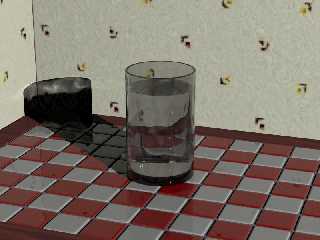
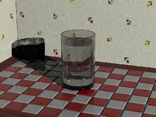
> I'm not convinced about the glass.. Even though you added water drops,
which
> is a nice touch.

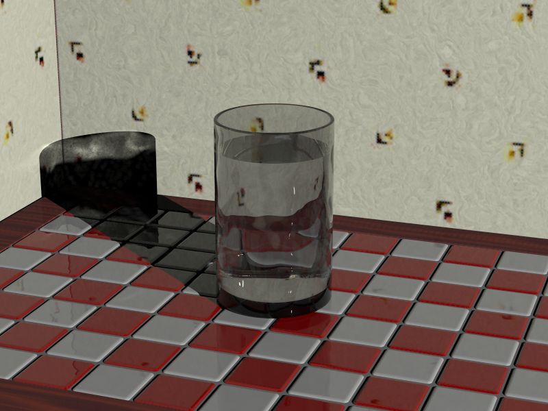
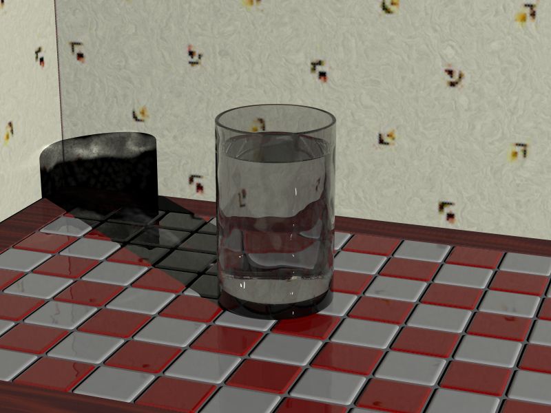
There is one thing everyone misses when doing glasses of liquids.  See if
you can tell which of the following images is better and why.

-tgq
Post a reply to this message
Attachments:
Download 'testg1.JPG' (63 KB)
Download 'testg2.JPG' (63 KB)
Preview of image 'testg1.JPG'
Preview of image 'testg2.JPG'
|
|
| |
| |
|
|
From: Sir Charles W Shults III
Subject: Re: Too lonely - Loneliness (WIP)
Date: 20 Aug 2002 11:19:13
Message: <3d625df1@news.povray.org>
|
|
|
| |
| |
|
|
Meniscus.  Second image.

Cheers!

Chip Shults
My robotics, space and CGI web page - http://home.cfl.rr.com/aichip
Post a reply to this message
|
|
| |
| |
|
|
|
|
| |
| |
|
|
"Sir Charles W. Shults III" <aic### [at] cflrrcom> wrote in message
news:3d625df1@news.povray.org...
>     Meniscus.  Second image.
You are correct.  It does not seem like it would be a noticeable thing until
you actually compaqre the difference.  Without it, something just tells my
brain that something is off though I may not always be able to pinpoint it.

-tgq
Post a reply to this message
|
|
| |
| |
|
|
|
|
| |
| |
|
|
My image does have water tension / miniscus (?),
perhaps too little?

--
Tim Nikias
Homepage: http://www.digitaltwilight.de/no_lights/index.html
Email: Tim### [at] gmxde

> >     Meniscus.  Second image.
> You are correct.  It does not seem like it would be a noticeable thing
until
> you actually compaqre the difference.  Without it, something just tells my
> brain that something is off though I may not always be able to pinpoint
it.
Post a reply to this message
|
|
| |
| |
|
|
|
|
| |
| |
|
|
I could run a try for blurred reflections, but I think
the render time will skyrocket, and there's not much time
left actually...

--
Tim Nikias
Homepage: http://www.digitaltwilight.de/no_lights/index.html
Email: Tim### [at] gmxde

> > NOT CONVINCED ABOUT THE GLASS!?!
>
> Heh..  :o)  Well I'm very rarely convinced about raytraced glass.. I tend
to
> judge the realism by what I usually see in real life, and in real life, I
> rarely see a setup within a simple enviroment. Even if the room is dark,
as
> in your picture, there is usually some spots of light from different
> directions. This affects glass and metal very much.
>
> Another thing is the shape of reflections, on your glass the reflections
has
> very sharp edges and I would expect them to be a bit blurred.
>
> This is all because I'm a nerd for realism.  :o)
>
> Regards,
> Hugo
>
>
Post a reply to this message
|
|
| |
| |
|
|
|
|
| |
| |
|
|
"Tim Nikias" <tim### [at] gmxde> wrote in news:3d621b8e$2@news.povray.org

> More antialias is saved for final trace...
>
> Nothing else that bothers you? I'm looking for feedback
> which things I could improve.

iamge is too dark, table texture basicly is entire black
I would increase contrast

--
#macro g(U,V)(.4*abs(sin(9*sqrt(pow(x-U,2)+pow(y-V,2))))*pow(1-min(1,(sqrt(
pow(x-U,2)+pow(y-V,2))*.3)),2)+.9)#end#macro p(c)#if(c>1)#local l=mod(c,100
);g(2*div(l,10)-8,2*mod(l,10)-8)*p(div(c,100))#else 1#end#end light_source{
y 2}sphere{z*20 9pigment{function{p(26252423)*p(36455644)*p(66656463)}}}//M
Post a reply to this message
|
|
| |
| |
|
|
|
|
| |