|
|
|
|
|
|
| |
| |
|
|
|
|
| |
| |
|
|
Hi,

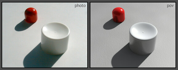
By using "trial-and-error" and all my knowledge about raytracing, I did this
today. A few things will be easy to fix, such as the brightness of the red
color, and the too strong reflection on the white tube-head.

I was surprised that I needed heavy "variable reflection" to get the right
look. Are there any references for real life values?

I used one area_light with strength 1.. Is that wrong, or not important
unless I add other light_sources?

I didn't use fade_power, but I guess that's correct for the sun?

I used focal blur with 30 samples, but the anti-aliasing between red and
grey is not as good as the photo, while the shadows look pretty much the
same.. Do you have any idea why?

Other comments will be welcome!  :o)

Regards,
Hugo
Post a reply to this message
Attachments:
Download 'Photo-Compare.JPG' (26 KB)
Preview of image 'Photo-Compare.JPG'
|
|
| |
| |
|
|
|
|
| |
| |
|
|
Very clever to model even the small imperfections in the real world objects.
There is more of a radiosity effect in the photo. This is the only flaw that
I can see. Your objects are a little shinier, but still look like real
objects.
-Shay
Hugo <hua### [at] post3 teledk> wrote in message news:3cb2eec4@news.povray.org... teledk> wrote in message news:3cb2eec4@news.povray.org...
Post a reply to this message
|
|
| |
| |
|
|
|
|
| |
| |
|
|
Hugo wrote:

> By using "trial-and-error" and all my knowledge about raytracing, I did this
> today. A few things will be easy to fix, such as the brightness of the red
> color, and the too strong reflection on the white tube-head.


   Very good! The red color seems "tood red", and a bit more reflectant.


> I was surprised that I needed heavy "variable reflection" to get the right
> look. Are there any references for real life values?


   I too needed a heavy variable reflection and falloff for the floor of
my office WIP... very difficult to adjust.


> I used one area_light with strength 1.. Is that wrong, or not important
> unless I add other light_sources?
> I didn't use fade_power, but I guess that's correct for the sun?


   Well, if you are not using fading, a strenght of 1 seems fine.
Perhaps radiosity needs a bit more brightness?


> I used focal blur with 30 samples, but the anti-aliasing between red and
> grey is not as good as the photo, while the shadows look pretty much the
> same.. Do you have any idea why?


   30 blur_samples only? :)


> Other comments will be welcome!  :o)

   As someone said, the most apreciable difference is that colourful
grain on the photo. But I don't know how to imitate that inside pov...

   Again, very good!

--
Jaime Vives Piqueres

http://www.ignorancia.org/
La Persistencia de la Ignorancia
Post a reply to this message
|
|
| |
| |
|
|
|
|
| |
| |
|
|
Nice, a bit fine tuning and I couldn't say which one is real
(what is real at all? :-) ).

The red seems a bit too red (should be darker?) but that has been
mentioned before.

I like the ground, it looks like a wall texture in a building, could you
post it?

Sebastian H.
Post a reply to this message
|
|
| |
| |
|
|
|
|
| |
| |
|
|
I noticed that the light color seems different in the photo.  The photo's
"white cylinder" seems almost an ecru color and the ground is a warmer tone.
The povray seems a little more "bluish"

"Hugo" <hua### [at] post3teledk> wrote in message
news:3cb2eec4@news.povray.org...
> Hi,
>
> By using "trial-and-error" and all my knowledge about raytracing, I did
this
> today. A few things will be easy to fix, such as the brightness of the red
> color, and the too strong reflection on the white tube-head.
>
> I was surprised that I needed heavy "variable reflection" to get the right
> look. Are there any references for real life values?
>
> I used one area_light with strength 1.. Is that wrong, or not important
> unless I add other light_sources?
>
> I didn't use fade_power, but I guess that's correct for the sun?
>
> I used focal blur with 30 samples, but the anti-aliasing between red and
> grey is not as good as the photo, while the shadows look pretty much the
> same.. Do you have any idea why?
>
> Other comments will be welcome!  :o)
>
> Regards,
> Hugo
>
>
>
Post a reply to this message
|
|
| |
| |
|
|
|
|
| |
| |
|
|
Nice! :)

but... (always a but...)

The white part would look better with a little bit of subsurface scattering.
I tried this, and it looked good imho: add a transmit value of .5 to your
pigment, and add this interior:

 interior {
  media {
   #declare Kleur=<.5,.75,.9>;
   #declare opacity=1.5;
   #declare Diffuse=1*opacity;
   scattering {1, rgb Kleur*10*Diffuse extinction opacity/Diffuse }
   samples 1,10
   method 2
  }
 }

Will be slower of course, but also more realistic :)
Oh, and make sure your model has the same shape as the real object..  Not only
on the outside but also the inside!

cu!
--
camera{location-z*3}#macro G(b,e)b+(e-b)*(C/50)#end#macro L(b,e,k,l)#local C=0
;#while(C<50)sphere{G(b,e),.1pigment{rgb G(k,l)}finish{ambient 1}}#local C=C+1
;#end#end L(y-x,y,x,x+y)L(y,-x-y,x+y,y)L(-x-y,-y,y,y+z)L(-y,y,y+z,x+y)L(0,x+y,
<.5,1,.5>,x)L(0,x-y,<.5,1,.5>,x)               // ZK http://www.povplace.be.tf
Post a reply to this message
|
|
| |
| |
|
|
|
|
| |
| |
|
|
> I used focal blur with 30 samples, but the anti-aliasing between red and
> grey is not as good as the photo, while the shadows look pretty much the
> same.. Do you have any idea why?

The white object in the photo seems to have a stronger focal blur than on
the raytraced image.
Post a reply to this message
|
|
| |
| |
|
|
|
|
| |
| |
|
|
Hugo wrote:
>
> I used focal blur with 30 samples, but the anti-aliasing between red and
> grey is not as good as the photo, while the shadows look pretty much the
> same.. Do you have any idea why?

I'd just chalk it up to differences in media.

You might try rendering at a large size, then post-processing the image
with a blur and then downscaling to the correct size; I don't imagine
this image takes too long to render.

Also, the red thing in the photo seems to reflect more than the one in
your scene; perhaps with some tweaking in that direction, the edges
would soften out a bit.

-Xplo
Post a reply to this message
|
|
| |
| |
|
|
|
|
| |
| |
|
|
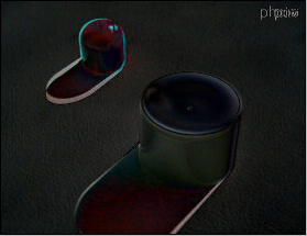
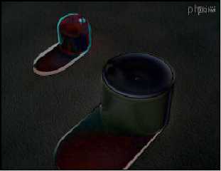
Hope this helps. Its the difference of the 2 photos in photoshop. Pretty
close I'd say, shadows need some work though. Maybe an area light (or a
slightly larger one if you're already using one. The shadows in the photo
look a lot bluer than your render even though your render overall looks
bluer than the photo.

Corey
Post a reply to this message
Attachments:
Download 'dif.png' (106 KB)
Preview of image 'dif.png'
|
|
| |
| |
|
|
|
|
| |
| |
|
|
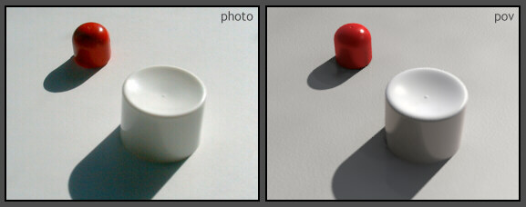
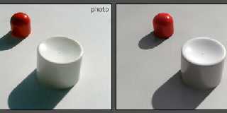
Hello again,

Thanks for all your suggestions!  I tried to include them all, and here is
the result.  :o)  I just didn't use subsurface scattering because this kind
of plastic is "hard" and does not seem to produce any visible scattering...
Rendertime is 47 minutes, 1 ghz AMD... Soo, give comments.  ;o)  If you like
to comment, of course.

Btw, I tried to code an internal "color noise" right in front of the camera.
But I think the effect was so subtle it dissapeared with focal blur (AA).

Regards,
Hugo
Post a reply to this message
Attachments:
Download 'Photo-Compare2.JPG' (24 KB)
Preview of image 'Photo-Compare2.JPG'
|
|
| |
| |
|
|
|
|
| |
| |
|
|
Patrick Dugan wrote
> I noticed that the light color seems different in the photo.  The photo's
> "white cylinder" seems almost an ecru color and the ground is a warmer
tone.
> The povray seems a little more "bluish"

Yes.. And, as you can see in my new version, I tried to adjust this but I
think the photo actually are too much off white, because the cameras
automatic white-balance is easy to fool.

Regards,
Hugo
Post a reply to this message
|
|
| |
| |
|
|
|
|
| |
| |
|
|
Sebastian wrote:
> I like the ground, it looks like a wall texture in a building,
> could you post it?

Ops, it was supposed to look like paper, so I improved this in my new
version. But here is the old texture - it's very simple so maybe you will
make it more complex for a wall.

#declare Ground_Texture=texture {
 pigment { bumps pigment_map { [ 0 rgb .9 ] [ 1 rgb 1.1 ] }
  turbulence .3 scale 1.5 }
 finish { ambient 0 brilliance 1.4 specular .3 roughness .08 }
 normal { granite .06 scale .39 }
}


> Nice, a bit fine tuning and I couldn't say which one is real

Do you think my new version still looks CG ?  :o)

Regards,
Hugo
Post a reply to this message
|
|
| |
| |
|
|
|
|
| |
| |
|
|
The pictures are not an exact match, but I think that you have achieved
photo-realism with your render.

 -Shay

Hugo <hua### [at] post3teledk> wrote in message news:3cb42376@news.povray.org...
Post a reply to this message
|
|
| |
| |
|
|
|
|
| |
| |
|
|
> The pictures are not an exact match, but I think that you have achieved
> photo-realism with your render.

Thanks! That was my goal. Now I wonder if this setup can be reused, and I'm
thinking about what I have learned from this experiment.

There's something with the white tube-head: Reflections are stronger than
the photo, but if I reduce them, the sides of the tube-head becomes too dark
because they also light up due to reflections.. But I can't use a higher
ambient value because ambient = 0.. So it needs to catch more diffuse light
from radiosity.. But if I raise brightness of radiosity, the shadows will
brighten too, and that's not going to look like the photo.. So what's really
going on in reality here, I don't know..

Regards,
Hugo
Post a reply to this message
|
|
| |
| |
|
|
|
|
| |
| |
|
|
Hugo <hua### [at] post3teledk> wrote in message news:3cb44a0d@news.povray.org...
>
> There's something with the white tube-head: Reflections are stronger than
> the photo, but if I reduce them, the sides of the tube-head becomes too
dark
> because they also light up due to reflections.. But I can't use a higher
> ambient value because ambient = 0.. So it needs to catch more diffuse
light
> from radiosity.. But if I raise brightness of radiosity, the shadows will
> brighten too, and that's not going to look like the photo.. So what's
really
> going on in reality here, I don't know..
>


Have you tried blurred reflection? I think that this is present in the
photo.

 -Shay
Post a reply to this message
|
|
| |
| |
|
|
|
|
| |
| |
|
|
> Have you tried blurred reflection? I think that this is present in the
> photo.

I use blurred reflection on both objects, adjusted to fit the photo.
Regarding the reflection contrast, blurring has no influence. But I tried to
set reflection_exponent below 1 because I imagined this would reduce
contrast but it merely seems to darken the reflection.

Further suggestions will be appriciated.  :o)

Regards,
Hugo
Post a reply to this message
|
|
| |
| |
|
|
|
|
| |
| |
|
|
Since the object is white, I wonder if using the metallic keyword in the
reflection block would help. Increasing the diffuse would lighten the
reflection, but perhaps cause worse problems.

 -Shay

Hugo <hua### [at] post3teledk> wrote in message
news:3cb452c8$1@news.povray.org...
Post a reply to this message
|
|
| |
| |
|
|
|
|
| |
| |
|
|
>    Very good! The red color seems "tood red", and a bit more reflectant.
Yes, if you want realistic colours do not use full rgb values.  A while back
when I was looking at information about light and colour, it mentions that
we do not actually experience colours represented by these rgb values.  Have
a read here http://www.fourmilab.ch/documents/specrend/

-tgq
Post a reply to this message
|
|
| |
| |
|
|
|
|
| |
| |
|
|
Hugo wrote:
> I just didn't use subsurface scattering because this kind of plastic
> is "hard" and does not seem to produce any visible scattering...

You should have used :-). At least I see subsurface scattering on the
photo.

--
          /"\                           |    iki.
          \ /     ASCII Ribbon Campaign |    fi/
           X      Against HTML Mail     |    zds
          / \
Post a reply to this message
|
|
| |
| |
|
|
|
|
| |
| |
|
|
Me too.
Post a reply to this message
|
|
| |
| |
|
|
|
|
| |
| |
|
|
TinCanMan wrote:
> a read here http://www.fourmilab.ch/documents/specrend/

  He he... :) This is one of my many bookmarks about color and light. I
have read a lot of stuff like this when creating my light macro. Not
that I understood much of it, but I at least extracted some asumptions
for personal use. POV-Ray, as the vast majority of renderers, cant' use
directly spectral data, but we can at least use an aproximation for
"proportionality" purposes. My method is really a bad and weird
aproximation, but it is surprisingly realistic in my own tests against
real photos, in terms of color proportions.

--
Jaime Vives Piqueres

http://www.ignorancia.org/
La Persistencia de la Ignorancia
Post a reply to this message
|
|
| |
| |
|
|
|
|
| |
| |
|
|
>   He he... :) This is one of my many bookmarks about color and light. I
> have read a lot of stuff like this when creating my light macro. Not
> that I understood much of it

Me neither, not even the benefit of understanding this. It seems to me just
like another way to think about surface colors, but an input for POV-Ray
will still have to be RGB, so what I did here, was to guess the color based
on the photo, so would there be any difference?

> it is surprisingly realistic in my own tests against
> real photos

Yesterday evening I tried my setup on a more complex object (my computer
keyboard that I made earlier) but the result was disappointing.. I don't
understand why it didn't look realistic and render time was WAY too high!!
I broke it after 4 hours.

Regards,
Hugo
Post a reply to this message
|
|
| |
| |
|
|
|
|
| |
| |
|
|
> You should have used :-).
> At least I see subsurface scattering on the photo.

You're kidding..? Okay if I take the objects in my hand and hold them
against the sun, I see the inside light up.. This means they ARE transparant
a little, but on the photo this seems invisible to me.. And because of that,
I see no reason to slow down my render even more.. A higher quality of
radiosity on the other hand, could improve the blocky shadows.

Regards,
Hugo
Post a reply to this message
|
|
| |
| |
|
|
|
|
| |
| |
|
|
> You're kidding..? Okay if I take the objects in my hand and hold them
> against the sun, I see the inside light up.. This means they ARE transparant
> a little, but on the photo this seems invisible to me.. And because of that,
> I see no reason to slow down my render even more.. A higher quality of
> radiosity on the other hand, could improve the blocky shadows.
The biggest difference between the photo and the render, is the
subsurfacescattering imho...

But nice job anyway :)

cu!
--
camera{location-z*3}#macro G(b,e)b+(e-b)*(C/50)#end#macro L(b,e,k,l)#local C=0
;#while(C<50)sphere{G(b,e),.1pigment{rgb G(k,l)}finish{ambient 1}}#local C=C+1
;#end#end L(y-x,y,x,x+y)L(y,-x-y,x+y,y)L(-x-y,-y,y,y+z)L(-y,y,y+z,x+y)L(0,x+y,
<.5,1,.5>,x)L(0,x-y,<.5,1,.5>,x)               // ZK http://www.povplace.be.tf
Post a reply to this message
|
|
| |
| |
|
|
|
|
| |
| |
|
|
Some suggestions.

Paint the inside of the white cap black and compare the
effect on the outside surface to unpainted one. That's
sub-surface scattering.

Figure out the tonal mapping or ICC profile of your camera.
POV-Ray output is gamma corrected linear. I bet the camera
output is something different.

Do the out of frame scene geometry and colors match the
real scene?


_____________
Kari Kivisalo
Post a reply to this message
|
|
| |
| |
|
|
|
|
| |
| |
|
|
> Do the out of frame scene geometry and colors match the
> real scene?

Yes, the most important parts does. It misses a brighter left side (outside
camera view) however.

> POV-Ray output is gamma corrected linear.
> I bet the camera output is something different.

Yes I thought about this too. My cameras response to light may not be
linear, and this might cause the reflection on the photo to be dimmer.. But,
on the other hand it looks too strong on my render.

:o)

Regards,
Hugo
Post a reply to this message
|
|
| |
| |
|
|
|
|
| |