|
|
|
|
|
|
| |
| |
|
|
|
|
| |
| |
|
|
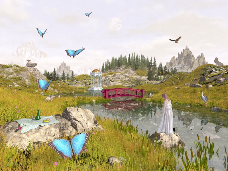
I'm afraid this doesn't quite work. Don't know why - tried a hundred or two variations
with no sucess.

Mick
Post a reply to this message
Attachments:
Download 'Landscape.jpg' (236 KB)
Preview of image 'Landscape.jpg'
|
|
| |
| |
|
|
|
|
| |
| |
|
|
"Mick Hazelgrove" <mic### [at] mhazelgrove fsnetcouk> wrote in message
news:3c791634@news.povray.org...
> I'm afraid this doesn't quite work. Don't know why - tried a hundred or
two variations with no sucess.
The proportions seem off to me. The woman is too small, the butterflies,
heron and wolf are too large, the trees seem tiny or too far away and the
small group of rocks on the left seem to be rising out of a hole. fsnetcouk> wrote in message
news:3c791634@news.povray.org...
> I'm afraid this doesn't quite work. Don't know why - tried a hundred or
two variations with no sucess.
The proportions seem off to me. The woman is too small, the butterflies,
heron and wolf are too large, the trees seem tiny or too far away and the
small group of rocks on the left seem to be rising out of a hole.
Post a reply to this message
|
|
| |
| |
|
|
|
|
| |
| |
|
|
in news:3c791634@news.povray.org Mick Hazelgrove wrote:

> I'm afraid this doesn't quite work.

At first glance I would say you have a scale problem, yet I can't pinpoint
it. The wolf, the waterbird and the moon look to big, the trees and the
lady too small?

Things that could be tried: make the trees bigger and darker, get rid of
the dome structure/building (if that results in a "gap" maybe add a little
(sailing)boat), make the bridge blend in more with the landscape and
exaggurate the size of the butterflies even more (50% bigger?). Maybe a
little bit more overall contrast.

The plants and grass are great, the way the colours mix, it gets a painted
look.

Ingo
Post a reply to this message
|
|
| |
| |
|
|
|
|
| |
| |
|
|
Mick Hazelgrove wrote:
>
> I'm afraid this doesn't quite work. Don't know why - tried a hundred or two
variations with no sucess.
>

Where is the problem?

Some parts look very good i think, esp. the rock on the left, how did you
do it?

There is a bit of the scale problem with the heron(?), the wolf and maybe
the butterflies (although those could be very near to the camera).

I also wonder about the lighting, the sun seems to be shining, but the
contrasts are extremely low apart from the bridge.  I can hardly see any
shadows.

How are the trees made, it's a bit difficult to see at that distance.

Christoph

--
POV-Ray tutorials, IsoWood include,
TransSkin and more: http://www.tu-bs.de/~y0013390/
Last updated 21 Feb. 2002 _____./\/^>_*_<^\/\.______
Post a reply to this message
|
|
| |
| |
|
|
|
|
| |
| |
|
|
"Bill DeWitt"  wrote:

>     The proportions seem off to me.
I agree

>The woman is too small, Could be

the butterflies, are very close to the camera and intentionally large

> heron and wolf are too large,

I agree

the trees seem tiny  they are correct but I could try them larger

> small group of rocks on the left seem to be rising out of a hole.

Yep they are!

Mick
Post a reply to this message
|
|
| |
| |
|
|
|
|
| |
| |
|
|
"ingo" wrote in message:

> At first glance I would say you have a scale problem, yet I can't pinpoint
> it. The wolf, the waterbird and the moon look to big, the trees and the
> lady too small?

Agreed

> Things that could be tried: make the trees bigger and darker, get rid of
> the dome structure/building (if that results in a "gap" maybe add a little
> (sailing)boat), make the bridge blend in more with the landscape and
> exaggurate the size of the butterflies even more (50% bigger?). Maybe a
> little bit more overall contrast.

I'll try it. though I've tried it before!

> The plants and grass are great, the way the colours mix, it gets a painted
> look.

thanks
Post a reply to this message
|
|
| |
| |
|
|
|
|
| |
| |
|
|
"Christoph Hormann"wrote:

> Some parts look very good i think, esp. the rock on the left, how did you
> do it?

Thanks, it was made in amorphium. It's about the only thing I can get it to do!

> There is a bit of the scale problem with the heron(?), the wolf and maybe
> the butterflies (although those could be very near to the camera).

I agree

> I also wonder about the lighting, the sun seems to be shining, but the
> contrasts are extremely low apart from the bridge.  I can hardly see any
> shadows.

I think there may be a problem with how others see the image in comparison to how I
see the colour - I have yet to properly
calibrate my monitor and get the gamma right.

I think that's due to the grass hiding the shadows

> How are the trees made, it's a bit difficult to see at that distance.

They are meshes and triangles. Made in X-Frog. Everything else apart from the Poser
figures waas modelled in Rhino.

Mick
Post a reply to this message
|
|
| |
| |
|
|
|
|
| |
| |
|
|
Mick Hazelgrove wrote:
>
> [...]
>
> I think there may be a problem with how others see the image in comparison to how I
see the colour - I have yet to properly
> calibrate my monitor and get the gamma right.
>
> I think that's due to the grass hiding the shadows

I don't think it has much to do with the gamma, brightness seems correct.
The grass being without shadows might explain a lot.  Usually grass is
much darker at the lower parts where less light reaches.  Without shadows
you won't get this effect.

> > How are the trees made, it's a bit difficult to see at that distance.
>
> They are meshes and triangles. Made in X-Frog. Everything else apart from the Poser
figures waas modelled in Rhino.
>

The terrain too?

I wonder how detailed the trees are, i'm still searching for an efficient
method to generate coniferous trees.

Christoph

--
POV-Ray tutorials, IsoWood include,
TransSkin and more: http://www.tu-bs.de/~y0013390/
Last updated 21 Feb. 2002 _____./\/^>_*_<^\/\.______
Post a reply to this message
|
|
| |
| |
|
|
|
|
| |
| |
|
|
"Christoph Hormann"  wrote:

> I don't think it has much to do with the gamma, brightness seems correct.
> The grass being without shadows might explain a lot.  Usually grass is
> much darker at the lower parts where less light reaches.  Without shadows
> you won't get this effect.

Hmmm

> The terrain too?

No that's a mixture og HF and Isosurfaces

> I wonder how detailed the trees are, i'm still searching for an efficient
> method to generate coniferous trees.

Very good until you get very close. X-Frog though is as good as it gets and can
produce very good trees close up.

Mick
Post a reply to this message
|
|
| |
| |
|
|
|
|
| |
| |
|
|
Bill DeWitt wrote:
> The proportions seem off to me. The woman is too small, the
> butterflies, heron and wolf are too large, the trees seem
> tiny or too far away and the small group of rocks on the left
> seem to be rising out of a hole.

I dunno, I think the misproportioning is intentional...I rather
like this image.  Seems needs a little something to make it more
pre-raphaelite-esque.

--
Tim Cook
http://empyrean.scifi-fantasy.com

-----BEGIN GEEK CODE BLOCK-----
Version: 3.12
GFA dpu- s: a?-- C++(++++) U P? L E--- W++(+++)>$
N++ o? K- w(+) O? M-(--) V? PS+(+++) PE(--) Y(--)
PGP-(--) t* 5++>+++++ X+ R* tv+ b++(+++) DI
D++(---) G(++) e*>++ h+ !r--- !y--
------END GEEK CODE BLOCK------
Post a reply to this message
|
|
| |
| |
|
|
|
|
| |
| |
|
|
IMHO, I believe the color/brightness of the bridge seems too intense...
perhaps too much ambient?

Fernando.
Post a reply to this message
|
|
| |
| |
|
|
|
|
| |
| |
|
|
Very nice. Thoughts for improving it:

1) Greener greenery.
2) More flowers.
3) More tiny butterflies fluttering about the flowers, not near the camera.
4) Radiosity, unless you're already using it.
5) Less fog.
6) Less transparent water, and bluer.
7) No wolf.

Pick and choose those you like. :)
Post a reply to this message
|
|
| |
| |
|
|
|
|
| |
| |
|
|
"Tony[B]" <ben### [at] catholicorg> wrote :
>
> 3) More tiny butterflies fluttering about the flowers, not near the
camera.

    Agree. I almost mentioned that. It would provide a continuity of scale
that might make other things work. I might also get rid of the apparently
butterfly-sized Eagle.

> 7) No wolf.

    Agree. Unless there is a story-telling reason for the wolf, it really
pulls the eye away from some other good things and ends up with me looking
at a less detailed part of the image.

    All in all, I would remove the man-made clutter, the eye drawing wolf
and perspective defeating eagle, and the Duck Rocks.

    ...unless, as I said, there are story-telling reasons for having them
there.
Post a reply to this message
|
|
| |
| |
|
|
|
|
| |
| |
|
|
In article <3c791634@news.povray.org>, mic### [at] mhazelgrovefsnetcouk
says...

> I'm afraid this doesn't quite work. Don't know why
> - tried a hundred or two variations with no sucess.

I think you need to focus the image more one one particular thing.

There is the girl, the butterflies, the red bridge wich all attract the
eye to themselves - thats simply too much.

One possible solution: Drop the butterflys (or make them small), move the
girl in the foreground and the rock with the food on it to the
background, and give the bridge a different texture (wood for example)

Lutz-Peter
Post a reply to this message
|
|
| |
| |
|
|
|
|
| |
| |
|
|
> I'm afraid this doesn't quite work. Don't know why - tried a hundred or
two variations with no sucess.

Hi Mick,

comparing your image with my entry for the current irtc round I don´t like
my own work anymore. This image has so much potential.

This said I see similar problems. So it seems you use a "fast grass" like
Rune´s macro. This would explain the black spots, the lacking shadows and
the purple flowers. But otherwise ...

For me the real problem is the color saturation of the bridge, butterflies
and the vase, which is too deep. Otherwise the girl is too pale.

Some minor problems:

water is too clear,
some scale problems and
the trees need a darker underground and a greater variation of angle.

Norbert
Post a reply to this message
|
|
| |
| |
|
|
|
|
| |
| |
|
|
"Norbert Kern" wrote

>it seems you use a "fast grass" like Rune´s macro.

No, there are 250 000 blades of grass in this pic.


> For me the real problem is the color saturation of the bridge, butterflies
> and the vase, which is too deep. Otherwise the girl is too pale.

> water is too clear,

Yes, I'm still trying to get fade to work on this

Mick
Post a reply to this message
|
|
| |
| |
|
|
|
|
| |
| |
|
|
"Mick Hazelgrove" <mic### [at] mhazelgrovefsnetcouk> wrote in
news:3c791634@news.povray.org:

> I'm afraid this doesn't quite work. Don't know why - tried a hundred
> or two variations with no sucess.

    It's hard to tell what the subject of the piece is.  That may be why
you think it's not working.  Maybe you could point the line of butterflys
closer to, or directly at the girl, and put one or two butterflys just past
her.  Get rid of the wolf, and add just a touch of turbulence to the water
surface (it seems much too reflective, especially in the distance).
    This is a great image!  Can't wait to see it evolve a bit more.

--
Rich Allen
(Remove SPAM from my address to reply by e-mail)
Post a reply to this message
|
|
| |
| |
|
|
|
|
| |
| |
|
|
>     It's hard to tell what the subject of the piece is.  That may be why
> you think it's not working.

I think this is probably right, the picture has gone through several story lines and
has become confused, once the idea behind it is
sorted I think the rest will fall in line.

Mick
Post a reply to this message
|
|
| |
| |
|
|
|
|
| |
| |
|
|
the size problems can be greatly alleviated by exaggerating the
atmosphere between the viewer and the distance.

the colors are a little confusing.  With the strength of the
butterflies I would tone down the bridge significantly.  It
attracts too much attention.  If I were doing the image, I would
have significant atmosphere beginning to be noticeable just after
the woman.  I would fake alot of it by graying my colors from her
on into the distance more and more.

There is too much detail in the far horizon.

Lose the bird.

The scales of objects don't seem to match.  This is easily
solveable- it's raytraced, right?  Check your scales match.  If
you are using forced perspective (which I have done before) and
faking the apparent distance, check you sightlines, or figure out
the ratio of scales by the tilt of your plane and do the math.

The grass is very well done.

It is a potentially gorgeous image with a voice begging to sing,
IMO, so stick with it until you've finished.  Don't give up.
--
Current obsession: "Ballet pour ma fille."
http://www.applesnake.net
Post a reply to this message
|
|
| |
| |
|
|
|
|
| |
| |
|
|
lose which bird?

the one in the air.

that's the one I meant.  sorry I was not specific.

-peter
--
Current obsession: "Ballet pour ma fille."
http://www.applesnake.net
Post a reply to this message
|
|
| |
| |
|
|
|
|
| |
| |
|
|
On Sun, 24 Feb 2002 16:31:41 -0000, Mick Hazelgrove wrote:
> I'm afraid this doesn't quite work. Don't know why - tried a hundred or
> two variations with no sucess.

Beautiful image.  For me the sharp points of the two most prominent sets
of trees and mountains gives an uneasy feeling, maybe if you smothed both
sets of mountains a bit and just had one clump of pointy trees and make
the other clum a more rounded type of tree then it mighte make a difference.

Just my 2p.

PS: I keep meaning to mail you about the POV UK get together, maybe
    tomorrow.

--
%HAV-A-NICEDAY                    email mailto:ste### [at] zeroppsuklinuxnet
Steve                                web http://www.zeropps.uklinux.net/
                                             or http://start.at/zero-pps
  1:17am  up 9 days,  7:06,  1 user,  load average: 1.02, 1.05, 1.01
Post a reply to this message
|
|
| |
| |
|
|
|
|
| |
| |
|
|
As others have said, the main thing that appears to be wrong is the scale of
certain element, specifically the butterflies and the wolf.

Leitha
Post a reply to this message
|
|
| |
| |
|
|
|
|
| |
| |
|
|
Like others have said, the scale is off. I notice that
the vase is about the same length as the girl's
forearm. I suppose that might be right if it's a big
vase but it still seems larger than I would expect.
It might help if there was a butterfly closer to
the fruit to show the scale. That might help to make
the other butterflies seem close and not like giants.


--
Phil
Behold, for I am the keeper of the sacred coffee brewing method.
Post a reply to this message
|
|
| |
| |
|
|
|
|
| |
| |
|
|
"Mick Hazelgrove" <mic### [at] mhazelgrovefsnetcouk> wrote in message
news:3c791634@news.povray.org...
> I'm afraid this doesn't quite work. Don't know why - tried a hundred or two
variations with no sucess.
>

I dunno - I think the mixing of styles throws it. A formal garden or park seems
called for, rather than this rather wild terrain...
Post a reply to this message
|
|
| |
| |
|
|
|
|
| |
| |
|
|
Tom Melly wrote:
> I dunno - I think the mixing of styles throws it. A formal garden
> or park seems called for, rather than this rather wild terrain...

I still think it's a very Pre-raphaelite image, it just needs some
minor tweaking.  My impressions of the large butterflies is that
they're supposed to be that way.

The bridge is too vibrant, and the gazebo too well-defined, but
look at the arc created by the butterflies-bird-wolf, then the
line of girl/bridge/gazebo/distant mountain...the arc draws the
viewer through the painting.  So the wolf is nice.  Only problem
is the overall scene is significantly more saturated than the
girl.  I DO like the sudden bright blue of the foremost butterfly,
perhaps drop the saturation of the rest of the image.  And put in
some specific little items that you really have to be looking at
to see, but have high detail.  Add more to the background.

--
Tim Cook
http://empyrean.scifi-fantasy.com

-----BEGIN GEEK CODE BLOCK-----
Version: 3.12
GFA dpu- s: a?-- C++(++++) U P? L E--- W++(+++)>$
N++ o? K- w(+) O? M-(--) V? PS+(+++) PE(--) Y(--)
PGP-(--) t* 5++>+++++ X+ R* tv+ b++(+++) DI
D++(---) G(++) e*>++ h+ !r--- !y--
------END GEEK CODE BLOCK------
Post a reply to this message
|
|
| |
| |
|
|
|
|
| |
| |
|
|
> I'm afraid this doesn't quite work. Don't know why - tried a hundred or
two variations with no sucess.

looks unbalanced - loose the red bridge


--

Rick

Kitty5 WebDesign - http://Kitty5.com
POV-Ray News & Resources - http://Povray.co.uk
TEL : +44 (01270) 501101 - FAX : +44 (01270) 251105 - ICQ : 15776037

PGP Public Key
http://pgpkeys.mit.edu:11371/pks/lookup?op=get&search=0x231E1CEA
Post a reply to this message
|
|
| |
| |
|
|
|
|
| |
| |
|
|
Making the bridge white or brown will make a world of a difference. Take the
butterflies further from the camera, maybe leave one or two near the camera.
Putting some butterflies near the lady will also help realize their size. Focal
blur would also help with the scale but then you'd loose a lot of detail.

--
#local X=20*<-2,2,5>;#local K=2*z*X-X;#local R=seed(frame_number);blob{#while(K
.x>X.x)#local N=X+<rand(R)rand(R)1>/3;#local X=(vlength(N-K)<vlength(X-K)?N:2*X
-N);sphere{X,1,1rotate z*90}sphere{X,1,1}#end pigment{rgbt 1}interior{media{
emission<2,4,5>*5}}hollow scale.05}//   http://nekar_xenos.tripod.com/metanoia/
sphere_sweep{catmull_rom_spline 6<-8,-8>1<-8,-8>1<-8,8>1<8,-8>1<8,8>1<8,8>1
translate 20*z pigment{gradient z scale 3color_map{[0rgb<0,9,18>][1rgb 0]}}}


---
Outgoing mail is certified Virus Free.
Checked by AVG anti-virus system (http://www.grisoft.com).
Version: 6.0.325 / Virus Database: 182 - Release Date: 2002/02/19
Post a reply to this message
|
|
| |
| |
|
|
|
|
| |
| |
|
|
"Mick Hazelgrove" <mic### [at] mhazelgrovefsnetcouk> wrote in message
news:3c7922a7@news.povray.org...
>
>
> Thanks, it was made in amorphium. It's about the only thing I can get it to
do!
>

Phew - I thought it was just me.... Oh, I can make things SPIKEY!
Post a reply to this message
|
|
| |
| |
|
|
|
|
| |
| |
|
|
Mick -

It looks like you are going for "fantasy painting" or "magical reality"
imagery.  In this case, I think the color saturation and lack of shadows
look pretty cool.

Like many people, my biggest issue is with scale.  If your lady were to
walk over to the bridge or the gazebo, they would be absolutely giant.
Maybe you could actually move your lady onto the bridge or the gazebo
and do a very simple test run to check the scale.  Basically, I think
she needs to be a bit bigger, but she's YOUR lady...

Second, you've done a marvelous job with adding randomness and variation
to the landscape.  I really like the subtle balancing rocks in the
distance.  However, the "man-made" objects like the picnic kit seem to
be very plastic.  Maybe you could add some texturing to them (spots on
the banana and apple).  I think the gazebo and bridge could do with some
signs of weathering, too.  That would increase the illusion of realism.

Hope this helps.

- Ben
Post a reply to this message
|
|
| |
| |
|
|
|
|
| |
| |
|
|
I agree, the bridge seems a bit off.  for one thing, it is bright red, and
jumps out at you, while the rest is a kind of soothing, cool green or
bluish.  Also, it looks oriental to me, like you would see in a japaneese
garden.  Those tend to be very calm ordered, while this scene is more open,
wild, or something.  Plus, it is sitting in front of the white gazeebo, and
they don't seem to match at all.
I think you're being to hard on yourself.  I would love to be able to create
something like this!  Excelent scene!

Barron
Post a reply to this message
|
|
| |
| |
|
|
|
|
| |
| |
|
|
Hi Mick,

"Mick Hazelgrove" <mic### [at] mhazelgrovefsnetcouk> wrote in message
news:3c7920d2@news.povray.org...

You said:

: the butterflies, are very close to the camera and intentionally large
: Mick

But when you look at the picture, the first butterfly
on the left (the biggest one) looks like it is further
away from the camera than the little pink flower that
is positioned to the left of it. If so, then the butterfly
seems about 10 times bigger than the flower.

From my perspective, the blades of grass are in
front of the butterfly too, making it look further away
than the flower.

If you want to take the eye to your subject better,
perhaps have her wear a brighter color dress and
tone down the bridge, unless the bridge is your
subject. The bright color of the butterflies tends to
draw the eye away from the girl too. Maybe a bright
bouquet of flowers in her hand or a ribbon in her
hair? I don't know... The dragonflies look a little big
too. Try taking the bridge out?

Personally, I like the color of the water. I think the
sky is a little drab. Love the grass and cattails.

Still, a wonderful picture! I love your rocks. How do
you make those?

=Bob=
Post a reply to this message
|
|
| |
| |
|
|
|
|
| |
| |
|
|
"Tony[B]" wrote:
>
> 6) Less transparent water, and bluer.

I disagree; blueish color is just a reflection of the sky, which in this
case is not very intense or saturated, so the water really wouldn't pick
up much color.

--
David Fontaine  <dav### [at] faricynet>  ICQ 55354965
My raytracing gallery:  http://davidf.faricy.net/
Post a reply to this message
|
|
| |
| |
|
|
|
|
| |