|
|
|
|
|
|
| |
| |
|
|
|
|
| |
| |
|
|
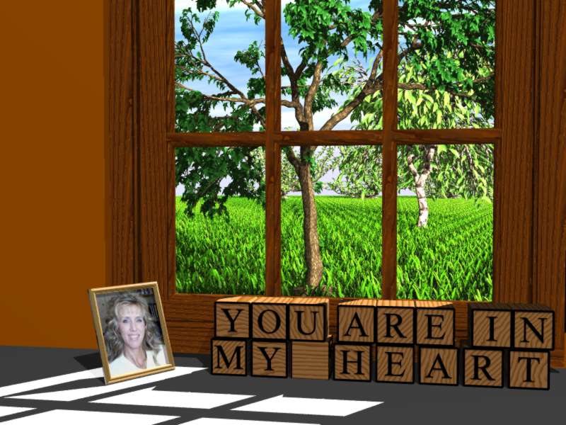
hi everybody!

long time listener, first time image-poster.  i've got a ton
of time in this.  mostly just coming up to speed, and some
time (like playing with moray) that wasn't ever incorporated
into the picture.  thanks to gilles for the grass and trees,
and i couldn't find a name in the alphabet block include.

anyway, i'd love to hear your comments.  however, i think
there should be some ground rules here... the following
comments are not considered apropo:

1. so you grow your grass in rows in indiana just like your
corn?
2. and i guess you don't actually use glass in your windows,
either, in indiana?
3. consider going back to crayons and working your way
up to the paint program that comes with windows.
4. please delete this image before gilles sees what you've
done with his include files.

suggested comments include:

1. that picture frame is awesome!  can i get the code for it?
2. beautiful and inspirational use of gilles's include files!
can i get the code for it?
3. is that really a pov image?  it looks like a real photo to
me.
4.  would you like to meet my sister?

thanks, miker
Post a reply to this message
Attachments:
Download 'cheri.jpg' (79 KB)
Preview of image 'cheri.jpg'
|
|
| |
| |
|
|
|
|
| |
| |
|
|
"MR" <a### [at] b net> wrote in message news:3c39af17@news.povray.org...
>
> anyway, i'd love to hear your comments.
Looks acceptable enough for a beginning :-)
Your sunlight seems to be coming from very near the house. That can cause
bad sunburn as well as incorrect shadows.
The orderly grass, and that's some big grass BTW, I haven't tried Gilles
grass but it could use randomization if it doesn't already have it (I'd
expect it probably does though). Sorry, but I couldn't pass up mentioning
it.
And sure, I'd like to meet your sister if that's her in the photo.
bob h net> wrote in message news:3c39af17@news.povray.org...
>
> anyway, i'd love to hear your comments.
Looks acceptable enough for a beginning :-)
Your sunlight seems to be coming from very near the house. That can cause
bad sunburn as well as incorrect shadows.
The orderly grass, and that's some big grass BTW, I haven't tried Gilles
grass but it could use randomization if it doesn't already have it (I'd
expect it probably does though). Sorry, but I couldn't pass up mentioning
it.
And sure, I'd like to meet your sister if that's her in the photo.
bob h
Post a reply to this message
|
|
| |
| |
|
|
|
|
| |
| |
|
|
hi bob,

thanks for the comments.  one of the things i became aware of while
doing this scene is how important every little thing is, such as lighting,
camera postion, and textures.  especially lighting.  i see a lot of
discussion about lighting in the good images.  seems like radiosity
and the inevitable long render times come into play often.

i wanted the rays of sun to be visible, and i played with media for a
very long time.  it finally came down to building a ray-shaped mesh and
containing the media inside the mesh, but in the end it didn't look good
and the renders were taking so long that every incremental adjustment
i made took a lot of time so i bailed on it.

i took a ready-made patch of grass that gilles had done and tiled the
yard in.  i needed thicker grass so i overlapped them quite a bit, and
i attempted to put a random offset and rotation on the tiling job.  i ended
up with a really nice looking macro that didn't seem to do a darn thing
as far as getting rid of the rows.  and yes, the rows are my fault, not
gilles.

and no, no, no!  you're spozed to ask me if I wanna meet YOUR sister!

thanks again, miker


"bob h" <omn### [at] charternet> wrote in message
news:3c39b320@news.povray.org...
> "MR" <a### [at] bnet> wrote in message news:3c39af17@news.povray.org...
> >
> > anyway, i'd love to hear your comments.
>
> Looks acceptable enough for a beginning  :-)
> Your sunlight seems to be coming from very near the house.  That can cause
> bad sunburn as well as incorrect shadows.
> The orderly grass, and that's some big grass BTW, I haven't tried Gilles
> grass but it could use randomization if it doesn't already have it (I'd
> expect it probably does though).  Sorry, but I couldn't pass up mentioning
> it.
> And sure, I'd like to meet your sister if that's her in the photo.
>
> bob h
>
>
Post a reply to this message
|
|
| |
| |
|
|
|
|
| |
| |
|
|
"MR" <a### [at] bnet> wrote in message news:3c39bc2e@news.povray.org...
>
> and no, no, no!  you're spozed to ask me if I wanna meet YOUR sister!

Oops, I see Mike.  Only if she gets a divorce then.

bob h
Post a reply to this message
|
|
| |
| |
|
|
|
|
| |
| |
|
|
Hey, I like your trees! How did you create them?

Congrats,

Fernando.

"MR" <a### [at] bnet> wrote in message news:3c39af17@news.povray.org...
> hi everybody!
>
> long time listener, first time image-poster.  i've got a ton
> of time in this.  mostly just coming up to speed, and some
> time (like playing with moray) that wasn't ever incorporated
> into the picture.  thanks to gilles for the grass and trees,
> and i couldn't find a name in the alphabet block include.
>
> anyway, i'd love to hear your comments.  however, i think
> there should be some ground rules here... the following
> comments are not considered apropo:
>
> 1. so you grow your grass in rows in indiana just like your
> corn?
> 2. and i guess you don't actually use glass in your windows,
> either, in indiana?
> 3. consider going back to crayons and working your way
> up to the paint program that comes with windows.
> 4. please delete this image before gilles sees what you've
> done with his include files.
>
> suggested comments include:
>
> 1. that picture frame is awesome!  can i get the code for it?
> 2. beautiful and inspirational use of gilles's include files!
> can i get the code for it?
> 3. is that really a pov image?  it looks like a real photo to
> me.
> 4.  would you like to meet my sister?
>
> thanks, miker
>
>
>
>
>
Post a reply to this message
|
|
| |
| |
|
|
|
|
| |
| |
|
|
"MR" <a### [at] bnet> wrote :
>
> and no, no, no!  you're spozed to ask me if I wanna meet YOUR sister!

    So now I'm confused... Is it you or your sister in the photo? And if
it's you, I don't think my sister is all that interested in meeting you.
Post a reply to this message
|
|
| |
| |
|
|
|
|
| |
| |
|
|
MR wrote:
>
> hi everybody!
>
> long time listener, first time image-poster.  i've got a ton
> of time in this.  mostly just coming up to speed, and some
> time (like playing with moray) that wasn't ever incorporated
> into the picture.  thanks to gilles for the grass and trees,
> and i couldn't find a name in the alphabet block include.
>
> [...]

It looks good and i like to especially point out the texturing of the
window frame where you did a much better job than various IRTC entries i
have seen in the past...

The trees could vary a bit more from the standard maketree samples and the
contrast between light and shadow should be stronger.

>
> suggested comments include:
>
> [...]
> 4.  would you like to meet my sister?
>

In this case you maybe should have put your picture in that frame.


Christoph

--
Christoph Hormann <chr### [at] gmxde>
IsoWood include, radiosity tutorial, TransSkin and other
things on: http://www.schunter.etc.tu-bs.de/~chris/
Post a reply to this message
|
|
| |
| |
|
|
|
|
| |
| |
|
|
Please excuse me if my comment doesn't qualify, but all I can think of
when I look at your image is how sad it makes me feel. Not much help,
am I? :)


Peter Popov ICQ : 15002700
Personal e-mail : pet### [at] vipbg
TAG      e-mail : pet### [at] tagpovrayorg
Post a reply to this message
|
|
| |
| |
|
|
|
|
| |
| |
|
|
now cut that out!   ;-)  and yes!  you are confused, cuz thats not my
sister or me in the picture.  she's a chat friend from the internet.

i think we need to concentrate more on my image and less on my
sister.  NO!  wait!  not MY sister... your sister!  no, wait... its not
your sister either!  thats not what i meant!   oh, heck with it!    ;-)

miker


"Bill DeWitt" <bde### [at] cflrrcom> wrote in message
news:3c39d381$1@news.povray.org...
>
> "MR" <a### [at] bnet> wrote :
> >
> > and no, no, no!  you're spozed to ask me if I wanna meet YOUR sister!
>
>     So now I'm confused... Is it you or your sister in the photo? And if
> it's you, I don't think my sister is all that interested in meeting you.
>
>
Post a reply to this message
|
|
| |
| |
|
|
|
|
| |
| |
|
|
hi fernando,

the trees and grass are straight out of gilles's tree and grass
include files.  i was lazy and merely tiled a patch of grass he
supplied as an example, causing the "row" effect.

both of his include files are superb.  gilles is both an excellent
artist and a talented programmer.

thanks, miker


"Fernando González del Cueto" <fcu### [at] yahoocom> wrote in message
news:3c39c90c@news.povray.org...
> Hey, I like your trees! How did you create them?
>
> Congrats,
>
> Fernando.
>
Post a reply to this message
|
|
| |
| |
|
|
|
|
| |
| |
|
|
hi chris,

thanks for your comments.

i went thru every wood texture in the standard wood include file
and chose that one.  i thought i'd tell you which one it is but my
files are calling it "auto_name_no_1".  i don't know why it ended
up with a name like that.

the fact that the standard wood textures are axis-sensitive is
something i learned by lurking in the newbie group.

i played with developing textures in moray's excellent texture
editor.  in one of my first newbie posts about a search for a
texture, someone made the remark, "don't use ready-made
textures.  its always best to make them yourself."  so i worked
at it long enough to believe that textures are very, very difficult
to do well.

thanks again, miker


"Christoph Hormann"  said:

> It looks good and i like to especially point out the texturing of the
> window frame where you did a much better job than various IRTC entries i
> have seen in the past...
>
> The trees could vary a bit more from the standard maketree samples and the
> contrast between light and shadow should be stronger.
>
> >
> > suggested comments include:
> >
> > [...]
> > 4.  would you like to meet my sister?
> >
>
> In this case you maybe should have put your picture in that frame.
>
>
> Christoph
Post a reply to this message
|
|
| |
| |
|
|
|
|
| |
| |
|
|
hi peter,

i can understand your feeling.  i think its pretty darned sad myself.
hahaha.

because it was my first image, i've got tons of time in it.  i have
mixed feelings about abandoning it in the condition its in, but i'm
burnt out on it.  i need to move on for now.  i'm saving everybody's
comments, though.  after giving it a rest, i hope to come back and
clean it up.

thanks, miker
*************************************************
"Peter Popov" wrote:

> Please excuse me if my comment doesn't qualify, but all I can think of
> when I look at your image is how sad it makes me feel. Not much help,
> am I? :)
>
Post a reply to this message
|
|
| |
| |
|
|
|
|
| |
| |
|
|
The trees and sky look good, and I like the window frame.

I think that using the alphabet blocks is a bit over the top
for this scene, the words would look good carved into the
table roughly or written in condensation on the window.

A great first scene, you can be proud of it, I look forward
to seeing your work in the future.

--
Cheers
Steve              email mailto:ste### [at] zeroppsuklinuxnet

%HAV-A-NICEDAY Error not enough coffee  0 pps.

web http://www.zeropps.uklinux.net/

or  http://start.at/zero-pps

  7:10pm  up 91 days, 10:58,  2 users,  load average: 1.00, 1.03, 1.00
Post a reply to this message
|
|
| |
| |
|
|
|
|
| |
| |
|
|
I understand about first images.
You might consider a few things, though you suggested not commenting in some excellent
directions.

1) Adding glass would add to the realism.
2) Decrease the grass elements by bunching them up tighter close to the house, and
then add a turbulated texture beyond that in the
same color. This would help preserve the impression that grass covered the view,
without increasing the render time dramatically.
3) Add a surface normal to the walls and counter/desk surface.
4) Use an area light.
5) Render with radiosity and use the 'normal on' statement.

For a first post you have created quite a scene and it came off very well!

Grim
Post a reply to this message
|
|
| |
| |
|
|
|
|
| |
| |
|
|
Nice first effort. Good window frame.
Here are some tips:

- Do not use fully saturated colors. The wall looks a bit too orange and the green
grass is, well, a bit too green. If your pic starts to look like a cartoon, that's
the sign that you have to lower the saturation (it's pretty simple if you're using
HBS).

- Forget finish ambient, or make it as low as possible. Either use radiosity or a
shadowless fading light_source (placed at the same location of the camera).

- Add a bit of specular to every material. For the wood something like 0.1-0.3 should
be good.

- Remember that normals add to the overall realism of the scene. Get used to them.

- Dirt it up! Add a partially transparent layer of dirt to your textures.

- Clutter. Those block are placed with a rule ;)

- Use area lights.

- Put glass panels on your window to repair from wind ;)

Question: is this a present for you chat friend? :-D

--
#local j=text{ttf"arial""JRG".2,0}#local J=0;#while(J<10)#local R=0;#while
(R<2)#local G=0;#while(G<1)#if(inside(j<R,G.1>))object{j scale.025translate
<R-1G-J/20J/-40+2>pigment{rgb<9J>}}#debug"O"#else#debug" "#end#local G=G+
.025;#end#local R=R+.05;#debug"\n"#end#local J=J+1;#end// JRG

Home: http://digilander.iol.it/jrgpov  //New: Kitchen scene WIP
Post a reply to this message
|
|
| |
| |
|
|
|
|
| |
| |
|
|
"MR" <a### [at] bnet> wrote in message news:3c39af17@news.povray.org...
> hi everybody!
>
> long time listener, first time image-poster.

A fan of talk radio?

> 1. so you grow your grass in rows in indiana just like your
> corn?

psssst. If you told us it was 'young' corn to begin with, you wouldn't have to
cover here. ;D

> 1. that picture frame is awesome!  can i get the code for it?

The picture frame really is the best thing in the picture. Great job there.


> 4.  would you like to meet my sister?

I would consider this, but, there seem to be romantic overtures in the picture
itself. I might be messing up something. :)

--
light_source{0,1}#macro c(J,a)sphere{0,1pigment{rgb z}scale a translate J+O}
#end#macro B(R,V,O)c(0,4)intersection{c(V,R)difference{c(-z*4x+10)c(-z*4.1x+
10)c(0<7.5,45,5>)}}#end B(12,0z*25)B(8y*4<0,12,50>)          // Batronyx ^"^
Post a reply to this message
|
|
| |
| |
|
|
|
|
| |
| |
|
|
"MR" <a### [at] bnet> wrote in message news:3c39af17@news.povray.org...
> hi everybody!
>
> long time listener, first time image-poster.  i've got a ton
> of time in this.  mostly just coming up to speed, and some
> time (like playing with moray) that wasn't ever incorporated
> into the picture.  thanks to gilles for the grass and trees,
> and i couldn't find a name in the alphabet block include.
>

Nice. The grass looks just like the mielie fields round here <grin>
The window frame is very nice

Suggestions and nitpicks

Tone down the sunlight, and use an arealight for the sun.

Slightly dirty glass in the window

are the blocks and frame on the floor or a desk? Looks like the floor
(no gap between the edge and the wall and level with the base of the
tree)

A texture on the desk. Looks like it's just pigment {White} at
the moment

Gail
--
*************************************************************************
* gsh### [at] monotixcoza                *   Chaos, disorder and panic      *
* http://www.rucus.ru.ac.za/~gail/   *   My job here is done.           *
*************************************************************************
* Just think of me as the storm before the calm     Magic: The Gathering*
*************************************************************************
Post a reply to this message
|
|
| |
| |
|
|
|
|
| |
| |
|
|
hi steve,

thanks for the words of encouragement.  i really enjoyed
doing the image.  and yes, its probably "overdone."  the
image evolved as i went.  at first i was gonna have the
scene pointed towards a monitor and keyboard, with the
photo and the window off to the side, but i changed my
mind.   i'm not even gonna talk about how many times i
jockeyed the camera and light position.  and although i did
wrestle with the media demon (i lost), i never fooled with
radiosity.

in the end, i knew that i just didn't know what was right.
but at least i knew that.

thanks again, miker


povray and the people that use it never
ceased to amaze me.  i'm not a good artist, and i doubt
that i ever will be.  but i am sorta math and physics oriented,
and the way that povray


"Steve" <ste### [at] zeroppsuklinuxnet> wrote in message
news:slr### [at] zero-ppslocaldomain...
> The trees and sky look good, and I like the window frame.
>
> I think that using the alphabet blocks is a bit over the top
> for this scene, the words would look good carved into the
> table roughly or written in condensation on the window.
>
> A great first scene, you can be proud of it, I look forward
> to seeing your work in the future.
>
Post a reply to this message
|
|
| |
| |
|
|
|
|
| |
| |
|
|
hi grimdude,

i'm just sucking up everybody's suggestion like a sponge.  your
comment about adding a texture beyond the grass is interesting.
and so is your comment about adding a surface normal to the
wall.  i had thought it needed a texture.  i know that a normal is
a line perpendicular to a surface, but i'll have to look into what
you're talking about.  my only experience with messing with the
normal has been a brief encounter with smoothed meshes and
i believe thats how bump maps are done, too.

and radiosity is definitely something i want to experiment with,
but it scares me.  i don't really have any "instinctive" feel yet for
what kind of effect different code will have on an image.  my
standard operating procedure involved a small tweak and then
rerendering.  i'll bet i rendered the scene a thousand times.  no
kidding.  and anything that dramatically increases the render
time slowed my work down to a snail's pace.  thats why i'm nervous
about radiosity.

thank you for your comments and encouragement.

miker


"GrimDude" <vos### [at] gulfnet> wrote in message news:3c3a09c6@news.povray.org...
> I understand about first images.
> You might consider a few things, though you suggested not commenting in
some excellent directions.
>
> 1) Adding glass would add to the realism.
> 2) Decrease the grass elements by bunching them up tighter close to the
house, and then add a turbulated texture beyond that in the
> same color. This would help preserve the impression that grass covered the
view, without increasing the render time dramatically.
> 3) Add a surface normal to the walls and counter/desk surface.
> 4) Use an area light.
> 5) Render with radiosity and use the 'normal on' statement.
>
> For a first post you have created quite a scene and it came off very well!
>
> Grim
>
>
Post a reply to this message
|
|
| |
| |
|
|
|
|
| |
| |
|
|
hi jrg,

oh yeah!  i could look at the image and see most of those problems
that you mentioned.  BUT, i didn't have any idea how to remedy
them.  you gave me a lot of good ideas on surface modelling, like
specularity, color saturation, ambience, and normals.

and thanks for phrasing them for a beginner.  knocking down on
color saturation to reduce the cartoon effect is straightforward.
and so was everything else, like bailing on finish ambience and
adding specular.  i need to do some renders and get a feel for
this.

thanks for your comments and encouragement.  and yes, you hit
the nail on the head with your question... it was a christmas gift.
thank goodness its the thought that counts.  hahaha.

miker

"JRG" <jrg### [at] hotmailcom> wrote in message
news:3c3a30db@news.povray.org...
> Nice first effort. Good window frame.
> Here are some tips:
>
> - Do not use fully saturated colors. The wall looks a bit too orange and
the green
> grass is, well, a bit too green. If your pic starts to look like a
cartoon, that's
> the sign that you have to lower the saturation (it's pretty simple if
you're using
> HBS).
>
> - Forget finish ambient, or make it as low as possible. Either use
radiosity or a
> shadowless fading light_source (placed at the same location of the
camera).
>
> - Add a bit of specular to every material. For the wood something like
0.1-0.3 should
> be good.
>
> - Remember that normals add to the overall realism of the scene. Get used
to them.
>
> - Dirt it up! Add a partially transparent layer of dirt to your textures.
>
> - Clutter. Those block are placed with a rule ;)
>
> - Use area lights.
>
> - Put glass panels on your window to repair from wind ;)
>
> Question: is this a present for you chat friend? :-D
>
> --
> #local j=text{ttf"arial""JRG".2,0}#local J=0;#while(J<10)#local R=0;#while
> (R<2)#local G=0;#while(G<1)#if(inside(j<R,G.1>))object{j
scale.025translate
> <R-1G-J/20J/-40+2>pigment{rgb<9J>}}#debug"O"#else#debug" "#end#local G=G+
> .025;#end#local R=R+.05;#debug"\n"#end#local J=J+1;#end// JRG
>
> Home: http://digilander.iol.it/jrgpov  //New: Kitchen scene WIP
>
>
>
Post a reply to this message
|
|
| |
| |
|
|
|
|
| |
| |
|
|
"MR" <a### [at] bnet> wrote in message news:3c39f535$1@news.povray.org...
> now cut that out!   ;-)  and yes!  you are confused, cuz thats not my
> sister or me in the picture.  she's a chat friend from the internet.
>
> i think we need to concentrate more on my image and less on my
> sister.  NO!  wait!  not MY sister... your sister!  no, wait... its not
> your sister either!  thats not what i meant!   oh, heck with it!    ;-)

    Well now I've gone right off your sister and wouldn't want to meet her
with a ten foot pole. But if -you- want to meet... the same place.. wear
white and be holding a single red flower.
Post a reply to this message
|
|
| |
| |
|
|
|
|
| |
| |
|
|
hi batronyx,

yeah, the grass thing really made me smile.  like i mentioned
earlier, i used a standard square patch that gilles had used as
an example, and i simply tiled it.  there were so many tiles i
had to write a loop macro to do it.  i not only incremented x and
z, but the grass was sorta thin so i overlapped it.

when i seen the row pattern, i dug into the documentation, and
figured out how to work with random and added a randomness
to the tiling, along with even some random rotation of the patch.

when the code was finished i was very proud of it...  of course it
didn't do a darn thing as far as eliminating the rows.   hahaha.

thanks, miker
Post a reply to this message
|
|
| |
| |
|
|
|
|
| |
| |
|
|
hi gail,

thank you for your comments.  i think i'm going to give the image
a month or two rest and then attack it again.  i needed a break
from it.  i spent about 3 months working on that thing!  of course,
like i mentioned earlier, i'm counting in a lot of stuff that never
even showed up in the picture, like working with patches and
the texture editor in moray, and my failed attempts with media.

another thing... i thought that because the image was obviously
newbie-ish and unfinished, that maybe i shouldn't post it.  your
encouragement in povray general prompted me to post it.  i'm
glad i did.  i would never have come up with all the modelling
improvements on my own... not even close.

thanks again, miker


"Gail Shaw" <gsh### [at] monotixcoza> wrote in message
news:3c3a8fbd@news.povray.org...
>
> "MR" <a### [at] bnet> wrote in message news:3c39af17@news.povray.org...
> > hi everybody!
> >
> > long time listener, first time image-poster.  i've got a ton
> > of time in this.  mostly just coming up to speed, and some
> > time (like playing with moray) that wasn't ever incorporated
> > into the picture.  thanks to gilles for the grass and trees,
> > and i couldn't find a name in the alphabet block include.
> >
>
> Nice. The grass looks just like the mielie fields round here <grin>
> The window frame is very nice
>
> Suggestions and nitpicks
>
> Tone down the sunlight, and use an arealight for the sun.
>
> Slightly dirty glass in the window
>
> are the blocks and frame on the floor or a desk? Looks like the floor
> (no gap between the edge and the wall and level with the base of the
> tree)
>
> A texture on the desk. Looks like it's just pigment {White} at
> the moment
>
> Gail
> --
> *************************************************************************
> * gsh### [at] monotixcoza                *   Chaos, disorder and panic      *
> * http://www.rucus.ru.ac.za/~gail/   *   My job here is done.           *
> *************************************************************************
> * Just think of me as the storm before the calm     Magic: The Gathering*
> *************************************************************************
>
>
Post a reply to this message
|
|
| |
| |
|
|
|
|
| |
| |
|
|
"MR" <a### [at] bnet> wrote in message news:3c3ae7b3@news.povray.org...
> hi grimdude,
>
> i'm just sucking up everybody's suggestion like a sponge.  your
> comment about adding a texture beyond the grass is interesting.
> and so is your comment about adding a surface normal to the
> wall.  i had thought it needed a texture.  i know that a normal is
> a line perpendicular to a surface, but i'll have to look into what
> you're talking about.  my only experience with messing with the
> normal has been a brief encounter with smoothed meshes and
> i believe thats how bump maps are done, too.
>

Normal is part of a texture. It makes the surface look bumpy. Most of
the patterns used in pigments (bozo, crackle, granite, etc) can be used
in the normal statement

eg
box {
 -1,1
 texture {
 pigment {rgb 1}
 finish {specular 0.2 roughness 0.05}
 normal {
  wrinkles 0.5
  scale 0.2
 }
}

check the section on normal in the docs for more info

Gail
--
*************************************************************************
* gsh### [at] monotixcoza                *   Chaos, disorder and panic      *
* http://www.rucus.ru.ac.za/~gail/   *   My job here is done.           *
*************************************************************************
* Just think of me as the storm before the calm     Magic: The Gathering*
*************************************************************************
Post a reply to this message
|
|
| |
| |
|
|
|
|
| |