|
|
|
|
|
|
| |
| |
|
|
|
|
| |
| |
|
|
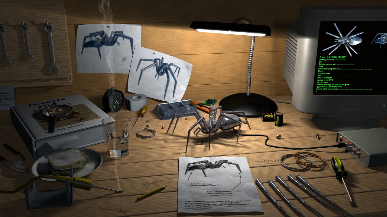
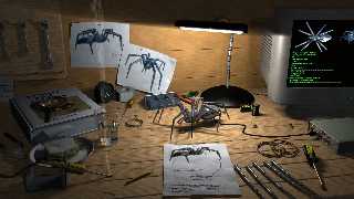
After a more or less satisfactory exam at University, I've made some other
little changes. I know the scene is far to be finished, but I'm quickly
getting bored of it...is there anyone who knows this pathology? After about
one month of work I use to leave my scenes incomplete, just when I should
add those little details that make a scene a good one... Anyway I completely
agree with Robert Becraft, we do have to be fussy in order to make a
realistic scene which tells a realistic story, the problem here is that I
have no eletronic tools as reference and my imagination is completely dry,
so I have no idea which other tools I could model.
I want to thank Tom Melly for donating me his sandwich (hoping he's not
starving now...): it looks great (the mayo macro which puts the mayonnaise
in the sandwich with the trace() function made me go crazy!).

Finally I have a couple of questions about some problems which puzzled me:
  -I tried a radiosity version of the scene and I got very strange results:
even with high quality radiosity settings (incredibly slow even with a 1Ghz
machine...) the book looked completely yellow...I can post the image if
someone is interested in this mistery.
  -when I add a new texture layer to make the surfaces look dirty the
surfaces theirselves look much brighter and the normals seem to disappear,
so that I have to darken the first layer colour and to increase the bump
size of the normals. The texture layer I'm talking about is something like
this: texture {pigment {wrinkles color_map {[0 rgbt <0,0,0,1>][1 rgbt
<0,0,0,0.5>]}}      As you can see the color is always black, but with this
layer all my objects look brighter.
Does the diffuse value take into account the rgb values of all the visible
layers or just of the last?

p.s. Any suggestion about how to fill up the empty space in the desk and in
the walls will be really appreciated!
Thanks in advance,

JRG.
Post a reply to this message
Attachments:
Download 'irtc_big.jpg' (232 KB)
Preview of image 'irtc_big.jpg'
|
|
| |
| |
|
|
|
|
| |
| |
|
|
Personally I think the detail and "stuff" you have there is great.

The desk isn't scratched up enough, and maybe the bottom part of the
wall that touches the desk. The new sandwich is a great improvement.
The electronic equipment is fine, seems like a small time
non-professional basement type shop, nothing fancy.

If it were me I'd beat up the desk with scratches and some
dirt/smudge/grease.

if I take a broad view, the only things that don't look photorealistic
are the soldering iron, the PC screen, and the black/yellow handle of
the screwdriver (it's too clean).


Don't get me wrong, I could not do this in a month.
This is a really great pic, and I hope you get a really high score.

Is

JRG wrote:

> After a more or less satisfactory exam at University, I've made some other
> little changes. I know the scene is far to be finished, but I'm quickly
> getting bored of it...is there anyone who knows this pathology? After about
> one month of work I use to leave my scenes incomplete, just when I should
> add those little details that make a scene a good one... Anyway I completely
> agree with Robert Becraft, we do have to be fussy in order to make a
> realistic scene which tells a realistic story, the problem here is that I
> have no eletronic tools as reference and my imagination is completely dry,
> so I have no idea which other tools I could model.
> I want to thank Tom Melly for donating me his sandwich (hoping he's not
> starving now...): it looks great (the mayo macro which puts the mayonnaise
> in the sandwich with the trace() function made me go crazy!).
>
> Finally I have a couple of questions about some problems which puzzled me:
>   -I tried a radiosity version of the scene and I got very strange results:
> even with high quality radiosity settings (incredibly slow even with a 1Ghz
> machine...) the book looked completely yellow...I can post the image if
> someone is interested in this mistery.
>   -when I add a new texture layer to make the surfaces look dirty the
> surfaces theirselves look much brighter and the normals seem to disappear,
> so that I have to darken the first layer colour and to increase the bump
> size of the normals. The texture layer I'm talking about is something like
> this: texture {pigment {wrinkles color_map {[0 rgbt <0,0,0,1>][1 rgbt
> <0,0,0,0.5>]}}      As you can see the color is always black, but with this
> layer all my objects look brighter.
> Does the diffuse value take into account the rgb values of all the visible
> layers or just of the last?
>
> p.s. Any suggestion about how to fill up the empty space in the desk and in
> the walls will be really appreciated!
> Thanks in advance,
>
> JRG.
>
>
>
>
>
> irtc_big.jpg
>
> Content-Type:
>
> image/jpeg
> Content-Encoding:
>
> x-uuencode
>
>
Post a reply to this message
|
|
| |
| |
|
|
|
|
| |
| |
|
|
Great detail on that clutter, and its positioning is realistic too.
I'd say it's very near completion. One suggestion, try using light
fading; fade_power and fade_distance.
About the radiosity question: what kind of yellow? Could it be coming
from the wood? IIRC you might try changing distance_maximum.
--
David Fontaine <dav### [at] faricy net> ICQ 55354965
My raytracing gallery: http://davidf.faricy.net/ net> ICQ 55354965
My raytracing gallery: http://davidf.faricy.net/
Post a reply to this message
|
|
| |
| |
|
|
|
|
| |
| |
|
|
"JRG" <jrg### [at] hotmailcom> wrote in message
news:3b291507@news.povray.org...
> After a more or less satisfactory exam at University, I've made some other
> little changes. I know the scene is far to be finished, but I'm quickly
> getting bored of it...is there anyone who knows this pathology? After
about
> one month of work I use to leave my scenes incomplete, just when I should
> add those little details that make a scene a good one... Anyway I
completely
> agree with Robert Becraft, we do have to be fussy in order to make a
> realistic scene which tells a realistic story, the problem here is that I
> have no eletronic tools as reference and my imagination is completely dry,
> so I have no idea which other tools I could model.

I find the lack of technical equipment/tools adds to the mystery of this
picture. The batteries, screws etc are all too big for the spider device.
Where did it come from ... how did it get built... how did the person get
it???

If you want to go the other way & imply that it is being built, then you
would need small screws, small precision (jewelers) screw drivers, small
pliers, perhaps a spare leg joint/hinge, small circuit board, small electric
motor, etc...

----

The main things that bother me about the picture is the was the top of the
computer monitor disappears but the screen display  goes up into the
blackness. I think that the screen would be better without the spider
display, just the mysterious green character cell text.

----

Still a fantastic picture... I only wish that I could create something as
interesting.

Chris
Post a reply to this message
|
|
| |
| |
|
|
|
|
| |
| |
|
|
Connect the spider to an oscilloscope!
Post a reply to this message
|
|
| |
| |
|
|
|
|
| |
| |
|
|
Exceptional picture.
Oldstench................
Post a reply to this message
|
|
| |
| |
|
|
|
|
| |
| |
|
|
Very nice.. the only thing I would say is that I think the glass is a little
too big and looks out of proportion - the base doesn't appear that much
smaller than the sandwich!  Apart from that and a bit of dirt and grime
you've got a top quality image.

Peter Cracknell

http://www.petercracknell.com
Post a reply to this message
|
|
| |
| |
|
|
|
|
| |
| |
|
|
"David Fontaine" <dav### [at] faricynet> ha scritto nel messaggio
news:3B2935F0.E5BA5AA9@faricy.net...
> Great detail on that clutter, and its positioning is realistic too.
>
> I'd say it's very near completion.  One suggestion, try using light
> fading; fade_power and fade_distance.

My light has fade_power 4 and fade_distance 12...
Probably you are referring to the fill light.

> About the radiosity question: what kind of yellow?  Could it be coming
> from the wood?  IIRC you might try changing distance_maximum.

I thought distance_maximum was ignored by MegaPov radiosity, but I could be
wrong...
Post a reply to this message
|
|
| |
| |
|
|
|
|
| |
| |
|
|
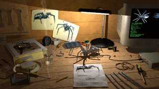
Anyway, here's how it looked after one hour and twelve minutes of rendering:
Post a reply to this message
Attachments:
Download 'irtc_rad.jpg' (18 KB)
Preview of image 'irtc_rad.jpg'
|
|
| |
| |
|
|
|
|
| |
| |
|
|
I think it loks great!  I don't have an answer for you about the 'dirt
layer' but I hope you figure it out.  The only nitpick I have is that the
writing on the desk is too neat.  There are a ton of free fonts on the
internet that have a scribbled scrawl look; one of two of these would make
the writing more realistic.  Try changing font sizes as well as font types
too.

Rich
Post a reply to this message
|
|
| |
| |
|
|
|
|
| |
| |
|
|
JRG wrote:
>
> After a more or less satisfactory exam at University, I've made some other
> little changes. I know the scene is far to be finished, but I'm quickly
> getting bored of it...is there anyone who knows this pathology? After about
> one month of work I use to leave my scenes incomplete, just when I should
> add those little details that make a scene a good one... Anyway I completely
> agree with Robert Becraft, we do have to be fussy in order to make a
> realistic scene which tells a realistic story, the problem here is that I
> have no eletronic tools as reference and my imagination is completely dry,
> so I have no idea which other tools I could model.
> I want to thank Tom Melly for donating me his sandwich (hoping he's not
> starving now...): it looks great (the mayo macro which puts the mayonnaise
> in the sandwich with the trace() function made me go crazy!).

It looks really good, just i think the smoke looks fairly bright.
Furthermore the shadowed parts of the wood on the left look much brighter
than the left side of the book for example.  Probably reducing the ambient
would help.

As 'Is' mentioned, the table looks to clan apart from the 'writings'.
Some more (previously made) burns from the iron and some scratches would
look nice.

> Finally I have a couple of questions about some problems which puzzled me:
>   -I tried a radiosity version of the scene and I got very strange results:
> even with high quality radiosity settings (incredibly slow even with a 1Ghz
> machine...) the book looked completely yellow...I can post the image if
> someone is interested in this mistery.

I had a look at the small radiosity version and it looks fairly natural
(as far as i can see at that size)  You should expect a yellow tint with
all the wood.  The other walls of the room are important too of course,
furthermore you an vary the light source color.

And of course don't forget to turn all ambient finishes to 0 (apart from
the lamp)

Christoph

--
Christoph Hormann <chr### [at] gmxde>
IsoWood include, radiosity tutorial, TransSkin and other
things on: http://www.schunter.etc.tu-bs.de/~chris/
Post a reply to this message
|
|
| |
| |
|
|
|
|
| |
| |
|
|
"Is" <mee### [at] yahoocom> ha scritto nel messaggio
news:3B2### [at] yahoocom...
> Personally I think the detail and "stuff" you have there is great.

Thank you, but I think there is still too empty space.

> The desk isn't scratched up enough, and maybe the bottom part of the
> wall that touches the desk.

Yeah, you're probably right.


> if I take a broad view, the only things that don't look photorealistic
> are the soldering iron, the PC screen, and the black/yellow handle of
> the screwdriver (it's too clean).

I'll try to fix the handle of the screwdriver. As concern the soldering iron
and the screen you could suggest me what is wrong. ;)


> Don't get me wrong, I could not do this in a month.

As a matter of fact, I decided to start this scene on May the 25th. As
concern the spider, it took me the first week of May to model it, just at
the beginning of the round, but I couldn't get any good idea on how using it
until the end of the month.

> This is a really great pic, and I hope you get a really high score.

It's just my second entry, I don't expect that much. Thank you anyway.

JRG.
Post a reply to this message
|
|
| |
| |
|
|
|
|
| |
| |
|
|
"Chris Poole" <chr### [at] usaskca> ha scritto nel messaggio
news:3b293d91$1@news.povray.org...
>
> I find the lack of technical equipment/tools adds to the mystery of this
> picture. The batteries, screws etc are all too big for the spider device.
> Where did it come from ... how did it get built... how did the person get
> it???

Well, to say the truth, I'd want you to know that the spider has been built.
If the scene doesn't show this, well, there's lack of something...

> If you want to go the other way & imply that it is being built, then you
> would need small screws, small precision (jewelers) screw drivers, small
> pliers, perhaps a spare leg joint/hinge, small circuit board, small
electric
> motor, etc...

I tried to model a small circuit board, but I didn't get any good result.
Probably I need to find some photos or drawings to use as reference. BTW
I'll try to add smaller screws, screwdrivers et similia.

> The main things that bother me about the picture is the was the top of the
> computer monitor disappears but the screen display  goes up into the
> blackness. I think that the screen would be better without the spider
> display, just the mysterious green character cell text.

I didn't notice it before you told me, but doesn't this happen in real life?
IMHO the shadow shouldn't darken the PC screen since it's emitting light. I
may be wrong.

> Still a fantastic picture...

Thank you a lot.

JRG.
Post a reply to this message
|
|
| |
| |
|
|
|
|
| |
| |
|
|
"Mick Hazelgrove" <mic### [at] mhazelgrovefsnetcouk> ha scritto nel messaggio
news:3b29a9d9@news.povray.org...
> Connect the spider to an oscilloscope!
>

Now you can be sure I will.

JRG.
Post a reply to this message
|
|
| |
| |
|
|
|
|
| |
| |
|
|
"Peter Cracknell" <pc### [at] lineonenet> ha scritto nel messaggio
news:3b29ca2f@news.povray.org...
> Very nice.. the only thing I would say is that I think the glass is a
little
> too big and looks out of proportion - the base doesn't appear that much
> smaller than the sandwich!  Apart from that and a bit of dirt and grime
> you've got a top quality image.
>
> Peter Cracknell
>

Dunno... maybe the sandwich is too small. Many people in my family told me
that the glass was too small (in the very first versions of the scene), so I
scale it up.
What do you all mean by dirt?: another texture layer or something more
material?

JRG.
Post a reply to this message
|
|
| |
| |
|
|
|
|
| |
| |
|
|
"Oldstench" <sor### [at] butnocom> ha scritto nel messaggio
news:7anjit44qp8rqtl4kfpf8rlvlf3ftagq1v@4ax.com...
> Exceptional picture.
> Oldstench................

Thank you very much. I'm glad you like it.
JRG.
Post a reply to this message
|
|
| |
| |
|
|
|
|
| |
| |
|
|
"Christoph Hormann" <chr### [at] gmxde> ha scritto nel messaggio
news:3B2A3153.F1EC509E@gmx.de...
> It looks really good, just i think the smoke looks fairly bright.
> Furthermore the shadowed parts of the wood on the left look much brighter
> than the left side of the book for example.  Probably reducing the ambient
> would help.

This is due to the dirty layer, as I mentioned in the main post. All
textures have ambient set to 0. The lamp is an emitting media, so the only
textures which don't have ambient 0 are the PC screen and the fluorescent
fingers of the clock.


> I had a look at the small radiosity version and it looks fairly natural
> (as far as i can see at that size)  You should expect a yellow tint with
> all the wood.  The other walls of the room are important too of course,
> furthermore you an vary the light source color.

I'll post a larger image to show how odd these yellow tones look.

JRG
Post a reply to this message
|
|
| |
| |
|
|
|
|
| |
| |
|
|
"Rich" <SrP### [at] ricoswebcom> ha scritto nel messaggio
news:Xns90C16330CF586spammindspringcom@204.213.191.228...
>   I think it loks great!  I don't have an answer for you about the 'dirt
> layer' but I hope you figure it out.  The only nitpick I have is that the
> writing on the desk is too neat.  There are a ton of free fonts on the
> internet that have a scribbled scrawl look; one of two of these would make
> the writing more realistic.  Try changing font sizes as well as font types
> too.
>
> Rich
>

Yeah, I have really not many fonts...
I'll search in the net.
Thank you anyway.
JRG
Post a reply to this message
|
|
| |
| |
|
|
|
|
| |
| |
|
|
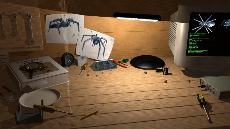
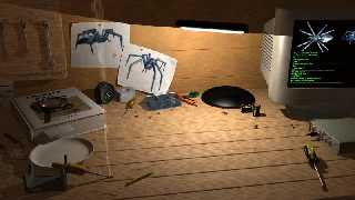
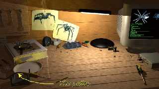
I rendered a bigger version. This time I commented out some include files
and the yellow tones disappeared (as you can see).
So, the gulty is not the wood texture, but something among:
spider,
spider legs,
piece of paper,
sphere sweeps,
sandwich,
glass of water.
I'll start to add one by one these objects, and when the yellow tones come
back I'll discover what causes them.
Any stake?

Anyway, do you think that radiosity is a better choice than fill light?
The scene looks a bit too reddish: should I increase the grey_threshold?
Can you suggest me any good radiosity settings? High quality but not too
slow rendering (oximorous?) would be great (this one uses a humble 50-count
radiosity setting and took 29 minutes to render).

JRG.
Post a reply to this message
Attachments:
Download 'irtc_rad.jpg' (50 KB)
Preview of image 'irtc_rad.jpg'
|
|
| |
| |
|
|
|
|
| |
| |
|
|
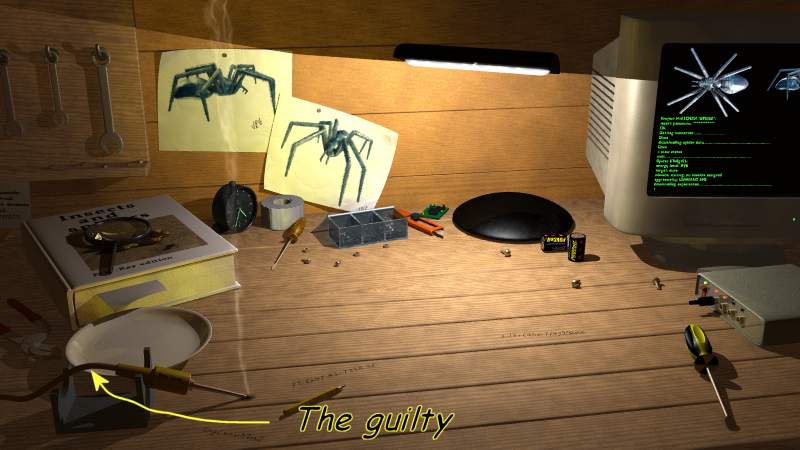
We have a winner! aehm...
The guilty was the wire of the soldering iron. (I simply add it to the last
scene).
It's rather strange, isn't it?
Now the question is: is this a radiosity bug or a sphere_sweep bug?
How can I get rid of this? Who knows? Who am I to make these questions?
Does God exist? Is this yellow tone a divine manifestation? Will the
Universe collapse?
Will POV 3.5 be ready before I'm eighty?

J"Hamlet"G
Post a reply to this message
Attachments:
Download 'bad_rad.jpg' (44 KB)
Preview of image 'bad_rad.jpg'
|
|
| |
| |
|
|
|
|
| |
| |
|
|
"JRG" <jrg### [at] hotmailcom> wrote in message
news:3b2a34d2@news.povray.org...
>
> "Chris Poole" <chr### [at] usaskca> ha scritto nel messaggio
> news:3b293d91$1@news.povray.org...
> >
> > I find the lack of technical equipment/tools adds to the mystery of this
> > picture. The batteries, screws etc are all too big for the spider
device.
> > Where did it come from ... how did it get built... how did the person
get
> > it???
>
> Well, to say the truth, I'd want you to know that the spider has been
built.
> If the scene doesn't show this, well, there's lack of something...
>
> > If you want to go the other way & imply that it is being built, then you
> > would need small screws, small precision (jewelers) screw drivers, small
> > pliers, perhaps a spare leg joint/hinge, small circuit board, small
> electric
> > motor, etc...
>
> I tried to model a small circuit board, but I didn't get any good result.
> Probably I need to find some photos or drawings to use as reference. BTW
> I'll try to add smaller screws, screwdrivers et similia.


       I really like your image, to me it shows a sign of 'forward
thinking'.

    But in reality I think that if this is a 'workshop', and you want to
show that the spider has been made by you, then you 'must' have a few more
tools on your workbench. Being a jeweller, I would ask questions like, "How
did you drill the holes in the legs?" or similar, but to be honest, there
are so many questions that I would ask, (engineering wise), I won't list/ask
them here.

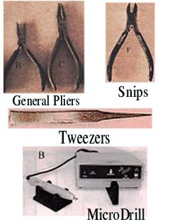
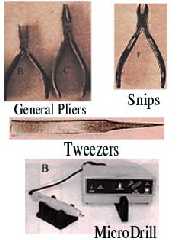
     You would definately need some pliers, and tweezers for those small
screws. You have some wire in your image, so you would also need some snips,
so I hope that the image attached is useful, although I'm sorry for the
quality, (came straight out of a trade catalogue).

  And how about getting rid of the spanner rack? <Ouch!>, and putting a rack
of pliers on the wall next to the computer?

    Sounds easy, I know, but it isn't.  Good luck, I like it.

    ~Steve~


> JRG.
>
>
>
>
Post a reply to this message
Attachments:
Download 'Jewellers tools.jpg' (49 KB)
Preview of image 'Jewellers tools.jpg'
|
|
| |
| |
|
|
|
|
| |
| |
|
|
JRG <jrg### [at] hotmailcom> wrote in message
news:3b2a36b1$1@news.povray.org...
>
>
>
> Yeah, I have really not many fonts...
> I'll search in the net.


Or better, if you have a scanner write the notes yourself and
scan them in.

Gail
*************************************************************************
* gsh### [at] monotixcoza                *   Step into the abyss,           *
* http://www.rucus.ru.ac.za/~gail/   *   and let go.          Babylon 5 *
*************************************************************************
* The difficult we do immediately, the impossible takes a little longer *
*************************************************************************
Post a reply to this message
|
|
| |
| |
|
|
|
|
| |
| |
|
|
JRG wrote:
>
> My light has fade_power 4 and fade_distance 12...
> Probably you are referring to the fill light.

Really?  It's hard to tell.  I would expect a tad darker around the
edges.  Though you don't want those parts to be invisible... on second
thought, it's fine how it is. :)

--
David Fontaine  <dav### [at] faricynet>  ICQ 55354965
My raytracing gallery:  http://davidf.faricy.net/
Post a reply to this message
|
|
| |
| |
|
|
|
|
| |