|
|
|
|
|
|
| |
| |
|
|
|
|
| |
| |
|
|
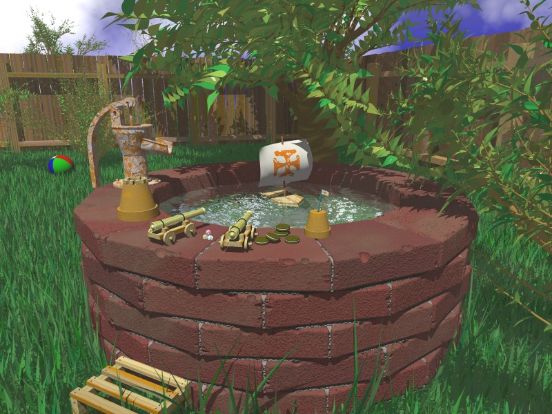
Here's a second pass on my render. I've
added more grasses, they are also thinner
and more random lengths. I added more
texture to the bricks and misc. objects.
Fabien suggested I look at the source for
Bouf's worship entry, and I extracted a
bit of code that I modified for the texture of
the pump. I turned down the ambient light and
modified many of the objects' diffuse and
ambient settings as many of you suggested. I
pumped up the colors a bit and after it was
rendered, I adjusted it again in PSP6, but just
the contrast.

I have yet to figure out what object I will add on
the left side. I like the idea of an old lawnmower,
as suggested by Dave Blandston. Next I'll try
to work on that sky.

Thanks again for your input. I look forward to
your continued comments.

Have a great day!
=Bob=
Post a reply to this message
Attachments:
Download 'Fortress5.jpg' (166 KB)
Preview of image 'Fortress5.jpg'
|
|
| |
| |
|
|
|
|
| |
| |
|
|
"=Bob=" <Bob### [at] threestrands com> wrote:
> Here's a second pass on my render.
This one has really great atmosphere and setting, and a good idea.
Suggestions:
The grass is still too uniform IMO, perhaps you should try throwing in other
types of plants to make it look more like a distended corner of a garden.
The leaves of the trees are a bit too flat, a more defined texture and/or
some shinyness might help.
You could add a trickle of water to the nozzle of the pump.
As for what object to put on the left side; I personally don't much like the
idea of a lawnmower... This looks like a secluded corner of a garden, a bit
distended and wild, the kind of place that seldom sees a lawnmower. More
vegetation (trees, bushes) behind the fence would enhance that air of
intimacy even more - provided that's what you are going for. A covered
woodpile or little shed might look good at the left side (this scene
resembles me of a garden I knew as a kid, which had a covered stack of
firewood in a similar setting).
--
Margus Ramst
Personal e-mail: mar### [at] peakeduee
TAG (Team Assistance Group) e-mail: mar### [at] tagpovrayorg
Home page http://www.hot.ee/margusrt
Post a reply to this message
|
|
| |
| |
|
|
|
|
| |
| |
|
|
Much improved! I did notice that the wood texture on the "box" in the
lower left looks a little od on the upright parts. Almost as if the
grain is running in the wrong direction.

Ken Matassa
Post a reply to this message
|
|
| |
| |
|
|
|
|
| |
| |
|
|
This looks much better than the first version. I don't think it needs
anything on the left side. It's looking great as it is. Maybe just pull the
ball up closer to the viewer and 'weather' it a bit. If I added anything it
would be some ants on the march towards those cookies :)( which look a
little too green BTW, at least on my monitor. ).
Suggestions:
    Vary the grass blade color as you've done with the closer leaves and add
some bump and shine to all of the foliage.

    Generally 'dirty-up' and 'weather' everything as you've done with the
bricks and pump: grimy smudged hand/fingerprints on the toys, darken the
pump handle a bit where its most often grabbed, wrinkles and frayed edges to
the paper sail, desaturate the fence colors pushing them closer to gray, add
splintering and dirt to the step/crate thing, etc.

    For inspiration, check out dvgarage.com Alex Lindsay, who worked for
several years on Star Wars Episode I and with ILM for awhile, is offering
free daily and weekly 3D tutorials based on principles and not geared toward
any specific package.

    Keep going, this developing into a great pic and I'm looking forward to
the final result.

Batronyx™ ^"^
bat### [at] cadronhsacom
Post a reply to this message
|
|
| |
| |
|
|
|
|
| |
| |
|
|
Whoops! It is...
Thanks!
=Bob=

"Ken Matassa" <kma### [at] pacbellnet> wrote in message
news:3AC### [at] pacbellnet...
: Much improved! I did notice that the wood texture on the "box" in the
: lower left looks a little od on the upright parts. Almost as if the
: grain is running in the wrong direction.
:
: Ken Matassa
Post a reply to this message
|
|
| |
| |
|
|
|
|
| |
| |
|
|
I like the setting very much.

I'd like to see procedural patina like that done by Ben Pashke under p.b.i.
posted 8 March 2001 on the pump.

Nice work.

Nekar


"=Bob=" <Bob### [at] threestrandscom> wrote in message
news:3ac008e4@news.povray.org...
> Here's a second pass on my render. I've
> added more grasses, they are also thinner
> and more random lengths. I added more
> texture to the bricks and misc. objects.
> Fabien suggested I look at the source for
> Bouf's worship entry, and I extracted a
> bit of code that I modified for the texture of
> the pump. I turned down the ambient light and
> modified many of the objects' diffuse and
> ambient settings as many of you suggested. I
> pumped up the colors a bit and after it was
> rendered, I adjusted it again in PSP6, but just
> the contrast.
>
> I have yet to figure out what object I will add on
> the left side. I like the idea of an old lawnmower,
> as suggested by Dave Blandston. Next I'll try
> to work on that sky.
>
> Thanks again for your input. I look forward to
> your continued comments.
>
> Have a great day!
> =Bob=
>
>
>
>
>
Post a reply to this message
|
|
| |
| |
|
|
|
|
| |
| |
|
|
Thanks for the suggestions! That's where
I need to go with this pic now. Lots of effort
to get it just right. Not sure why the cookies
would look green. Might have been the
increased contrast. I'll check it out.

You're not alone on the grass and leaf textures.
And I'll check out Alex Lindsay.

=Bob=

"Batronyx" <bat### [at] cadronhsacom> wrote in message news:3ac02fca@news.povray.org...

[Some deletions for brevity]

:     Vary the grass blade color as you've done with the closer leaves and add
: some bump and shine to all of the foliage.
:     Generally 'dirty-up' and 'weather' everything as you've done with the
: bricks and pump: grimy smudged hand/fingerprints on the toys, darken the
: pump handle a bit where its most often grabbed, wrinkles and frayed edges to
: the paper sail, desaturate the fence colors pushing them closer to gray, add
: splintering and dirt to the step/crate thing, etc.
:     For inspiration, check out dvgarage.com Alex Lindsay, who worked for
: several years on Star Wars Episode I and with ILM for awhile, is offering
: free daily and weekly 3D tutorials based on principles and not geared toward
: any specific package.
:     Keep going, this developing into a great pic and I'm looking forward to
: the final result.
: Batronyx™ ^"^
: bat### [at] cadronhsacom
Post a reply to this message
|
|
| |
| |
|
|
|
|
| |
| |
|
|
Thanks Margus,

I think you're right. It needs more of the
"wild" backyard look. Still trying to get those
leaves to pop out. I think I like the idea of
a wood pile and the water drop. Thanks
for the suggestions.

Have a great day!
=Bob=

"Margus Ramst" <mar### [at] peakeduee> wrote in message news:3ac00e7f@news.povray.org...
: "=Bob=" <Bob### [at] threestrandscom> wrote:
:
: > Here's a second pass on my render.
:
: This one has really great atmosphere and setting, and a good idea.
: Suggestions:
: The grass is still too uniform IMO, perhaps you should try throwing in other
: types of plants to make it look more like a distended corner of a garden.
: The leaves of the trees are a bit too flat, a more defined texture and/or
: some shinyness might help.
: You could add a trickle of water to the nozzle of the pump.
: As for what object to put on the left side; I personally don't much like the
: idea of a lawnmower... This looks like a secluded corner of a garden, a bit
: distended and wild, the kind of place that seldom sees a lawnmower. More
: vegetation (trees, bushes) behind the fence would enhance that air of
: intimacy even more - provided that's what you are going for. A covered
: woodpile or little shed might look good at the left side (this scene
: resembles me of a garden I knew as a kid, which had a covered stack of
: firewood in a similar setting).
:
: --
: Margus Ramst
:
: Personal e-mail: mar### [at] peakeduee
: TAG (Team Assistance Group) e-mail: mar### [at] tagpovrayorg
: Home page http://www.hot.ee/margusrt
Post a reply to this message
|
|
| |
| |
|
|
|
|
| |
| |
|
|
Thanks Nekar,

I'll check out the procedural patina. I copied
the pseudo code and read the thread, so
I'll give a go in the next couple of days.

Best regards...
=Bob=

"Nekar Xenos" <vir### [at] iconcoza> wrote in message news:3ac03342@news.povray.org...
: I like the setting very much.
:
: I'd like to see procedural patina like that done by Ben Pashke under p.b.i.
: posted 8 March 2001 on the pump.
:
: Nice work.
:
: Nekar
Post a reply to this message
|
|
| |
| |
|
|
|
|
| |
| |
|
|
Looks good, I think maybe they need some neighbors though;
a house next door would work. I can see the grass through the
fence openings extending to infinity and it sort of makes me
feel like this backyard exists in the twilight zone.

--
Phil
...coffee?...yes please! extra sugar,extra cream...Thank you.
Post a reply to this message
|
|
| |
| |
|
|
|
|
| |
| |
|
|
looks much better - i like this new trend of developing irtc entries in
public, lets hope it continues

the cookies are to green, soft shadows?, and not sure i am 100% keen on the
rusty pump texture, but aside from that, damn good :)


--
Rick

POV-Ray News & Resources - http://Povray.co.uk
Kitty5 WebDesign - http://Kitty5.com
Hi-Impact web site design & database driven e-commerce
TEL : +44 (01625) 266358 - FAX : +44 (01625) 611913 - ICQ : 15776037

PGP Public Key
http://pgpkeys.mit.edu:11371/pks/lookup?op=get&search=0x231E1CEA
Post a reply to this message
|
|
| |
| |
|
|
From: Christoph Hormann
Subject: Re: 2nd WIP, maybe IRTC entry (180k)
Date: 27 Mar 2001 06:35:00
Message: <3AC07AE5.35B7FFBB@gmx.de>
|
|
|
| |
| |
|
|
It mostly looks better, but the bricks are worse IMO (the additional
regular roughness does not seem realistic)

The grass looks better, but the water still seems too bright to me.

Maybe make the rust on the pump a bit darker.

Christoph


--
Christoph Hormann <chr### [at] gmxde>
IsoWood include, radiosity tutorial, TransSkin and other
things on: http://www.schunter.etc.tu-bs.de/~chris/
Post a reply to this message
|
|
| |
| |
|
|
|
|
| |
| |
|
|
Much improved.  Shadows still need to be darker, IMO.  I like the flaky
texture of the pump.  Have you considered using a slope map, so that the
bottoms are rustier than the top segments?  I've had some good luck with
making good rust that way (my IRTC entry uses rust a lot, but the details
are too fine to see.  I can post an example if you like of a detail shot)
This assumes you're using Mega, but from your radiosity (Is it radiosity?),
it certainly looks that way.

The problem with the trees seems to be related to the sun (light source)
being directly overhead, or nearly.  Maybe moving it in towards the camera,
so that things are shadowed behind themselves (I recommend at least 10
degrees off, though, either left or right.  Directly in line with the camera
has its own problems) will help. Otherwise, all the leaves are in shadow and
so you only see their ambient color, resulting in flatness.

Geoff
Post a reply to this message
|
|
| |
| |
|
|
|
|
| |
| |
|
|
"Rick [Kitty5]" wrote:
>
> looks much better - i like this new trend of developing irtc entries in
> public, lets hope it continues
>
> the cookies are to green, soft shadows?, and not sure i am 100% keen on the
> rusty pump texture, but aside from that, damn good :)

Yeah, the mottled appearence just doesnt sit right. I'd go with a dark
red rust texture on the pump. Like cast iron thats been sitting out a
while.

--
Derek Stark
Linux Admin - eSN
dms### [at] esupportnowcom
xt 8952
Post a reply to this message
|
|
| |
| |
|
|
|
|
| |
| |
|
|
Batronyx wrote:
>
>     For inspiration, check out dvgarage.com Alex Lindsay, who worked for
> several years on Star Wars Episode I and with ILM for awhile, is offering
> free daily and weekly 3D tutorials based on principles and not geared toward
> any specific package.

I am so going to spend all my time on that site!!!!

--
Francois Labreque | The surest sign of the existence of extra-
    flabreque     | terrestrial intelligence is that they never
        @         | bothered to come down here and visit us!
  videotron.ca    |                             - Calvin
Post a reply to this message
|
|
| |
| |
|
|
|
|
| |
| |
|
|
Excellent artwork. I get a nastolgic feeling looking at this image; it's
very earthy and organic. I can actually almost smell the thick perfume that
must hang in the air here. It has a certain something that I can't put my
finger on, but it's managed to capture something. :)

I can't wait to see what the final looks like!

D.J.

"=Bob=" <Bob### [at] threestrandscom> wrote in message
news:3ac008e4@news.povray.org...
> Here's a second pass on my render. I've
> added more grasses, they are also thinner
> and more random lengths. I added more
> texture to the bricks and misc. objects.
> Fabien suggested I look at the source for
> Bouf's worship entry, and I extracted a
> bit of code that I modified for the texture of
> the pump. I turned down the ambient light and
> modified many of the objects' diffuse and
> ambient settings as many of you suggested. I
> pumped up the colors a bit and after it was
> rendered, I adjusted it again in PSP6, but just
> the contrast.
>
> I have yet to figure out what object I will add on
> the left side. I like the idea of an old lawnmower,
> as suggested by Dave Blandston. Next I'll try
> to work on that sky.
>
> Thanks again for your input. I look forward to
> your continued comments.
>
> Have a great day!
> =Bob=
>
>
>
>
>
Post a reply to this message
|
|
| |
| |
|
|
|
|
| |
| |
|
|
=Bob= <Bob### [at] threestrandscom> wrote in message
news:3ac008e4@news.povray.org...
> Thanks again for your input. I look forward to
> your continued comments.
>
> Have a great day!
> =Bob=
>
>
 Bob,

I think the render is great.  I would suggest a little noise on the tree
leaf texture.  They look too much like paper cut-outs.

Khaver
Post a reply to this message
|
|
| |
| |
|
|
|
|
| |
| |
|
|
Thanks Phil,

Yeah, I need to work on the area
beyond the fence. All I did was just
put some green spheres and boxes
in the distance to break up the horizon.

Thanks again!
=Bob=

"Phil Clute" <pcl### [at] tiacnet> wrote in message
news:3AC054F4.3878C647@tiac.net...
: Looks good, I think maybe they need some neighbors though;
: a house next door would work. I can see the grass through the
: fence openings extending to infinity and it sort of makes me
: feel like this backyard exists in the twilight zone.
: Phil
: ...coffee?...yes please! extra sugar,extra cream...Thank you.
Post a reply to this message
|
|
| |
| |
|
|
|
|
| |
| |
|
|
Thanks Rick,

I'm not sure why the cookies look green.
I'm at work now and they look green here,
but at home they don't. Same monitor in
both places, different video card.

I really have enjoyed this development in
public too.

Thanks for all your help!
=Bob=

"Rick [Kitty5]" <ric### [at] kitty5com> wrote in message
news:3ac06fc8$1@news.povray.org...
: looks much better - i like this new trend of developing irtc entries in
: public, lets hope it continues
:
: the cookies are to green, soft shadows?, and not sure i am 100% keen on
the
: rusty pump texture, but aside from that, damn good :)
:
:
: --
: Rick
:
: POV-Ray News & Resources - http://Povray.co.uk
: Kitty5 WebDesign - http://Kitty5.com
: Hi-Impact web site design & database driven e-commerce
: TEL : +44 (01625) 266358 - FAX : +44 (01625) 611913 - ICQ : 15776037
:
: PGP Public Key
: http://pgpkeys.mit.edu:11371/pks/lookup?op=get&search=0x231E1CEA
:
:
Post a reply to this message
|
|
| |
| |
|
|
|
|
| |
| |
|
|
Thanks Christoph,

I'll try to tone down the roughness on
the bricks a little, I think it needs some,
but maybe I overdid it. I have ambient and
diffuse values of both 0.1 for the water.
It's an isosurface with a bump normal.
Maybe the ambient and diffuse values
should be 0? The bottom of the well
is the mortar texture, so it could be that
it's transmitting that color. I can also
tell that it's reflecting the clouds on the
surface. I'll try some experiments.

I surely appreciate everyone's help!
=Bob=

"Christoph Hormann" <chr### [at] gmxde> wrote in message
news:3AC07AE5.35B7FFBB@gmx.de...
:
: It mostly looks better, but the bricks are worse IMO (the additional
: regular roughness does not seem realistic)
: The grass looks better, but the water still seems too bright to me.
: Maybe make the rust on the pump a bit darker.
: Christoph
: Christoph Hormann <chr### [at] gmxde>
: IsoWood include, radiosity tutorial, TransSkin and other
: things on: http://www.schunter.etc.tu-bs.de/~chris/
Post a reply to this message
|
|
| |
| |
|
|
|
|
| |
| |
|
|
Hi Geoff,

Yes. I'm using MegaPov, but I'm not using
any radiosity. I tried it, but it was just way too
slow to render. I might try it again.

I'll try moving the light source around. Do you
think you should be able to see the trunk of the
tree in the shadows? I wasn't sure.  I think you
are right about it's position being the reason
for the flatness of the leaves. There's actually
quite a bit of phong for the leaves, but it just
won't show up. I'll try moving the camera
around just to take a look from overhead to
get a better idea of what's going on.

I'd love to see a detail shot of your rust, please
post.

Again, I really appreciate everyone's comments,
suggestions and help!
=Bob=

"Geoff Wedig" <wed### [at] darwinepbicwruedu> wrote in message
news:3ac08970@news.povray.org...
: Much improved.  Shadows still need to be darker, IMO.  I like the flaky
: texture of the pump.  Have you considered using a slope map, so that the
: bottoms are rustier than the top segments?  I've had some good luck with
: making good rust that way (my IRTC entry uses rust a lot, but the details
: are too fine to see.  I can post an example if you like of a detail shot)
: This assumes you're using Mega, but from your radiosity (Is it
radiosity?),
: it certainly looks that way.
:
: The problem with the trees seems to be related to the sun (light source)
: being directly overhead, or nearly.  Maybe moving it in towards the
camera,
: so that things are shadowed behind themselves (I recommend at least 10
: degrees off, though, either left or right.  Directly in line with the
camera
: has its own problems) will help. Otherwise, all the leaves are in shadow
and
: so you only see their ambient color, resulting in flatness.
:
: Geoff
Post a reply to this message
|
|
| |
| |
|
|
|
|
| |
| |
|
|
Thanks D.J.,

Thank you for the compliments. Margus
mentioned the same kind of feeling about
it. It feels wonderful to have made something
that connects with others. Maybe we've all
been there?

Best regards...
=Bob=

"D.J. Brown" <ext### [at] hotmailcom> wrote in message
news:3ac0b788$1@news.povray.org...
: Excellent artwork. I get a nastolgic feeling looking at this image; it's
: very earthy and organic. I can actually almost smell the thick perfume
that
: must hang in the air here. It has a certain something that I can't put my
: finger on, but it's managed to capture something. :)
: I can't wait to see what the final looks like!
: D.J.
Post a reply to this message
|
|
| |
| |
|
|
From: Christoph Hormann
Subject: Re: 2nd WIP, maybe IRTC entry (180k)
Date: 27 Mar 2001 11:32:47
Message: <3AC0C092.31636D8C@gmx.de>
|
|
|
| |
| |
|
|
=Bob= wrote:
>
> I'll try to tone down the roughness on
> the bricks a little, I think it needs some,
> but maybe I overdid it.

No, not too strong, but too regular.  Maybe try granite or turbulent
crackle (slow!) instead.

> I have ambient and
> diffuse values of both 0.1 for the water.
> It's an isosurface with a bump normal.
> Maybe the ambient and diffuse values
> should be 0?

Yes, probably, unless you want muddy water :-)
Maybe have a look at the water finish tutorial on my site.

Christoph

--
Christoph Hormann <chr### [at] gmxde>
IsoWood include, radiosity tutorial, TransSkin and other
things on: http://www.schunter.etc.tu-bs.de/~chris/
Post a reply to this message
|
|
| |
| |
|
|
|
|
| |
| |
|
|
Thanks Khaver,

I'll try that tonight. Going to be working
on getting the leaves looking good next.
There's only a simple normal on them now,
so I'll try something more sophisticated.

Thanks for your help!
=Bob=

"khaver" <kha### [at] netzeronet> wrote in message
news:3ac0ba72@news.povray.org...
[Deletions]
:  Bob,
: I think the render is great.  I would suggest a little noise on the tree
: leaf texture.  They look too much like paper cut-outs.
: Khaver
Post a reply to this message
|
|
| |
| |
|
|
From: Mick Hazelgrove
Subject: Re: 2nd WIP, maybe IRTC entry (180k)
Date: 27 Mar 2001 12:11:09
Message: <3ac0c9ad@news.povray.org>
|
|
|
| |
| |
|
|
"Christoph Hormann" <chr### [at] gmxde> wrote in message
news:3AC0C092.31636D8C@gmx.de...
> No, not too strong, but too regular.  Maybe try granite or turbulent
> crackle (slow!) instead.

Try a normal_map, start with ridiculously high values then reduce them! or
normal_maps within normal_maps
Here's an example

 normal{
  average normal_map{
   [0 ripples 500 scale <2, 55,10>/5 warp{turbulence .25}rotate y*-20
translate x*.5]
   [.5 ripples normal_map{[0 agate 5 scale <2, 5,10>/5][.5 wrinkles 5
scale<2, 5,10>/8]} rotate y*76]
   }
   scale.5
     }

BTW the pic is much improved.

Mick
Post a reply to this message
|
|
| |
| |
|
|
|
|
| |
| |
|
|
=Bob= <bob### [at] threestrandscom> wrote:

> Hi Geoff,

> Yes. I'm using MegaPov, but I'm not using
> any radiosity. I tried it, but it was just way too
> slow to render. I might try it again.

I may be giving up radiosity myself at this point.  It's taking *really*
long.


> I'll try moving the light source around. Do you
> think you should be able to see the trunk of the
> tree in the shadows? I wasn't sure.

Depends on what you mean.  The trunk should cast a shadow, certainly.  If
the part is already in a shadow, then the trunk shouldn't make it noticably
darker (well, in reality it would, slightly), but if it's itself the first
shadow object, it should be nice and dark.

  I think you
> are right about it's position being the reason
> for the flatness of the leaves. There's actually
> quite a bit of phong for the leaves, but it just
> won't show up. I'll try moving the camera
> around just to take a look from overhead to
> get a better idea of what's going on.

Some nice shadows, maybe even longish ones to the right (left?  No, right,
I'd think) might be nice.  Like you're seeing this place at/near sunset.  Sunset
is a twilight time, a time of change to something darker.  Might evoke the
sense of abandonment that you're working towards here.

Or maybe not.  Worth a shot, anyway.

> I'd love to see a detail shot of your rust, please
> post.


I'll see what I can do.  I got PVM to work on the computer here, so I'm
getting results much faster, but the radiosity is giving me trouble (part of
the reason I might skip it for this pic)  We'll see.

Geoff
Post a reply to this message
|
|
| |
| |
|
|
|
|
| |
| |
|
|
Nice pic, bob. I like the bricks. However I would up the contrast a
bit further. Best way to do that is adjusting the black value in
'Levels'. And mayve it would add to realism to make the wet bricks
darker.

sig
--
ICQ 74734588
Post a reply to this message
|
|
| |
| |
|
|
|
|
| |
| |
|
|
Thanks Mick,

I'll try the normal map tonight!
Really appreciate your help. I don't
know what I'd have without you.

Have a great day!
=Bob=


"Mick Hazelgrove" <mic### [at] mhazelgrovefsnetcouk> wrote in message
news:3ac0c9ad@news.povray.org...
:
: "Christoph Hormann" <chr### [at] gmxde> wrote in message
: news:3AC0C092.31636D8C@gmx.de...
: > No, not too strong, but too regular.  Maybe try granite or turbulent
: > crackle (slow!) instead.
:
: Try a normal_map, start with ridiculously high values then reduce them! or
: normal_maps within normal_maps
: Here's an example
:
:  normal{
:   average normal_map{
:    [0 ripples 500 scale <2, 55,10>/5 warp{turbulence .25}rotate y*-20
: translate x*.5]
:    [.5 ripples normal_map{[0 agate 5 scale <2, 5,10>/5][.5 wrinkles 5
: scale<2, 5,10>/8]} rotate y*76]
:    }
:    scale.5
:      }
:
: BTW the pic is much improved.
: Mick
Post a reply to this message
|
|
| |
| |
|
|
|
|
| |
| |
|
|
Thanks Sigmund,

I'll give it a go.
Thanks for all your help!
=Bob=

"Sigmund Kyrre Aas" <as### [at] studntnuno> wrote in message
news:sah1ctcsutigt0jmovbecvnfdp21jk1qub@4ax.com...
: Nice pic, bob. I like the bricks. However I would up the contrast a
: bit further. Best way to do that is adjusting the black value in
: 'Levels'. And mayve it would add to realism to make the wet bricks
: darker.
:
: sig
: --
: ICQ 74734588
Post a reply to this message
|
|
| |
| |
|
|
|
|
| |
| |
|
|
What I mean is, the trunk is both dark and in the
shadow of the tree. The grass and fence are
also in the shadow. Should we be able to discern
the trunk in the shadows? I thought so and was
trying to get the trunk to be at least somewhat
visible in the shadow, even if just a silhouette, but
it took alot of light and upping the ambient values
to get it to show up, that's when everything started
looking flat and washed out. I've reduced the ambient
values and now you really can't make out the tree
trunk anymore, but most of the other objects are looking
much better. So, as I get stronger shadows, the trunk
disappears into those shadows.

I don't mind that happening if it's considered the
appropriate view -- I just thought otherwise.

Thanks again!
=Bob=

"Geoff Wedig" <wed### [at] darwinepbicwruedu> wrote in message
news:3ac0cfeb@news.povray.org...
[Deletions]

: > I'll try moving the light source around. Do you
: > think you should be able to see the trunk of the
: > tree in the shadows? I wasn't sure.
:
: Depends on what you mean.  The trunk should cast a shadow, certainly.  If
: the part is already in a shadow, then the trunk shouldn't make it
noticably
: darker (well, in reality it would, slightly), but if it's itself the first
: shadow object, it should be nice and dark.

[More deletions]

: Geoff
Post a reply to this message
|
|
| |
| |
|
|
From: Mick Hazelgrove
Subject: Re: 2nd WIP, maybe IRTC entry (180k)
Date: 27 Mar 2001 15:30:25
Message: <3ac0f861@news.povray.org>
|
|
|
| |
| |
|
|
"=Bob=" <bob### [at] threestrandscom> wrote in message
news:3ac0e212$1@news.povray.org...
I've reduced the ambient
> values and now you really can't make out the tree
> trunk anymore, but most of the other objects are looking
> much better. So, as I get stronger shadows, the trunk
> disappears into those shadows.

Have you tried increasing diffuse? This is where radiosity pays off but the
render times, Ouch!

Mick
Post a reply to this message
|
|
| |
| |
|
|
|
|
| |
| |
|
|
Thanks Mick,

I'll give it a try. I've been staying away
from radiosity though just because of
the time. Right now, this picture at
AA 0.10 takes about 10 hours! Without
AA it takes over an hour.

=Bob=

"Mick Hazelgrove" <mic### [at] mhazelgrovefsnetcouk> wrote in message
news:3ac0f861@news.povray.org...

[Deletions]

: Have you tried increasing diffuse? This is where radiosity pays off but
the
: render times, Ouch!
: Mick
Post a reply to this message
|
|
| |
| |
|
|
|
|
| |
| |
|
|
This is a big improvement, the bricks are great, and I
love the colour of the water.  But (and there's always
a but), the trees, leaves and grass all still look too
dry as do the chocolate biscuits on the wall.

--
Cheers
Steve              email mailto:ste### [at] zeroppsuklinuxnet

%HAV-A-NICEDAY Error not enough coffee  0 pps.

web http://www.zeropps.uklinux.net/

or  http://start.at/zero-pps

 10:45pm  up 53 days, 23:28,  2 users,  load average: 1.12, 1.18, 1.09
Post a reply to this message
|
|
| |
| |
|
|
|
|
| |
| |
|
|
Thanks Steve,

I'll be working on those leaves and
grasses next. I think I know what to
do, just not sure yet what twiddling
it will take.

And the cookies look kind-of green
everyone has said. That will never
do!

Have a great day!
=Bob=

"Steve" <ste### [at] zeroppsuklinuxnet> wrote in message
news:slr### [at] zero-ppslocaldomain...
: This is a big improvement, the bricks are great, and I
: love the colour of the water.  But (and there's always
: a but), the trees, leaves and grass all still look too
: dry as do the chocolate biscuits on the wall.
: Cheers
: Steve              email mailto:ste### [at] zeroppsuklinuxnet
: %HAV-A-NICEDAY Error not enough coffee  0 pps.
: web http://www.zeropps.uklinux.net/
: or  http://start.at/zero-pps
:  10:45pm  up 53 days, 23:28,  2 users,  load average: 1.12, 1.18, 1.09
Post a reply to this message
|
|
| |
| |
|
|
|
|
| |
| |
|
|
So the cookies are slightly... aged. So? The older the better!
Post a reply to this message
|
|
| |
| |
|
|
|
|
| |
| |
|
|
Hmm. The pigment seems a little off on the grass, but it's hard to say.
The cookies, for sure.

The detailing is excellent.

--
David Fontaine  <dav### [at] faricynet>  ICQ 55354965
My raytracing gallery:  http://davidf.faricy.net/
Post a reply to this message
|
|
| |
| |
|
|
|
|
| |