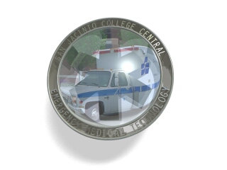
"Shay" <sah### [at] simcopartscom> wrote in <3a9fe16c@news.povray.org>:
>I am pretty happy with this web graphic, but would like to hear any ideas>y'all may have for improving it.
Looks good. Only thing I can think of is making the text surrounding the
image more readable - somehow.
- Nikodemus
From: Stephen Bell
Subject: Re: Need Ideas for Improvement
Date: 2 Mar 2001 16:26:28
Message: <3aa01004@news.povray.org>
"Nikodemus Siivola" <tsi### [at] cchutfi> wrote in message
news:Xns### [at] 204213191226...
> "Shay" <sah### [at] simcopartscom> wrote in <3a9fe16c@news.povray.org>:>> >I am pretty happy with this web graphic, but would like to hear any ideas> >y'all may have for improving it.>> Looks good. Only thing I can think of is making the text surrounding the> image more readable - somehow.>> - Nikodemus
I agree. I'm not sure exactly how you rendered the text around the image,
but you could make the text stand out more by:
1. Moving your light source farther back to make the text cast bigger
shadows on the rest of the border (assuming they are actual 3D objects, not
just an image map or something).
2. Make the text a little lighter or the background a little darker (I
think it would be best if you made it darker.
3. Put something behind the camera (ie. a plane and a sky pattern) that
would be reflected by the border, but not the text. Just an idea.