|
|
|
|
|
|
| |
| |
|
|
|
|
| |
| |
|
|
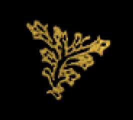
On Sun, 12 Nov 2000 19:53:41 -0800, Dave Blandston wrote:
>Here's a police badge that I've been working on, but I'm having some trouble
>with the design of the silver triangular pieces. A real badge has some type
>of floral design (as y'all can see in the small photograph), but this is a
>little too complicated for me to make with POV. Anyone have any suggestions
>about how to make a simple but appealing design for the triangular areas?
Someone recently did a Celtic knot macro which might give you what you
need for the triangular bits.
--
Cheers
Steve email mailto:ste### [at] zeropps uklinuxnet
%HAV-A-NICEDAY Error not enough coffee 0 pps.
web http://www.zeropps.uklinux.net/
or http://start.at/zero-pps
4:25am up 33 days, 6:47, 2 users, load average: 1.13, 1.16, 1.22 uklinuxnet
%HAV-A-NICEDAY Error not enough coffee 0 pps.
web http://www.zeropps.uklinux.net/
or http://start.at/zero-pps
4:25am up 33 days, 6:47, 2 users, load average: 1.13, 1.16, 1.22
Post a reply to this message
|
|
| |
| |
|
|
|
|
| |
| |
|
|
I concur with Ken, an hf is probably what would work best. here's the
results I came up with.
The code:
height_field {
png "badge2.png"
smooth
pigment { color rgb <0.906,0.737,0.282> }
translate <-.5, -.5, -.5>
scale <17, 1, 17>
clipped_by {
box {
<-10,0.1,-10>
<10,5,10>
}
}
}
attached: hftest.gif (rendered heightfield)
badge2.png (source for hf)
--
Dan D.
"Through the Eye of a Needle"
http://filebox.vt.edu/users/ddombrow/
Post a reply to this message
Attachments:
Download 'hftest.gif' (2 KB)
Download 'badge2.png' (18 KB)
Preview of image 'hftest.gif'
Preview of image 'badge2.png'

|
|
| |
| |
|
|
|
|
| |
| |
|
|
If I can suggest, I think there is too much different colors in the badge... A
real badge would have a nice 3-5 colors design... and I mean White, red, brown,
yellow, etc... only those, no shade of colors... actually the shade should be
made by the antialiasing...
MHO
--
+-------------------------+----------------------------------+
| Simon Lemieux | Website : http://www.666Mhz.net |
| Email : Sin### [at] 666Mhznet | POV-Ray, OpenGL, C++ and more... |
+-------------------------+----------------------------------+
Post a reply to this message
|
|
| |
| |
|
|
|
|
| |
| |
|
|
Now why didn't I think of a height field? I also like the Celtic knot idea -
that has a lot of potential also, and it's unique. Thanks for the great
ideas, folks!
Regards,
Dave
Post a reply to this message
|
|
| |
| |
|
|
From: Dave Blandston
Subject: Re: Police badge (suggestions?...) 82kb
Date: 13 Nov 2000 01:38:58
Message: <3a0f8c82@news.povray.org>
|
|
|
| |
| |
|
|
"Simon Lemieux" <lem### [at] yahoocom> wrote in message
news:3A0### [at] yahoocom...
> If I can suggest, I think there is too much different colors in the
badge... A
> real badge would have a nice 3-5 colors design... and I mean White, red,
brown,
> yellow, etc... only those, no shade of colors... actually the shade
should be
> made by the antialiasing...
>
> MHO
>
> --
> +-------------------------+----------------------------------+
> | Simon Lemieux | Website : http://www.666Mhz.net |
> | Email : Sin### [at] 666Mhznet | POV-Ray, OpenGL, C++ and more... |
> +-------------------------+----------------------------------+
I agree, Simon. I failed to mention that the end result of this will be a
black and white "undertone." Hard to explain, so here's a picture...
Post a reply to this message
Attachments:
Download 'cdcover.jpg' (54 KB)
Preview of image 'cdcover.jpg'
|
|
| |
| |
|
|
|
|
| |
| |
|
|
On Mon, 13 Nov 2000 00:32:05 -0500, ddombrow wrote...
> attached: hftest.gif (rendered heightfield)
> badge2.png (source for hf)
Congratulations. For some reason the .png that you attached made ACDSee
fall over every time I tried to look at it.
What did you use to create the .png? I'm just curious to see if I can
reproduce the occurrence.
Bye for now,
Jamie.
Post a reply to this message
|
|
| |
| |
|
|
|
|
| |
| |
|
|
I used Paintshop Pro 6 to create the png. I forgot there was an alpha
channel involved, maybe that did it.
Is this better?
--
Dan D.
"Through the Eye of a Needle"
http://filebox.vt.edu/users/ddombrow/
Post a reply to this message
Attachments:
Download 'badge2.png' (10 KB)
Preview of image 'badge2.png'

|
|
| |
| |
|
|
|
|
| |
| |
|
|
> I agree, Simon. I failed to mention that the end result of this will be a
> black and white "undertone." Hard to explain, so here's a picture...
Ok, then in this image I agree it looks good! and just need a little tweak for
the triangles as you said before...
Maybe a bumpmap of leaf patterns?
--
+-------------------------+----------------------------------+
| Simon Lemieux | Website : http://www.666Mhz.net |
| Email : Sin### [at] 666Mhznet | POV-Ray, OpenGL, C++ and more... |
+-------------------------+----------------------------------+
Post a reply to this message
|
|
| |
| |
|
|
|
|
| |
| |
|
|
Dave Blandston wrote:
>
> Here's a police badge that I've been working on, but I'm having some trouble
> with the design of the silver triangular pieces. A real badge has some type
> of floral design (as y'all can see in the small photograph), but this is a
> little too complicated for me to make with POV. Anyone have any suggestions
> about how to make a simple but appealing design for the triangular areas?
If you can use a image map for the center, why not for the triangles?
Even use it as a height field and slice it up until it fits.
--
Modern superstition: If we forget the horrors of the Nazis
they will rise again.
-- The Iron Webmaster, 135
Post a reply to this message
|
|
| |
| |
|
|
|
|
| |
| |
|
|
On Mon, 13 Nov 2000 16:08:10 -0500, ddombrow wrote...
> I used Paintshop Pro 6 to create the png. I forgot there was an alpha
> channel involved, maybe that did it.
>
> Is this better?
Much better, but I've never had problems with .png's and alpha channels
in ACDSee, other than it displaying the alpha channel as black over the
top of everything else.
Hmm... Must just have been the way PSP handles alpha channels in .png's
Thanks, anyway.
Bye for now,
Jamie.
Post a reply to this message
|
|
| |
| |
|
|
|
|
| |