|
|
|
|
|
|
| |
| |
|
|
|
|
| |
| |
|
|
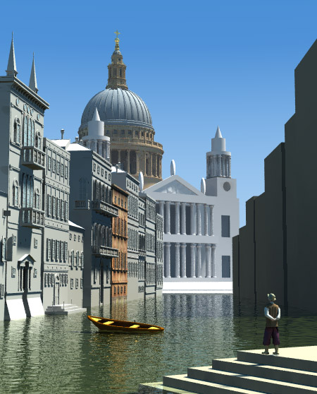
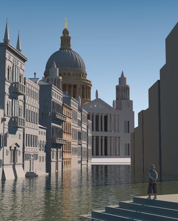
We cancelled fishing today because of bad weather.
So I had some time to work on the image :)

Added the rest buildings to the left side. Modified some
previous buildings.
Made some changes recommended by Christoph Hormann.
Added bindings to the dome recommended by Ib Rasmussen.
Rearranged some objects.
The source is in p.b.s-f.

As a next step I'll paint those buildings. If you have a good
paintbrush or airbrush you can join me :)

Gena.
Post a reply to this message
Attachments:
Download 'capriccio.jpg' (80 KB)
Preview of image 'capriccio.jpg'
|
|
| |
| |
|
|
|
|
| |
| |
|
|
Gena Obukhov wrote:

> As a next step I'll paint those buildings. If you have a good
> paintbrush or airbrush you can join me :)

Well, I don't, but I might be able to help with some more buildings to
paint on :)

When you started this project, you offered detailed drawings of St. Paul
Cathedral Facade. I would like to see what you've got. If there is not
too many sculptures on it, I might give it a try (unless somebody else
has already started on it?).

/Ib
Post a reply to this message
|
|
| |
| |
|
|
|
|
| |
| |
|
|
Gena Obukhov wrote:
>
> We cancelled fishing today because of bad weather.
> So I had some time to work on the image :)
>
> Added the rest buildings to the left side. Modified some
> previous buildings.
> Made some changes recommended by Christoph Hormann.
> [...]

The most important point - 'assumed_gamma 1' - is still missing.  I
strongly suggest to add it (or to apply gamma correction afterwards if
preferred) before working on the textures.

Christoph

--
POV-Ray tutorials, include files, Sim-POV,
HCR-Edit and more: http://www.tu-bs.de/~y0013390/
Last updated 28 Feb. 2003 _____./\/^>_*_<^\/\.______
Post a reply to this message
|
|
| |
| |
|
|
|
|
| |
| |
|
|
Ib Rasmussen wrote:

> When you started this project, you offered detailed drawings of St. Paul
> Cathedral Facade. I would like to see what you've got. If there is not
> too many sculptures on it, I might give it a try (unless somebody else
> has already started on it?).
>

I downloaded some views of the facade to try and reference the statues
on top.  But I don't have anything very useful.  If there are any
details of the statues I could try and rough them out.

-Jim
Post a reply to this message
|
|
| |
| |
|
|
|
|
| |
| |
|
|
Jim Charter wrote:

> Ib Rasmussen wrote:
>
>> When you started this project, you offered detailed drawings of St.
>> Paul Cathedral Facade. I would like to see what you've got. If there
>> is not too many sculptures on it, I might give it a try (unless
>> somebody else has already started on it?).
>>
>
> I downloaded some views of the facade to try and reference the statues
> on top.  But I don't have anything very useful.  If there are any
> details of the statues I could try and rough them out.


I found a large photo at
http://www.gregoryferdinandsen.com/Old/Old_Images/St%20Pauls%20Cathedral.jpg

I have three different classical figures, that I have used on a church
(http://www.ibras.ishoejby.dk/frederik/frederik.htm), that might pass as
the three free standing sculptures on top of the triangular front
(pediment?), but there is also some figure groups on the side towers,
and a number of reliefs, especially the large triangular one
(tympanon?), which I wouldn't know what to do with.

/Ib
Post a reply to this message
|
|
| |
| |
|
|
|
|
| |
| |
|
|
Ib Rasmussen wrote:

> I have three different classical figures, that I have used on a church
> (http://www.ibras.ishoejby.dk/frederik/frederik.htm), that might pass as
> the three free standing sculptures on top of the triangular front
> (pediment?), but there is also some figure groups on the side towers,
> and a number of reliefs, especially the large triangular one
> (tympanon?), which I wouldn't know what to do with.

You can always try HFs for that. Jim Kress and I have both had pretty good
success recreating sculpture with HFs. An example can be seen at Jim's site

http://www.kressworks.com/Art/resources/JWK_works/pieta_finished.jpg

This is of coarse presuming that you can find a good base image to start with.

--
Ken Tyler
Post a reply to this message
|
|
| |
| |
|
|
|
|
| |
| |
|
|
Ib Rasmussen wrote:

> Gena Obukhov wrote:
>
> > As a next step I'll paint those buildings. If you have a good
> > paintbrush or airbrush you can join me :)
>
> Well, I don't, but I might be able to help with some more buildings to
> paint on :)
>
> When you started this project, you offered detailed drawings of St. Paul
> Cathedral Facade. I would like to see what you've got.

I posted zip file with some images in p.b.s.-f.
See the thread 'Re: Capriccio - Dome of St. Pauls'
I think the image which you posted in this thread
has more details :)

Gena.
Post a reply to this message
|
|
| |
| |
|
|
|
|
| |
| |
|
|
Could you please describe the process? I have been always thinking
about something like that for faces/figures/sculptures. Is it completely manual
process?

Gena.


Ken wrote:

> Ib Rasmussen wrote:
>
> > I have three different classical figures, that I have used on a church
> > (http://www.ibras.ishoejby.dk/frederik/frederik.htm), that might pass as
> > the three free standing sculptures on top of the triangular front
> > (pediment?), but there is also some figure groups on the side towers,
> > and a number of reliefs, especially the large triangular one
> > (tympanon?), which I wouldn't know what to do with.
>
> You can always try HFs for that. Jim Kress and I have both had pretty good
> success recreating sculpture with HFs. An example can be seen at Jim's site
>
> http://www.kressworks.com/Art/resources/JWK_works/pieta_finished.jpg
>
> This is of coarse presuming that you can find a good base image to start with.
>
> --
> Ken Tyler
Post a reply to this message
|
|
| |
| |
|
|
|
|
| |
| |
|
|
Ib Rasmussen wrote:
>
>
> Jim Charter wrote:
>
>> Ib Rasmussen wrote:
>>

>
> I found a large photo at
> http://www.gregoryferdinandsen.com/Old/Old_Images/St%20Pauls%20Cathedral.jpg
>
great pic
>
> I have three different classical figures, that I have used on a church
> (http://www.ibras.ishoejby.dk/frederik/frederik.htm), that might pass as
> the three free standing sculptures on top of the triangular front

Sounds good

> (pediment?), but there is also some figure groups on the side towers,

Okay, I'll try and do something rough for those

> and a number of reliefs, especially the large triangular one
> (tympanon?), which I wouldn't know what to do with.
>
> /Ib
>
>
Post a reply to this message
|
|
| |
| |
|
|
|
|
| |
| |
|
|
Christoph Hormann wrote:

> The most important point - 'assumed_gamma 1' - is still missing.  I
> strongly suggest to add it (or to apply gamma correction afterwards if
> preferred) before working on the textures.

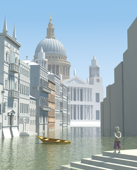
Here is image with assumed_gamma 1
Should we change any other parameter(s)?
It looks too dim for me.

Gena.
Post a reply to this message
Attachments:
Download 'capricio.jpg' (69 KB)
Preview of image 'capricio.jpg'

|
|
| |
| |
|
|
|
|
| |
| |
|
|
Gena Obukhov wrote:
>
> Could you please describe the process? I have been always thinking
> about something like that for faces/figures/sculptures. Is it completely manual
> process?

Yes, it is a manual process and depending on what the base image looks like
can be rather labor intensive. When I tried it a few years ago I started with
a color image of the object I wanted to recreate, converted it to greyscale
and then imported it into the HF program Leveller. Inside Leveller you can
do quite a bit to raise and lower the repective areas that may need extra
attention with a wide variety of tools. After exporting to POV-Ray's 16 bit
HF image format you can then apply the original color image to the HF to give
it that added sense of reality. Leveller now supports export to .OBJ so
UV mapping should also now be possible.

You can see my attempt (about 4 years ago) at HF sculpture on the testimonial
page at the Leveller site -

http://www.daylongraphics.com/products/leveller/user_ex/index.htm

--
Ken Tyler
Post a reply to this message
|
|
| |
| |
|
|
|
|
| |
| |
|
|
Gena Obukhov wrote:

> Here is image with assumed_gamma 1
> Should we change any other parameter(s)?
> It looks too dim for me.

For me it's much brighter now.

--
Ken Tyler
Post a reply to this message
|
|
| |
| |
|
|
|
|
| |
| |
|
|
Ken wrote:

> For me it's much brighter now.

Yep. When I said 'dim' I meant that there is too high grey
component in all colors. It makes colors a bit dull.
Maybe we have to reduce brightness of the light source.

Gena.
Post a reply to this message
|
|
| |
| |
|
|
|
|
| |
| |
|
|
Gena Obukhov wrote:
>
> [...]
>
> Here is image with assumed_gamma 1
> Should we change any other parameter(s)?
> It looks too dim for me.

That's precisely what i am talking about all the time.  The textures and
lighting need to be adapted to produce the intended results.  Changing one
thing (like the gamma correction) will result in a large mess.

The version with the water i posted contains lighting and some provisonal
textures for usage with assumed_gamma 1.  Most important things probably
are:

- reducing radiosity brightness (to 1.0, lower could even be better)
- make the sky darker
- change the finishes (scratch any ambient if there is, i have the
impression it is not 0 but maybe it's just the fog)
- change the colors of the objects if necessary

Christoph

--
POV-Ray tutorials, include files, Sim-POV,
HCR-Edit and more: http://www.tu-bs.de/~y0013390/
Last updated 28 Feb. 2003 _____./\/^>_*_<^\/\.______
Post a reply to this message
|
|
| |
| |
|
|
|
|
| |
| |
|
|
Gena Obukhov wrote:

> I posted zip file with some images in p.b.s.-f.
> See the thread 'Re: Capriccio - Dome of St. Pauls'


Oh, missed that one. Hmm, not quite the details I had hoped for. I'll
see how far I can get with it, but I am not optimistic.


> I think the image which you posted in this thread
> has more details :)


Found another big one at http://www.milton.com/praha2002/im000163.jpg

/Ib
Post a reply to this message
|
|
| |
| |
|
|
|
|
| |
| |
|
|
Ken wrote:

>
> Ib Rasmussen wrote:
>
>
>>I have three different classical figures, that I have used on a church
>>(http://www.ibras.ishoejby.dk/frederik/frederik.htm), that might pass as
>>the three free standing sculptures on top of the triangular front
>>(pediment?), but there is also some figure groups on the side towers,
>>and a number of reliefs, especially the large triangular one
>>(tympanon?), which I wouldn't know what to do with.
>>
>
> You can always try HFs for that. Jim Kress and I have both had pretty good
> success recreating sculpture with HFs. An example can be seen at Jim's site


Impressive, but as a matter of principle, I only do CSG ;)

/Ib
Post a reply to this message
|
|
| |
| |
|
|
|
|
| |
| |
|
|
>> I have three different classical figures, that I have used on a church
>> (http://www.ibras.ishoejby.dk/frederik/frederik.htm), that might pass
>> as the three free standing sculptures on top of the triangular front
>
> Sounds good

I just remembered, we are only allowed to use our own objects for this
project, and I can't claim to have made these figures :(

/Ib
Post a reply to this message
|
|
| |
| |
|
|
|
|
| |
| |
|
|
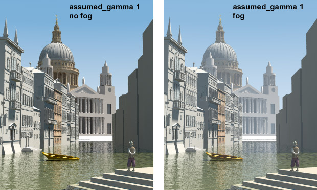
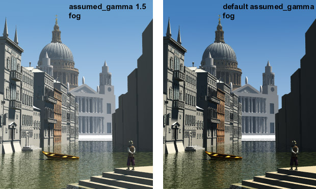
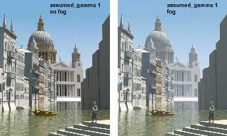
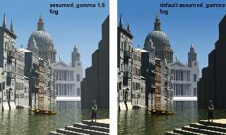
I removed 'ambient' from all textures (except cathedral facade),
reduced radiosity brightness to 0.6, reduced 'diffuse' to 0.6 and
reduced sky brightness.
You can see the result below. Let's decide which value for
assumed_gamma we should use.
IMHO we should use something from the middle 1.4-1.6 even
though such value is not right from theoretical point of view :)

Gena.
Post a reply to this message
Attachments:
Download 'gamma1.jpg' (80 KB)
Download 'gamma2.jpg' (84 KB)
Preview of image 'gamma1.jpg'
Preview of image 'gamma2.jpg'
|
|
| |
| |
|
|
|
|
| |
| |
|
|
The only realistic approach would be using assumed_gamma 1,
and modifying the scene to accompensate for that. Colors just
need to be darker, and perhaps some adjusting for the contrast
is needed. The fog could also be adjusted.
The problem with using a different value is that many (at least
I hope so) people use assumed_gamma 1, and base their
color experience on that (at least I do).
--
Tim Nikias v2.0
Homepage: http://www.digitaltwilight.de/no_lights
Email: Tim### [at] gmx de
> I removed 'ambient' from all textures (except cathedral facade),
> reduced radiosity brightness to 0.6, reduced 'diffuse' to 0.6 and
> reduced sky brightness.
> You can see the result below. Let's decide which value for
> assumed_gamma we should use.
> IMHO we should use something from the middle 1.4-1.6 even
> though such value is not right from theoretical point of view :)
>
> Gena.
>
>
> de
> I removed 'ambient' from all textures (except cathedral facade),
> reduced radiosity brightness to 0.6, reduced 'diffuse' to 0.6 and
> reduced sky brightness.
> You can see the result below. Let's decide which value for
> assumed_gamma we should use.
> IMHO we should use something from the middle 1.4-1.6 even
> though such value is not right from theoretical point of view :)
>
> Gena.
>
>
>
Post a reply to this message
|
|
| |
| |
|
|
|
|
| |
| |
|
|
Post a reply to this message
Attachments:
Download 'v9.jpg' (57 KB)
Preview of image 'v9.jpg'
|
|
| |
| |
|
|
|
|
| |
| |
|
|
> ..., and perhaps some adjusting for the contrast
> is needed...

How? Colors with assumed_gamma = 1 look washed-out.
If there is a way to increase contrast using that value let us
know.

I usualy use default values (I guess it's 2.2). If normal value
for assumed_gamma is 1 why it's not a default value?

Gena.
Post a reply to this message
|
|
| |
| |
|
|
|
|
| |
| |
|
|
"Gena Obukhov" <obu### [at] mailcom> wrote in message
news:3E9A2071.A34BDF4A@mail.com...
> > ..., and perhaps some adjusting for the contrast
> > is needed...
>
> How? Colors with assumed_gamma = 1 look washed-out.
> If there is a way to increase contrast using that value let us
> know.
>
> I usualy use default values (I guess it's 2.2). If normal value
> for assumed_gamma is 1 why it's not a default value?


Just stepping in briefly-- has everyone adjusted their monitors according to
POV's specs?

What I know from recent reading is that PCs generally need a gamma of around
2.2 while Macs generally need one of 1.6, and somehow the assumed_gamma is
supposed to even things up. I *think* that means that assumed_gamma 1 will
be right for anybody who has adjusted their monitor as suggested in the POV
docs-- http://www.povray.org/documentation/view/128/ -- section 5.2.2.2.2.2

I spent an hour or so a week ago noodling through all the POV stuff I could
find on gamma, and doing the monitor adjustment as shown above. Although I'm
running a Dell Windoze box, my best gamma setting was at 1.4 -- *way*
different from what my reading led me to expect. But then my monitor is an
add-on flat screen.

Changing my monitor settings according to the above link has made my world
brighter and more colorful. I think before a group settles on an
assumed_gamma setting, it would be good if everyone calibrated their
monitors.


--
Will Woodhull
Thornhenge, SW Oregon, USA
willl.at.thornhenge.net
Post a reply to this message
|
|
| |
| |
|
|
|
|
| |
| |
|
|
in news:3e9a4670@news.povray.org Will W wrote:

> POV docs-- http://www.povray.org/documentation/view/128/ -- section
> 5.2.2.2.2.2
>
> Although I'm running a Dell Windoze box, my best gamma setting was at
> 1.4 -- *way* different from what my reading led me to expect. But
> then my monitor is an add-on flat screen.

I think I should add a note to the above mentioned paragraph that explains
that flatscreens don't have the same gamma-curve as CRT's and that thus
the method won't work (although the result may look resonable).

If you want to use flatscreens for graphics work you need one that is
designed for it.

Ingo
Post a reply to this message
|
|
| |
| |
|
|
|
|
| |
| |
|
|
Will W wrote:

> supposed to even things up. I *think* that means that assumed_gamma 1 will
> be right for anybody who has adjusted their monitor as suggested in the POV
> docs-- http://www.povray.org/documentation/view/128/ -- section 5.2.2.2.2.2

You are talking about  Display_gamma which works together with
assumed_gamma. That gamma stuff was always a 'terra incognita'
for me :)

I think the main confusing definition in assuming_gamma is that
it 'resolves the problem with brightness of images on different
platforms'. But it's actually not true unless you use format containning
gamma info (e.g. PNG). If you use JPG it will be normal on PC but still
bright on Macintosh. So IMHO for viewing final image in non-gamma format
it doesn't help.
It helps when you render image on different platforms. In this case you
can set assumed_gamma=1 and set different Display_Gamma on different
platforms, for example 2.2 on PC and 1.8 on Macintosh. In this case POV-Ray
will create image based on your Display_Gamma settings. So actual value
which you have to play with is Display_Gamma not assumed_gamma which
should be usually equal 1.

Please correct me if I'm wrong :)

Gena.
Post a reply to this message
|
|
| |
| |
|
|
|
|
| |
| |
|
|
Great models! Especially for completely hand-made models.
We have a family already :)
There are some visible artefacts but I think you are
aware of it.
Keep on good job Jim :)

Gena.
Post a reply to this message
|
|
| |
| |
|
|
|
|
| |
| |
|
|
Gena Obukhov wrote:
>
> I removed 'ambient' from all textures (except cathedral facade),
> reduced radiosity brightness to 0.6, reduced 'diffuse' to 0.6 and
> reduced sky brightness.
> You can see the result below. Let's decide which value for
> assumed_gamma we should use.
> IMHO we should use something from the middle 1.4-1.6 even
> though such value is not right from theoretical point of view :)

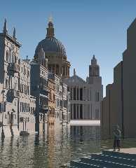
Attached is my adaptation of the scene for assumed_gamma 1 - i did not try
to modify the textures apart from removing the ambient since they are
provisonal anyway.  I changed the light position to be fairly conforming
with the painting (although this is tricky since the painting does not
really have consistent lighting...)

The modified scene is in p.b.s-f. (only the main scene, the other
modifications are only the removing of ambient in finishes)

Concerning assumed_gamma: not specifying it results in a linear output,
just as if assumed_gamma and display_gamma have the same value.  As Tim
explained most people are used to design their textures for assumed_gamma
1.

Christoph

--
POV-Ray tutorials, include files, Sim-POV,
HCR-Edit and more: http://www.tu-bs.de/~y0013390/
Last updated 28 Feb. 2003 _____./\/^>_*_<^\/\.______
Post a reply to this message
Attachments:
Download 'capriccio9a.jpg' (86 KB)
Preview of image 'capriccio9a.jpg'
|
|
| |
| |
|
|
|
|
| |
| |
|
|
Christoph Hormann wrote:

> As Tim explained most people are used to design their textures for

> assumed_gamma 1.

Do you have any hard data to support that assumption? I would think that
most people would use the default 2.2. I know, I have never used
anything else.

/Ib
Post a reply to this message
|
|
| |
| |
|
|
|
|
| |
| |
|
|
Gena Obukhov wrote:

> You can see the result below. Let's decide which value for
> assumed_gamma we should use.

I'm for the default 2.2.

/Ib
Post a reply to this message
|
|
| |
| |
|
|
|
|
| |
| |
|
|
On Mon, 14 Apr 2003 11:27:00 +0200, Ib Rasmussen <ib### [at] ibrasdk> wrote:
> > You can see the result below. Let's decide which value for
> > assumed_gamma we should use.
>
> I'm for the default 2.2.

Quoting manual from http://www.povray.org/documentation/view/216/
"Recommended value for assumed_gamma is 1.". Since it is likely representative
work of POV possibilites I would suggest follow this recommendation.

ABX
Post a reply to this message
|
|
| |
| |
|
|
|
|
| |
| |
|
|
Ib Rasmussen wrote:
>
> > As Tim explained most people are used to design their textures for
>
> > assumed_gamma 1.
>
> Do you have any hard data to support that assumption? I would think that
> most people would use the default 2.2. I know, I have never used
> anything else.

I have not investigated this matter into depth, could be interesting to
see what is commonly used in the IRTC scenes where source is given.  At
the risk of repeating myself, 'assumed_gamma' is not meant as a value to
adjust to personal preferences, in fact it is not really necessary because
for technically correct results you would either use a value of 1 (meaning
correct gamma correction being applied) or give no value (meaning the
render result is linear and needs to be gamma corrected afterwards).

As explained before the huge advantage of using correct gamma adjustment
is that you can achieve realistic results by using 'correct' settings.
You can surely also achieve realistic pictures with linear gamma but this
will require adjusting the values to fit well with each other until things
look good.  This will be immensely tricky when several people are working
on a scene - one will change the sky/light/radiosity settings to gain some
effects and all others will cry because their part no more looks good.

Christoph

--
POV-Ray tutorials, include files, Sim-POV,
HCR-Edit and more: http://www.tu-bs.de/~y0013390/
Last updated 28 Feb. 2003 _____./\/^>_*_<^\/\.______
Post a reply to this message
|
|
| |
| |
|
|
|
|
| |
| |
|
|
Ib Rasmussen wrote:
>
> Christoph Hormann wrote:
>
> > As Tim explained most people are used to design their textures for
>
> > assumed_gamma 1.
>
> Do you have any hard data to support that assumption? I would think that
> most people would use the default 2.2. I know, I have never used
> anything else.

I think the majority of people simply go with the default of 2.2. I know,
I do.

--
Ken Tyler
Post a reply to this message
|
|
| |
| |
|
|
|
|
| |
| |
|
|
Ib Rasmussen wrote:
>
>
> Christoph Hormann wrote:
>
>> As Tim explained most people are used to design their textures for
>
>
>> assumed_gamma 1.
>
>
> Do you have any hard data to support that assumption? I would think that
> most people would use the default 2.2. I know, I have never used
> anything else.

It would depend on how many people have read the part of the manual that
says "For new scenes, you should use an assumed gamma value of 1.0 as
this models how light appears in the real world more realistically.". I
have, so I use assumed_gamma 1.
Post a reply to this message
|
|
| |
| |
|
|
|
|
| |
| |
|
|
Gena Obukhov wrote:
> I removed 'ambient' from all textures (except cathedral facade),
> reduced radiosity brightness to 0.6, reduced 'diffuse' to 0.6 and
> reduced sky brightness.
> You can see the result below. Let's decide which value for
> assumed_gamma we should use.
> IMHO we should use something from the middle 1.4-1.6 even
> though such value is not right from theoretical point of view :)

What was the monitor_gamma used for creating these images? Unless
everyone viewing them has monitors of that gamma value they are useless
for comparison. Surely an assumed_gamma value should be chosen such that
when someone renders the scene on their computer with the monitor_gamma
set for their monitor, a ray calculated to have a color of <0.5, 0.5,
0.5> is displayed as a grey perceived to have 50% of the monitor's full
intensity. That value is 1.
Post a reply to this message
|
|
| |
| |
|
|
|
|
| |
| |
|
|
"Ib Rasmussen" <ib### [at] ibrasdk> a écrit dans le message de news:
3E9### [at] ibrasdk...
> I'm for the default 2.2.

For what it's worth, I had until last year used the default 2.2, but after
having to switch monitors (CRT and flat) and running into gamma trouble, I'm
now all for assumed_gamma 1 and I don't regret it. Of course, textures and
lighting must be changed accordingly if they had been designed with
assumed_gamma 2.2 in mind.

G.


--

**********************
http://www.oyonale.com
**********************
- Graphic experiments
- POV-Ray and Poser computer images
- Posters
Post a reply to this message
|
|
| |
| |
|
|
|
|
| |
| |
|
|
"ingo" <ing### [at] tagpovrayorg> wrote in message
news:Xns### [at] povrayorg...
> in news:3e9a4670@news.povray.org Will W wrote:

> I think I should add a note to the above mentioned paragraph that explains
> that flatscreens don't have the same gamma-curve as CRT's

Exactly so.

> and that thus
> the method won't work (although the result may look resonable).

No.

First you are contradicting yourself. If the results of the display_gamma
adjustment look more reasonable than they did before, then the system is in
better adjustment for your situation than it had been. Which is all that one
can hope to achieve no matter what type of display you've got.

It is true that the procedure given in the POV docs was designed to take
advantage of side effects of CRT technology-- on  a flat screen you don't
get the necessary blurring of raster lines that analog CRT phosphors
provide. That isn't a problem for me-- I just take off my glasses. Or you
can unfocus your vision to get the requisite blurring.

It is also true that the rate of change in brightness as one approaches the
extremes is different for flatscreens and CRTs, but that doesn't invalidate
the procedure. The procedure adjusts the central value of medium gray--
whether your whites are whiter and your blacks are blacker than someone
else's is a different thing entirely. And it doesn't even touch color
balance. (Paint Shop Pro has a color gamma calibration procedure that can
help with that).

> If you want to use flatscreens for graphics work you need one that is
> designed for it.

If I had everything I wanted, I'd be riding a powerful horse rather than
trudging along this muddy rut :-)

Thanks for your input.


--
Will Woodhull
Thornhenge, SW Oregon, USA
willl.at.thornhenge.net
Post a reply to this message
|
|
| |
| |
|
|
|
|
| |
| |
|
|
in news:3e9ac173@news.povray.org Will W wrote:

>> and that thus
>> the method won't work (although the result may look resonable).
>
> No.

You're right, what I wrote is rather inaccurate, yet from your awnser I
understand that you understood exactly what I meant. Guess I'll have to
grow them pointy ears first, before I write that bit for the docs :)


Ingo
Post a reply to this message
|
|
| |
| |
|
|
|
|
| |
| |
|
|
Thanks very much, Gena! By jumping back and forth between what you've
written and the POV-Ray docs, I've learned a bit.

I've got my display_gamma set to 1.8, which is appropriate for my system,
which means that I've got POV's equivalent of an artist's studio with large
north-facing windows: a neutral environment for selecting colors and
brightness levels. When I use assumed_gamma 1, POV will use my display_gamma
without any further adjustment to correct the pixels it writes to the image
file. The result will be the best I can hope for in terms of viewabiltiy on
other systems. If I want to tune my jpgs to look their best on PC systems,
then I should set the assumed_gamma to 2.2 (and accept that fact that Mac
users will see a poorer image).

If I have chosen the .png format, POV will also write the appropriate gamma
correction factor into the image file. Then anybody who is using viewing
software that is smart about .png gamma corrections and correctly set up on
their system will see my image precisely the way I intended. But other than
in this situation, my work is going to be distorted on some other systems.

It seems to me that in a cooperative creation process, the people doing the
textures need to have their display_gamma settings correctly tuned for their
systems, and use assumed_gamma 1 in their output.

It also seems to me that in a cooperative situation, decisions on the
assumed_gamma level cannot be based on how jpgs look, since Macs and PCs and
other systems will always distort jpgs in different ways. The decisions need
to be made either on the basis of .png files displayed through a smart
viewer that is correctly configured for the individual system, or by sending
out .pov files that each contributor would render on their own (assuming
they have their display_gamma set correctly). Sending out sample .pov files
shouldn't be too difficult.

Does this sound right to you?


--
Will Woodhull
Thornhenge, SW Oregon, USA
willl.at.thornhenge.net

"Gena Obukhov" <obu### [at] mailcom> wrote in message
news:3E9A5D93.B10D1E84@mail.com...
> Will W wrote:
>
> > supposed to even things up. I *think* that means that assumed_gamma 1
will
> > be right for anybody who has adjusted their monitor as suggested in the
POV
> > docs-- http://www.povray.org/documentation/view/128/ -- section
5.2.2.2.2.2
>
> You are talking about  Display_gamma which works together with
> assumed_gamma. That gamma stuff was always a 'terra incognita'
> for me :)
>
> I think the main confusing definition in assuming_gamma is that
> it 'resolves the problem with brightness of images on different
> platforms'. But it's actually not true unless you use format containning
> gamma info (e.g. PNG). If you use JPG it will be normal on PC but still
> bright on Macintosh. So IMHO for viewing final image in non-gamma format
> it doesn't help.
> It helps when you render image on different platforms. In this case you
> can set assumed_gamma=1 and set different Display_Gamma on different
> platforms, for example 2.2 on PC and 1.8 on Macintosh. In this case
POV-Ray
> will create image based on your Display_Gamma settings. So actual value
> which you have to play with is Display_Gamma not assumed_gamma which
> should be usually equal 1.
>
> Please correct me if I'm wrong :)
>
> Gena.
Post a reply to this message
|
|
| |
| |
|
|
|
|
| |
| |
|
|
"ingo" <ing### [at] tagpovrayorg> wrote in message
news:Xns### [at] povrayorg...
>
> You're right, what I wrote is rather inaccurate, yet from your awnser I
> understand that you understood exactly what I meant.

Uh, well... *now* I know that you know what I was talking about is so, yet
when I wrote that last message I wasn't sure that was the case.

But there are several people who have voiced an opinion about where to set
the assumed_gamma for a joint project. Including some who may be thinking
that the default value in one system-specific POV-Ray implementation is the
POV-Ray default used in all implementations on every platform.

So do you think they know what we know?
I would hope so.
But I feel I have cause to wonder about it.


--
Will Woodhull
Thornhenge, SW Oregon, USA
willl.at.thornhenge.net
Post a reply to this message
|
|
| |
| |
|
|
|
|
| |
| |
|
|
> What was the monitor_gamma used for creating these images? Unless

It was default value. I guess on my PC it's 2.2

So let's recap the discussion :)
From all those posts and POV-Ray doc we could make conclusion
that recommended assumed_gamma is 1. So let's use it.

If you feel that image looks too bright or too dark on your monitor
with assumed_gamma=1 try to adjust Display_Gamma parameter
which is monitor specific (I specified 1.8 for my monitor). Because
that parameter is placed in command line we don't have to have
gamma-specific sources for each platform.

Please, correct me if I'm wrong :)

Gena.
Post a reply to this message
|
|
| |
| |
|
|
|
|
| |
| |
|
|
Will W wrote:

> ...Does this sound right to you?

Totally agree :)
Let's use assumed_gamma=1 and adjust Display_Gamma
according to our monitors. Let's don't make any brightness
decisions on JPEG images let's render it on your platform
instead with your Display_Gamma settings.

Gena.
Post a reply to this message
|
|
| |
| |
|
|
|
|
| |
| |
|
|
in news:3e9ae5d1@news.povray.org Will W wrote:

> So do you think they know what we know?
> I would hope so.

It may take some time, but in the end they will.


Though, sometimes I wonder why assumed_gamma is a Float and not a Bool.
Gamma_correction yes/no.


Ingo
Post a reply to this message
|
|
| |
| |
|
|
|
|
| |
| |
|
|
On 14 Apr 2003 14:11:34 -0400
ingo <ing### [at] tagpovrayorg> wrote:

> Though, sometimes I wonder why assumed_gamma is a Float and not a
> Bool. Gamma_correction yes/no.

  Because it is a correction value? IMHO, it is suposed to let you adapt
the image to the intended viewing conditions. I think I finally learned
how assumed_gamma is related to the typical "viewing gamma" on most
gamma tutorials like this one:

  http://www.w3.org/TR/PNG-GammaAppendix.html)

  If I'm not wrong, it works this way:

    viewing_gamma = pov_output_gamma * display_gamma

  where

    pov_output_gamma = 1/(Display_Gamma_ini_setting/scene_assumed_gamma)

  and display_gamma is the gamma corrections of your display.

  So, with assumed_gamma 1.0 you end up with a viewing_gamma of 1.0,
suposing you have set properly your ini setting to the real gamma of
your monitor. The usual recommendation says you must use a "viewing
gamma" of 1.0 for bright environments, 1.25 for poorly light rooms, and
1.5 for really dark rooms.

  Please, can someone confirm I'm not worng?

--
Jaime Vives Piqueres

La Persistencia de la Ignorancia
http://www.ignorancia.org
Post a reply to this message
|
|
| |
| |
|
|
|
|
| |
| |
|
|
in news:200### [at] ignoranciaorg Jaime Vives
Piqueres wrote:

>   Please, can someone confirm I'm not worng?
>

You're not wrong.

There are two reasons why I sometimes wonder why there is no
"Gamma_correction yes/no" instead of assumed_gamma;

- assumed_gamma seems to generate a lot of confusion although the way it
works is technically correct.

- Working with POV-Ray is like working in a photo studio (even for outdoor
scenes) where you have full control over the lighting scheme and thus over
contrast range / distribution ('gamma').

Ingo
Post a reply to this message
|
|
| |
| |
|
|
|
|
| |
| |
|
|
"Gena" <obu### [at] mailcom> wrote in message
news:3E9AF410.968C320C@mail.com...
> Let's use assumed_gamma=1 and adjust Display_Gamma
> according to our monitors. Let's don't make any brightness
> decisions on JPEG images let's render it on your platform
> instead with your Display_Gamma settings.

I tend to leave assumed_gamma out. I should have learned enough about all
this by now but it's still a stumbling block for me. I'm not sure why it is
suggested, dare I say required, in every scene file made now. I'm all for
the value of 1.0 for new renders and the reasons behind it, but what stops
me all the time is that it has seemingly become a requirement and yet I
thought it was still just a suggestion. A person might expect their
Display_Gamma, set in the main povray.ini file, to be all that is needed.
Until, of course, a scene file is rendered from another computer and then
adjustments made to the gamma for that reason.

Anyway, this is always the subject of debate and yet it still goes on even
after the documentation tries to settle it once and for all. I don't see any
solution unless assumed_gamma becomes mandatory (error without it) and
people follow the advice given for its usage.

All that said, Christoph has shown it can be done, obviously. Looked fairly
good to me.

Sure hope someone is willing to mess with that jumble I put together for the
"facade" of the cathedral. It's starting to look quite repulsive now.  :-)
I don't seem to get much effort into this project these days... or any other
for that matter.
Post a reply to this message
|
|
| |
| |
|
|
|
|
| |
| |
|
|
Will W wrote:
> Thanks very much, Gena! By jumping back and forth between what you've
> written and the POV-Ray docs, I've learned a bit.
>
> I've got my display_gamma set to 1.8, which is appropriate for my system,
> which means that I've got POV's equivalent of an artist's studio with large
> north-facing windows: a neutral environment for selecting colors and
> brightness levels. When I use assumed_gamma 1, POV will use my display_gamma
> without any further adjustment to correct the pixels it writes to the image
> file. The result will be the best I can hope for in terms of viewabiltiy on
> other systems. If I want to tune my jpgs to look their best on PC systems,
> then I should set the assumed_gamma to 2.2 (and accept that fact that Mac
> users will see a poorer image).

Did you mean "set the display_gamma to 2.2" in that last sentance?
Post a reply to this message
|
|
| |
| |
|
|
|
|
| |
| |
|
|
"Edward Coffey" <eco### [at] alphalinkcomau> wrote in message
news:3E9### [at] alphalinkcomau...
> Will W wrote:
> > Thanks very much, Gena! By jumping back and forth between what you've
> > written and the POV-Ray docs, I've learned a bit.
> >
> > I've got my display_gamma set to 1.8, which is appropriate for my
system,
> > which means that I've got POV's equivalent of an artist's studio with
large
> > north-facing windows: a neutral environment for selecting colors and
> > brightness levels. When I use assumed_gamma 1, POV will use my
display_gamma
> > without any further adjustment to correct the pixels it writes to the
image
> > file. The result will be the best I can hope for in terms of viewabiltiy
on
> > other systems. If I want to tune my jpgs to look their best on PC
systems,
> > then I should set the assumed_gamma to 2.2 (and accept that fact that
Mac
> > users will see a poorer image).
>
> Did you mean "set the display_gamma to 2.2" in that last sentance?
>

No, I meant what I said.

display_gamma only affects what POV sends to the screen. It's important to
have it right so you get the right feedback when you're developing textures.
Otherwise it would be like painting with watercolors under one of those
bright bluish streetlights. Your end product would only look good under the
same streetlight-- it would look garish and ugly in daylight or in a home.

Of course you won't notice anything is wrong unless you can see your work on
somebody else's monitor (that has a different gamma).

Once display_gamma is set, if assumed_gamma is 1 then POV knows how to
adjust the the colors in the jpgs and other images it produces for a
"neutral" appearance. But if you *assume* that your audience is using only
PCs (like, maybe you're sending your portfolio to Microsoft) then you can
adjust assumed_gamma to the best value for that audience.

I think that's right. I'm pretty sure, and others seem to be agreeing with
this.


--
Will Woodhull
Thornhenge, SW Oregon, USA
willl.at.thornhenge.net
Post a reply to this message
|
|
| |
| |
|
|
|
|
| |
| |
|
|
Will W wrote:
> "Edward Coffey" <eco### [at] alphalinkcomau> wrote in message
> news:3E9### [at] alphalinkcomau...
>
>>Will W wrote:
>>
>>>Thanks very much, Gena! By jumping back and forth between what you've
>>>written and the POV-Ray docs, I've learned a bit.
>>>
>>>I've got my display_gamma set to 1.8, which is appropriate for my
>>
> system,
>
>>>which means that I've got POV's equivalent of an artist's studio with
>>
> large
>
>>>north-facing windows: a neutral environment for selecting colors and
>>>brightness levels. When I use assumed_gamma 1, POV will use my
>>
> display_gamma
>
>>>without any further adjustment to correct the pixels it writes to the
>>
> image
>
>>>file. The result will be the best I can hope for in terms of viewabiltiy
>>
> on
>
>>>other systems. If I want to tune my jpgs to look their best on PC
>>
> systems,
>
>>>then I should set the assumed_gamma to 2.2 (and accept that fact that
>>
> Mac
>
>>>users will see a poorer image).
>>
>>Did you mean "set the display_gamma to 2.2" in that last sentance?
>>
>
>
> No, I meant what I said.
>
> display_gamma only affects what POV sends to the screen. It's important to
> have it right so you get the right feedback when you're developing textures.
> Otherwise it would be like painting with watercolors under one of those
> bright bluish streetlights. Your end product would only look good under the
> same streetlight-- it would look garish and ugly in daylight or in a home.
>
> Of course you won't notice anything is wrong unless you can see your work on
> somebody else's monitor (that has a different gamma).
>
> Once display_gamma is set, if assumed_gamma is 1 then POV knows how to
> adjust the the colors in the jpgs and other images it produces for a
> "neutral" appearance. But if you *assume* that your audience is using only
> PCs (like, maybe you're sending your portfolio to Microsoft) then you can
> adjust assumed_gamma to the best value for that audience.
>
> I think that's right. I'm pretty sure, and others seem to be agreeing with
> this.

display_gamma does not only affect what POV sends to the screen, it also
affects what it sends to the saved image file. I believe the connection
between 'assuming' your audience uses a certain gamma and the
'assumed'_gamma setting is completely unintended and misleading. When
rendering (not while doing the lighting and texturing on your system,
only during the final render) for an audience you believe to have a
certain display gamma, you set display_gamma to match it.

The way I understand it is you set assumed_gamma to 1 and leave it
alone, as others have said, it may be less confusing if it were a
boolean option to select whether gamma correction is applied to the
output. You develop your scene using display_gamma set to 1.8, and do
any renders designed to be viewed on similar systems the same way. When
you do a render designed to be viewed on systems with display systems
having a gamma value nearer 2.2, you change the display_gamma value to
2.2 for the final render. It looks bright on your monitor, but you send
it off to a PC user and it looks spot on when they view it on their
gamma 2.2 system.
Post a reply to this message
|
|
| |
| |
|
|
|
|
| |
| |
|
|
"Edward Coffey" <eco### [at] alphalinkcomau> wrote in message
news:3E9### [at] alphalinkcomau...

> display_gamma does not only affect what POV sends to the screen, it also
> affects what it sends to the saved image file.

Well yes, sort of. *If* assumed_gamma is used, then the display_gamma is one
of the factors used in determining the actual rgb values. I thought I had
said that, but it is hard to be clear. If assumed_gamma is turned off, then
display_gamma doesn't matter-- the file will be built with no gamma
correction at all. [see footnote]

>                                                                 I believe
the connection
> between 'assuming' your audience uses a certain gamma and the
> 'assumed'_gamma setting is completely unintended and misleading.


Well, you are reading much more into something I intended as a useful
mnemonic than I thought would happen.


>
When
> rendering (not while doing the lighting and texturing on your system,
> only during the final render) for an audience you believe to have a
> certain display gamma, you set display_gamma to match it.

Yes, that seems to be what the dang thing is there for.


> The way I understand it is you set assumed_gamma to 1 and leave it
> alone, as others have said, it may be less confusing if it were a
> boolean option to select whether gamma correction is applied to the
> output. You develop your scene using display_gamma set to 1.8, and do
> any renders designed to be viewed on similar systems the same way. When
> you do a render designed to be viewed on systems with display systems
> having a gamma value nearer 2.2, you change the display_gamma value to
> 2.2 for the final render. It looks bright on your monitor, but you send
> it off to a PC user and it looks spot on when they view it on their
> gamma 2.2 system.

That sounds like an alternate approach that could work. However it isn't the
 one that's implemented in POV-Ray.

There is another piece of this that isn't getting enough emphasis. The
design used in POV-Ray fits very well with image file formats like .png that
enable the client software to do the final adjustments. This isn't very
widely supported as yet, but browsers and image editors that use the png
gamma information are coming. POV-Ray is just ahead of the curve on this
one-- its method of handling gamma will make more sense as newer software is
adopted.

Yet another thing is that assuming that all PCs are 2.2 and all Macs are 1.8
is increasingly in error as time goes by. I'm not the only PC user with a
newfangled flatscreen whose gamma is now around 1.6 - 1.8.


[note] It occurred to me as I was rereading this that if I'm using POV to
prepare an image for a heightfield, I probably need to set assumed_gamma at
zero or the heightfield will be distorted. That might explain why some of my
experiments have been less than successful... hmmm.

--
Will Woodhull
Thornhenge, SW Oregon, USA
willl.at.thornhenge.net
Post a reply to this message
|
|
| |
| |
|
|
|
|
| |
| |
|
|
On Tue, 15 Apr 2003 00:38:37 -0700
"Will W" <wil### [at] NOSPAMwizzardsnet> wrote:

> [note] It occurred to me as I was rereading this that if I'm using POV
> to prepare an image for a heightfield, I probably need to set
> assumed_gamma at zero or the heightfield will be distorted.

  This will give you a blank image! :)

--
Jaime Vives Piqueres

La Persistencia de la Ignorancia
http://www.ignorancia.org
Post a reply to this message
|
|
| |
| |
|
|
|
|
| |
| |
|
|
On 14 Apr 2003 16:53:33 -0400
ingo <ing### [at] tagpovrayorg> wrote:

> There are two reasons why I sometimes wonder why there is no
> "Gamma_correction yes/no" instead of assumed_gamma;
>
> - assumed_gamma seems to generate a lot of confusion although the way
> it works is technically correct.

  Yes, but gamma in general generates a lot of confusion, isn't? ;)

> - Working with POV-Ray is like working in a photo studio (even for
> outdoor scenes) where you have full control over the lighting scheme
> and thus over  contrast range / distribution ('gamma').

  That's true, but I think you must have a way to adjust the image for
the viewing conditions (once the scene is finished), without having to
change all the lighting and texturing setup. Also, we need a standard
way to "syncronize" our viewing gammas when sharing code. The float
assumed_gamma give us this all, IMHO.

--
Jaime Vives Piqueres

La Persistencia de la Ignorancia
http://www.ignorancia.org
Post a reply to this message
|
|
| |
| |
|
|
|
|
| |