|
|
|
|
|
|
| |
| |
|
|
|
|
| |
| |
|
|
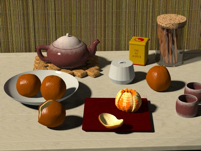
My entry in the previous irtc round was something of a rush job, done
over about 4 days while on vacation at the end of December.  I think the
  work may have more potential than what was complete at the time of the
deadline.  So I have decided to try and complete to a second state.  I
have made some changes based on comments received in the contest in dome
cases, and included elements that render times prevented during the
entry period.  All suggestions on how to make this a better picture are
welcome.
-Jim
Post a reply to this message
Attachments:
Download 'v30001.jpg' (95 KB)
Preview of image 'v30001.jpg'
|
|
| |
| |
|
|
|
|
| |
| |
|
|
Hi Jim,

Textures look great 'except' that the orange peel looks brown on my monitor,
and the orange segments are perhaps a little 'too' orange.

All the best,

Andy Cocker
Post a reply to this message
|
|
| |
| |
|
|
|
|
| |
| |
|
|
"Jim Charter" <jrc### [at] aol com> wrote in message
news:3C5### [at] aolcom...
> My entry in the previous irtc round was something of a rush job, done
> over about 4 days while on vacation at the end of December. I think the
> work may have more potential than what was complete at the time of the
> deadline. So I have decided to try and complete to a second state. I
> have made some changes based on comments received in the contest in dome
> cases, and included elements that render times prevented during the
> entry period. All suggestions on how to make this a better picture are
> welcome.
> -Jim
>
Make the textures in the oranges semi transparent and fill with scattering
media. problem is, it will take a lot longer to render...
--
#local X=20*<-2,2,5>;sphere_sweep{catmull_rom_spline 6<-8,-8>1<-8,-8>1<-8,8>1<
8,-8>1<8,8>1<8,8>1translate 20*z pigment{gradient z scale 3color_map{[0rgb<0,9
,18>][1rgb 0]}}}#local K=2*z*X-X;#local R=seed(clock);blob{#while(K.x>X.x)
#local N=X+<rand(R)rand(R)1>/3;#local X=(vlength(N-K)<vlength(X-K)?N:2*X-N);
sphere{X,1,1rotate z*90}sphere{X,1,1}#end pigment{rgbt 1}interior{media{//Nekar
emission<2,4,5>*5}}hollow scale.05}// http://nekar_xenos.tripod.com/metanoia/
---
Outgoing mail is certified Virus Free.
Checked by AVG anti-virus system (http://www.grisoft.com).
Version: 6.0.317 / Virus Database: 176 - Release Date: 2002/01/21 com> wrote in message
news:3C5### [at] aolcom...
> My entry in the previous irtc round was something of a rush job, done
> over about 4 days while on vacation at the end of December. I think the
> work may have more potential than what was complete at the time of the
> deadline. So I have decided to try and complete to a second state. I
> have made some changes based on comments received in the contest in dome
> cases, and included elements that render times prevented during the
> entry period. All suggestions on how to make this a better picture are
> welcome.
> -Jim
>
Make the textures in the oranges semi transparent and fill with scattering
media. problem is, it will take a lot longer to render...
--
#local X=20*<-2,2,5>;sphere_sweep{catmull_rom_spline 6<-8,-8>1<-8,-8>1<-8,8>1<
8,-8>1<8,8>1<8,8>1translate 20*z pigment{gradient z scale 3color_map{[0rgb<0,9
,18>][1rgb 0]}}}#local K=2*z*X-X;#local R=seed(clock);blob{#while(K.x>X.x)
#local N=X+<rand(R)rand(R)1>/3;#local X=(vlength(N-K)<vlength(X-K)?N:2*X-N);
sphere{X,1,1rotate z*90}sphere{X,1,1}#end pigment{rgbt 1}interior{media{//Nekar
emission<2,4,5>*5}}hollow scale.05}// http://nekar_xenos.tripod.com/metanoia/
---
Outgoing mail is certified Virus Free.
Checked by AVG anti-virus system (http://www.grisoft.com).
Version: 6.0.317 / Virus Database: 176 - Release Date: 2002/01/21
Post a reply to this message
|
|
| |
| |
|
|
|
|
| |
| |
|
|
"Jim Charter" <jrc### [at] aolcom> wrote in message
news:3C5### [at] aolcom...

Very nice - the teapot has some highlights, should the cups have the same since
they look like the same material?
Post a reply to this message
|
|
| |
| |
|
|
|
|
| |
| |
|
|
Jim:

  As valencian, I can't resist to comment on the oranges: although there
are orange varieties with such dark-redish color, they are not really
common. Most people would see them more convincing with a more orange color
(but for me they are clearly what we call here "blood" oranges, "taronxa de
sanc" in valencian).

  Anyhow, I've read the technique you used for the oranges, and it is very
good and brilliant, indeed. The skin grain is very good, but perhpas the
big deformations are too pronounced: oranges are not spherical, but they
tend to be more spherical.


--
Jaime Vives Piqueres

La Persistencia de la Ignorancia
http://www.ignorancia.org
Post a reply to this message
|
|
| |
| |
|
|
|
|
| |
| |
|
|
I agree with the other comments about the color of the oranges and the
orange flesh being somewhat off.

I also feel the "opened" orange is a bit too cleanly opened and the contents
(I assuming the flesh is from the opened orange) would not have fit through
the opening made in that orange.  In fact I have never seen the contents of
an orange come cleanly out of the interior of the skin since they are so
well attached.

The glass container in the background might benefit through the use of
photons.

Despite my comments I think the image is great!  It really looks "real" and
solid.


"Jim Charter" <jrc### [at] aolcom> wrote in message
news:3C5### [at] aolcom...
> My entry in the previous irtc round was something of a rush job, done
> over about 4 days while on vacation at the end of December.  I think the
>   work may have more potential than what was complete at the time of the
> deadline.  So I have decided to try and complete to a second state.  I
> have made some changes based on comments received in the contest in dome
> cases, and included elements that render times prevented during the
> entry period.  All suggestions on how to make this a better picture are
> welcome.
> -Jim
>


----------------------------------------------------------------------------
----
Post a reply to this message
|
|
| |
| |
|
|
|
|
| |
| |
|
|
Jim Charter <jrc### [at] aolcom> wrote in message
news:3C5### [at] aolcom...

Very impressive. I have seen tangerines that would pop out of the skin like
that. I will have to go back and find your IRTC entry to learn how you
created the oranges.

 -Shay
Post a reply to this message
|
|
| |
| |
|
|
|
|
| |
| |
|
|
Nekar Xenos wrote:

> Make the textures in the oranges semi transparent and fill with scattering
> media. problem is, it will take a lot longer to render...

Good idea, especially since traditional still life with sliced open lemons or the
like often seem to emphasize the transparency.  The texture had a slight
transparency as it stands now, .15 I think.  But it would be interesting to use
more and with scattering media.  Without a deadline looming, render times are no
obstacle.
Post a reply to this message
|
|
| |
| |
|
|
|
|
| |
| |
|
|
Sharp observation Tom.  I don't really know the answer, the identical texture
including finish is applied to each

Tom Melly wrote:

> "Jim Charter" <jrc### [at] aolcom> wrote in message
> news:3C5### [at] aolcom...
>
> Very nice - the teapot has some highlights, should the cups have the same since
> they look like the same material?
Post a reply to this message
|
|
| |
| |
|
|
|
|
| |
| |
|
|
Patrick Dugan wrote:

> I also feel the "opened" orange is a bit too cleanly opened and the contents
> (I assuming the flesh is from the opened orange) would not have fit through
> the opening made in that orange.  In fact I have never seen the contents of
> an orange come cleanly out of the interior of the skin since they are so
> well attached.

Yes the peels do need more work.  Probably there sould be thre pieces and the
edges much more ragged.  I just can't think how to do it at the moment.  Right
now. one piece is an intersection with some blobs, the other a difference with
the same set of blobs. Maybe I can get more blobs with a greater range of scale
involved.

>
>
> The glass container in the background might benefit through the use of
> photons.

Never even thought if that one!  Have never used photons.  Mmm scary.  Will look
into it.
Post a reply to this message
|
|
| |
| |
|
|
|
|
| |
| |
|
|
Yes I was using as a general reference some clementines and also some
tangerines which both tend to be dark and reddish.  I was so excited with how
the color worked together with the texture that I allowed this stretching of
reality to creep in.  I will play with the color further. Same with the
irregularity.  I guess I wanted it to be noticable and exaggerated it some.
Thanks for your kind remarks, Jaime.

Jaime Vives Piqueres wrote:

> Jim:
>
>   As valencian, I can't resist to comment on the oranges: although there
> are orange varieties with such dark-redish color, they are not really
> common. Most people would see them more convincing with a more orange color
> (but for me they are clearly what we call here "blood" oranges, "taronxa de
> sanc" in valencian).
>
>   Anyhow, I've read the technique you used for the oranges, and it is very
> good and brilliant, indeed. The skin grain is very good, but perhpas the
> big deformations are too pronounced: oranges are not spherical, but they
> tend to be more spherical.
>
> --
> Jaime Vives Piqueres
>
> La Persistencia de la Ignorancia
> http://www.ignorancia.org
Post a reply to this message
|
|
| |
| |
|
|
|
|
| |
| |
|
|
On Tue, 29 Jan 2002 00:27:44 -0500, Jim Charter wrote:

>  All suggestions on how to make this a better picture are
>welcome.

Nicely set out, the orange peel looks brown to me and the segments of
orange have a solid/stale look to them.

The bread sticks in the jar are excelent.

--
%HAV-A-NICEDAY                    email mailto:ste### [at] zeroppsuklinuxnet
Steve                                web http://www.zeropps.uklinux.net/
                                             or http://start.at/zero-pps
  3:34pm  up 113 days,  7:24,  1 user,  load average: 1.02, 1.03, 1.02
Post a reply to this message
|
|
| |
| |
|
|
|
|
| |
| |
|
|
Thanks Andy, I will play with the color some more.  Since the oranges are teh
focus of attention I guess it would pay to get them right

Andrew Cocker wrote:

> Hi Jim,
>
> Textures look great 'except' that the orange peel looks brown on my monitor,
> and the orange segments are perhaps a little 'too' orange.
>
> All the best,
>
> Andy Cocker
Post a reply to this message
|
|
| |
| |
|
|
|
|
| |
| |
|
|
Yes the actual examples I had at hand were clementines and the skin seems to be
attached to them quite loosely.  The technique I used is a variation on the
technique I used in my entry for the "Worship" round.

Shay wrote:

> Jim Charter <jrc### [at] aolcom> wrote in message
> news:3C5### [at] aolcom...
>
> Very impressive. I have seen tangerines that would pop out of the skin like
> that. I will have to go back and find your IRTC entry to learn how you
> created the oranges.
>
>  -Shay
Post a reply to this message
|
|
| |
| |
|
|
|
|
| |
| |
|
|
I think maybe you just can't see the highlight because of the viewing angle.

Stephen

"Jim Charter" <jrc### [at] aolcom> wrote in message
news:3C56EF29.F9F121CC@aol.com...
> Sharp observation Tom.  I don't really know the answer, the identical
texture
> including finish is applied to each
>
> Tom Melly wrote:
>
> > "Jim Charter" <jrc### [at] aolcom> wrote in message
> > news:3C5### [at] aolcom...
> >
> > Very nice - the teapot has some highlights, should the cups have the
same since
> > they look like the same material?
>
Post a reply to this message
|
|
| |
| |
|
|
|
|
| |
| |
|
|
Steve wrote:
> Nicely set out, the orange peel looks brown to me and the segments of
> orange have a solid/stale look to them.

Agreed.

>
> The bread sticks in the jar are excelent.

bread sticks?  I assumed they were cinnamon.

--
Tom Bates
Post a reply to this message
|
|
| |
| |
|
|
|
|
| |
| |
|
|
Speaking strictly as an art student, the background is taking the attention
away from all of your beautiful objects.  The antialiasing creates some
strange patterns, and the bright coloring is pretty harsh.  Is there any way
to scale up the pattern on the back wall so that the antialiasing wouldn't
do weird things to the lines?  And maybe darken the wall or make your light
source not shine quite so directly on it.  Great scene otherwise.  Keep up
the good work.

Stephen

"Jim Charter" <jrc### [at] aolcom> wrote in message
news:3C5### [at] aolcom...
> My entry in the previous irtc round was something of a rush job, done
> over about 4 days while on vacation at the end of December.  I think the
>   work may have more potential than what was complete at the time of the
> deadline.  So I have decided to try and complete to a second state.  I
> have made some changes based on comments received in the contest in dome
> cases, and included elements that render times prevented during the
> entry period.  All suggestions on how to make this a better picture are
> welcome.
> -Jim
>


----------------------------------------------------------------------------
----
Post a reply to this message
|
|
| |
| |
|
|
|
|
| |
| |
|
|
Yes the intention was cinnamon.  I put a spiral normal on them but it
doesn't really show up.

Tom Bates wrote:

> Steve wrote:
> > Nicely set out, the orange peel looks brown to me and the segments of
> > orange have a solid/stale look to them.
>
> Agreed.
>
> >
> > The bread sticks in the jar are excelent.
>
> bread sticks?  I assumed they were cinnamon.
>
> --
> Tom Bates
Post a reply to this message
|
|
| |
| |
|
|
|
|
| |
| |
|
|
I have, off and on, played with still life scenes where the vertical of the
backdrop is painted in some intense texture which challenges the sense of space,
but adds an overall visual "punch" to the image.  The tradeoff is between a nice
illusion of space and the visual scintillation of the background texture/pattern
which is alligned with the picture plane and can sometimes ( especially in my
paintings ) work as a tromp l'oeil surface texture.  This harkens back to
Matisse, as I am sure you know.
Your idea of darkening the backdrop, overall, is worth a try.  The moire effect
is a tradeoff between realistic scale of the rattan, and the interference
patterns caused when the scale of the pattern approaches the scale of the
resolution.  Maybe I will try a different pattern.

Stephen Bell wrote:

> Speaking strictly as an art student, the background is taking the attention
> away from all of your beautiful objects.  The antialiasing creates some
> strange patterns, and the bright coloring is pretty harsh.  Is there any way
> to scale up the pattern on the back wall so that the antialiasing wouldn't
> do weird things to the lines?  And maybe darken the wall or make your light
> source not shine quite so directly on it.  Great scene otherwise.  Keep up
> the good work.
>
> Stephen
>
Post a reply to this message
|
|
| |
| |
|
|
|
|
| |
| |
|
|
Some beautiful texture work there! Only thing I could sugest is perhaps
using radiosity, it could help soften some of those really dark shadows.
However this might be a realism/artisic tradeoff decision on your part.
Post a reply to this message
|
|
| |
| |
|
|
|
|
| |
| |
|
|
Actually I did use radiosity, but along with an area light

Thomas Lake wrote:

> Some beautiful texture work there! Only thing I could sugest is perhaps
> using radiosity, it could help soften some of those really dark shadows.
> However this might be a realism/artisic tradeoff decision on your part.
Post a reply to this message
|
|
| |
| |
|
|
|
|
| |
| |
|
|
That's a very nice looking picture! Is that supposed to be a sugar bowl in the
middle? It -- unlike the excellent teapot -- looks too solid; I'm not sure where
the lid stops and the bowl starts.

BTW, where is the spoon? Or should there be one? Since this was originally for
the "Spirit of Asia" round, just ignore my cultural ignorance if it turns out
that isn't supposed to be a sugar bowl and no spoon is needed :)


--
light_source{0,1}#macro c(J,a)sphere{0,1pigment{rgb z}scale a translate J+O}
#end#macro B(R,V,O)c(0,4)intersection{c(V,R)difference{c(-z*4x+10)c(-z*4.1x+
10)c(0<7.5,45,5>)}}#end B(12,0z*25)B(8y*4<0,12,50>)          // Batronyx ^"^
Post a reply to this message
|
|
| |
| |
|
|
|
|
| |
| |
|
|
You got me!  It is a spoonless ( or tongless  if lumps ) sugar bowl.
MOre detail needed there too. :)

Batronyx wrote:

> That's a very nice looking picture! Is that supposed to be a sugar bowl in the
> middle? It -- unlike the excellent teapot -- looks too solid; I'm not sure where
> the lid stops and the bowl starts.
>
> BTW, where is the spoon? Or should there be one? Since this was originally for
> the "Spirit of Asia" round, just ignore my cultural ignorance if it turns out
> that isn't supposed to be a sugar bowl and no spoon is needed :)
>
>
> --
> light_source{0,1}#macro c(J,a)sphere{0,1pigment{rgb z}scale a translate J+O}
> #end#macro B(R,V,O)c(0,4)intersection{c(V,R)difference{c(-z*4x+10)c(-z*4.1x+
> 10)c(0<7.5,45,5>)}}#end B(12,0z*25)B(8y*4<0,12,50>)          // Batronyx ^"^
>
>
>
Post a reply to this message
|
|
| |
| |
|
|
|
|
| |
| |
|
|
"Stephen Bell" <ste### [at] yahoocom> wrote in message
news:3c5700fe@news.povray.org...
> I think maybe you just can't see the highlight because of the viewing angle.

I considered that, but IMHO no. Take a look at the highlight on the unpeeled
orange on the right - the highlight on the cups should be in roughly the same
place. Also, and this is fairly subjective, there are other aspects to the
finish on the teapot that seem to be missing from the cups. The teapot has some
reflectivity and is generally glossier.

I'd double-check your code - it looks like the finish has been dropped from the
cups....
Post a reply to this message
|
|
| |
| |
|
|
|
|
| |
| |
|
|
If you look very closely at the white part of the cups, I do believe you can
see the hightlights there.
Or maybe I'm just seeing things.

-tgq
Post a reply to this message
|
|
| |
| |
|
|
|
|
| |
| |
|
|
I think yours is the best explanation, else it is really a puzzle.  The pigment
and finish are wrappered under the same texture name and applied to all three
objects.  I also switched the locations of one of the cups and one of the
oranges and sure enough, the orange shows a highlight where the cup wouldn't and
the cup still won't show a highlight except the thread along the very top.  Hope
soon to post a new version including most of the suggestions posted here.  Will
be my first time with a photon map.  Whoohoo!

TinCanMan wrote:

> If you look very closely at the white part of the cups, I do believe you can
> see the hightlights there.
> Or maybe I'm just seeing things.
>
> -tgq
Post a reply to this message
|
|
| |
| |
|
|
|
|
| |