|
|
|
|
|
|
| |
| |
|
|
|
|
| |
| |
|
|
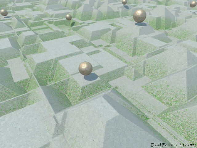
Sort of, not really, based on Incan, Aztec, and Mayan stuff. Every
object but the cloud pigment on the sky_sphere, which is not discernably
reflected in the brass spheres anyway, uses crackle. Also my first use
of rad_def.inc in 3.5, and I was quite pleased.
The surface normals got averaged out a bit when I resized it from
1280x960. The stonework looks less precise than I wanted, but I
increased the beveling in the normal to make the cracks more visible.
Everything looks better at 1280x960.
Comments?
--
David Fontaine <dav### [at] faricy net> ICQ 55354965
My raytracing gallery: http://davidf.faricy.net/ net> ICQ 55354965
My raytracing gallery: http://davidf.faricy.net/
Post a reply to this message
Attachments:
Download 'civilization.jpg' (146 KB)
Preview of image 'civilization.jpg'
|
|
| |
| |
|
|
|
|
| |
| |
|
|
David Fontaine wrote:

 > Comments?

Strange but nice... perhaps the sun is too vertical (if there were not
spheres, sun position will be very difficult to understand).

--
Jaime Vives Piqueres

La Persistencia de la Ignorancia
http://www.ignorancia.org/
Post a reply to this message
|
|
| |
| |
|
|
From: Mick Hazelgrove
Subject: Re: Civilization of sorts, or, Fun with crackle
Date: 8 Dec 2001 04:58:21
Message: <3c11e43d@news.povray.org>
|
|
|
| |
| |
|
|
An excellent image with a sense of the ancient - perhaps less perfection,
some ruination? Nice colour and textures.

Mick

"Jaime Vives Piqueres" <jai### [at] ignoranciaorg> wrote in message
news:3C1### [at] ignoranciaorg...
> David Fontaine wrote:
>
>  > Comments?
>
> Strange but nice... perhaps the sun is too vertical (if there were not
> spheres, sun position will be very difficult to understand).
>
> --
> Jaime Vives Piqueres
>
> La Persistencia de la Ignorancia
> http://www.ignorancia.org/
>
Post a reply to this message
|
|
| |
| |
|
|
From: Kevin Ellis
Subject: Re: Civilization of sorts, or, Fun with crackle
Date: 8 Dec 2001 08:23:13
Message: <3c121441@news.povray.org>
|
|
|
| |
| |
|
|
I really like this although I agree with Jaime that the sun is too vertical.
Try lowering it towards the horizon and then you should be able to see a
more dramatic effect from the radiosity.

Kev
Post a reply to this message
|
|
| |
| |
|
|
From: Christoph Hormann
Subject: Re: Civilization of sorts, or, Fun with crackle
Date: 8 Dec 2001 08:59:12
Message: <3C121CB0.513C5132@gmx.de>
|
|
|
| |
| |
|
|
David Fontaine wrote:
>
> Sort of, not really, based on Incan, Aztec, and Mayan stuff.  Every
> object but the cloud pigment on the sky_sphere, which is not discernably
> reflected in the brass spheres anyway, uses crackle.  Also my first use
> of rad_def.inc in 3.5, and I was quite pleased.
>
> The surface normals got averaged out a bit when I resized it from
> 1280x960.  The stonework looks less precise than I wanted, but I
> increased the beveling in the normal to make the cracks more visible.
> Everything looks better at 1280x960.
>

Really effective, the crackle pattern offers indeed a lot of
possibilities.  Is it a heightfield or an isosurface?

Christoph

--
Christoph Hormann <chr### [at] gmxde>
IsoWood include, radiosity tutorial, TransSkin and other
things on: http://www.schunter.etc.tu-bs.de/~chris/
Post a reply to this message
|
|
| |
| |
|
|
From: Kevin
Subject: Re: Civilization of sorts, or, Fun with crackle
Date: 8 Dec 2001 12:14:07
Message: <3c124a5f@news.povray.org>
|
|
|
| |
| |
|
|
Understated, but definately cool!

- Kevin


"David Fontaine" <dav### [at] faricynet> wrote in message
news:3C11AAD2.E059B8F3@faricy.net...
> Sort of, not really, based on Incan, Aztec, and Mayan stuff.  Every
> object but the cloud pigment on the sky_sphere, which is not discernably
> reflected in the brass spheres anyway, uses crackle.  Also my first use
> of rad_def.inc in 3.5, and I was quite pleased.
>
> The surface normals got averaged out a bit when I resized it from
> 1280x960.  The stonework looks less precise than I wanted, but I
> increased the beveling in the normal to make the cracks more visible.
> Everything looks better at 1280x960.
>
> Comments?
>
> --
> David Fontaine  <dav### [at] faricynet>  ICQ 55354965
> My raytracing gallery:  http://davidf.faricy.net/


----------------------------------------------------------------------------
----
Post a reply to this message
|
|
| |
| |
|
|
|
|
| |
| |
|
|
Jaime Vives Piqueres wrote:
>
> Strange but nice...

Thanks

> perhaps the sun is too vertical (if there were not
> spheres, sun position will be very difficult to understand).

perhaps... i might try some different positions.

--
David Fontaine  <dav### [at] faricynet>  ICQ 55354965
My raytracing gallery:  http://davidf.faricy.net/
Post a reply to this message
|
|
| |
| |
|
|
|
|
| |
| |
|
|
Mick Hazelgrove wrote:
>
> An excellent image with a sense of the ancient - perhaps less perfection,
> some ruination? Nice colour and textures.

Thanks.  More ruination might be difficult though, I might have to go to
an isosurface, and then, the displacement is vertical so it'd be hard to
take chunks out perpendicular to the inclined faces without skewing the
chunks.  If I want to wait years I can always difference two isos.

--
David Fontaine  <dav### [at] faricynet>  ICQ 55354965
My raytracing gallery:  http://davidf.faricy.net/
Post a reply to this message
|
|
| |
| |
|
|
|
|
| |
| |
|
|
Kevin Ellis wrote:
>
> I really like this although I agree with Jaime that the sun is too vertical.
> Try lowering it towards the horizon and then you should be able to see a
> more dramatic effect from the radiosity.

Thanks.  I agree, a little more contrast might help it.

--
David Fontaine  <dav### [at] faricynet>  ICQ 55354965
My raytracing gallery:  http://davidf.faricy.net/
Post a reply to this message
|
|
| |
| |
|
|
|
|
| |
| |
|
|
Christoph Hormann wrote:
>
> Really effective, the crackle pattern offers indeed a lot of
> possibilities.  Is it a heightfield or an isosurface?

Height_field.  Isosurface goes much much slower.  :(

--
David Fontaine  <dav### [at] faricynet>  ICQ 55354965
My raytracing gallery:  http://davidf.faricy.net/
Post a reply to this message
|
|
| |
| |
|
|
|
|
| |
| |
|
|
"Kevin iggle@mtcn" wrote:
>
> Understated, but definately cool!

Thanks!

--
David Fontaine  <dav### [at] faricynet>  ICQ 55354965
My raytracing gallery:  http://davidf.faricy.net/
Post a reply to this message
|
|
| |
| |
|
|
|
|
| |
| |
|
|
On Fri, 07 Dec 2001 23:53:22 -0600, David Fontaine <dav### [at] faricynet>
wrote:

>This is a multi-part message in MIME format.
>--------------8A793892BEEF8EA0C9E51442
>Content-Type: text/plain; charset=us-ascii
>Content-Transfer-Encoding: 7bit
>
>Sort of, not really, based on Incan, Aztec, and Mayan stuff.  Every
>object but the cloud pigment on the sky_sphere, which is not discernably
>reflected in the brass spheres anyway, uses crackle.  Also my first use
>of rad_def.inc in 3.5, and I was quite pleased.
>
>The surface normals got averaged out a bit when I resized it from
>1280x960.  The stonework looks less precise than I wanted, but I
>increased the beveling in the normal to make the cracks more visible.
>Everything looks better at 1280x960.
>
>Comments?
>
>--

	Freakin cool!

Pete
Post a reply to this message
|
|
| |
| |
|
|
|
|
| |
| |
|
|
Pet### [at] nymaliasnetalmost wrote:
>
>         Freakin cool!

Thanks!

--
David Fontaine  <dav### [at] faricynet>  ICQ 55354965
My raytracing gallery:  http://davidf.faricy.net/
Post a reply to this message
|
|
| |
| |
|
|
|
|
| |
| |
|
|
Lowered the sun's position and tweaked the surface normals a bit.  The
blue/yellow contrast from the radiosity is more pronounced now.  Perhaps
a bit dark now though, could be adjusted.

http://davidf.faricy.net/renders/civilization.jpg
(resized from 1152x864)

--
David Fontaine  <dav### [at] faricynet>  ICQ 55354965
My raytracing gallery:  http://davidf.faricy.net/
Post a reply to this message
|
|
| |
| |
|
|
|
|
| |
| |
|
|
"David Fontaine" <dav### [at] faricynet> wrote in message
news:3C184626.AEB03636@faricy.net...
> Lowered the sun's position and tweaked the surface normals a bit.  The
> blue/yellow contrast from the radiosity is more pronounced now.  Perhaps
> a bit dark now though, could be adjusted.

Much better, but I still think it should be lower. At this angle you get a
bad line diagonally through the center of the image where you can just see
the shadow which is kind of distarcting.

Kev
Post a reply to this message
|
|
| |
| |
|
|
|
|
| |
| |
|
|
Kevin Ellis wrote:
>
> Much better, but I still think it should be lower. At this angle you get a
> bad line diagonally through the center of the image where you can just see
> the shadow which is kind of distarcting.

(mumble mumble groan) Though, perhaps you are right...

--
David Fontaine  <dav### [at] faricynet>  ICQ 55354965
My raytracing gallery:  http://davidf.faricy.net/
Post a reply to this message
|
|
| |
| |
|
|
|
|
| |
| |
|
|
http://davidf.faricy.net/renders/civilization.jpg

version 2 was:
http://davidf.faricy.net/renders/civilization_.jpg

I think it's very close to finished now.  Any comments?

--
David Fontaine  <dav### [at] faricynet>  ICQ 55354965
My raytracing gallery:  http://davidf.faricy.net/
Post a reply to this message
|
|
| |
| |
|
|
|
|
| |
| |
|
|
"David Fontaine" <dav### [at] faricynet> wrote in message
news:3C1C1987.D7BDEEFD@faricy.net...
> http://davidf.faricy.net/renders/civilization.jpg
>
> version 2 was:
> http://davidf.faricy.net/renders/civilization_.jpg
>
> I think it's very close to finished now.  Any comments?

The chipped stone looks good.  What occured to me about the vines, or
vegetation, is that there isn't any thick ground cover on the lowest flat
areas.  Guess that could be explained by the predominant places for growth
being only on angled walls.  Would be great if there were a way to get the
smaller walls to have less greenery and the larger ones more.  Not sure if
slope texturing can vary in that way.
--
text{ttf"arial","bob h",.1,0pigment{rgb 9}translate<-1,-.2,3>}
Post a reply to this message
|
|
| |
| |
|
|
|
|
| |
| |
|
|
bob h wrote:
>
> The chipped stone looks good.  What occured to me about the vines, or
> vegetation, is that there isn't any thick ground cover on the lowest flat
> areas.  Guess that could be explained by the predominant places for growth
> being only on angled walls.  Would be great if there were a way to get the
> smaller walls to have less greenery and the larger ones more.  Not sure if
> slope texturing can vary in that way.

I don't think that's possible.  Also, to get better contrast between the
vegetation in the high and low flat areas, I had to make the texture
depend to much on elevation and too little on slope, and couldn't get
realistic contrast between the walls and the flat areas.  I decided this
was an okay compromise.

Maybe I could have a look into combining two vine textures, one more
dependent on elevation and one more on slope.

--
David Fontaine  <dav### [at] faricynet>  ICQ 55354965
My raytracing gallery:  http://davidf.faricy.net/
Post a reply to this message
|
|
| |
| |
|
|
|
|
| |
| |
|
|
Is there any chance I could get a copy of the code for that Christmas
tree in your gallery? I tried to replicate it, but very weird things
started to happen, so I abandoned that pretty fast...

--
signature{
  "Grey Knight"
  contact{ email "gre### [at] yahoocom" }
  site_of_week{ url "http://enphilistor.users4.50megs.com/" }
}
Post a reply to this message
|
|
| |
| |
|
|
|
|
| |