|
|
|
|
|
|
| |
| |
|
|
|
|
| |
| |
|
|
Alberto.
Post a reply to this message
Attachments:
Download 'room.jpg' (74 KB)
Preview of image 'room.jpg'
|
|
| |
| |
|
|
|
|
| |
| |
|
|
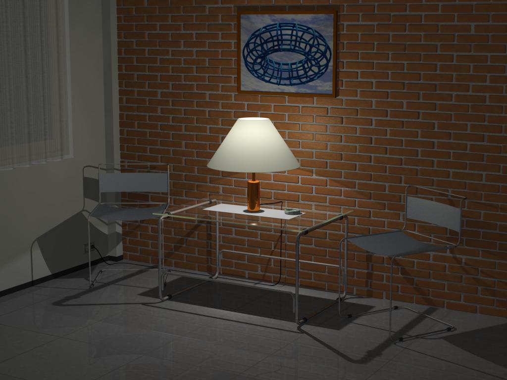
Very nice. Can you tell us a little more about the image and its making? My
only comment to you would be to make it a little dirtier, add a little more
variety to the coloring of the bricks, and toss in some focal blur for ol'
times' sake. :)
Post a reply to this message
|
|
| |
| |
|
|
|
|
| |
| |
|
|
>

An interesting study.  A sense of mood. Ennui perhaps.  Is the lamp exactly in
the centre, are the chairs exactly at 45 degrees?  The black dasher looked
like a shadow to me btw, took awhile to resolve what it was.  Only when I
meticulously traced the lamp cord with my eye did I get it.
Post a reply to this message
|
|
| |
| |
|
|
|
|
| |
| |
|
|
"Tony[B]" wrote:
>
> only comment to you would be to make it a little dirtier, add a little more
> variety to the coloring of the bricks

I just a made a tileable brick wall height field. Brief explanation:
http://www.pp.htv.fi/kkivisal/brick.htm


The translucent lamp shade looks good. It doesn't look just double illuminate
was used here.


_____________
Kari Kivisalo
Post a reply to this message
|
|
| |
| |
|
|
|
|
| |
| |
|
|
Those chairs could never support me  :-) and their seats seem to high up but
I think that's because of the table and backs of the chairs being low.
Nice lighting.

Bob H.
Post a reply to this message
|
|
| |
| |
|
|
|
|
| |
| |
|
|
Wow! You're good.
Post a reply to this message
|
|
| |
| |
|
|
|
|
| |
| |
|
|
The kindly Rev. overheard Alberto <jac### [at] usb ve> saying on 22 Jul 2001:
> Attachment saved: D:\Application Data\Xnews\Attachments\room.jpg
Great. I like the harsh shadows. They certainly do give the
impression that the lamp in the scene is the only light on in the room.
The only thing I wonder about is, wouldn't the lampshade be a secondary
source of light in the real world (along with all the objects in the
room to a lesser extent)? I think the shadows might consequently be
just a smidgen too sharp.
--
Rev. Bob "Bob" Crispen
crispen at hiwaay dot net
"And I observe, when any Yahoo comes from London out of Curiosity [to]
visit me at mine own House, we neither of us are able to deliver our
Conceptions in a Manner intelligible to the other." - Jonathan Swift ve> saying on 22 Jul 2001:
> Attachment saved: D:\Application Data\Xnews\Attachments\room.jpg
Great. I like the harsh shadows. They certainly do give the
impression that the lamp in the scene is the only light on in the room.
The only thing I wonder about is, wouldn't the lampshade be a secondary
source of light in the real world (along with all the objects in the
room to a lesser extent)? I think the shadows might consequently be
just a smidgen too sharp.
--
Rev. Bob "Bob" Crispen
crispen at hiwaay dot net
"And I observe, when any Yahoo comes from London out of Curiosity [to]
visit me at mine own House, we neither of us are able to deliver our
Conceptions in a Manner intelligible to the other." - Jonathan Swift
Post a reply to this message
|
|
| |
| |
|
|
|
|
| |
| |
|
|
In article <3b5b22ba@news.povray.org>, Tony[B] says...
> Wow! You're good.
>
>
>
I don't understand this: is the image by Alberto or by Kari? Or are they
the same person??

IMO the image is a little stiff, although it generally looks very good.
I agree with Tony! Make it a little more real...  :))
--
Regards,  Sander
Post a reply to this message
|
|
| |
| |
|
|
|
|
| |
| |
|
|
This has a lovely cool atmosphere to it.  It feels more
like a patio on a summer evening after the sun has gone
down.  The pic on the wall is good too.

--
Cheers
Steve              email mailto:ste### [at] zeroppsuklinuxnet

%HAV-A-NICEDAY Error not enough coffee  0 pps.

web http://www.zeropps.uklinux.net/

or  http://start.at/zero-pps

  9:55pm  up 8 days, 23:57,  2 users,  load average: 1.60, 1.19, 1.06
Post a reply to this message
|
|
| |
| |
|
|
|
|
| |
| |
|
|
"Tony[B]" wrote:
>
> Very nice. Can you tell us a little more about the image and its making? My
> only comment to you would be to make it a little dirtier, add a little more
> variety to the coloring of the bricks, and toss in some focal blur for ol'
> times' sake. :)

Some time ago I made a brick wall macro and this scene was motivated by
it's use. I thought that the scene was in it's final state but I'll try
some of your suggestions.
Post a reply to this message
|
|
| |
| |
|
|
|
|
| |
| |
|
|
"Bob H." wrote:
>
> Those chairs could never support me  :-) and their seats seem to high up but
> I think that's because of the table and backs of the chairs being low.

Well... yes, everyone can sit at it's own risk. 8-)

> Nice lighting.

Thanks.
Post a reply to this message
|
|
| |
| |
|
|
|
|
| |
| |
|
|
Kari Kivisalo wrote:
>
> I just a made a tileable brick wall height field. Brief explanation:
> http://www.pp.htv.fi/kkivisal/brick.htm
>
Fantastic!

It's hard to compete with image maps :-)

> The translucent lamp shade looks good. It doesn't look just double illuminate
> was used here.
>

A little bit of brilliance was used to.
Alberto.
Post a reply to this message
|
|
| |
| |
|
|
|
|
| |
| |
|
|
Looks pretty realistic.  Those chairs don't look too comfortable IMHO...

--
David Fontaine  <dav### [at] faricynet>  ICQ 55354965
My raytracing gallery:  http://davidf.faricy.net/
Post a reply to this message
|
|
| |
| |
|
|
|
|
| |
| |
|
|
Nice!
If I lived in this place, there would be a lot more objects scattered around
:)
I like your brick wall, I think it lives up to the inndoor look, not too
rough..
And I'm really interested in how you did the curtains, they look great!

"Alberto" <jac### [at] usbve> skrev i melding news:3B5AD6E6.42A3915C@usb.ve...
> Alberto.
Post a reply to this message
|
|
| |
| |
|
|
|
|
| |
| |
|
|
Jim Charter wrote:
>
> An interesting study.  A sense of mood. Ennui perhaps.  Is the lamp exactly in
> the centre, are the chairs exactly at 45 degrees?

Yes they are. I allready change this.


> The black dasher looked
> like a shadow to me btw, took awhile to resolve what it was.  Only when I
> meticulously traced the lamp cord with my eye did I get it.

I thought it was wrong to put the outlet on the brick wall.
Post a reply to this message
|
|
| |
| |
|
|
|
|
| |
| |
|
|
David Fontaine wrote:
>
> Looks pretty realistic.
Thanks.
> Those chairs don't look too comfortable IMHO...
>
                  ?-)
Post a reply to this message
|
|
| |
| |
|
|
|
|
| |
| |
|
|
Steve wrote:
>
> This has a lovely cool atmosphere to it.  It feels more
> like a patio on a summer evening after the sun has gone
> down.  The pic on the wall is good too.
>
Thank you. At the beginning I wanted to call the scene something like relax.
Post a reply to this message
|
|
| |
| |
|
|
|
|
| |
| |
|
|
Peter Hertel wrote:
>
> Nice!
> If I lived in this place, there would be a lot more objects scattered around
> :)
> I like your brick wall, I think it lives up to the inndoor look, not too
> rough..
> And I'm really interested in how you did the curtains, they look great!
>

The curtains are bezier spline prisms with a downscaled uv-mapped
quilted semi-transparent pigment with a little turbulence.
A finish was also used, in fact finish{brilliance .5  ambient .15}.

If you are interested I can post the macro that generates the prism.

Alberto
Post a reply to this message
|
|
| |
| |
|
|
|
|
| |
| |
|
|
> The curtains are bezier spline prisms with a downscaled uv-mapped
> quilted semi-transparent pigment with a little turbulence.
> A finish was also used, in fact finish{brilliance .5  ambient .15}.
>
> If you are interested I can post the macro that generates the prism.
>
> Alberto

That would've been great, I'd like to take a look, and see if I can learn
anything.
You can mail it to me if it's too big to post here pet### [at] hertelno thanks :)
-Peter
Post a reply to this message
|
|
| |
| |
|
|
|
|
| |