|
|
|
|
|
|
| |
| |
|
|
|
|
| |
| |
|
|
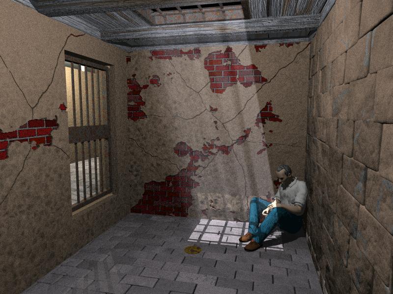
Yes, it is for the current IRTC round.
Thanks in advance for any comments.
Bob
Post a reply to this message
Attachments:
Download 'hostage.jpg' (84 KB)
Preview of image 'hostage.jpg'
|
|
| |
| |
|
|
|
|
| |
| |
|
|
Very nice. I think the floor is too clean (you can even see
highlights/reflection from the door bars). Kinda minor complaint given the
overall quality :-)
"Bob Franke" <bob### [at] hotmail com> wrote in message
news:3AC66C6A.166A4B98@hotmail.com...
> Yes, it is for the current IRTC round.
> Thanks in advance for any comments.
> Bob
>
Post a reply to this message
|
|
| |
| |
|
|
|
|
| |
| |
|
|
> Yes, it is for the current IRTC round.
> Thanks in advance for any comments.
> Bob
>

Nice textures, but the red bricks look a little regular and the plaster's
perhaps a bit thick. I think the scene could use more contrast, so the light
gets brighter and the room darker. The position the man's in really sells
the scene for me. Is that a plate of food on the floor in front of him? It's
not obvious.

Nice image overall. I like the concept too, quite novel.

--
Tek
http://www.evilsuperbrain.com
Post a reply to this message
|
|
| |
| |
|
|
|
|
| |
| |
|
|
Bob Franke wrote:
> Thanks in advance for any comments.

Very nice. I especially like the left and middle wall - they are very
close to realistically crumbled wall. When it comes improvements, the
man is, while being very realistic as model and position, quite plastic
in textures.

I'd also make the the floor and maybe the right wall a little more dirty
and weathered, and use area light to blur the edges of the light a bit.
Now it looks like there was some really bright and close artificial
light pointing downwards. And possibly make the scene a little bit
darker - now it is quite clearly lit, but I can't see what is the source
of the light. Have you used radiosity? I'd use radiosity, no ambient and
only the two lights we can already see.

--
          /"\                           |    iki.
          \ /     ASCII Ribbon Campaign |    fi/
           X      Against HTML Mail     |    zds
          / \
Post a reply to this message
|
|
| |
| |
|
|
|
|
| |
| |
|
|
very impressive - tho i think the back back and left walls are 2 smooth -
maybe reuse the textures to add a slight bump, and maybe a touch of contrast
tweaking - oh, and a puddle (sorry but its mandatory)


--
Rick

POV-Ray News & Resources - http://Povray.co.uk
Kitty5 WebDesign - http://Kitty5.com
Hi-Impact web site design & database driven e-commerce
TEL : +44 (01625) 266358 - FAX : +44 (01625) 611913 - ICQ : 15776037

PGP Public Key
http://pgpkeys.mit.edu:11371/pks/lookup?op=get&search=0x231E1CEA
Post a reply to this message
|
|
| |
| |
|
|
|
|
| |
| |
|
|
I believe that's just the light shining in from the hallway, not a
reflection.  It is a bit distracting though...
"Spock" <spo### [at] nospamcom> wrote in message news:3ac67435@news.povray.org...
> Very nice.  I think the floor is too clean (you can even see
> highlights/reflection from the door bars).  Kinda minor complaint given
the
> overall quality :-)
>
> "Bob Franke" <bob### [at] hotmailcom> wrote in message
> news:3AC66C6A.166A4B98@hotmail.com...
> > Yes, it is for the current IRTC round.
> > Thanks in advance for any comments.
> > Bob
> >
>
>
Post a reply to this message
|
|
| |
| |
|
|
|
|
| |
| |
|
|
Bob Franke wrote:
>
> Yes, it is for the current IRTC round.
> Thanks in advance for any comments.

I rather like it.

The image is very unusual. The man has the posture of a prisoner, but
looks more like someone who's here unexpectedly. Who is he? Why is he in
prison?

It looks to me more like a metaphor for loss than a real prison scene,
as if the man has just learned of a death of a loved one, and feels
completely lost and alone.

Very interesting! Don't change anything about the man!


Simon
Post a reply to this message
|
|
| |
| |
|
|
|
|
| |
| |
|
|
Bob Franke wrote:
>
> Yes, it is for the current IRTC round.
> Thanks in advance for any comments.
> Bob
>
>   ------------------------------------------------------------------------
>  [Image]

Very impressive.  I've tried to do a similar wall texture in the past
but never came to close to what you have here.

Obligatory nitpicks:
 - As others have mentioned, the floor is waaaaaaaay too clean.
 - Why is the "upstairs room" black?  If light is coming from it, it
should be a lot brighter.

Just my 1.36 cents (at the current rates)

--
Francois Labreque | The surest sign of the existence of extra-
    flabreque     | terrestrial intelligence is that they never
        @         | bothered to come down here and visit us!
  videotron.ca    |                             - Calvin
Post a reply to this message
|
|
| |
| |
|
|
|
|
| |
| |
|
|
> Just my 1.36 cents (at the current rates)


If you're refering to the Canada/U.S. exchange rate, I believe you mean 1.58
(*ouch*).  As a Canadian student going to school in the states, I'm pretty
sure about that.  :-(

Stephen Bell
http://students.oc.edu/stephen.bell
Post a reply to this message
|
|
| |
| |
|
|
|
|
| |
| |
|
|
Stephen Bell wrote:

> > Just my 1.36 cents (at the current rates)
>
> If you're refering to the Canada/U.S. exchange rate, I believe you mean 1.58
> (*ouch*).  As a Canadian student going to school in the states, I'm pretty
> sure about that.  :-(

Um.. Isn't that good? 0.79 Can->US as opposed to 0.565 when I got back a week
ago. That means the Canadian dollar got stronger. Of course, I did notice stuff
seems cheaper in Canada, taking into account the exchange.

--
David Fontaine  <dav### [at] faricynet>  ICQ 55354965
My raytracing gallery:  http://davidf.faricy.net/
Post a reply to this message
|
|
| |
| |
|
|
|
|
| |
| |
|
|
David Fontaine wrote:

> > > Just my 1.36 cents (at the current rates)
> >
> > If you're refering to the Canada/U.S. exchange rate, I believe you mean 1.58
> > (*ouch*).  As a Canadian student going to school in the states, I'm pretty
> > sure about that.  :-(
>
> Um.. Isn't that good? 0.79 Can->US as opposed to 0.565 when I got back a week
> ago. That means the Canadian dollar got stronger. Of course, I did notice stuff
> seems cheaper in Canada, taking into account the exchange.

Or does that mean you exchanged a bunch back when Canadian money was somewhat
worthless, so as a person holding US currency a strong Canadian dollar is bad? But
I would think you mostly do it electronically (cash card) and get it converted on
demand, and wouldn't have too much US $$ at once.

--
David Fontaine  <dav### [at] faricynet>  ICQ 55354965
My raytracing gallery:  http://davidf.faricy.net/
Post a reply to this message
|
|
| |
| |
|
|
|
|
| |
| |
|
|
Stephen Bell wrote:
>
> > Just my 1.36 cents (at the current rates)
>
> If you're refering to the Canada/U.S. exchange rate, I believe you mean 1.58
> (*ouch*).  As a Canadian student going to school in the states, I'm pretty
> sure about that.  :-(

You have it backwards.  1.58 CDN = 1.00 USD, therefore my Canadian 2
cents are only worth 1.28 US cents, so my opinion is worth even less.

--
Francois Labreque | The surest sign of the existence of extra-
    flabreque     | terrestrial intelligence is that they never
        @         | bothered to come down here and visit us!
  videotron.ca    |                             - Calvin
Post a reply to this message
|
|
| |
| |
|
|
|
|
| |
| |
|
|
Bob Franke wrote:
>
> Yes, it is for the current IRTC round.
> Thanks in advance for any comments.
> Bob
>

The wood and stones look very nice, but the black parts in the top window
look fairly unrealistic.  Also there seems to be a light source actually
inside the room while none is visible.

Christoph

--
Christoph Hormann <chr### [at] gmxde>
IsoWood include, radiosity tutorial, TransSkin and other
things on: http://www.schunter.etc.tu-bs.de/~chris/
Post a reply to this message
|
|
| |
| |
|
|
|
|
| |
| |
|
|
On Sat, 31 Mar 2001 15:46:50 -0800, Bob Franke
<bob### [at] hotmailcom> wrote:

>Yes, it is for the current IRTC round.
>Thanks in advance for any comments.
>Bob

I love the composition, esp. the posing of the man.

Texture and lighting do need some work. The floor is too clean, the
light/shadows are too sharp and there is a general need for radiosity.
In a room as closed as this one, where is all this light coming from?

A very good picture overall!


Peter Popov ICQ : 15002700
Personal e-mail : pet### [at] vipbg
TAG      e-mail : pet### [at] tagpovrayorg
Post a reply to this message
|
|
| |
| |
|
|
|
|
| |
| |
|
|
In article <3AC66C6A.166A4B98@hotmail.com>, Bob Franke says...
> Yes, it is for the current IRTC round.
> Thanks in advance for any comments.
> Bob
>
> [image/jpeg]
>

Will you share the textures?? I like them very much :)
--
Regards,  Sander
Post a reply to this message
|
|
| |
| |
|
|
|
|
| |
| |
|
|
$1 (CDN)=$0.63 (US)
$1(US)=$1.58(CDN)
That's the lowest it's been since August 1998.  I looked it up on Bank of
Canada.  That means since last time I paid my tuition it goes up about %3
(plus the amount they add every year).  And, yes, I realize now that
Francois was converting 2 cents Canadian into American cents.  It still
doesn't look good.  I suppose we're getting a little off topic.  Ummm...
Great jail cell.  Keep up the good work.

Stephen Bell
http://students.oc.edu/stephen.bell

"David Fontaine" <dav### [at] faricynet> wrote in message
news:3AC6C650.E48E9746@faricy.net...
> Stephen Bell wrote:
>
> > > Just my 1.36 cents (at the current rates)
> >
> > If you're refering to the Canada/U.S. exchange rate, I believe you mean
1.58
> > (*ouch*).  As a Canadian student going to school in the states, I'm
pretty
> > sure about that.  :-(
>
> Um.. Isn't that good? 0.79 Can->US as opposed to 0.565 when I got back a
week
> ago. That means the Canadian dollar got stronger. Of course, I did notice
stuff
> seems cheaper in Canada, taking into account the exchange.
>
> --
> David Fontaine  <dav### [at] faricynet>  ICQ 55354965
> My raytracing gallery:  http://davidf.faricy.net/
>
>
Post a reply to this message
|
|
| |
| |
|
|
|
|
| |
| |
|
|
Bob Franke <bob### [at] hotmailcom> wrote:

> [-- text/plain, encoding 7bit, 4 lines --]

> Yes, it is for the current IRTC round.
> Thanks in advance for any comments.
> Bob

Very nice.  How were the cracks in the wall done, if I might ask?  I've
wanted to do things like that for awhile, and haven't figured them out.

The bricks in the right wall overlap in a funky way (3-4th rows from top).
I'd fix that.  They also seem to have their textures go from one brick to
another, which isn't good.  The texture is a little plastic.

Lights should be areas, especially the one in the corner.  The top light I
assumed was the sun, so a sharp light is fine, but the corridor light is a
florescent (judging by the shape of it) and should give very soft shadows.

I agree with others about the lighting.  Kill the ambient, darken it up.
Not sure if Radiosity is strictly necessary, but would be a good experiment.
More than 3 recurssion is probably unneeded, so it should be quick (-er) at
least.

The man's jeans and shoes are good, skin, hair and shirt could use some
texturing.

I really like the weathered wood you've got on the roof.  Any chance of
getting the code?

The rust spots on the grate are good in color, but look a little regular.
I'd also suggest a slope map to make more rust on the bottom of the bars.
For some reason, the rust on the door doesn't bother me.

There doesn't seem to be hinges or handle on the door.  How does it open?

Ok, nuff crit.  Really, looks good on the whole.

Geoff
Post a reply to this message
|
|
| |
| |
|
|
|
|
| |
| |
|
|
"Bob Franke" <bob### [at] hotmailcom> wrote in message
news:3AC66C6A.166A4B98@hotmail.com...
> Yes, it is for the current IRTC round.
> Thanks in advance for any comments.
>


    Wow ! That wood is fantastic ! As others have already pointed out, the
plaster on the brick wall seems a little thick and the texturing on the man
needs a little work, but otherwise, WOW!

    Fix the little problems (including putting something upstairs (I assume
it's black because there's actually nothing up there and so we're seing the
background color, yes ?)) and fire up some radiosity and you could have
yourself a winner !

P.S. I hope you include _all_ the source when you enter it into the IRTC (so
that I can appropriate those rusty metal and wood textures ;-) - that wood's
the best I've ever seen).

--
Scott Hill
Software Engineer.
NC Graphics (Cambridge) Ltd.
Web : http://www.ncgraphics.co.uk
E-mail : sco### [at] ncgraphicsnet
ICQ : 110661991
Post a reply to this message
|
|
| |
| |
|
|
|
|
| |
| |
|
|
I have to agree with most of the other comments so far: great wood!; needs
more dirt, especially in the corners with bits of plaster on the floor next
to the wall; the man's skin is a bit plastic, and the hair could use some of
that wood texture scaled finer. Generally just needs more aging, wear, and
tear, in keeping with the dilapidation indicated by the plaster. Check out
http://www.dvgarage.com for some tips in this regard.

On the plaster: The edges of the 'holes' look to sharp, more like missing
puzzle pieces than cracked plaster. If it is an image mapped heightfield,
then maybe a small amount of smudge brush around the edges. If it is done
procedurally, with a ????_map ( i.e. [ 0 something][ 0.5 something else])
then maybe make the transition less sharp and map in a different finer
scaled noisy texture into the transition space.

Very impressive overall.

Batronyx™ ^"^
bat### [at] cadronhsacom


Bob Franke wrote in message <3AC66C6A.166A4B98@hotmail.com>...
>Yes, it is for the current IRTC round.
>Thanks in advance for any comments.
>Bob
>
Post a reply to this message
|
|
| |
| |
|
|
|
|
| |