|
|
|
|
|
|
| |
| |
|
|
|
|
| |
| |
|
|
Sigh.  Moving along...

H.E. Day
<><
Post a reply to this message
Attachments:
Download 'adventure001.jpg' (53 KB)
Preview of image 'adventure001.jpg'
|
|
| |
| |
|
|
|
|
| |
| |
|
|
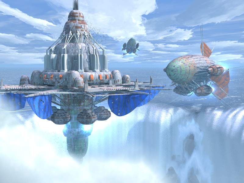
I think you forgot an rainbow in front of the waterfall...
When I think right, I saw an movie with an waterfall and there was a
rainbow in front of.

The "water in the air" of a waterfall (hope, you understand) is like
rain. At certain angles you can see a rainbow....

Just an suggestion....

v
Zan

PS.: Sorry for my poor english....

"H.E. Day" schrieb:
>
> Sigh.  Moving along...
>
> H.E. Day
> <><
>
>   ------------------------------------------------------------------------
>  [Image]
Post a reply to this message
|
|
| |
| |
|
|
|
|
| |
| |
|
|
H.E. Day <The### [at] heday freeserverscom> wrote:
> [-- text/plain, encoding 7bit, 5 lines --]
> Sigh. Moving along...
Quite nice. Perhaps add something colorful up near where the three pronged
forks connect to the station body?
I keep wanting to see a control cabin about 20 degrees up on the blimgs
surface. A little thing with a viewport of some sort. It looks blind as it
is now.
Geoff
Post a reply to this message
|
|
| |
| |
|
|
|
|
| |
| |
|
|
"H.E. Day"  wrote
> Sigh.  Moving along...
>
> H.E. Day
> <><
>
Definately looking good. The sails look more like they belong now.
The engines appear to be putting out plenty of power.
Post a reply to this message
|
|
| |
| |
|
|
|
|
| |
| |
|
|
>
>Sigh.  Moving along...
>
>H.E. Day
><><

Been following this thread since the beginning but just decided to post.  That
is the best of the lot in my opinion.  the banners aren't too overpowering,
but still give some color.

Fantastic!

Erik
Post a reply to this message
|
|
| |
| |
|
|
|
|
| |
| |
|
|
The sails look very nice now, but i liked the 'mirrored' version more.

Christoph

--
Christoph Hormann <chr### [at] gmxde>
IsoWood include, radiosity tutorial, TransSkin and other
things on: http://www.schunter.etc.tu-bs.de/~chris/
Post a reply to this message
|
|
| |
| |
|
|
|
|
| |
| |
|
|
Take 9 was better.  I prefer the more vivid colors.  The striping in the
blue and red in this take looks odd and detracts from the whole scene.

Jim

"H.E. Day" <The### [at] hedayfreeserverscom> wrote in message
news:3AC36DED.B12C609D@heday.freeservers.com...
> Sigh.  Moving along...
>
> H.E. Day
> <><
>


----------------------------------------------------------------------------
----
Post a reply to this message
|
|
| |
| |
|
|
|
|
| |
| |
|
|
"H.E. Day" wrote:

> Sigh.  Moving along...

Some constructive criticism on a  nice image (lovely details and colours,
everyone has told you that already). All what follow is strictly IMHO of
course, take it with a grain of salt...

- Main complaint would be on the general composition. It's a fortress, OK ? So
it got to be impressive, towering. It is... but a low-angle shot would help a
lot to add some dramatic effect. Right now, it's more a peaceful docking
station than a fortress. (Of course, a low-angle shot is a also a cliché in
this type of scene).The low angle shot would allow you to show the darker,
more ominous parts of the fortress and its tiny pretty lights. The lower
structures would be given more space and there would be more contrast. If you
want to crush people with it (including IRTC voters), it has to have weight.

- The fortress. Could do with more tiny stuff like antennas, smaller pods,
docking cranes, irregular structures and the likes (but there's the risk of
overdoing it). Could be more threatening too. What is the purpose of this
fortress, who are its enemies, what sort of weapons does it have, where are
its defenses ?
The blue sails are still too bright, they should be toned down as the red ones
of the blimps. To be frank, the sails are a really nice concept but you
already used them on the blimps, so they're not necessary on the fortress.

- The waterfall : I'm still wondering about it. The realisation itself is
impressive, but I'm not sure about its aesthetic purpose. My problem is that
it is roughly of the same size as the fortress, so you've got 2 elements that
scream "I'm sooo big" in the scene. They compete with each other and something
is lost in the process. If the waterfall was so big that it would dwarf an
already large fortress, it would make more dramatic sense. I don't have a good
solution for this, other than a drastic recomposition of the image (like
making it vertical, or panoramic).

- Blimps : perfect as they are (great textures), but they should have a
clearer relationship with the fortress. Are they defenseless cargo ships or
battle cruisers returning from a raid ? Are they going in or out ? Their
relative size is hard to tell. In fact we're back to the scale problem, as
with the waterfall. You could have one or several already docked blimps on the
fortress itself, and then a larger one floating. The size difference between
the docked blimps and the floating one would give the relative size of the
fortress. With a panoramic view, you could have the larger blimp clearly
coming in, preceded by a flotilla of small tugboats. The sense of scale would
be given by the tugboat/floating blimp, floating blimp/docked blimps, docked
blimps/fortress relationships.

I'd get rid of the exhaust fires, BTW. They're wonderful in space scenes but
here the cyan is too different from the general blue tone.

That's it !!! Already nice for a take 10 (I usually need a take 20 or so
before it's as "finished" as this one is).

G.

--

**********************
http://www.oyonale.com
**********************
Graphic experiments
Pov-ray gallery
Post a reply to this message
|
|
| |
| |
|
|
|
|
| |
| |
|
|
Gilles Tran <tra### [at] inapginrafr> wrote:

> <snippage>

Beautiful critique, Gilles.  Can I get one, just like that, but, well, on my
pic?  Please?  Pretty please?  *begbegwhine*?

Geoff
Post a reply to this message
|
|
| |
| |
|
|
|
|
| |
| |
|
|
If I may ask, Why has H.E. Day not gone to some Computer Graphics
company? No, wait. They wouldn't know when to stop giving him projects...
Looks REAL GOOD!!!


Lil Bugger. :-<
Post a reply to this message
|
|
| |
| |
|
|
|
|
| |
| |
|
|
I agree.

Jim Kress wrote:
>
> Take 9 was better.  I prefer the more vivid colors.  The striping in the
> blue and red in this take looks odd and detracts from the whole scene.
>
> Jim
>
> "H.E. Day" <The### [at] hedayfreeserverscom> wrote in message
> news:3AC36DED.B12C609D@heday.freeservers.com...
> > Sigh.  Moving along...
> >
> > H.E. Day
> > <><
> >
>
> ----------------------------------------------------------------------------
> ----
Post a reply to this message
|
|
| |
| |
|
|
|
|
| |
| |
|
|
"Lt_Lettch" wrote.
>     If I may ask, Why has H.E. Day not gone to some Computer Graphics
> company? No, wait. They wouldn't know when to stop giving him projects...
> Looks REAL GOOD!!!
>
I've been asking myself the same since I first saw his work. Why hasn't IL&M
or a similar graphics workshop grabbed him yet?
Post a reply to this message
|
|
| |
| |
|
|
|
|
| |
| |
|
|
Data wrote:
>
> "Lt_Lettch" wrote.
> >     If I may ask, Why has H.E. Day not gone to some Computer Graphics
> > company? No, wait. They wouldn't know when to stop giving him projects...
> > Looks REAL GOOD!!!
> >
> I've been asking myself the same since I first saw his work. Why hasn't IL&M
> or a similar graphics workshop grabbed him yet?

He would have to finish high-school first.

--
Francois Labreque | The surest sign of the existence of extra-
    flabreque     | terrestrial intelligence is that they never
        @         | bothered to come down here and visit us!
  videotron.ca    |                             - Calvin
Post a reply to this message
|
|
| |
| |
|
|
|
|
| |
| |
|
|
"Francois Labreque" wrote.
> Data wrote:
> >
> > I've been asking myself the same since I first saw his work. Why hasn't
IL&M
> > or a similar graphics workshop grabbed him yet?
>
> He would have to finish high-school first.
>
I thought he had a 40h a week job
Post a reply to this message
|
|
| |
| |
|
|
|
|
| |
| |
|
|
> He would have to finish high-school first.

Ha.  Did that.  Last June.  Been looking for a job ever since.  There's not much
in Eugene, besides Dynamix. :(
Any job offers?? ;)

H.E. Day
<><
Post a reply to this message
|
|
| |
| |
|
|
|
|
| |
| |
|
|
"Lt_Lettch" <Akk### [at] aolcom> wrote in message
news:3ac399a9$1@news.povray.org...
>     If I may ask, Why has H.E. Day not gone to some Computer Graphics
> company? No, wait. They wouldn't know when to stop giving him projects...
> Looks REAL GOOD!!!

    I seem to recall he is applying, but he is still quite young and might
need to finish school yet.
Post a reply to this message
|
|
| |
| |
|
|
|
|
| |
| |
|
|
Watching the evolution of the scene is impressive. I still think the sky
looks oily for some reason.. label it a strange adjective.

I hope that you will consider posting this series on your site with your
comments as to why you made certain changes along the way. Not only would the
permanent record be interesting, but we don't get to see an image evolve in
the IRTC, we just see the end result. I only know of one image "First Strike
at Pearl Harbor" that posted something similar, and it was very helpful in
the understanding how great scenes are put together.

Josh English
eng### [at] spiritonecom
Post a reply to this message
|
|
| |
| |
|
|
|
|
| |
| |
|
|
On Thu, 29 Mar 2001 09:16:30 -0800, "H.E. Day" <The### [at] hedayfreeserverscom> wrote:

>Sigh.  Moving along...
>
>H.E. Day
><><

I would like to give a great artistic critique like Gilles, but I don't have the skill
:-(
I thought all the images were great, just some better than others.  I like the
anachronistic
juxtaposition of blimps needing a lighter than air gas for support, when the colossal
weight
of the fortress is supported by some sort of reaction drive.  The flags add a lovely
bizzare
touch. Great stuff Howard, please keep posting!
It's a privilege to follow such an educational and artistic thread.
David
----------------------
dav### [at] hamiltonitecom
http://hamiltonite.com/
Post a reply to this message
|
|
| |
| |
|
|
|
|
| |
| |
|
|
Looks good, the best so far.  Just one question, what are the blue things
underneath the fortress?

Leitha
Post a reply to this message
|
|
| |
| |
|
|
|
|
| |
| |
|
|
H.E. Day wrote:
> Any job offers?? ;)
>
> H.E. Day
> <><

Well... I was gonna get our head artist to look at your website, but then I
spotted you were based in the US and I kinda figured you wouldn't be
interested in moving to the UK. I work for Codemasters, BTW.

Still, if you're interested, I'd be happy to mention you to our people :)

--
Tek
http://www.evilsuperbrain.com
Post a reply to this message
|
|
| |
| |
|
|
|
|
| |
| |
|
|
"Tek" wrote in message news:3ac50900$1@news.povray.org...
> I work for Codemasters, BTW.

Hey, cool... Another POV-Ray user from Codemasters :-)

--
Jonathan Hunt
http://www.xlcus.co.uk/povray/

ps. Umm, does anyone know  how/if  you can to set followups in
    outlook express?  I can't seem to work it out...
Post a reply to this message
|
|
| |
| |
|
|
|
|
| |
| |
|
|
> Well... I was gonna get our head artist to look at your website, but then I
> spotted you were based in the US and I kinda figured you wouldn't be
> interested in moving to the UK. I work for Codemasters, BTW.
>
> Still, if you're interested, I'd be happy to mention you to our people :)

Please do.  At the very least it'll give me an opinion as to if I'm
employable....
:)
Thanks!


H.E. Day
<><
Post a reply to this message
|
|
| |
| |
|
|
|
|
| |
| |
|
|
> ps. Umm, does anyone know  how/if  you can to set followups in
>     outlook express?  I can't seem to work it out...

When you reply, go to the menu, select "View | All Headers" and some more
configurable headers should appear.

fup 2 ot
Post a reply to this message
|
|
| |
| |
|
|
|
|
| |
| |
|
|
The problem is, the fortress and blimp are, being fictional objects, of
indeterminate size. The ocean and sky are neutral (being limitless for the
purposes of the image) and waterfalls vary in size, and this one is obscured
mostly.

I think you need something to give it scale, the birds are a good clue,
something more apparent is needed. A human figure would be best, or a few,
to do this. At that distance you could use just about anything vaguely human
looking and it would have a good effect. If you don't want to use a human
figure, use something else whose size doesn't vary too much and that is
instantly recognizable.

--
Dan D.
Post a reply to this message
|
|
| |
| |
|
|
|
|
| |
| |
|
|
ddombrow wrote:
>
> The problem is, the fortress and blimp are, being fictional objects, of
> indeterminate size. The ocean and sky are neutral (being limitless for the
> purposes of the image) and waterfalls vary in size, and this one is obscured
> mostly.
>
> I think you need something to give it scale, the birds are a good clue,
> something more apparent is needed. A human figure would be best, or a few,
> to do this. At that distance you could use just about anything vaguely human
> looking and it would have a good effect. If you don't want to use a human
> figure, use something else whose size doesn't vary too much and that is
> instantly recognizable.

Yes.  Why don't you put a few people on the flight decks.

--
Francois Labreque | The surest sign of the existence of extra-
    flabreque     | terrestrial intelligence is that they never
        @         | bothered to come down here and visit us!
  videotron.ca    |                             - Calvin
Post a reply to this message
|
|
| |
| |
|
|
|
|
| |
| |
|
|
"Francois Labreque" <fla### [at] videotronca> wrote :
>
> Yes.  Why don't you put a few people on the flight decks.

    At the scale I am imagining, they would only have to be elongated
spheres...
Post a reply to this message
|
|
| |
| |
|
|
|
|
| |
| |
|
|
In article <3AC36DED.B12C609D@heday.freeservers.com>, "H.E. Day"
<The### [at] hedayfreeserverscom> wrote:

> Sigh.  Moving along...

Ignore my last message, I'm catching up on some posts and didn't see the
latest version.
I like the thruster glows, too bad you can't see it against the
waterfall. Actually, you might have success graying down the foam...
It still looks a bit like a tower, because you can't see that it is
unattached at the base.

I don't know what those orange things are...they add a nice touch of
color, but don't seem to serve a purpose. I'm not sure about the
patterns on the cloth banners, they make everything appear smaller, and
they look like blankets and sheets being hung out to dry. They still
look like they would get roasted by the thrusters on the blimps.

--
Christopher James Huff
Personal: chr### [at] maccom, http://homepage.mac.com/chrishuff/
TAG: chr### [at] tagpovrayorg, http://tag.povray.org/

<><
Post a reply to this message
|
|
| |
| |
|
|
|
|
| |
| |
|
|
epic

"H.E. Day" wrote:

> Sigh.� Moving along...
>
> H.E. Day
> <><
>
> � ------------------------------------------------------------------------
> �[Image]
Post a reply to this message
|
|
| |
| |
|
|
|
|
| |