|
|
|
|
|
|
| |
| |
|
|
|
|
| |
| |
|
|
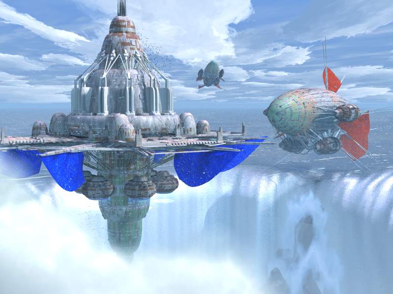
Oh boy, I think I'm getting closer...  The changes I've made should be
obvious. (everything for the better!! :)
Enjoy!!

H.E. Day
<><
Post a reply to this message
Attachments:
Download 'adventure001.jpg' (53 KB)
Preview of image 'adventure001.jpg'
|
|
| |
| |
|
|
|
|
| |
| |
|
|
H.E. Day <The### [at] heday freeserverscom> wrote:
> [-- text/plain, encoding 7bit, 7 lines --]
> Oh boy, I think I'm getting closer... The changes I've made should be
> obvious. (everything for the better!! :)
Wish I could say that most of the time. ;)
Really nice. Only qualm is that the blue is maybe too blue. Add a bit of
yellow to it, maybe? Not a lot, we don't want green, but it looks so
*pure*.
Other than that, way to go.
Why the inversion, though?
Geoff
Post a reply to this message
|
|
| |
| |
|
|
|
|
| |
| |
|
|
> Really nice.  Only qualm is that the blue is maybe too blue.  Add a bit of
> yellow to it, maybe?  Not a lot, we don't want green, but it looks so
> *pure*.
blue+yellow=white, isn't it?


--
ZK
http://www.povplace.be.tf
Post a reply to this message
|
|
| |
| |
|
|
|
|
| |
| |
|
|
Zeger Knaepen <zeg### [at] studentkuleuvenacbe> wrote:

>> Really nice.  Only qualm is that the blue is maybe too blue.  Add a bit of
>> yellow to it, maybe?  Not a lot, we don't want green, but it looks so
>> *pure*.
> blue+yellow=white, isn't it?

Depends on the relative quantities.  <.1,.1,1> wouldn't be white.  And
<.1,.3,1> wouldn't be either.  The first would be near pure blue, the second
would be somewhat greenish.

Geoff
Post a reply to this message
|
|
| |
| |
|
|
|
|
| |
| |
|
|
All I'm gonna say is WOW!
=Bob=

"H.E. Day" <The### [at] hedayfreeserverscom> wrote in message
news:3AC21A9A.AC2777FF@heday.freeservers.com...
: Oh boy, I think I'm getting closer...  The changes I've made should be
: obvious. (everything for the better!! :)
: Enjoy!!
:
: H.E. Day
Post a reply to this message
|
|
| |
| |
|
|
|
|
| |
| |
|
|
It looks great!  I don't know if I want to launch a photon torpedo at it or
take a vacation there!

It is very reminiscent of dozens of sci-fi novel covers I saw in the 70's.
Great work, and not too blue at all.

"H.E. Day" wrote:

> Oh boy, I think I'm getting closer...  The changes I've made should be
> obvious. (everything for the better!! :)
> Enjoy!!
>
> H.E. Day
> <><
>
>   ------------------------------------------------------------------------
>  [Image]
Post a reply to this message
|
|
| |
| |
|
|
|
|
| |
| |
|
|
On Wed, 28 Mar 2001 09:08:42 -0800, "H.E. Day"
<The### [at] hedayfreeserverscom> wrote:

>Oh boy, I think I'm getting closer...  The changes I've made should be
>obvious. (everything for the better!! :)
>Enjoy!!

Hmm, blue on fin/sail thingies is too intense... unless in the minds
of the fortress owners they're meant to be decorative, in which case
it might be cool to customize each one. But given the more muted
colors of the fortress itself I'd suggest toning the hue down.

Also, if you're done with the part of your brain that does raytracing
for now can I borrow it?

-- T
Post a reply to this message
|
|
| |
| |
|
|
|
|
| |
| |
|
|
Awesome!

Jim

"H.E. Day" <The### [at] hedayfreeserverscom> wrote in message
news:3AC21A9A.AC2777FF@heday.freeservers.com...
> Oh boy, I think I'm getting closer...  The changes I've made should be
> obvious. (everything for the better!! :)
> Enjoy!!
>
> H.E. Day
> <><
>


----------------------------------------------------------------------------
----
Post a reply to this message
|
|
| |
| |
|
|
|
|
| |
| |
|
|
Everything looks good except I'm not sure I like the bright saturated color on
the sail-things. The blimps seem to fit in better but I'm still not sure about
them. Water and clouds are perfect!

--
David Fontaine  <dav### [at] faricynet>  ICQ 55354965
My raytracing gallery:  http://davidf.faricy.net/
Post a reply to this message
|
|
| |
| |
|
|
|
|
| |
| |
|
|
"H.E. Day" <The### [at] hedayfreeserverscom> wrote in message
news:3AC21A9A.AC2777FF@heday.freeservers.com...

Lovely.

3 crits - the blue flags are too blue (I'm not sure blue is the best base
colour, given the amount of blue in the sky and sea). Secondly, it's hard to
get a sense of scale on the near blimp, since you can't easily tell whether
it's behind or in front of the fortress. Thirdly (and this is very picky),
are those birds at the base of the station? Wouldn't the thrusters and/or
the water preclude them hanging around there?
Post a reply to this message
|
|
| |
| |
|
|
|
|
| |
| |
|
|
in <3ac2ef73$1@news.povray.org> Tom Melly wrote:

>Thirdly (and this is very picky),
>are those birds at the base of the station? Wouldn't the thrusters
>and/or the water preclude them hanging around there?

It's a fisherman's dream
Dinner's already steamed
And ready to eat
When you feel your resolve
It's about to dissolve
Then stop for a treat
In a river of steam
Nothing seams to obscene
...
        --Nick Mason's Fictitious Sports
          Carla Bley / Nick Mason 1981


I like the blue!

Ingo

--
Photography: http://members.home.nl/ingoogni/
Pov-Ray    : http://members.home.nl/seed7/
Post a reply to this message
|
|
| |
| |
|
|
|
|
| |
| |
|
|
Sorry, but I simply hate those blue and red thingys. They does't fit in
the scene and make it look ridiculous :-(

I would remove them, and make the ships much smaller so the fortress
looks bigger.

But, then again, almost everybody else seems to like it as ist is, so
don't listen to me ;-)

Lutz-Peter
Post a reply to this message
|
|
| |
| |
|
|
|
|
| |
| |
|
|
On Wed, 28 Mar 2001 13:58:00 -0800, Tina S. <you### [at] ucanfoadorg>
wrote:

>Also, if you're done with the part of your brain that does raytracing
>for now can I borrow it?

Don't do it, you'll leave him brainless!


Peter Popov ICQ : 15002700
Personal e-mail : pet### [at] vipbg
TAG      e-mail : pet### [at] tagpovrayorg
Post a reply to this message
|
|
| |
| |
|
|
|
|
| |
| |
|
|
But, then again, almost everybody else seems to like it as ist is, so
don't listen to me ;-)

Don't worry, we don't.
Post a reply to this message
|
|
| |
| |
|
|
|
|
| |
| |
|
|
YES!!

This is the best so far! I think the change in position of the fort
makes for better composision.

Ken Matassa
Post a reply to this message
|
|
| |
| |
|
|
|
|
| |
| |
|
|
In article <3AC21A9A.AC2777FF@heday.freeservers.com>, "H.E. Day"
<The### [at] hedayfreeserverscom> wrote:

> Oh boy, I think I'm getting closer...  The changes I've made should be
> obvious. (everything for the better!! :)

The blue banners are definitely too bright...the red ones look worn and
faded, but the blue ones look brand new, which doesn't fit in with the
rest of the fortress. Maybe just make a lighter, uneven shade of blue.
And if they are for increasing visibility of the fortress, blue probably
wouldn't be the best color in these conditions, especially not when it
begins to fade. Maybe a yellow or orange...and maybe green fins on the
blimp transport things.

--
Christopher James Huff
Personal: chr### [at] maccom, http://homepage.mac.com/chrishuff/
TAG: chr### [at] tagpovrayorg, http://tag.povray.org/

<><
Post a reply to this message
|
|
| |
| |
|
|
|
|
| |