|
|
|
|
|
|
| |
| |
|
|
|
|
| |
| |
|
|
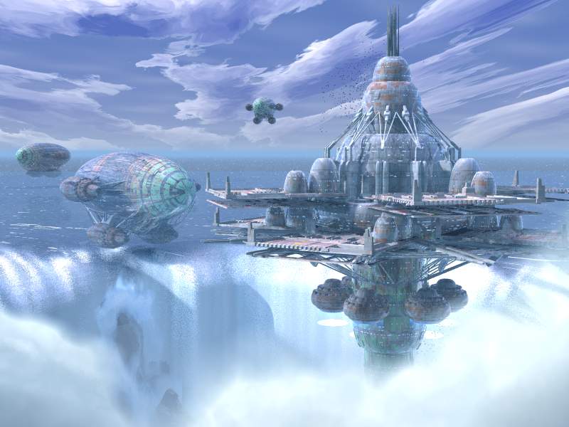
Nearing the end of the development stage and approaching the start of
the fine-tuning phase.  As you can see, the Nearest blimp is indeed
hovering over the edge of the falls.  I also added the rocks back in,
and got rid of the annoying box.  I also altered the blimps so they'd
look more "stable". :)  I think I've finally gotten the falls right.  Or
really close. :\

I just want to take a minute and thank all the people who have replied
to these posts.  You have shaped these images far more than i have. :)
Enjoy!

H.E. Day
<><
Post a reply to this message
Attachments:
Download 'adventure001.jpg' (51 KB)
Preview of image 'adventure001.jpg'
|
|
| |
| |
|
|
|
|
| |
| |
|
|
It's surely not bad, but my first impression was that it's becoming a
bit too crowded. Sorry to say it. The waterfall is better, nevertheless.

And dear mr. HE Day, where is my water texture?  :o))


Hugo
Post a reply to this message
|
|
| |
| |
|
|
|
|
| |
| |
|
|
Well, as another person in this list did, i saved all the 7 versions of this
image on disk, and
took time comparing them ( enjoyed doing it, they're so nice ... ).

Excepted the falls of the seventh version - these rocks rocks - i still like
the 4th much better :
The fortress looks less heavy with only one platform layer - ok, it may be the
effect you wanted ... -, and seems bigger.
The blimps in V7 shrinks the fortress i think, they're too big.
Oh, and the seventh version is too blue, too ... complicated ?
and H.E. Day definitely erased my last dreams of participating to IRTC. Argh.

Xavier
Post a reply to this message
|
|
| |
| |
|
|
|
|
| |
| |
|
|
this just keep sgetting better and better - you stoppit now ya hear!


--
Rick

POV-Ray News & Resources - http://povray.co.uk
Kitty5 WebDesign - http://kitty5.com
Hi-Impact web site design & database driven e-commerce
TEL : +44 (01625) 266358 - FAX : +44 (01625) 611913 - ICQ : 15776037

PGP Public Key
http://pgpkeys.mit.edu:11371/pks/lookup?op=get&search=0x231E1CEA
Post a reply to this message
|
|
| |
| |
|
|
|
|
| |
| |
|
|
Sorry, but most changes are to the worse IMO.
- The overall bluish tint does not look very good.
- The clouds were better in the last version
- As others said, it looks too crowded, making the additional objects
smaller would help IMO, furthermore with only one level, the fortress
looked more generous.
- The waterfall looks really good now. Just the structures of falling
water could be a bit smaller (like in take 4)
Version 4 was really my favourite until now.
Christoph
--
Christoph Hormann <chr### [at] gmx de>
IsoWood include, radiosity tutorial, TransSkin and other
things on: http://www.schunter.etc.tu-bs.de/~chris/
Post a reply to this message
|
|
| |
| |
|
|
|
|
| |
| |
|
|
Christoph has said most of what I wanted to, so I'm piggy backing

Christoph Hormann <chr### [at] gmxde> wrote:


> Sorry, but most changes are to the worse IMO.

> - The overall bluish tint does not look very good.

Yes.  The darker coloring loses something from previous pics.

> - The clouds were better in the last version

I also agree.  They were more solid and white.

> - As others said, it looks too crowded, making the additional objects
> smaller would help IMO, furthermore with only one level, the fortress
> looked more generous.

While it is more crowded, I like the 'poses', if you will, of them better.
I do agree about the station being only one level being nicer.

> - The waterfall looks really good now.  Just the structures of falling
> water could be a bit smaller (like in take 4)

I disgree.  Smaller wouldn't look right, IMO

> Version 4 was really my favourite until now.

I don't think I have a favorite, and I can't go back and check at this
point, since I didn't keep them and I don't want to go through all the
threads to find them.

Geoff
Post a reply to this message
|
|
| |
| |
|
|
|
|
| |
| |
|
|
I really like this image, I wish I had an idea how to create such
wonderful sci-fi things....

Anyway, my only critique is that I think that the blimps are to fuzzy.
What I mean to say is that the platform thing is nice and crisp whilst
the blimps are slightly out of focus. Now this may be an artifact from
the water spray, but it is a little awkward on the eyes.

Very nice image, makes nice wallpaper :-)


-paul
Post a reply to this message
|
|
| |
| |
|
|
|
|
| |
| |
|
|
My question still is : What's the story? Are the blimps attacking? Are
they supply ships, and if so why do they need three? Are they tourist ships?
Post a reply to this message
|
|
| |
| |
|
|
|
|
| |
| |
|
|
Since my opinion is highly regarded, I will weigh in...

I like it.  Composition, colours, originality, everything.

I particulary like the implied flight path created by multiple blimps, and
the water texture is wonderful.

There is some horizontal banding in the waterfall at the left, but it might
be a jpg artifact.  This sky is not my favorite of the series, but its not
bad.

Its been a fun series so far.  When you declare it done please post a bigger
and/or less compressed image.  Thanks.
Post a reply to this message
|
|
| |
| |
|
|
|
|
| |
| |
|
|
Spock wrote:
>
> Since my opinion is highly regarded, I will weigh in...
>
> I like it.  Composition, colours, originality, everything.
>
> I particulary like the implied flight path created by multiple blimps, and
> the water texture is wonderful.

I think one of the blimps...maybe the back one, should be pointed
slightly skyward like its going up (real blimps to this, don't they?).
It might give the scene a bit of a 'busy' feel. It'll make them seem
less static.

Eeep. Back to work.

--
Derek Stark
Linux Admin - eSN
dms### [at] esupportnowcom
xt 8952
Post a reply to this message
|
|
| |
| |
|
|
|
|
| |
| |
|
|
Little bugger. Heres my take on it. The Blimps are supply ships for a colony
out in the Misty Falls Region, where the water movement makes using repluser
lifts difficult at best. Dr, H.E. Day designed a station that could be
stable, and even move, on these treacherous waters. After a year and a half,
it is finally coming online. It applies to the Fortress IRTC because it has
defense turrets, and (hidden) Mass Cannons (Mark III). The Blimps Cargo is
Food stuffs, Cattle, Trees, and Personnel. They will be arriving in batches
of three and fours, Blimps because the water currents will not move them.
The Colony supports
 1200 Workers, be it military, Technicians, whatever, and 5000 Colonists.
The Colonists will tend to the cattle, Farms, Etc. while the "Crew" does
repair, Building, and defense. It will take Twelve more "Wagon Trains", and
6 more days, to bring everyone here.
How'd I do?
Post a reply to this message
|
|
| |
| |
|
|
|
|
| |
| |
|
|
I like that interpretation! Much better than what I'd come up with. It suits
the whole sci-fi art style of the picture too :)

--
Tek
http://www.evilsuperbrain.com


Lt_Lettch <Akk### [at] aolcom> wrote in message
news:3ab8ecc8$1@news.povray.org...
> Little bugger. Heres my take on it. The Blimps are supply ships for a
colony
> out in the Misty Falls Region, where the water movement makes using
repluser
> lifts difficult at best. Dr, H.E. Day designed a station that could be
> stable, and even move, on these treacherous waters. After a year and a
half,
> it is finally coming online. It applies to the Fortress IRTC because it
has
> defense turrets, and (hidden) Mass Cannons (Mark III). The Blimps Cargo is
> Food stuffs, Cattle, Trees, and Personnel. They will be arriving in
batches
> of three and fours, Blimps because the water currents will not move them.
> The Colony supports
>  1200 Workers, be it military, Technicians, whatever, and 5000 Colonists.
> The Colonists will tend to the cattle, Farms, Etc. while the "Crew" does
> repair, Building, and defense. It will take Twelve more "Wagon Trains",
and
> 6 more days, to bring everyone here.
> How'd I do?
>
>
>
Post a reply to this message
|
|
| |
| |
|
|
|
|
| |
| |
|
|
i agree with much of the other comments already made.  i have one thing
to add.  some people have said take 7 is too crowded and that you should
consider making the other ships smaller.  another solution would be to
keep the image the same height, but widen it to another aspect ratio.
that way you could maybe move the ships apart laterally, but keep them
the same distance from the camera.

"H.E. Day" wrote:
>
> Nearing the end of the development stage and approaching the start of
> the fine-tuning phase.  As you can see, the Nearest blimp is indeed
> hovering over the edge of the falls.  I also added the rocks back in,
> and got rid of the annoying box.  I also altered the blimps so they'd
> look more "stable". :)  I think I've finally gotten the falls right.  Or
> really close. :\
>
> I just want to take a minute and thank all the people who have replied
> to these posts.  You have shaped these images far more than i have. :)
> Enjoy!
>
> H.E. Day
> <><
>
>   ------------------------------------------------------------------------
>  [Image]
Post a reply to this message
|
|
| |
| |
|
|
|
|
| |
| |
|
|
Here's my take: I think the blimps deserve their own scene -- they look pretty
cool right now, but the station (IMHO) looks much much better and takes away
from them.  Also, the blimps make the station look too small.  I don't mind
the blue tint and the clouds are cool.  What are those bright lights/spots
near the bottom of the station, they complicate things?

I think if you have any ships in the image other than the large station, they
should be small, and should be either going toward or away from the station,
making it the central point of the image.

The falls are awesome! Those rocks are *very* cool.

Nice work!

-Eugene
Post a reply to this message
|
|
| |
| |
|
|
|
|
| |
| |
|
|
I agree with changing the aspect ratio, maybe 16:9 to make it seem truly
cinematic.

Kev

http://perso.libertysurf.co.uk/kevin.ellis
Post a reply to this message
|
|
| |
| |
|
|
|
|
| |
| |
|
|
First of all, I think your picture is beautiful.  It is so stylized that it
looks almost painted instead of rendered.  I was just thinking that if you
wanted to do something interesting to the scene, you could do something like
the Pearl Harbor picture
(http://oz.irtc.org/ftp/pub/stills/1998-12-31/strike.jpg) and put one of the
blimps in the foreground and make it look as though the camera were
travelling with the blimp, like it was going to be docking or something
(although if you put it in the foreground for any reason you would probably
need to put extra detail on it).  Someone else said something about having
the blimps at different angles to show movement.  I think that is a great
idea.  You could even tip the camera (again, stealing from Pearl Harbor,
sorry).  Anyway, forgive my rambling and brainstorming.  GREAT modelling,
texturing, and ... okay... just about everything.

"H.E. Day" <The### [at] hedayfreeserverscom> wrote in message
news:3AB84679.C36BCF70@heday.freeservers.com...
> Nearing the end of the development stage and approaching the start of
> the fine-tuning phase.  As you can see, the Nearest blimp is indeed
> hovering over the edge of the falls.  I also added the rocks back in,
> and got rid of the annoying box.  I also altered the blimps so they'd
> look more "stable". :)  I think I've finally gotten the falls right.  Or
> really close. :\
>
> I just want to take a minute and thank all the people who have replied
> to these posts.  You have shaped these images far more than i have. :)
> Enjoy!
>
> H.E. Day
> <><
>


----------------------------------------------------------------------------
----
Post a reply to this message
|
|
| |
| |
|
|
|
|
| |
| |
|
|
Kevin Ellis <kev### [at] libertysurfcouk> wrote:

> I agree with changing the aspect ratio, maybe 16:9 to make it seem truly
> cinematic.

<AOL>

Me too.  Be very cool.

</AOL>

Geoff
Post a reply to this message
|
|
| |
| |
|
|
|
|
| |