|
|
|
|
|
|
| |
| |
|
|
|
|
| |
| |
|
|
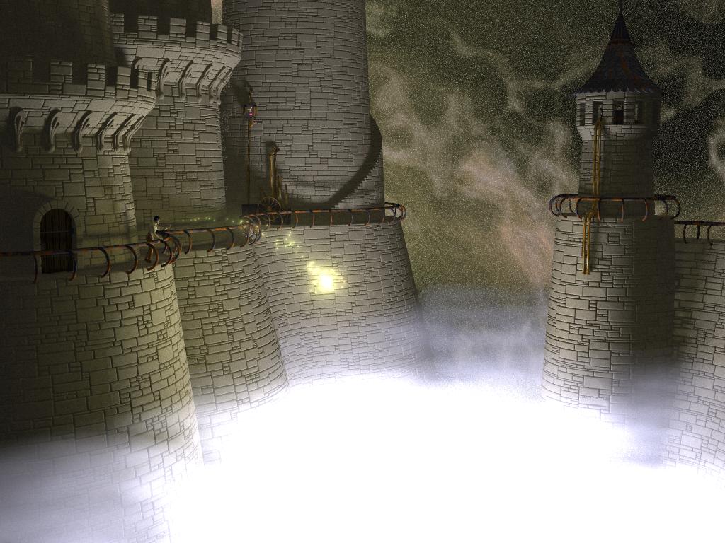
Well, I may not be HE Day, but that's all the more reason for me to ask for
other people's thoughts.  So here's my current IRTC WIP.  Sorry about the size
of the image for those with smallish monitors, but I needed to go that big
(1024x768) to get the detail I wanted. ;)

So thoughts?  Criticisms (constructive, of course)?

Geoff
Post a reply to this message
Attachments:
Download 'abyss.jpg' (124 KB)
Preview of image 'abyss.jpg'
|
|
| |
| |
|
|
|
|
| |
| |
|
|
Beautiful!
Can't really make out what the structures are that go up and down the walls.
But I guess I wouldn't know even if I could see in fine detail because
everything is completely otherworldly. Reminds me a bit of 'The Wheel of
Time' by Robert Jordan... :-)
I like the smoke in the background, even though it doesn't really look real.
Nekar
"Geoff Wedig" <wed### [at] darwin cwruedu> wrote in message
news:3AB### [at] darwincwruedu...
> Well, I may not be HE Day, but that's all the more reason for me to ask
for
> other people's thoughts. So here's my current IRTC WIP. Sorry about the
size
> of the image for those with smallish monitors, but I needed to go that big
> (1024x768) to get the detail I wanted. ;)
>
> So thoughts? Criticisms (constructive, of course)?
>
> Geoff
>
>
----------------------------------------------------------------------------
----
Post a reply to this message
|
|
| |
| |
|
|
|
|
| |
| |
|
|
Geoff Wedig wrote:
>
> Well, I may not be HE Day, but that's all the more reason for me to ask for
> other people's thoughts.  So here's my current IRTC WIP.  Sorry about the size
> of the image for those with smallish monitors, but I needed to go that big
> (1024x768) to get the detail I wanted. ;)
>
> So thoughts?  Criticisms (constructive, of course)?

I love the stone texture.  Is it just an image_map, or is it procedural?

I think the picture should explain a bit better what the person is
doing.  Is he throwing a spell at a beast in the mist, or simply dumping
his dinner left-overs?

IMHO, it needs more pipes and stuff.

The bluish mist should extend further in the distance.  Right now, it
looks like an Hollywood set with a wall behind the castle (unless you're
going for a '30's B-movie feel).

That is all.

--
Francois Labreque | The surest sign of the existence of extra-
    flabreque     | terrestrial intelligence is that they never
        @         | bothered to come down here and visit us!
  videotron.ca                                  - Calvin
Post a reply to this message
|
|
| |
| |
|
|
|
|
| |
| |
|
|
Francois Labreque <fla### [at] videotronca> wrote:


> Geoff Wedig wrote:
>>
>> Well, I may not be HE Day, but that's all the more reason for me to ask for
>> other people's thoughts.  So here's my current IRTC WIP.  Sorry about the size
>> of the image for those with smallish monitors, but I needed to go that big
>> (1024x768) to get the detail I wanted. ;)
>>
>> So thoughts?  Criticisms (constructive, of course)?

> I love the stone texture.  Is it just an image_map, or is it procedural?

The stones are around 13000 separate isosurfaces, placed procedurally.  The
texture is pretty simple.

> I think the picture should explain a bit better what the person is
> doing.  Is he throwing a spell at a beast in the mist, or simply dumping
> his dinner left-overs?

There will be some text associated with the pic, yes.

> IMHO, it needs more pipes and stuff.

Yeah, that's a fairly recent addition, so I'm still working out where and
what.

> The bluish mist should extend further in the distance.  Right now, it
> looks like an Hollywood set with a wall behind the castle (unless you're
> going for a '30's B-movie feel).

Hmm, I was going for an 'edge of the world' effect, but maybe it doesn't
work.

Geoff
Post a reply to this message
|
|
| |
| |
|
|
|
|
| |
| |
|
|
Nekar Xenos <vir### [at] iconcoza> wrote:

> Beautiful!

Thanks

> Can't really make out what the structures are that go up and down the walls.
> But I guess I wouldn't know even if I could see in fine detail because
> everything is completely otherworldly. Reminds me a bit of 'The Wheel of
> Time' by Robert Jordan...  :-)

Which structures?  The piping?

I'm sorry about the WoT reference, since I've never read them, nor do I wish
to (bad associations), but it was supposed to be a bit of the fantastic.


> I like the smoke in the background, even though it doesn't really look real.

It's mostly the Galaxy.inc, tweaked slightly to deal with radiosity and a
few other things.  Finding one that I liked was a bit of a challenge,
though.

Geoff
Post a reply to this message
|
|
| |
| |
|
|
|
|
| |
| |
|
|
> Which structures?  The piping?

Yes; it does seem to end in the middle of nowhere...

>
> I'm sorry about the WoT reference, since I've never read them, nor do I
wish
> to (bad associations), but it was supposed to be a bit of the fantastic.

Bad? I haven't read the book but I started playing the game and I like it.
Taste differs, I guess....   :-)
Post a reply to this message
|
|
| |
| |
|
|
|
|
| |
| |
|
|
Nekar Xenos <vir### [at] iconcoza> wrote:


>> Which structures?  The piping?

> Yes; it does seem to end in the middle of nowhere...

Which ones?  The ones to the left curve into the building, while the ones on
the right are drainage (I'm planning on putting spray underneath, if I can
ever figure out a good texture :/

>>
>> I'm sorry about the WoT reference, since I've never read them, nor do I
> wish
>> to (bad associations), but it was supposed to be a bit of the fantastic.

> Bad? I haven't read the book but I started playing the game and I like it.
> Taste differs, I guess....   :-)

No, bad associations.  I read about the first hundred pages once and put it
down.  It's not my thing.  But many many people love them.

Geoff
Post a reply to this message
|
|
| |
| |
|
|
|
|
| |
| |
|
|
In article <3AB### [at] darwincwruedu>, wed### [at] darwincwruedu
says...

> So thoughts?  Criticisms (constructive, of course)?
I like it, but I think it would be a lot better if the walls looked not
so new and clean.
Perhaps it would help if you added a "granite"-normal to the stones. Or
even add the "granite" pattern to the isosurface.

Lutz-Peter
Post a reply to this message
|
|
| |
| |
|
|
|
|
| |
| |
|
|
Lutz-Peter Hooge <lpv### [at] gmxde> wrote:

> In article <3AB### [at] darwincwruedu>, wed### [at] darwincwruedu
> says...

>> So thoughts?  Criticisms (constructive, of course)?
> I like it, but I think it would be a lot better if the walls looked not
> so new and clean.
> Perhaps it would help if you added a "granite"-normal to the stones. Or
> even add the "granite" pattern to the isosurface.

Yeah, the walls are a little too clean.  I'm planning on weathing them some,
but as the render already takes close to 12 hours, I'm worried what it'll do
to the time it takes.  I'm using radiosity, so I can't even split the effort
over several systems.

Does anyone have any data on how much longer adding a (say) granite pigment
to the iso takes?  The isos are deformed rounded boxes right now.

Geoff
Post a reply to this message
|
|
| |
| |
|
|
|
|
| |
| |
|
|
>> Criticisms (constructive, of course)?

You're doing fine! My thoughts:

1) The white bottom is too bright. Really.

2) I didn't realize it was smoke in the background, until someone said
so. I think it looks too rough. It should be smooth. You could add
something behind the smoke, for the rough and realistic look, but if you
want to keep the "edge of the world effect" (interesting idea, and I
think you should) then I suggest you keep things simple, behind the
smoke. Eventually just a wall, for example.

3) The stones are great, but they look like a bump map. Since you say
it's really Iso-Stones, I strongly suggest you add a small random
displacement in the depth direction. Yeah, they were good builders in
ancient times, but anyway.

4) Someone said "they're too clean" and it's true, but I disagree that a
granite pattern would help. It would just give more noise in the
picture. Better to use a texture that looks like either sludge or algae
has been running down the walls for a long time.. But discrete, and if
possible, not just some long "lines", but have each stone affect it.

Hope this helps! I like the rest. The spell is surely made of glows, and
they look magic. The human gives the whole picture it's proportions,
although I think that is too simple / not fully enough.

Hugo
Post a reply to this message
|
|
| |
| |
|
|
|
|
| |
| |
|
|
Hugo <hua### [at] post3teledk> wrote:

>>> Criticisms (constructive, of course)?

> You're doing fine! My thoughts:

> 1) The white bottom is too bright. Really.

Truely.  That's actual scattering media, so it's not without reason, but
reducing it will darken the rest of the image, which I'm not sure is a goof
thing.

> 2) I didn't realize it was smoke in the background, until someone said
> so. I think it looks too rough. It should be smooth. You could add
> something behind the smoke, for the rough and realistic look, but if you
> want to keep the "edge of the world effect" (interesting idea, and I
> think you should) then I suggest you keep things simple, behind the
> smoke. Eventually just a wall, for example.

Since the swirly patterns are done with the Galaxy.inc file, I don't think
there can really be much behind them.  Have to think about it though.

> 4) Someone said "they're too clean" and it's true, but I disagree that a
> granite pattern would help. It would just give more noise in the
> picture. Better to use a texture that looks like either sludge or algae
> has been running down the walls for a long time.. But discrete, and if
> possible, not just some long "lines", but have each stone affect it.

You've read my mind actually.  I had written down some notes this morning
about adding a mossy layer on the lower stones, fading away as it gets
higher.  I'm not sure how it'll look, but I'm going to give it a go.

Geoff
Post a reply to this message
|
|
| |
| |
|
|
|
|
| |
| |
|
|
This is a really GREAT render.  I really like the masonry and the design
of the castle, etc.

How is the wall lit?  It might be really useful to *try* a radiosity
render.  If it's supposed to be lit by the mist, IMHO I think the shadow
of the railing and a lot of other stuff is way too distinct.

Like others, I also think the individual stones need to be bumpier.
Maybe you could use a bump_map or something.  The texture should be a
mix of some smooth pattern like bozo and some creased pattern like
wrinkles or crackle. (check out some natural stone masonry in your
area).  Plus, if you are using crackle with metric 1.0(?) to make the
bricks, you might want to increase it to 1.2 or something.

Also like others, I think the glowing mist is too bright.  If it's
media, maybe you could put a dark, indistinct, huge figure somewhere
near the top.  It would make a dark area in the mist and give the
spellcaster a target.

Again, I agree about the sky.  If everything is supposed to be this
bright, how can you even see the stars (or whatever those specks
are...)  Have you tried to see the stars at night when you have any
significant light nearby?  Try looking out a window of your house at
night.  Everything you see is way dark because your eyes are adjusted to
the light.

Keep up the great work.

-Ben
Post a reply to this message
|
|
| |
| |
|
|
|
|
| |
| |
|
|
Ben Birdsey <cla### [at] mailcom> wrote:


> This is a really GREAT render.  I really like the masonry and the design
> of the castle, etc.

Thanks.

> How is the wall lit?  It might be really useful to *try* a radiosity
> render.  If it's supposed to be lit by the mist, IMHO I think the shadow
> of the railing and a lot of other stuff is way too distinct.

This is a radiosity render.  There are only two light sources in the
picture, one under the mist (which is scattering media) and one at the ball
of light.  Most of the shadows are from the latter.  The tall hazy shadows
are from the former.  I'm assuming that scattering media + radiosity handles
these lights correctly, but I may be wrong on that.

> Like others, I also think the individual stones need to be bumpier.
> Maybe you could use a bump_map or something.  The texture should be a
> mix of some smooth pattern like bozo and some creased pattern like
> wrinkles or crackle. (check out some natural stone masonry in your
> area).  Plus, if you are using crackle with metric 1.0(?) to make the
> bricks, you might want to increase it to 1.2 or something.

I'm planning on adding some bumps to the iso, but haven't done so because
that's fairly easy, but will slow the render, so I'm waiting until more of
the details are in place.

> Also like others, I think the glowing mist is too bright.  If it's
> media, maybe you could put a dark, indistinct, huge figure somewhere
> near the top.  It would make a dark area in the mist and give the
> spellcaster a target.

Hmm, that's an idea.  Have to think about it.  I think it might take
attention away from some of the other things I've been doing.

> Again, I agree about the sky.  If everything is supposed to be this
> bright, how can you even see the stars (or whatever those specks
> are...)  Have you tried to see the stars at night when you have any
> significant light nearby?  Try looking out a window of your house at
> night.  Everything you see is way dark because your eyes are adjusted to
> the light.

In some ways, the sky is still too bright.  It casts a lot of light into the
deep shapws.  At the same time, it casts light onto the shingles on the top
of the tower, something I spent too $#%^ing long on to have it swallowed by
darkness. ;)  Have to consider what to do.

> Keep up the great work.

Intend on it.

Geoff
Post a reply to this message
|
|
| |
| |
|
|
|
|
| |
| |
|
|
Geoff Wedig wrote:
>
> So thoughts?  Criticisms (constructive, of course)?
>

This looks great; actually reminds me of a (good) painting rather than a
raytraced image. I think the background adds a good deal to this.
A little wear and tear on the walls, maybe some objects cluttering the
walls and platforms to make the place a bit more lived-in. Difficult to
suggest anything in particular without knowing more of the backstory.
The bright fog hurts my eyes, but then anything above rgb 0.5 tends to
do that to me :)

--
Margus Ramst

Personal e-mail: mar### [at] peakeduee
TAG (Team Assistance Group) e-mail: mar### [at] tagpovrayorg
Home page http://www.hot.ee/margusrt
Post a reply to this message
|
|
| |
| |
|
|
|
|
| |
| |
|
|
Margus Ramst <mar### [at] peakeduee> wrote:

> Geoff Wedig wrote:
>>
>> So thoughts?  Criticisms (constructive, of course)?
>>

> This looks great; actually reminds me of a (good) painting rather than a
> raytraced image. I think the background adds a good deal to this.

That was part of the effect I was going for, actually.  Glad it comes
through.

> A little wear and tear on the walls, maybe some objects cluttering the
> walls and platforms to make the place a bit more lived-in. Difficult to
> suggest anything in particular without knowing more of the backstory.
> The bright fog hurts my eyes, but then anything above rgb 0.5 tends to
> do that to me :)

I dislike it too, but when I drop the lighting so the fog is less bright,
the picture becomes completely dark elsewhere.

I might try a light source to light the fog, then a light source that is
unaffected by media for the rest of the pic.  That might work.

And you can always turn your brightness down :P

Geoff
Post a reply to this message
|
|
| |
| |
|
|
|
|
| |
| |
|
|
Hi Geoff,

This is a wonderful picture, so full of ideas
and great dimension and perspective. It's
such a superb picture, there's not alot to say
negative. But I'll try to get picky:

1. I think the mist at the bottom is too bright.

2. I don't care for the vertical line that appears
where the blocks all line up on the left side. The
blocks should overlap or they would be unsound.
The part I'm talking about is a vertical line in the
blocks directly behind the lergest glow.

4. The turrets and windows look "cutout" rather
than built-in.

5. Maybe it could use more distance in the back-
ground.

6. With all that mist, it seems there should be some
shininess to the blocks, at least the lower ones. And
I agree with those who mentioned adding moss.

All in all, a really great work.
=Bob=


"Geoff Wedig" <wed### [at] darwincwruedu> wrote in message
news:3AB### [at] darwincwruedu...
: Well, I may not be HE Day, but that's all the more reason for me to ask
for
: other people's thoughts.  So here's my current IRTC WIP.  Sorry about the
size
: of the image for those with smallish monitors, but I needed to go that big
: (1024x768) to get the detail I wanted. ;)
:
: So thoughts?  Criticisms (constructive, of course)?
:
: Geoff
Post a reply to this message
|
|
| |
| |
|
|
|
|
| |
| |
|
|
=Bob= <bob### [at] threestrandscom> wrote:

> Hi Geoff,

> This is a wonderful picture, so full of ideas
> and great dimension and perspective. It's
> such a superb picture, there's not alot to say
> negative. But I'll try to get picky:

> 1. I think the mist at the bottom is too bright.

Unfortunately, I'm having a bear of a time fixing this.  Still working on it
though.  Any experts on scattering media want to give me a hand?  I need a
cloud cover with a bright patch in the center, but foggy by the edges, and
thick enough that you can't see what's below throughout.  I I lessen the
density, the brightness fades to the center, but so does the opacity.  What
I'd really like is an opaque cloud layer with something bright underneath,
but doing it the naive way (a cloud layer with a bright object underneath)
doesn't seem to be working well.

> 2. I don't care for the vertical line that appears
> where the blocks all line up on the left side. The
> blocks should overlap or they would be unsound.
> The part I'm talking about is a vertical line in the
> blocks directly behind the lergest glow.

Drat.  You noticed. :P  The algorithm I use is a rewritten version of the
mur.inc.  I didn't like the way vertical lines would often appear, so I got
rid of them in my algorithm (as well as a lot of other stuff.  The algorithm
is significantly more complex)  However, I work in blocks, and the curve in
block is separate from the tower curve (they're basically conic sections)
I'd hoped I could hide it in the background... :/

> 4. The turrets and windows look "cutout" rather
> than built-in.

I'm not sure why.  They're both built in to the algorithm in the sense that
there was never anything there.  One problem might be that relatively small
stones were used around them, compared to the rest of the structure.

> 5. Maybe it could use more distance in the back-
> ground.

> 6. With all that mist, it seems there should be some
> shininess to the blocks, at least the lower ones. And
> I agree with those who mentioned adding moss.

Yep.  Wall in the works, and is half done (the easy half, sadly)

> All in all, a really great work.


Thanks
Post a reply to this message
|
|
| |
| |
|
|
|
|
| |
| |
|
|
Hi Geoff,

Ok, here's why I think the openings don't look
right. When I look at pictures of real castles,
the distance between the openings (crenels)
at the top of the turrets should be smaller than
the material (merlons) between them, otherwise
it's not sturdy. In some cases you have a single
block there, so it looks cut-out, rather than built
there. Maybe make the crenels smaller and make
the blocks in the merlons small enough to have
more than one. Take a look at this pic:

http://www.castlewales.com/pembroke.html

See how wide the merlons are?

I wish I had some answers for you on the media.
I'm still fuddling with it myself. Did you try the
scattering? You might need to use some fog
to help it too.

Wishing you a grand and wonderful day!
=Bob=


"Geoff Wedig" <wed### [at] darwinepbicwruedu> wrote in message
news:3ab67a20@news.povray.org...
: =Bob= <bob### [at] threestrandscom> wrote:
:
: > Hi Geoff,
:
: > This is a wonderful picture, so full of ideas
: > and great dimension and perspective. It's
: > such a superb picture, there's not alot to say
: > negative. But I'll try to get picky:
:
: > 1. I think the mist at the bottom is too bright.
:
: Unfortunately, I'm having a bear of a time fixing this.  Still working on
it
: though.  Any experts on scattering media want to give me a hand?  I need a
: cloud cover with a bright patch in the center, but foggy by the edges, and
: thick enough that you can't see what's below throughout.  I I lessen the
: density, the brightness fades to the center, but so does the opacity.
What
: I'd really like is an opaque cloud layer with something bright underneath,
: but doing it the naive way (a cloud layer with a bright object underneath)
: doesn't seem to be working well.
:
: > 2. I don't care for the vertical line that appears
: > where the blocks all line up on the left side. The
: > blocks should overlap or they would be unsound.
: > The part I'm talking about is a vertical line in the
: > blocks directly behind the lergest glow.
:
: Drat.  You noticed. :P  The algorithm I use is a rewritten version of the
: mur.inc.  I didn't like the way vertical lines would often appear, so I
got
: rid of them in my algorithm (as well as a lot of other stuff.  The
algorithm
: is significantly more complex)  However, I work in blocks, and the curve
in
: block is separate from the tower curve (they're basically conic sections)
: I'd hoped I could hide it in the background... :/
:
: > 4. The turrets and windows look "cutout" rather
: > than built-in.
:
: I'm not sure why.  They're both built in to the algorithm in the sense
that
: there was never anything there.  One problem might be that relatively
small
: stones were used around them, compared to the rest of the structure.
:
: > 5. Maybe it could use more distance in the back-
: > ground.
:
: > 6. With all that mist, it seems there should be some
: > shininess to the blocks, at least the lower ones. And
: > I agree with those who mentioned adding moss.
:
: Yep.  Wall in the works, and is half done (the easy half, sadly)
:
: > All in all, a really great work.
:
:
: Thanks
Post a reply to this message
|
|
| |
| |
|
|
|
|
| |
| |
|
|
I meant emission!

: I'm still fuddling with it myself. Did you try the
: scattering? You might need to use some fog

=Bob=
Post a reply to this message
|
|
| |
| |
|
|
From: Christoph Hormann
Subject: Re: IRTC Work in Progress (about 125k)
Date: 19 Mar 2001 17:38:17
Message: <3AB68A5A.A6B97727@gmx.de>
|
|
|
| |
| |
|
|
Geoff Wedig wrote:
>
> Well, I may not be HE Day, but that's all the more reason for me to ask for
> other people's thoughts.  So here's my current IRTC WIP.  Sorry about the size
> of the image for those with smallish monitors, but I needed to go that big
> (1024x768) to get the detail I wanted. ;)
>
> So thoughts?  Criticisms (constructive, of course)?
>

That stones look impressive, maybe try to vary their texture individually
to make them look more natural.

I would also make the fog less bright and maybe add some background
landscape between the towers.

I would like to see some of your stone code, will you include it when you
submit it?

Christoph

--
Christoph Hormann <chr### [at] gmxde>
IsoWood include, radiosity tutorial, TransSkin and other
things on: http://www.schunter.etc.tu-bs.de/~chris/
Post a reply to this message
|
|
| |
| |
|
|
|
|
| |
| |
|
|
>> when I drop the lighting so the fog is less bright,
>> the picture becomes completely dark elsewhere.

Hi again!  :o)  Just like to mention that if media is your main source
to light up the walls, you can increase the brightness of radiosity in
the global settings.

It may also help to lower the density of media, rather than decreasing
the light sources. Well, this sounds logical to me but don't ask me how;
media is a slow effect I rarely use.  :o}

And the smoke: There exsists an include file for this, maybe you would
be interested in trying it. I don't know if it's flexible enough or the
speed of rendering, but...

http://www.studenter.hb.se/~arch/smokegen/index.htm


Hugo
Post a reply to this message
|
|
| |
| |
|
|
|
|
| |
| |
|
|
Wow. The towers look very good. The brick pattern in enviable.
The sky needs a little work. It is very grainy that is a bit distraction. Also,
it is not clear what spell is being cast or what it is being cast at.

I can't wait to see how you did those bricks...

Josh

Geoff Wedig wrote:

> Well, I may not be HE Day, but that's all the more reason for me to ask for
> other people's thoughts.  So here's my current IRTC WIP.  Sorry about the size
> of the image for those with smallish monitors, but I needed to go that big
> (1024x768) to get the detail I wanted. ;)
>
> So thoughts?  Criticisms (constructive, of course)?
>
> Geoff
>
>   ------------------------------------------------------------------------
>  [Image]
Post a reply to this message
|
|
| |
| |
|
|
|
|
| |
| |
|
|
Nice work.

--
Cheers
Steve              email mailto:ste### [at] zeroppsuklinuxnet

%HAV-A-NICEDAY Error not enough coffee  0 pps.

web http://www.zeropps.uklinux.net/

or  http://start.at/zero-pps

 11:39pm  up 46 days,  1:22,  2 users,  load average: 1.61, 1.36, 1.20
Post a reply to this message
|
|
| |
| |
|
|
From: Dave Blandston
Subject: Re: IRTC Work in Progress (about 125k)
Date: 19 Mar 2001 23:56:16
Message: <3ab6e2f0@news.povray.org>
|
|
|
| |
| |
|
|
This picture really does a great job of creating a mood. I especially like
the stone pattern. It has some regularity to it, but also an element of
randomness. I would vary the texture of the stone walls a little though, but
that's just my preference. Is each stone a separate object that can be
individually textured? If so, it might be interesting to vary each one a
little in color and/or surface texture.

The stairway is a nice touch as well.

I can't tell what the brown things are hanging out of the window... Maybe
some pipes?

Regards,
Dave

"Geoff Wedig" <wed### [at] darwincwruedu> wrote in message
news:3AB### [at] darwincwruedu...
> Well, I may not be HE Day, but that's all the more reason for me to ask
for
> other people's thoughts.  So here's my current IRTC WIP.  Sorry about the
size
> of the image for those with smallish monitors, but I needed to go that big
> (1024x768) to get the detail I wanted. ;)
>
> So thoughts?  Criticisms (constructive, of course)?
>
> Geoff
Post a reply to this message
|
|
| |
| |
|
|
|
|
| |
| |
|
|
You have the mood down well. The stone looks kinda plasticy to me though... hmm...

--
David Fontaine  <dav### [at] faricynet>  ICQ 55354965
My raytracing gallery:  http://davidf.faricy.net/
Post a reply to this message
|
|
| |
| |
|
|
From: Dave Blandston
Subject: Re: IRTC Work in Progress (about 125k)
Date: 20 Mar 2001 00:41:18
Message: <3ab6ed7e@news.povray.org>
|
|
|
| |
| |
|
|
OK, I was so excited about adding my 2 cents that I didn't read the rest of
the posts first - I see that you already answered that question. I'm
convinced that adjusting the texture of those stones (slimy and wet in the
fog, dry and lighter higher up - or whatever you may have in mind...) is the
key to making this a really great picture.

"Dave Blandston" <gra### [at] earthlinknet> wrote in message
news:3ab6e2f0@news.povray.org...
> Is each stone a separate object that can be
> individually textured?
Post a reply to this message
|
|
| |
| |
|
|
|
|
| |
| |
|
|
Geoff Wedig <wed### [at] darwinepbicwruedu> wrote in message
news:3ab62a1c@news.povray.org...
>
> Does anyone have any data on how much longer adding a (say) granite
pigment
> to the iso takes?  The isos are deformed rounded boxes right now.
>

iirc adding a granite pigment function to my isosurface bricks multiplied
my render time by 5. I wasn't using radiosity however and had a lot of
lights

Gail
*************************************************************************
* gsh### [at] monotixcoza                *   Step into the abyss,           *
* http://www.rucus.ru.ac.za/~gail/   *   and let go.        Babylon 5   *
*************************************************************************
* The difficult we do immediately, the impossible takes a little longer *
*************************************************************************
Post a reply to this message
|
|
| |
| |
|
|
|
|
| |
| |
|
|
=Bob= <bob### [at] threestrandscom> wrote:

> Hi Geoff,

> Ok, here's why I think the openings don't look
> right. When I look at pictures of real castles,
> the distance between the openings (crenels)
> at the top of the turrets should be smaller than
> the material (merlons) between them, otherwise
> it's not sturdy. In some cases you have a single
> block there, so it looks cut-out, rather than built
> there. Maybe make the crenels smaller and make
> the blocks in the merlons small enough to have
> more than one. Take a look at this pic:

> http://www.castlewales.com/pembroke.html

> See how wide the merlons are?

I see what you're saying.  I based these on pics I had from my trip to
France, though.  Obviously these things varied.  However, it's really easy
to change this sort of parameter (my stone laying algorithm is really nice
that way) so I'll see what I can do.  It might knock the supports off,
though.  Right now there's a 121 correspondence between supports and
crennels (the second tower angle is off), and I like that symmetry.  Have to
see what I can do to change it.

> I wish I had some answers for you on the media.
> I'm still fuddling with it myself. Did you try the
> scattering? You might need to use some fog
> to help it too.

No problem.  Most media isn't too bad, but this is the first time I've
worked with scattering,  Upping the extinction and splitting the light in
two (one that reacts with media and one that doesn't) seems to be having
some effect, but it's not perfect yet.  Alas, it's also slowed down my image
badly.  It'd been going for 13 hours when I got up this morning and was only
half done, and all the important changes were in the bottom of the pic!
Arg.

Geoff
Post a reply to this message
|
|
| |
| |
|
|
|
|
| |
| |
|
|
Christoph Hormann <chr### [at] gmxde> wrote:

> Geoff Wedig wrote:
>>
>> Well, I may not be HE Day, but that's all the more reason for me to ask for
>> other people's thoughts.  So here's my current IRTC WIP.  Sorry about the size
>> of the image for those with smallish monitors, but I needed to go that big
>> (1024x768) to get the detail I wanted. ;)
>>
>> So thoughts?  Criticisms (constructive, of course)?
>>

> That stones look impressive, maybe try to vary their texture individually
> to make them look more natural.

> I would also make the fog less bright and maybe add some background
> landscape between the towers.

> I would like to see some of your stone code, will you include it when you
> submit it?

I'm working on a doc for it.  Once that's done, it'll be posted here and put
on a website.  I doubt it'll be done by the IRTC submission deadline, but it
might.

Geoff
Post a reply to this message
|
|
| |
| |
|
|
|
|
| |
| |
|
|
Joshua English <eng### [at] spiritonecom> wrote:

> Wow. The towers look very good. The brick pattern in enviable.
> The sky needs a little work. It is very grainy that is a bit distraction. Also,
> it is not clear what spell is being cast or what it is being cast at.

> I can't wait to see how you did those bricks...

13000+ isosurfaces.  Right now, they're just distorted rounded boxes.  :/
It's the same stone laying code from Door into Summer (posted here awhile
back) and The Summoning (IRTC Contrast round).

Geoff
Post a reply to this message
|
|
| |
| |
|
|
|
|
| |
| |
|
|
Dave Blandston <gra### [at] earthlinknet> wrote:

> This picture really does a great job of creating a mood. I especially like
> the stone pattern. It has some regularity to it, but also an element of
> randomness. I would vary the texture of the stone walls a little though, but
> that's just my preference. Is each stone a separate object that can be
> individually textured? If so, it might be interesting to vary each one a
> little in color and/or surface texture.

Each stone is an iso, and I have complete control over their texturing.
Right now I'm working on adding some aging to them, but I also want to add a
pigment to the iso to make them a little less regular.

> The stairway is a nice touch as well.

Thanks.

> I can't tell what the brown things are hanging out of the window... Maybe
> some pipes?

Got it in one.  There's going to be something coming out of them, maybe (if
I can get it to work), and perhaps some steam.  That should make it clearer.

Unfortunately, with the detail level I'm working, even at 1024 x 768 details
are often down to a few pixels.  I am hoping to have time to do some detail
shots of important stuff later (not strictly for the IRTC, but because
people may want to see).  For example, the only image_map in the picture is
the figure's eyeballs...

Geoff
Post a reply to this message
|
|
| |
| |
|
|
|
|
| |
| |
|
|
Gail Shaw <gsh### [at] monotixcoza> wrote:


> Geoff Wedig <wed### [at] darwinepbicwruedu> wrote in message
> news:3ab62a1c@news.povray.org...
>>
>> Does anyone have any data on how much longer adding a (say) granite
> pigment
>> to the iso takes?  The isos are deformed rounded boxes right now.
>>

> iirc adding a granite pigment function to my isosurface bricks multiplied
> my render time by 5. I wasn't using radiosity however and had a lot of
> lights

Sounds a little high for my pics.  I have very few lights, and the radiosity
is surprisingly quick.  I did some trials, and I think it might double my
time.  It also made them look kind of a nasty brown (increased shadows) in
places.  Maybe I'll do every 10th brick or so, with more in the lower
segments... Hrm

Geoff
Post a reply to this message
|
|
| |
| |
|
|
|
|
| |
| |
|
|
Geoff Wedig wrote:
>
> Unfortunately, with the detail level I'm working, even at 1024 x 768 details
> are often down to a few pixels.

That's the spirit!

> I am hoping to have time to do some detail
> shots of important stuff later (not strictly for the IRTC, but because
> people may want to see).  For example, the only image_map in the picture is
> the figure's eyeballs...

However, that might be taking it too far!  (Unless an animation is in
the works)

--
Francois Labreque | The surest sign of the existence of extra-
    flabreque     | terrestrial intelligence is that they never
        @         | bothered to come down here and visit us!
  videotron.ca    |                             - Calvin
Post a reply to this message
|
|
| |
| |
|
|
|
|
| |
|
|