|
|
|
|
|
|
| |
| |
|
|
|
|
| |
| |
|
|
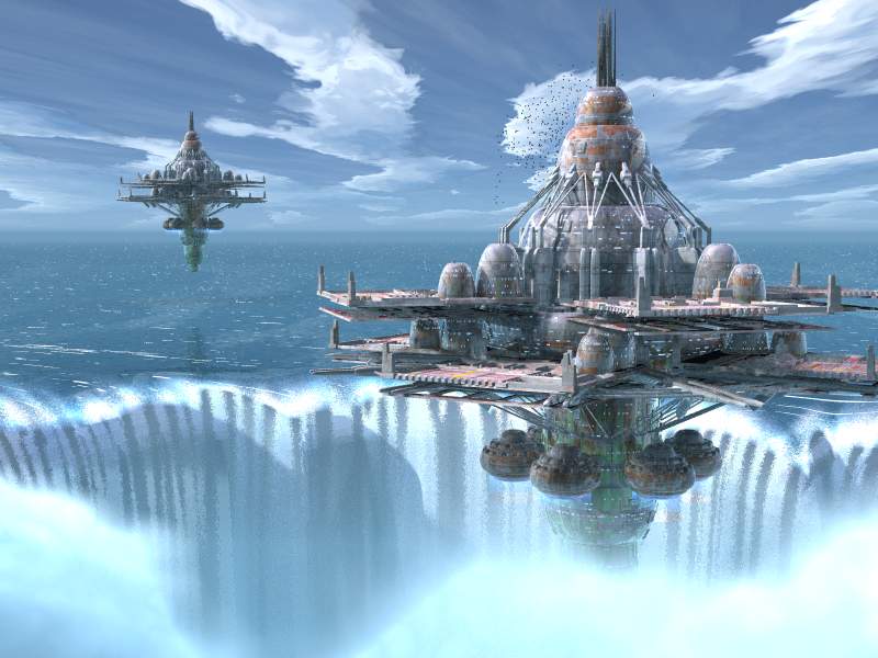
Well, got rid of the cave/rocks and just put spray there.  To balance
the image I placed another floating station farther away.  Also I added
more detail to the stations.
And I fixed the falls. The problem was that the falling water texture
was simply stretched in the z direction, which caused some weird stuff
to happen around the edges.  I slapped a cylindrical warp on the texture
and viola!
Comments?  Enjoy!

H.E. Day
<><
Post a reply to this message
Attachments:
Download 'adventure001.jpg' (56 KB)
Preview of image 'adventure001.jpg'
|
|
| |
| |
|
|
|
|
| |
| |
|
|
It's a spectacular image.  Everything works for me except the falling water.
The falling water is ingeneous enough in and of itself and in another image
might "read", but in this image it can't match the station's structure in
sense of detail and resolution.  Also I can't help thinking of Niagra Falls
which I grew up near to.  If you observe pictures of "the Falls" you will
notice there is usually a column or pillar of mist that rises up often higher
than the lip of the falls.
/jc
Post a reply to this message
|
|
| |
| |
|
|
|
|
| |
| |
|
|
I think this one is the best so far!
The best part of the docks was the bridge to the fortress. I liked those
drooping cables underneath. Maybe a couple of them connected with those
bridges?
The waterfall is looking better too, but it still needs something. I would
definitely keep it for the dynamic aspect it adds to the image.
The mist on the right still looks a little bright. The little bit on the
left has some depth to it. Maybe a negative fill light on the right side
would help.
I also like the extra detail you've added to the structures.
You're on a roll man.
Batronyx™ ^"^
bat### [at] cadronhsa com
Post a reply to this message
|
|
| |
| |
|
|
|
|
| |
| |
|
|
The best so far!

The only thing I don't like is the second fortress. It destroys the
character of the first one because it suggests this fortress is just a
device that can be mass produced. In earlier images it looked like a place
where people lived that had been built up over time and had lots of
character. Still, that's just my interpretation :)

Perhaps you could have an enemy fortress instead?

--
Tek
http://www.evilsuperbrain.com
Post a reply to this message
|
|
| |
| |
|
|
|
|
| |
| |
|
|
This is looking a lot better, I'm glad you got rid of the docks.  I thought
the rocks looked pretty nice in the last image though.  I thought the image
looked better when there was only one ship, I guess that goes along with the
idea that the docks made it look too civilized and developed.

Great work!
Eugene
Post a reply to this message
|
|
| |
| |
|
|
|
|
| |
| |
|
|
"H.E. Day" <The### [at] hedayfreeserverscom> wrote:

> Comments?  Enjoy!

I tend to agree with others in that the second platform seems to diminish
the impact of the image - makes the first platform look less monumental
and, well, enigmatic. Maybe you could use something else to balance the
image (an island, a large moon, etc, etc) and/or shift the viewpoint so the
platform is more centered.
I'd say the clouds still need some work, they are too bright and look
somewhat solid (remind me of porcelain for some reason). Perhaps a little
fluff along the edges would help...

--
Margus Ramst

Personal e-mail: mar### [at] peakeduee
TAG (Team Assistance Group) e-mail: mar### [at] tagpovrayorg
Home page http://www.hot.ee/margusrt
Post a reply to this message
|
|
| |
| |
|
|
|
|
| |
| |
|
|
Leave it just like that.  There are some washed out looking
bits of waterfall but they just add to the atmosphere.

It looks finished to me.

--
Cheers
Steve              email mailto:ste### [at] zeroppsuklinuxnet

%HAV-A-NICEDAY Error not enough coffee  0 pps.

web http://www.zeropps.uklinux.net/

or  http://start.at/zero-pps

  6:18pm  up 44 days, 20:00,  2 users,  load average: 1.09, 1.03, 1.01
Post a reply to this message
|
|
| |
| |
|
|
|
|
| |
| |
|
|
The falls are looking really good now, details on the station are excellent.

What will you show us next, Mr. Day?

--
Dan D.
Post a reply to this message
|
|
| |
| |
|
|
|
|
| |
| |
|
|
A winner!  You might play with the sky and the mist a bit, and I agree with
the folks who think the second station is a mistake (try re-using one of
your other wonderful spaceships instead) but overall this image is getting
to the point of diminishing returns.  Beautiful :-)
Post a reply to this message
|
|
| |
| |
|
|
|
|
| |
| |
|
|
Any chance you could put a larger version on the web?
H²

"H.E. Day" <The### [at] hedayfreeserverscom> wrote in message
news:3AB4DC59.F4C2B855@heday.freeservers.com...
> Well, got rid of the cave/rocks and just put spray there.  To balance
> the image I placed another floating station farther away.  Also I added
> more detail to the stations.
> And I fixed the falls. The problem was that the falling water texture
> was simply stretched in the z direction, which caused some weird stuff
> to happen around the edges.  I slapped a cylindrical warp on the texture
> and viola!
> Comments?  Enjoy!
>
> H.E. Day
> <><
>


----------------------------------------------------------------------------
----
Post a reply to this message
|
|
| |
| |
|
|
|
|
| |
| |
|
|
in <3ab4fcf6$1@news.povray.org> Margus Ramst wrote:

>Maybe you could use something else to balance the
>image (an island, a large moon, etc, etc) and/or shift the viewpoint
>so the platform is more centered.

a ship

Ingo

--
Photography: http://members.home.nl/ingoogni/
Pov-Ray    : http://members.home.nl/seed7/
Post a reply to this message
|
|
| |
| |
|
|
|
|
| |
| |
|
|
Margus Ramst wrote:
> Maybe you could use something else to balance the
> image (an island, a large moon, etc, etc) and/or shift the viewpoint so the
> platform is more centered.

a rainbow

Karl
Post a reply to this message
|
|
| |
| |
|
|
|
|
| |
| |
|
|
Nice..

Just an idea : the second platform has to be farther, and in a hole in the water
too...

--
FD aka Freddy D. aka Prof D.
Pro### [at] wanadoofr
http://profd.est-ici.org
'... et n'oubliez pas d'éteindre en sortant. Merci !...'
Post a reply to this message
|
|
| |
| |
|
|
|
|
| |
| |
|
|
"H.E. Day" <The### [at] hedayfreeserverscom> wrote :
>
> Comments?  Enjoy!

    I agree that two implies hundreds, and the station loses it's
incongruity and uniqueness. The falls are a little grainy but other-wise I
would replace the second station with almost anything else and then call it
finished.

    Maybe a fleet of supply ships coming in at about 300 ft? Or a close up
of a ship leaving? Anything occupying about the same visual space would do,
but something that adds to the story would be best.

    What's the story?
Post a reply to this message
|
|
| |
| |
|
|
|
|
| |
| |
|
|
Margus Ramst wrote:
> Maybe you could use something else to balance the
> image (an island, a large moon, etc, etc) and/or shift the viewpoint so
the
> platform is more centered

a penguin...?

-Chris-
Post a reply to this message
|
|
| |
| |
|
|
|
|
| |
| |
|
|
It's very beautiful!  :o)

May I ask something? Is your philosophy to reuse only the things you
have found to "work great"? I mean, a lot of POV'ers seem to experiement
with new things all the time.. But maybe you mostly stick with things
you already succesfully invented; continuing to use them? (This includes
textures, principles, modelling and lighting)

I'm just thinking about how you acheive these great results, moreover in
a short amount of time, with a relative slow computer.. And may I humbly
ask, if you could share the water texture with us? Please. It's the best
POV water I've seen so far.

Eminent! What more to say..

Byebye,
Hugo
Post a reply to this message
|
|
| |
| |
|
|
|
|
| |
| |
|
|
> May I ask something? Is your philosophy to reuse only the things you
> have found to "work great"? I mean, a lot of POV'ers seem to experiement
> with new things all the time.. But maybe you mostly stick with things
> you already succesfully invented; continuing to use them? (This includes
> textures, principles, modelling and lighting)

Hmm.  I don't think so.   My images may have a similar style, but I don't
think I don't experiment with every new image.  The only thing that may
transfer between images is snippets of trace() code and maybe some lighting
setups (that are quickly altered).
I usually just start with a black text screen and just start typing.  When I
get to a point where I think the result might look good, I hit the render
button.  Case in point -  I built the station from the ground up without
rendering it once (no texturing or landing pads...) .  I guess I can just
visualize it. ;)

> I'm just thinking about how you acheive these great results, moreover in
> a short amount of time, with a relative slow computer..

Actually, I'm using a P133 instead of my P200. :) Patience is key.

> And may I humbly
> ask, if you could share the water texture with us? Please. It's the best
> POV water I've seen so far.

I will. When I post Take 6, the water code will be right there. :)

Ta.

H.E. Day
<><
Post a reply to this message
|
|
| |
| |
|
|
|
|
| |
| |
|
|
> I tend to agree with others in that the second platform seems to diminish
> the impact of the image - makes the first platform look less monumental
> and, well, enigmatic. Maybe you could use something else to balance the
> image (an island, a large moon, etc, etc) and/or shift the viewpoint so the
> platform is more centered.

Blimps.  Everyone loves blimps, right?

> I'd say the clouds still need some work, they are too bright and look
> somewhat solid (remind me of porcelain for some reason). Perhaps a little
> fluff along the edges would help...

Hmm. I think i have the clouds fixed to my satisfaction.  You'll see in the
next image. :)

H.E. Day
<><
Post a reply to this message
|
|
| |
| |
|
|
|
|
| |
| |
|
|
Margus Ramst wrote:


> and, well, enigmatic. Maybe you could use something else to balance the
> image (an island, a large moon, etc, etc) and/or shift the viewpoint so the
> platform is more centered.

A two headed elephant.

--
Ken Tyler
Post a reply to this message
|
|
| |
| |
|
|
|
|
| |
| |
|
|
> A two headed elephant.

Do we really need a picture of John McCain ruining an otherwise marvelous
work of art?

:>}

Jim
Post a reply to this message
|
|
| |
| |
|
|
|
|
| |
| |
|
|
Maybe a craft coming in for a landing...

Nekar


"Jim Kress" <dea### [at] kressworkscom> wrote in message
news:3ab59563@news.povray.org...
> > A two headed elephant.
>
> Do we really need a picture of John McCain ruining an otherwise marvelous
> work of art?
>
> :>}
>
> Jim
>
>
>
Post a reply to this message
|
|
| |
| |
|
|
|
|
| |
| |
|
|
How about zeppelins?

"H.E. Day" wrote:

>
> Blimps.  Everyone loves blimps, right?
Post a reply to this message
|
|
| |
| |
|
|
|
|
| |
| |
|
|
H.E. Day <The### [at] hedayfreeserverscom> wrote:

> [-- text/plain, encoding 7bit, 12 lines --]

> Well, got rid of the cave/rocks and just put spray there.  To balance
> the image I placed another floating station farther away.  Also I added
> more detail to the stations.
> And I fixed the falls. The problem was that the falling water texture
> was simply stretched in the z direction, which caused some weird stuff
> to happen around the edges.  I slapped a cylindrical warp on the texture
> and viola!
> Comments?  Enjoy!

Ok, the waterfall is much better here.   It's much clearer that it's a
circular depression and not a waterfall, now, thanks to the clouds to the
right as well as left.

Like others, I don't like the second station, though someone mentioned
making a second pit, which could be cool.  Other than that, everything looks
fabulous.

Geoff
Post a reply to this message
|
|
| |
| |
|
|
|
|
| |
| |
|
|
Who has noticed (besides me) that the file name ends with 001.
As if it were going to be part of an _animation?_

"H.E. Day" wrote:
>
> Well, got rid of the cave/rocks and just put spray there.  To balance
> the image I placed another floating station farther away.  Also I added
> more detail to the stations.
> And I fixed the falls. The problem was that the falling water texture
> was simply stretched in the z direction, which caused some weird stuff
> to happen around the edges.  I slapped a cylindrical warp on the texture
> and viola!
> Comments?  Enjoy!
>
> H.E. Day
> <><
>
>   ------------------------------------------------------------------------
>  [Image]
Post a reply to this message
|
|
| |
| |
|
|
|
|
| |
| |
|
|
It's still pretty awesome, but the water was better in the last one I think.
The falls look like almost solid vertical bands. I kinda liked it better with
one station. It looks too like this one's gone more towards photorealism from
the flatter modernist painting look you kinda had before. I like it either
way, but realistic is harder to pull off because everything has to be in
place. Right now the falls don't fit.

--
David Fontaine  <dav### [at] faricynet>  ICQ 55354965
My raytracing gallery:  http://davidf.faricy.net/
Post a reply to this message
|
|
| |
| |
|
|
|
|
| |