|
|
|
|
|
|
| |
| |
|
|
|
|
| |
| |
|
|
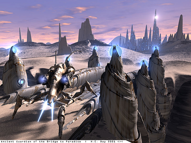
Should I post this on the IRTC??  Is it good enough??  I've got a story
and everything to back it up.  Note that the majority of objects are
Julia_Fractals. :) Gotta love 'm
Your opinion welcomed!!

H.E. Day
<><
Post a reply to this message
Attachments:
Download 'ag.jpg' (163 KB)
Preview of image 'ag.jpg'
|
|
| |
| |
|
|
|
|
| |
| |
|
|
>> Should I post this on the IRTC??  Is it good enough??

As to the first part, I am in no position to judge. As to the second part -
come on, now. Is there really any doubt in your mind?

Setep
Post a reply to this message
|
|
| |
| |
|
|
|
|
| |
| |
|
|
Sorry, forgot to add this little observation. I (who admittedly get confused
easily) took a while to resolve the outline of the guardian due to the
proximity in the background of the monolith object.

Great pic, tho'!!

Setep
Post a reply to this message
|
|
| |
| |
|
|
|
|
| |
| |
|
|
"H.E. Day" wrote:
> Should I post this on the IRTC??  Is it good enough??

It looks great generally, but there's a thing that annoys me.

I find it difficult to separate the "robot thing" in the foreground from the
objects behind it. The coloring and shape of the thing is not noticeably
different from the background objects. When I look into it I can see it, but
the first impression and the overall impression is a bit confusing, at least
to me. Dunno what could be done to avoid it...

> I've got a story and everything to back it up.

Well, I don't get the connection to the worship theme. In my opinion, in
images submitted to the IRTC, the connection to the theme should be
self-explanatory. One shouldn't have to read the text file to get the
connection. But that's just my opinion, and I know that it is quite common
in the IRTC to see images where the connection is not obvious at the first
glance. It may also just be me who don't get the connection...

Besides the things I have mentioned above I think it's a really great image,
one of your best. The details, as well as the way it works as a whole, is
great.

Rune
--
\ Include files, tutorials, 3D images, raytracing jokes,
/ The POV Desktop Theme, and The POV-Ray Logo Contest can
\ all be found at http://rsj.mobilixnet.dk (updated January 28)
/ Also visit http://www.povrayusers.org
Post a reply to this message
|
|
| |
| |
|
|
|
|
| |
| |
|
|
H.E. Day wrote:
> Is it good enough??

Surely you mock us with this comment, this image is amazing.
I don't see the 'Worship' theme, but I'm sure your story would explain all.

I've suddenly become rather embarrased of my 'Chipped Marbles' posts.

--
Duncan Gray
(warning: may contain traces of nut)
Post a reply to this message
|
|
| |
| |
|
|
|
|
| |
| |
|
|
In article <3a999668@news.povray.org>, "Rune" <run### [at] iname com>
wrote:
> I find it difficult to separate the "robot thing" in the foreground
> from the objects behind it. The coloring and shape of the thing is
> not noticeably different from the background objects. When I look
> into it I can see it, but the first impression and the overall
> impression is a bit confusing, at least to me.
I had the same problem, I had to really look at the guard in order to
see it.
> Dunno what could be done to avoid it...
I'm not sure anything *should* be done...I think it makes the image more
interesting.
--
Christopher James Huff
Personal: chr### [at] maccom, http://homepage.mac.com/chrishuff/
TAG: chr### [at] tagpovrayorg, http://tag.povray.org/
<><
Post a reply to this message
|
|
| |
| |
|
|
|
|
| |
| |
|
|
Setepenaset wrote:
> I (who admittedly get confused easily) took a while
> to resolve the outline of the guardian due to the
> proximity in the background of the monolith object.

yes, the guardian could stand to be a different color - how about
whiter?

> Great pic, tho'!!


--
Anton Sherwood  --  br0### [at] p0b0xcom  --  http://ogre.nu/
Post a reply to this message
|
|
| |
| |
|
|
|
|
| |
| |
|
|
Great stuff. I love fractals...

 I don't know why the others don't get it. The writing a t the bottom
basically explains it to me.

I'd suggest giving the 'guardian' a more metallic texture to amke it more
distinguishable from the background. Or just make it a different colour from
the background.  It might also help to rotate it a bit.

Nekar
Post a reply to this message
|
|
| |
| |
|
|
|
|
| |
| |
|
|
Superb textures - nice colour.

Don't like the sky, not up to the same standard as the rest and some of the
shadows seem far too strong.

As to the gaurdian, I think his body shape is too similar to the bridge
which makes it hard to distinguise, on the other hand this might be
camouflage!

Another excellent piece of work.

Mick
Post a reply to this message
|
|
| |
| |
|
|
|
|
| |
| |
|
|
My son wants to know if you play starcraft. He says that the guardian
looks just like a creature from that game.

"H.E. Day" wrote:
>
> Should I post this on the IRTC??  Is it good enough??  I've got a story
> and everything to back it up.  Note that the majority of objects are
> Julia_Fractals. :) Gotta love 'm
> Your opinion welcomed!!
>
> H.E. Day
> <><
>
>   ------------------------------------------------------------------------
>  [Image]
Post a reply to this message
|
|
| |
| |
|
|
|
|
| |
| |
|
|
"H.E. Day" <The### [at] hedayfreeserverscom> wrote in message
news:3A99896A.EC416696@heday.freeservers.com...
> Should I post this on the IRTC??  Is it good enough??  I've got a story
> and everything to back it up.  Note that the majority of objects are

Hmm, seems off-topic IMHO. I tend to think that the text should add to the
theme, rather than explain it.

Great pic, though.
Post a reply to this message
|
|
| |
| |
|
|
|
|
| |
| |
|
|
"H.E. Day" wrote:
>
> Should I post this on the IRTC??  Is it good enough??

Well, I fail to see a distinct "Worship" theme in there, but this is a matter of
interpretation I guess.
Technically, there is very little to complain about. A few things that come to
mind:
1) While the overall colouring of the sky fits well, the clouds seem a bit fake
somehow - perhaps they need more detail.
2) The mountains in the background look too much like plain "gaussian bells", I
think some jaggedness a la the foreground rocks would make them more convincing.
3) As others have said, the shape of the Guardian is difficult to make out,
either it or the bridge should be a somewhat different colour. Also, to one who
has played way too much Starcraft, it looks distinctly Protoss :)

Oh by the way, that chasm doesn't look so wide; I'd just forget about the
Guardian and pole vault to Paradise... Unless both bridge and Guardian are
supposed to be huge; but they don't look that way.

--
Margus Ramst

Personal e-mail: mar### [at] peakeduee
TAG (Team Assistance Group) e-mail: mar### [at] tagpovrayorg
Home page http://www.hot.ee/margusrt
Post a reply to this message
|
|
| |
| |
|
|
|
|
| |
| |
|
|
> Should I post this on the IRTC??  Is it good enough??
No (duh!!) its only one of the best pieces you have done !!


think you may have gone a little ott with the contrast sharpen tho :)


--
Rick

POV-Ray News & Resources - http://povray.co.uk
Kitty5 WebDesign - http://kitty5.com
Hi-Impact web site design & database driven e-commerce
TEL : +44 (01625) 266358 - FAX : +44 (01625) 611913 - ICQ : 15776037

PGP Public Key
http://pgpkeys.mit.edu:11371/pks/lookup?op=get&search=0x231E1CEA
Post a reply to this message
|
|
| |
| |
|
|
|
|
| |
| |
|
|
> My son wants to know if you play starcraft. He says that the guardian
> looks just like a creature from that game.

Yes I do.  Kinda a mix between a Zealot and a Dragoon, huh? :)

H.E. Day
<><
Post a reply to this message
|
|
| |
| |
|
|
|
|
| |
| |
|
|
> Well, I fail to see a distinct "Worship" theme in there, but this is a matter of
> interpretation I guess.
> Technically, there is very little to complain about. A few things that come to
> mind:

> 1) While the overall colouring of the sky fits well, the clouds seem a bit fake
> somehow - perhaps they need more detail.

Will do.

>
> 2) The mountains in the background look too much like plain "gaussian bells", I
> think some jaggedness a la the foreground rocks would make them more convincing.

Done.

>
> 3) As others have said, the shape of the Guardian is difficult to make out,
> either it or the bridge should be a somewhat different colour. Also, to one who
> has played way too much Starcraft, it looks distinctly Protoss :)

Not necessarily a bad thing.  As someone mentioned, it looks like it is camouflaged.

> Oh by the way, that chasm doesn't look so wide; I'd just forget about the
> Guardian and pole vault to Paradise... Unless both bridge and Guardian are
> supposed to be huge; but they don't look that way.

I'll stick some defense cannons on the other side.  To discourage pole vaulters. :)
Post a reply to this message
|
|
| |
| |
|
|
|
|
| |
| |
|
|
"H.E. Day" wrote:
>
> Should I post this on the IRTC??  Is it good enough??  I've got a story
> and everything to back it up.  Note that the majority of objects are
> Julia_Fractals. :) Gotta love 'm
> Your opinion welcomed!!
>

Looks very pleasant as usual.

Some thoughts:
- as others mentioned probably a bit off-topic for this IRTC round.
- i like the sky, but it somehow contradicts the effect radiosity lighting
would have (i suppose you do not use radiosity here).  The shadows would
have to be more blue-red.
- The border between the julia fractal and the ground is very visible
because of the triangle structure.  Using an isosurface for the ground
would of course avoid this, but the rendering time...

Christoph

--
Christoph Hormann <chr### [at] gmxde>
IsoWood include, radiosity tutorial, TransSkin and other
things on: http://www.schunter.etc.tu-bs.de/~chris/
Post a reply to this message
|
|
| |
| |
|
|
|
|
| |
| |
|
|
"Chris Huff" wrote:
> I had the same problem, I had to really look at the guard
> in order to see it.

> > Dunno what could be done to avoid it...
>
> I'm not sure anything *should* be done...I think it makes
> the image more interesting.

Hmm, not I.

I don't think the visual confusion adds anything to the image. On the
contrary...

Rune
--
\ Include files, tutorials, 3D images, raytracing jokes,
/ The POV Desktop Theme, and The POV-Ray Logo Contest can
\ all be found at http://rsj.mobilixnet.dk (updated January 28)
/ Also visit http://www.povrayusers.org
Post a reply to this message
|
|
| |
| |
|
|
|
|
| |
| |
|
|
> - The border between the julia fractal and the ground is very visible
> because of the triangle structure.  Using an isosurface for the ground
> would of course avoid this, but the rendering time...

It *is* an Isosurface!!!  I set the accuracy at .05 instead of .01.  Oops.

H.E. Day
<><
Post a reply to this message
|
|
| |
| |
|
|
|
|
| |
| |
|
|
In article <3A9A8392.33E037E5@heday.freeservers.com>, "H.E. Day"
<The### [at] hedayfreeserverscom> wrote:

> Not necessarily a bad thing.  As someone mentioned, it looks like it is
> camouflaged.

Or like it's been there for a *very* long time, so that it is
practically part of the bridge.

--
Christopher James Huff
Personal: chr### [at] maccom, http://homepage.mac.com/chrishuff/
TAG: chr### [at] tagpovrayorg, http://tag.povray.org/

<><
Post a reply to this message
|
|
| |
| |
|
|
|
|
| |
| |
|
|
Bingo.


H.E. Day
<><
Post a reply to this message
|
|
| |
| |
|
|
|
|
| |
| |
|
|
H.E. Day <The### [at] hedayfreeserverscom> wrote in message
news:3A99896A.EC416696@heday.freeservers.com...
> Should I post this on the IRTC??  Is it good enough??  I've got a story
> and everything to back it up.  Note that the majority of objects are
> Julia_Fractals. :) Gotta love 'm
> Your opinion welcomed!!

I like it, but the objects in the foreground look very sharp and the change
from sharp
to blur seems very sharp. Has the image been adjusted in Photoshop?
Also my eye is drawn to the pillars front right instead of the guardian
(which
I assume should be the focus of the pic) Maybe move the camera a little to
the left?

Background is beautiful, I like the clouds. Modelling is as usual excellent.

Definatly good enough for the irtc. How about adding a creature leaving an
offering to the guardian in hopes of being allowed over the bridge.

Gail
********************************************************************
* gsh### [at] monotixcoza              * System.dat not found.         *
* http://www.rucus.ru.ac.za/~gail/ * Reformat hard drive Y)es O)k  *
********************************************************************
* If at first you don't succeed, call it version 1.0               *
********************************************************************
Post a reply to this message
|
|
| |
| |
|
|
|
|
| |
| |
|
|
> Surely you mock us with this comment, this image is amazing.
> I've suddenly become rather embarrased of my... posts.

Welcome to the club.
Post a reply to this message
|
|
| |
| |
|
|
|
|
| |
| |
|
|
H.E. Day <The### [at] hedayfreeserverscom> wrote in message
news:3A9A82D2.E11CFF71@heday.freeservers.com...
> > My son wants to know if you play starcraft. He says that the guardian
> > looks just like a creature from that game.
>
> Yes I do.  Kinda a mix between a Zealot and a Dragoon, huh? :)

That vaguely poped into my head when I saw it to, though the hydralisks from
the waste land cinematic poped into my head.


--
-The "D"
    A Thunderstorm is God's way of telling you you spend too much time on
the
computer
Email address given is a spam catcher only
Post a reply to this message
|
|
| |
| |
|
|
|
|
| |
| |
|
|
Tony[B] wrote:
> Welcome to the club.

I figure it is down to me to help keep the overall quality down, otherwise
exceptional images like this wouldn't be ... exceptional.  ;)
Post a reply to this message
|
|
| |
| |
|
|
|
|
| |
| |
|
|
Exactly. You and I and all the other "average" POVers must do our best and
suck in order for those who are truly talented to shine.
Post a reply to this message
|
|
| |
| |
|
|
|
|
| |
| |
|
|
Tony[B] <ben### [at] catholicorg> wrote in message
news:3a9d7b52@news.povray.org...
> Exactly. You and I and all the other "average" POVers must do our best and
> suck in order for those who are truly talented to shine.

hehe
Amen! Preach it Brotha'!
^_^


--
-The "D"
    A Thunderstorm is God's way of telling you you spend too much time on
the
computer
Email address given is a spam catcher only
Post a reply to this message
|
|
| |
| |
|
|
|
|
| |