 |
|
|
|
|
|
| |
| |
|
|
|
|
| |
| |
|
|
"Jamie Davison" <jam### [at] dh70qd u-netcom> wrote :
>
> Of course this being an
> english translation of Japanese, it's easily open to confusion.
Then add to that the fact that my Japanese was taught to me by a guy
from North Carolina.... u-netcom> wrote :
>
> Of course this being an
> english translation of Japanese, it's easily open to confusion.
Then add to that the fact that my Japanese was taught to me by a guy
from North Carolina....
Post a reply to this message
|
|
| |
| |
|
|
|
|
| |
| |
|
|
message news: 39dc9a12@news.povray.org...
> "Olivier Rougeron" <oro### [at] eraware-softcom> wrote in message
> news:39dc60e1@news.povray.org...
> |
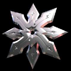
> | It's a logo (splash screen) for the software I am working on.
> | doesn't it look a little bit empty ?
> |
> | I'm waiting for your suggestion
>
> Although the shadows are a nice 3D touch it doesn't seem clean enough with
> them as is. Could be the double-shadowing making me think so, or that
there
> isn't enough of a shadow to make the objects prominent. Something about
it
> anyway.
Perhaps a little bevel on the letter to grab the light, but... how to do
this ? (it's a text object)
> I agree with the other replies that this is all you need, complexity in a
> logo isn't a good idea, however for a splash screen it could be more I
> suppose. Won't there be additional wording on this if used as such? If
so
> this might be best then.
as it's a splash screen, there will have credits and version somewhere (but
certainly not rendered in POV)
> How about a deeper red outer glow (fading fast) with this bright pinkish
> color only in the center of the light object. I think that would seem
more
> dramatic. Since you're new to POV-Ray keywords fade_distance D (D being
how
> far before fading) and fade_power 2 or 3 should do well. Of course it all
> depends on what type of look you are wanting.
can I do this effect with a glow object ?
the sphere in the middle is transparent with a media emitter inside.
Post a reply to this message
|
|
| |
| |
|
|
|
|
| |
| |
|
|
in fact, that was my first idea
but it looks too much complicated because my boss wanted 8 branchs so I
decided to make one more simple in POV (that I don't know before I saw IRTC
and was astonished by the quality of this renderer !).
here is an image of the beginning (made in 3dsmax ! sorry ;)) but I prefer
the result in POV ;-)
39dc6af8@news.povray.org...
>
> A little empty, yes. Current form would look better on a building.
>
> Also, why has the Shuriken more than 4 points? My real ones have four,
> because of the way they are to be used; held in the hand and not throwing.
>
> I think they look better; here is an example.
>
> ian
>
> Olivier Rougeron wrote in message <39dc60e1@news.povray.org>...
> >Hello everybody,
> >
> >I'm new with POV and here is my first image.
> >
> >It's a logo (splash screen) for the software I am working on.
> >doesn't it look a little bit empty ?
>
>
>
Post a reply to this message
Attachments:
Download 'shuriken0.jpg' (19 KB)
Preview of image 'shuriken0.jpg'
|
|
| |
| |
|
|
|
|
| |
| |
|
|
As of this I am unsure as no differentiation in name from blade number was
made known to me; what I know is that the 34th Grandmaster of Togakure Ryu
Bujinkan Ninjutsu (Masaaki Hatsumi) uses 'Shuriken' for the four pointed
one...as does Stephen Hayes who was taught by him. :)
However, Hatsumi speaks no English and typically uses esoteric Japanese;
therefore his books had to be translated, and in doing much was lost.
I am very off-topic now, I need to render something..
ian
Jamie Davison wrote in message ...
>IIRC, a shuriken is a single pointed throwing weapon, and the >name for a
multi pointed throwing weapon is a Shaken.
Post a reply to this message
|
|
| |
| |
|
|
|
|
| |
| |
|
|
You are correct, much too complicated for the splash-image. :)
They are nice though.
The first image looks very nice, it just seems to be missing something.
I might place in the background a simple Sumi-e painting, and remove the
pink hue.
But, I do things 'differently'. :)
ian
Olivier Rougeron wrote in message <39dd9bce@news.povray.org>...
>in fact, that was my first idea but it looks too much complicated >because
my boss wanted 8 branchs so I decided to make one more >simple in POV
Post a reply to this message
|
|
| |
| |
|
|
|
|
| |
| |
|
|
"Olivier Rougeron" <oro### [at] eraware-softcom> wrote in message
news:39dd8850@news.povray.org...
|
| Perhaps a little bevel on the letter to grab the light, but... how to do
| this ? (it's a text object)
A few things I know of to bevel text for use in POV-Ray.
SoftText: http://www.xs4all.nl/~remcodek/softtext.html (use the povray link
there)
AC3D: http://tina.lancs.ac.uk/computing/users/andy/ac3d.html
Elefont: http://www.armanisoft.ch/webdesign/Elefont.htm
| can I do this effect with a glow object ?
| the sphere in the middle is transparent with a media emitter inside.
Sure, as long as you use either the latest MegaPovPlus or MegaPOV custom
versions, which obviously you are.
You'll still might need a light source (questionable when using radiosity)
and object (at least if you want actual structure), it seems they can affect
things in radiosity, which is good unless you were to use a large number of
them. I've seen artifacts become prevalent.
The only real difficulty (if that could be said) is in getting a good
falloff and inner/outer size. Only because they're a new thing to me.
Bob
Post a reply to this message
|
|
| |
| |
|
|
|
|
| |
| |
|
|
for a small logo it would look nice...
if it is to be this size a light background texture or normal would be
appealing...
nothing to strong... just a hint of flavor for lack of a better word in the
pink...?
Olivier Rougeron wrote:
> Hello everybody,
>
> I'm new with POV and here is my first image.
>
> It's a logo (splash screen) for the software I am working on.
> doesn't it look a little bit empty ?
>
> I'm waiting for your suggestion
>
> megaPov 0.6
> with radiosity
> 1024x768 = 10h25mn
>
> ----------------------------------------------------------------------------
> --------
> Olivier Rougeron - ErawarE
> Network admin and webmaster
> Tel : (33/0) 1 30 49 09 55 - Fax : (33/0) 1 30 49 09 56
> email:oro### [at] eraware-softcom - http://www.eraware-soft.com
> ----------------------------------------------------------------------------
> --------
>
> [Image]
Post a reply to this message
|
|
| |
| |
|
|
|
|
| |
| |
|
|
I agree a background would be nice...
I was thinking of a light/subtle marble with the original pink and maybe a
cream for the veins...
I like the complexity of the 3Dmax image...
The curvatures in the depressions appeal to me.
Although not as a logo or splash...
That should be kept simple to please the eye.
Possibility for promotional or box cover...?)
ian wrote:
> You are correct, much too complicated for the splash-image. :)
> They are nice though.
>
> The first image looks very nice, it just seems to be missing something.
>
> I might place in the background a simple Sumi-e painting, and remove the
> pink hue.
>
> But, I do things 'differently'. :)
>
> ian
>
> Olivier Rougeron wrote in message <39dd9bce@news.povray.org>...
> >in fact, that was my first idea but it looks too much complicated >because
> my boss wanted 8 branchs so I decided to make one more >simple in POV
Post a reply to this message
|
|
| |
| |
|
|
|
|
| |
| |
|
|
Olivier Rougeron wrote:
> Therefore, is there a way to make a bevel effect on the text ?
Try applying the matrix key word to the finished text...?
There are some good tutorials on how to use the matrix in the pov links...
Post a reply to this message
|
|
| |
| |
|
|
|
|
| |


