 |
 |
|
 |
|
 |
|  |
|  |
|
 |
|
 |
|  |
|  |
|
 |
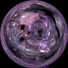
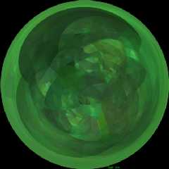
I think the cylinders came out pretty good. The plane one seems too
plain (no pun intended), too uniform, but it has some interesting
shapes. It's like the walls of a big mound of suds. Anyway here they
are, making eight total...
Hmm, I wonder, looking back on all of these, what do you think of them
as a group? IMHO they go nice together, but individually the original
three are best.
--
David Fontaine <dav### [at] faricy net> ICQ 55354965
Please visit my website: http://davidf.faricy.net/ net> ICQ 55354965
Please visit my website: http://davidf.faricy.net/
Post a reply to this message
Attachments:
Download 'obje_cylinders_sm.jpg' (52 KB)
Download 'objet_planes_sm.jpg' (40 KB)
Preview of image 'obje_cylinders_sm.jpg'

Preview of image 'objet_planes_sm.jpg'

|
 |
|  |
|  |
|
 |
|
 |
|  |
|  |
|
 |
Ooh, these two do not go side by side!
--
David Fontaine <dav### [at] faricy net> ICQ 55354965
Please visit my website: http://davidf.faricy.net/ net> ICQ 55354965
Please visit my website: http://davidf.faricy.net/
Post a reply to this message
|
 |
|  |
|  |
|
 |
From: Doug Eichenberg
Subject: Re: Et le plan et le cylindre (last ones) [39+52k]
Date: 11 Sep 2000 23:42:02
Message: <39bda60a@news.povray.org>
|
|
 |
|  |
|  |
|
 |
Dave, I think these (and the previous ones) are very nice. This is
the sort of thing I had in mind when I brought up the possibility
of an abstract or nonrepresentational round of the IRTC!
--
- Doug Eichenberg
http://www.getinfo.net/douge
dou### [at] nls net net
Post a reply to this message
|
 |
|  |
|  |
|
 |
|
 |
|  |
|  |
|
 |
I have heard a definition of abstract art that it has little intrinsic
value.
Abstract raytracing generally has smaller code than "photorealistic"
traces and practically any values will fit, so it has high intrinsic
value provided the methods are appearant. :-)
--
David Fontaine <dav### [at] faricy net> ICQ 55354965
Please visit my website: http://davidf.faricy.net/ net> ICQ 55354965
Please visit my website: http://davidf.faricy.net/
Post a reply to this message
|
 |
|  |
|  |
|
 |
|
 |
|  |
|  |
|
 |
David Fontaine wrote:
>
> I think the cylinders came out pretty good. The plane one seems too
> plain (no pun intended), too uniform, but it has some interesting
> shapes. It's like the walls of a big mound of suds. Anyway here they
> are, making eight total...
As an experiment, I ran the cylinders through Photoshop's
Polar-Rectangular filter and applied some Unsharp Mask to clean up the
edges a bit. What resulted tiled horizontally seamlessly, and when
tiled, gave a gorgeous (if incredibly distracting) "cave of jewels" effect.
I suspect that the other images in this series would behave the same.
-Xplo
Post a reply to this message
|
 |
|  |
|  |
|
 |
|
 |
|  |
|  |
|
 |
You know, these would look pretty cool as a bauble on a shelf or something in
part of a bigger scene. Or maybe on the desk of some necromancer or
something. Is the source available?
Thanks,
Derek
David Fontaine wrote:
> I think the cylinders came out pretty good. The plane one seems too
> plain (no pun intended), too uniform, but it has some interesting
> shapes. It's like the walls of a big mound of suds. Anyway here they
> are, making eight total...
>
> Hmm, I wonder, looking back on all of these, what do you think of them
> as a group? IMHO they go nice together, but individually the original
> three are best.
>
> --
> David Fontaine <dav### [at] faricy net> ICQ 55354965
> Please visit my website: http://davidf.faricy.net/
>
> ------------------------------------------------------------------------
> [Image] [Image] net> ICQ 55354965
> Please visit my website: http://davidf.faricy.net/
>
> ------------------------------------------------------------------------
> [Image] [Image]
Post a reply to this message
|
 |
|  |
|  |
|
 |
From: David Fontaine
Subject: Re: Et le plan et le cylindre (last ones) [39+52k]
Date: 12 Sep 2000 18:00:52
Message: <39BEA66B.330A48E@faricy.net>
|
|
 |
|  |
|  |
|
 |
Xplo Eristotle wrote:
> As an experiment, I ran the cylinders through Photoshop's
> Polar-Rectangular filter and applied some Unsharp Mask to clean up the
> edges a bit. What resulted tiled horizontally seamlessly, and when
> tiled, gave a gorgeous (if incredibly distracting) "cave of jewels" effect.
>
> I suspect that the other images in this series would behave the same.
Of course, they are 360 fisheye views. And AFAIK fisheye=polar...
--
David Fontaine <dav### [at] faricy net> ICQ 55354965
Please visit my website: http://davidf.faricy.net/ net> ICQ 55354965
Please visit my website: http://davidf.faricy.net/
Post a reply to this message
|
 |
|  |
|  |
|
 |
|
 |
|  |
|  |
|
 |
"D. Stark" wrote:
> You know, these would look pretty cool as a bauble on a shelf or something in
> part of a bigger scene. Or maybe on the desk of some necromancer or
> something. Is the source available?
--
David Fontaine <dav### [at] faricy net> ICQ 55354965
Please visit my website: http://davidf.faricy.net/ net> ICQ 55354965
Please visit my website: http://davidf.faricy.net/
Post a reply to this message
|
 |
|  |
|  |
|
 |
|
 |
|  |
|  |
|
 |
I like the "plain" one...?) I like it cuz it's green... =) Very Salvador Dali
like...
David Fontaine wrote:
> I think the cylinders came out pretty good. The plane one seems too
> plain (no pun intended), too uniform, but it has some interesting
> shapes. It's like the walls of a big mound of suds. Anyway here they
> are, making eight total...
>
> Hmm, I wonder, looking back on all of these, what do you think of them
> as a group? IMHO they go nice together, but individually the original
> three are best.
>
> --
> David Fontaine <dav### [at] faricy net> ICQ 55354965
> Please visit my website: http://davidf.faricy.net/
>
> ------------------------------------------------------------------------
> [Image] [Image] net> ICQ 55354965
> Please visit my website: http://davidf.faricy.net/
>
> ------------------------------------------------------------------------
> [Image] [Image]
Post a reply to this message
|
 |
|  |
|  |
|
 |
|
 |
|  |
|  |
|
 |
SomeGuy wrote:
> I like the "plain" one...?) I like it cuz it's green... =) Very Salvador Dali
> like...
yes
green is an excellent color
--
David Fontaine <dav### [at] faricy net> ICQ 55354965
Please visit my website: http://davidf.faricy.net/ net> ICQ 55354965
Please visit my website: http://davidf.faricy.net/
Post a reply to this message
|
 |
|  |
|  |
|
 |
|
 |
|  |


![]()