|
|
|
|
|
|
| |
| |
|
|
|
|
| |
| |
|
|
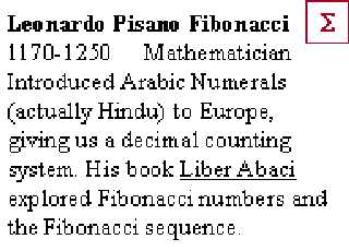
On Mon, 14 Aug 2000 22:12:55 -0700, C.J. - POV User wrote:
>This is going to be the background for a windows theme I'm working on....
>
Reminds me of honey and the inside of a bee hive.
--
Cheers
Steve email mailto:ste### [at] zeropps uklinuxnet
%HAV-A-NICEDAY Error not enough coffee 0 pps.
web http://www.zeropps.uklinux.net/
or http://start.at/zero-pps
12:39pm up 31 days, 11:06, 2 users, load average: 1.15, 1.21, 1.13 uklinuxnet
%HAV-A-NICEDAY Error not enough coffee 0 pps.
web http://www.zeropps.uklinux.net/
or http://start.at/zero-pps
12:39pm up 31 days, 11:06, 2 users, load average: 1.15, 1.21, 1.13
Post a reply to this message
|
|
| |
| |
|
|
|
|
| |
| |
|
|
"C.J." wrote:
> It was not intended to be a spiral, its circular. Each ring is just offset a
> little so it is not to symmetrical. I made a simple macro to make the rings
> and the ring objects are slightly larger and darker as you move away from
> the center. I also left one thing out of this render and that is the text
> "POV Raytracer" in the center off the sun. It will be in the POV Theme, but
> I thought the image by itself was interesting.
Well, it still looks totally awesome, so do what you want. :-)
--
David Fontaine <dav### [at] faricynet> ICQ 55354965
Please visit my website: http://www.faricy.net/~davidf/
Post a reply to this message
|
|
| |
| |
|
|
|
|
| |
| |
|
|
Looks like it would be a GREAT sunflower! But fantastic as is also!!!!
"C.J. - POV User" wrote:
> This is going to be the background for a windows theme I'm working on....
>
> Regards,
> C.J. - POV User
> POV Ray Study Gallery
> www.crosswinds.net/~povstudy
>
> [Image]
Post a reply to this message
|
|
| |
| |
|
|
|
|
| |
| |
|
|
> > This is going to be the background for a windows theme I'm working on....
>
> Looks neat, but it would look neater if it were a real Fibanochi(sp)
> spiral...
I think it's spelt Fibonacci.
Bye for now,
Jamie.
Post a reply to this message
|
|
| |
| |
|
|
|
|
| |
| |
|
|
Jamie Davison wrote:
> > > This is going to be the background for a windows theme I'm working on....
> >
> > Looks neat, but it would look neater if it were a real Fibanochi(sp)
> > spiral...
>
> I think it's spelt Fibonacci.
>
> Bye for now,
> Jamie.
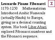
Fibonacci is
Post a reply to this message
Attachments:
Download 'bf014.gif' (3 KB)
Preview of image 'bf014.gif'
|
|
| |
| |
|
|
|
|
| |
| |
|
|
On Mon, 14 Aug 2000 22:12:55 -0700, "C.J. - POV User"
<hou### [at] yahoocom> wrote:
>This is going to be the background for a windows theme I'm working on....
I regret to say this but it's completely unuseable as a wallpaper. On
the other hand it's stunningly beautiful to just look at and enjoy.
Peter Popov ICQ : 15002700
Personal e-mail : pet### [at] usanet
TAG e-mail : pet### [at] tagpovrayorg
Post a reply to this message
|
|
| |
| |
|
|
|
|
| |
| |
|
|
> I regret to say this but it's completely unuseable as a wallpaper
It is? Why?
C.J. - POV User
Post a reply to this message
|
|
| |
| |
|
|
|
|
| |
| |
|
|
On Wed, 16 Aug 2000 07:52:04 -0700, "C.J."
<hou### [at] yahoocom> wrote:
>> I regret to say this but it's completely unuseable as a wallpaper
>It is? Why?
Too bright, too distractive and too colourful. I work at night, I try
to concentrate and my work is graphics-related. When I show the
desktop (for one reason or another) it hits me in the face with
brightness. PhotoShop has been calibrated carefully so I don't touch
the monitor controls. The image is also very distracting and I'd spend
five minutes exploring it and finally forgetting what I was initially
going to do. Lastly, it's in a pretty tight spectral range and the eye
compensates for it after a while, so when I look away from it after
staring for some time, white looks bluish.
I usually use a black or dark gray background. If I use a picture,
it's a dark one with most colors present. But that's just me.
And you snipped the part of my post where I wrote how beautiful your
image was! :-/
Peter Popov ICQ : 15002700
Personal e-mail : pet### [at] usanet
TAG e-mail : pet### [at] tagpovrayorg
Post a reply to this message
|
|
| |
| |
|
|
|
|
| |
| |
|
|
Peter Popov wrote:
> Lastly, it's in a pretty tight spectral range and the eye
> compensates for it after a while, so when I look away from it after
> staring for some time, white looks bluish.
Aaggh! I hate that.
--
David Fontaine <dav### [at] faricynet> ICQ 55354965
Please visit my website: http://davidf.faricy.net/
Post a reply to this message
|
|
| |
| |
|
|
|
|
| |
| |
|
|
Sorry Peter,
I will no longer snip you.
:)
C.J. - POV User
Peter Popov <pet### [at] usanet> wrote in message
news:3g5mpskkh7e51n4bpeci1e0jjn2e513cbp@4ax.com...
> On Wed, 16 Aug 2000 07:52:04 -0700, "C.J."
> <hou### [at] yahoocom> wrote:
>
> >> I regret to say this but it's completely unuseable as a wallpaper
>
> >It is? Why?
>
> Too bright, too distractive and too colourful. I work at night, I try
> to concentrate and my work is graphics-related. When I show the
> desktop (for one reason or another) it hits me in the face with
> brightness. PhotoShop has been calibrated carefully so I don't touch
> the monitor controls. The image is also very distracting and I'd spend
> five minutes exploring it and finally forgetting what I was initially
> going to do. Lastly, it's in a pretty tight spectral range and the eye
> compensates for it after a while, so when I look away from it after
> staring for some time, white looks bluish.
>
> I usually use a black or dark gray background. If I use a picture,
> it's a dark one with most colors present. But that's just me.
>
> And you snipped the part of my post where I wrote how beautiful your
> image was! :-/
>
>
> Peter Popov ICQ : 15002700
> Personal e-mail : pet### [at] usanet
> TAG e-mail : pet### [at] tagpovrayorg
Post a reply to this message
|
|
| |
| |
|
|
|
|
| |