 |
 |
|
 |
|
 |
|  |
|  |
|
 |
|
 |
|  |
|  |
|
 |
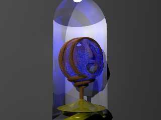
Less Ugly Head Thing, some may think it looks worse, but I kind of like
this variation. I'm thinking of doing several variations, if anyone
would be interested??
--
Come visit my web site:-) : http://www.geocities.com/~thomaslake/
Post a reply to this message
Attachments:
Download 'spatch head2.jpg' (44 KB)
Preview of image 'spatch head2.jpg'

|
 |
|  |
|  |
|
 |
|
 |
|  |
|  |
|
 |
> Less Ugly Head Thing, some may think it looks worse, but I kind of like
> this variation. I'm thinking of doing several variations, if anyone
> would be interested??
no, its worse.
try un texturing everything, and rendering at all in a neutral grey, it will
help you develope it faster than (ack!) glass
Rick
Post a reply to this message
|
 |
|  |
|  |
|
 |
|
 |
|  |
|  |
|
 |
"Rick [Kitty5]" wrote:
> > Less Ugly Head Thing, some may think it looks worse, but I kind of like
> > this variation. I'm thinking of doing several variations, if anyone
> > would be interested??
>
> no, its worse.
:-( Actually after looking at it more I have to agree with you. Oh well :-(
> try un texturing everything, and rendering at all in a neutral grey, it will
> help you develope it faster than (ack!) glass
:-(
>
>
> Rick
--
Come visit my web site:-) : http://www.geocities.com/~thomaslake/
Post a reply to this message
|
 |
|  |
|  |
|
 |
|
 |
|  |
|  |
|
 |
In article <398CF010.EA2B53D3@home.com>, Thomas Lake <tla### [at] home com>
writes
>Less Ugly Head Thing, some may think it looks worse, but I kind of like
>this variation. I'm thinking of doing several variations, if anyone
>would be interested??
>
>--
>Come visit my web site:-) : http://www.geocities.com/~thomaslake/
>
>
>[ A MIME image / jpeg part was included here. ]
>
Now that I like very much.
--
David Parrott com>
writes
>Less Ugly Head Thing, some may think it looks worse, but I kind of like
>this variation. I'm thinking of doing several variations, if anyone
>would be interested??
>
>--
>Come visit my web site:-) : http://www.geocities.com/~thomaslake/
>
>
>[ A MIME image / jpeg part was included here. ]
>
Now that I like very much.
--
David Parrott
Post a reply to this message
|
 |
|  |
|  |
|
 |
|
 |
|  |


![]()