|
|
|
|
|
|
| |
| |
|
|
|
|
| |
| |
|
|
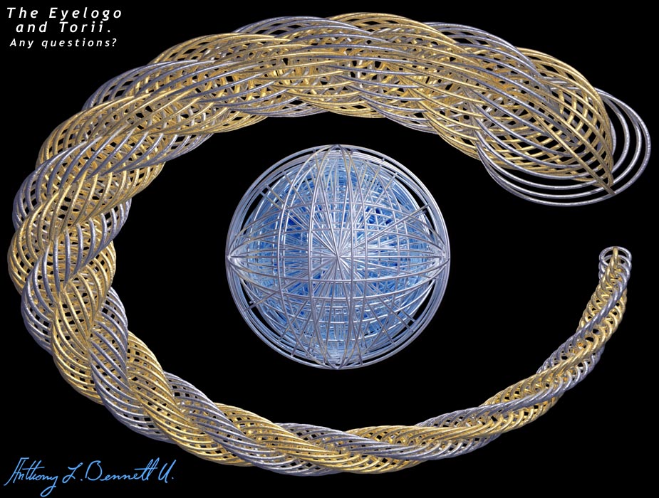
Yet Another Crappy Eyelogo Presentation. This is my 7th so far. I like it.
The sphere in the middle uses negative emission media... oooohh... I hope
it's not that crappy. ;-) I did it a while ago, just got to post it. Enjoy.
Post a reply to this message
Attachments:
Download 'torii variant.jpg' (158 KB)
Preview of image 'torii variant.jpg'
|
|
| |
| |
|
|
|
|
| |
| |
|
|
yes ,a question:
how did you make your signature in the bottom left of the image?
graphic pen,scan,ttf font???
gibus
Post a reply to this message
|
|
| |
| |
|
|
|
|
| |
| |
|
|
I think this is one of the better crappy eye logos yet. I dont think it's so
crappy though. Needs more crappiness.:)
HH
"Tony[B]" <ben### [at] panama c-comnet> wrote in message
news:398b7594@news.povray.org...
> Yet Another Crappy Eyelogo Presentation. This is my 7th so far. I like it.
> The sphere in the middle uses negative emission media... oooohh... I hope
> it's not that crappy. ;-) I did it a while ago, just got to post it.
Enjoy.
>
>
>
Post a reply to this message
|
|
| |
| |
|
|
|
|
| |
| |
|
|
Gibus wrote:

> yes ,a question:
> how did you make your signature in the bottom left of the image?
> graphic pen,scan,ttf font???
> gibus

I would say not ttf because the n's aren't identical.

--
David Fontaine     <dav### [at] faricynet>     ICQ 55354965
Please visit my website: http://www.faricy.net/~davidf/
Post a reply to this message
|
|
| |
| |
|
|
|
|
| |
| |
|
|
First I scanned it, then I redrew it in Illustrator and exported in really
high-resolution. I just rescale that image each time I need it, and paste it
into my images. :)
Post a reply to this message
|
|
| |
| |
|
|
|
|
| |
| |
|
|
> I think this is one of the better crappy eye logos yet. I dont think it's
so
> crappy though. Needs more crappiness. :)

I knew it wasn't crappy enough... Thanks. I'll get to work on it. ;)
Post a reply to this message
|
|
| |
| |
|
|
|
|
| |
| |
|
|
Not bad.
The silver lacings on the left lose some definition next
to the gold.

I love the sig, no matter how you did it.
Cool.

Peter.
Post a reply to this message
|
|
| |
| |
|
|
|
|
| |
| |
|
|
Very nice! :-)

Greetings,

Rune
--
\ Include files, tutorials, 3D images, raytracing jokes,
/ The POV Desktop Theme, and The POV-Ray Logo Contest can
\ all be found at http://rsj.mobilixnet.dk (updated July 23)
/ Also visit http://www.povrayusers.org
Post a reply to this message
|
|
| |
| |
|
|
|
|
| |
| |
|
|
Much too complex for a logo.  I like complex and hate logos tho', so it
looks good to me. :)

-Mike
Post a reply to this message
|
|
| |
| |
|
|
|
|
| |
| |
|
|
> Not bad.
> The silver lacings on the left lose some definition next
> to the gold.
>
> I love the sig, no matter how you did it.
> Cool.

Thanks. :)
Post a reply to this message
|
|
| |
| |
|
|
|
|
| |
| |
|
|
> Very nice! :-)

Excellent. I guess you can use this as one of my presentations then. Should
I send you the original, full-size render?
Post a reply to this message
|
|
| |
| |
|
|
|
|
| |
| |
|
|
> Much too complex for a logo.  I like complex and hate logos tho', so it
> looks good to me. :)

It's just a presentation of the logo. I'm glad you like it. :)
Post a reply to this message
|
|
| |
| |
|
|
|
|
| |
| |
|
|
negative emission media?  elaborate.  what are properties one can expect
from such a beast?

"Tony[B]" wrote:
>
> Yet Another Crappy Eyelogo Presentation. This is my 7th so far. I like it.
> The sphere in the middle uses negative emission media... oooohh... I hope
> it's not that crappy. ;-) I did it a while ago, just got to post it. Enjoy.
>
>  [Image]
Post a reply to this message
|
|
| |
| |
|
|
|
|
| |
| |
|
|
"Tony[B]" wrote:
> I guess you can use this as one of my presentations then.

Yes!

> Should I send you the original, full-size render?

That might not be necessary. I'll mail you about the details a little later.

Rune
--
\ Include files, tutorials, 3D images, raytracing jokes,
/ The POV Desktop Theme, and The POV-Ray Logo Contest can
\ all be found at http://rsj.mobilixnet.dk (updated July 23)
/ Also visit http://www.povrayusers.org
Post a reply to this message
|
|
| |
| |
|
|
|
|
| |
| |
|
|
> negative emission media?  elaborate.  what are properties one can expect
> from such a beast?

-<1,2,3>/3 means you see <3,2,1>/3 on very bright, white backgrounds.
Post a reply to this message
|
|
| |
| |
|
|
|
|
| |
| |
|
|
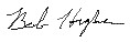
Not to start a bunch of fraud activity but thought I'd show a truly "crappy"
signature... my own.
Unfortunately all the while in school I printed my name even though I
learned cursive (they called it that) in 3rd grade.  I signed things in
regular print style up until my late teens when I was ever more coaxed into
writing it cursively.  So, I've always been envious of nice signatures but I
thought my printed style was fine.  Often it now turns out a ugly illegible
scrawl, I know better signatures can be illegible too but are usually also
great stylistic handwriting.
Attached is my best with graphics pen and tablet.  Don't go zeroxing it onto
documents please.
Oh yeah, I think the eye logo in wire strands is another good look for it.
Whatever happened to that "other" rendering work you were doing though?  :-)
Apologize for not remembering the name. "Aracan" or something... I didn't
see it listed here when I looked.  Still have the logo-fever and can't
render anything else? Just kidding.

Bob
Post a reply to this message
Attachments:
Download 'crappysig.jpg' (2 KB)
Preview of image 'crappysig.jpg'
|
|
| |
| |
|
|
|
|
| |
| |
|
|
ha har!, now wheres my photocopyer.......

Rick
Post a reply to this message
|
|
| |
| |
|
|
|
|
| |
| |
|
|
"Bob Hughes" <per### [at] aolcom?subject=PoV-News:> wrote :
>
> Unfortunately all the while in school I printed my name even though I
> learned cursive (they called it that) in 3rd grade.  I signed things in
> regular print style up until my late teens when I was ever more coaxed
into
> writing it cursively.

    I did the same thing. Still do. The only bank in a town I lived in told
me that they would not accept my printed signature, so I messed it up a
little but still printed it, and they took it.

    I have an ongoing project to make my handwriting style in TTF. I have
been working on it for 3 years and have about 10 letters done.
Post a reply to this message
|
|
| |
| |
|
|
|
|
| |
| |
|
|
"Bill DeWitt" <the### [at] earthlinknet> wrote in message
news:398d64e0@news.povray.org...
|
|     I did the same thing. Still do. The only bank in a town I lived in
told
| me that they would not accept my printed signature, so I messed it up a
| little but still printed it, and they took it.

Yep, annoying to change the way you write your name after so long a time.

|     I have an ongoing project to make my handwriting style in TTF. I have
| been working on it for 3 years and have about 10 letters done.

But your name is only 7 letters...  oh, you meant all 26 of the alphabet.
Gee, only 4.8 more years to go then.

Bob
Post a reply to this message
|
|
| |
| |
|
|
|
|
| |
| |
|
|
"Bob Hughes" <per### [at] aolcom?subject=PoV-News:> wrote :
>
> Gee, only 4.8 more years to go then.

    Eh... plus the capital letters and the other characters, 20+ years.
Post a reply to this message
|
|
| |
| |
|
|
|
|
| |
| |
|
|
On Sat, 5 Aug 2000 23:50:45 -0500 "Bob Hughes"
<per### [at] aolcom?subject=PoV-News:> wrote:

>Often it now turns out a ugly illegible
>scrawl, I know better signatures can be illegible too but are usually also
>great stylistic handwriting.
>Attached is my best with graphics pen and tablet.

  Bob, there's nothing wrong with your signature. I can easily make it
out - "Bob Higher" <g>.

--
Alan - ako### [at] povrayorg - a k o n g <at> p o v r a y <dot> o r g
http://www.povray.org - Home of the Persistence of Vision Ray Tracer
Post a reply to this message
|
|
| |
| |
|
|
|
|
| |
| |
|
|
On Sun, 6 Aug 2000 09:15:30 -0400 "Bill DeWitt"
<the### [at] earthlinknet> wrote:

>I did the same thing. Still do. The only bank in a town I lived in told
>me that they would not accept my printed signature, so I messed it up a
>little but still printed it, and they took it.

  I guess they can tell you anything they want but (I think) you should
be able to print if you so choose, Bill. If they were concerned about
security of your account, even printing can yield telltale
discrepancies. It just may not be as apparent to the untrained eye.

--
Alan - ako### [at] povrayorg - a k o n g <at> p o v r a y <dot> o r g
http://www.povray.org - Home of the Persistence of Vision Ray Tracer
Post a reply to this message
|
|
| |
| |
|
|
|
|
| |
| |
|
|
Bill DeWitt wrote:

>     I have an ongoing project to make my handwriting style in TTF. I have
> been working on it for 3 years and have about 10 letters done.

You know, there are services that will do that for you if you submit a sample
card.

--
David Fontaine     <dav### [at] faricynet>     ICQ 55354965
Please visit my website: http://www.faricy.net/~davidf/
Post a reply to this message
|
|
| |
| |
|
|
|
|
| |
| |
|
|
"Alan Kong" <ako### [at] povrayNO-SPAMorg> wrote :
>
>   I guess they can tell you anything they want

    It was either that or drive 30 miles to the next bank.

> but (I think) you should
> be able to print if you so choose, Bill. If they were concerned about
> security of your account, even printing can yield telltale
> discrepancies. It just may not be as apparent to the untrained eye.

    I thought so too. I worked hard on my printed signature while learning
calligraphy and I had it just like I wanted it and I dared the bank clone to
try to reproduce it with any less effort than any other signature. Bunch of
dim bulbs.

    I have since returned to my printed signature. People can read my
writing and will be able to know what my name is if they see it. Now if I
could just avoid the Hairy Eyeball of Death when I laboriously hand print
the whole "William James DeWitt" on my checks in the hardware store line. Of
course it doesn't help that I printed "thirty seven dollars and ninety three
cents" too...

    People find me tedious.
Post a reply to this message
|
|
| |
| |
|
|
|
|
| |
| |
|
|
"Alan Kong" <ako### [at] povrayNO-SPAMorg> wrote in message
news:k7jroskup8f4q6vmqkgp3ri88p7te7tgg4@4ax.com...
| On Sat, 5 Aug 2000 23:50:45 -0500 "Bob Hughes"
| <per### [at] aolcom?subject=PoV-News:> wrote:
|
| >Often it now turns out a ugly illegible
| >scrawl, I know better signatures can be illegible too but are usually
also
| >great stylistic handwriting.
| >Attached is my best with graphics pen and tablet.
|
|   Bob, there's nothing wrong with your signature. I can easily make it
| out - "Bob Higher" <g>.

I did say that was a very clear sig there, not at all like when I sign
checks and things.  A little turbulence and skewed scaling on the image as a
mapped pigment in POV-Ray would soon show what it's really like.

Bob
Post a reply to this message
|
|
| |
| |
|
|
|
|
| |
| |
|
|
Beautiful image, thanks Tony.

--
Cheers
Steve              email mailto:ste### [at] zeroppsuklinuxnet

%HAV-A-NICEDAY Error not enough coffee  0 pps.

web http://www.zeropps.uklinux.net/

or  http://start.at/zero-pps

 11:18pm  up 22 days, 21:45,  2 users,  load average: 1.13, 1.04, 1.01
Post a reply to this message
|
|
| |
| |
|
|
|
|
| |
| |
|
|
Very good. The sphere is getting better with every version of this. You're
getting closer to showing "infinity" in there.

Josh

"Tony[B]" wrote:

> Yet Another Crappy Eyelogo Presentation. This is my 7th so far. I like it.
> The sphere in the middle uses negative emission media... oooohh... I hope
> it's not that crappy. ;-) I did it a while ago, just got to post it. Enjoy.
>
>  [Image]

--
Josh English -- Lexiphanic Lethomaniac
eng### [at] spiritonecom
The POV-Ray Cyclopedia http://www.spiritone.com/~english/cyclopedia/
Post a reply to this message
|
|
| |
| |
|
|
|
|
| |