|
|
|
|
|
|
| |
| |
|
|
|
|
| |
| |
|
|
Very nice! :-)
Greetings,
Rune
--
\ Include files, tutorials, 3D images, raytracing jokes,
/ The POV Desktop Theme, and The POV-Ray Logo Contest can
\ all be found at http://rsj.mobilixnet.dk (updated July 23)
/ Also visit http://www.povrayusers.org
Post a reply to this message
|
|
| |
| |
|
|
|
|
| |
| |
|
|
Much too complex for a logo. I like complex and hate logos tho', so it
looks good to me. :)
-Mike
Post a reply to this message
|
|
| |
| |
|
|
|
|
| |
| |
|
|
> Not bad.
> The silver lacings on the left lose some definition next
> to the gold.
>
> I love the sig, no matter how you did it.
> Cool.
Thanks. :)
Post a reply to this message
|
|
| |
| |
|
|
|
|
| |
| |
|
|
> Very nice! :-)
Excellent. I guess you can use this as one of my presentations then. Should
I send you the original, full-size render?
Post a reply to this message
|
|
| |
| |
|
|
|
|
| |
| |
|
|
> Much too complex for a logo. I like complex and hate logos tho', so it
> looks good to me. :)
It's just a presentation of the logo. I'm glad you like it. :)
Post a reply to this message
|
|
| |
| |
|
|
|
|
| |
| |
|
|
negative emission media? elaborate. what are properties one can expect
from such a beast?
"Tony[B]" wrote:
>
> Yet Another Crappy Eyelogo Presentation. This is my 7th so far. I like it.
> The sphere in the middle uses negative emission media... oooohh... I hope
> it's not that crappy. ;-) I did it a while ago, just got to post it. Enjoy.
>
> [Image]
Post a reply to this message
|
|
| |
| |
|
|
|
|
| |
| |
|
|
"Tony[B]" wrote:
> I guess you can use this as one of my presentations then.
Yes!
> Should I send you the original, full-size render?
That might not be necessary. I'll mail you about the details a little later.
Rune
--
\ Include files, tutorials, 3D images, raytracing jokes,
/ The POV Desktop Theme, and The POV-Ray Logo Contest can
\ all be found at http://rsj.mobilixnet.dk (updated July 23)
/ Also visit http://www.povrayusers.org
Post a reply to this message
|
|
| |
| |
|
|
|
|
| |
| |
|
|
> negative emission media? elaborate. what are properties one can expect
> from such a beast?
-<1,2,3>/3 means you see <3,2,1>/3 on very bright, white backgrounds.
Post a reply to this message
|
|
| |
| |
|
|
|
|
| |
| |
|
|
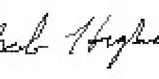
Not to start a bunch of fraud activity but thought I'd show a truly "crappy"
signature... my own.
Unfortunately all the while in school I printed my name even though I
learned cursive (they called it that) in 3rd grade. I signed things in
regular print style up until my late teens when I was ever more coaxed into
writing it cursively. So, I've always been envious of nice signatures but I
thought my printed style was fine. Often it now turns out a ugly illegible
scrawl, I know better signatures can be illegible too but are usually also
great stylistic handwriting.
Attached is my best with graphics pen and tablet. Don't go zeroxing it onto
documents please.
Oh yeah, I think the eye logo in wire strands is another good look for it.
Whatever happened to that "other" rendering work you were doing though? :-)
Apologize for not remembering the name. "Aracan" or something... I didn't
see it listed here when I looked. Still have the logo-fever and can't
render anything else? Just kidding.
Bob
Post a reply to this message
Attachments:
Download 'crappysig.jpg' (2 KB)
Preview of image 'crappysig.jpg'
|
|
| |
| |
|
|
|
|
| |
| |
|
|
ha har!, now wheres my photocopyer.......
Rick
Post a reply to this message
|
|
| |
| |
|
|
|
|
| |