 |
 |
|
 |
|
 |
|  |
|  |
|
 |
|
 |
|  |
|  |
|
 |
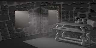
Just looking for suggestiong to make the image more realistic.
Thanks,
Dave
Post a reply to this message
|
 |
|  |
|  |
|
 |
|
 |
|  |
|  |
|
 |
Post a reply to this message
Attachments:
Download 'DreamRoom.jpg' (20 KB)
Preview of image 'DreamRoom.jpg'

|
 |
|  |
|  |
|
 |
From: Ian Witham
Subject: Re: Suggestions wanted. - DreamRoom.jpg (1/1)
Date: 12 Jul 2000 21:10:56
Message: <396d1720@news.povray.org>
|
|
 |
|  |
|  |
|
 |
That table's floating an inch off the floor...
--
Ian
Inkwell: Ian's Homepage
http://www.topcities.com/cartoon/inkwell/index.htm
Dave Rich <est### [at] jetcable com> wrote in message
news:t04qmss1olg9amrhkadpgnjacki1oggubs@4ax.com... com> wrote in message
news:t04qmss1olg9amrhkadpgnjacki1oggubs@4ax.com...
Post a reply to this message
|
 |
|  |
|  |
|
 |
From: David Heys
Subject: Re: Suggestions wanted. - DreamRoom.jpg (1/1)
Date: 12 Jul 2000 23:11:01
Message: <396d3345@news.povray.org>
|
|
 |
|  |
|  |
|
 |
Radiosity...
A slight Sepia tint to the scene.
David
Post a reply to this message
|
 |
|  |
|  |
|
 |
|
 |
|  |
|  |
|
 |
ooooohhhh..... neat. I really like the walls. The hovering table is
cool, too.
Josh
Dave Rich wrote:
> [Image]
--
Josh English -- Lexiphanic Lethomaniac
eng### [at] spiritone com
The POV-Ray Cyclopedia http://www.spiritone.com/~english/cyclopedia/ com
The POV-Ray Cyclopedia http://www.spiritone.com/~english/cyclopedia/
Post a reply to this message
|
 |
|  |
|  |
|
 |
From: Doug Eichenberg
Subject: Re: Suggestions wanted. - DreamRoom.jpg (1/1)
Date: 13 Jul 2000 17:51:16
Message: <396e39d4$1@news.povray.org>
|
|
 |
|  |
|  |
|
 |
I would fill in the walls with more stones, and give the stones a rough
texture (perhaps a granite surface normal). A wooden surface for the table
might look good too.
-Doug Eichenberg
Post a reply to this message
|
 |
|  |
|  |
|
 |
|
 |
|  |
|  |
|
 |
Cool.
Needs a big spider on the floor.
--
Cheers
Steve email mailto:ste### [at] zeropps uklinux uklinux net
%HAV-A-NICEDAY Error not enough coffee 0 pps.
web http://www.zeropps.uklinux.net/
or http://start.at/zero-pps
2:23am up 15 days, 2:04, 2 users, load average: 1.04, 1.05, 1.01 net
%HAV-A-NICEDAY Error not enough coffee 0 pps.
web http://www.zeropps.uklinux.net/
or http://start.at/zero-pps
2:23am up 15 days, 2:04, 2 users, load average: 1.04, 1.05, 1.01
Post a reply to this message
|
 |
|  |
|  |
|
 |
|
 |
|  |
|  |
|
 |
The neat square window cut through the irregular (off-angle!) stones
looks really odd.
--
Anton Sherwood -- br0### [at] p0b0x com -- http://ogre.nu com -- http://ogre.nu
Post a reply to this message
|
 |
|  |
|  |
|
 |
|
 |
|  |
|  |
|
 |
Dave Rich wrote in message ...
Add a color. like red, or um, blue. Even, yes...yellow.
JMHO,
Peter
war### [at] hotmail com com
Post a reply to this message
|
 |
|  |
|  |
|
 |
|
 |
|  |


![]()