|
|
|
|
|
|
| |
| |
|
|
|
|
| |
| |
|
|
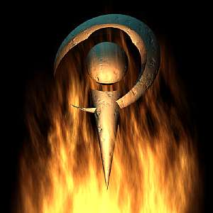
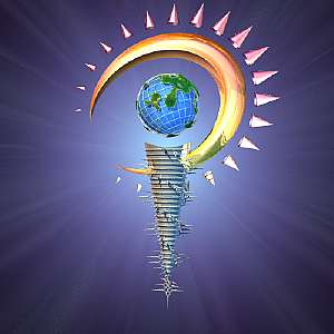
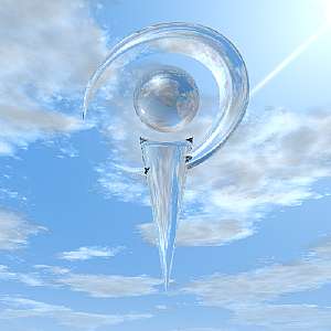
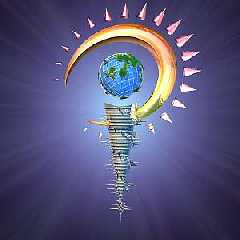
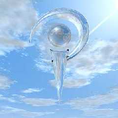
It's a P (and an O and V, if you look hard enough), or perhaps it's an eye
with a ray being traced from it...and it all fits in a few lines of code:

union { sphere {<0, 2, 0>, 1}
   difference { cone {<0, 2, 0>, 1, <0, -4, 0>, 0}
      sphere {<0, 2, 0>, 1.4 scale <1, 1, 2>}}
   difference { sphere {0, 1 scale <2.6, 2.2, 1>}
      sphere {0, 1 scale <2.3, 1.8, 2> translate <-.35, 0, 0>}
      rotate z*30 translate <0, 2, 0>}
   pigment {rgb <1, 1, 1>}}
Post a reply to this message
Attachments:
Download 'cc_logo.jpg' (6 KB)
Download 'cc_logo2.jpg' (10 KB)
Download 'cc_logo3.jpg' (10 KB)
Download 'cc_logo4.jpg' (9 KB)
Preview of image 'cc_logo.jpg'

Preview of image 'cc_logo2.jpg'
Preview of image 'cc_logo3.jpg'
Preview of image 'cc_logo4.jpg'
|
|
| |
| |
|
|
|
|
| |
| |
|
|
Ooo...
--
I get paid to do -anything- while connected to the internet.
Please use my referral id to find out more
http://www.getpaid4.com/?billdewitt
"Chris Colefax" <chr### [at] tag povrayorg> wrote in message
news:3930f25a@news.povray.org...
> It's a P (and an O and V, if you look hard enough), or perhaps it's an eye
> with a ray being traced from it...and it all fits in a few lines of code:
>
> union { sphere {<0, 2, 0>, 1}
> difference { cone {<0, 2, 0>, 1, <0, -4, 0>, 0}
> sphere {<0, 2, 0>, 1.4 scale <1, 1, 2>}}
> difference { sphere {0, 1 scale <2.6, 2.2, 1>}
> sphere {0, 1 scale <2.3, 1.8, 2> translate <-.35, 0, 0>}
> rotate z*30 translate <0, 2, 0>}
> pigment {rgb <1, 1, 1>}}
>
>
>
>
Post a reply to this message
|
|
| |
| |
|
|
|
|
| |
| |
|
|
Chris Colefax wrote:

>It's a P (and an O and V, if you look hard enough)

and if you rotate <0,0,90>,
the pov-mascotte is almost there.

I like it, it's the most "playfull" one yet.

cc_logo3.jpg: POV is punk (Yeaaaaah, ingo starts stagediving from his desk.
In mid air he realises there is no audience to catch him.....)

Ingo

--
Photography: http://members.home.nl/ingoogni/
Pov-Ray    : http://members.home.nl/seed7/
Post a reply to this message
|
|
| |
| |
|
|
|
|
| |
| |
|
|
Whoa!, love that versitility, and isnt that whats povrays all about after
all, this one gets my vote (so far), ..

Rick
Post a reply to this message
|
|
| |
| |
|
|
|
|
| |
| |
|
|
Nice! The double symbilics is a bit suble, but I can definetely see the
"POV"-letters. And the shapes are so obviously simple and geometric! The
lightning is very cool too. :)

(And I notice that you can shorten the code even further. (Using 1 instead
of <1, 1, 1>, y instead of <0, 1, 0> and so forth..)

Simen Kvaal.


Chris Colefax skrev i meldingen <3930f25a@news.povray.org>...
>It's a P (and an O and V, if you look hard enough), or perhaps it's an eye
>with a ray being traced from it...and it all fits in a few lines of code:
>
>union { sphere {<0, 2, 0>, 1}
>   difference { cone {<0, 2, 0>, 1, <0, -4, 0>, 0}
>      sphere {<0, 2, 0>, 1.4 scale <1, 1, 2>}}
>   difference { sphere {0, 1 scale <2.6, 2.2, 1>}
>      sphere {0, 1 scale <2.3, 1.8, 2> translate <-.35, 0, 0>}
>      rotate z*30 translate <0, 2, 0>}
>   pigment {rgb <1, 1, 1>}}
Post a reply to this message
|
|
| |
| |
|
|
|
|
| |
| |
|
|
As was said, very versatile. Yet simple. I like this one a lot.

--
Margus Ramst

Personal e-mail: mar### [at] peakeduee
TAG (Team Assistance Group) e-mail: mar### [at] tagpovrayorg
Post a reply to this message
|
|
| |
| |
|
|
|
|
| |
| |
|
|
Aw, c'mon Chris, I was winning before. Look what you went and did... ;) Cool
idea. I like it. You certainly presented it in an array of different styles.
I should get working on presenting mine too. Damn Uni. just eats up so much
of my time... :(
Post a reply to this message
|
|
| |
| |
|
|
|
|
| |
| |
|
|
Very appealing in it's simplicity. The fire one rules.

Regards,
Dave

"Chris Colefax" <chr### [at] tagpovrayorg> wrote in message
news:3930f25a@news.povray.org...
> It's a P (and an O and V, if you look hard enough), or perhaps it's an eye
> with a ray being traced from it...and it all fits in a few lines of code:
>
> union { sphere {<0, 2, 0>, 1}
>    difference { cone {<0, 2, 0>, 1, <0, -4, 0>, 0}
>       sphere {<0, 2, 0>, 1.4 scale <1, 1, 2>}}
>    difference { sphere {0, 1 scale <2.6, 2.2, 1>}
>       sphere {0, 1 scale <2.3, 1.8, 2> translate <-.35, 0, 0>}
>       rotate z*30 translate <0, 2, 0>}
>    pigment {rgb <1, 1, 1>}}
>
>
>
>
Post a reply to this message
|
|
| |
| |
|
|
|
|
| |
| |
|
|
Wow.  And the third one redefines "flamboyant" (no, not the flaming one).
This is along the lines of what I've been trying, less the great scenery.  I think
something of this nature and design will be about as good as it gets.

Bob
Post a reply to this message
|
|
| |
| |
|
|
|
|
| |
| |
|
|
Chris Colefax has done it again.

Chris Colefax wrote:
>
> It's a P (and an O and V, if you look hard enough), or perhaps it's an eye
> with a ray being traced from it...and it all fits in a few lines of code:
>
> union { sphere {<0, 2, 0>, 1}
>    difference { cone {<0, 2, 0>, 1, <0, -4, 0>, 0}
>       sphere {<0, 2, 0>, 1.4 scale <1, 1, 2>}}
>    difference { sphere {0, 1 scale <2.6, 2.2, 1>}
>       sphere {0, 1 scale <2.3, 1.8, 2> translate <-.35, 0, 0>}
>       rotate z*30 translate <0, 2, 0>}
>    pigment {rgb <1, 1, 1>}}
>
>  [Image]
>
>  [Image]
>
>  [Image]
>
>  [Image]
Post a reply to this message
|
|
| |
| |
|
|
|
|
| |
| |
|
|
Jee !!!!

I really like these.
It's so simple and yet so efficient.
These are very likely to be winners.

I bet that the one with the earth in the middle was inspired by Lightwave.

Fabien Hénon


Chris Colefax a écrit :

> It's a P (and an O and V, if you look hard enough), or perhaps it's an eye
> with a ray being traced from it...and it all fits in a few lines of code:
>
> union { sphere {<0, 2, 0>, 1}
>    difference { cone {<0, 2, 0>, 1, <0, -4, 0>, 0}
>       sphere {<0, 2, 0>, 1.4 scale <1, 1, 2>}}
>    difference { sphere {0, 1 scale <2.6, 2.2, 1>}
>       sphere {0, 1 scale <2.3, 1.8, 2> translate <-.35, 0, 0>}
>       rotate z*30 translate <0, 2, 0>}
>    pigment {rgb <1, 1, 1>}}
>
>  [Image]
>
>  [Image]
>
>  [Image]
>
>  [Image]
Post a reply to this message
|
|
| |
| |
|
|
|
|
| |
| |
|
|
> I bet that the one with the earth in the middle was inspired by Lightwave.

It does look like that doesn't it? I'll be putting out a new version of mine
(well, not really a new version, but rather I will be presenting it in new
ways. One is going to be a play on the Lightwave logo).
Post a reply to this message
|
|
| |
| |
|
|
|
|
| |
| |
|
|
On second thought, it is probably a matter of presentation. I'd be interested
to see TonyB's in a similar setup.

--
David Fontaine     <dav### [at] faricynet>     ICQ 55354965
Please visit my website: http://www.faricy.net/~davidf/
Post a reply to this message
|
|
| |
| |
|
|
|
|
| |
| |
|
|
On third thought, I agree. I tried Chris' script with a plain background. I find
it .......less interesting ( sorry for my bluntness).

But I guess that the strength of his source is that is can be inserted anywhere
you want and can easily reproduced and modified.

Besides, the background shows Chris's artistic talents.

Fabien Hénon

David Fontaine a écrit :

> On second thought, it is probably a matter of presentation. I'd be interested
> to see TonyB's in a similar setup.
>
> --
> David Fontaine     <dav### [at] faricynet>     ICQ 55354965
> Please visit my website: http://www.faricy.net/~davidf/
Post a reply to this message
|
|
| |
| |
|
|
|
|
| |
| |
|
|
Wow. Simple, accurate, and with these treatments, this is one I'd vote for,
too.

Josh

Chris Colefax wrote:

> It's a P (and an O and V, if you look hard enough), or perhaps it's an eye
> with a ray being traced from it...and it all fits in a few lines of code:
>
> union { sphere {<0, 2, 0>, 1}
>    difference { cone {<0, 2, 0>, 1, <0, -4, 0>, 0}
>       sphere {<0, 2, 0>, 1.4 scale <1, 1, 2>}}
>    difference { sphere {0, 1 scale <2.6, 2.2, 1>}
>       sphere {0, 1 scale <2.3, 1.8, 2> translate <-.35, 0, 0>}
>       rotate z*30 translate <0, 2, 0>}
>    pigment {rgb <1, 1, 1>}}
>
>  [Image]
>
>  [Image]
>
>  [Image]
>
>  [Image]

--
Josh English
eng### [at] spiritonecom
"May your hopes, dreams, and plans not be destroyed by a few zeros."
Post a reply to this message
|
|
| |
| |
|
|
|
|
| |
| |
|
|
Oooh! Very nice, I really like this (these) one(s). Kinda reminds me of the
Lightwave logo. Would be hard pressed to say which of the ones here would be
my favourite.

Equiprawn
Post a reply to this message
|
|
| |
| |
|
|
|
|
| |
| |
|
|
Very nice, very clever. However (You didn't think you would get away without
a but, didn't you?!) it lacks the subtlety of proportions the eye logo has.
Very good concept - still needs some refining work.


Povingly


Philippe
Post a reply to this message
|
|
| |
| |
|
|
|
|
| |
| |
|
|
Very nice!

Simple and flexible, and presented in interesting ways. It would be nice to
see a black and white version so we could see how it looks when presented in
it's most simple form.

Greetings,

Rune

---
Updated April 25: http://rsj.mobilixnet.dk
Containing 3D images, stereograms, tutorials,
The POV Desktop Theme, 350+ raytracing jokes,
miscellaneous other things, and a lot of fun!
Post a reply to this message
|
|
| |
| |
|
|
|
|
| |
|
|